Overview
The Pop Modal Panel snippet lets you add a pop-up modal to your application. Modals are smaller windows that display on top of another page. When displayed, modals disable the rest of the page, leaving it visible but darkened. You can use a modal to draw your end-user's attention better than using a static message.
You'll often want user interaction to trigger a modal. For example, you could have a modal appear at the click of a button. Or, you might have a modal appear if there's an error on the page. Either way, your end-user must dismiss the modal to continue.
The main driver of this snippet is a Panel component, which holds the content of your modal. You can customize the Panel, adding components that fit your needs. Here are some examples of when you might use the Pop Modal Panel snippet:
Display help information that won't fit in a tooltip. Or, for components that don't have a tooltip option.
Prompt end-users to join an email list.
Allow end-users to complete a registration form for an event.
Display information for a selected row in a ViewGrid component.
The Pop Modal snippet is preconfigured with a Button component that reads Open. Clicking the button opens the contents of the Panel component as a modal. The Panel then has a Close button to close the modal. Here's what the snippet looks like in Express View:
And here's how the snippet looks in the Module Builder:
What You'll Learn
In this article, you'll learn how the Pop Modal Panel snippet works and how to customize it.
How the Snippet Works
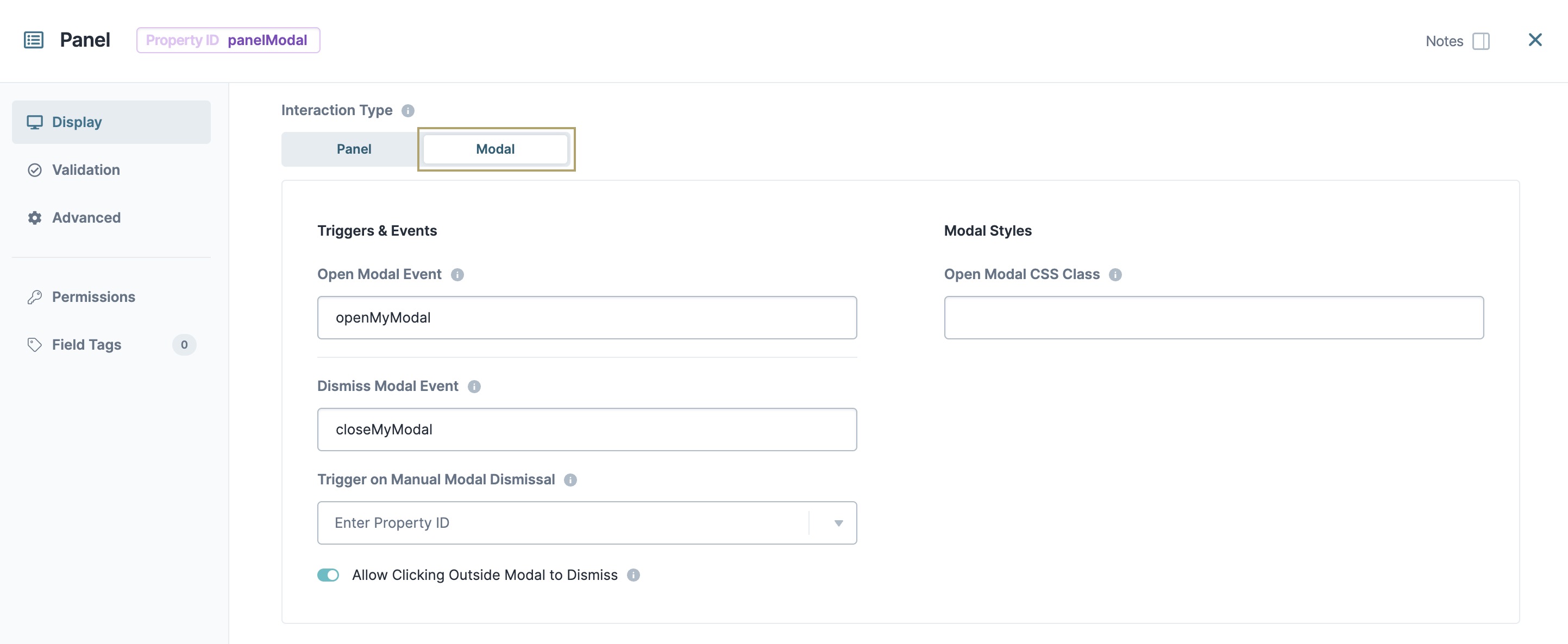
Your Pop Modal Panel snippet has a Panel component that holds the content of your modal. Selecting the Modal Interaction Type lets the Panel component behave as a modal. With this setting enabled, your modal displays once the end-user triggers it.
How the btnOpen and btnClose Button Components Work
The snippet also includes two preconfigured Button components to trigger the Panel. Both Button components include an Event Action Type that triggers either the openModal or closeModal event:
Clicking the openModal Button triggers the openModal event. This button displays outside the modal.
Clicking the closeModal Button triggers the closeModal event. This button displays inside the modal.
How the ruleBtn Decisions Components Works
Lastly, the snippet uses a Decisions component to define the role of each button. On button-click, the Decisions component triggers the panelModal Panel component. The Micro Decisions determine which button was clicked and either opens or closes the modal.

Customizing the Snippet
The function of this snippet is fairly general. So, there are many ways to use it. That said, the fundamental customization is the same.
The main customization to make to this snippet is the modal's content. The modal is a Panel component, so you can add components to it if that was part of your use case. For example, if you want the modal to collect email addresses, you'll add an Email component. The same goes for collecting phone numbers or addresses.
To learn more about collecting phone numbers or addresses, see our Phone Number, Intl Phone Number, and Address Search component articles.
From there, you'll likely edit the Button component labels that display. If you plan to save data using this snippet, you also need to configure a new Button component. The following section shows you some of the customizations that might help you.
Changing the Content of the Pop Modal
By default, the snippet includes an HTML Element component as the only content for the modal. use this component to add your own content. First, you'll delete the HTML Element component and then add your own. To add or remove content:
Hover over the htmlModalPanel
 HTML Element component.
A 5-button toolbar appears above the component on hover-over.
Using the toolbar, click the
.jpg) (Settings) button.
(Settings) button.Using the Configuration window, make changes to the component’s settings and content as needed.
Click Save & Close.
Changing the Button Labels
By default, the Buttons in this snippet read as Open and Close. To customize these labels:
Hover over the btnOpen or btnClose
.png) Button component.
Button component.A 5-button toolbar appears above the component on hover-over.
Using the toolbar, click the
(Settings) button.Adjust the Label Text as needed.
Save & Close each component after making changes.
Adding a Button Component
Depending on your use case, you may need more than two Button components. For example, you might need a Save button if you want to collect information in your modal. To do this, you'll add a new Button component to your module.
Drag and drop a
Button component onto your canvas, positioning it as needed.Configure the
Button as needed.Click Save & Close.
Save your module.