The Phone Number component is a specialized input used for entering phone numbers. By default, this component includes an input mask of (999) 999-9999, ensuring end-users input this predefined format. As an end-user enters their phone number, the input mask formats the value in the submission data.
You'll find the Phone Number component under the Secondary Fields group to the left of the Module Builder.
About the Configuration Window
To learn more about general component settings and those that display when a component is associated with Data Models, view our General Component Settings article.
Display Settings
Field Text
Setting | Description |
|---|---|
Property ID | A Property ID is the unique field ID used by Unqork to track and link components in your module. The Property ID is how the software identifies your component. Using Property IDs lets you link components, creating logic-based configurations and API calls. Property IDs must use camel case (stylized as camelCase) without spaces or punctuation. |
Label Text | Label Text conveys what the input component is and what information it displays. Enter the purpose of the corresponding component or field. User-friendly labels make your module more accessible. Keep labels short and descriptive (a word or two) using title case. For longer entries, use sentence case. |
Placeholder Text | A short prompt telling end-users the expected value of an input field. For example, |
Prefix | Alphanumeric characters append to the start of the value entered in the field. If called by another component, the prefix stores with the value. |
Suffix | Alphanumeric characters that append to the end of the value entered in the field. If called by another component, the suffix stores with the value. |
Contextual Help
Setting | Description |
|---|---|
Tooltip | A quick tip describing the expected value of an input field. Unlike a Tooltip, Helper Text stays visible under the input field and displays on a single line. |
Default State Options
Setting | Description |
|---|---|
Disable User Input | When set to By default, Disable User Input is set to |
Read Only View | When set to By default, the Read Only View toggle is set to |
Hide Field | Displays or hides the component from view. Setting Hide Field to By default, Hide Field is set to |
Disable Browser Autofill | Setting the toggle to
By default, the Disable Browser Autofill toggle is set to |
Formatting
Setting | Description |
|---|---|
Autocomplete | Autocomplete detects end-user data saved in a browser and uses it to fill relevant fields. For example, in Express View, if there is a field labeled First Name, and an end-user clicks into the field, the end-user's browser autofill function suggests first names saved to the browser. By default, Autocomplete is set to |
Autocomplete Value | When Autocomplete is set to
|
Input Mask | An Input Mask is a string of characters that indicates the format of a valid input. Use an Input Mask when the format of the input value must be consistent. Use 9 to require a number, a to require a letter, and * to require an alphanumeric character. By default, the Phone Number component has an Input Mask of (999) 999-9999. Note that phone numbers store in the submission data without formatting. |
Mask Error Message | The error message that displays to the end-user if they input the incorrect number of digits. |
Input Behavior
Setting | Description |
|---|---|
Input Behavior | Controls how end-users interact with the component. Choose from the following options:
|
Data Settings
Data Storage
Setting | Description |
|---|---|
Store Data in Database | The Store Data in Database setting affects how data persists through your application. When set to
Set the toggle to
By default, this toggle is set to |
Validation Settings
User Input
Setting | Description |
|---|---|
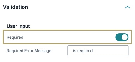
Required | When set to By default, Required is set to |
Required Error Message | A custom error message that displays below a required field. The error message displays when the end-user tries to save or submit the module without completing the required field. |
Advanced Settings
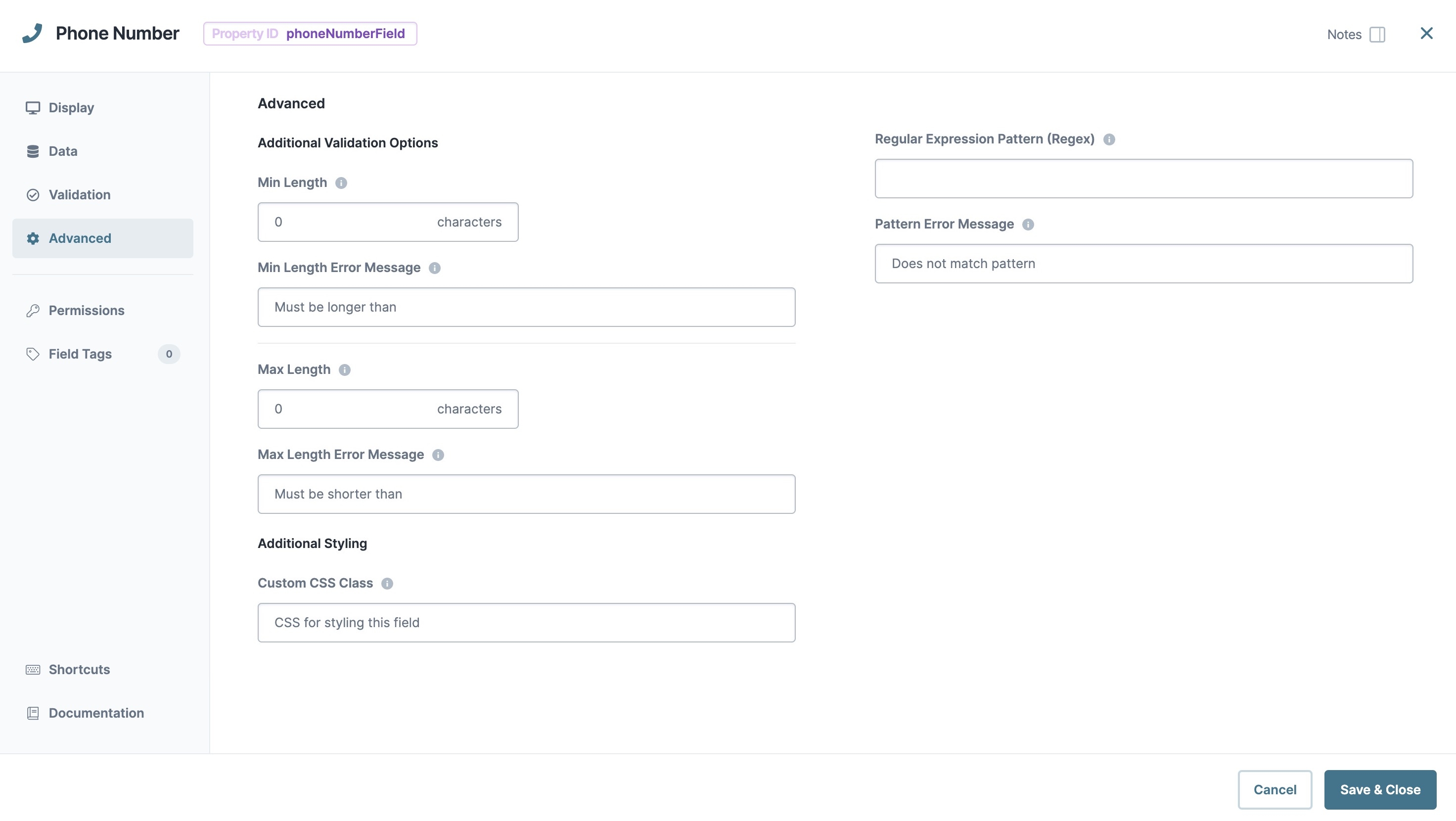
Additional Validation Options
Setting | Description |
|---|---|
Min/Max Length | Sets the minimum or the maximum number of characters an end-user must enter for valid input. |
Min/Max Length Error Message | A custom error message that displays below the input field. The error message displays when the entry doesn't meet the minimum or maximum character length rule. |
Regular Expression Pattern | The Regular Expression pattern that the field's value must match to be valid.
|
Pattern Error Message | An error message that displays if the value does not meet the Regular Expression pattern. |
Additional Styling
Setting | Description |
|---|---|
Custom CSS Class | Enter a Custom CSS Class to apply to your component. Custom CSS lets you maintain a consistent look and feel when the field or element is part of a template or multiple modules. Updated CSS styling applies to all components that reference this custom class name. |
Adding a Phone Number Component
Let's configure a Phone Number component that accepts a standard United States phone number. Setting the field to required ensures that the end-user enters a value before moving on.
In the Module Builder, drag and drop a Phone Number component onto your canvas.
In the Property ID field, enter phone.
In the Label Text field, enter
Phone Number.Navigate to the component's Validation settings.
Under User Input, set Required to
 (ON).
(ON).Click Save Component.
Save your module.
Preview your module in Express View and enter a United States phone number. Notice how an error message displays if you do not have the correct number of digits.
The Phone Number component is a specialized input used for entering phone numbers. By default, this component includes an input mask of (999) 999-9999, ensuring end-users input this predefined format. As an end-user enters their phone number, the input mask formats the value in the submission data.
Unqork offers a Phone Number and an Intl (International) Phone Number component. The Phone Number component works best with United States phone numbers. The Intl Phone Number component lets you set an international, country-specific input mask.
You'll find the Phone Number component under the Secondary Fields group to the left of the Module Builder.
Learning Objectives
About the Configuration Window
To learn more about general component settings and those that display when a component is associated with Data Models, view our General Component Settings article.
Display Panel
Field Text
Setting | Description |
|---|---|
Label Text | Label Text conveys what the input component is and what information it displays. Enter the purpose of the corresponding component or field. User-friendly labels make your module more accessible. Keep labels short and descriptive (a word or two) using title case. For longer entries, use sentence case. |
Placeholder Text | A short prompt telling end-users the expected value of an input field. For example, |
Prefix | Alphanumeric characters append to the start of the value entered in the field. If called by another component, the prefix stores with the value. |
Suffix | Alphanumeric characters that append to the end of the value entered in the field. If called by another component, the suffix stores with the value. |
Contextual Help
Setting | Description |
|---|---|
Tooltip | A quick tip describing the expected value of an input field. Unlike a Tooltip, Helper Text stays visible under the input field and displays on a single line. |
Default State Options
Setting | Description |
|---|---|
Disable Browser Autofill | Setting the toggle to
By default, the Disable Browser Autofill toggle is set to |
Disable User Input | When set to By default, Disable User Input is set to |
Read Only View | When set to By default, the Read Only View toggle is set to |
Hide Field | Displays or hides the component from view. Setting Hide Field to By default, Hide Field is set to |
Formatting
Setting | Description |
|---|---|
Input Mask | An Input Mask is a string of characters that indicates the format of a valid input. Use an Input Mask when the format of the input value must be consistent. Use By default, the Phone Number component has an Input Mask of (999) 999-9999. Note that phone numbers store in the submission data without formatting. |
Mask Error Message | The error message that displays to the end-user if they input the incorrect number of digits. |
Autocomplete
Setting | Description |
|---|---|
Autocomplete | Autocomplete detects end-user data saved in a browser and uses it to fill relevant fields. For example, in Express View, if there is a field labeled First Name, and an end-user clicks into the field, the end-user's browser autofill function suggests first names saved to the browser. By default, Autocomplete is set to |
Autocomplete Value | When Autocomplete is set to
|
Data Panel
Data Storage
Setting | Description |
|---|---|
Store Data in Database | The Store Data in Database setting affects how data persists through your application. When set to
Set the toggle to
By default, this toggle is set to |
Validation Panel
User Input
Setting | Description |
|---|---|
Required | When set to By default, Required is set to |
Required Error Message | A custom error message that displays below a required field. The error message displays when the end-user tries to save or submit the module without completing the required field. |
Advanced Panel
Additional Validation Options
Setting | Description |
|---|---|
Min/Max Length | Sets the minimum or the maximum number of characters an end-user must enter for valid input. |
Min/Max Length Error Message | A custom error message that displays below the input field. The error message displays when the entry doesn't meet the minimum or maximum character length rule. |
Regular Expression Pattern | The Regular Expression pattern that the field's value must match to be valid.
|
Pattern Error Message | An error message that displays if the value does not meet the Regular Expression pattern. |
Additional Styling
Setting | Description |
|---|---|
Custom CSS Class | Enter a Custom CSS Class to apply to your component. Custom CSS lets you maintain a consistent look and feel when the field or element is part of a template or multiple modules. Updated CSS styling applies to all components that reference this custom class name. |
Adding a Phone Number Component
Let's configure a Phone Number component that accepts a standard United States phone number. Setting the field to required ensures that the end-user enters a value before moving on.
In the Module Builder, drag and drop a Phone Number component onto your canvas.
In the Property ID field, enter phone.
In the Label Text field, enter
Phone Number.In the component's configuration menu, select
.png) Validation.
Validation.Set Required to
 (ON).
(ON).Click Save & Close.
Save your module.
Preview your module in Express View and enter a United States phone number. Notice how an error message displays if you do not have the correct number of digits.
.jpg)
.jpg)
.jpg)
.jpg)

.jpg)


