Overview
The Progress Bar snippet adds a visual representation of progress to your applications. You can use it any time you have a total value and a current value. The current value determines the position of the bar. The total value is the length of the entire bar.
The Progress Bar snippet can be used in a lot of different ways. Think about a progress bar that tells the end-user the progress of a large file upload. Or maybe you'll use a progress bar to show an end-user how far along they are in an application.
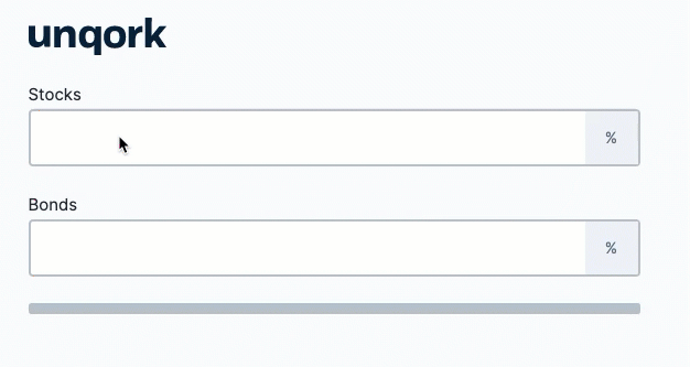
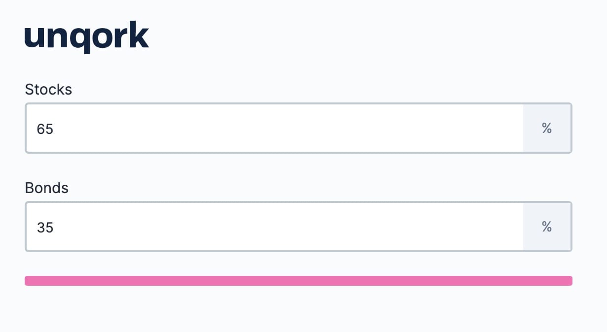
Below is a use case for the snippet. The end-user needs to enter 2 values that add up to 100%. The progress bar shows them how close they are to 100%. If the values add up to above 100%, the bar turns red. If they add up to 100% exactly, the bar turns green.
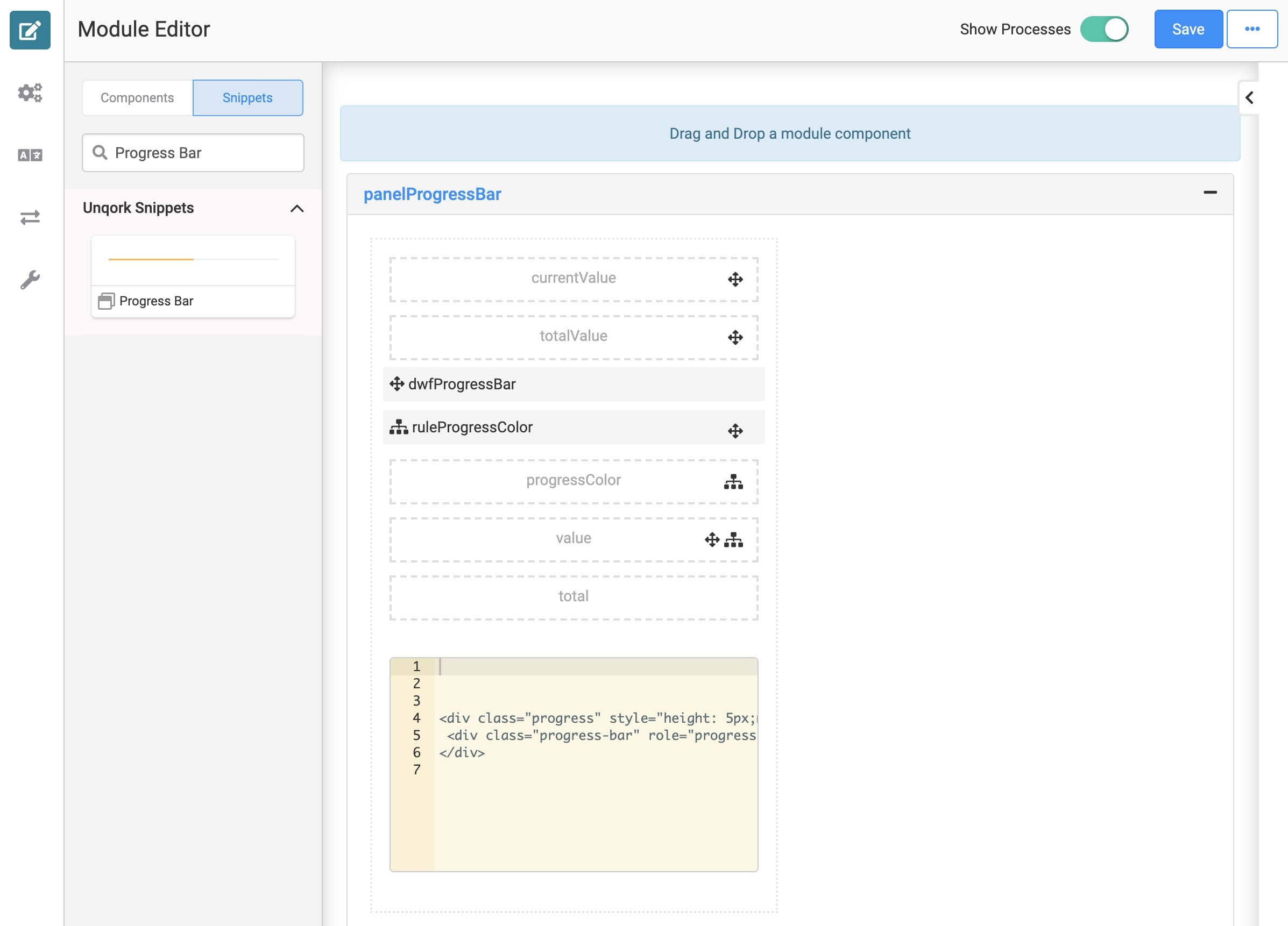
And here's what the snippet looks like in the Module Builder:
Adding the Snippet
To add the Progress Bar snippet to your module, do the following:
In the left sidebar of Module Builder, click the Snippets button.
Enter Progress Bar in the search bar.
Drag and drop the Progress Bar snippet onto your canvas.
Save your module.
How the Snippet Works
The actual progress bar is created with the Content component. You'll see the code in the Content component. You'll most likely leave the code alone (unless you want to change the size and position of the bar).
The snippet relies on 2 values to determine the position of the progress bar: the current value and the total value. These values come from 2 Hidden components (currentValue and totalValue) in the snippet. To configure the snippet you just need to assign values to these Hidden components.
The Decisions component in the snippet is where you'll choose the colors of the progress bar. In the Micro Decisions table, you'll see different colors assigned based on the position of the progress bar. By default, the bar starts yellow. When your current value equals the total value, the bar turns green. If your current value surpasses the total value, the bar turns red. You can customize the bar colors.
How to Set Up the Progress Bar Snippet
Let's set up the snippet using the configuration you saw in the Overview section. The use case is for an end-user setting up their retirement investments. They will need to select a percentage to allocate toward stocks and a percentage toward bonds. The percentage will need to add up to 100%. Since the totalValue Hidden component is by default 100, you won't need to make any edits to it.
Follow along to learn how to connect values to the progress bar. These instructions assume you have an open module with the Progress Bar snippet added.
Adding the Number Components
These are the fields the end-user will use to enter their percentages of investment.
Drag and drop 2 Number components into panelProgressBar.
Enter the Property ID and Label Text as follows:
Label Text
Property ID
Stocks
stocks
Bonds
bonds
Enter % in the Suffix fields.
Save each Number component as you add it.
Adding a Calculator Component
The Calculator will add the values in the Number components and output them to the currentValue Hidden component.
Drag and drop a Calculator component into panelProgressBar.
Enter calcInvestments in the Property ID and Label Text fields.
Set the Trigger Type to Watch.
In the Inputs table, enter the following:
Property ID
Alias
stocks
A
bonds
B
In the Outputs table, enter the following:
Property ID
Formula
currentValue
=SUM(A,B)
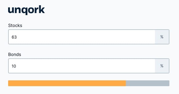
Again, your module should look something like this in Express View:
Customizing the Snippet
The Progress Bar snippet is very customizable. The progress bar can work in a lot of different scenarios. But, there are 2 main ways you can customize this snippet:
The values used to track progress
The appearance of the bar
Changing the Values Used in the Progress Bar
The parts of this snippet that you'll most likely customize are the values used to determine the position of the bar. There are 2 Hidden components the bar uses to determine position: currentValue and totalValue. To set up this snippet, you'll have to assign actual values to these Hidden components.
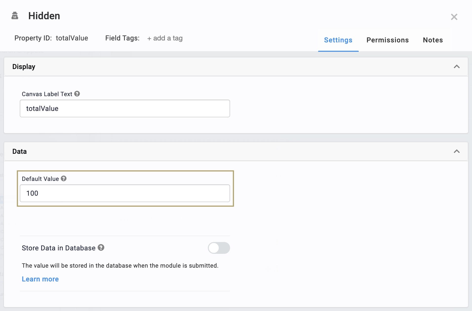
Updating the totalValue Hidden Component
Your totalValue can either be static or dynamic. For example, you could set the totalValue to 100 if you want the progress bar to represent 100. To do that, just enter the value in the Default Value field of the totalValue Hidden component.
Additionally, your totalValue can be dynamic. This will be the case any time the totalValue could change. For example, you could have a progress bar that shows an end-user the progress of a file being uploaded. In this case, the totalValue of the progress bar would change depending on the file size. You'd output the uploaded file's size to the totalValue Hidden component.
Updating the currentValue Hidden Component
Unlike totalValue, the currentValue Hidden component should always be a dynamic value. This is because currentValue determines the position of the progress bar. In other words, the currentValue shouldn't have a Default Value. If it did, the progress bar would be stuck in one position.
Instead, you should use other components to output a value into the currentValue component. As an example, reference the use case above.
Changing the Look of the Progress Bar
Let's go over 2 easy ways you can change the look of the progress bar: color and size.
Changing the Color of the Bar
To change the color of the progress bar, you just have to know the Hex code of the colors you'd like to use. You'll configure the colors using the ruleProgressColor Decisions component. Look at the Micro Decisions table in that component. You'll see there are, by default, 3 different colors the bar can be. From 0%-99%, the bar is yellow. At 100% the bar turns green. Above 100%, the bar turns red.
The values you see in the Input Values column are the percentages of your currentValue to your totalValue. So, a value of 100 is equal to 100% of your currentValue to totalValue. This means you don't have to adjust the Micro Decisions table even if you change your totalValue.
As a simple example, let's change the color of the bar for the use case you just completed. We now want the bar to turn hot pink when the end-user hits 100%.
Updating the Decisions Component
Hover over the ruleProgressColor Decisions component.
A 5-button toolbar appears above the component on hover-over.
Using the toolbar, click the
.jpg) (Settings) button.
(Settings) button.In the Micro Decisions table, enter #FF69B4 in the bottom output value. This is the output value for the value of 100.
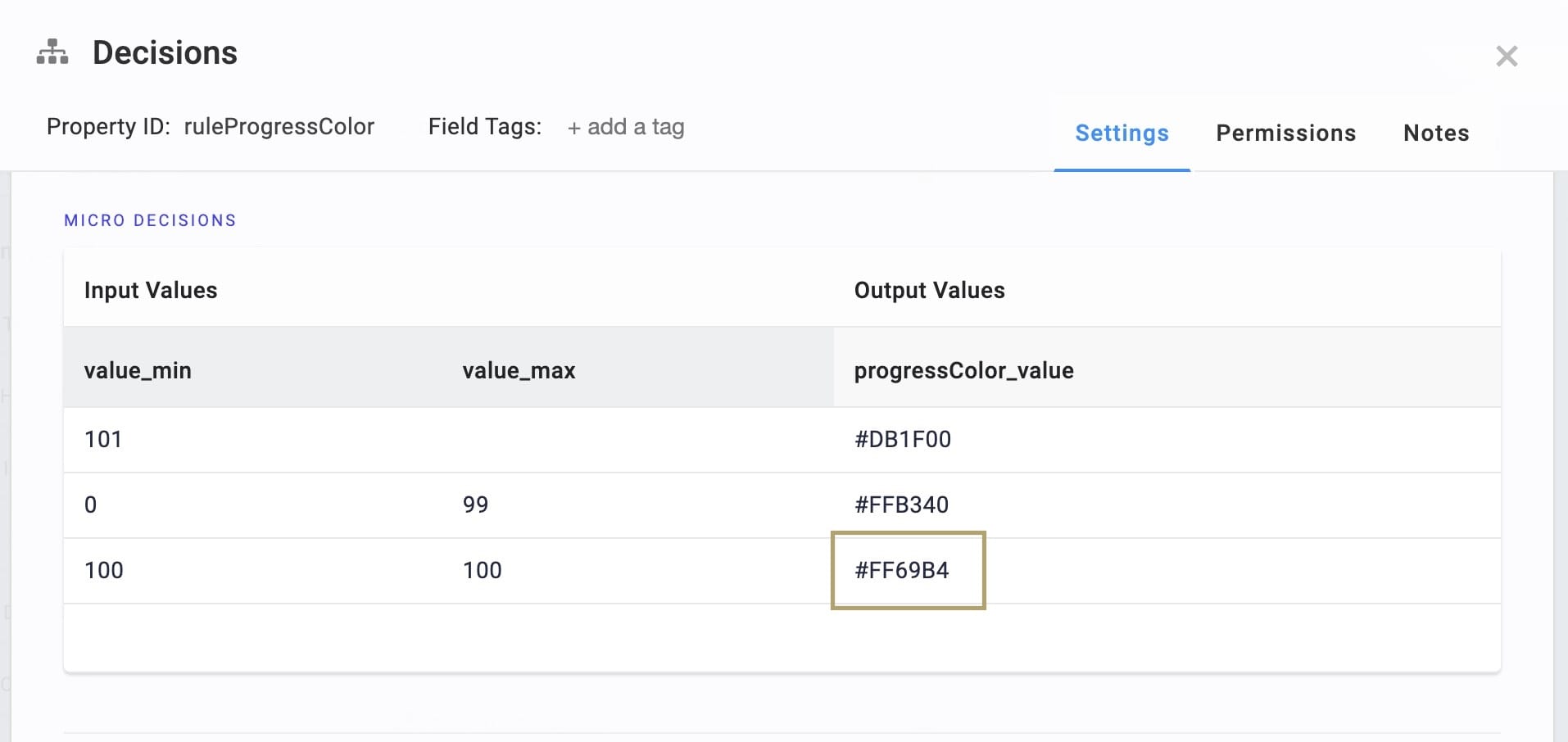
Click Save.
When you reach 100%, your progress bar will now turn hot pink.
Changing the Size of the Progress Bar
Adjusting the size of the bar is even simpler than the color. You just need to change the style in the Content component. Let's make the bar twice as thick.
Updating the Content Component
Click into the Content component's canvas.
Locate the line height: 10px in the Content component. This means the bar is by default 10 pixels high.
Update the line to say height: 20px.
Click Save.
Your progress bar should now be a little larger. Here's the bar at 20px:
Removing the Snippet
Removing a snippet from your module is simple. To remove the Progress Bar snippet:
In the Module Builder, hover over the panelProgressBar.
A 5-button toolbar appears above the component on hover-over.
Using the toolbar, click the
.jpg) (Remove) button.
(Remove) button.Save your module.