The Email component acts like a Text Field component, but with an additional feature that validates end-user input to ensure it matches valid email formatting. This component is often used with account setups or user registration. You can use it whenever you need end-users to submit a valid email address, though the component does not confirm if the email address is active.
You can find the component under the Secondary Fields group to the left of the Module Builder.
Acceptable Email Formats
The Email component relies on valid email address formatting in the form of prefix@DomainName.TopLevelDomain. Use the table below to better understand acceptable Email component formats:
Attribute | Description |
|---|---|
| The prefix is the name of an email mailbox that belongs to a specific person, mailing list, or department. The recipient name must not exceed 64 characters. Prefixes can include the following characters:
|
| The symbol in an email address separating the prefix from the domain name. |
| The domain name of a specific mailbox provider or organization. Domain names must not exceed 253 characters. Domains can include the following characters:
|
| Top-level domains are the highest level of the domain naming system. Common top-level domains can include the following examples:
|
About the Configuration Window
To learn more about general component settings and those that display when a component is associated with Data Models, view our General Component Settings article.
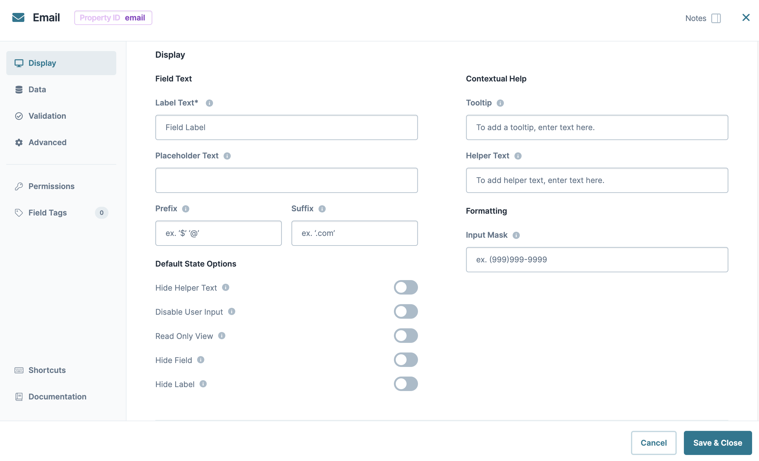
Display Panel
Field Text
Setting | Description |
|---|---|
Label Text | Label Text conveys what the input component is and what information it displays. Enter the purpose of the corresponding component or field. User-friendly labels make your module more accessible. Keep labels short and descriptive (a word or two) using title case. For longer entries, use sentence case. |
Placeholder Text | A short prompt telling end-users the expected value of an input field. For example, |
Prefix | Alphanumeric characters append to the start of the value entered in the field. If called by another component, the prefix stores with the value. |
Suffix | Alphanumeric characters that append to the end of the value entered in the field. If called by another component, the suffix stores with the value. |
Contextual Help
Setting | Description |
|---|---|
Tooltip | A short hint that displays when an end-user positions their cursor over the |
Helper Text | A quick tip describing the expected value of an input field. Unlike a Tooltip, Helper Text stays visible under the input field and displays on a single line. |
Default State Options
Setting | Description |
|---|---|
Hide Label | Setting Hide Label to By default, this setting is set to |
Hide Field | Displays or hides the component from view. Setting Hide Field to By default, Hide Field is set to |
Hide Helper Text | Stops Helper Text from displaying in Express View. By default, the Hide Helper Text toggle is set to |
Formatting
Setting | Description |
|---|---|
Input Mask | An Input Mask is a string of characters that indicates the format of a valid input. Use an Input Mask when the format of the input value must be consistent. Use 9 to require a number, a to require a letter, and * to require an alphanumeric character. For example, you might use an input mask with a field that stores a social security number, like 999-99-9999. Or, use an input mask that stores a formatted username, like aa9999. |
Input Behavior | Controls how end-users interact with the component. Choose from the following options:
|
Data Panel
Data Storage
Setting | Description |
|---|---|
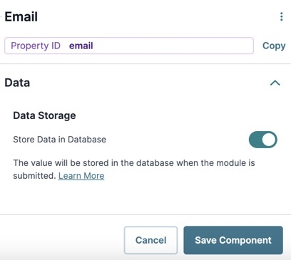
Store Data in Database | The Store Data in Database setting affects how data persists through your application. When set to
Set the toggle to (OFF) when you don’t want to store the values from this field in the database.
|
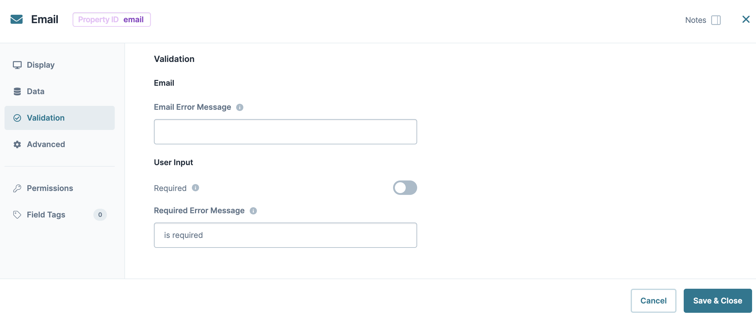
Validation Panel
Setting | Description |
|---|---|
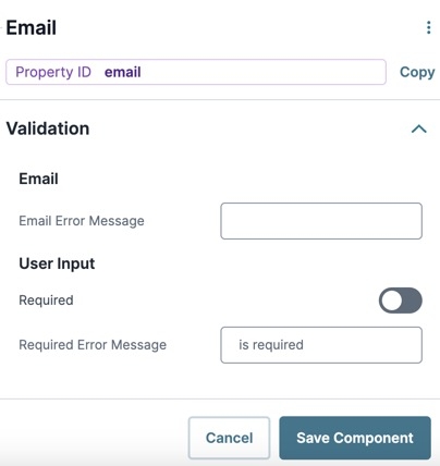
Email Error Message | Displays as a custom error message under the field when the end-user enters an invalid email address and advances, like saving or submitting a form. |
User Input
Setting | Description |
|---|---|
Required | When set to By default, Required is set to |
Required Error Message | A custom error message that displays below a required field. The error message displays when the end-user tries to save or submit the module without completing the required field. |
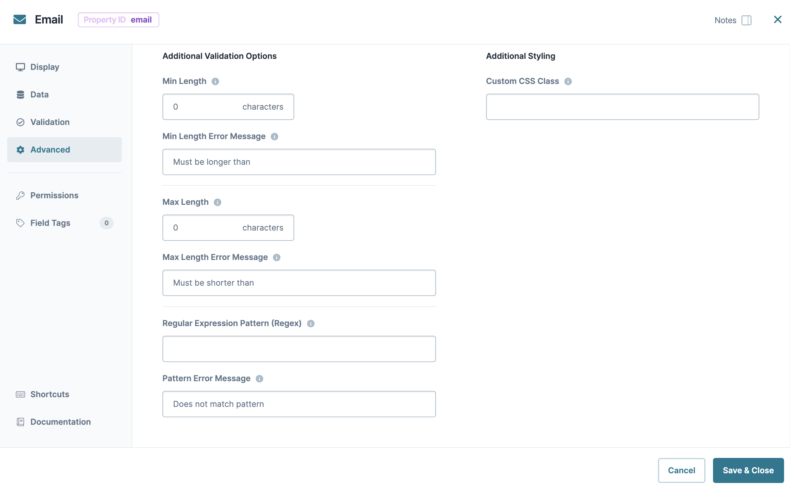
Advanced Panel
Additional Validation Options
Setting | Description |
|---|---|
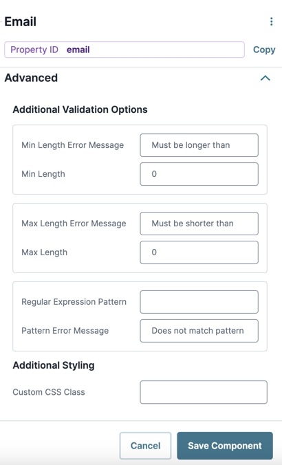
Min/Max Length Error Message | A custom error message that displays below the input field. The error message displays when the entry doesn't meet the minimum or maximum character length rule. |
Min/Max Length | Sets the minimum or the maximum number of characters an end-user must enter for valid input. |
Regular Expression Pattern | The Regular Expression pattern that the field's value must match to be valid.
|
Pattern Error Message | An error message that displays if the value does not meet the Regular Expression pattern. |
Additional Styling
Setting | Description |
|---|---|
Custom CSS Class | Enter a Custom CSS Class to apply to your component. Custom CSS lets you maintain a consistent look and feel when the field or element is part of a template or multiple modules. Updated CSS styling applies to all components that reference this custom class name. |
Adding an Email Component
In this example, you'll configure an Email component that collects a beneficiary's email address. These instructions assume that you have an open module saved with a title.
Drag and drop an
.png) Email component onto the canvas.
Email component onto the canvas.In the Property ID field, enter beneficiaryEmail.
In the Label Text field, enter
Beneficiary Email.Click Save Component.
Save your module.
Preview your module in Express View. You'll see the following functionality:
The Email component acts like a Text Field component, but with an additional feature that validates end-user input to ensure it matches valid email formatting. This component is often used with account setups or user registration. You can use it whenever you need end-users to submit a valid email address, though the component does not confirm if the email address is active.
You can find the component under the Secondary Fields group to the left of the Module Builder.
Acceptable Email Formats
The Email component relies on valid email address formatting in the form of prefix@DomainName.TopLevelDomain. Use the table below to better understand acceptable Email component formats:
Attribute | Description |
|---|---|
| The prefix is the name of an email mailbox that belongs to a specific person, mailing list, or department. The recipient name must not exceed 64 characters. Prefixes can include the following characters:
|
| The symbol in an email address separating the prefix from the domain name. |
| The domain name of a specific mailbox provider or organization. Domain names must not exceed 253 characters. Domains can include the following characters:
|
| Top-level domains are the highest level of the domain naming system. Common top-level domains can include the following examples:
|
About the Configuration Window
To learn more about general component settings and those that display when a component is associated with Data Models, view our General Component Settings article.
Display Panel
Field Text
Setting | Description |
|---|---|
Label Text | Label Text conveys what the input component is and what information it displays. Enter the purpose of the corresponding component or field. User-friendly labels make your module more accessible. Keep labels short and descriptive (a word or two) using title case. For longer entries, use sentence case. |
Placeholder Text | A short prompt telling end-users the expected value of an input field. For example, |
Prefix | Alphanumeric characters append to the start of the value entered in the field. If called by another component, the prefix stores with the value. |
Suffix | Alphanumeric characters that append to the end of the value entered in the field. If called by another component, the suffix stores with the value. |
Default State Options
Setting | Description |
|---|---|
Hide Helper Text | Stops Helper Text from displaying in Express View. By default, the Hide Helper Text toggle is set to |
Disable User Input | When set to By default, Disable User Input is set to |
Read Only View | When set to By default, the Read Only View toggle is set to |
Hide Field | Displays or hides the component from view. Setting Hide Field to By default, Hide Field is set to |
Hide Label | Setting Hide Label to By default, this setting is set to |
Contextual Help
Setting | Description |
|---|---|
Tooltip | A short hint that displays when an end-user positions their cursor over the |
Helper Text | A quick tip describing the expected value of an input field. Unlike a Tooltip, Helper Text stays visible under the input field and displays on a single line. |
Formatting
Setting | Description |
|---|---|
Input Mask | An Input Mask is a string of characters that indicates the format of a valid input. Use an Input Mask when the format of the input value must be consistent. Use For example, you might use an input mask with a field that stores a Social Security Number (999-99-9999) or a formatted username (aa9999). |
Data Panel
Setting | Description |
|---|---|
Store Data in Database | The Store Data in Database setting affects how data persists through your application. When set to
Set the toggle to
|
Validation Panel
Setting | Description |
|---|---|
Email Error Message | Displays as a custom error message under the field when the end-user enters an invalid email address and advances, like saving or submitting a form. |
User Input
Setting | Description |
|---|---|
Required | When set to By default, Required is set to |
Required Error Message | A custom error message that displays below a required field. The error message displays when the end-user tries to save or submit the module without completing the required field. |
Advanced Panel
Additional Validation Options
Setting | Description |
|---|---|
Min/Max Length | Sets the minimum or the maximum number of characters an end-user must enter for valid input. |
Min/Max Length Error Message | A custom error message that displays below the input field. The error message displays when the entry doesn't meet the minimum or maximum character length rule. |
Regular Expression Pattern | The Regular Expression pattern that the field's value must match to be valid.
|
Pattern Error Message | An error message that displays if the value does not meet the Regular Expression pattern. |
Additional Styling
Setting | Description |
|---|---|
Custom CSS Class | Enter a Custom CSS Class to apply to your component. Custom CSS lets you maintain a consistent look and feel when the field or element is part of a template or multiple modules. Updated CSS styling applies to all components that reference this custom class name. |
Adding an Email Component
In this example, you'll configure an Email component to collect a beneficiary's email address. These instructions assume that you have an open module saved with a title.
Drag and drop an
.png) Email component onto the canvas.
Email component onto the canvas.In the Property ID field, enter beneficiaryEmail.
In the Label Text field, enter
Beneficiary Email.Click Save & Close.
Save your module.
Preview your module in Express View. You'll see the following functionality:
.jpg) (Tooltip) icon. Tooltips can display across more than one line.
(Tooltip) icon. Tooltips can display across more than one line.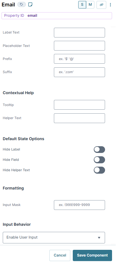
.jpg)
