The HTML Element component adds HTML formatting into your application. In Express View, you can see your HTML Elements render along with the rest of your module.
Some common examples of when to use the HTML Element component are:
Inserting a custom logo or image.
Showing a section heading or break.
Adding a paragraph of static text.
You'll find the HTML Element component in the Display & Layout group to the left of the Module Builder.
What You'll Learn
After completing this article, you’ll know when to use an HTML Element component, how to configure its settings, and how to add it to an application.
About the Configuration Window
To learn more about general component settings and those that display when a component is associated with Data Models, view our General Component Settings article.
Display Panel
Formatting
Setting | Description |
|---|---|
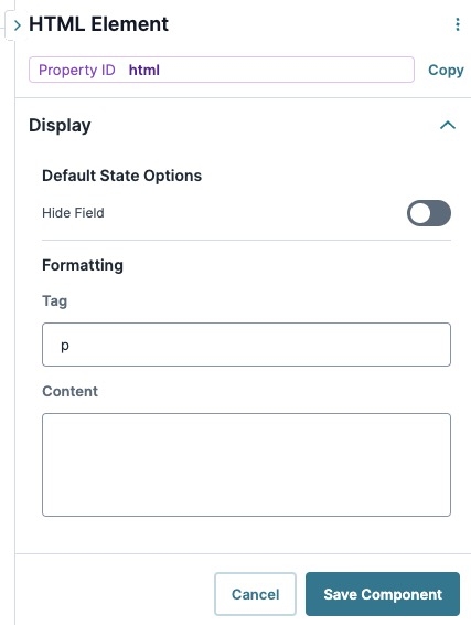
Tag | Set the HTML container for your content here. The HTML Tag is what you'll see inside angled brackets in traditional HTML. Common HTML tags you can use include:
By default, the HTML Tag is set to p. |
Content | The Content window works together with your HTML Tag. If you create a heading, enter your heading text here. The same goes for a paragraph or a basic hyperlink. What you enter here is what displays to your end-user in Express View. In traditional HTML, your content displays between your start and end tags. You can also enter additional HTML tags in the Content window. What you enter in the Tag setting field determines the default HTML tag. To prevent security exploits, only use safe HTML tags and attributes. When configuring your HTML tags and attributes, consider the following:
|
Default State Options
Setting | Description |
|---|---|
Hide Element | Displays or hides the component from view. Setting Hide Field to By default, Hide Field is set to |
Advanced Panel
Additional Styling
Setting | Description |
|---|---|
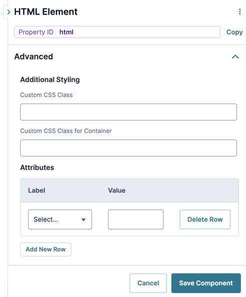
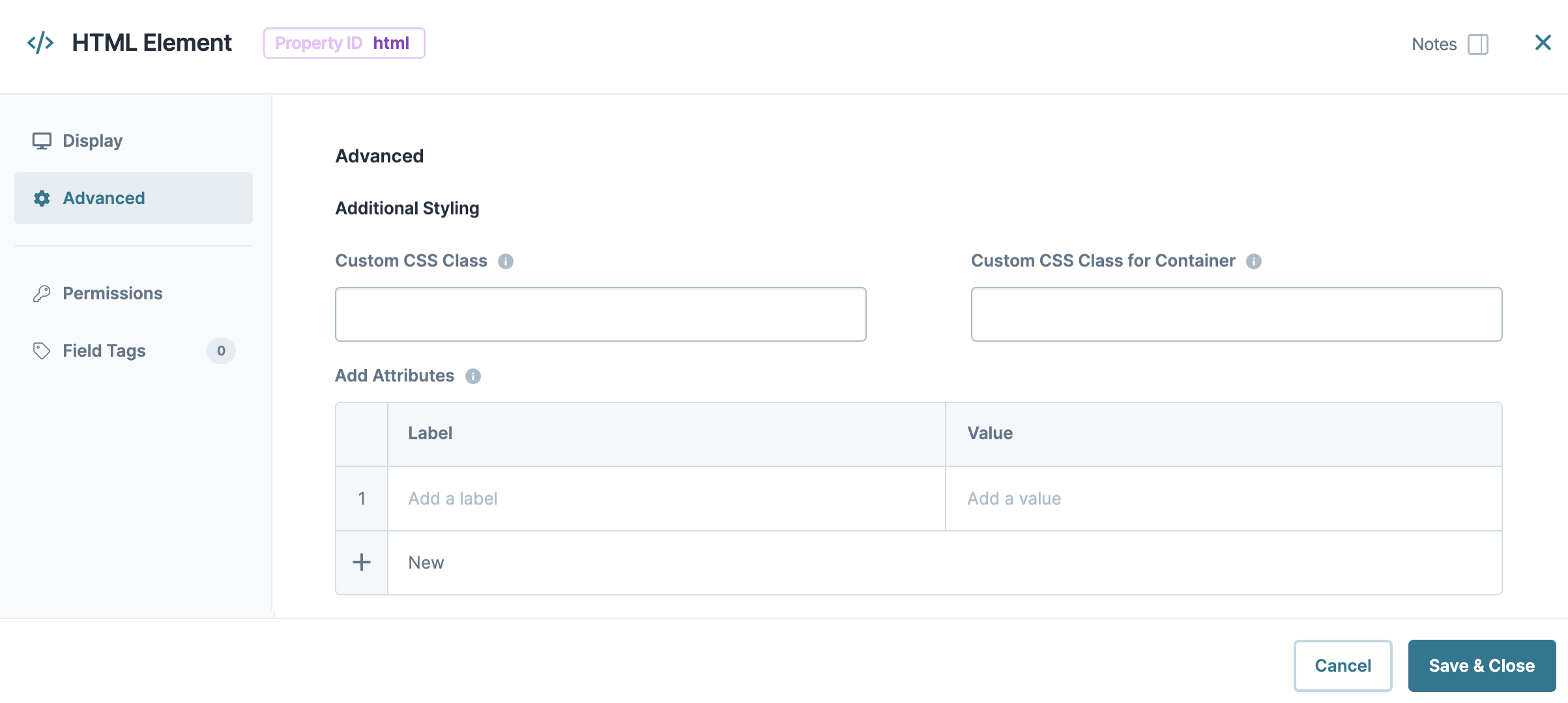
Custom CSS Class | Enter a Custom CSS Class to apply to your component. Custom CSS lets you maintain a consistent look and feel when the field or element is part of a template or multiple modules. Updated CSS styling applies to all components that reference this custom class name. |
Custom CSS Class for Container | Enter a Custom CSS Class to apply to the HTML tag you entered in the HTML Tag field. |
Add Attributes | This table works together with your HTML Tag to define any relevant attributes. Common examples include:
|
Label | Each attribute has a label recognized in HTML. For example:
|
Value | Each attribute has a value assigned to it. For a hyperlink, this is the URL you link to. For an image, this is the address where the image exists. |
Adding an HTML Element Component
In this example, use an HTML Element component to add a heading for a few Personal Information questions. Follow this configuration with two Text Field components to collect the end-user’s first and last names. Also use a Phone Number component to collect their phone number. Then, place these into columns and add a second HTML Element component to hold a horizontal rule denoting the end of the section.
These instructions assume that you have an open module saved with a title.
For this configuration, you'll need the following components:
2 HTML Element components
1 Columns component
2 Text Field components
1 Phone Number component
Configure the First HTML Element Component
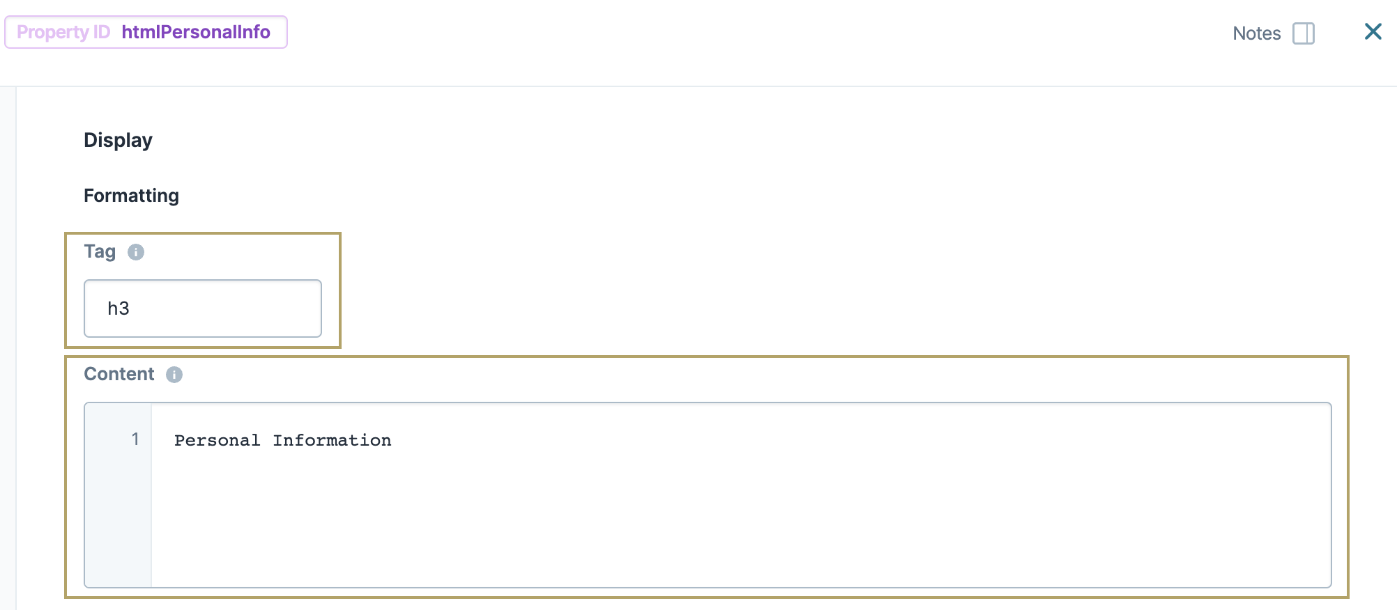
First, set up the section header. Add an HTML Element component that reads Personal Information and set its size to h3.
In the Module Builder, drag and drop an HTML Element component onto your canvas.
In the Property ID field, enter htmlPersonalInfo.
In the Tag field, enter
h3.In the Content window, enter
Personal Information..Click Save Component.
Configure the Columns Component
Using a Columns component, you can create containers for the components that follow. Select the pre-configured layout containing two evenly-spaced columns.
Drag and drop a
.png) Columns component onto your canvas, placing it below your htmlPersonalInfo HTML Element.
Columns component onto your canvas, placing it below your htmlPersonalInfo HTML Element.In the Property ID field, enter colPersonalInfo.
Click Save Component.
Configure the Text Field Components
Add two Text Field components to collect your end-user’s first and last name.
Drag and drop two Text Field components onto your canvas, placing one Text Field in each column of the colPersonalInfo
.png) Columns component.
Columns component.Complete the Property ID and Label Text as follows:
Property ID
Label Text
firstName
First Name
lastName
Last Name
Click Save Component for each component as you add it.
Configure the Phone Number Component
Add a Phone Number component to collect more personal information.
Drag and drop a Phone Number component onto your canvas, placing it below your firstName Text Field component in the colPersonalInfo
.png) Columns component.
Columns component.In the Property ID field, enter phoneNumber.
In the Label Text field, enter
Phone Number.Click Save Component.
Configure the Second HTML Element Component
Add a second HTML Element component to the configuration.
Drag and drop an HTML Element component onto your canvas, placing it below your colPersonalInfo
.png) Columns component.
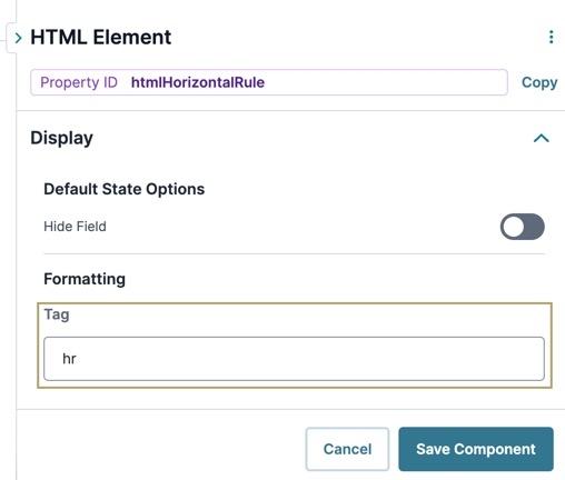
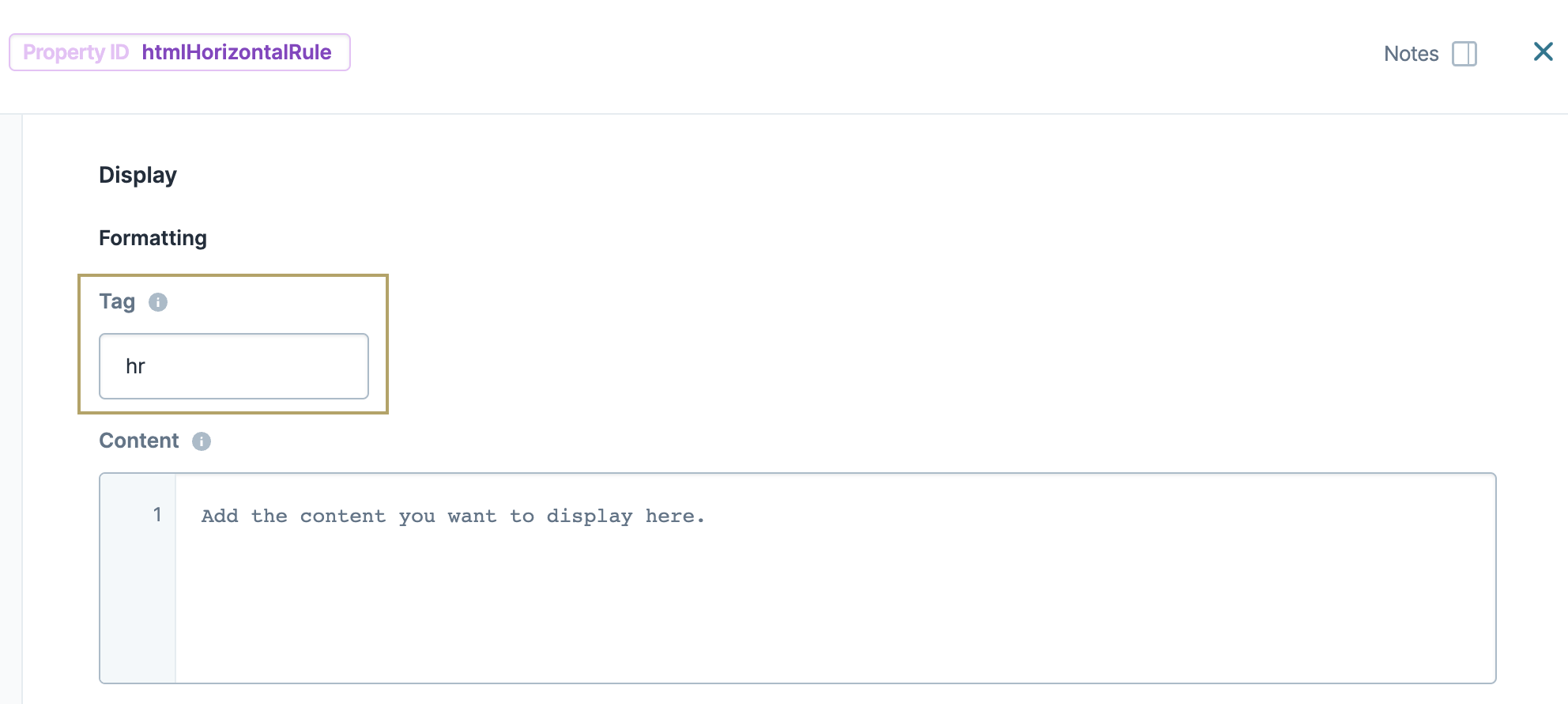
Columns component.In the Property ID field, enter htmlHorizontalRule.
In the Tag field, enter
hr. This tag adds a horizontal line to your module in Express View.Click Save Component.
Save your module.
Your module looks like the following in Express View:
Resources
The HTML Element component adds HTML formatting into your application. In Express View, you can see your HTML Elements render along with the rest of your module.
Some common examples of when to use the HTML Element component are:
Inserting a custom logo or image.
Showing a section heading or break.
Adding a paragraph of static text.
You'll find the HTML Element component in the Display & Layout group to the left of the Module Builder.
What You'll Learn
After completing this article, you’ll know when to use an HTML Element component, how to configure its settings, and how to add it to an application.
About the Configuration Window
To learn more about general component settings and those that display when a component is associated with Data Models, view our General Component Settings article.
Display Panel
Formatting
Setting | Description |
|---|---|
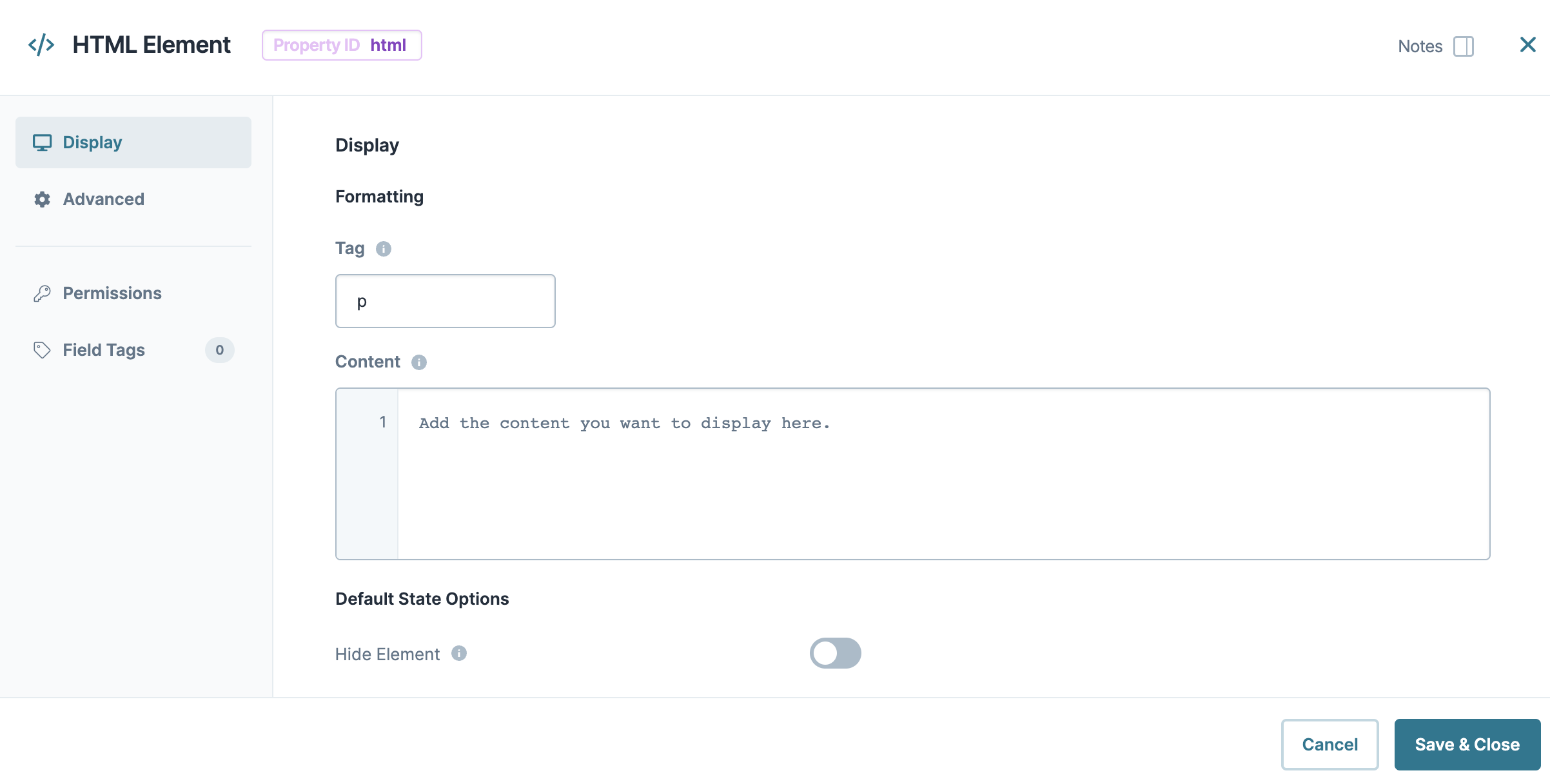
Tag | Set the HTML container for your content here. The HTML Tag is what you'll see inside angled brackets in traditional HTML. Common HTML tags you can use include:
By default, the HTML Tag is set to p. |
Content | The Content window works together with your HTML Tag. If you create a heading, enter your heading text here. The same goes for a paragraph or a basic hyperlink. What you enter here is what displays to your end-user in Express View. In traditional HTML, your content displays between your start and end tags. You can also enter additional HTML tags in the Content window. What you enter in the Tag setting field determines the default HTML tag. To prevent security exploits, only use safe HTML tags and attributes. When configuring your HTML tags and attributes, consider the following:
|
Default State Options
Setting | Description |
|---|---|
Hide Element | Displays or hides the component from view. Setting Hide Field to By default, Hide Field is set to |
Advanced Panel
Additional Styling
Setting | Description |
|---|---|
Custom CSS Class | Enter a Custom CSS Class to apply to your component. Custom CSS lets you maintain a consistent look and feel when the field or element is part of a template or multiple modules. Updated CSS styling applies to all components that reference this custom class name. |
Custom CSS Class for Container | Enter a Custom CSS Class to apply to the HTML tag you entered in the HTML Tag field. |
Add Attributes | This table works together with your HTML Tag to define any relevant attributes. Common examples include:
|
Label | Each attribute has a label recognized in HTML. For example:
|
Value | Each attribute has a value assigned to it. For a hyperlink, this is the URL you link to. For an image, this is the address where the image exists. |
Adding an HTML Element Component
In this example, use an HTML Element component to add a heading for a few Personal Information questions. Follow this configuration with two Text Field components to collect the end-user’s first and last names. Also use a Phone Number component to collect their phone number. Then, place these into columns and add a second HTML Element component to hold a horizontal rule denoting the end of the section.
These instructions assume that you have an open module saved with a title.
For this configuration, you'll need the following components:
2 HTML Element components
1 Columns component
2 Text Field components
1 Phone Number component
Configure the First HTML Element Component
First, set up the section header. Add an HTML Element component that reads Personal Information and set its size to h3.
In the Module Builder, drag and drop an HTML Element component onto your canvas.
In the Property ID field, enter htmlPersonalInfo.
In the Tag field, enter h3.
In the Content window, enter
Personal Information..Click Save & Close.
Configure the Columns Component
Using a Columns component, you can create containers for the components that follow. Select the pre-configured layout containing two evenly-spaced columns.
Drag and drop a
.png) Columns component onto your canvas, placing it below your htmlPersonalInfo HTML Element.
Columns component onto your canvas, placing it below your htmlPersonalInfo HTML Element.In the Property ID field, enter colPersonalInfo.
Under Formatting, click the icon displaying
.png) (two) evenly-spaced columns.
(two) evenly-spaced columns.Click Save & Close.
Configure the Text Field Components
Add two Text Field components to collect your end-user’s first and last name.
Drag and drop two Text Field components onto your canvas, placing one Text Field in each column of the colPersonalInfo
.png) Columns component.
Columns component.Complete the Property ID and Label Text as follows:
Property ID
Label Text
firstName
First Name
lastName
Last Name
Save & Close each component as you add it.
Configure the Phone Number Component
Add a Phone Number component to collect more personal information.
Drag and drop a Phone Number component onto your canvas, placing it below your firstName Text Field component in the colPersonalInfo
.png) Columns component.
Columns component.In the Property ID field, enter phoneNumber.
In the Label Text field, enter Phone Number.
Click Save & Close.
Configure the Second HTML Element Component
Add a second HTML Element component to the configuration.
Drag and drop an HTML Element component onto your canvas, placing it below your colPersonalInfo
.png) Columns component.
Columns component.In the Property ID field, enter htmlHorizontalRule.
In the Tag field, enter hr to display a horizontal rule on the page.
Click Save & Close.
Save your module.
Your module looks like the following in Express View:
