Overview
The Dynamic Navigation snippet sets you up with navigation that changes based on your end-user’s input. The data your end-user enters personalizes their experience. So, based on their input, they can move from panel to panel in your application in non-sequential order. Dynamic navigation makes your application more user-friendly and engaging.
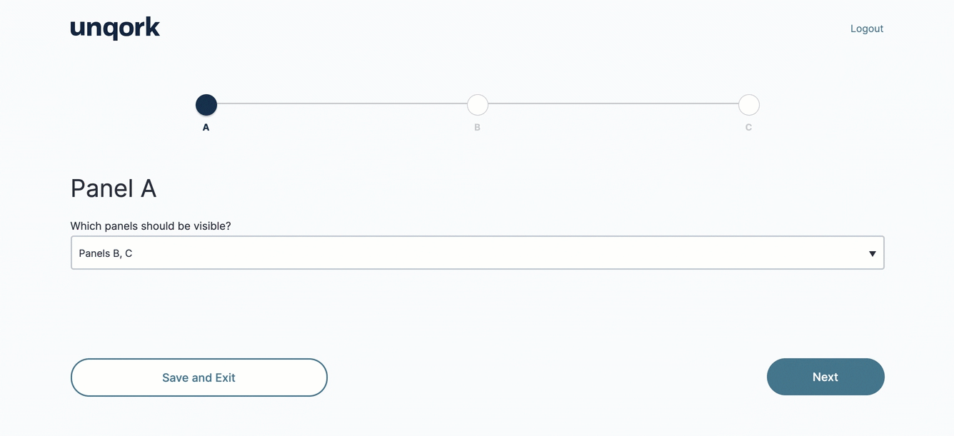
Here’s a GIF of the Dynamic Navigation’s basic functionality in Express View. Notice that each drop-down choice changes what navigation steps are visible:
And here's how the snippet looks in the Module Builder: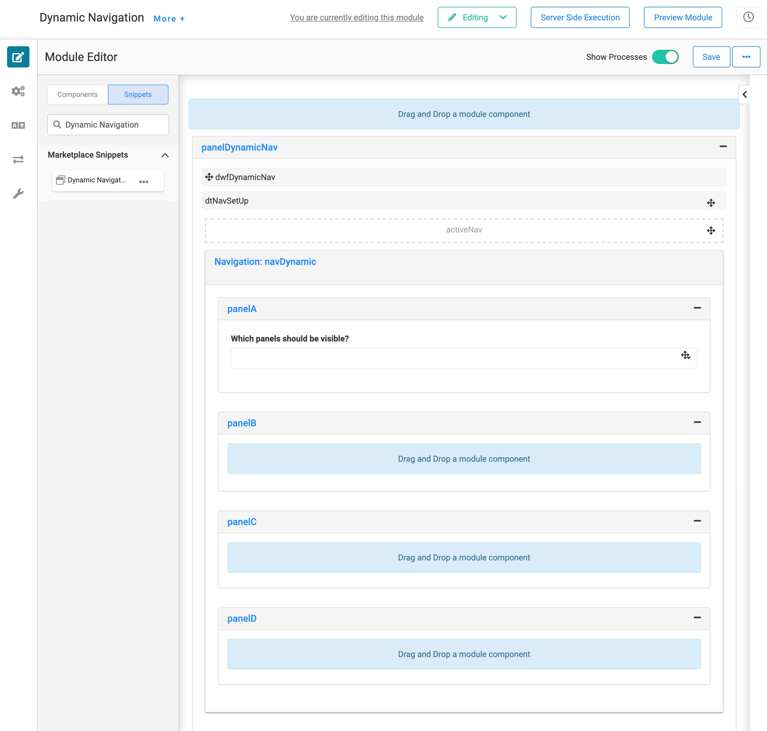
How the Snippet Works
This snippet uses a Data Table, Data Workflow, and Navigation component to create navigation that changes based on your end-user's input.
Here are the basic steps of this snippet:
Your end-user makes a selection from the Multi-Select Dropdown in Express View.
The Data Workflow uses your end-user's selection to filter the Data Table. The Data Workflow outputs that filtered data to the Hidden component.
The Navigation component uses the filtered data to create navigation dynamically.
Now, let's take a deeper look into how the components work together to create this snippet's functionality. As a reminder, here's the snippet in the Module Builder:
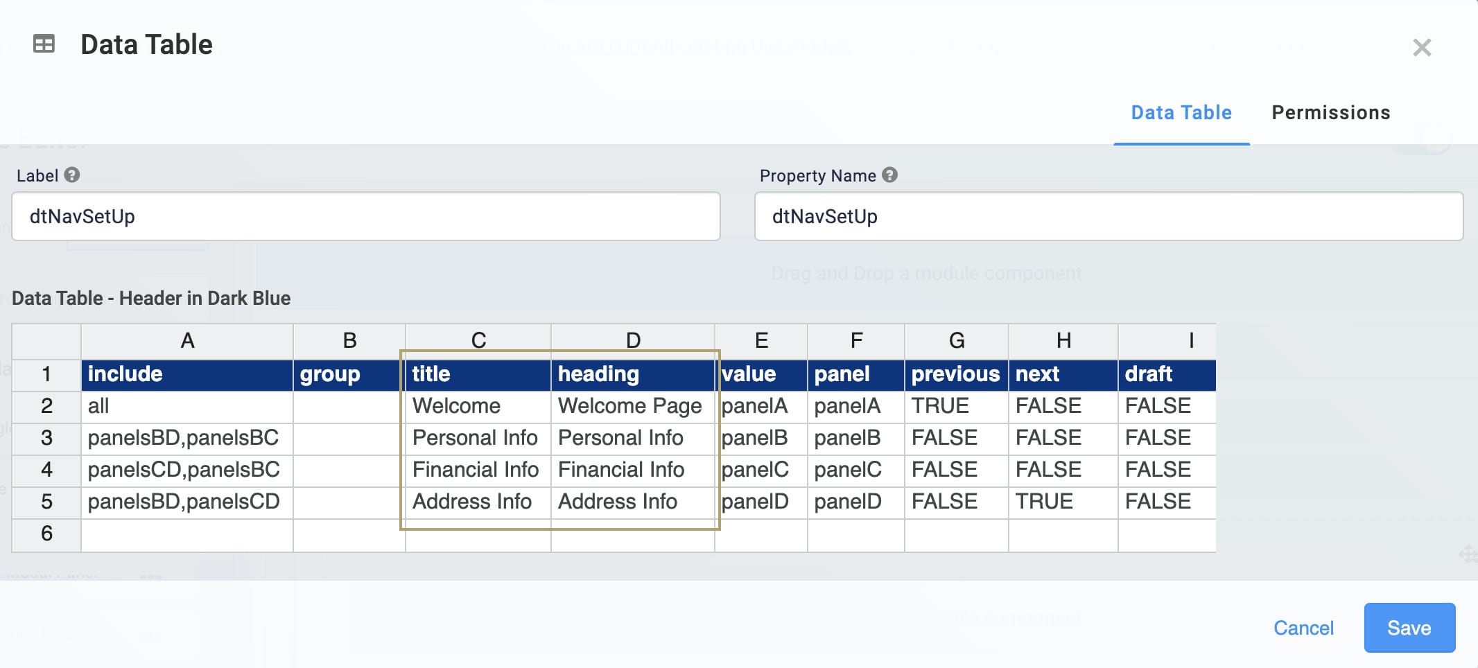
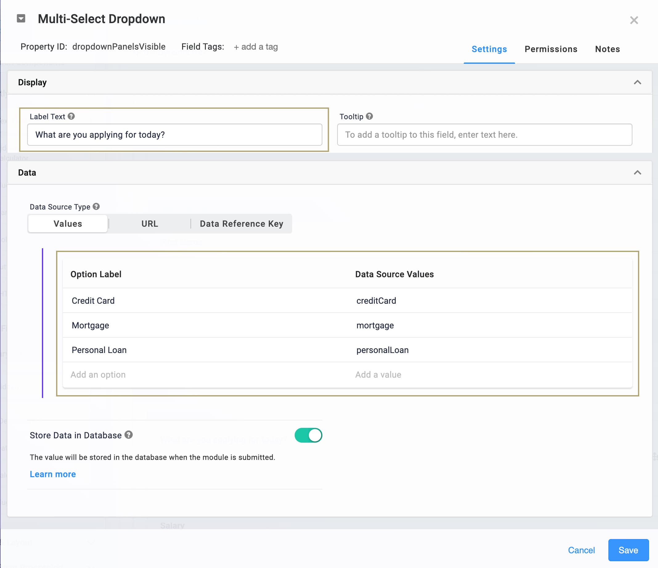
First, take a look at the panelA Panel. This Panel has a Multi-Select Dropdown component called dropdownPanelsVisible with the label Which panels should be visible? This is where the end-user selects a list item that drives the dynamic navigation. You'll see the data sources for these options on the Data tab of the Multi-Select Dropdown component. As it stands, the Data Source Values are panelsBD, panelsCD, and panelsBD. You'll likely change these values when you customize your snippet.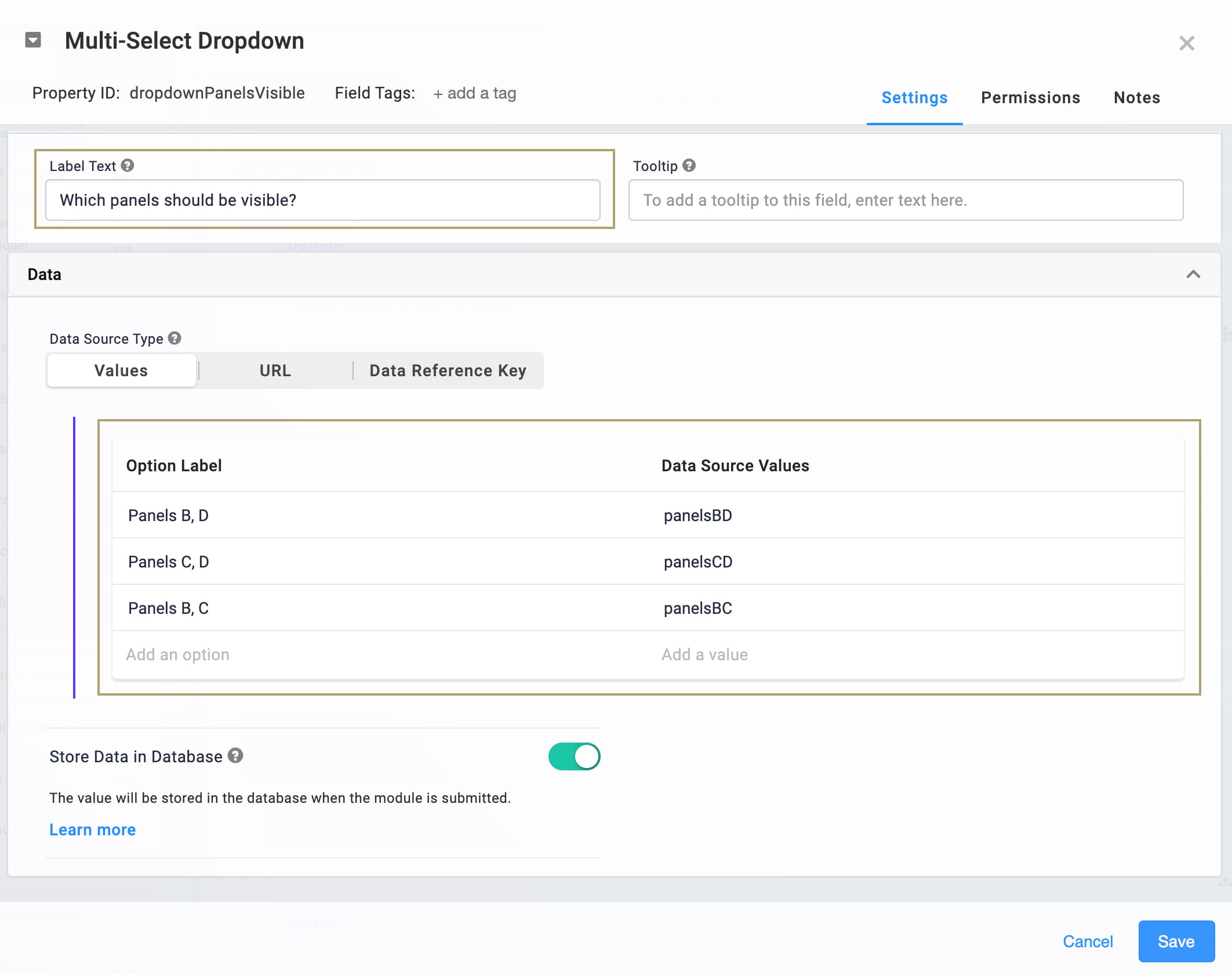
You'll also see these same Data Source Values in the Data Table component. The Include column of the data table is where you enter the values that trigger each Panel. For example, Panel B is visible if the end-user selects panelsBD or panelsBC from the Multi-Select Dropdown. Take a peek at the data table, paying special attention to the Include and Panel columns:
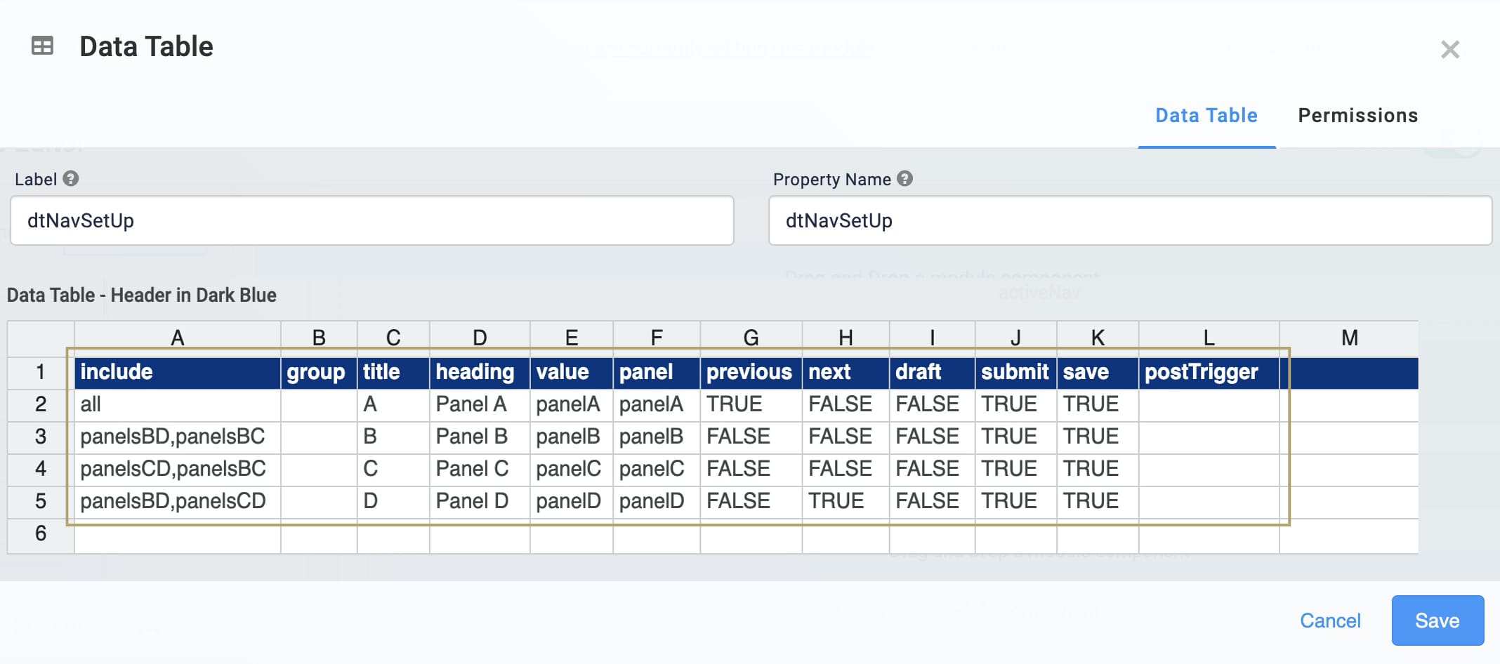
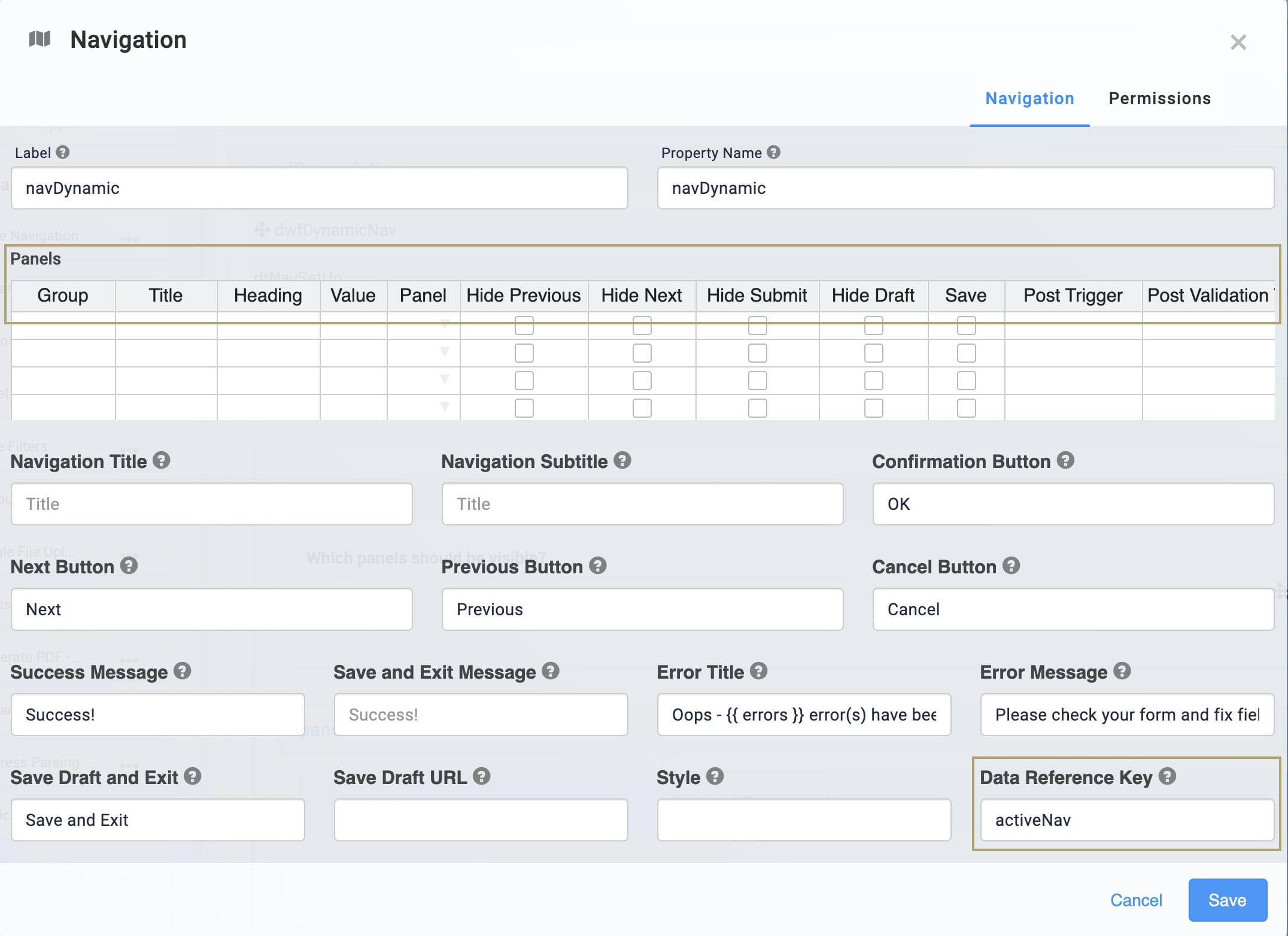
The columns included in the data table mirror the setup of a Navigation component's Panels table. If you want to add a Post Trigger, enter the Property ID for the component you want to trigger in the data table's postTrigger column. You can also add other columns you find in the Navigation component, such as Post Validation, Pre Trigger, and Post Save.
Based on the Multi-Select Dropdown selection, the dwfDynamicNav filters the Data Table and outputs to the activeNav Hidden component. The Navigation component uses activeNav as its Data Reference Key to dynamically create the flow of your navigation.
Below, you'll see the setup for a Navigation component. Look familiar? The Data Table component in this snippet uses the same column headers as the Navigation component:
So, the Data Workflow, Data Table, and Navigation components work together to create a dynamic flow for your end-user. The functionality works off the shelf, and there a few ways to customize the snippet.
Customizing the Snippet
There are a few ways you could customize the Dynamic Navigation snippet. Obviously, you'll add whatever components you want to each Panel in your Navigation component. That's how you set up what each navigation page looks like. You can also:
Change the Title and Header of each navigation page.
Change the selection options and values in the Multi-Select Dropdown.
Adding Headers to Navigation Pages
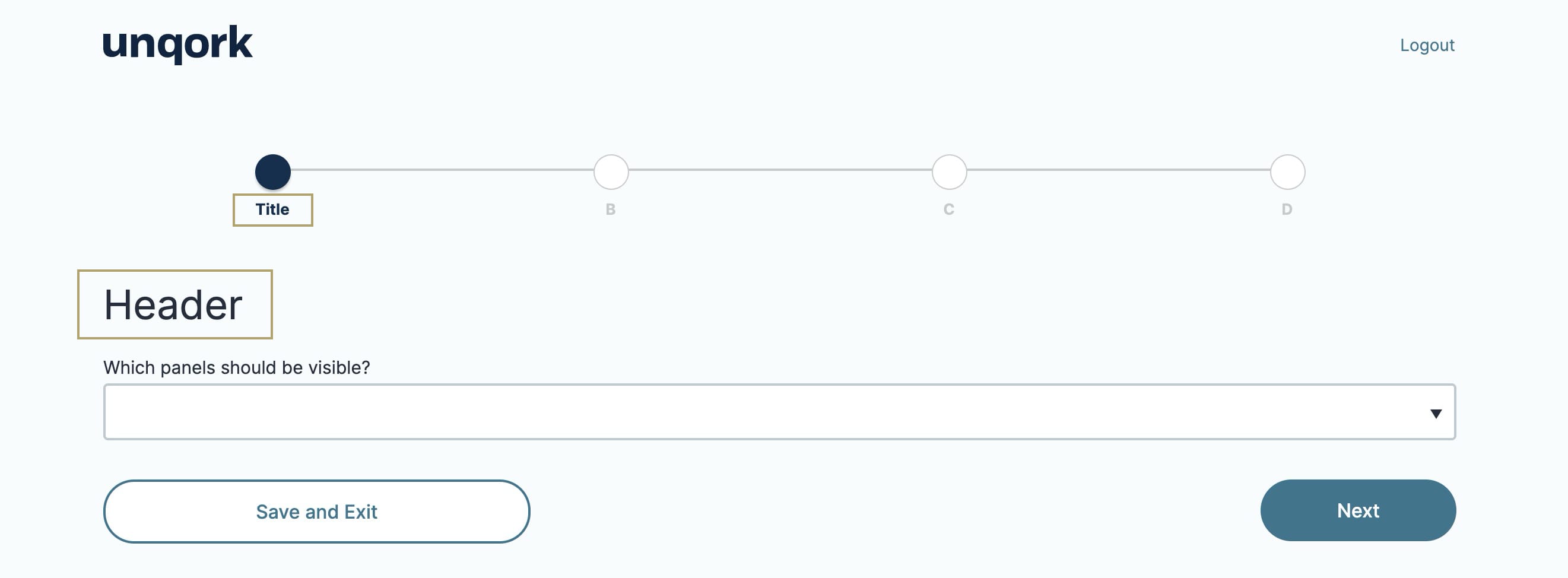
To improve your end-user's experience, you can add custom headers and titles to your navigation pages. A navigation page Title shows right under the navigation bar at the top of the screen. A navigation page Header shows as a header for the Express View page itself. Here's how these look:
To customize Titles and Headers:
Hover over the Data Table component.
Using the toolbar, click the
.jpg) (Settings) button.
(Settings) button.In the Data Table table, enter the title you want for each page in the Title column.
In the Data Table table, enter the header you want for each page in the Heading column.
Click Save.
Save your module
Customizing the Selection Options and Values
The snippet's Multi-Select Dropdown comes with placeholder options. So, you'll want to change those to something that works for you. Let's say you want your end-users to apply for financial backing from a bank. There are 2 steps to this update:
Update the Multi-Select Dropdown component.
Update the Data Table component.
Updating the Multi-Select Dropdown Component
You'll want to change the Label Text of the drop-down. Also, you'll update the selection options. Do the following:
Hover over the Multi-Select Dropdown component.
Using the toolbar, click the
(Settings) button.Update the Label Text. For example, you could enter What are you applying for today?.
Update the Option Labels to the options you want for your end-users.
Update the Data Source Values to a Camel Case (stylized as camelCase) version of the Option Label.
Click Save.
Save your module.
Updating the Data Table Component
Next, you'll update the Data Table component with the new Data Source Values.
Hover over the Data Table component.
Using the toolbar, click the
(Settings) button.In the Data Table table, update the Include column with the Data Source Values from your Multi-Select Dropdown.
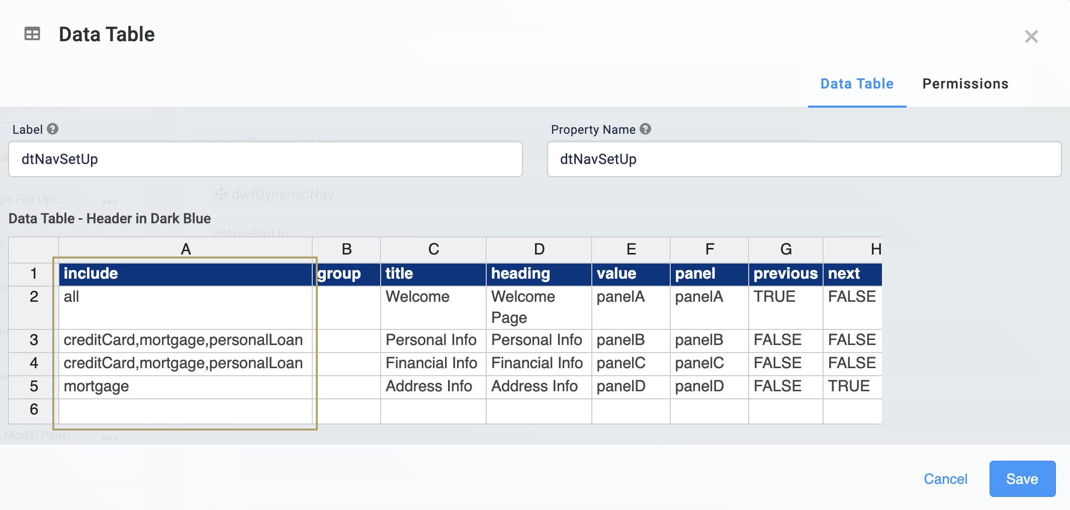
Remember, the Include column of the data table is where you enter the values that trigger each Panel (navigation page). In the above example, you'll see that panelD (the Address Info page) only shows if your end-user selects the Mortgage option from the drop-down in Express View.
Click Save.
Save your module.
Lab
You'll find the completed lab for this use case here: https://training.unqork.io/#/form/60dcd97a98d38f02eb3f5e5f/edit.