Overview
The Single File Upload snippet is a ready-to-use configuration that prevents the end-user from uploading more than one file to the File component. By default, the File component allows the end-user to upload multiple files. But, there are times when you'll want to limit them to one upload. For those instances, use this snippet.
Here's how the snippet looks in Express View:
And here's how the snippet looks in the Module Builder:
What You'll Learn
In this article, you'll learn how the Single File Upload snippet works and how to customize it.
How the Snippet Works
The Single File Upload snippet is straightforward. The snippet comes with 4 components. It has a File component, Calculator component, Hidden component, and Decisions component. Here's how the components work together:
First, an end-user uploads a file to the File component. The Calculator component then uses a Len formula to determine how many files the end-user uploaded. If the end-user uploads one file, the value is 1. The Calculator outputs that value of 1 to the docLen Hidden component.
The Decisions component inputs the docLen value. When the value is 1, the Decisions component disables the File component, so the end-user can't upload more files.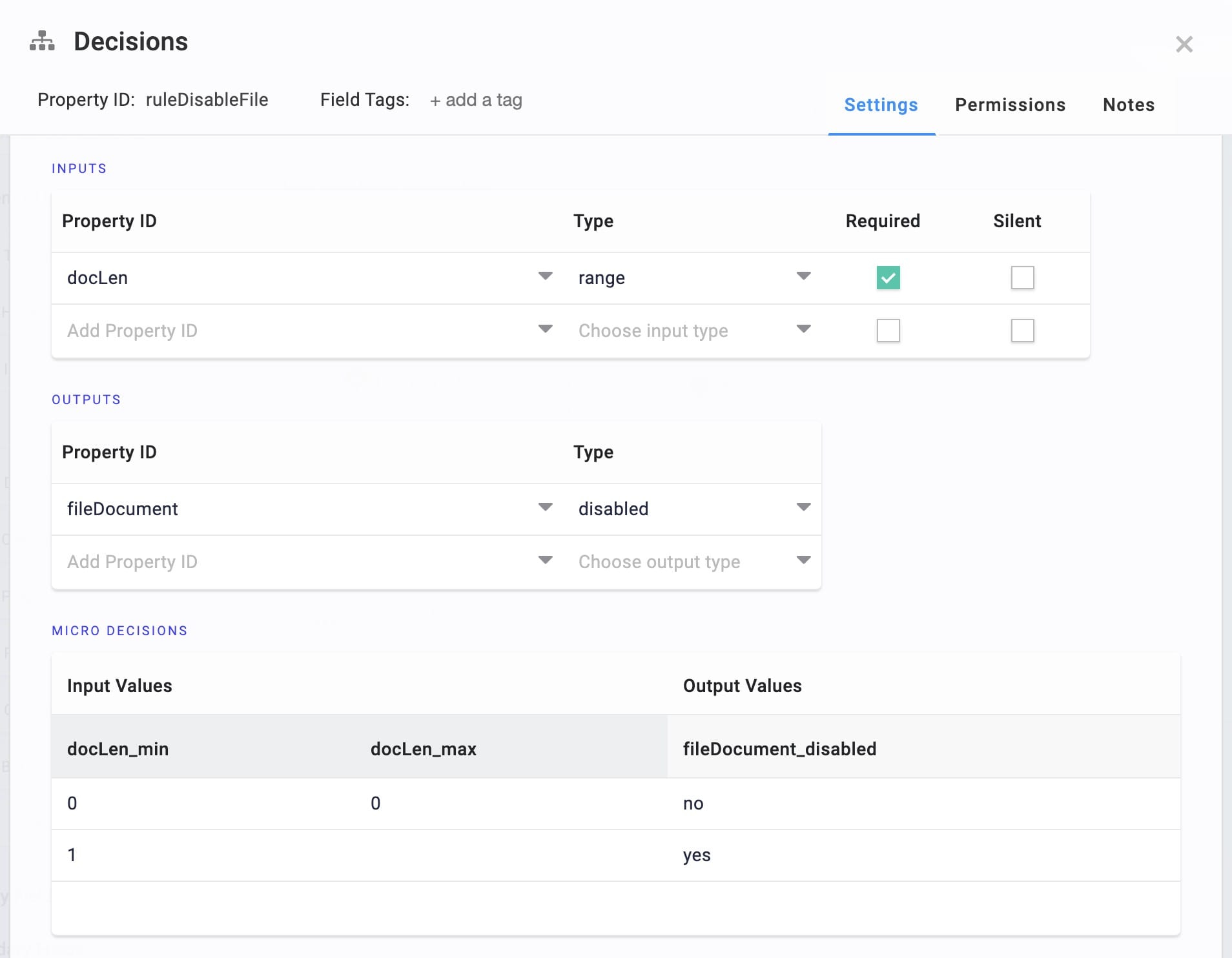
To put it simply, the Decisions component sees when the end-user uploads a file. It then disables the File component, preventing the end-user from uploading more files.
Customizing the Snippet
There are two customizations you might want for this snippet. You can:
Change the number of files the end-user can upload.
Add a delete button to the configuration so the end-user can upload a different file.
Changing the Number of Allowed Uploads
By default, the Single File Upload snippet allows an end-user to upload a single file. But, if you want to limit your end-user to a different number of uploads, you can customize the snippet.
Updating the Decisions Component
The Decisions component disables the File component. So, to change the number of allowed uploads, you'll update the Micro Decisions table. In the example below, you'll change the maximum uploads to 2.
In the Module Builder, hover over the ruleDisableFileDecisions component.
A 5-button toolbar displays above the component on hover-over.
Using the toolbar, click the
.jpg) (Settings) button.
(Settings) button.Find the Micro Decisions table.
Update the Micro Decisions table as follows:
docLen_min
docLen_max
fileDocument_disabled
0
1
no
2
yes
Click Save.
Your snippet now lets the end-user upload 2 files. You can also change the 2 to any number you want. That number is the new file upload limit.
Adding a Delete Button
This customization gives your end-user the option to delete the file they uploaded. This allows them to upload a different file if needed.
Configuring the Button Component
The Button component serves as the Delete button.
On your canvas, drag and drop a Button component.
In the Property ID field, enter btnDelete.
In the Label Text field, enter Delete File.
Set the Hide Button toggle to ON.
Select Event as the Action Type.
In the Trigger on Click field, enter initDeleteFile.
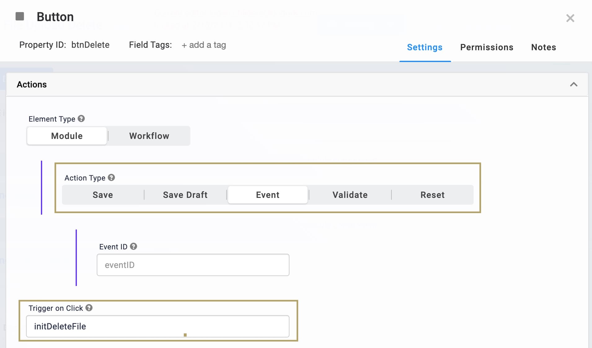
Click Save.
Updating the Decisions Component
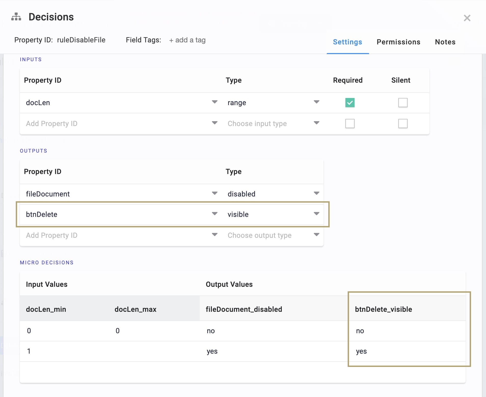
You'll add a new output to the Decisions component. This output controls whether the Delete button is visible.
In the Module Builder, hover over the ruleDisableFileDecisions component.
A 5-button toolbar displays above the component on hover-over.
Using the toolbar, click the
(Settings) button.In the Outputs table, add the following row:
Property ID
Mapping
btnDelete
visible
In the Microdecisions table, add the following to the btnDelete_visible column:
btnDelete_visible
no
yes
Click Save.
Configuring the Initializer Component
The Initializer clears the File component. If you recall, the Button component triggers this Initializer.
On your canvas, drag and drop an Initializer component.
In the Property ID and Canvas Label Text fields, enter initDeleteFile.
Select Manual as the Trigger Type.
In the Outputs table, enter the following:
Property ID
Type
Value
fileDocument
clear
yes
Click Save.
When you preview your module in Express View, you now have a functioning Delete button.