Overview
The State Dropdown snippet provides you with a ready-to-use drop-down field containing all 50 U.S. states and the District of Columbia. Instead of adding each state into a data table, drop this snippet into your module and you're good to go.
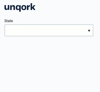
Here's what the snippet looks like in Express View:
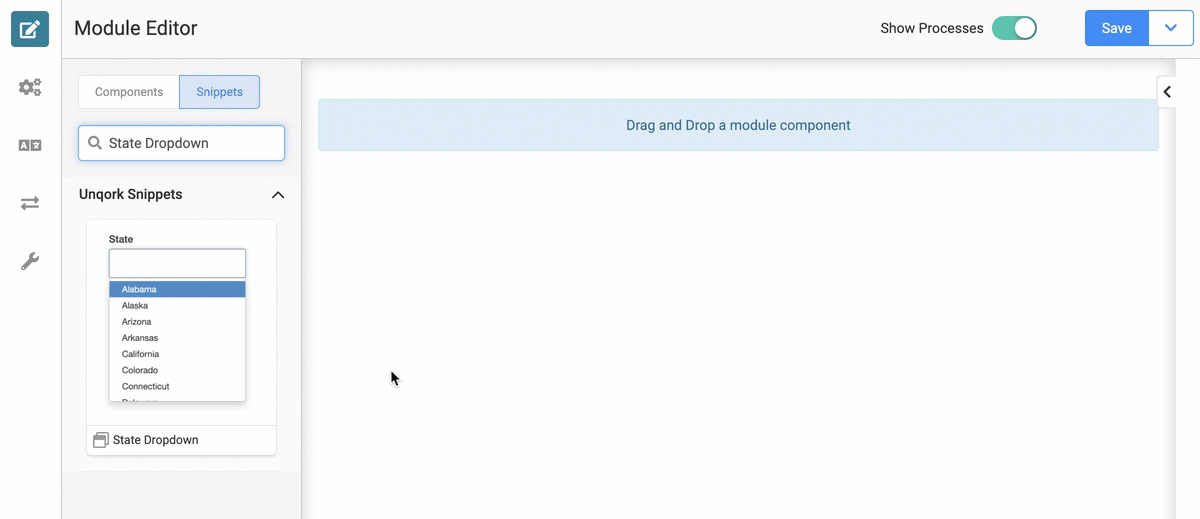
And here's what the snippet looks like in the Module Builder:
What You'll Learn
In this article, you'll learn:
How to add the State Dropdown snippet.
How the State Dropdown snippet works.
How to remove the State Dropdown snippet.
Adding the Snippet
To add the State Dropdown snippet to your module, do the following:
In the left sidebar of Module Builder, click the Snippet button.
Enter State Dropdown in the search bar.
Drag and drop the State Dropdown snippet onto your canvas.
Save your module.
The State Dropdown snippet is ready-to-use and requires no configuration or customization.
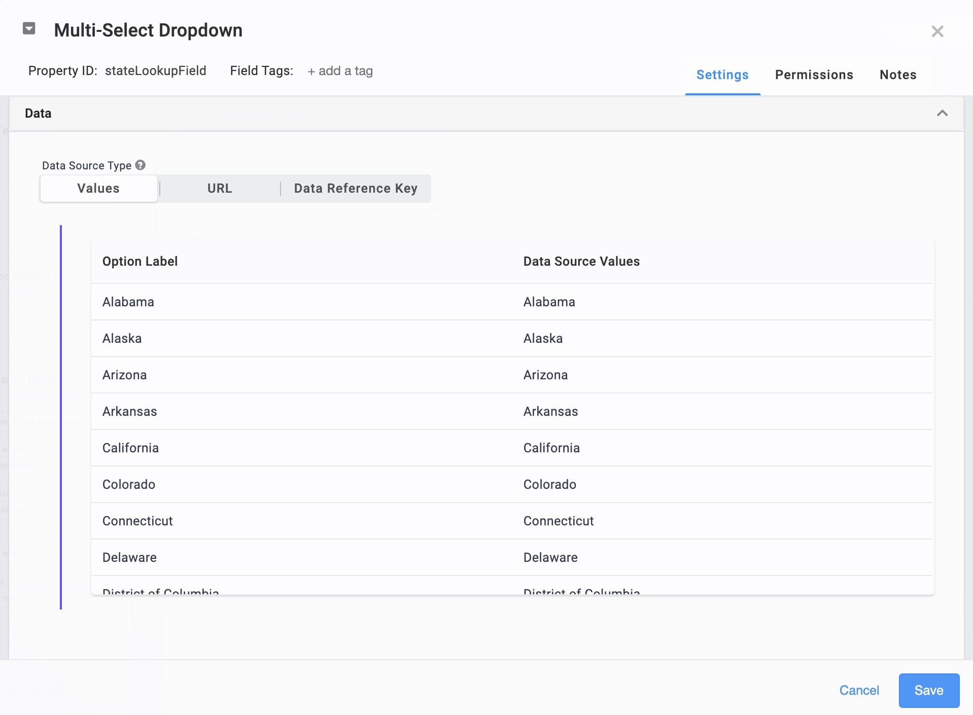
How the Snippet Works
The State Dropdown snippet includes a Multi-Select Dropdown component pre-populated with state data. This snippet functions right off the shelf, and shouldn't need any further configuration.
Removing the Snippet
Removing a snippet from your module is simple. To remove the State Dropdown snippet:
In the Module Builder, hover over the panelStateDropdown.
A 5-button toolbar appears above the component on hover-over.
Using the toolbar, click the
.jpg) (Remove) button.
(Remove) button.Save your module.