7.20.0 Platform Release Notes
Release Schedule
| Cohort | Staging Release Date | UAT Release Date | Production Release Date |
|---|---|---|---|
|
Early Release |
Apr 22, 2025 |
May 6, 2025 |
May 27, 2025 This release has been delayed due to unforeseen circumstances. Please note the new release date. |
|
GA |
May 7, 2025 |
May 28, 2025 This release has been delayed due to unforeseen circumstances. Please note the new release date. |
Jun 4, 2025 |
|
Exception |
May 29, 2025 This release has been delayed due to unforeseen circumstances. Please note the new release date. |
Jun 5, 2025 |
Jun 17, 2025 |
* Dates in orange text have been adjusted.
Feature: New Administration Pages
|
|
|
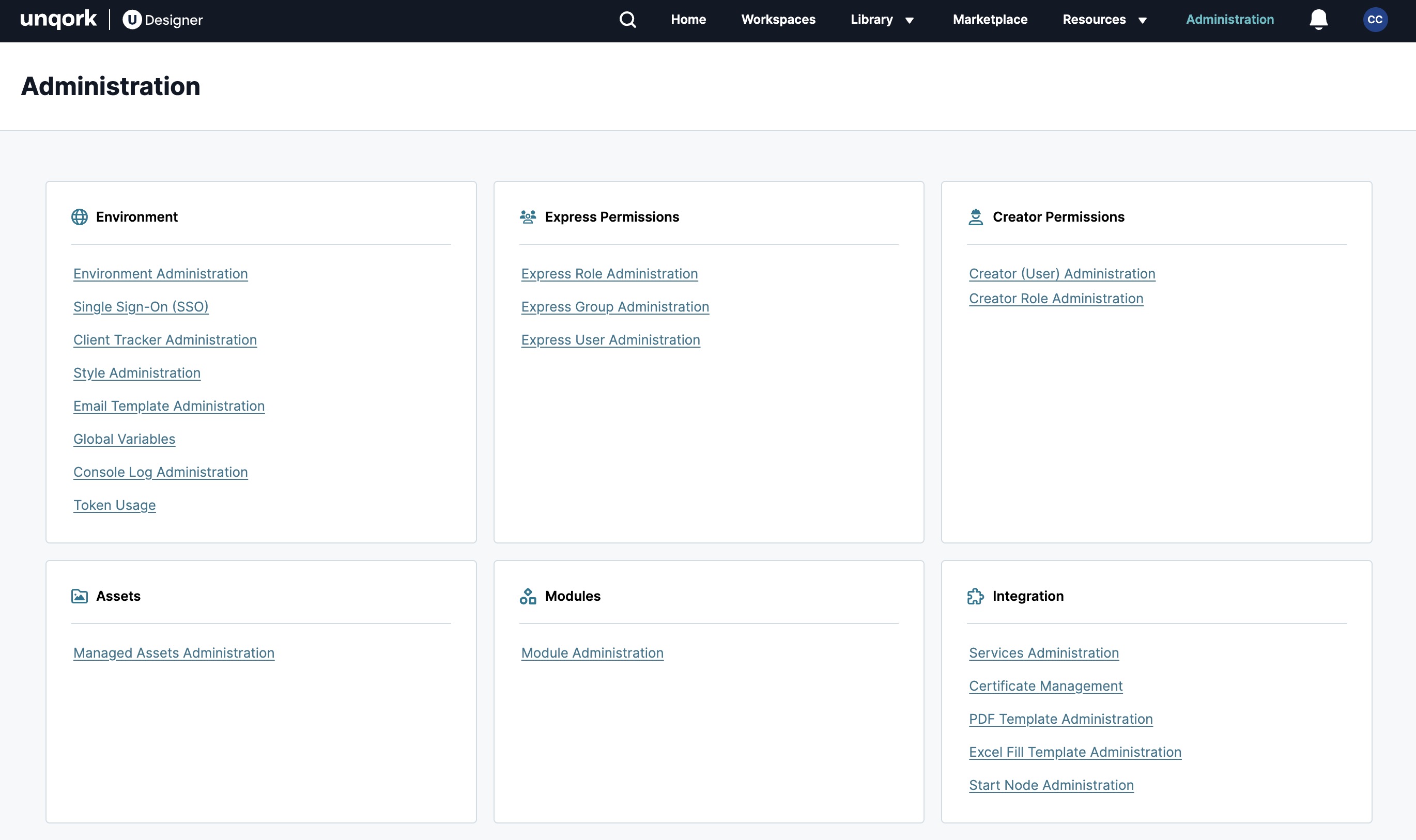
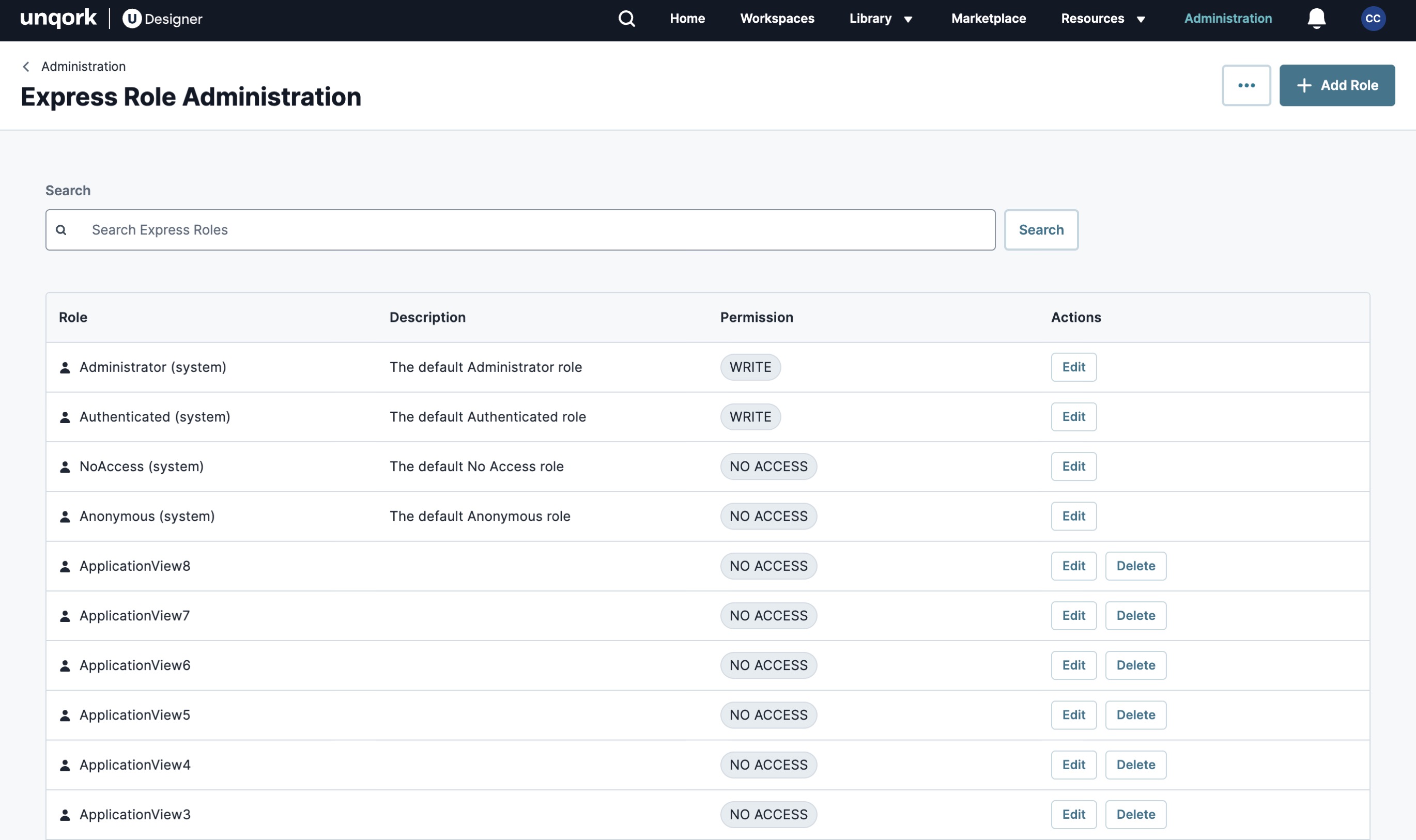
Summary & Business Benefits:
UDesigner now offers a new Administration homepage and Express Role Administration design. This work improves the overall look and feel of Unqork Administration pages, modernizing them to UDesigner standards. You'll also find a better organization structure to make it easier to navigate Administration pages and configure your environment.
In coming releases, you can expect new designs for other Administration pages.
Enhancements:
-
New UDesigner UI An API payload is the data that is sent or received between a client and a server during an API request or response. It contains the information needed to perform actions or get resources. with updated colors and containers.
-
Improved table organization for Express Role Administration, reducing scrolling and bringing the most important information to the top of the page.
-
Improved visibility when managing your Express roles. You can now easily identify the role's permissions and edit or delete them from the table.
-
A new Add Role modal that makes it easier to configure your Express roles.
-
Improved organization that lets you easily navigate Express role settings to perform the same functions as before.
Feature: Vega File Component
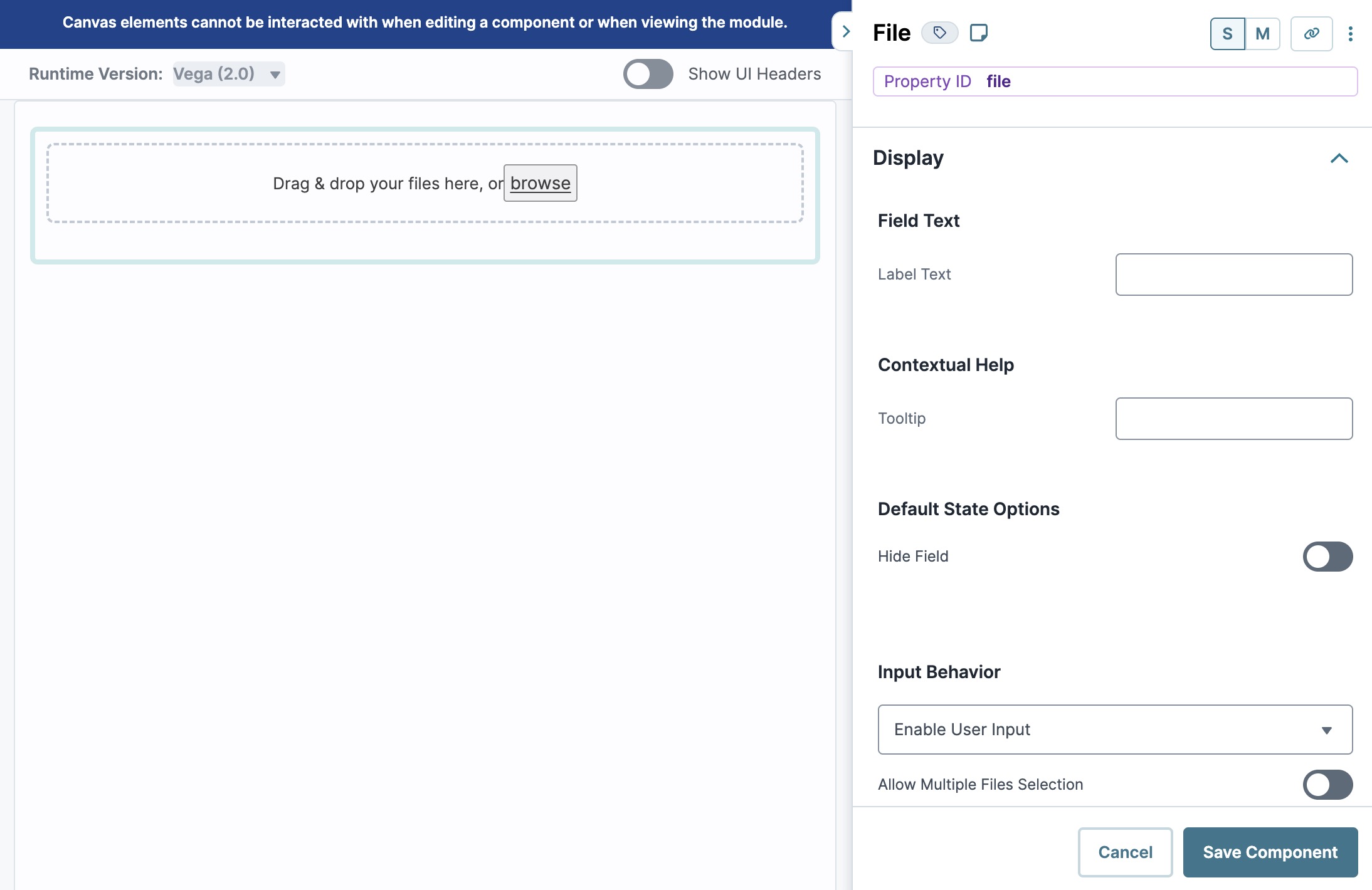
Summary & Business Benefits:
Vega now offers a new Vega File component so end-users can upload files in your Vega runtime applications. This component shares all the same functionality as the Centauri version so your end-user can drag and drop files in Express View Unqork Version Control, also known as source control, is a system used to track and manage changes to modules and applications., or use a browse function to select a file to upload. The component also supports uploading large file sizes and downloading files from a URL.
Enhancements:
-
Improved runtime parity so you can use the component in Centauri or Vega.
-
New UDesigner UI An API payload is the data that is sent or received between a client and a server during an API request or response. It contains the information needed to perform actions or get resources. with updated colors and settings drawer.
-
Informative messaging to help ensure you configure the component using Unqork best practices.
Feature: Vega Chart Component
The Vega Chart component is now generally available to all customers and clients. It creates a graphical display of data sets in an application. In the Module Builder, Creators Also known as Unqork Users, or Designer Users; is anyone who is inside the Unqork platform. can configure the Vega Chart component using one or more chart types and data sets. In Express View Unqork Version Control, also known as source control, is a system used to track and manage changes to modules and applications., the Vega Chart lets end-users visualize the data sets in a meaningful and intuitive way.
Below are some common examples of when to use the Vega Chart component:
-
To display a scatter plot to track the number of sales for each sales agent in your department.
-
To display a pie chart to show the percentages of end-user submissions.
-
To display a bar graph that shows product consumption by demographic.
The Vega Chart component is a Vega (2.0) runtime component and is not supported in the Centauri (1.0) runtime.
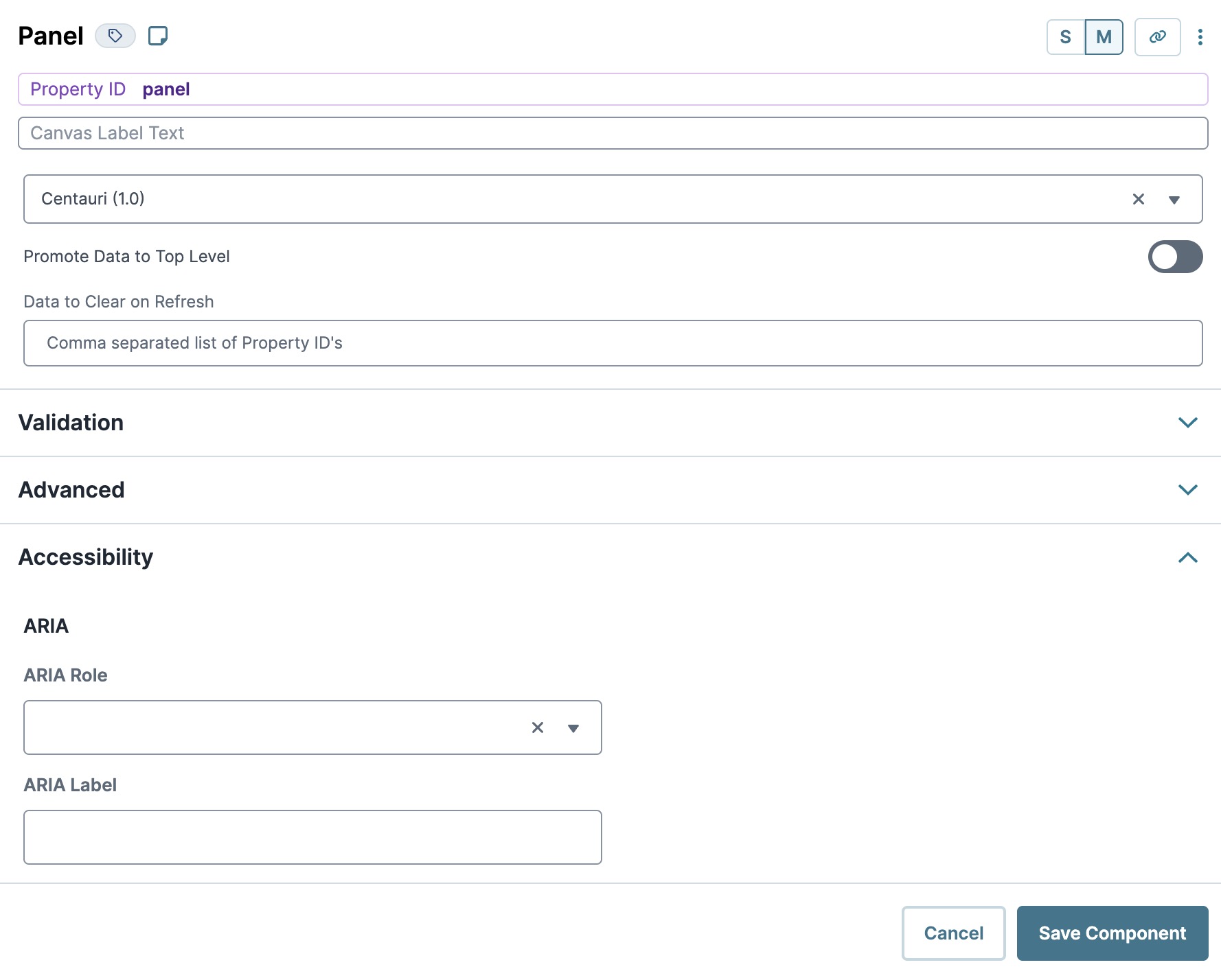
WCAG Compliance Improvements
Creators can now expect new accessibility settings in Unqork components. This ongoing work promotes the configuration of accessible applications that all your end-users can use. With this release, Unqork has improved Centauri and Vega component accessibility for ARIA and role attributes, keyboard navigation, and VoiceOver in component settings.
You can find these settings in a new section toward the bottom of the component’s settings drawer. Below is an example of the new section in a Panel component:
Centauri Accessibility Improvements
For this release, the accessibility settings are supported for the following Centauri components:
-
Button component: ARIA
-
Chart component: Caption, X-Axis Description, and Y-Axis Description settings
-
Columns component: ARIA and role attributes
-
Field Group component: ARIA and role attributes
-
Panel component: ARIA and role attributes
Centauri/Vega Accessibility Improvements
-
Button component: Improved accessibility of our Button component's confirmation drawer by changing its ARIA role to alertdialog instead of dialog.
-
Input components: Reorganized all relevant input components with a new Settings section called Input Behavior. These settings promote configuring accessible applications in Unqork.
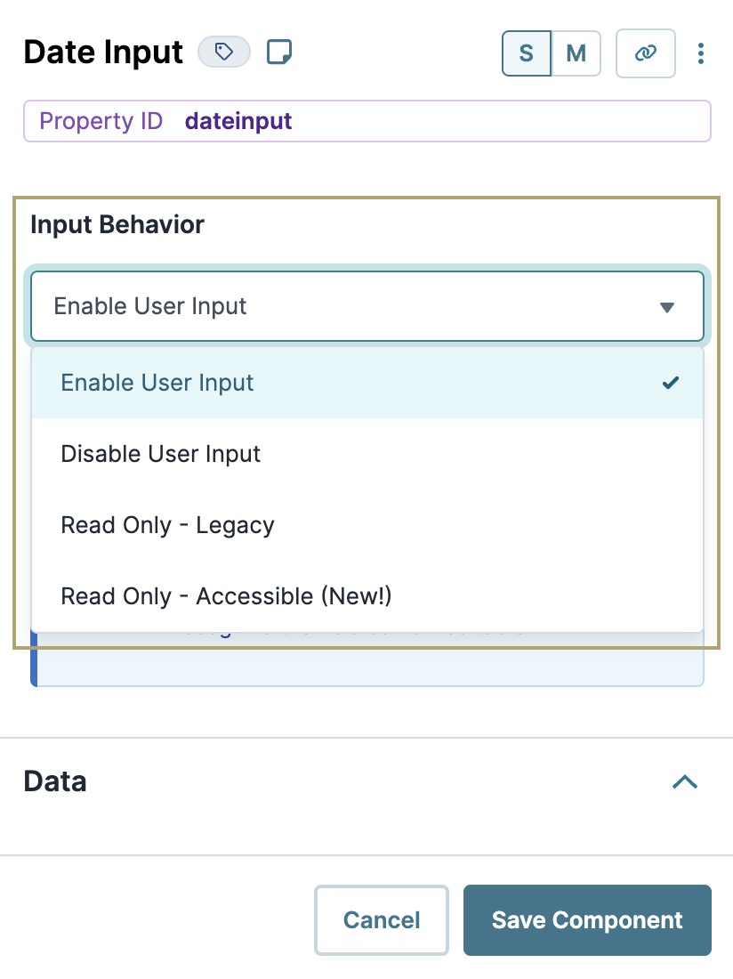
These settings are not supported in the Multi-Select Dropdown component at this time.
-
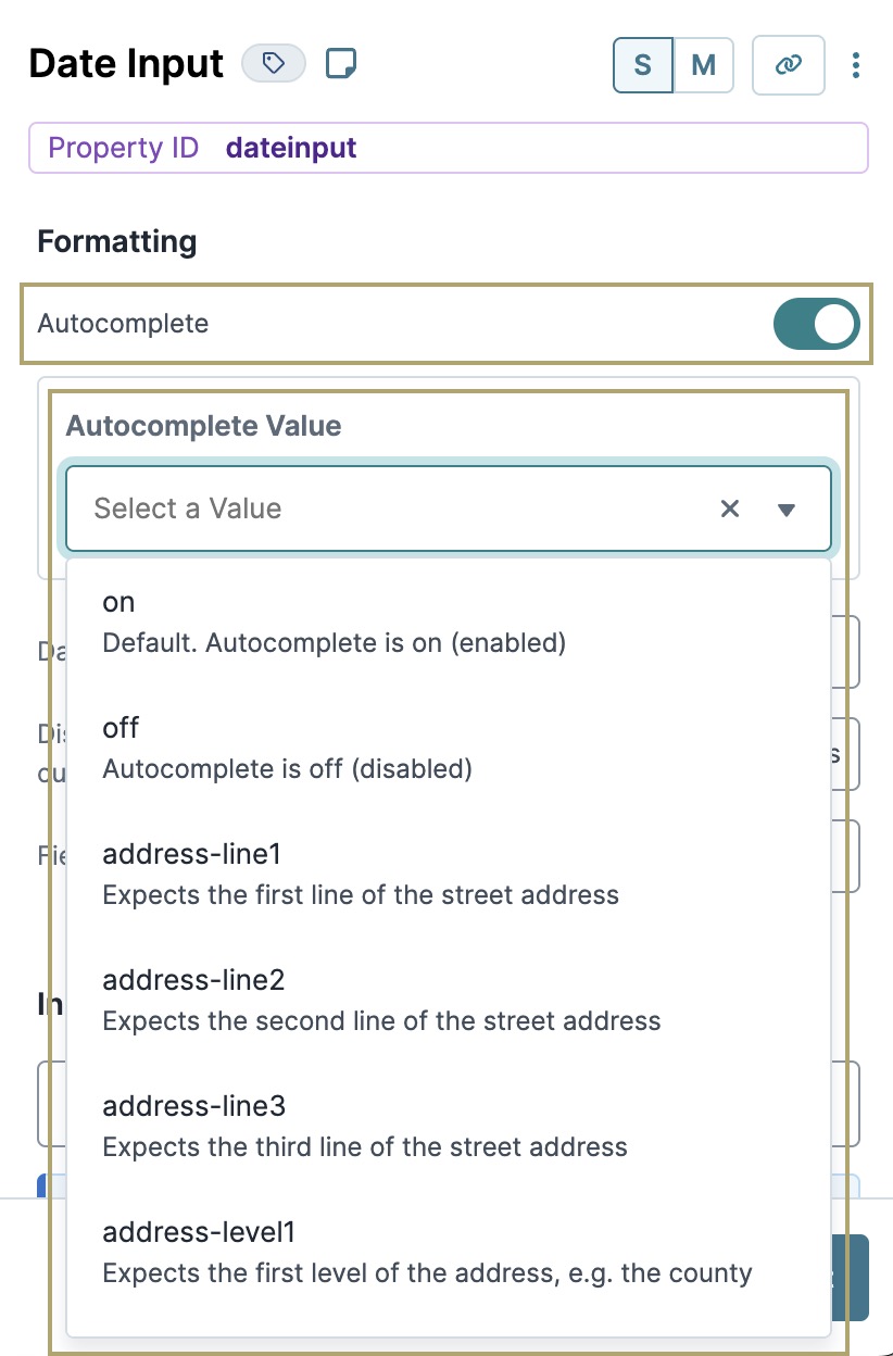
Input components: Added a new setting and rearranged others that let Creators enable Autocomplete and choose a value to promote better accessibility for end-users inputting a value into the field.
-
Supported components include the following:
-
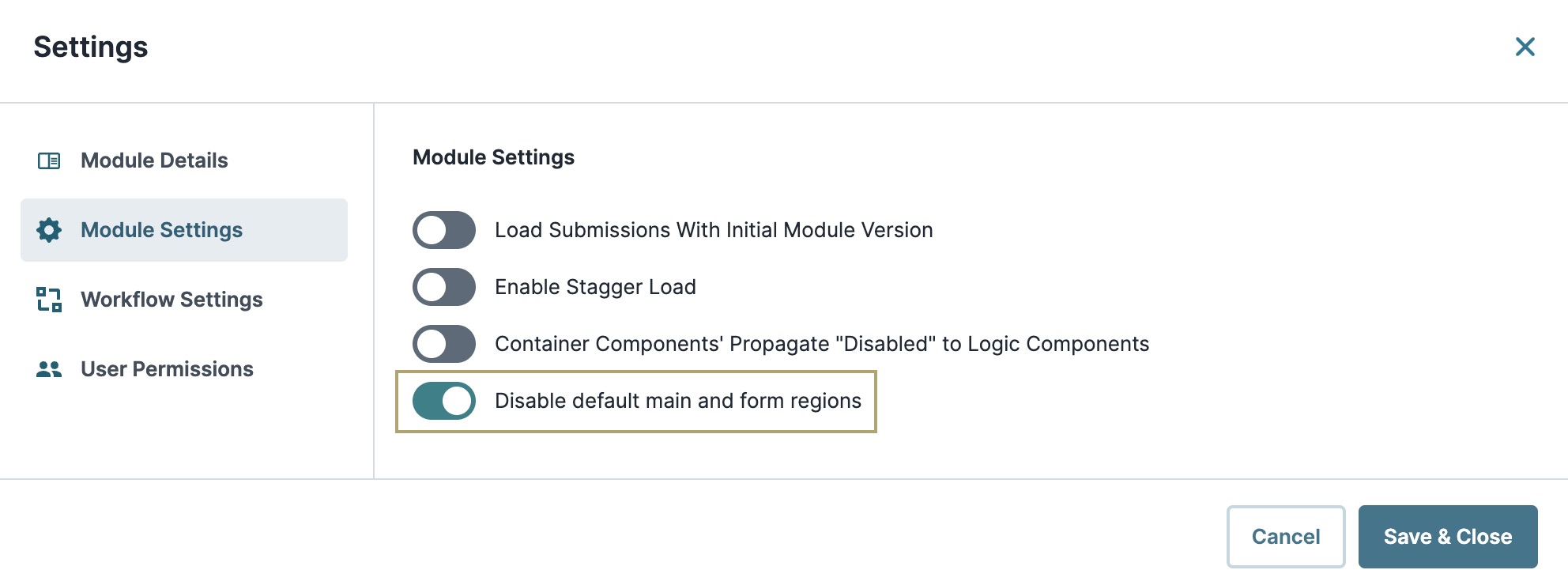
Module Settings: Added a new Disable Default Main and Form Regions setting that, when enabled, disables the default <main> and <form> regions. Using this setting lets you add your own containers with role wrappers to customize the page structure.
Vega Accessibility Improvements
-
Date Input component: Implemented accessibility enhancements for the Date Input component. The calendar view is now keyboard navigable.
-
iFrame component: Improved accessibility for the iFrame component, including adding the title field in the configuration settings.
-
Search Select component: Improved accessibility of the Search Select component when using screen reader software.
-
Simple Select component: Improved accessibility of the Simple Select component when using screen reader software.
-
Vega Table component: Improved keyboard navigation for Simple Select and Search Select components adding inside the Vega Table component.
UDesigner Parity
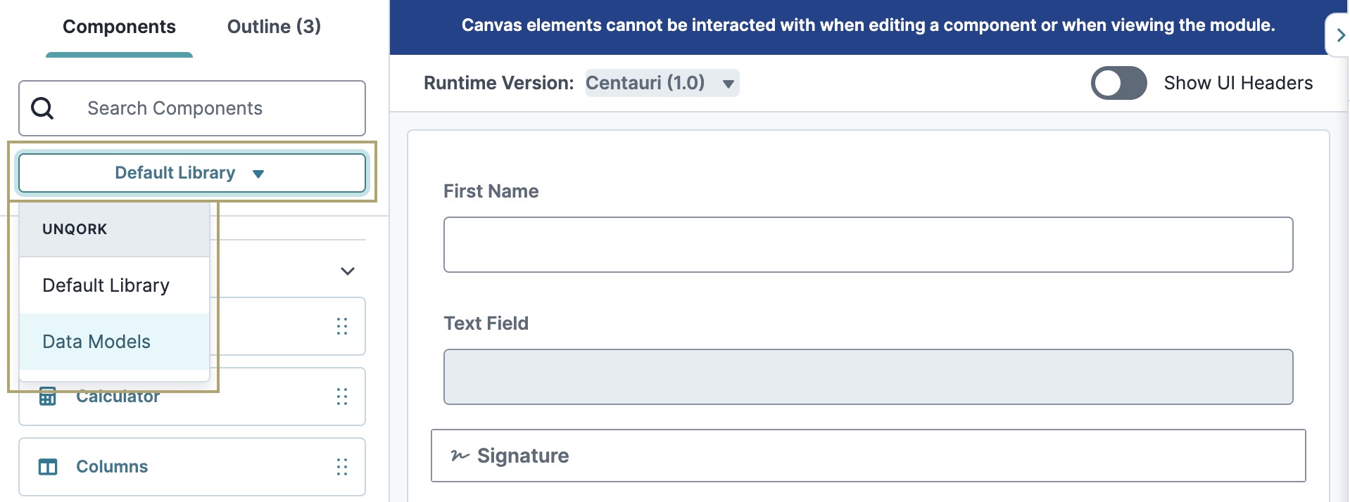
With this release, Data Models are now available for Creators Also known as Unqork Users, or Designer Users; is anyone who is inside the Unqork platform. to use in the UDesigner Module Builder. If there are Data Models in the Workspace where the module exists, Creators can view the list of Data Models by switching the Default Library to Data Models in the Components tray. Creators can drag and drop a Data Model onto the Module Builder canvas and select the component type based on the Data Model field mapping.
This release also supports UDesigner enhancements with a new look and feel for the following components:
-
Map v1 component
Documentation is currently being updated to match the UDesigner look and feel. Thank you for your patience.
Enhancements & Bug Fixes
Centauri
 Enhancements
-
Disable User Input: Added an improvement on how components display in the Module Builder when the Disable User Input setting is enabled. The following components display as grayed-out when the setting is enabled:
|
|
-
Required: Added an improvement on how components display in the Module Builder when the Required setting is enabled. The following components display with a red asterisk (*) when the setting is enabled:
|
|
|
 Fixes
Fixes
-
Dynamic Refresh: Fixed an issue where, in certain situations, switching between Centauri and Vega causes dynamically-refreshed content from correctly executing validations. Now, if a validation is triggered in the dynamically-refreshed content, it properly validates.
-
File component: Fixed an issue where <html> tags were added to .html files after being saved to a submission.
-
Plug-In component: Fixed two issues affecting Creators Also known as Unqork Users, or Designer Users; is anyone who is inside the Unqork platform. when using an internal service that requires module selection. When selecting a module from the component's Settings menu, the module name now displays correctly instead of the unexpected ******. The Edit Module link below the component's Module drop-down menu has been restored. Previously, it did not display after selecting a module.
-
Tooltips: Fixed an issue where tooltips incorrectly displayed <html> tags.
-
ViewGrid component: Fixed an issue where the Select All setting in the header experienced delays in the triggering of downstream logic components.
-
Workflow: Fixed an issue where, in Express View, the GET runtimeSettings API APIs (application programming interfaces) are a set of protocols and definitions developers use to build and integrate application software. APIs act as the connective tissue between products and services. endpoint returned a 404 HTTP status code after a redirect is performed.
UDesigner
Enhancements
-
Dark Mode: Made various enhancements to UDesigner’s Dark Mode feature to improve the performance across the platform.
-
Module Builder: Collapsed and expanded states of collapsible components can now be saved in the Module Builder. For example, if a Creator collapses a Panel component and saves the module, that Panel component remains collapsed the next time the module is opened.
Fixes
-
Advanced Search: Fixed issue where the Advanced Search feature was not consistently returning results for an existing Property ID A Property ID is the unique field ID used by Unqork to track and link components in your module..
-
Calculator and Data Workflow components: Fixed an issue when using Unit Testing to test Lodash functions. The Boolean results displayed as blank values. These results are now correctly displayed.
-
Columns component: Fixed an issue where the Columns component did not reflect the correct layout in the Module Builder when Custom Layouts were used.
-
Dynamic Grid component: Fixed an issue where the field to change the width of the columns were not editable when Manually Set Column Widths is enabled.
-
Input components: Fixed an issue where, in certain situations, having a component named submissionId did not resolve its value correctly when used as an input in logic components.
-
Logic components: Fixed an issue where the validate Output Type did not exist in the Decisions, Initializer, and Data Workflow components.
-
Module Builder: Fixed an issue where, after deleting a component in the Module Builder, the Save button did not display the correct color to save the module.
-
Module Builder: Fixed an issue where, in certain situations, the canvas would not render when a Field Group component is saved with an empty Decisions or Data Workflow component.
-
Module Settings: Fixed an issue where the Save & Close button did not disable in the Module Settings modal A modal is a window that appears on top of the content you are currently viewing. when a validation error was present.
-
Operations Builder: Fixed an issue where, in certain situations, the Operations Builder was displaying options that should be hidden. Now, Filter Options are hidden when Use Faceted Values is enabled.
-
Operations Builder: Fixed an issue where the settings for arrays of objects were not displaying in the correct order when editing an operation.
-
Unit Testing: Fixed an issue where duplicating Unit Tests caused the tests to display twice and skip numbers.
Vega
Enhancements
-
Performance: Made performance improvements to speed up responsiveness of initial load times and end-user interactions. For complex applications using Vega Table components, end-users Express View is how your end-user views your application. Express View also lets you preview your applications to test your configuration and view the styling. This is also the view your end-users will see when interacting with your application. After configuring a module, click Preview in the Module Builder to interact with the module in Express View. can expect a 50% performance improvement of render and reaction times.
-
Vega Table component: Updated the component’s Component State to include Filter Type data under the columnFilters property. This data is especially useful when using Server-Side Pagination because it can be used to create a query to filter data from the table.
-
Vega Table component: Added a new setting to the Vega Table component to let Creators set a default page size when pagination is enabled.
Fixes
-
Button component: Fixed an issue where, in certain situations, translations did not work in the Button component if the Success and Error Messages are not set in the configuration.
-
Express View: Fixed an issue where, in certain situations, components would not display until after Plug-In component API APIs (application programming interfaces) are a set of protocols and definitions developers use to build and integrate application software. APIs act as the connective tissue between products and services. calls, styles, and roles loaded. Now, network calls will not block the rendering of components.
-
File component: Fixed an issue where <html> tags were added to .html files after being saved to a submission.
-
Merge operator: Fixed an issue where, in certain situations, the Merge operator unexpectedly dropped nested keys.
-
Plug-In component: Fixed an issue where, in certain situations, an error would display and rendering would be blocked when attempting to use the Get Module Components API APIs (application programming interfaces) are a set of protocols and definitions developers use to build and integrate application software. APIs act as the connective tissue between products and services. with a Dynamic Refresh panel. Now, errors are handled, communicated, and rendered.
-
Timer component: Fixed accessibility issue linking timer display to its label.
-
Tooltips: Fixed an issue where tooltip styling was missing in Embedded UI and Cross-Runtime Support Vega Panels.
-
Workflow: Fixed an issue where, in Express View, the GET runtimeSettings API APIs (application programming interfaces) are a set of protocols and definitions developers use to build and integrate application software. APIs act as the connective tissue between products and services. endpoint returned a 404 HTTP status code after a redirect is performed.
Resources