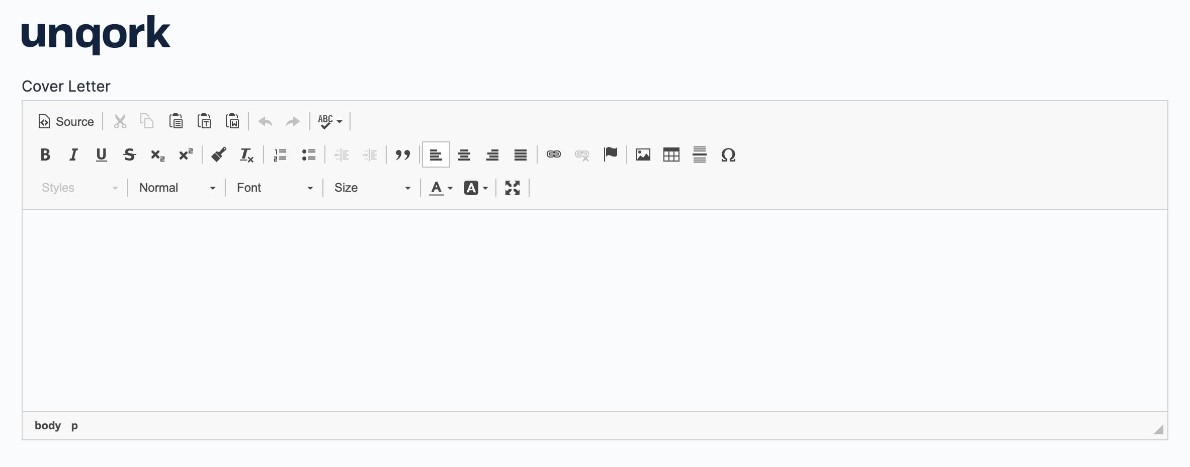
The Rich Text Editor component is an interactive component for rich text content. This component lets your end-users input and format rich text content like modern word processor tools.
Additionally, the Rich Text Editor component lets you do the following:
Format and style text.
Spell-check content.
Paste content from external sources, including Microsoft Word.
Add images.
Maximize the Editor window for full-screen viewing.
Supported Fonts
The Rich Text Editor component retains some font types when you copy and paste from an external source into the component in Express View. After pasting text into the component, confirm the font by clicking the ![]() Source button in Express View:
Source button in Express View:
The Rich Text Editor supports the following fonts:
Arial | Courier New | Georgia | Tahoma | Trebuchet MS |
Calibri | EB Garamond | Lucida Sans Unicode | Times New Roman | Verdana |
You'll find the Rich Text Editor component in the Display & Layout group to the left of the Module Builder.
To learn more about the Rich Text Editor's settings,Check below:
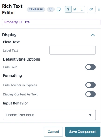
Display Settings
Field Text
Setting | Description |
|---|---|
Label Text | Label Text conveys what the input component is and what information it displays. Enter the purpose of the corresponding component or field. User-friendly labels make your module more accessible. Keep labels short and descriptive (a word or two) using title case. For longer entries, use sentence case. |
Default State Options
Setting | Description |
|---|---|
Hide Field | Displays or hides the component from view. Setting Hide Field to By default, Hide Field is set to |
Formatting
Setting | Description |
|---|---|
Hide Toolbar in Express | When set to By default, this setting is set to |
Display Content as Text | When set to By default, this setting is set to |
Default Content | This field offers a semi-WYSIWYG (What You See is What You Get) content editor. Built to look like a word processor, this editor lets you create, edit, and format your content. Text in this field does not display in the Module Builder canvas. Instead, Preview the module to see the text. This setting is available when you set the Display Content as Text toggle to |
Reference Content | This field lets you reference content from other components. To reference content, choose the Property ID of the referenced component and give it an alias. Then, reference that alias in the Editor. To work, you must surround your alias in curly braces. For example, Where you entered the alias, the end-user will see the referenced content. This setting is available when you set the Display Content as Text toggle to |
Input Behavior
Setting | Description |
|---|---|
Input Behavior | Controls how end-users interact with the component. Choose from the following options:
|
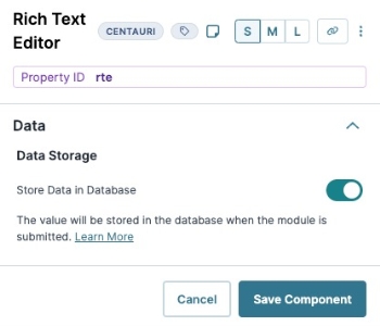
Data Settings
Data Storage
Setting | Description |
|---|---|
Store Data in Database | The Store Data in Database setting affects how data persists through your application. When set to
Set the toggle to
By default, the Store Data in Database toggle is set to |
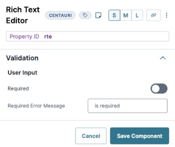
Validation Settings
Input Required
Setting | Description |
|---|---|
Required | When set to By default, Required is set to |
Error Message | A custom error message that displays below a required field. The error message displays when the end-user tries to save or submit the module without completing the required field. |
Adding a Rich Text Editor Component
For this example, leave the content field blank for your end-user to edit. You want the end-user to enter their cover letter as part of an application process. These instructions assume that you have an open module saved with a title.
In the Module Builder, drag and drop a Rich Text Editor component onto your canvas.
In the Property ID, enter rteCoverLetter.
In the Label Text field, enter
Cover Letter.Click Save Component.
Save your module.
Preview your module in Express View and to view the following functionality:
The Rich Text Editor component is an interactive component for rich text content. You can use the component in the following ways:
To give your end-users a familiar tool to input and format rich text content.
To easily create and format rich text content in the Module Builder. Then, display that content as read-only content in Express View.
The Rich Text Editor component lets you do the following:
Format and style text.
Spell-check content.
Paste content from external sources, including Microsoft Word.
Add images.
Maximize the Editor window for full-screen viewing.
The Rich Text Editor also has a Read Only Content View setting. When set to ![]() (ON), you can use the Rich Text Editor component to display formatted text instead of writing out HTML using a Content or HTML Element component. If you're not familiar with HTML, you can use the Rich Text Editor component as a display component.
(ON), you can use the Rich Text Editor component to display formatted text instead of writing out HTML using a Content or HTML Element component. If you're not familiar with HTML, you can use the Rich Text Editor component as a display component.
Supported Fonts
If the Rich Text Editor component supports a specific font, it retains it when you copy and paste from an external source into the component in Express View. After pasting text into the component, you can confirm the font by clicking the ![]() Source button in Express View:
Source button in Express View:
The Rich Text Editor supports the following fonts:
Arial | Courier New | Georgia | Tahoma | Trebuchet MS |
Calibri | EB Garamond | Lucida Sans Unicode | Times New Roman | Verdana |
You'll find the Rich Text Editor component in the Display & Layout group to the left of the Module Builder.
To learn more about the Rich Text Editor's settings,Check below:
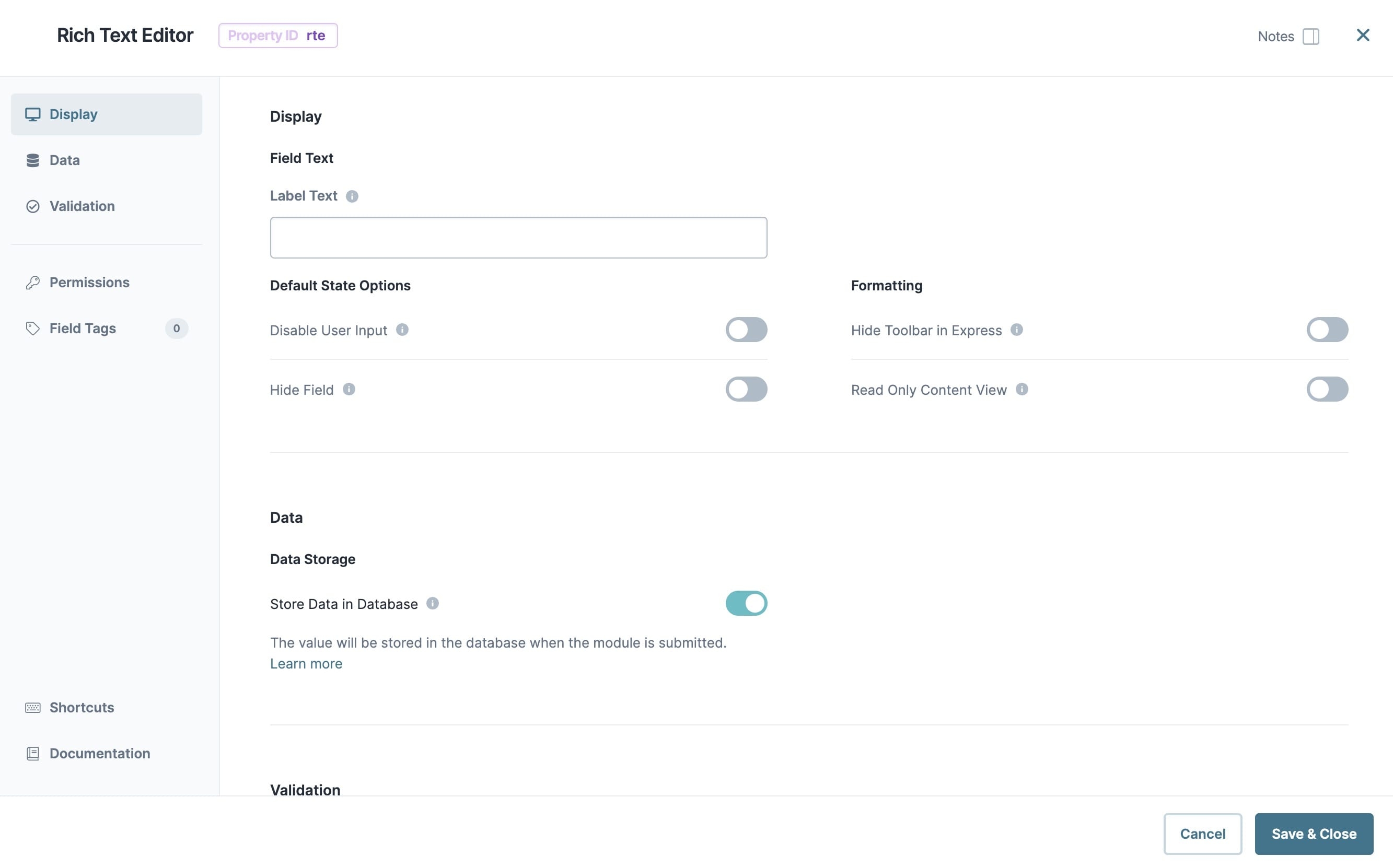
Display Panel
Field Text
Setting | Description |
|---|---|
Label Text | Label Text conveys what the input component is and what information it displays. Enter the purpose of the corresponding component or field. User-friendly labels make your module more accessible. Keep labels short and descriptive (a word or two) using title case. For longer entries, use sentence case. |
Default State Options
Setting | Description |
|---|---|
Disable User Input | When set to By default, Disable User Input is set to |
Hide Field | Displays or hides the component from view. Setting Hide Field to By default, Hide Field is set to |
Formatting
Setting | Description |
|---|---|
Hide Toolbar in Express | When set to By default, this setting is set to |
Read Only Content View | When set to By default, this setting is set to |
Default Content | This field offers a semi-WYSIWYG (What You See is What You Get) content editor. Built to look like a word processor, this editor lets you create, edit, and format your content. Entering content into the editor and setting the component as read-only makes the content user-facing. If you don't set the component as read-only, the end-user has a blank content field to edit in Express View. This setting is available when you set Read Only Content View to |
Reference Content | This field lets you reference content from other components. To reference content, choose the Property ID of the referenced component and give it an alias. Then, reference that alias in the Editor. To work, you must surround your alias in curly braces. For example, {{Name}}. Where you entered the alias, the end-user will see the referenced content. This setting is available when you set Read Only Content View to |
Data Panel
Data Storage
Setting | Description |
|---|---|
Store Data in Database | The Store Data in Database setting affects how data persists through your application. When set to
Set the toggle to
By default, the Store Data in Database toggle is set to |
Validation Panel
Input Required
Setting | Description |
|---|---|
Required | When set to By default, Required is set to |
Error Message | A custom error message that displays below a required field. The error message displays when the end-user tries to save or submit the module without completing the required field. |
Adding a Rich Text Editor Component
For this example, leave the content field blank for your end-user to edit. You want the end-user to enter their cover letter as part of an application process. These instructions assume that you have an open module saved with a title.
In the Module Builder, drag and drop a Rich Text Editor component onto your canvas.
In the Property ID, enter rteCoverLetter.
In the Label Text field, enter
Cover Letter.Click Save & Close.
Save your module.
Preview your module in Express View to view the following functionality:
