iFrame Component

Overview

The iFrame component is a Vega (v2.0) The Vega (v 2.0.0) runtime is the next-generation engine of the UDesigner platform. Vega uses cutting-edge technologies to improve the Creator and end-user experience. component that lets you embed and display HTML HTML (Hyper Text Markup Language) is the standard markup language for for achieving font, color, graphic, and hyperlink effects when creating web pages. content in your Front-End modules. With this component, you can specify iframe dimensions, or apply a custom CSS class Cumulative Layout Shift (CLS) measures how much elements in a webpage shift while using it. Some search engines use the CLS metric to rate a website's accessibility in their search rankings.. Use this component by entering an external URL A URL (uniform resource locator) is a unique identifier used to locate a resource on the internet. Also known as a web address. address of a page you want to display inside the iframe.

Iframes are susceptible to XSS Cross Site Scripting attacks vulnerability used by malicious entities to bypass the access controls of a website. (cross-site scripting) attacks. Bad actors A bad actor is a cybercriminal or organization that might attempt to exploit vulnerabilites in your environment or application. Common exploits used by bad actors include XSS (cross-site scripting) attacks, malware, randsomware, and more. can perform XSS attacks and change the source site URL, install malware, steal information, or hijack clicks and keystrokes.

To embed Unqork content outside of the Unqork Platform without using iframes, view our Embedded User Interface article.

About the Configuration Window

To learn more about general component settings, view our General Component Settings article.

Display Settings

Default State Options

A static image displaying the iFrame component's Display settings.

Setting

Description

Hide Field

Shows or hides the component from view. Setting Hidden to  (ON) hides the component in Express View Express View is how your end-user views your application. Express View also lets you preview your applications to test your configuration and view the styling. This is also the view your end-users will see when interacting with your application. After configuring a module, click Preview in the Module Builder to interact with the module in Express View.. Setting it to (OFF) shows the component. The component is always visible in the Module Builder.

By default, Hidden is set to (OFF).

Formatting Options

Setting

Description

URL

Enter the URL address to display inside of the iFrame component. Embedded URL content larger than the Width and Height field values display as scroll bars.

Iframes cannot embed URLs when the X-Frame-Options header is set to DENY.

Width

The horizontal width of the iframe (in pixels) when displayed in Express View Express View is how your end-user views your application. Express View also lets you preview your applications to test your configuration and view the styling. This is also the view your end-users will see when interacting with your application. After configuring a module, click Preview in the Module Builder to interact with the module in Express View..

If the Width field does not have a value, the default width is 300px.

Height

The vertical height of the iframe (in pixels) when displayed in Express View Express View is how your end-user views your application. Express View also lets you preview your applications to test your configuration and view the styling. This is also the view your end-users will see when interacting with your application. After configuring a module, click Preview in the Module Builder to interact with the module in Express View..

If the Height field does not have a value, the default height is 150px.

Custom CSS Class

Enter a Custom CSS Cascading Style Sheets (CSS) is a style sheet language used for presenting how a HTML or XML document looks to end-users. Class to apply to your component. Custom CSS lets you maintain a consistent look and feel when the field or element is part of a template or multiple modules.

Updated CSS styling applies to all components that reference this custom class name.

Adding an iFrame Component

To use an iFrame component, you must have a URL address to implement. For this example, use the following URL address: https://docs.unqork.io/Content/UnqorkHome.htm.

Configure the iFrame Component

1. In the Module Builder, drag and drop an Iframe component onto the canvas.
2. In the Property ID A Property ID is the unique field ID used by Unqork to track and link components in your module. field, enter iframeDocHub.
3. In the URL field, enter https://docs.unqork.io/Content/UnqorkHome.htm.
4. In the Width field, enter 1200.
5. In the Height field, enter 900.
6. Click Save Component.

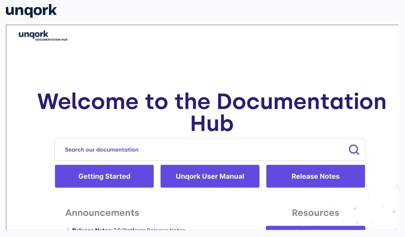
Preview your module in Express View Express View is how your end-user views your application. Express View also lets you preview your applications to test your configuration and view the styling. This is also the view your end-users will see when interacting with your application. After configuring a module, click Preview in the Module Builder to interact with the module in Express View.. The iFrame component displays the URL in a 1200px by 900px box.

A static image displaying the Express View example of an iFrame component.

Structure of an iFrame Component's Data

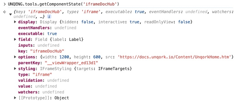
Using the example above, execute the Vega Console command UNQENG.tools.getComponentState('iframeDocHub') in the DevTools Console The DevTools Console helps you securely store, build, test, and deploy your software. to display the following component data structure:

A static image displaying the data structure of an iFrame component.

Resources