Overview
With a Checkboxes component, you can create a question with more than one possible answer. Checkboxes let your end-user choose more than one response from your provided options. As a comparison, the Radio Buttons component only allows one selection. With a Checkboxes component, your end-user can compare all available options, selecting all that apply.
Here are some examples of checkbox questions:
Do you have any of the following medical conditions? Please select all that apply.
What sports do you play on a regular basis? Please select all that apply.
Which of these account types are you interested in opening? Please select all that apply.
The Checkboxes component has built-in Select All and None of the Above options. This adds more versatility to your application and prevents conflicting responses.
You can also use a Checkboxes component to trigger a Text Field component to display. Think of this as a write-in option for your end-user. For example, if none of the provided answers apply, they can select the Other box, which displays a separate text field. That way, your end-user can enter their response.
A Checkboxes component can also trigger an existing component. For example, an end-user who wants to open an account can select Retirement from a list of options. When they select the Retirement box, a new drop-down displays to select a specific account type.
You'll find the Checkboxes component in the Primary Fields group to the left of the Module Builder.
About the Configuration Window
To learn more about general component settings and those that display when a component is associated with Data Models, view our General Component Settings article.
Display Panel
Field Text

Setting | Description |
|---|---|
Property ID | A Property ID is the unique field ID used by Unqork to track and link components in your module. The Property ID is how the software identifies your component. Using Property IDs lets you link components, creating logic-based configurations and API calls. Property IDs must use camel case (stylized as camelCase) without spaces or punctuation. |
Label Text | Label Text conveys what the input component is and what information it displays. Enter the purpose of the corresponding component or field. User-friendly labels make your module more accessible. Keep labels short and descriptive (a word or two) using title case. For longer entries, use sentence case. |
Contextual Help
Setting | Description |
|---|---|
Tooltip | A short hint that displays when an end-user positions their cursor over the |
Helper Text | A quick tip describing the expected value of an input field. Unlike a Tooltip, Helper Text stays visible under the input field and displays on a single line. |
 (Tooltip) icon. Tooltips can display across more than one line.
Default State Options
Setting | Description |
|---|---|
Hide Field | Displays or hides the component from view. Setting Hide Field to By default, Hide Field is set to |
.png)
Formatting
Setting | Description |
|---|---|
Number of Columns | The number of columns in which you want the checkboxes evenly arranged. You have the option of By default, the checkboxes align on a single column. |
 (one),
  (three) columns.
 Input Behaviour
Setting | Description |
|---|---|
Input Behavior | Controls how end-users interact with the component. Choose from the following options:
|
Data Panel
Data Storage

Setting | Description |
|---|---|
Store Data in Database | The Store Data in Database setting affects how data persists through your application. When set to
Set the toggle to
|
Promote Data to Top Level | When set to When set to By default, the Promote Data to Top Level toggle is set to |
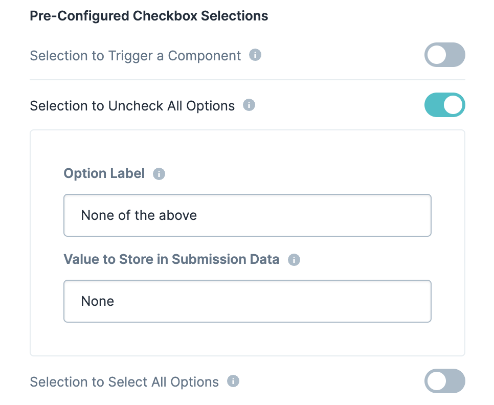
Pre-Configured Checkbox Selections
Setting | Description |
|---|---|
Selection to Trigger a Component | When set to By default, the Selection to Trigger a Component toggle is set to |
Option Label | Each option needs an end-user-facing label describing the choice that it represents. Enter your Option Labels using this column. After you create an option, another row displays for you to create the next option. By default, the Selection to Trigger a Component has the Option Label of |
Value to Store in Submission Data | Each option needs an associated value to store in the submission data. Enter the values to store in submission data using this column. By default, the value is a camelCase version of the Option Label. |
Component to Trigger When a User Selects This Option | Here you have the choice of triggering a new Text Field component or an existing component to display below the associated checkbox option.
|
Property Name of Text Field | If you select the Text Field option, you must give the new Text Field component a Property Name. |
Placeholder of Text Field | If you select the Text Field, you can enter a placeholder text to assist the end-user. |
Property Name of Existing Component | If you select the Choose Existing, you can enter the Property ID of an existing component in your module to trigger. |
Selection to Uncheck All Options | This setting adds a new checkbox (None of the Above) that, when selected, clears all other options. With None of the Above selected, the end-user cannot make any other selections. To make another selection, they must clear None of the Above. By default, the Selection to Uncheck All Options toggle is set to |
Option Label | Each option needs an end-user-facing label describing the choice that it represents. Enter your Option Labels using this column. After you create an option, another row displays for you to create the next option. By default, the Selection to Uncheck All Options has the Option Label of |
Value to Store in Submission Data | Each option needs an associated value to store in the submission data. Enter the values to store in submission data using this column. By default, the value is a camelCase version of the Option Label. By default, the Selection to Uncheck All Options has a value of |
Selection to Select All Options | This setting adds a new checkbox (Select All) that, when selected, selects all other options. This option automatically excludes the None of the Above option, if applicable. By default, the Selection to Select All Options toggle is set to |
Option Label | Each option needs an end-user-facing label describing the choice that it represents. Enter your Option Labels using this column. After you create an option, another row displays for you to create the next option. By default, the Selection to Select All Options has the Option Label of |
Data Source Type
There are two methods that you can use to populate a Checkboxes component: Values or a Data Reference Key.
Values
Values are the simplest way to populate a Checkboxes component. When selecting the Values setting, a Values table displays. Click the Edit button to open the Values table and enter each checkbox option with its associated value.

Setting | Description |
|---|---|
Option Label | Each option needs an end-user-facing label describing the choice that it represents. Enter your Option Labels using this column. After you create an option, another row displays for you to create the next option. |
Value to Store in Submission Data | Each option needs an associated value to store in the submission data. Enter the values to store in submission data using this column. By default, the value is a camelCase version of the Option Label. |
Data Reference Key
With a Data Reference Key, you can use data from another component to populate your Checkboxes component. You'll most often use a Data Table component. Add your data to the Data Table and then reference it in your Checkboxes component's configuration menu.
Think of this as a hybrid when using Values and Data Collection to populate your Checkboxes component. You still use data stored in Unqork, but it's data from your module instead of a Data Collection.

Setting | Description |
|---|---|
Data Reference Key | Enter the Property ID of the component whose data you're referencing. |
Value Property | If a data set includes a column for values, enter the column's name here. If not specified, the application uses the data drawn using the Label Path setting below. |
Label Path | This field refers to the option labels to retrieve. If you're retrieving data from a Data Table component, enter the column header in this field. |
Actions Panel
Triggers
Setting | Description |
|---|---|
Trigger | To set up a trigger, enter the Property ID of your chosen logic component into this field. When the end-user performs an action on the current component, the triggered component fires. |

Validation Panel
Other Errors
Setting | Description |
|---|---|
Custom Error Message | You can set specific parameters apart from requiring the field. For example, you might only allow your end-user to select two items from the list. If they select a third item, this custom error message displays. |
User Input
Setting | Description |
|---|---|
Required | When set to By default, Required is set to |
Required Error Message | A custom error message that displays below a required field. The error message displays when the end-user tries to save or submit the module without completing the required field. |

Advanced Panel
Advanced Styling

Setting | Description |
|---|---|
Custom CSS Classes | Enter a Custom CSS Class to apply to your component. Custom CSS lets you maintain a consistent look and feel when the field or element is part of a template or multiple modules. Updated CSS styling applies to all components that reference this custom class name. |
Adding a Checkboxes Component
Now, let's create an application that will collect the medical history of an applicant.
These instructions assume that you have an open modulesaved with a title.
Configure the Checkboxes Component
In the Module Builder, drag and drop a
.png) Checkboxes component onto your canvas.
Checkboxes component onto your canvas.In the Property ID field, enter medicalHistory.
In the Label Text field, enter
Do you have, or have you had any of the following? Please check all that apply..Under Formatting, set the Number of Columns to
 (two columns).
Navigate to the component's Data settings.
To the right of the Values table, click Edit. The Values pane displays.
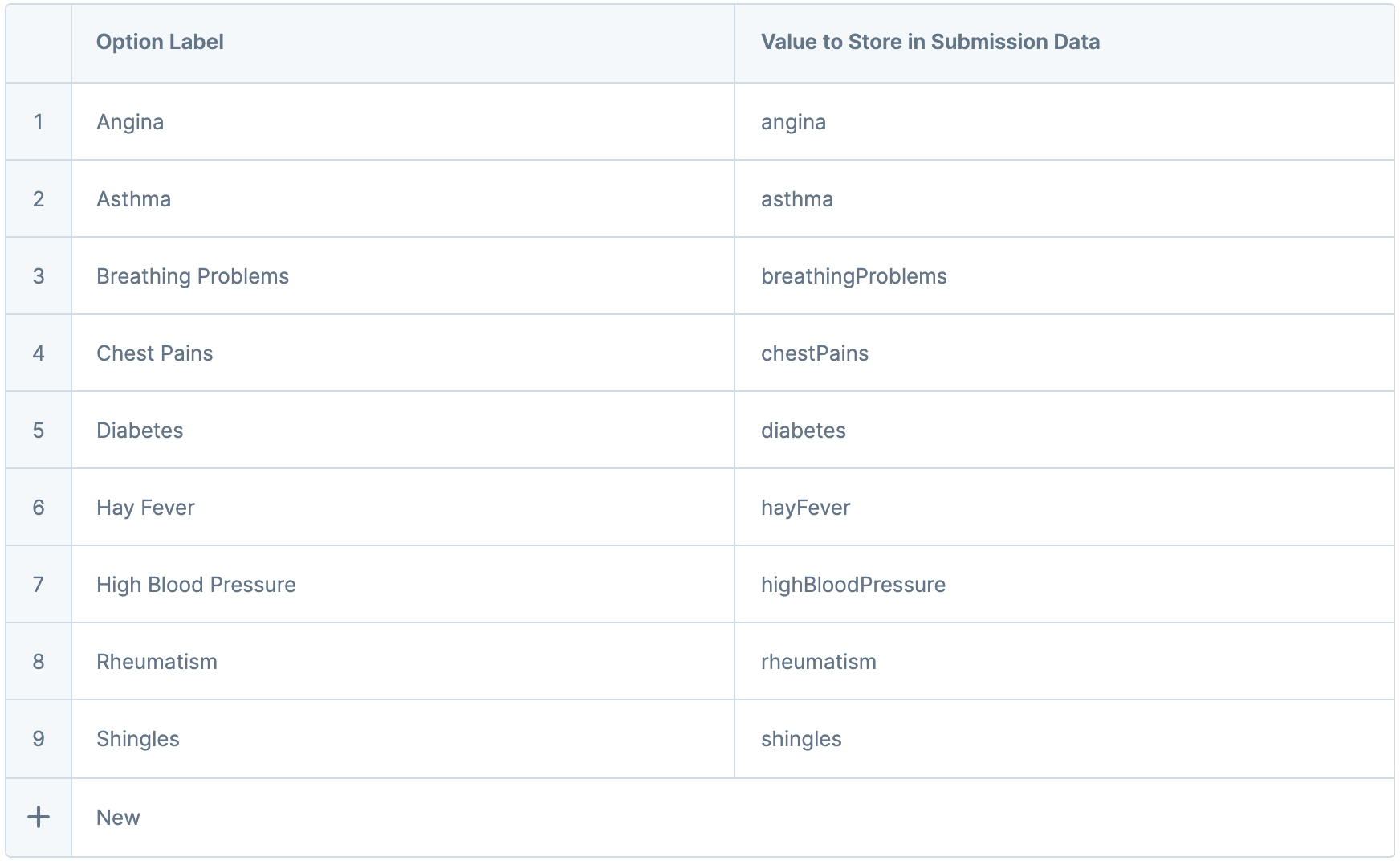
In the Values table, enter the following:
#
Option Label
Value to Store in Submission Data
1
Angina
angina
2
Asthma
asthma
3
Breathing Problems
breathingProblems
4
Chest Pains
chestPains
5
Diabetes
diabetes
6
Hay Fever
hayFever
7
High Blood Pressure
highBloodPressure
8
Rheumatism
rheumatism
9
Shingles
shingles
10
Ulcers
ulcers
In the upper-right corner of the Values pane, click Close. The new values display in the component's configuration panel.
Set Selection to Uncheck All Options to
 (ON).
(ON).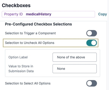
Navigate to the component's Validation settings.
Set Required to
(ON).Click Save Component.
Save your module.

Preview your module in Express View. You'll see the following functionality:
Structure of a Checkboxes Component's Data
Using the example above, in Express View, execute the AngularJS command in the DevTools Console. The medicalHistory Checkboxes component stores selected options in an array when viewed in the developer console. If no options have been checked, then the array is empty.

Resources
Overview
With a Checkboxes component, you can create a question with more than one possible answer. Checkboxes let your end-user choose more than one response from your provided options. As a comparison, the Radio Buttons component only allows one selection. With a Checkboxes component, your end-user can compare all available options, selecting all that apply.
Here are some examples of checkbox questions:
Do you have any of the following medical conditions? Please select all that apply.
What sports do you play on a regular basis? Please select all that apply.
Which of these account types are you interested in opening? Please select all that apply.
The Checkboxes component has built-in Select All and None of the Above options. This adds more versatility to your application and prevents conflicting responses.
You can also use a Checkboxes component to trigger a Text Field to display. Think of this as a write-in option for your end-user. For example, if none of the provided answers apply, they can select the Other box, which displays a separate text field. Then, they can enter their response.
A Checkboxes component can also trigger an existing component. For example, an end-user who wants to open an account can select Retirement from a list of options. When they select the Retirement box, a new drop-down displays. Here, they can select a more specific account type.
You'll find the Checkboxes component in the Primary Fields group to the left of the Module Builder.
About the Configuration Window
To learn more about general component settings and those that display when a component is associated with Data Models, view our General Component Settings article.
Display Panel

Field Text
Setting | Description |
|---|---|
Label Text | Label Text conveys what the input component is and what information it displays. Enter the purpose of the corresponding component or field. User-friendly labels make your module more accessible. Keep labels short and descriptive (a word or two) using title case. For longer entries, use sentence case. |
Contextual Help
Setting | Description |
|---|---|
Tooltip | A short hint that displays when an end-user positions their cursor over the |
Helper Text | A quick tip describing the expected value of an input field. Unlike a Tooltip, Helper Text stays visible under the input field and displays on a single line. |
Default State Options
Setting | Description |
|---|---|
Disable User Input | When set to By default, Disable User Input is set to |
Hide Field | Displays or hides the component from view. Setting Hide Field to By default, Hide Field is set to |
Formatting
Setting | Description |
|---|---|
Number of Columns | The number of columns in which you want the checkboxes evenly arranged. You have the option of By default, the checkboxes align on a single column. |
Data Panel

Data Source Types
There are two methods that you can use to populate a Checkboxes component: Values or a Data Reference Key.
Values
Values are the simplest way to populate a Checkboxes component. When you select Values, a Custom Checkbox Selections table displays. In this table, enter each checkbox option and its associated value.
Setting | Description |
|---|---|
Option Label | Each option needs an end-user-facing label describing the choice that it represents. Enter your Option Labels using this column. After you create an option, another row displays for you to create the next option. |
Value to Store in Submission Data | Each option needs an associated value to store in the submission data. Enter the values to store in submission data using this column. By default, the value is a camelCase version of the Option Label. |
Data Reference Key
With a Data Reference Key, you can use data from another component to populate your Checkboxes component. You'll most often do this with a Data Table component. Add your data to the Data Table and then reference it in your Checkboxes configuration window.
Think of this as a hybrid of using Values and Data Collection to populate your Checkboxes. You still use data stored in Unqork, but it's data from yourmodulerather than a Data Collection.
Setting | Description |
|---|---|
Data Reference Key | Enter the Property ID of the component whose data you're referencing. |
Value Property | If a data set includes a column for values, enter the column's name here. If not specified, the application uses the data drawn using the Label Path setting below. |
Label Path | This field refers to the option labels to retrieve. If you're retrieving data from a Data Table component, enter the column header in this field. |
Pre-Configured Checkbox Selections
Setting | Description |
|---|---|
Selection to Trigger a Component | When set to By default, the Selection to Trigger a Component toggle is set to |
Option Label | Each option needs an end-user-facing label describing the choice that it represents. Enter your Option Labels using this column. After you create an option, another row displays for you to create the next option. By default, the Selection to Trigger a Component has the Option Label of Other. |
Value to Store in Submission Data | Each option needs an associated value to store in the submission data. Enter the values to store in submission data using this column. By default, the value is a camelCase version of the Option Label. |
Component to Trigger When a User Selects This Option | Here you have the choice of triggering a new Text Field or an existing component. The triggered Text Field or component displays below the associated checkbox option.
|
Property Name of Text Field | If you select the Text Field option, you must give the new Text Field component a Property Name. |
Placeholder of Text Field | If you select the Text Field, you can enter a placeholder text to assist the end-user. |
Property Name of Existing Component | If you select the Choose Existing, you can enter the Property ID of an existing component in your module to trigger. |
Selection to Uncheck All Options | This setting adds a new checkbox (None of the Above) that, when selected, clears all other options. With None of the Above selected, the end-user can't make any other selections. To make another selection, they must clear None of the Above. By default, the Selection to Uncheck All Options toggle is set to |
Option Label | Each option needs an end-user-facing label describing the choice that it represents. Enter your Option Labels using this column. After you create an option, another row displays for you to create the next option. By default, the Selection to Uncheck All Options has the Option Label of None of the Above. |
Value to Store in Submission Data | Each option needs an associated value to store in the submission data. Enter the values to store in submission data using this column. By default, the value is a camelCase version of the Option Label. By default, the Selection to Uncheck All Options has a value of none. |
Selection to Select All Options | This setting adds a new checkbox (Select All) that, when selected, selects all other options. This option automatically excludes the None of the Above option, if applicable. By default, the Selection to Select All Options toggle is set to |
Option Label | Each option needs an end-user-facing label describing the choice that it represents. Enter your Option Labels using this column. After you create an option, another row displays for you to create the next option. By default, the Selection to Select All Options has the Option Label of Select All. |
Data Storage
Setting | Description |
|---|---|
Promote Data to Top Level | When set to When set to By default, the Promote Data to Top Level toggle is set to |
Store Data in Database | The Store Data in Database setting affects how data persists through your application. When set to
Set the toggle to
|
Actions Panel

Triggers
Setting | Description |
|---|---|
Trigger | To set up a trigger, enter the Property ID of your chosen logic component into this field. When the end-user performs an action on the current component, the triggered component fires. |
Validation Panel

User Input
Setting | Description |
|---|---|
Required | When set to By default, Required is set to |
Required Error Message | A custom error message that displays below a required field. The error message displays when the end-user tries to save or submit the module without completing the required field. |
Advanced Panel

Additional Styling
Setting | Description |
|---|---|
Custom CSS Classes | Enter a Custom CSS Class to apply to your component. Custom CSS lets you maintain a consistent look and feel when the field or element is part of a template or multiple modules. Updated CSS styling applies to all components that reference this custom class name. |
Adding a Checkboxes Component
Now, let's create an application that will collect the medical history of an applicant. These instructions assume that you have an open modulesaved with a title.
Configure the Checkboxes Component
In the Module Builder, drag and drop a
Checkboxes component onto your canvas.In the Property ID field, enter medicalHistory.
In the Label Text field, enter
Do you have, or have you had any of the following? Please check all that apply.Set the Number of Columns as
(two columns).From the component navigation menu, select
 Data.
Data.In the table under the Values Data Source Type, enter the following:
Option Label
Value to Store in Submission Data
Angina
angina
Asthma
asthma
Breathing Problems
breathingProblems
Chest Pains
chestPains
Diabetes
diabetes
Hay Fever
hayFever
High Blood Pressure
highBloodPressure
Rheumatism
rheumatism
Shingles
shingles
Ulcers
ulcers
Set the Selection to Uncheck All Options toggle to
(ON).The Option Label stays set to
None of the above. You can leave this as set or change it as needed.The Value to Store in Submission Data stays set to
None. You can leave this as set or change it as needed.
In the component navigation menu, select
 Validation.
Set the Required toggle to
(ON).Click Save & Close.
Save your module.


Preview your module in Express View. You'll see the following functionality:
Structure of a Checkboxes Component's Data
A Checkboxes component stores its data as an array when viewed in the developer console.
