Charts are a great way to display data sets in your application. Using the Chart component, you can add and configure different types of charts on your dashboard, letting your end-user visualize your data in a meaningful way.
Below are some common examples of when to use the Chart component:
To display a scatter plot to track the number of sales for each sales agent in your department.
To display a pie chart to show the percentages of end-user submission.
To display a bar graph that shows product consumption by demographic.
About the Configuration Window
To learn more about general component settings and those that display when a component is associated with Data Models, view our General Component Settings article.
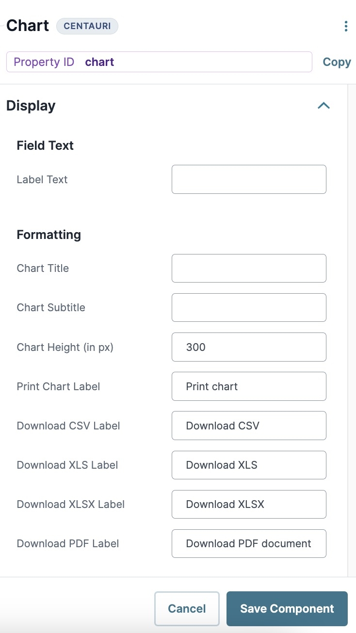
Display Panel
Field Text
Setting | Description |
|---|---|
Label Text | Label Text conveys what the input component is and what information it displays. Enter the purpose of the corresponding component or field. User-friendly labels make your module more accessible. Keep labels short and descriptive (a word or two) using title case. For longer entries, use sentence case. |
Formatting
Setting | Description |
|---|---|
Chart Title | The title that displays above your chart in Express View. |
Chart Subtitle | The subtitle that displays below the chart title in Express View. |
Chart Height (in px) | Adjusts the height (in pixels) of the frame that contains your chart in Express View. As you adjust the height of your chart box, the chart resizes accordingly. |
Print Chart, Download CSV, XLS, and PDF Label | Customizes the label of the download options in the chart drop-down menu. |
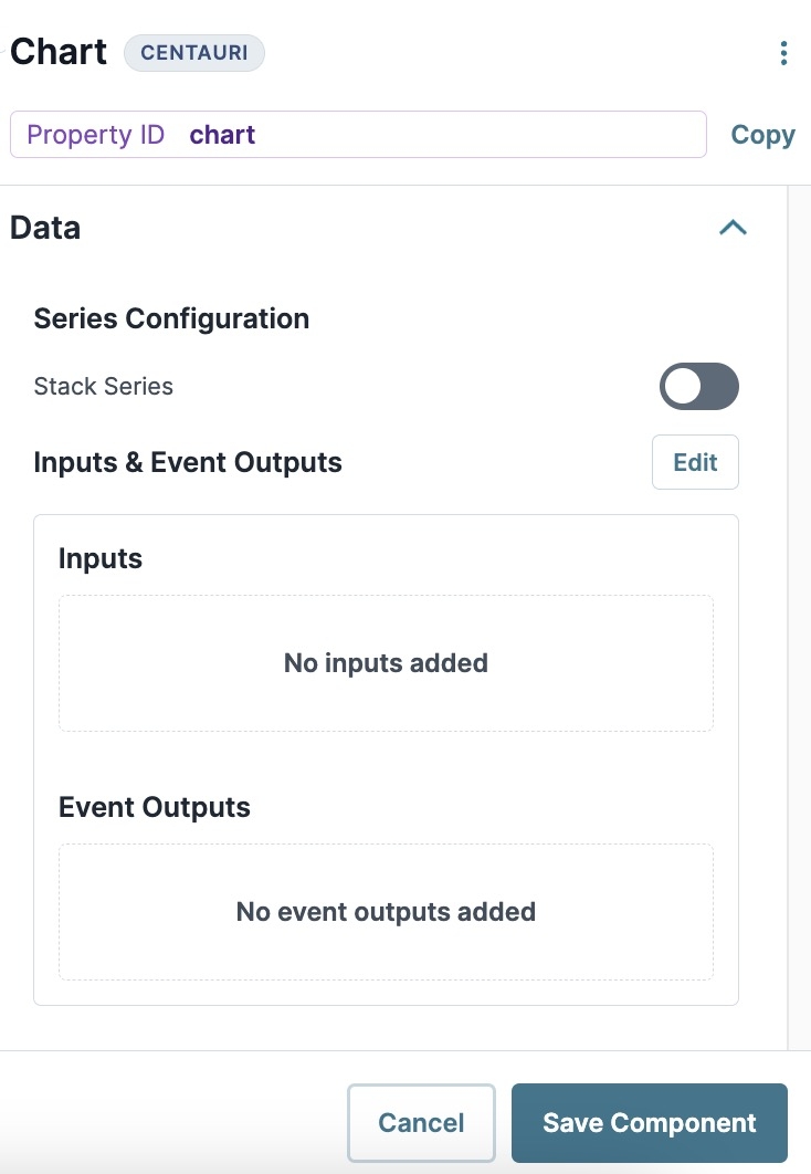
Data Panel
Series Configuration
Setting | Description |
|---|---|
Stack Series | Overlays multiple data sets in your chart, preventing multiple data inputs from overlapping in your application.
|
Inputs & Event Outputs
Setting | Description | ||||||||||||||||||
|---|---|---|---|---|---|---|---|---|---|---|---|---|---|---|---|---|---|---|---|
Inputs | Use this section to input and organize the data that your chart must display. To access the Inputs settings, select Edit.
| ||||||||||||||||||
Event Outputs | Lets the end-user select a category on your chart's user interface. You can then output the selected category to a Property ID. To access the Event Outputs settings, select Edit.
|
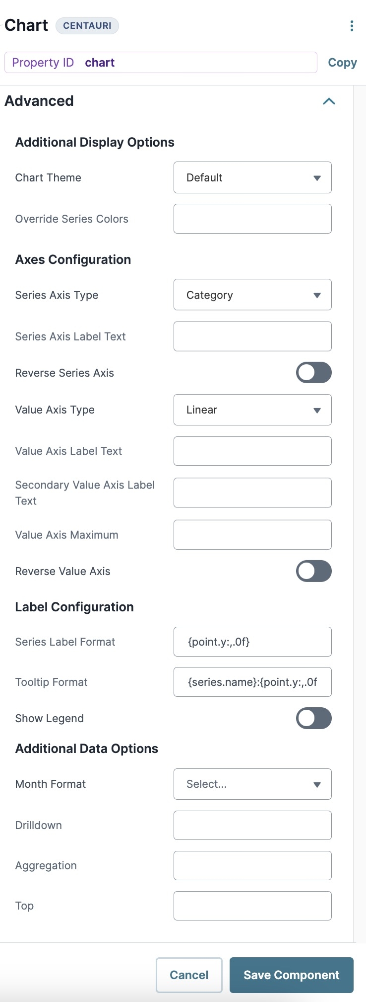
Advanced Panel
Additional Display Options
Setting | Description |
|---|---|
Chart Theme | Sets the theme or color scheme of your chart. |
Override Series Colors | Enter a HEX code to change the Series colors. |
Axes Configuration
Setting | Description |
|---|---|
Series Axis Type | Use this drop-down to define the axis type depending on the Series data you want to display. Options include:
|
Series Axis Label Text | Enter a label for the Series axis of your chart. This label represents the y-axis in a default bar graph. |
Reverse Series Axis | When set to Be default, this setting is |
Value Axis Type | Use this drop-down to define the axis type depending on the Value data you want to display. Options include:
|
Value Axis Label Text | Enter a label for the Value axis of your chart. This label represents the x-axis in a default bar graph. |
Secondary Value Axis Label Text | Enter a secondary label for the Value axis of your chart. |
Value Axis Maximum | Lets you set the maximum value length of your Value axis. |
Reverse Value Axis | When set to Be default, this setting is |
Label Configuration
Setting | Description |
|---|---|
Series Label Format | Use this field to change the Series label format. |
Tooltip Format | Use this field to change the interactive hover-over tooltip format. |
Show Legend | When set to Be default, this setting is |
Enable Dynamic Legend | When set to Be default, this setting is |
Additional Data Options
Setting | Description |
|---|---|
Month Format | Changes the month format of date values on your chart. |
Drilldown | Narrows down to any nested categories. |
Aggregation | Aggregates a variable in the tracking cascading status. |
Top | Returns only the top records. |
Adding a Chart Component
To expand on the example from earlier, say you want to build an application that shows the popularity of insurance providers to clients. You can use a Chart component to display this data in a pie chart. The Chart component can only display data, so you must first determine the number of membership submissions for each insurance provider for the chart to display correctly.
These instructions assume that you have an open module saved with a title.
Configure the Data Table Component
Begin by creating a data set that contains customer insurance enrollment data.
In the Module Builder, drag and drop a Data Table component onto your canvas.
In the Property ID and Canvas Label Text fields, enter
dtUserSubmission Data.In the Inputs data table, enter the following:
A
B
1
submission
provider
2
1
Aetna
3
2
Cigna
4
3
BCBS
5
4
Kaiser
6
5
UHC
7
6
Aetna
8
7
Cigna
9
8
BCBS
10
9
Kaiser
11
10
UHC
Click Save Component.
Configure the Hidden Component
This Hidden component stores your provider popularity data. Your Chart component references this data to display to the end-user.
Drag and drop a Hidden component onto the canvas, placing it below your dtUserSubmissionData Data Table component.
In the Property ID and Canvas Label Text fields, enter
providerCount.Click Save Component.
Configure the Data Workflow Component
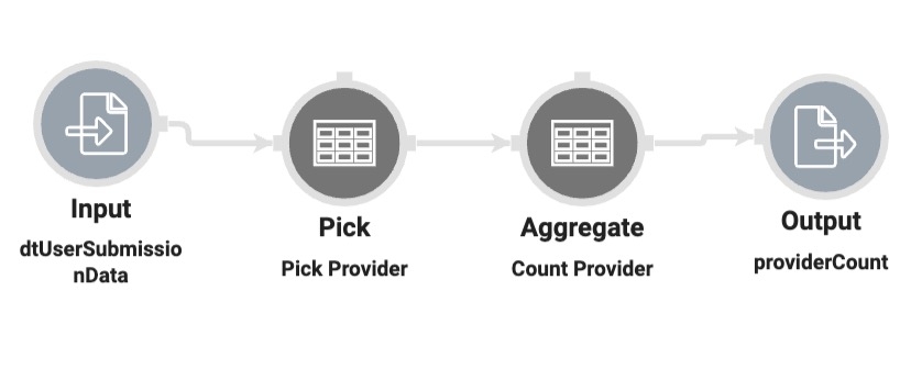
Chart components cannot make advanced calculations, so you'll configure a Data Workflow component to aggregate the data you want to display to the end-user.
Drag and drop a Data Workflow component onto the canvas, placing it between the dtUserSubmissionData Data Table and providerCount Hidden components.
In the Property ID and Canvas Label Text fields, enter
dwfProviderCount.
Configure the Input Operator
Drag and drop an Input operator onto your Data Workflow canvas.
Configure the operator's Info window as follows:
Setting
Value
Category
Input
Component
userSubmissionData
Required
Yes
Source
Default
Configure the Pick Operator
Drag and drop a Pick operator onto the Data Workflow canvas.
Configure the operator's Info window as follows:
Setting
Value
Category
Input
Label
Pick Provider
Pick Keys
provider
Connect the output port (right) of the Input operator to the input port (left) of the Pick operator.
Configure the Aggregate Operator
Drag and drop an Aggregate operator onto the Data Workflow canvas.
Configure the operator's Info window as follows:
Setting
Value
Category
Aggregate By
Label
Count Provider
Aggregation Type
Count By
Join Group Keys?
No
Group Key
provider
Value Key
count
Connect the output port (right) of the Pick operator to the input port (left) of the Aggregate operator.
Configure the Output Operator
Drag and drop an Output operator onto the Data Workflow canvas.
Configure the operator's Info window as follows:
Setting
Value
Category
Output
Component
providerCount
Action
value
Connect the output port (right) of the Aggregate operator to the input port (left) of the Output operator.
Click Save Component.
Configure the Chart Component
Using a Chart component, you can display the aggregated provider data.
Drag and drop a Chart component onto the canvas, placing below the providerCount Hidden component.
In the Property ID and Label Text fields, enter
submissionChart.In the Chart Title field, enter
Providers.In the Inputs table, enter the following:
ID
Label
Chart Type
Categories
Values
1
providerCount
Member Count
Pie
provider
count
Under Label Configuration in Advanced settings, set Show Legend to (ON).
Click Save Component.
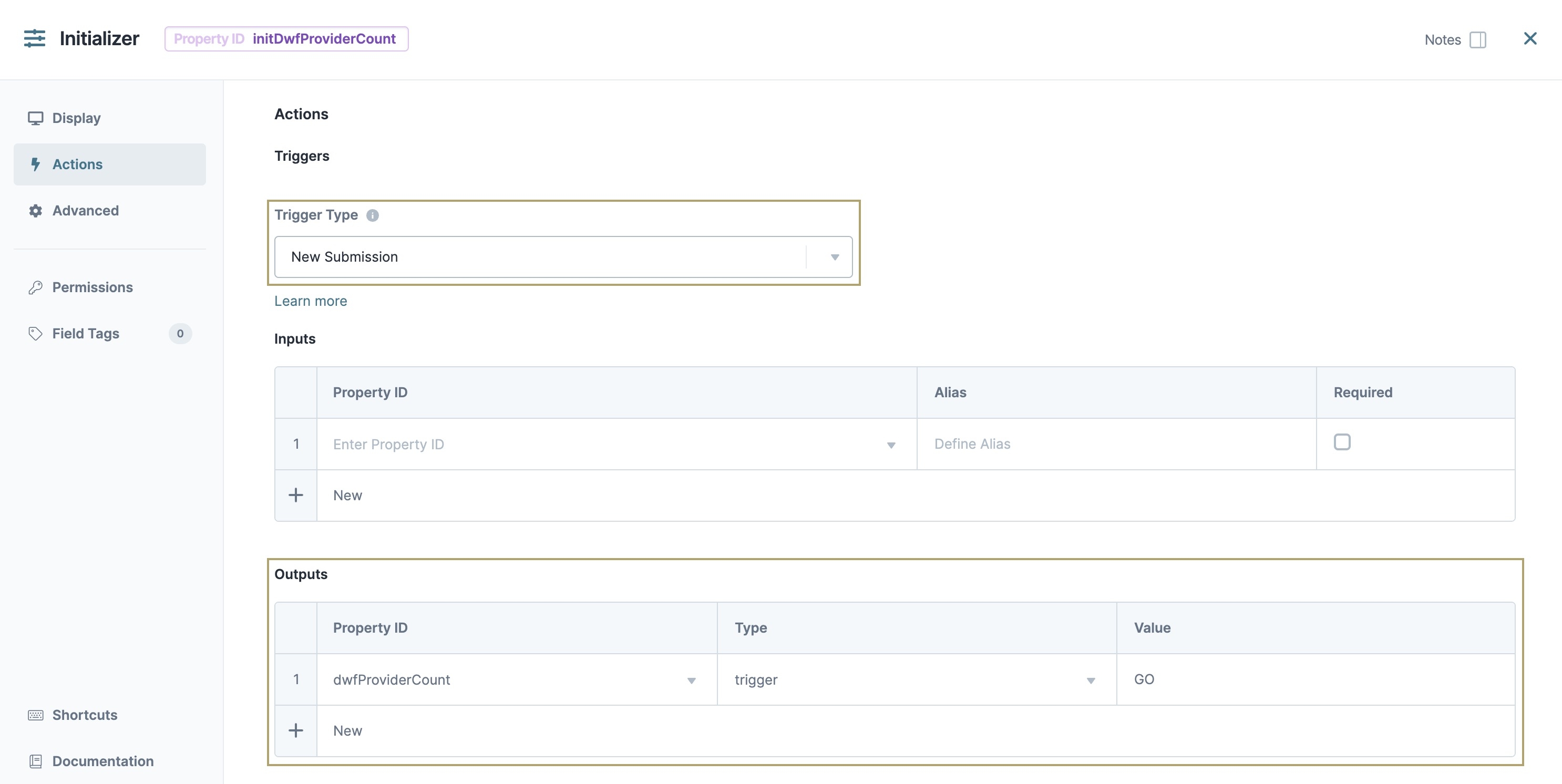
Configure the Initializer Component
To initiate your application on page load, you'll use an Initializer component.
Drag and drop an Initializer component onto your canvas, placing it above your dtUserSubmissionData
.png) Data Table component.
Data Table component.In the Property ID and Canvas Label Text fields, enter
initDwfProviderCount.Navigate to the Initializer component's Actions settings.
Set the Trigger Type to New Submission.
Next to Inputs & Outputs, click Edit.
In the Outputs table, enter the following:
Source
Type
Value
1
dwfProviderCount
Trigger
GO
Click Save Component.
Save your module.
Preview your module in Express View. Notice how you can hover over and select portions of the pie chart to identify specific information.
Structure of a Chart Component's Data
The Chart component uses input Property IDs to display array data.
Charts are a great way to display data sets in your application. Using the Chart component, you can add and configure different types of charts on your dashboard, letting your end-user visualize your data in a meaningful way.
Below are some common examples of when to use the Chart component:
To display a scatter plot to track the number of sales for each sales agent in your department.
To display a pie chart to show the percentages of end-user submission.
To display a bar graph that shows product consumption by demographic.
You can find the Chart component under the Charts & Graphs group to the left of the Module Builder.
About the Configuration Window
To learn more about general component settings and those that display when a component is associated with Data Models, view our General Component Settings article.
General
Setting | Description |
|---|---|
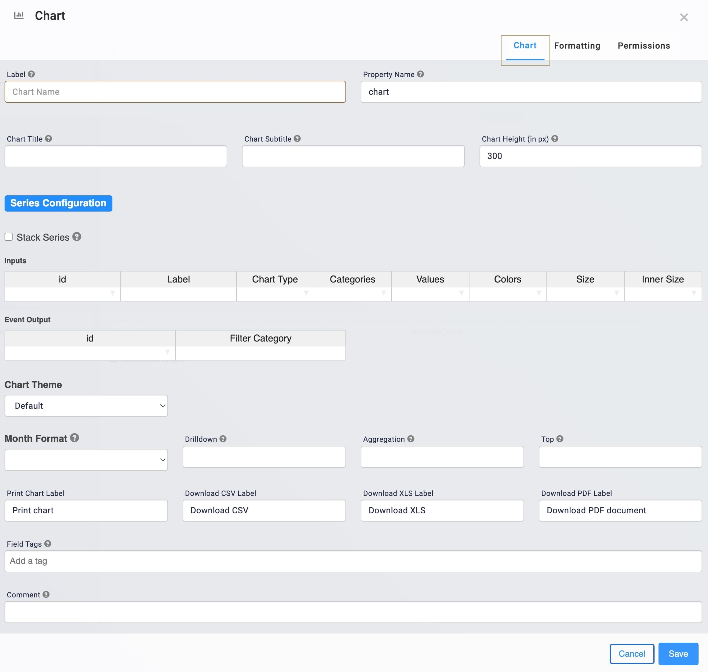
Chart tab | Selected by default and on opening of the modal. This tab gives you access to display settings for naming, Series, Theme, and Format. |
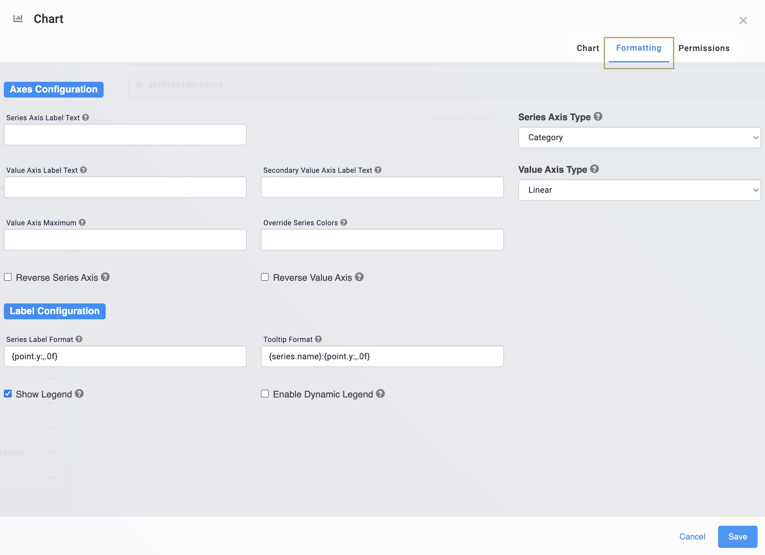
Formatting tab | Select this tab to access configuration for your chart's axis. You can also add a legend to your chart in this tab. To add a legend, select the Show Legend checkbox. |
Permissions tab | Select this tab to see the RBAC settings of the component. |
Cancel | Click this button to undo any unsaved configuration changes and return to the Module Builder canvas. |
Save | Click this button to save all setting configuration changes and return to the Module Builder canvas. |
Chart Tab
Setting | Description |
|---|---|
Label | A Label indicates the purpose of the corresponding field or component. For input components, the Label tells the end-user how to interact with the field. For non-input components, the Label is not end-user facing, and only appears in the Module Builder. User-friendly Labels make your module more accessible. Keep Labels short and descriptive (a word or two) using title case. For longer entries, use sentence case. |
Property Name | A Property Name is the unique field ID used by Unqork to track and link components in your module. The Property Name is how the software identifies your component. Using Property Names lets you link components, creating logic-based configurations and API (application programming interface) calls. Property Names must use camel case (stylized as camelCase) without spaces or punctuation. |
Chart Title | The title that displays above your chart in Express View. |
Chart Subtitle | The subtitle that displays below your chart title in Express View. |
Chart Height | Adjusts the height (in pixels) of the frame that contains your chart. As you adjust the height of your chart box, the chart resizes accordingly. |
Series Configuration
Setting | Description |
|---|---|
Stack Series | Overlays multiple data sets in your graph. This setting prevents multiple data inputs from overlapping in your application.
|
Inputs | Use this section to input and organize the data that your chart must display. |
ID | In this field, enter the Property ID of your input data.
|
Label | In this field, enter the value for what you're counting. For example, if your graph displays a count of numbers, enter |
Chart Type | This field lets you set the chart type to display your data. Below are the available chart types:
|
Categories | In this field, enter the data categories you want displayed on your chart. Enter only the key of your data's key/value pairs for each category. |
Values | Use this field to display the values for each category on your chart. Enter only the key of your data's key/value pairs for each category value. |
Colors | Manipulates the color of an input category if the input data array contains colors. Your color data can be in word or HEX form. |
Size | This setting expands the size of your chart, in pixels. |
Inner Size | Adds an inner-hole to make your pie chart into a doughnut chart. This setting only applies to pie charts. |
Event Output | Lets the end-user select a category on your chart's user interface. You can then output the selected category to a Property ID. |
ID | The Property ID you use to output your Filter Category. For example, if you want to store the selected Filter Category in a Hidden component named idOutput, enter |
Filter Category | Enter the input category value displayed on your chart. For example, if your Input category is provider, enter |
Chart Theme
Setting | Description |
|---|---|
Chart Theme | Sets the theme or color scheme of your chart. |
Month Format
Setting | Description |
|---|---|
Month Format | Changes the month format of date values on your chart. |
Additional Settings
Setting | Description |
|---|---|
Drilldown | Narrows down to any nested categories. |
Aggregation | Aggregates a variable in the tracking cascading status. |
Top | Returns only the top records. |
Print Chart, Download CSV, XLS, and PDF Label | Customizes the label of the download options in the chart drop-down menu. |
Field Tags | Assign components one-word labels to help organize, identify, and group the components in your application. Consider an example from the API Specification Snippet: Field Tags are applied to Hidden components in the panelRequest and panelResponse Panel components. The Field Tags identify the data type of parameters included in the API request and response. The API Docs Dashboard tool populates with information about each parameter’s data type, identified by the Field Tag. Field Tags act as a type of Property ID group and let you group components for configuration purposes. Field Tags let you target two or more components using a simple logic component. For example, add the Field Tag tagForDecision to multiple components in your module. Open the Inputs table of a Decisions component and reference the tagForDecision Field Tag as the input of the Decisions component. The output of the Decisions component then affects all components with the tagForDecision Field Tag. Save your Field Tags by pressing Enter (Return) or adding a comma after each entry. |
Comment | Use this field to keep your teammates informed about what this Chart component does. |
Formatting Tab
Series Configuration
Setting | Description |
|---|---|
Series Axis Label Text | Enter a label for the Series axis of your chart. This label represents the y-axis in a default bar graph. |
Series Axis Type | Use this drop-down to define the axis type depending on the Series data you want to display. Options include:
|
Value Axis Label Text | Enter a label for the Value axis of your chart. This label represents the x-axis in a default bar graph. |
Secondary Value Axis Label Text | Enter a secondary label for the Value axis of your chart. |
Value Axis Type | Use this drop-down to define the axis type depending on the Value data you want to display. Options include:
|
Value Axis Maximum | Lets you set the maximum value length of your Value axis. |
Override Series Colors | Enter a HEX code to change the Series colors. |
Reverse Series Axis | Check ( Be default, this box is unchecked ( |
Reverse Value Axis | Check ( Be default, this box is unchecked ( |
Label Configuration
Setting | Description |
|---|---|
Series Label Format | Use this field to change the Series label format. |
Tooltip Format | Use this field to change the interactive hover-over tooltip format. |
Show Legend | Check ( Be default, this box is unchecked ( |
Enable Dynamic Legend | Check ( Be default, this box is unchecked ( |
Adding a Chart Component
To expand on the example from earlier, say you want to build an application that shows the popularity of insurance providers to clients. You can use a Chart component to display this data in a pie chart. The Chart component can only display data, so you must first determine the number of membership submissions for each insurance provider for the chart to display correctly.
These instructions assume that you have an open module saved with a title.
What You Need
For this configuration, you need the following components:
1 Data Table component
1 Hidden component
1 Chart component
1 Initializer component
1 Data Workflow component
To set up your Data Workflow, you need:
Configure the Data Table Component
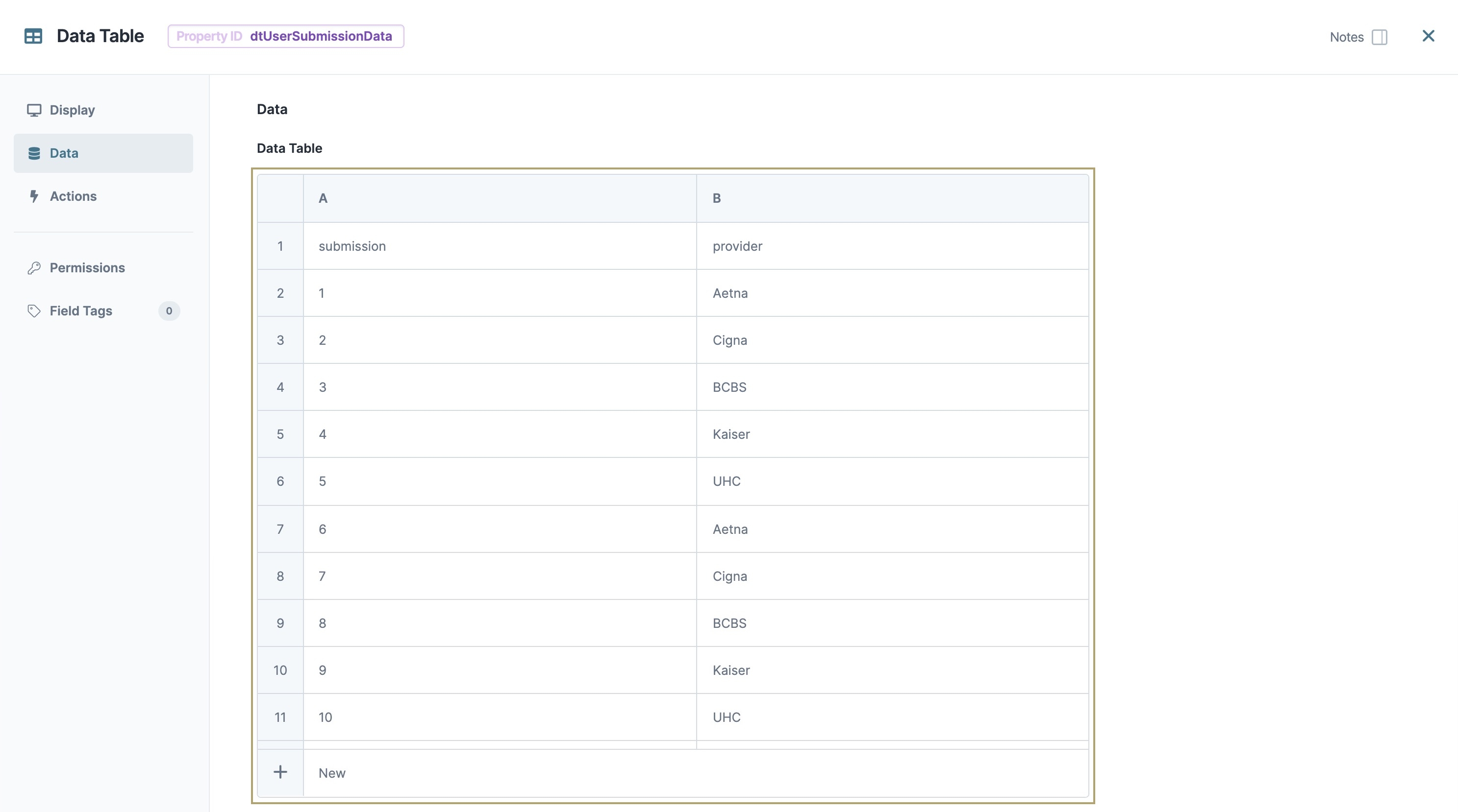
Begin by creating a data set that contains customer insurance enrollment data.
In the Module Builder, drag and drop a Data Table component onto your canvas.
In the Property ID and Canvas Label Text fields, enter
dtUserSubmission Data.To the left of the component's configuration window, click Data.
In the data table, enter the following:
A
B
1
submission
provider
2
1
Aetna
3
2
Cigna
4
3
BCBS
5
4
Kaiser
6
5
UHC
7
6
Aetna
8
7
Cigna
9
8
BCBS
10
9
Kaiser
11
10
UHC
Click Save & Close.
Configure the Hidden Component
This Hidden component stores your provider popularity data. Your Chart component references this data to display to the end-user.
Drag and drop a Hidden component onto the canvas, placing it below your dtUserSubmissionData Data Table component.
In the Property ID and Canvas Label Text fields, enter
providerCount.Click Save & Close.
Configure the Data Workflow Component
Chart components cannot make advanced calculations, so you'll configure a Data Workflow component to aggregate the data you want to display to the end-user.
Drag and drop a Data Workflow component onto the canvas, placing it between the dtUserSubmissionData Data Table and providerCount Hidden components.
In the Canvas Label Text and Property Name fields, enter
dwfProviderCount.
Configure the Input Operator
Drag and drop an
 Input operator onto your Data Workflow canvas.
Configure the operator's Info window as follows:
Setting
Value
Category
Input
Component
userSubmissionData
Required
Yes
Source
Default
Configure the Pick Operator
Drag and drop a
 Pick operator onto the Data Workflow canvas.
Configure the operator's Info window as follows:
Setting
Value
Category
Input
Label
Pick Provider
Pick Keys
provider
Connect the output port (right) of the
 Input operator to the input port (left) of the
  Pick operator.
Configure the Aggregate Operator
Drag and drop an
 Aggregate operator onto the Data Workflow canvas.
Configure the operator's Info window as follows:
Setting
Value
Category
Aggregate By
Label
Count Provider
Aggregation Type
Count By
Join Group Keys?
No
Group Key
provider
Value Key
count
Connect the output port (right) of the
 Pick operator to the input port (left) of the
  Aggregate operator.
Configure the Output Operator
Drag and drop an
 Output operator onto the Data Workflow canvas.
Configure the operator's Info window as follows:
Setting
Value
Category
Output
Component
providerCount
Action
value
Connect the output port (right) of the
 Aggregate operator to the input port (left) of the
  Output operator.
Click Save.
Configure the Chart Component
Using a Chart component, you can display the aggregated provider data.
Drag and drop a Chart component onto the canvas, placing below the providerCount Hidden component.
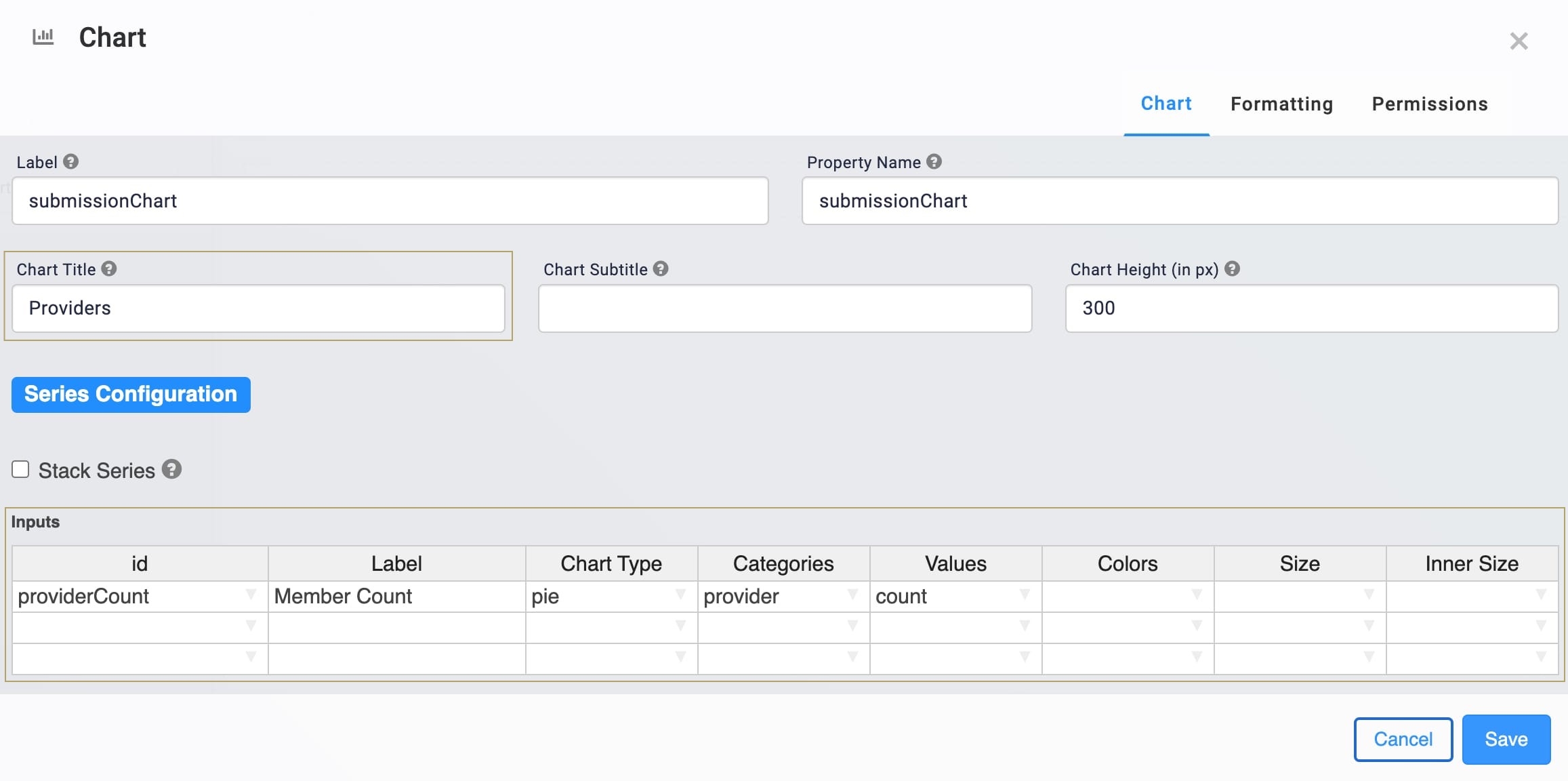
In the Label and Property Name fields, enter
submissionChart.In the Chart Title field, enter
Providers.In the Inputs table, enter the following:
id
Label
Chart Type
Categories
Values
providerCount
Member Count
Pie
provider
count
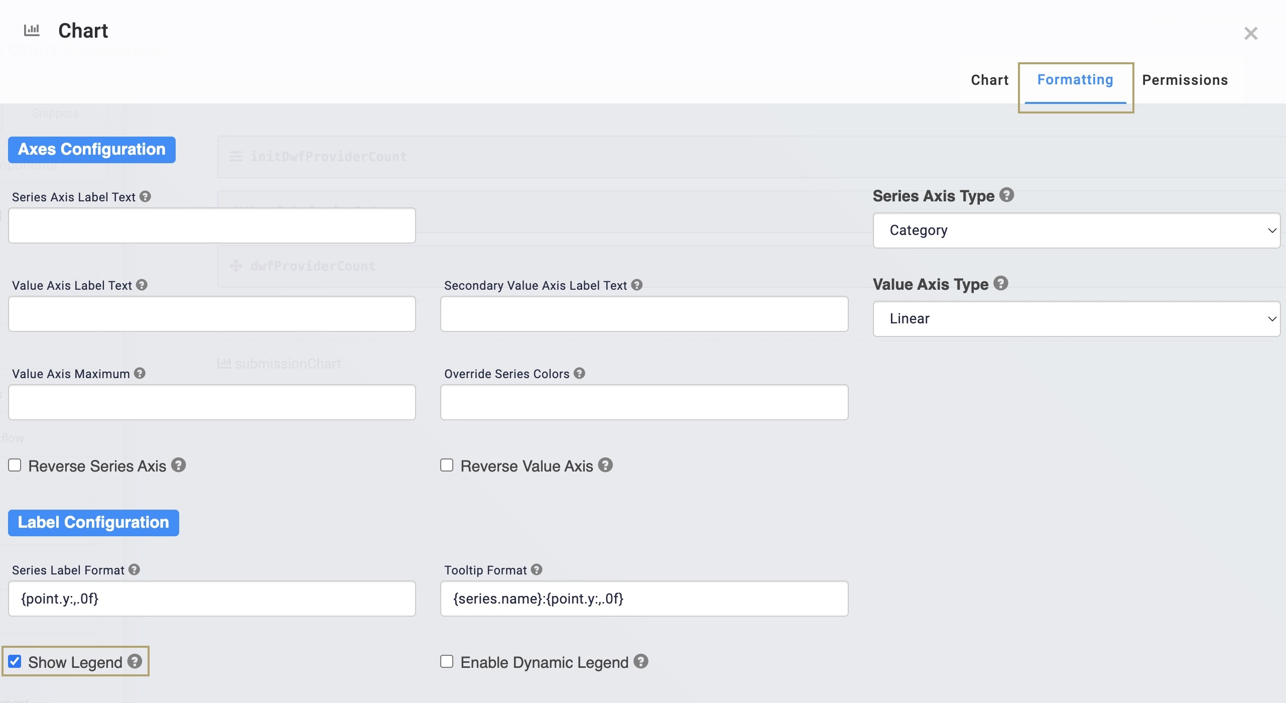
To the top right of the component's configuration window, click Formatting.
Set Show Legend to
.png) (Checked).
(Checked).Click Save.
Configure the Initializer Component
To initiate your application on page load, you'll use an Initializer component.
Drag and drop an Initializer component onto your canvas, placing it above your dtUserSubmissionData Data Table component.
In the Property ID and Canvas Label Text fields, enter
initDwfProviderCount.To the left of the component's configuration window, click
.png) Actions.
Actions.Set the Trigger Type to New Submission.
In the Outputs table, enter the following:
Property ID
Type
Value
dwfProviderCount
Trigger
GO
Click Save & Close.
Save your module.
Preview your module in Express View. Notice how you can hover over and select portions of the pie chart to identify specific information.
Structure of a Chart Component's Data
The Chart component uses input Property IDs to display array data.
