The Signature component creates a signature field in your module. In Express View, the signature field displays as a box where end-users can use their mouse to input their signature. In the submission data, the signature stores as a Base64 string.
Do not use the Signature component for legally-binding signatures. Instead, we suggest you use third-party software like DocuSign and SignNow.
You'll find the component under the Secondary Fields group to the left of the Module Builder:
About the Configuration Window
To learn more about general component settings, view our General Component Settings article.
Display Panel
Default State Options
Setting | Description |
|---|---|
Hide Field | Displays or hides the component from view in Express View. Setting it to By default, Hide Field is set to |
Formatting
Setting | Description |
|---|---|
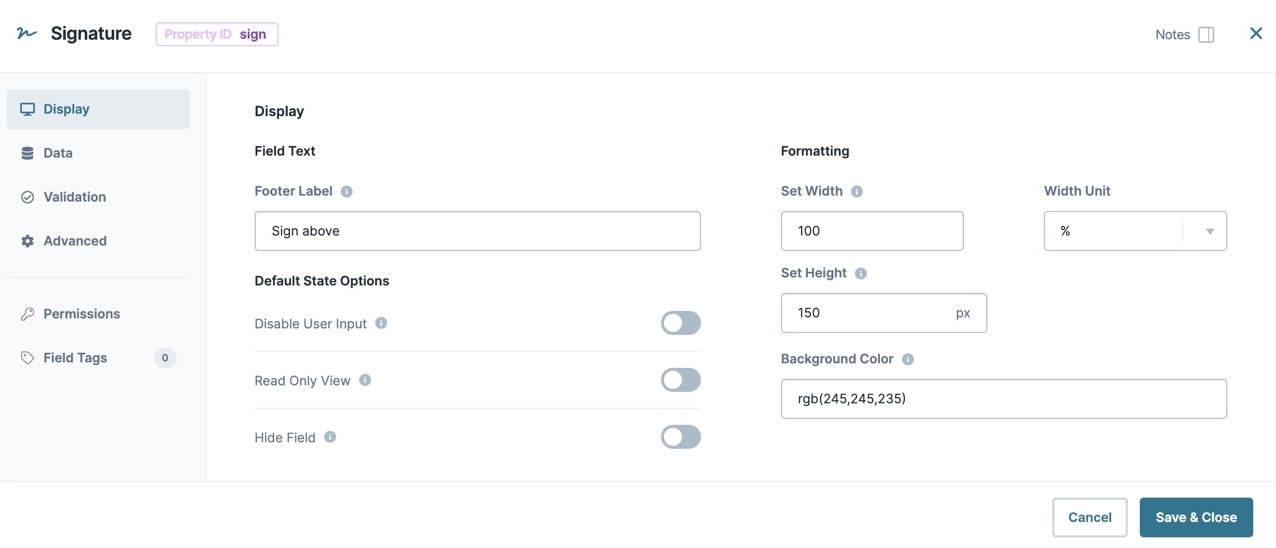
Footer Label | Like the label text, a component’s Footer Label indicates the purpose of the corresponding field or component. Placed under the Signature box, the Footer Label tells the end-user how to interact with the field. For example, giving the end-user instructions like Sign your name above. User-friendly labels make your module more accessible. Keep labels short, concise, and descriptive using title case. For longer entries, use sentence case. |
Background Color | You can customize the background color of the signature box using an HTML color picker. Enter the color’s RGB code in the Background Color field. For example, rgb (245,245,235). Your chosen color displays in the Module Builder and Express View. |
Set Width | Adjusts the width of the Signature box. The width value is specified in conjunction with the Width Unit type. |
Width Unit | Select the unit type for the Width value. Width Unit types include:
By default, the width unit type is set to % (Percentage). |
Set Height | This setting adjusts the height of the signature box. Set the number of pixels to apply to the box height. |
Input Behavior
Setting | Description |
|---|---|
Input Behavior | Controls how end-users interact with the component. Choose from the following options:
|
Data Panel
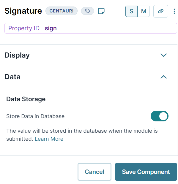
Data Storage
Setting | Description |
|---|---|
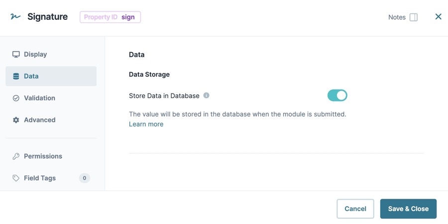
Store Data in Database | The Store Data in Database setting affects how data persists through your application. When set to
Set the toggle to
By default, this toggle is set to |
Validation Panel
User Input
Setting | Description |
|---|---|
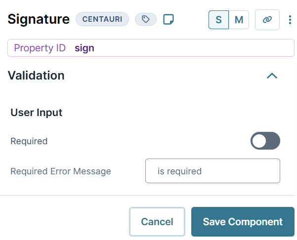
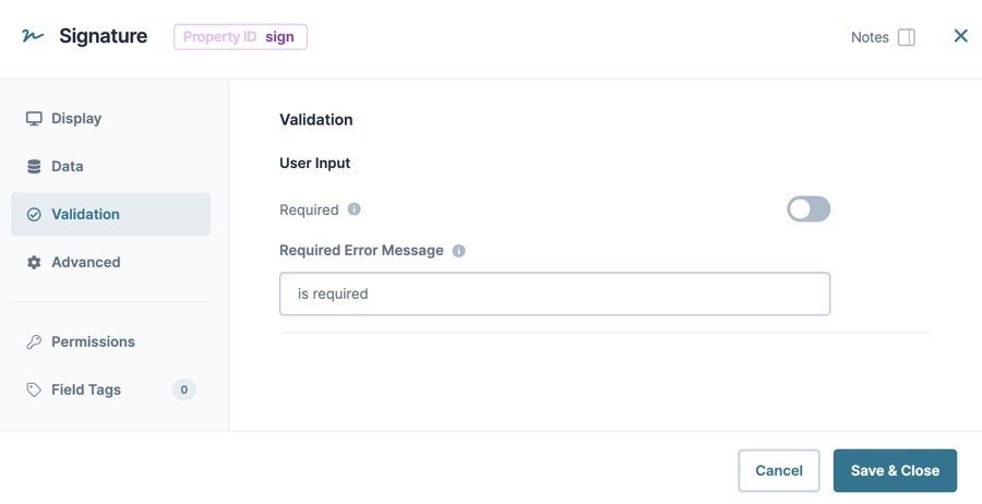
Required | When set to By default, Required is set to |
Required Error Message | A custom error message that displays below a required field. The error message displays when the end-user tries to save or submit the module without completing the required field. |
Advanced Panel
Additional Styling
Setting | Description |
|---|---|
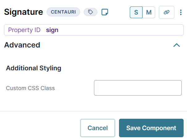
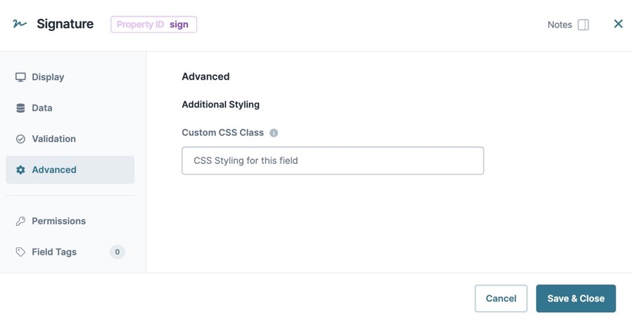
Custom CSS Class | Enter a Custom CSS Class to apply to your component. Custom CSS lets you maintain a consistent look and feel when the field or element is part of a template or multiple modules. Updated CSS styling applies to all components that reference this custom class name. |
Adding a Signature Component
Configure a Signature component to provide a signature field for an end-user. We'll use a light blue color for the field background and set the component as Required. These instructions assume that you have an open module saved with a title.
In the Module Builder, drag and drop a Signature component onto your canvas.
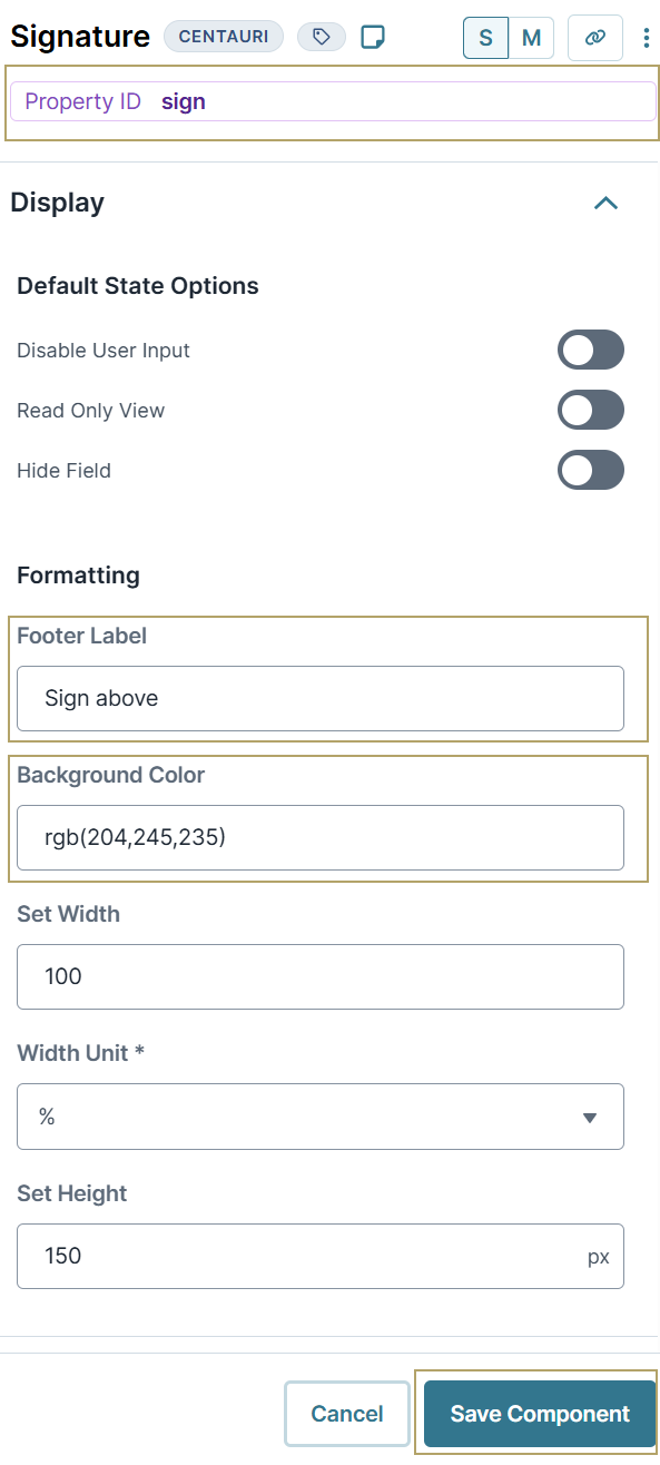
In the Property ID field, enter sign.
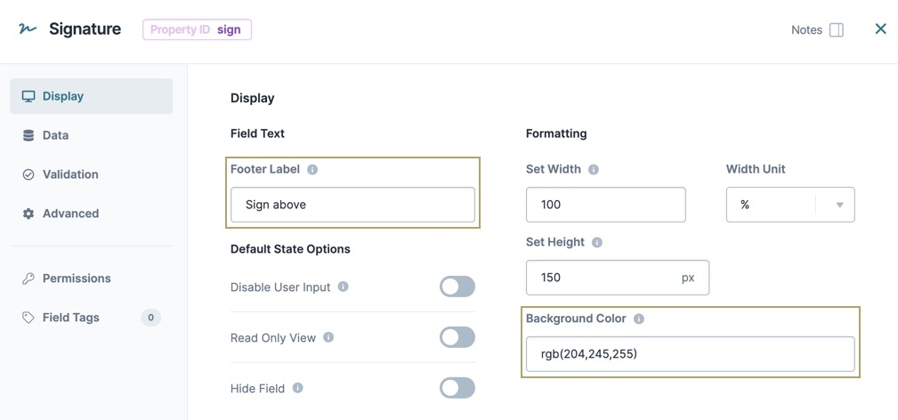
In the Footer Label field, enter
Sign above.In the Background Color field, enter
rgb(204,245,255). This color makes the field background light blue.Navigate to the Advanced settings.
Set Required to
 (ON).
(ON).Click Save Component.
Save your module.
Preview your module in Express View. You'll see the following functionality:
The Signature component creates a signature field in your module. In Express View, the signature field displays as a box where end-users can use their mouse to input their signature. In the submission data, the signature stores as a Base64 string.
Do not use the Signature component for legally-binding signatures. Instead, we suggest you use third-party software like DocuSign and SignNow.
You'll find the component under the Secondary Fields group to the left of the Module Builder:
About the Configuration Window
To learn more about general component settings, view our General Component Settings article.
Display Panel
Field Text
Setting | Description |
|---|---|
Footer Label | Like the label text, a component’s Footer Label indicates the purpose of the corresponding field or component. Placed under the Signature box, the Footer Label tells the end-user how to interact with the field. For example, giving the end-user instructions like Sign your name above. User-friendly labels make your module more accessible. Keep labels short, concise, and descriptive using title case. For longer entries, use sentence case. |
Default State Options
Setting | Description |
|---|---|
Disable User Input | When set to By default, Disable User Input is set to |
Read Only View | When set to By default, the Read Only View toggle is set to |
Hide Field | Displays or hides the component from view. Setting Hide Field to By default, Hide Field is set to |
Formatting
Setting | Description |
|---|---|
Set Width | Adjusts the width of the Signature box. The width value is specified in conjunction with the Width Unit type. |
Width Unit | Select the unit type for the Width value. Width Unit types include:
By default, the width unit type is set to % (Percentage). |
Set Height | This setting adjusts the height of the signature box. Set the number of pixels to apply to the box height. |
Background Color | You can customize the background color of the signature box using an HTML color picker. Enter the color’s RGB code in the Background Color field. For example, rgb (245,245,235). Your chosen color displays in the Module Builder and Express View. |
Data Panel
Data Storage
Setting | Description |
|---|---|
Store Data in Database | The Store Data in Database setting affects how data persists through your application. When set to
Set the toggle to
By default, this toggle is set to |
Validation Panel
User Input
Setting | Description |
|---|---|
Required | When set to By default, Required is set to |
Required Error Message | A custom error message that displays below a required field. The error message displays when the end-user tries to save or submit the module without completing the required field. |
Advanced Panel
Additional Styling
Setting | Description |
|---|---|
Custom CSS Class | Enter a Custom CSS Class to apply to your component. Custom CSS lets you maintain a consistent look and feel when the field or element is part of a template or multiple modules. Updated CSS styling applies to all components that reference this custom class name. |
Adding a Signature Component
Let's configure a Signature component to provide a signature field for your end-user. We'll use a light blue color for the field background and set the component as Required. These instructions assume that you have an open module saved with a title.
In the Module Builder, drag and drop a Signature component onto your canvas.
In the Property ID field, enter sign.
In the Footer Label field, enter
Sign above.In the Background Color field, enter
rgb(204,245,255). This color makes the field background light blue.From the Signature component configuration window, click the
.png) Advanced tab.
Advanced tab.Set Required to
 (ON).
(ON).Click Save & Close.
Save your module.
Preview your module in Express View. You'll see the following functionality:
Structure of a Signature Component's Data
A signature component stores its data as key/value pair. The value contains the data type and the signature in Base64 format.
.jpg)
