The Plaid component is a Centauri (v1.0) component that connects to the Plaid service, lettings Creators securely connect applications to financial accounts. In Express View, the Plaid component displays as a button end-users click to securely log into their financial account. Once clicked, Unqork applications access relevant and verified financial information. Because financial services have strict login requirements, the Plaid component can also verify an end-user's identity.
It's important to note that Plaid is just a data provider, and it does not perform financial transactions. To perform actual banking transactions, integration with Stripe is required.
The Account Linked button below displays a configured Plaid component in Express View:
Your Plaid service can include any of the following Plaid products:
Authentication
Assets
Identity
Income
Investments
Liabilities
Transactions
You'll find the Plaid component in the Data & Event Processing group to the left of the Module Builder.
About the Configuration Window
To learn more about general component settings, view our General Component Settings article.
Display Settings
Field Text
Setting | Description |
|---|---|
Label Text | Label Text conveys what the input component is and what information it displays. Enter the purpose of the corresponding component or field. User-friendly labels make your module more accessible. Keep labels short and descriptive (a word or two) using title case. For longer entries, use sentence case. |
Contextual Help
Setting | Description |
|---|---|
Helper Text | A quick tip describing the expected value of an input field. Unlike a Tooltip, Helper Text stays visible under the input field and displays on a single line. |
Default State Options
Setting | Description |
|---|---|
Hide Label | Setting Hide Label to By default, this setting is set to |
Input Behavior
Setting | Description |
|---|---|
Input Behavior | Controls how end-users interact with the component. Choose from the following options:
|
.jpg) Data Settings
Data Settings
Data
Setting | Description |
|---|---|
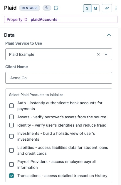
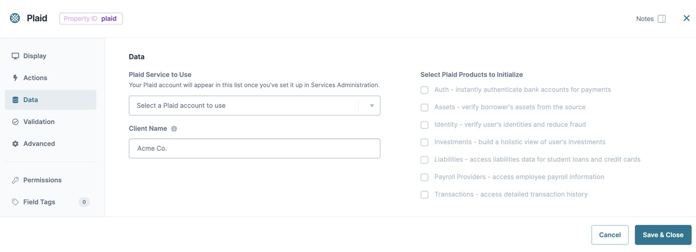
Plaid Service to Use | Displays Plaid services configured in the Services Administration tab. Use the drop-down to select which service you want to call. |
Client Name | Enter the name of the company accessing the end-user's account. |
Select Plaid Products to Initialize | Depending on the specifications of the Plaid service, various Plaid products are available. You can check any combination of products. If you select a product not included in your service, you cannot access that product's data. Available Plaid products include:
|
.jpg) Actions Settings
Actions Settings
Triggers
Setting | Description |
|---|---|
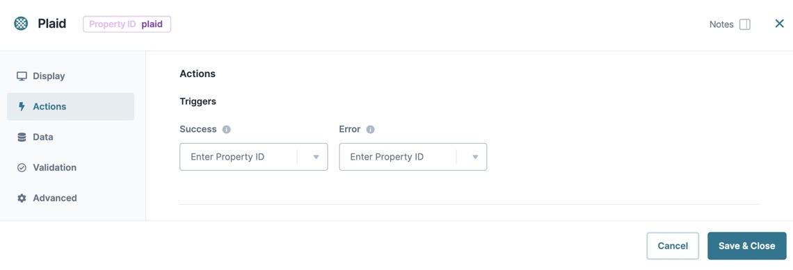
Success | Enter the Property ID of the component you'll trigger after your end-user successfully connects their account. |
Error Trigger | Enter the Property ID of the component you'd like to trigger if the account connection fails. |
.jpg) Validation Settings
Validation Settings
Account Linking Error Message
Setting | Description |
|---|---|
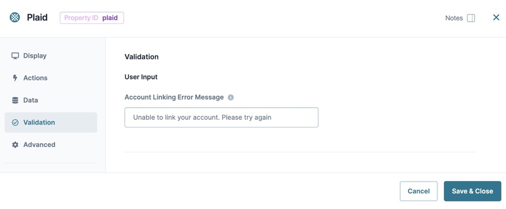
Account Linking Error Message | Enter a custom error message to display when Plaid cannot link to an end-user's account. |
.jpg) Advanced Settings
Advanced Settings
Additional Styling
Setting | Description |
|---|---|
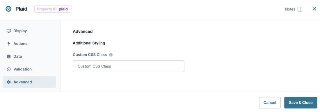
Custom CSS Class | Enter a Custom CSS Class to apply to your component. Custom CSS lets you maintain a consistent look and feel when the field or element is part of a template or multiple modules. Updated CSS styling applies to all components that reference this custom class name. |
.jpg) Adding the Plaid Component
Adding the Plaid Component
In this example, you'll build a module that uses a Plaid component to link an end-user's bank account. Once linked, a simple dashboard displays some basic account information.
If you configure a Plaid component in a Production application, ensure all Plug-In components execute server-side. For more information on server-side execution, view our Server-Side Module Execution article.
Preconfiguration
Before configuring the Plaid component, you need to set up the Plaid service in your environment. If a Plaid service is already set up in your environment, you can skip this section.
Setting up a Plaid service creates a back-end endpoint for your Plaid component and adds a layer of security. The API call occurs in an Unqork server and not your browser.
To connect to Plaid, you'll need a developer account and a set of Plaid API keys. To learn more, see Plaid's Quickstart article: https://plaid.com/docs/quickstart/.
Before setting up Plaid, ensure you have a Plaid administrator and that you've set up an API account with Plaid. As a best practice, every client should have one Plaid account and each module should have a minimum of one Plaid component.
To set up Plaid in your environment:
At the top right of the Unqork Designer Platform, click Administration.
Under Integration, select Services Administration.
Click + Add a Service. The Create New Service modal displays.
In the Service Title* field, enter a title for your service.
In the Service Name* field, enter a name for your service.
Click Next.
Under Share To, select the environment or workspace where you want to share the service.
Click Create. The service info page for the new service displays.
Click
 Edit.
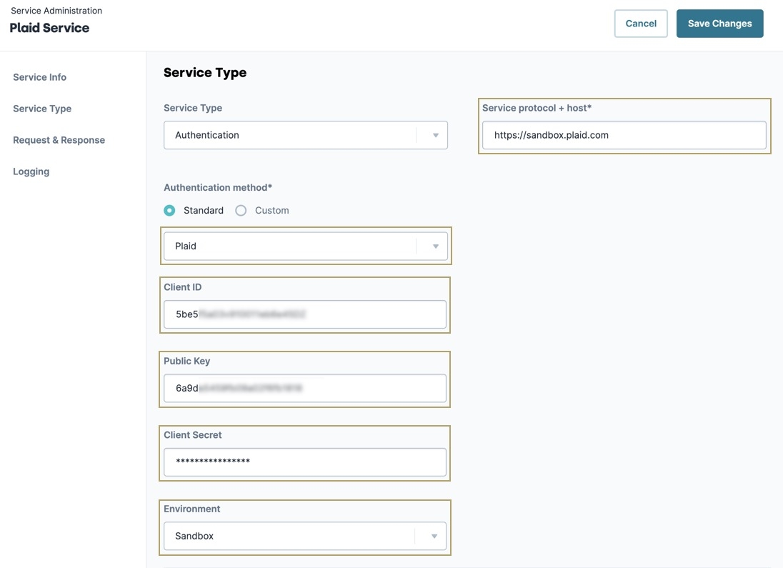
Edit.In the Service protocol + host field, enter your Plaid API Host address. For example,
https://sandbox.plaid.com.To learn more about Plaid's environments, visit their documentation: https://plaid.com/docs/api/#api-access.
From the Authentication Method* drop-down, select Plaid.
In the Client ID field, enter your API's client ID.
In the Public Key field, enter your API's public key.
In the Client Secret, enter your client secret key.
The secret key is a confidential value. Do not share this key with unauthorized users.
From the Environment drop-down, select the environment that matches the Service protocol + host* field.
Click Save Changes.
Configuration
Configuring the Plaid Component
Let's return to the Module Builder and learn how the Plaid component works. Remember, this use case only shows you how the component works. If you configure a Plaid component in a Production application, ensure all Plug-In components execute server-side.
These instructions assume that you have an open module saved with a title.
In the Module Builder, drag and drop a Plaid component onto your canvas.
In the Property ID field, enter plaidAccounts.
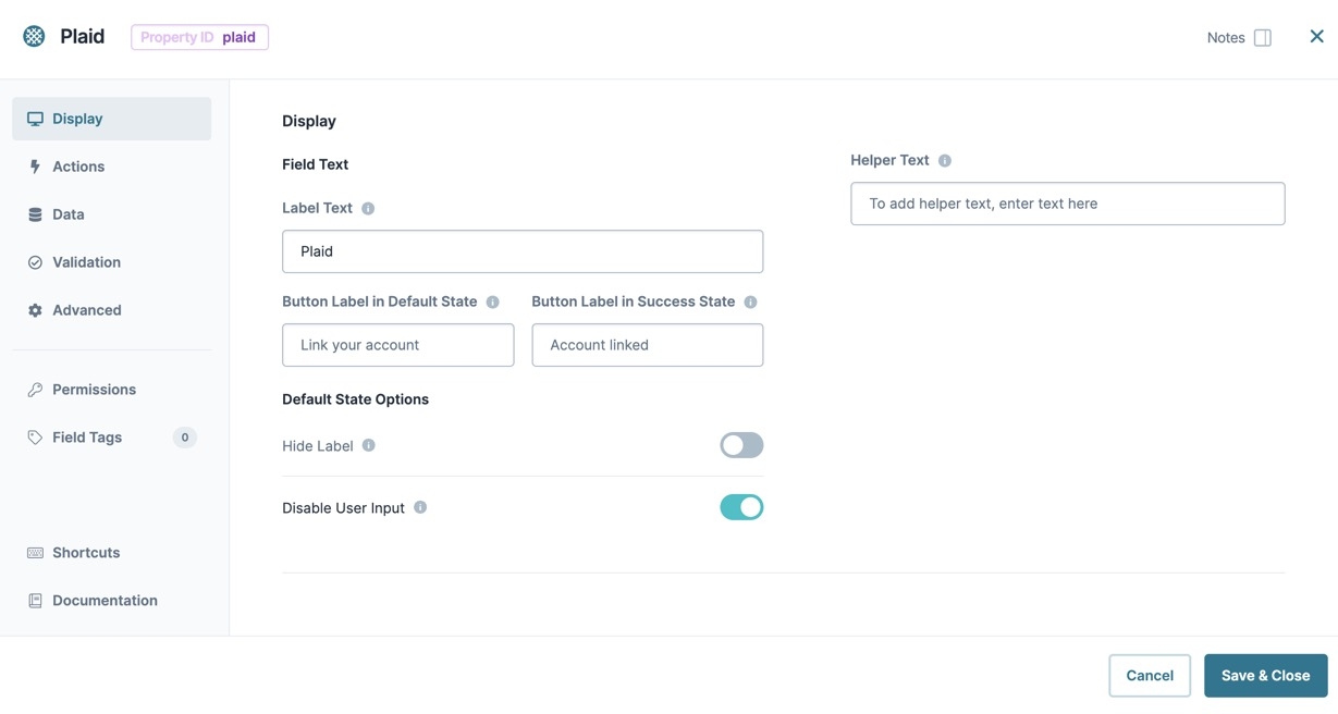
In the Label Text, enter
Link Your Account.Navigate to the component's Data settings.
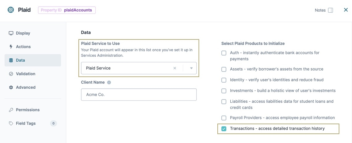
From the Plaid Service to Use drop-down, select the service created in the Setting up the Plaid Service section.
From the Select Plaid Products to Use list, select Transactions.
Click Save Component.
Configuring the Field Group Component
Configure a Field Group component to store all components related to extracting the Plaid data.
Drag and drop a Field Group component onto your canvas, placing it below the plaidAccounts Plaid component.
In the Property ID, enter fgPlaid.
Click Save Component.
Configuring the First Data Workflow Component
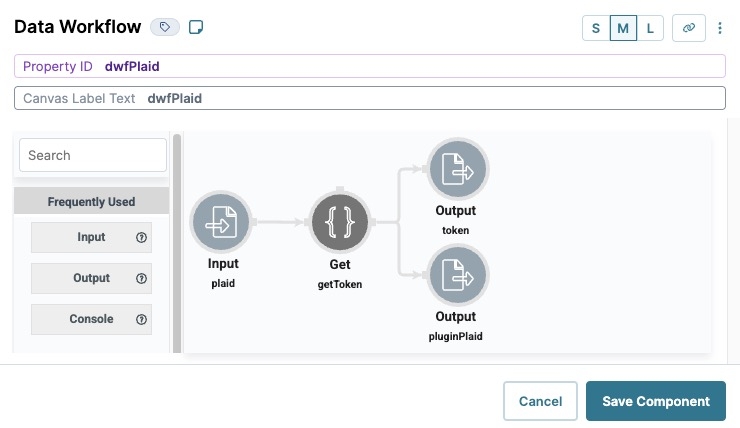
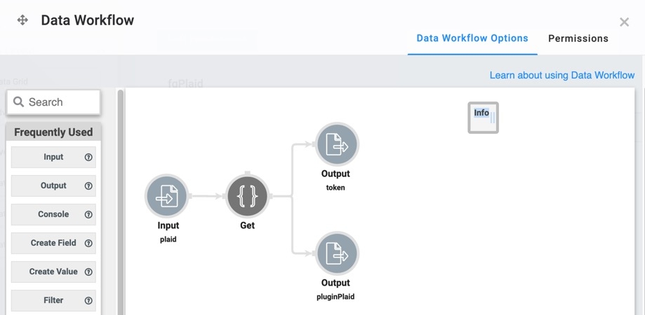
This Data Workflow component retrieves the Plaid token and sends it to a Hidden component. At the same time, it triggers a Plug-In component.
You'll configure the Hidden and Plug-In components in a later step.
Drag and drop a Data Workflow component onto your canvas, placing it inside the fgPlaid Field Group component.
In the Property ID field, enter dwfPlaid.
In the Canvas Label Text field, enter dwfPlaid.
Configure the Input Operator
This Input operator connects your Data Workflow to your data source. Your data source in this example is your Plaid component.
Drag and drop an Input operator onto your Data Workflow canvas.
Configure the Input operator's Info window as follows:
Info
category
Input
Component
plaid
required
Yes
source
Default
Configure the Get Operator
This Get operator retrieves the data from your Plaid component.
Drag and drop a Get operator onto your Data Workflow canvas.
Configure the Get operator's Info window as follows:
Info
category
Get
label
getToken
Preserve Argument Type
☐ (unchecked)
Path
accessToken
The Path value of accessToken represents the Plaid token data acquired from the Plaid component.
Connect the output port (right) of the plaid Input operator to the input port (left) of the getToken Get operator.
Configure the First Output Operator
Your first Output operator outputs the Plaid token to the token Hidden component.
Drag and drop an Output operator onto your Data Workflow canvas.
Configure the Output operator's Info window as follows:
Info
category
Output
Component
token
action
value
Connect the output port (right) of the getToken Get operator to the input port (left) of the token Output operator.
Configure the Second Output Operator
Your second Output operator triggers a Plug-In component.
Drag and drop an Output operator onto your Data Workflow canvas.
Configure the Output operator's Info window as follows:
Info
category
Output
Component
pluginPlaid
action
Trigger
Connect the output port (right) of the Get operator to the input port (left) of the pluginPlaid Output operator.
Click Save Component.
Configuring the Hidden Components
In the first Hidden component, you'll store the access token data. In the second, you'll store the end-user's account information.
Drag and drop a Hidden component inside the fgPlaid Field Group component, placing it below the dwfPlaid Data Workflow component.
In the Property ID field, enter token.
In the Label Text field, enter
token.Click Save Component.
Drag and drop another Hidden component inside the fgPlaid Field Group component, placing it below the tokenHidden component.
In the Property ID field, enter authHolder.
In the Label Text field, enter
authHolder.Click Save Component.
Configuring the Plug-In Component
Next, you'll configure a Plug-In component that is triggered by the Data Workflow, and makes an external API call to your Plaid service.
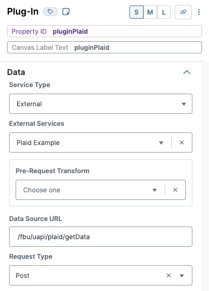
Drag and drop a Plug-In component inside the fgPlaid Field Group component, placing it below the authHolderHidden component.
In the Property ID field, enter pluginPlaid.
In the Canvas Label Text field, enter pluginPlaid.
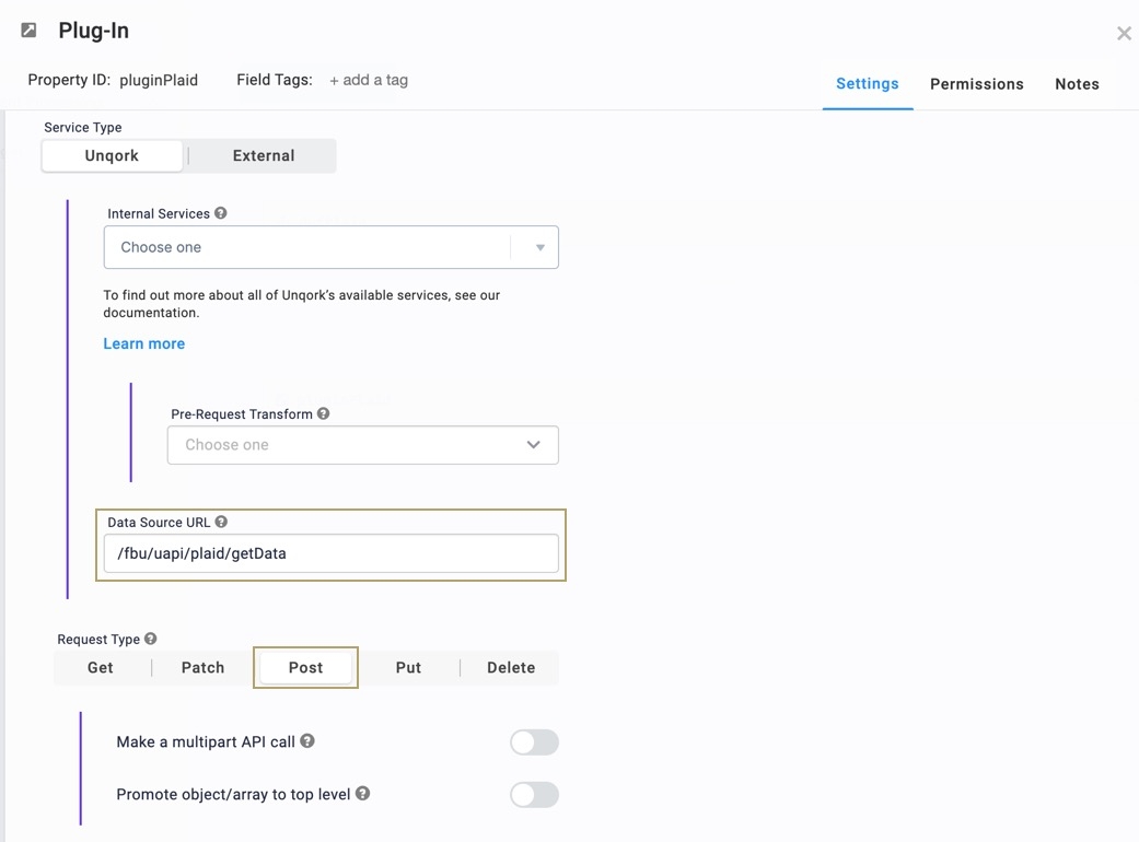
From the Service Type drop-down, select External.
From the External Services drop-down, enter or select your Plaid service.
In the Data Source URL, enter
/fbu/uapi/plaid/getData.From the Request Type drop-down, enter or select Post.
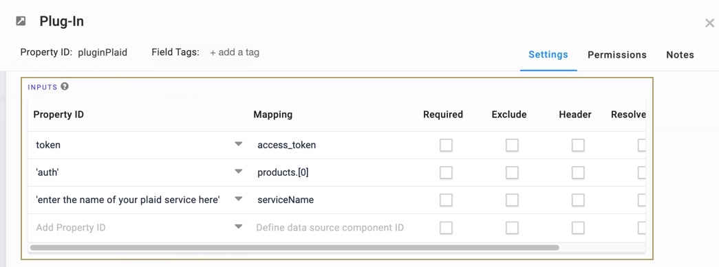
In the Inputs table, enter the following:
Property ID
Mapping
1
token
access_token
2
'auth'
products.[0]
3
'enter the name of your Plaid service here'
serviceName
Click Save Component.
Configuring the Data Table Component
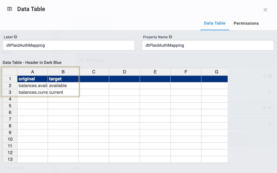
The Data Workflow uses this Data Table component to simplify the names of some of Plaid's native values.
Drag and drop a Data Table component inside the fgPlaid Field Group component, placing ti below the pluginPlaid Plug-In component.
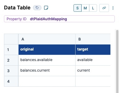
In the Property ID field, enter dtPlaidAuthMapping.
In the data table, enter the following:
A
B
1
original
target
2
balances.available
available
3
balances.current
current
Click Save Component.
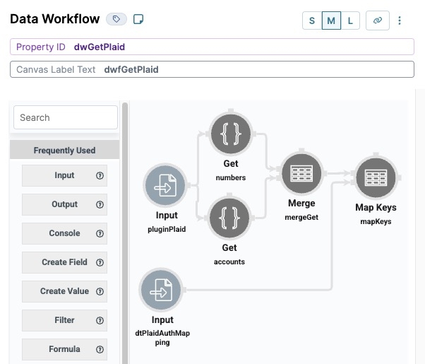
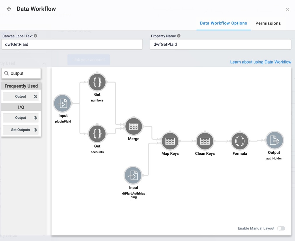
Configure the Second Data Workflow Component
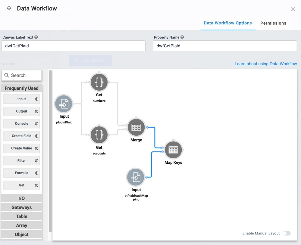
This Data Workflow component retrieves the Plaid token while triggering the pluginPlaidPlug-In component.
Drag and drop a Data Workflow component inside the fgPlaid Field Group component, placing it below the dtPlaidAuthMapping
.png) Data Table component.
Data Table component.In the Property ID field, enter dwfGetPlaid.
In the Canvas Label Text field, enter dwfGetPlaid.
Configure the First Input Operator
This Input operator connects your Data Workflow to your Plaid component.
Drag and drop an Input operator onto your Data Workflow canvas.
Configure the Input operator's Info window as follows:
Info
category
Input
Component
pluginPlaid
required
Yes
source
Default
Configure the First Get Operator
This Get operator retrieves specific data from your Plaid component.
Drag and drop a Get operator onto your Data Workflow canvas.
Configure the Get operator's Info window as follows:
Info
category
Get
label
numbers
Preserve Argument Type
☐ (unchecked)
Path
[0].auth.numbers.ach
Connect the output port (right) of the pluginPlaid Input operator to the input port (left) of the numbers Get operator.
Configure the Second Get Operator
This Get operator retrieves another set of data from your Plaid component.
Drag and drop a Get operator onto your Data Workflow canvas.
Configure the Get operator's Info window as follows:
Info
category
Get
label
accounts
Preserve Argument Type
☐ (unchecked)
Path
[0].auth.accounts
Connect the output port (right) of the pluginPlaid Input operator to the input (left) of the accounts Get operator.
Configure the Merge Operator
The Merge operator merges data from the Get operators.
Drag and drop a Merge operator onto your Data Workflow canvas.
Configure the Merge operator's Info window as follows:
Info
category
Merge
label
mergeGet
Preserve Argument Type
☐ (unchecked)
Merge Type
Inner
Keep Flag
False
Renaming
Rename
Rows to Keep
First
Merge Key
account_id
Connect the output port (right) of the numbers Get operator to the top input port (left) of the mergeGet Merge operator.
Connect the output port (right) of the accounts Get operator to the bottom input port (left) of the mergeGet Merge operator.
Configure the Second Input Operator
Configure another Input operator to retrieve data from your Data Table component.
Drag and drop another Input operator onto your Data Workflow canvas.
Configure the Input operator's Info window as follows:
Info
category
Input
Component
dtPlaidAuthMapping
required
No
source
Default
Configure the Map Keys Operator
The Map Keys operator references values from the Data Table component, making the data easier to read.
Drag and drop a Map Keys operator onto your Data Workflow canvas.
Configure the Map Keys operator's Info window as follows:
Info
category
Map Keys
Component
mapKeys
Preserve Argument Type
☐ (unchecked)
Source Column
original
Target Column
target
Connect the output port (right) of the mergeGet Merge operator to the top input port (left) of the mapKeys Map Keys operator
Connect the output port (right) of the dtPlaidAuthMapping Input operator to the bottom input port (left) of the mapKeys Map Keys operator.
Configure the Clean Keys Operator
Configure a Clean Keys operator to omit data with empty or missing values.
Drag and drop a Clean Keys operator onto your Data Workflow canvas.
Configure the Clean Keys operator's Info window as follows:
Info
category
Clean Keys
label
cleanKey
Preserve Argument Type
☐ (unchecked)
Fill if
Missing or Empty
Keys
available
Fill with
unavailable
Connect the output port (right) of the mapKeys Map Keys operator to the input port (left) of the cleanKey Clean Keys operator.
Configure the Formula Operator
This Formula operator manipulates the data so all text has the correct capitalization.
Drag and drop a Formula operator onto your Data Workflow canvas.
Configure the Formula operator's Info window as follows:
Info
category
Formula Value
label
formula
Preserve Argument Type
☐ (unchecked)
Formula/Expression
subtype = PROPER(subtype)
Connect the output port (right) of the cleanKey Clean Keys operator to the input port (left) of the formula Formula operator.
Configure the Output Operator
Your Output operator outputs the cleaned Plaid data to the authHolder Hidden component.
Drag and drop an Output operator onto your Data Workflow canvas.
Configure the Output operator's Info window as follows:
Info
category
Output
Component
authHolder
action
value
Connect the output port (right) of the formula Formula operator to the input port (left) of the authHolder Output operator.
Click Save Component.
Configure the ViewGrid Component
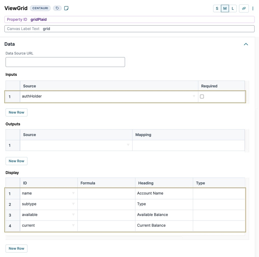
This ViewGrid component creates a dashboard to display account information. Once your end-user connects their account, the ViewGrid component displays their account information.
Drag and drop a
.png) ViewGrid component onto the canvas, placing it below the fgPlaid Field Group component.
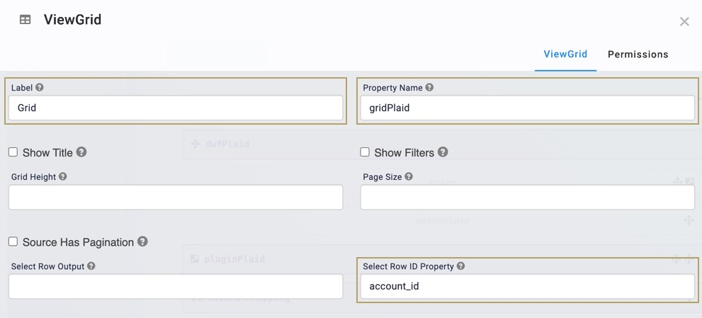
ViewGrid component onto the canvas, placing it below the fgPlaid Field Group component.In the Property ID field, enter gridPlaid.
In the Canvas Label Text field, enter grid.
Navigate to the component's Data settings.
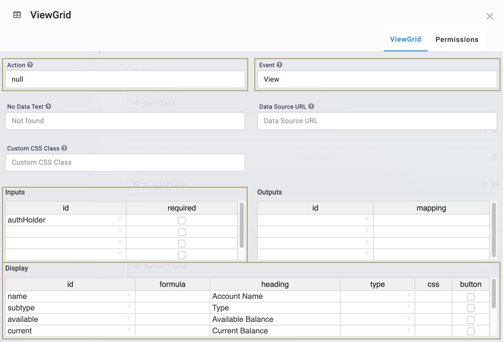
In the Inputs table, enter the following:
Source
Required
1
authHolder
☐ (unchecked)
In the Display table, enter the following:
id
formula
heading
1
name
Account Name
2
subtype
Type
3
available
Available Balance
4
current
Current Balance
Navigate to the component's Actions settings.
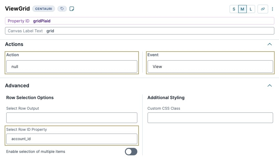
In the Action field, enter
null.In the Event field, enter
View.Navigate to the component's Advanced settings.
In the Select Row ID Property, enter
account_id.Click Save Component.
Save your module.
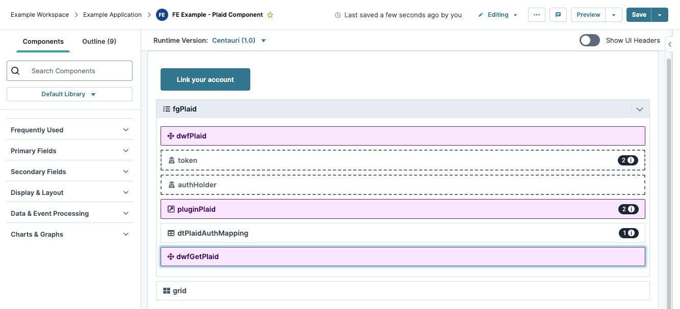
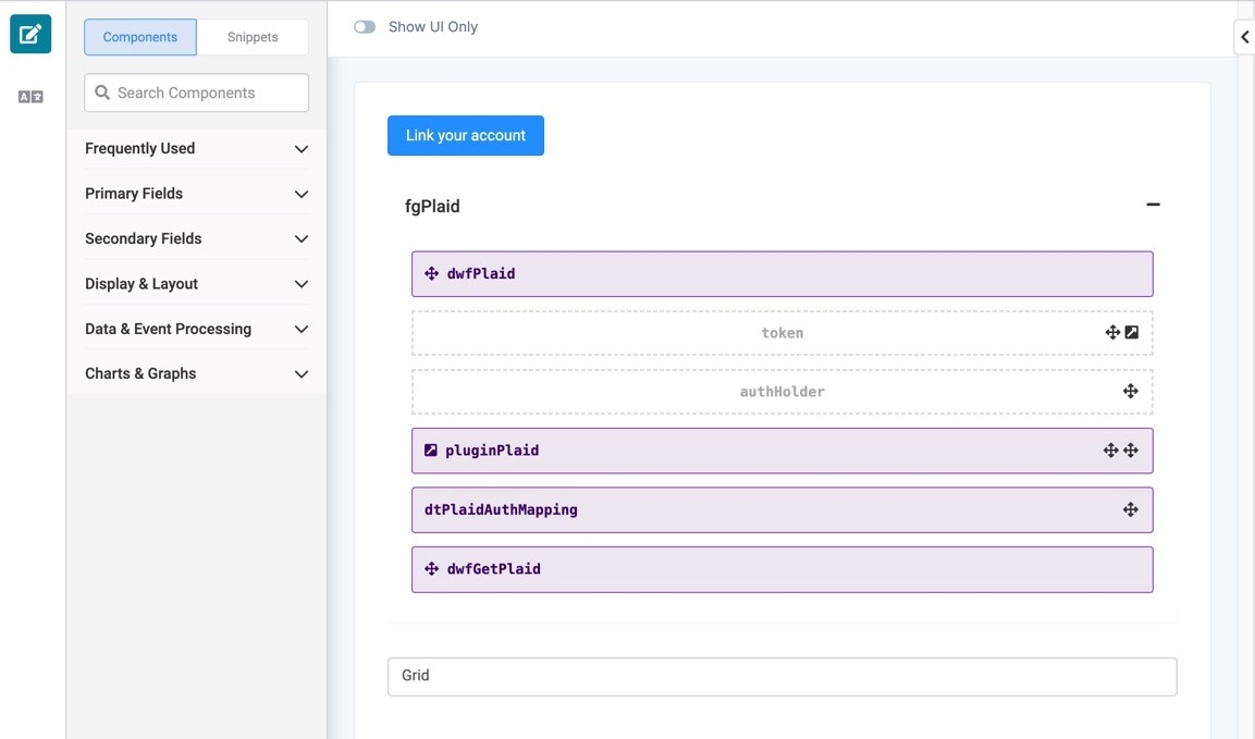
The Module Builder canvas looks like the following when complete:
On completion, you can log into your bank account and view your balances as shown below:
The Plaid component is a Centauri (v1.0) component that connects to the Plaid service, lettings Creators securely connect applications to financial accounts. In Express View, the Plaid component displays as a button end-users click to securely log into their financial account. Once clicked, Unqork applications access relevant and verified financial information. Because financial services have strict login requirements, the Plaid component can also verify an end-user's identity.
It's important to note that Plaid is just a data provider, and it doesn't perform financial transactions. To perform actual banking transactions, integration with Stripe is required.
The Account Linked button below displays a configured Plaid component in Express View:
Your Plaid service can include any of the following Plaid products:
Authentication
Assets
Identity
Income
Investments
Liabilities
Transactions
You'll find the Plaid component in the Data & Event Processing group to the left of the Module Builder.
About the Configuration Window
To learn more about general component settings, view our General Component Settings article.
Display Panel
Field Text
Setting | Description |
|---|---|
Label Text | Label Text conveys what the input component is and what information it displays. Enter the purpose of the corresponding component or field. User-friendly labels make your module more accessible. Keep labels short and descriptive (a word or two) using title case. For longer entries, use sentence case. |
Setting | Description |
|---|---|
Helper Text | A quick tip describing the expected value of an input field. Unlike a Tooltip, Helper Text stays visible under the input field and displays on a single line. |
Default State Options
Setting | Description |
|---|---|
Hide Label | Setting Hide Label to By default, this setting is set to |
Disable User Input | When set to By default, Disable User Input is set to |
Actions Panel
Triggers
Setting | Description |
|---|---|
Success | Enter the Property ID of the component you'll trigger after your end-user successfully connects their account. |
Error Trigger | Enter the Property ID of the component you'd like to trigger if the account connection fails. |
Data Panel
Data
Setting | Description |
|---|---|
Plaid Service to Use | Displays Plaid services configured in the Services Administration tab. Use the drop-down to select which service you want to call. |
Client Name | Enter the name of the company accessing the end-user's account. |
Select Plaid Products to Initialize | Depending on the specifications of the Plaid service, various Plaid products are available. You can check any combination of products. If you select a product not included in your service, you cannot access that product's data. Available Plaid products include:
|
Validation Panel
User Input
Setting | Description |
|---|---|
Account Linking Error Message | Enter a custom error message to display when Plaid cannot link to an end-user's account. |
Advanced Panel
Additional Styling
Setting | Description |
|---|---|
Custom CSS Class | Enter a Custom CSS Class to apply to your component. Custom CSS lets you maintain a consistent look and feel when the field or element is part of a template or multiple modules. Updated CSS styling applies to all components that reference this custom class name. |
Adding the Plaid Component
In this example, you'll build a module that uses a Plaid component to link an end-user's bank account. Once linked, a simple dashboard displays some basic account information.
If you configure a Plaid component in a live application, ensure all Plug-In components execute server-side. For more information on server-side execution, view our Server-Side Module Execution article.
Preconfiguration
Before configuring the Plaid component, you need to set up the Plaid service in your environment. If a Plaid service is already set up in your environment, you can skip this section.
Setting up a Plaid service creates a back-end endpoint for your Plaid component and adds a layer of security. The API call occurs in an Unqork server and not your browser.
To connect to Plaid, you'll need a developer account and a set of Plaid API keys. To learn more, see Plaid's Quickstart article: https://plaid.com/docs/quickstart/
Before setting up Plaid, ensure you have a Plaid administrator and that you've set up an API account with Plaid. As a best practice, every client should have one Plaid account and each module should have a minimum of one Plaid component. To set up Plaid in your environment, do the following:
From the top-right of the Unqork Designer Platform, click Settings ▾.
Click Administration.
Under Integration, select Services Administration.
Click + Add a Service. The Create New Service modal displays.
Enter your service name in the Services Title and Service Name.
Click Create. The service info page for the new service displays.
Click
 Edit.
Edit.In the Service protocol + host* field, enter your Plaid API Host address. For example,
https://sandbox.plaid.com.To learn more about Plaid's environments, visit their help documentation: https://plaid.com/docs/api/#api-access.
From the Authentication Method* drop-down, select Plaid.
In the Client ID field, enter your API's client ID.
In the Public Key field, enter your API's public key.
In the Client Secret, enter your client secret key.
The secret key is a confidential value. Do not share this key with unauthorized users.
From the Environment drop-down, select the environment that matches the Service protocol + host* field.
Click Save Changes.
Configuration
Configuring the Plaid Component
Now let's head back to the Module Builder so you can see how the Plaid component works. Remember, this use case only shows you how the component works. If you configure a Plaid component in a live application, ensure all Plug-In components execute server-side.
These instructions assume that you have an open module saved with a title.
In the Module Builder, drag and drop a Plaid component onto your canvas.
In the Property ID field, enter plaidAccounts.
In the Label Text, enter
Link Your Account.From the Plaid component configuration panel, select Data.
From the Plaid Service to Use drop-down, select the service created in the Setting up the Plaid Service section.
From the Select Plaid Products to Use list, select Transactions.
Click Save & Close.
Configuring the Field Group Component
In this Field Group, you'll store all components related to extracting the Plaid data.
Drag and drop a Field Group component onto your canvas, placing it below the plaidAccounts Plaid component.
In the Property ID, enter fgPlaid.
Click Save & Close.
Configuring the First Data Workflow Component
This Data Workflow will get the Plaid token and push it to a Hidden component. At the same time, it triggers a Plug-In component.
Drag and drop a Data Workflow component onto your canvas, placing it inside the fgPlaid Field Group.
In the Canvas Label Text and Property Name fields, enter
dwfPlaid.
Configure the Input Operator
This Input operator connects your Data Workflow to your data source. Your data source in this use case is your Plaid component.
Drag and drop an Input operator onto your Data Workflow canvas.
Configure the Input operator's Info window as follows:
Setting
Value
Component
plaid
Required
Yes
Source
Default
Configure the Get Operator
This Get operator retrieves the data from your data source. Remember, your data source is your Plaid component.
Drag and drop a Get operator onto your Data Workflow canvas.
Configure the Get operator's Info window as follows:
Setting
Value
Label
getToken
Path
accessToken
The Path value of accessToken represents the Plaid token data acquired from the Plaid component.
Connect the output port (right) of the plaid Input operator to the input port (left) of the getToken Get operator.
Configure the First Output Operator
Your first Output operator outputs the Plaid token to the token Hidden component.
Drag and drop an Output operator onto your Data Workflow canvas.
Configure the Output operator's Info window as follows:
Setting
Value
Component
token
Action
Value
Connect the output port (right) of the getToken Get operator to the input port (left) of the token Output operator.
Configure the Second Output Operator
Your second Output operator triggers a Plug-In component.
Drag and drop an Output operator onto your Data Workflow canvas.
Configure the Output operator's Info window as follows:
Setting
Value
Component
pluginPlaid
Action
Trigger
Connect the output port (right) of the Get operator to the input port (left) of the pluginPlaid Output operator.
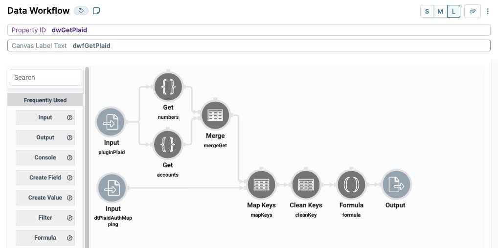
The dwfPlaidData Workflow looks like the following:
Click Save.
Configuring the Hidden Components
In the first Hidden component, you'll store the access token data. In the second, you'll store the end-user's account information.
Drag and drop a Hidden component onto your canvas, placing it inside the fgPlaid Field Group component.
In the Property ID field, enter token.
In the Canvas Label Text field, enter
token.Click Save & Close.
Drag and drop a Hidden component onto your canvas, placing it inside the fgPlaid Field Group component, below the tokenHidden component.
In the Property ID field, enter authHolder.
In the Canvas Label Text field, enter
authHolder.Click Save & Close.
Configuring the Plug-In Component
Drag and drop a Plug-In component onto your canvas, placing it inside the fgPlaid Field Group component.
In the Property ID and Canvas Label Text fields, enter
pluginPlaid.In the Data Source URL, enter
/fbu/uapi/plaid/getData.From the Request Type, select Post.
In the Inputs table, enter the following:
Property ID
Mapping
token
access_token
'auth'
products.[0]
'enter the name of your Plaid service here'
serviceName
Click Save.
Configuring the Data Table Component
The Data Workflow uses this Data Table to simplify the names of some of Plaid's native values.
Drag and drop a Data Table component onto your canvas, placing it below the pluginPlaid Plug-In component.
In the Label and Property Name fields, enter
dtPlaidAuthMapping.In the data table, enter the following:
A
B
1
original
target
2
balances.available
available
3
balances.current
current
Click Save.
Configure the Second Data Workflow Component
This Data Workflow will get the Plaid token while triggering the pluginPlaid Plug-In component.
Drag and drop a Data Workflow component onto your canvas, placing it below the dtPlaidAuthMapping
.png) Data Table component.
Data Table component.In the Canvas Label Text and Property Name fields, enter
dwfGetPlaid.
Configure the First Input Operator
This Input operator connects your Data Workflow to your data source. Your data source in this use case is your Plaid component.
Drag and drop an Input operator onto your Data Workflow canvas.
Configure the Input operator's Info window as follows:
Setting
Value
Component
pluginPlaid
Required
Yes
Source
Default
Configure the First Get Operator
This Get operator retrieves the data from your data source. Again, remember, this is your Plaid component.
Drag and drop a Get operator onto your Data Workflow canvas.
Configure the Get operator's Info window as follows:
Setting
Value
Label
numbers
Path
[0].auth.numbers.ach
Connect the output port (right) of the pluginPlaid Input operator to the input port (left) of the numbers Get operator.
Configure the Second Get Operator
This Get operator retrieves the data from your data source.
Drag and drop a Get operator onto your Data Workflow canvas.
Configure the Get operator's Info window as follows:
Setting
Value
Label
accounts
Path
[0].auth.accounts
Connect the output port (right) of the pluginPlaid Input operator to the input (left) of the accounts Get operator.
Configure the Merge Operator
The Merge operator merges data from the Get operators.
Drag and drop a Merge operator onto your Data Workflow canvas.
Configure the Merge operator's Info window as follows:
Setting
Value
Label
mergeGet
Merge Type
Inner
Keep Flag
False
Renaming
Rename
Rows to Keep
First
Merge Key
account_id
Connect the output port (right) of the numbers Get operator to the top input port (left) of the mergeGet Merge operator.
Connect the output port (right) of the accounts Get operator to the bottom input port (left) of the mergeGet Merge operator.
Configure the Second Input Operator
Drag and drop another Input operator onto your Data Workflow canvas.
Configure the Input operator's Info window as follows:
Setting
Value
Component
dtPlaidAuthMapping
Required
No
Source
Default
Configure the Map Keys Operator
The Map Keys operator references values from the Data Table, making the data easier to read.
Drag and drop a Map Keys operator onto your Data Workflow canvas.
Configure the Map Keys operator's Info window as follows:
Setting
Value
Label
mapKeys
Source Column
original
Target Column
target
Connect the output port (right) of the mergeGet Merge operator to the top input port (left) of themapKeys Map Keys operator
Connect the output port (right) of thedtPlaidAuthMapping Input operator to the bottom input port (left) of themapKeys Map Keys operator.
Configure the Clean Keys Operator
Drag and drop a Clean Keys operator onto your Data Workflow canvas.
Configure the Clean Keys operator's Info window as follows:
Setting
Value
Label
cleanKey
Fill if
Missing or Empty
Keys
available
Fill with
unavailable
Connect the output port (right) of the mapKeys Map Keys operator to the input port (left) of the cleanKey Clean Keys operator.
Configure the Formula Operator
Drag and drop a Formula operator onto your Data Workflow canvas.
Configure the Formula operator's Info window as follows:
Setting
Value
Label
formula
Formula/Expression
subtype = PROPER(subtype)
Connect the output port (right) of the cleanKey Clean Keys operator to the input port (left) of the formula Formula operator.
Configure the Output Operator
Your Output operator outputs the cleaned-up Plaid data to the authHolder Hidden component.
Drag and drop an Output operator onto your Data Workflow canvas.
Configure the Output operator's Info window as follows:
Setting
Value
Component
authHolder
Action
value
Connect the output port (right) of the formula Formula operator to the input port (left) of the authHolder Output operator.
Your dwfGetPlaid Data Workflow component looks like the following:Click Save.
Configure the ViewGrid Component
This ViewGrid component uses a table to display account information. Once your end-user connects their account, the ViewGrid displays their account information.
Drag and drop a ViewGrid component onto the canvas, placing it below the fgPlaid Field Group.
In the Label field, enter
grid.In the Property Name, enter gridPlaid.
In the Select Row ID Property, enter
account_id.In the Action field, enter
null.In the Event field, enter
View.In the Inputs table, enter the following:
id
required
authHolder
In the Display table, enter the following:
id
formula
heading
name
Account Name
subtype
Type
available
Available Balance
current
Current Balance
Click Save.
Save your module.
The Module Builder canvas looks like the following when complete:
On completion, you can log in to your bank account and see your balances as shown below:

