Overview
The Search Select component is a Primary Fields component that lets end-users search for, or select, one or more options from a drop-down list. Unlike the Simple Select component, end-users can enter a value into the field and the drop-down list filters options to match that value. End-users then use the arrow keys or their mouse to select an option from the filtered list.
By default, the Search Select component remains collapsed until the end-user clicks it. After making a selection, the list closes again.
You'll find the Search Select component in the Primary Fields group to the left of the Module Builder.
About the Configuration Window
To learn more about general component settings and those that display when a component is associated with Data Models, view our General Component Settings article.
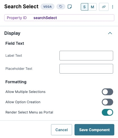
Display
Field Text
Setting | Description |
|---|---|
Label Text | Label Text conveys what the input component is and what information it displays. Enter the purpose of the corresponding component or field. User-friendly labels make your module more accessible. Keep labels short and descriptive (a word or two) using title case. For longer entries, use sentence case. |
Placeholder Text | A short prompt telling end-users the expected value of an input field. For example, |
Formatting
Setting | Description |
|---|---|
Allow Multiple Selections | When set to |
Allow Option Creation | When set to
Consider the following limitations:
|
Render Select Menu as Portal | When set to By default this setting is |
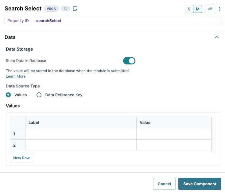
Data
Store Data in Database
Setting | Description |
|---|---|
Store Data in Database | The Store Data in Database setting affects how data persists through your application. When set to
Set the toggle to
|
Data Source Type
Values
Selecting Values displays a table where you can enter each option and its value.
Setting | Description |
|---|---|
Label | Enter the text that displays to the end-user. When an end-user clicks the text, the Action setting fires. |
Value | Create a key value for targeting the option. For example, if you have three options in your menu, you could assign the following keys: |
Adding a Search Select Component
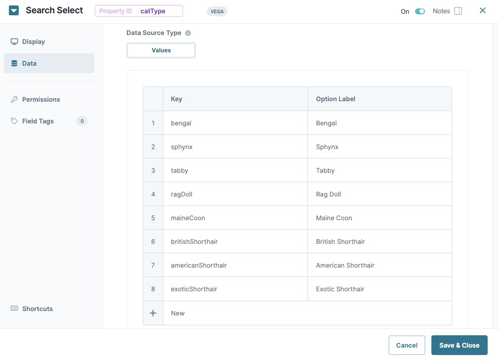
You'll configure a Search Select component to collect an end-user's cat type preference. You'll configure eight options for end-users to select.
These instructions assume that you have an open module saved with a title.
In the Module Builder, drag and drop a Search Select component onto the canvas.
In the Property ID field, enter catType.
In the Label Text field, enter
What is your favorite cat breed?.In the component's configuration menu, click Data.
In the Values table, enter the following:
Key
Option Label
1
bengal
Bengal
2
sphynx
Sphynx
3
tabby
Tabby
4
maineCoon
Maine Coon
5
ragDoll
Rag Doll
6
britishShorthair
British Shorthair
7
americanShorthair
American Shorthair
8
exoticShorthair
Exotic Shorthair
Click Save & Close.
Save your module.
Your Search Select component looks like the following in Express View:
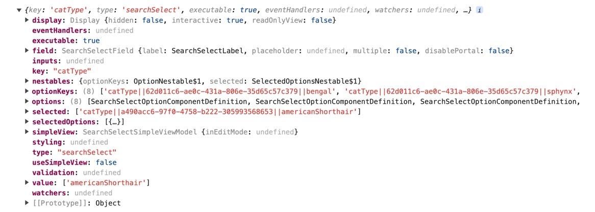
Structure of a Search Select Component's Data
Using the above example, execute the Vega Console command UNQENG.tools.getComponentState('catType') in the DevTools Console to display the component's data structure.
Here's how the above example looks after selecting an option in Express View:
Here's how the same component looks in the DevTools Console:
Overview
The Search Select component is a Primary Fields component that lets end-users search for, or select, one or more options from a drop-down list. Unlike the Simple Select component, end-users can enter a value into the field and the drop-down list filters options to match that value. End-users then use the arrow keys or their mouse to select an option from the filtered list.
By default, the Search Select component remains collapsed until the end-user clicks it. After making a selection, the list closes again.
You'll find the Search Select component in the Primary Fields group to the left of the Module Builder.
About the Configuration Window
To learn more about general component settings and those that display when a component is associated with Data Models, view our General Component Settings article.
Display Panel
.jpg)
Field Text
Formatting
Data Panel
.jpg)
Data Source Type
Values
Selecting Values displays a table where you can enter each option and its value.
Data Storage
Adding a Search Select Component
You'll configure a Search Select component to collect an end-user's cat type preference. You'll configure eight options for end-users to select.
These instructions assume that you have an open module saved with a title.
In the Module Builder, drag and drop a Search Select component onto the canvas.
In the Property ID field, enter catType.
In the Label Text field, enter
What is your favorite cat breed?.In the component's configuration menu, click Data.
In the Values table, enter the following:
Key
Option Label
1
bengal
Bengal
2
sphynx
Sphynx
3
tabby
Tabby
4
maineCoon
Maine Coon
5
ragDoll
Rag Doll
6
britishShorthair
British Shorthair
7
americanShorthair
American Shorthair
8
exoticShorthair
Exotic Shorthair
Click Save & Close.
Save your module.
Your Search Select component looks like the following in Express View:
Structure of a Search Select Component's Data
Using the above example, execute the Vega Console command UNQENG.tools.getComponentState('catType') in the DevTools Console to display the component's data structure.
Here's how the above example looks after selecting an option in Express View:
Here's how the same component looks in the DevTools Console:


