The Vega Chart component is a (Vega 2.0) component that creates a graphical display of data sets in an application. In the Module Builder, Creators configure the Vega Chart component using one or more chart types and data sets. In Express View, the Vega Chart lets end-users visualize the data sets in a meaningful and intuitive way.
The Vega Chart component is a Vega (2.0) runtime component and is not supported in the Centauri (1.0) runtime.
Below are some common examples of when to use the Vega Chart component:
To display a scatter plot to track the number of sales for each agent in your department.
To display a pie chart to show the percentages of end-user submission.
To display a bar graph that shows product consumption by demographic.
About the Configuration Window
To learn more about general component settings, view our General Component Settings article.
Display
Setting | Description |
|---|---|
Input Behavior | Controls how end-users interact with the component. Choose from the following options:Enable User Input: Allow end-users to view and enter data in this field.Disable User Input: Prevents end-users from entering data in the field, but lets them view it. In the Module Builder, the field’s background displays as gray. In Express View, when end-users hover over the field, their cursor displays with a prohibited symbol.Read Only - Legacy: Prevents end-users from entering data and replaces the field with the component’s data value. If no value is provided, the component displays None. |
Title | Displays as a header above the chart in Express View. |
Subtitle | Enter a value to display as a sub-header below the Title value in Express View. |
Accessible Label | Screen readers read this value to end-users in Express View. This value corresponds to the aria-label in the DOM. |
X Axis Title | Displays next to the chart's horizontal axis. In Express View, this value displays below the chart's graphics. |
Y Axis Title | Displays next to the chart's vertical axis. In Express View, this value displays to the left the chart's graphics. |
Hidden | Set to By default, this setting is |
Hide Legend | Set to |
Vertical Alignment | Select the vertical alignment location for the legend element. Values include:
|
Alignment | Select the horizontal alignment for the legend element. Values include:
|
Series
The Series table lets you overlay multiple data sets onto a single graph. Each row in the table represents a single data set.
Setting | Description |
|---|---|
ID | Enter a reference ID to target the row's chart data. |
Type | This field lets you set the chart type to display your data. Below are the available chart types:
|
Label | This value represents the data set's title in the legend. For example, if your graph displays a count of numbers, enter |
Reference Key | Enter the Property ID of the data source. An example data source could be a Data Table component containing the x and y values. |
Reference Property | Enter the component state property value to reference. |
X Property | Enter the x-property column value contained in the Reference Key. For example, if your Data Table component has a column labeled x that represents x-axis data, then enter x. |
Y Property | Enter the y-property column value contained in the Reference Key. For example, if your Data Table component has a column labeled y that represents y-axis data, then enter y. |
Color | Manipulates the color of an input category if the input data array contains colors. Your color data can be in word or HEX form. For example, this text is colored using the following hex: #fb7e14. |
Stack Group | Stack or separate data sets based on chart type. For example, if two data sets use the Bar chart type, labeling data set one as A and data set two as B displays each data set as a bar in the graph. Labeling data set one and two as A stacks the bars in the graph. |
Adding a Vega Chart Component
While the Vega Chart component provides thousands of possible data set combinations and displays, the example below details a pet availability chart for a pet store. You'll create two data tables, one for available pets, and the other for pets that have been reserved. Then, you'll use a Vega Chart component to visualize the data.
Configure the dtAvailablePets Data Table Component
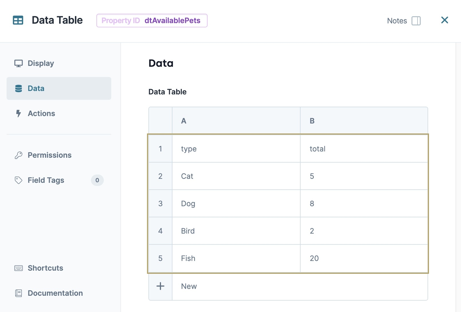
The first Data Table component contains a list of pet types and the total available pets for each type.
In the Module Builder, drag and drop a Data Table component onto your canvas.
In the Property ID and field, enter dtAvailablePets.
In the Data Table, enter the following:
A
B
1
type
total
2
Cat
5
3
Dog
8
4
Bird
2
5
Fish
20
In a Data Table component, the first row acts as headers for the data set.
Click Save Component.
Configure the dtReservedPets Data Table Component
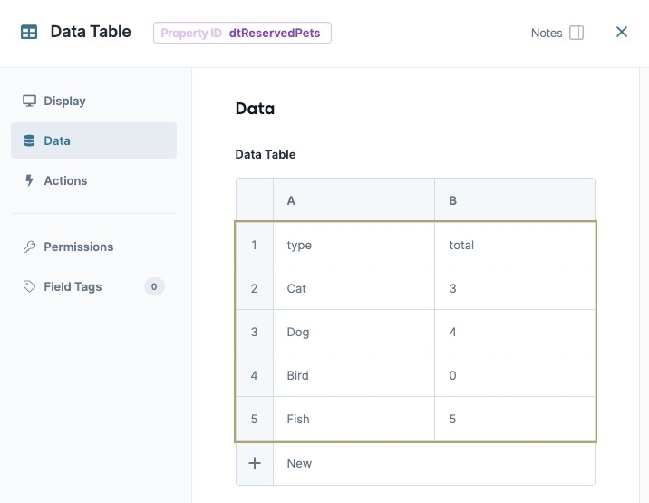
The second Data Table component contains the total reserved pets for each pet type.
Drag and drop a Data Table component onto your canvas, placing it below the dtAvailablePets Data Table component.
In the Property ID field, enter dtReservedPets.
In the Data Table, enter the following:
A
B
1
type
total
2
Cat
3
3
Dog
4
4
Bird
0
5
Fish
5
Click Save Component.
Configure the Vega Chart Component
Configure a Vega Chart to display the dtAvailablePets and dtReservedPets data. Add labels to describe each axis, and stack the data sets on top of each other using the Stack Group column.
Drag and drop a Vega Chart component onto the canvas, placing it above the dtAvailablePets
.png) Data Table component.
Data Table component.In the Property ID field, enter displayChart.
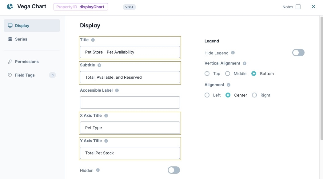
In the Title field, enter
Pet Store - Pet Availability.In the Subtitle field, enter
Total, Available, and Reserved.In the X Axis Title field, enter
Pet Type.In the Y Axis Title field, enter
Total Pet Stock.In the Series table, enter the following:
ID
Type
Label
Reference Key
Reference Property
X Property
Y Property
Color
Stack Group
1
series1
Bar
Available Pets
dtAvailablePets
value
type
total
A
2
series2
Bar
Reserved Pets
dtReservedPets
value
type
total
A
The Stack Group column places data sets on top of each other if they are the same type. In this example, the dtAvailabePets and dtReservedPets data is stacked on top of each other.
Click Save Component.
Save your module.
Preview your module in Express View. The Vega Chart displays the two data sets as a bar graph. Each bar is split into two colors, representing the dtAvailabePets and dtReservedPets values.
The Vega Chart component is a (Vega 2.0) component that creates a graphical display of data sets in an application. In the Module Builder, Creators configure the Vega Chart component using one or more chart types and data sets. In Express View, the Vega Chart lets end-users visualize the data sets in a meaningful and intuitive way.
The Vega Chart component is a Vega (2.0) runtime component and is not supported in the Centauri (1.0) runtime.
Below are some common examples of when to use the Vega Chart component:
To display a scatter plot to track the number of sales for each sales agent in your department.
To display a pie chart to show the percentages of end-user submissions.
To display a bar graph that shows product consumption by demographic.
About the Configuration Window
To learn more about general component settings, view our General Component Settings article.
Display
General
General settings control titles, labels, and the visibility of the Vega Chart component.
Setting | Description |
|---|---|
Title | Displays as a header above the chart in Express View. |
Subtitle | Enter a value to display as a sub-header below the Title value in Express View. |
Accessible Label | Screen readers read this value to end-users in Express View. This value corresponds to the aria-label in the DOM. |
X Axis Title | Displays next to the chart's horizontal axis. In Express View, this value displays below the chart's graphics. |
Y Axis Title | Displays next to the chart's vertical axis. In Express View, this value displays to the left the chart's graphics. |
Hidden | Set to By default, this setting is |
Legend
Legend settings control the display and location of the key values.
Setting | Description |
|---|---|
Hide Legend | Set to |
Vertical Alignment | Select the vertical alignment location for the legend element. Values include:
|
Alignment | Select the horizontal alignment for the legend element. Values include:
|
Series
The Series table lets you overlay multiple data sets onto a single graph. Each row in the table represents a single data set.
Setting | Description |
|---|---|
ID | Enter a reference ID to target the row's chart data. |
Type | This field lets you set the chart type to display your data. Below are the available chart types:
|
Label | This value represents the data set's title in the legend. For example, if your graph displays a count of numbers, enter |
Reference Key | Enter the Property ID of the data source. An example data source could be a Data Table component containing the x and y values. |
Reference Properties | Enter the component state property value to reference. |
X Property | Enter the x-property column value contained in the Reference Key. For example, if your Data Table component has a column labeled x that represents x-axis data, then enter x. |
Y Property | Enter the y-property column value contained in the Reference Key. For example, if your Data Table component has a column labeled y that represents y-axis data, then enter y. |
Color | Manipulates the color of an input category if the input data array contains colors. Your color data can be in word or HEX form. For example, this text is colored using the following hex: #fb7e14. |
Stack Group | Stack or separate data sets based on chart type. For example, if two data sets use the Bar chart type, labeling data set one as A and data set two as B displays each data set as a bar in the graph. Labeling data set one and two as A stacks the bars in the graph. |
Adding a Vega Chart Component
While the Vega Chart component provides thousands of possible data set combinations and displays, the example below details a pet availability chart for a pet store. You'll create two data tables, one for available pets, and the other for pets that have been reserved. Then, you'll use a Vega Chart component to visualize the data.
Configure the dtAvailablePets Data Table Component
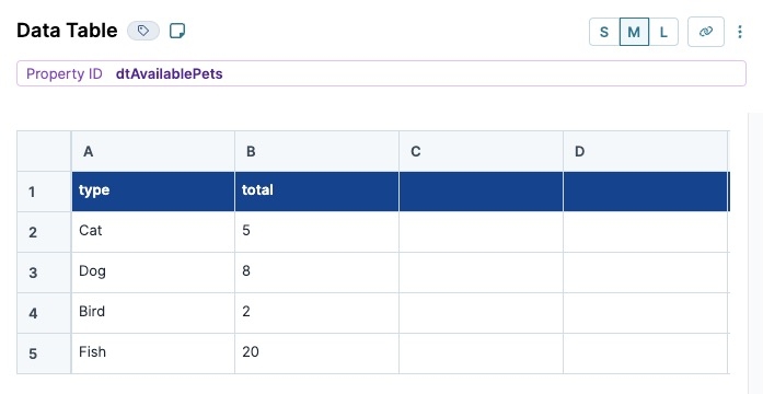
The first Data Table component contains a list of pet types and the total available pets for each type.
In the Module Builder, drag and drop a Data Table component onto your canvas.
In the Property ID and Canvas Label Text fields, enter
dtAvailablePets.In the component's configuration menu, click Data.
In the Data Table, enter the following:
A
B
1
type
total
2
Cat
5
3
Dog
8
4
Bird
2
5
Fish
20
In a Data Table component, the first row acts as headers for the data set.
Click Save & Close.
Configure the dtReservedPets Data Table Component
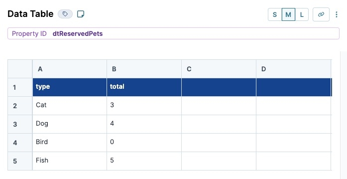
The second Data Table component contains the total reserved pets for each pet type.
Drag and drop a Data Table component onto your canvas, placing it below the dtAvailablePets Data Table component.
In the Property ID and Canvas Label Text fields, enter
dtReservedPets.In the component's configuration menu, click Data.
In the Data Table, enter the following:
A
B
1
type
total
2
Cat
3
3
Dog
4
4
Bird
0
5
Fish
5
In a Data Table component, the first row acts as headers for the data set.
Click Save & Close.
Configure the Vega Chart Component
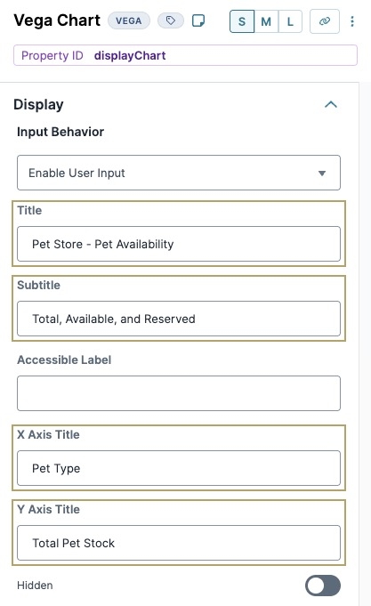
Configure a Vega Chart to display the dtAvailablePets and dtReservedPets data. Add labels to describe each axis, and stack the data sets on top of each other using the Stack Group column.
Drag and drop a Vega Chart component onto the canvas, placing it above the dtAvailablePets Data Table component.
In the Property ID field, enter displayChart.
In the Title field, enter
Pet Store - Pet Availability.In the Subtitle field, enter
Total, Available, and Reserved.In the X Axis Title field, enter
Pet Type.In the Y Axis Title field, enter
Total Pet Stock.In the component's configuration menu, click Series.
In the Series table, enter the following:
ID
Type
Label
Reference Key
Reference Property
X Property
Y Property
Color
Stack Group
1
series1
Bar
Available Pets
dtAvailablePets
value
type
total
A
2
series2
Bar
Reserved Pets
dtReservedPets
value
type
total
A
The Stack Group column places data sets on top of each other if they are the same type. In this example, the dtAvailabePets and dtReservedPets data is stacked on top of each other.
Click Save & Close.
Save your module.
Preview your module in Express View. The Vega Chart displays the two data sets as a bar graph. Each bar is split into two colors, representing the dtAvailabePets and dtReservedPets values..jpg)
Structure of a Vega Chart Component's Data
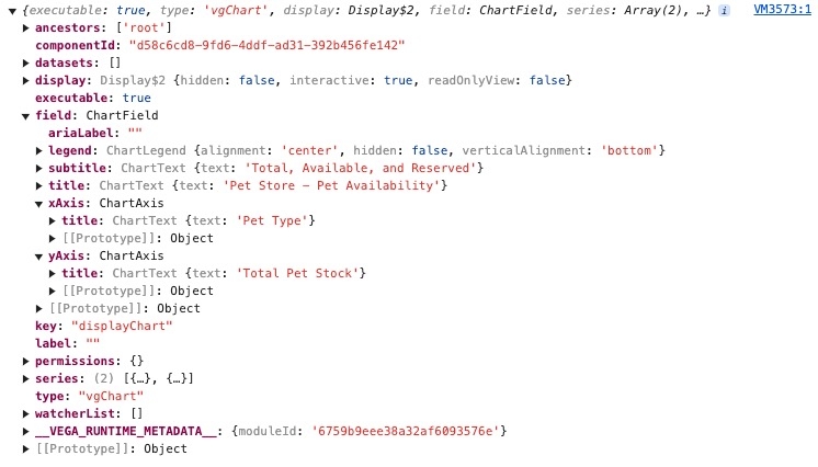
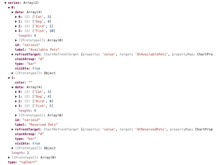
Using the example above, the image below displays a Vega Chart's component state:
To view the Vega Chart component's data sets, expand the series array. Each value in the array contains one data set:
.jpg)
.jpg)
.jpg)

