Before using the File component, please review our Working With Files in Unqork article to better understand expectations and limitations when working with files.
The File component lets your end-user upload files, like supporting documents or scanned images. This component adds an easy-to-use file uploader element to your applications so end-users can drag and drop files into the component area or use a browse function to select a file to upload.
Here are some scenarios when you'd use a File component:
A mortgage application where the end-user needs to upload financial documents.
A job application where the end-user uploads their resume.
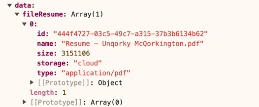
Once uploaded, files store in a data object. The data object contains the following:
The file data is represented as a cloud storage URL (submitted as Base64 or binary).
The file type.
The file name.
The file size.
Uploaded files become available to view, download, or delete as needed. How end-users access the file is intentionally dependent on the end-user’s OS:
Desktop (Mac/Windows/Linux): The file opens in the desktop’s native file browser.
Mobile (iOS/Android): Mobile devices typically allow the end-user to open the file using their photo library, file app, or camera app.
You'll find the File component in the Data & Event Processing group to the left of the Module Builder.
About the Configuration Window
To learn more about general component settings and those that display when a component is associated with Data Models, view our General Component Settings article.
Display Panel
Field Text
Setting | Description |
|---|---|
Label Text | Label Text conveys what the input component is and what information it displays. Enter the purpose of the corresponding component or field. User-friendly labels make your module more accessible. Keep labels short and descriptive (a word or two) using title case. For longer entries, use sentence case. |
Contextual Help
Setting | Description |
|---|---|
Tooltip | A short hint that displays when an end-user positions their cursor over the |
Default State Options
Setting | Description |
|---|---|
Hide Component | Shows or hides the component from view. Setting the Hide Component toggle to By default, Hide Component is set to |
Formatting
Setting | Description |
|---|---|
Input Behavior | Controls how end-users interact with the component. Choose from the following options:
|
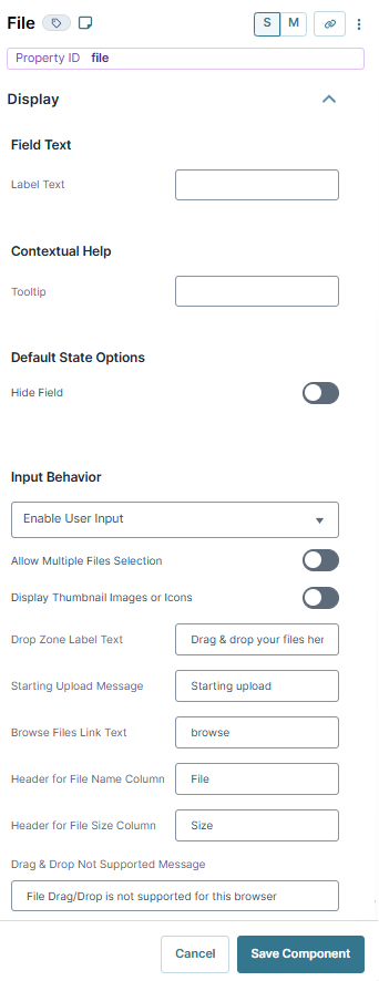
Allow Multiple Files Selection | When set to By default, this setting is set to |
Display Thumbnail Images of Icons | When set to
By default, this setting is set to |
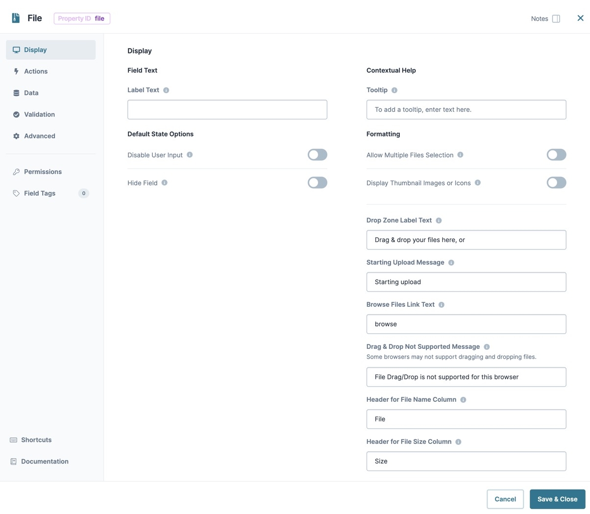
Drop Zone Label Text | Text that guides the end-user to upload a file. The text displays inside the boundaries of the drag and drop area. By default, the text is Drag & drop your files here, or. The Browse Files Link Text immediately follows this text. |
Starting Upload Message | Feedback text that displays when a file begins to upload. By default, the text displays Starting upload. |
Browse Files Link Text | The label text for the link allows end-users to browse their computer for files. By default, the link text shows as browse. |
Drag & Drop Not Supported Message | Text that displays when an end-user's browser doesn't support drag and drop. By default, the text shows as File Drag/Drop is not supported for this browser. |
Header for File Name Column | The header label for the column lists the individual file names. By default, the header is File. |
Header for File Size Column | The header label for the column listing the file sizes. By default, the header is Size. |
 Data Panel
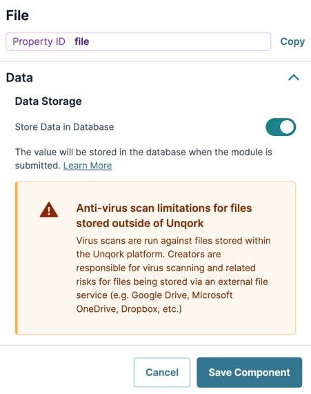
Data Storage
Setting | Description |
|---|---|
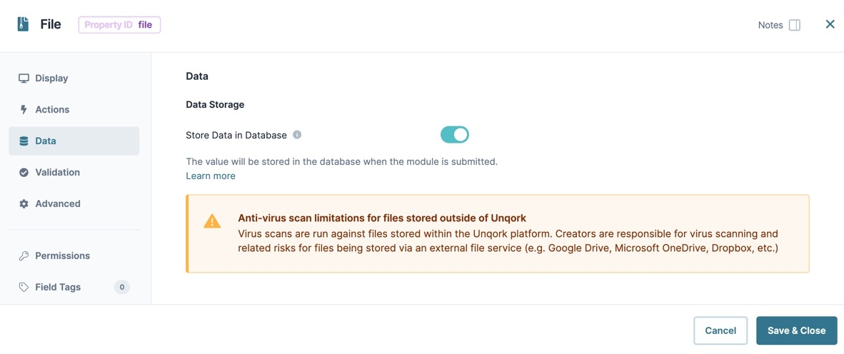
Store Data in Database | The Store Data in Database setting affects how data persists through your application. When set to
Set the toggle to
By default, this setting is |
 Actions Panel
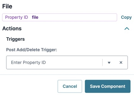
Triggers
Setting | Description |
|---|---|
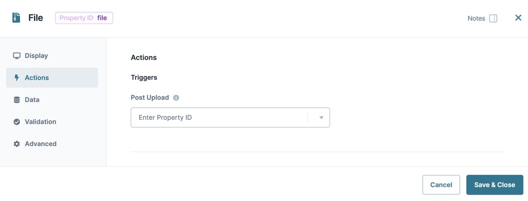
Post Upload | Enter the Property ID of a component you'd like to trigger after the file uploads. |
 Validation Panel
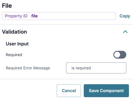
User Input
Setting | Description |
|---|---|
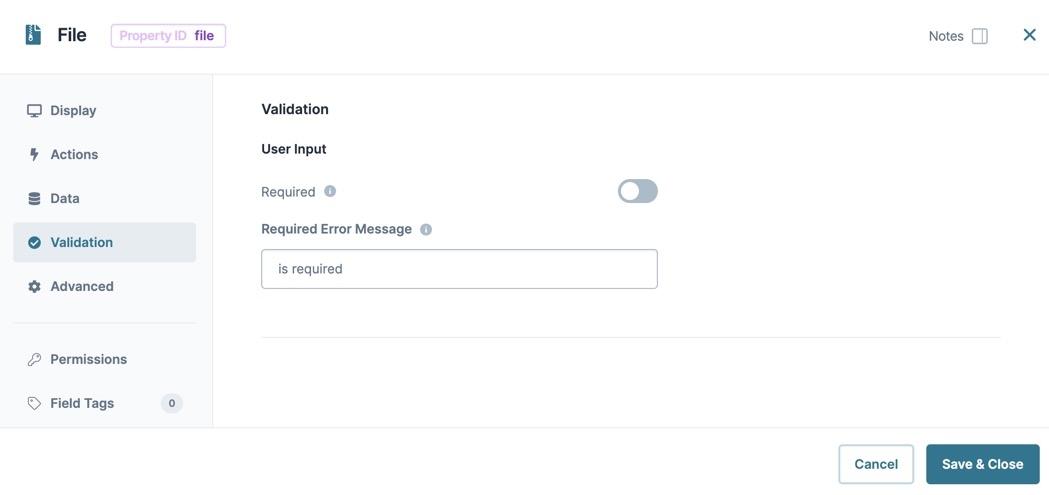
Required | When set to By default, Required is set to |
Required Error Message | A custom error message that displays below a required field. The error message displays when the end-user tries to save or submit the module without completing the required field. |
 Advanced Panel
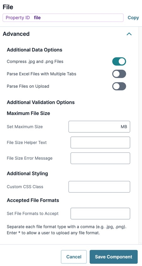
Additional Data Options
Setting | Description |
|---|---|
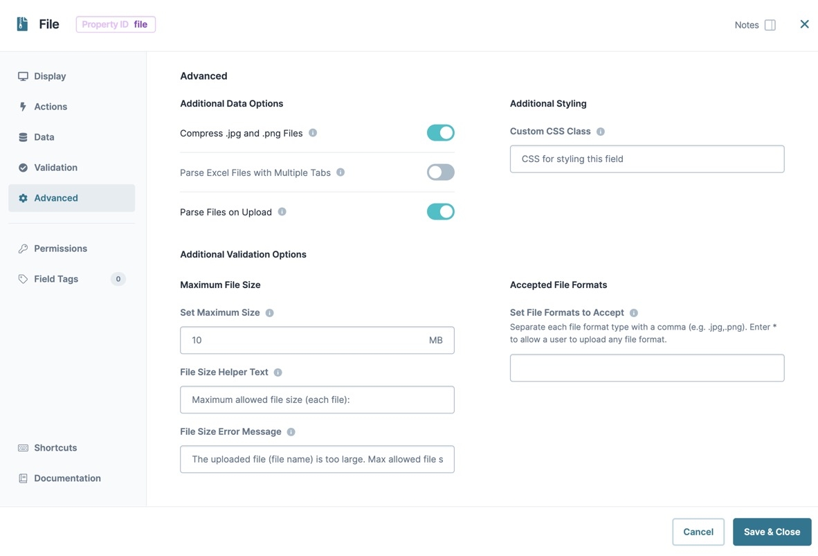
Compress .jpg and .png Files | When set to By default, this toggle is set to |
Parse Excel Files with Multiple Tabs | When set to By default, this setting is set to |
Parse Files on Upload | When set to
By default, this setting is set to |
Additional Validation Options
Setting | Description |
|---|---|
Set Maximum Size | Validation that limits the size of each file an end-user can upload. It might take longer to upload larger files depending on the browser and network connection.
|
File Size Helper Text | A quick tip explaining the file size limits of your File component. |
File Size Error Message | Custom error message that displays below uploaded files that exceed the maximum size. |
Additional Styling
Setting | Description |
|---|---|
Custom CSS Class | Enter a Custom CSS Class to apply to your component. Custom CSS lets you maintain a consistent look and feel when the field or element is part of a template or multiple modules. Updated CSS styling applies to all components that reference this custom class name. |
Accepted File Formats
Setting | Description |
|---|---|
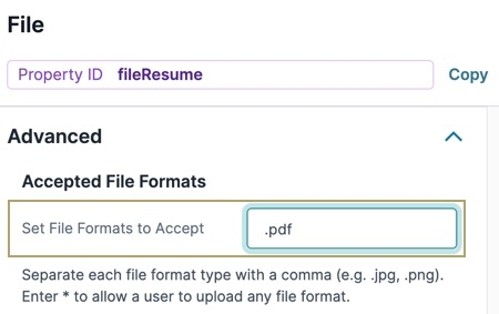
Set File Formats to Accept | Sets the file types accepted by this component. To allow the upload of any file type, simply set the field value to *. To limit file types, list the approved file types by adding a comma between each value. For example, .jpg,.png,.gif. |
 Adding a File Component
Let's create a basic File component configuration that prompts the end-user to upload a PDF version of their resume.
1.In the Module Builder, drag and drop a File component onto the canvas.
In the Property ID field, enter fileResume.
In the Label Text field, enter
Submit Your Resume.Navigate to the component's Validation settings.
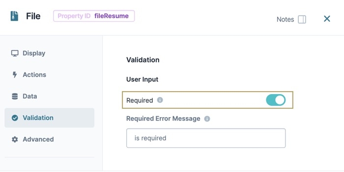
Set Required to
 (ON).
(ON).Navigate to the component's Advanced settings.
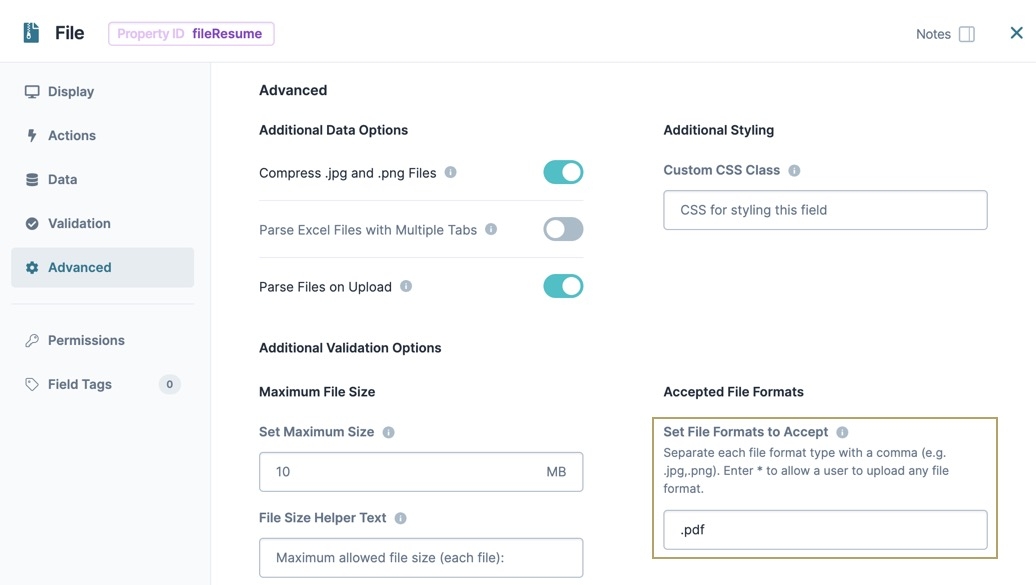
In the Set File Formats to Accept field, enter
.pdf.By entering .pdf in this field, the component only accepts PDF files from the end-user.
Click Save Component.
Save your module.
Preview the module in Express View to view the following functionality:
Data Structure of a File Component
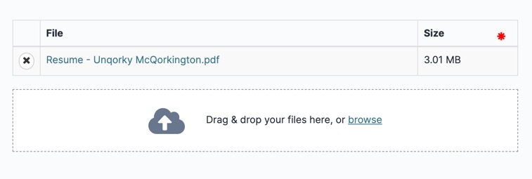
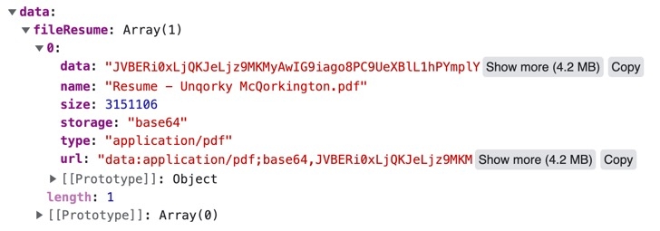
The File component's data stores in submission data as an array of objects. In the example below, the fileResume File component displays the uploaded content in a table. Opening an object in the array displays a set of key/value pairs containing information about the file.
Here's how the File component looks in Express View:
Here's how the same File component looks in the DevTools Console:
Before using the File component, please review our Working With Files in Unqork article to better understand expectations and limitations when working with files.
The File component lets your end-user upload files, like supporting documents or scanned images. This component adds an easy-to-use file uploader element to your applications so end-users can drag and drop files into the component area or use a browse function to select a file to upload.
Here are some scenarios when you'd use a File component:
A mortgage application where the end-user needs to upload financial documents.
A job application where the end-user uploads their resume.
Once uploaded, files store in a data object. The data object contains the following:
The file data is represented as a cloud storage URL (submitted as Base64 or binary).
The file type.
The file name.
The file size.
Uploaded files become available to view, download, or delete as needed. How end-users access the file is intentionally dependent on the end-user’s OS:
Desktop (Mac/Windows/Linux): The file opens in the desktop’s native file browser.
Mobile (iOS/Android): Mobile devices typically allow the end-user to open the file using their photo library, file app, or camera app.
You'll find the File component in the Data & Event Processing group to the left of the Module Builder.
About the Configuration Window
To learn more about general component settings and those that display when a component is associated with Data Models, view our General Component Settings article.
Display Panel
Field Text
Setting | Description |
|---|---|
Label Text | Label Text conveys what the input component is and what information it displays. Enter the purpose of the corresponding component or field. User-friendly labels make your module more accessible. Keep labels short and descriptive (a word or two) using title case. For longer entries, use sentence case. |
Default State Options
Setting | Description |
|---|---|
Disable User Input | When set to By default, Disable User Input is set to |
Hide Component | Shows or hides the component from view. Setting the Hide Component toggle to By default, the Hide Component toggle is set to |
Contextual Help
Setting | Description |
|---|---|
Tooltip | A short hint that displays when an end-user positions their cursor over the |
Formatting
Setting | Description |
|---|---|
Allow Multiple Files Selection | When set to By default, this toggle is set to |
Display Thumbnail Images of Icons | When set to
By default, this setting is set to |
Drop Zone Label Text | Text that guides the end-user to upload a file. The text displays inside the boundaries of the drag and drop area. By default, the text is Drag & drop your files here, or. The Browse Files Link Text immediately follows this text. |
Starting Upload Message | Feedback text that displays when a file begins to upload. By default, the text displays Starting upload. |
Browse Files Link Text | The label text for the link allows end-users to browse their computer for files. By default, the link text shows as browse. |
Drag & Drop Not Supported Message | Text that displays when an end-user's browser doesn't support drag and drop. By default, the text shows as File Drag/Drop is not supported for this browser. |
Header for File Name Column | The header label for the column lists the individual file names. By default, the header is File. |
Header for File Size Column | The header label for the column listing the file sizes. By default, the header is Size. |
Data Panel
Setting | Description |
|---|---|
Store Data in Database | The Store Data in Database setting affects how data persists through your application. When set to
Set the toggle to
By default, this setting is |
Actions Panel
Triggers
Setting | Description |
|---|---|
Post Upload | Enter the Property ID of a component you'd like to trigger after the file uploads. |
Validation Panel
Setting | Description |
|---|---|
Required | When set to By default, Required is set to |
Required Error Message | A custom error message that displays below a required field. The error message displays when the end-user tries to save or submit the module without completing the required field. |
Advanced Panel
Additional Data Options
Setting | Description |
|---|---|
Compress .jpg and .png Files | When set to By default, this toggle is set to |
Parse Excel Files with Multiple Tabs | When set to By default, this setting is set to |
Parse Files on Upload | When set to
By default, this setting is set to |
Parse Files Raw | This setting displays when Parse Files On Upload is set to Set to
|
Additional Styling
Setting | Description |
|---|---|
Custom CSS Class | Enter a Custom CSS Class to apply to your component. Custom CSS lets you maintain a consistent look and feel when the field or element is part of a template or multiple modules. Updated CSS styling applies to all components that reference this custom class name. |
Additional Validation Options
Setting | Description |
|---|---|
Set Maximum Size | Validation that limits the size of each file an end-user can upload. It might take longer to upload larger files depending on the browser and network connection.
|
File Size Helper Text | A quick tip explaining the file size limits of your File component. |
File Size Error Message | Custom error message that displays below uploaded files that exceed the maximum size. |
Accepted File Formats
Setting | Description |
|---|---|
Set File Formats to Accept | Sets the file types accepted by this component. To allow the upload of any file type, simply set the field value to *. To limit file types, list the approved file types by adding a comma between each value. For example, .jpg,.png,.gif. |
Adding a File Component
As an example, let's create a basic File component configuration. This component will prompt the end-user to upload a PDF version of their resume.
In the Module Builder, drag and drop a File component onto the canvas.
In the Property ID field, enter fileResume.
In the Label Text field, enter
Your Resume.From the File component's configuration menu, click
.png) Validation.
Validation.Set Required to
 (ON).
(ON).From the File component's configuration menu, click
.png) Advanced.
Advanced.In the Set File Formats to Accept field, enter
.pdf.By entering .pdf in this field, the component only accepts PDF files from the end-user.
Click Save & Close.
Save your module.
The File component looks like the following in Express View:
Data Structure of a File Component
The File component's data stores in submission data as an array of objects. In the example below, the fileResume ![]() File component displays the uploaded content in a table. Opening an object in the array displays a set of key/value pairs containing information about the file.
File component displays the uploaded content in a table. Opening an object in the array displays a set of key/value pairs containing information about the file.
Here's how the File component looks in Express View:
Here's how the same File component looks in the DevTools Console:
.jpg) (Tooltip) icon. Tooltips can display across more than one line.
(Tooltip) icon. Tooltips can display across more than one line.