The Dropdown component enables your end-user to select a single option from a list. Use the Dropdown component in situations where lists contain too many options for Radio Buttons and Checkboxes components. For example, use a Dropdown component if you have six or more options, or you don't want the full list of options to display on the page at all times.
By default, the Dropdown component stays collapsed until the end-user clicks to open it. After making a selection, the Dropdown list closes again. Your end-user has the option to type the first few letters of their response to quickly find that option in the list.
The Dropdown component is located in the Primary Fields group to the left of the Module Builder.
What You'll Learn
In this article, you'll learn about the Dropdown component, how to configure its settings, and how to use it in an application.
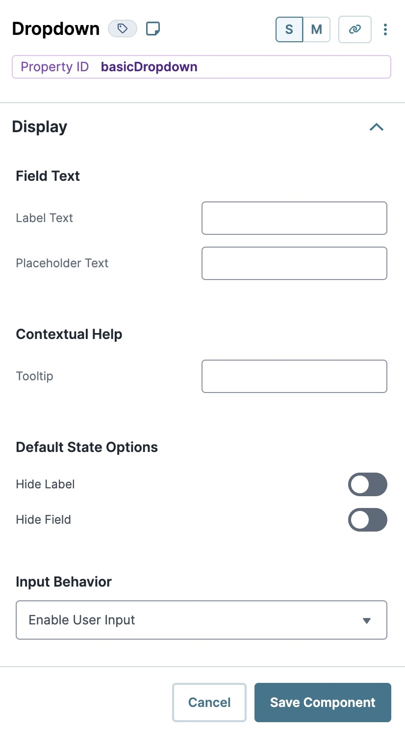
About the Configuration Window
To learn more about general component settings, view our General Component Settings article.
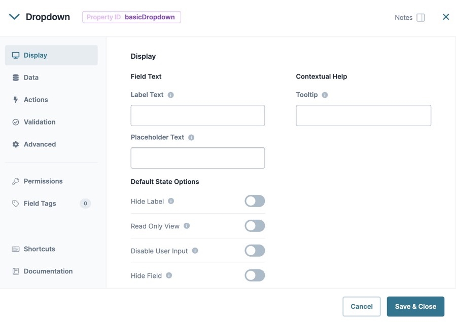
Display Panel
Field Text
Setting | Description |
|---|---|
Label Text | Label Text conveys what the input component is and what information it displays. Enter the purpose of the corresponding component or field. User-friendly labels make your module more accessible. Keep labels short and descriptive (a word or two) using title case. For longer entries, use sentence case. |
Placeholder Text | A short prompt telling end-users the expected value of an input field. For example, |
Contextual Help
Setting | Description |
|---|---|
Tooltip | A short hint that displays when an end-user positions their cursor over the |
Default State Options
Setting | Description |
|---|---|
Hide Label | Setting Hide Label to By default, this setting is set to |
Hide Field | Displays or hides the component from view. Setting Hide Field to By default, Hide Field is set to |
Input Behavior
Setting | Description |
|---|---|
Input Behavior | Controls how end-users interact with the component. Choose from the following options:
|
Data Panel
Data Storage
Setting | Description |
|---|---|
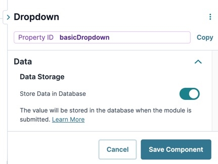
Store Data in Database | The Store Data in Database setting affects how data persists through your application. When set to
Set the toggle to
|
Data Source Type
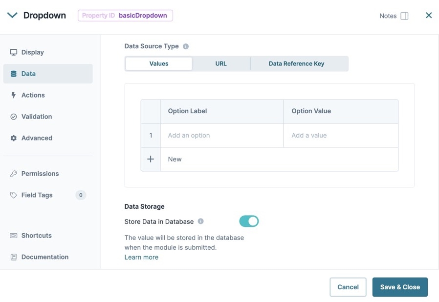
There are three methods that you can use to populate a Dropdown component: Values, URL, and Data Reference Key.
Values
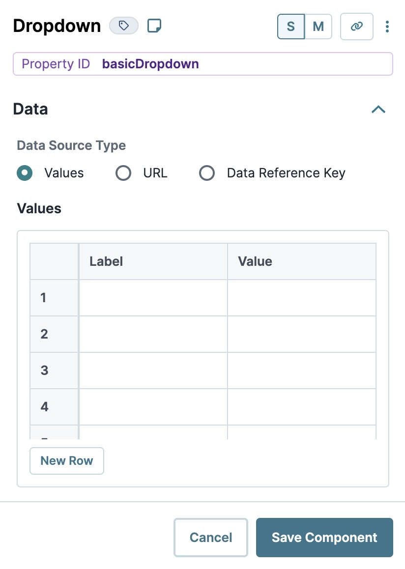
Selecting Values displays a table where you can enter each option and its value.
Setting | Description |
|---|---|
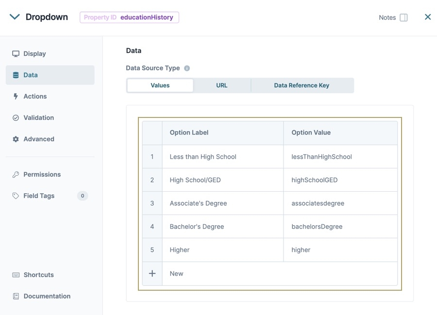
Option Label | Each option needs an end-user-facing label describing the choice that it represents. Enter your Option Labels using this column. After you create an option, another row displays for you to create the next option. |
Data Source Values | Each option needs an associated value to store in the submission data. Enter the values to store in submission data using this column. By default, the value is a camel case version of the Option Label. You can also assign a numeric value to each option for use in logic-based configurations. |
In Express View, the dropdown list searches and filters using the Option Label and Data Source values.
URL
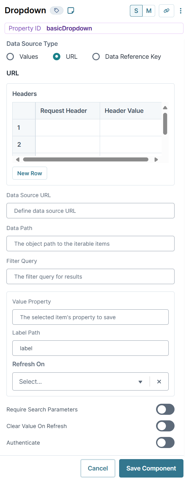
To use data that are not stored in a specific component, select URL. Generally, this data lives in two places:
External to Unqork and pulled into the component using an external API call.
Internally and stored as a data collection.
To use an external API call, reference the provider's documentation. There, you'll find the API's URL address and the information you need to filter the data. To learn more, see our Using an External API in a Dropdown Component article.
To reference data collections in Unqork, use the ![]() Data Collections tab at the Application Level. Click Create Data Collection to create a new data collection. Or, look through the available data collections and use one of those.
Data Collections tab at the Application Level. Click Create Data Collection to create a new data collection. Or, look through the available data collections and use one of those.
To learn more data collectioins, see our Workspaces: Data Collections article.
Setting | Description |
|---|---|
Request Header | Enter the information to display in the drop-down selections. These are your end-user's options. For external APIs, you'll find this information in the API documentation. To pull data from a Data Collection, enter the column header you want to use. |
Option Value | Each option needs an associated value to store in the submission data. Enter the values to store in submission data using this column. By default, the value is a camel case version of the Option Label. You can also assign a numeric value to each option for use in logic-based configurations. |
Data Source URL | For an API to retrieve data, you need the API's URL information. In this field, enter the API information as obtained from the API documentation. Add additional filters at the end of the URL if you want to drill down to a specific type of data. |
Data Path | If using an API call to populate the component, enter a specific data property to reference here. This is useful if you want to show one piece of a larger data set in your Dropdown component. |
Filter Query | Provide additional filtering using query parameters. Parameters append to the end of the Data Source URL. Query parameters can be static or dynamic. For example, |
Value Property | If a data set includes a column for values, enter the column's name here. If not specified, the application uses the option label itself. |
Label Path | This field refers to the option labels you want to pull. Enter the option label's column header in this field. |
Refresh On | This field displays a list of the other components in your module. You can select a component here to refresh your Dropdown. When your end-user interacts with the selected component, the Dropdown resets. You can also select Any Change. This refreshes the Dropdown if your end-user interacts with any of your components.
|
Require Search Parameters | When set to By default, this setting is |
Clear Value on Refresh | When set to By default, this setting is |
Authenticate | When set to By default, this setting is |
Data Reference Key
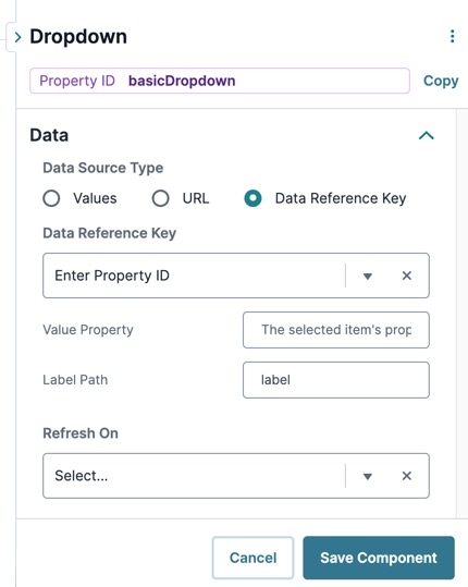
Using the Data Reference Key option, data from another component populates the Dropdown component. You'll most often do this with a Data Table component. Add your data to the Data Table. Then, reference the Data Table in your Dropdown's configuration window.
Think of this as a hybrid option of using Values and Data Collections to populate your Dropdown. You still use data stored in Unqork, but it's data from your module instead of a Data Collection.
Setting | Description |
|---|---|
Data Reference Key | Enter the Property ID of the component whose data you're referencing. |
Value Property | If a data set includes a column for values, enter the column's name here. If not specified, the application uses the data drawn using the Label Path setting below. |
Label Path | This field refers to the option labels to retrieve. If you're retrieving data from a Data Table component, enter the column header in this field. |
Refresh On | This field displays a list of the other components in your module. You can select a component here to cause your Dropdown to refresh. When your end-user interacts with the selected component, the Dropdown resets. Here, you can also select Any Change. This refreshes the Dropdown if your end-user interacts with any of your components.
|
Actions Panel
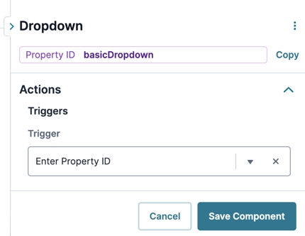
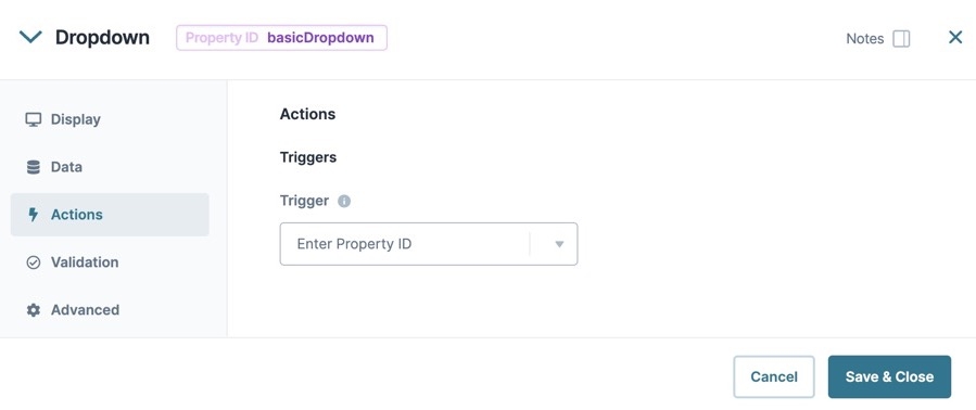
Triggers
Setting | Description |
|---|---|
Trigger | To set up a trigger, enter the Property ID of your chosen logic component into this field. When the end-user performs an action on the current component, the triggered component fires. |
Validation Panel
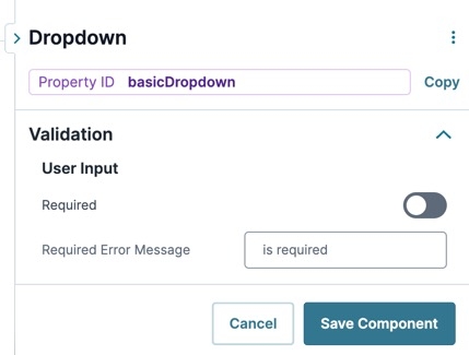
Input Required
Setting | Description |
|---|---|
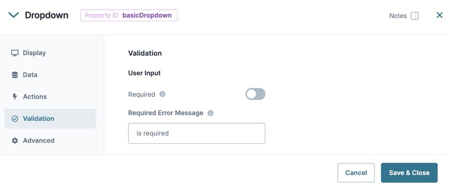
Required | When set to By default, Required is set to |
Required Error Message | A custom error message that displays below a required field. The error message displays when the end-user tries to save or submit the module without completing the required field. |
Advanced Panel
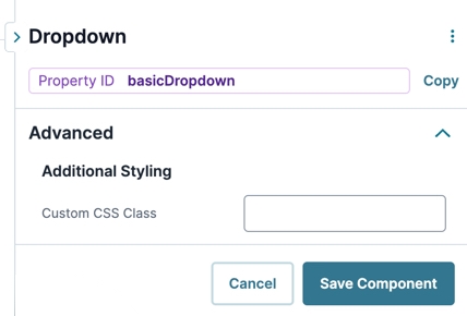
Additional Styling
Setting | Description |
|---|---|
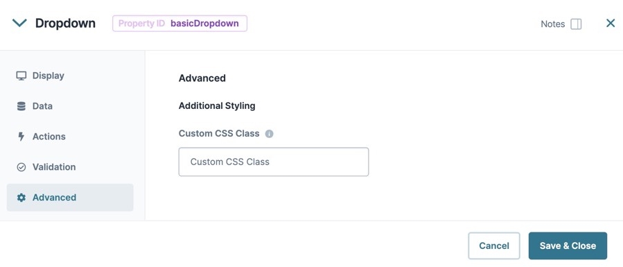
Custom CSS Class | Enter a Custom CSS Class to apply to your component. Custom CSS lets you maintain a consistent look and feel when the field or element is part of a template or multiple modules. Updated CSS styling applies to all components that reference this custom class name. |
Adding a Dropdown Component
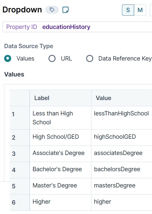
Now, configure a Dropdown component asking about an end-user's education history. The Dropdown includes six options for selection. These instructions assume that you have an open module saved with a title.
Drag and drop a
.png) Dropdown component onto the canvas.
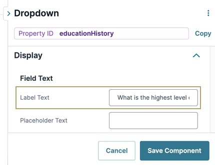
Dropdown component onto the canvas.In the Property ID field, enter educationHistory.
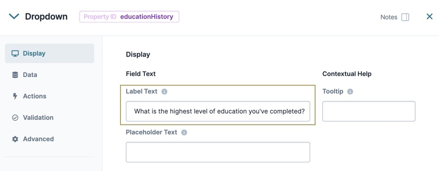
In the Label Text field, enter
What is the highest level of education you've completed?.Navigate to the
.png) Dropdown component's Data settings.
Dropdown component's Data settings.In the Values table, enter the following:
Option Label
Option Value
Less than High School
lessThanHighSchool
High School/GED
highSchoolGED
Associate's Degree
associatesDegree
Bachelor's Degree
bachelorsDegree
Master's Degree
mastersDegree
Higher
higher
Navigate to the
.png) Dropdown component's Validation settings.
Dropdown component's Validation settings.Set Required to
 (ON).
(ON).Click Save & Close.
Your Dropdown component looks like the following in Express View:
Structure of a Dropdown Component's Data
The data structure of a Dropdown's selection is a key value pair. The key is the Property ID name of the component, and the value is stored as a string.
Resources
The Dropdown component enables your end-user to select a single option from a list. Use the Dropdown component in situations where lists contain too many options for Radio Buttons and Checkboxes components. For example, use a Dropdown component if you have six or more options, or you don't want the full list of options to display on the page at all times.
By default, the Dropdown component stays collapsed until the end-user clicks to open it. After making a selection, the Dropdown list closes again. Your end-user has the option to type the first few letters of their response to quickly find that option in the list.
The Dropdown component is located in the Primary Fields group to the left of the Module Builder.
What You'll Learn
In this article, you'll learn about the Dropdown component, how to configure its settings, and how to use it in an application.
About the Configuration Window
To learn more about general component settings and those that display when a component is associated with Data Models, view our General Component Settings article.
Display Panel
Setting | Description |
|---|---|
Label Text | Label Text conveys what the input component is and what information it displays. Enter the purpose of the corresponding component or field. User-friendly labels make your module more accessible. Keep labels short and descriptive (a word or two) using title case. For longer entries, use sentence case. |
Tooltip | A short hint that displays when an end-user positions their cursor over the |
Placeholder Text | A short prompt telling end-users the expected value of an input field. For example, |
Hide Label | Setting Hide Label to By default, this setting is set to |
Read Only View | When set to By default, the Read Only View toggle is set to |
Disable User Input | When set to By default, Disable User Input is set to |
Hide Field | Displays or hides the component from view. Setting Hide Field to By default, Hide Field is set to |
Data Panel
Data Source Type
There are three methods that you can use to populate a Dropdown component: Values, URL, and Data Reference Key.
Values
Selecting Values displays a table where you can enter each option and its value.
Setting | Description |
|---|---|
Option Label | Each option needs an end-user-facing label describing the choice that it represents. Enter your Option Labels using this column. After you create an option, another row displays for you to create the next option. |
Data Source Values | Each option needs an associated value to store in the submission data. Enter the values to store in submission data using this column. By default, the value is a camel case version of the Option Label. You can also assign a numeric value to each option for use in logic-based configurations. |
URL
To use data that are not stored in a specific component, select URL. Generally, this data lives in two places:
External to Unqork and stored in the component using an external API call.
Internally and stored as a data collection.
To use an external API call, reference the provider's documentation. There, you'll find the API's URL address and the information you need to filter the data. To learn more, see our Using an External API in a Dropdown Component article.
To reference data collections in Unqork, use the ![]() Data Collections tab at the Application Level. Click Create Data Collection to create a new data collection. Or, look through the available data collections and use one of those.
Data Collections tab at the Application Level. Click Create Data Collection to create a new data collection. Or, look through the available data collections and use one of those.
To learn more data collections, see our Workspaces: Data Collections article.
Setting | Description |
|---|---|
Request Header | Enter the information to display in the drop-down selections. These are your end-user's options. For external APIs, you'll find this information in the API documentation. To pull data from a Data Collection, enter the column header you want to use. |
Option Value | Each option needs an associated value to store in the submission data. Enter the values to store in submission data using this column. By default, the value is a camel case version of the Option Label. You can also assign a numeric value to each option for use in logic-based configurations. |
Data Source URL | For an API to retrieve data, you need the API's URL information. In this field, enter the API information as obtained from the API documentation. Add additional filters at the end of the URL if you want to drill down to a specific type of data. |
Value Property | If a data set includes a column for values, enter the column's name here. If not specified, the application uses the option label itself. |
Data Path | If using an API call to populate the component, enter a specific data property to reference here. This is useful if you want to show one piece of a larger data set in your Dropdown component. |
Label Path | This field refers to the option labels you want to pull. Enter the option label's column header in this field. |
Filter Query | Provide additional filtering using query parameters. Parameters append to the end of the Data Source URL. Query parameters can be static or dynamic. For example, |
Refresh On | This field displays a list of the other components in your module. You can select a component here to refresh your Dropdown. When your end-user interacts with the selected component, the Dropdown resets. You can also select Any Change. This refreshes the Dropdown if your end-user interacts with any of your components.
|
Require Search Parameters | When set to By default, this setting is |
Clear Value on Refresh | When set to By default, this setting is |
Authenticate | When set to By default, this setting is |
Data Reference Key
Using the Data Reference Key option, data from another component populates the Dropdown component. You'll most often do this with a Data Table component. Add your data to the Data Table. Then, reference the Data Table in your Dropdown's configuration window.
Think of this as a hybrid option of using Values and Data Collections to populate your Dropdown. You still use data stored in Unqork, but it's data from your module instead of a Data Collection.
Setting | Description |
|---|---|
Data Reference Key | Enter the Property ID of the component whose data you're referencing. |
Value Property | If a data set includes a column for values, enter the column's name here. If not specified, the application uses the data drawn using the Label Path setting below. |
Label Path | This field refers to the option labels to retrieve. If you're retrieving data from a Data Table component, enter the column header in this field. |
Refresh On | This field displays a list of the other components in your module. You can select a component here to cause your Dropdown to refresh. When your end-user interacts with the selected component, the Dropdown resets. Here, you can also select Any Change. This refreshes the Dropdown if your end-user interacts with any of your components.
|
Data Storage
Setting | Description |
|---|---|
Store Data in Database | The Store Data in Database setting affects how data persists through your application. When set to
Set the toggle to
|
Actions Panel
Triggers
Setting | Description |
|---|---|
Trigger | To set up a trigger, enter the Property ID of your chosen logic component into this field. When the end-user performs an action on the current component, the triggered component fires. |
Validation Panel
User Input
Setting | Description |
|---|---|
Required | When set to By default, Required is set to |
Required Error Message | A custom error message that displays below a required field. The error message displays when the end-user tries to save or submit the module without completing the required field. |
Advanced Panel
Additional Styling
Setting | Description |
|---|---|
Custom CSS Class | Enter a Custom CSS Class to apply to your component. Custom CSS lets you maintain a consistent look and feel when the field or element is part of a template or multiple modules. Updated CSS styling applies to all components that reference this custom class name. |
Adding a Dropdown Component
Now, configure a Dropdown component asking about an end-user's education history. The Dropdown includes six options for selection. These instructions assume that you have an open module saved with a title.
Drag and drop a
.png) Dropdown component onto the canvas.
Dropdown component onto the canvas.In the Property ID field, enter educationHistory.
In the Label Text field, enter What is the highest level of education you've completed?.
To the left of the component's configuration window, click Data.
In the Values table, enter the following:
Option Label
Option Value
1
Less than High School
lessThanHighSchool
2
High School/GED
highSchoolGED
3
Associate's Degree
associatesDegree
4
Bachelor's Degree
bachelorsDegree
5
Master's Degree
mastersDegree
6
Higher
higher
Click
.png) Validation.
Validation.Set Required to
 (ON).
(ON).Click Save & Close.
Your Dropdown component looks like the following in Express View:
Structure of a Dropdown Component's Data
The data structure of a Dropdown's selection is a key value pair. The key is the Property ID name of the component, and the value is stored as a string.
.jpg) (Tooltip) icon. Tooltips can display across more than one line.
(Tooltip) icon. Tooltips can display across more than one line.