The Radio Buttons component creates a list of mutually exclusive options for end-users. Use the Radio Buttons component when you have a list with five or fewer options, and the end-user can only select one of the options.
Here are some examples of when to use a Radio Buttons component:
Ask a yes or no question.
Select an age or salary range.
Create a multiple-choice quiz.
Choose from a product selection.
The Radio Buttons component is located in the Primary Fields group to the left of the Module Builder.
About the Configuration Window
To learn more about general component settings and those that display when a component is associated with Data Models, view our General Component Settings article.
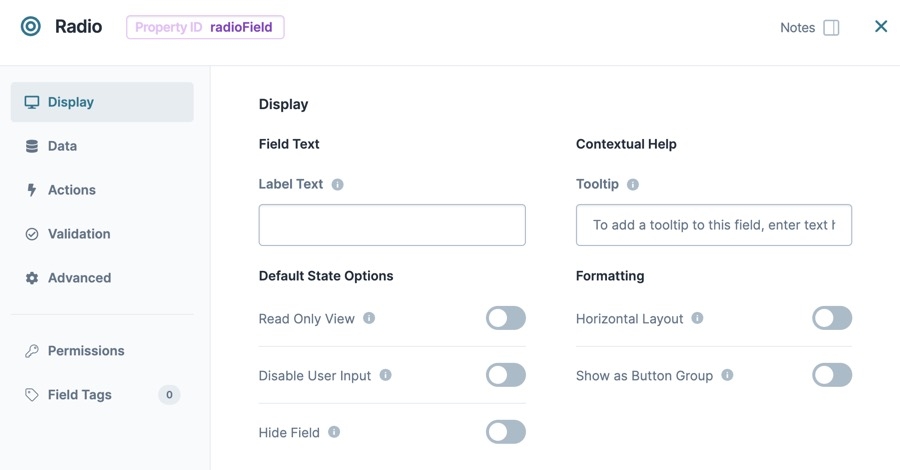
Display Panel
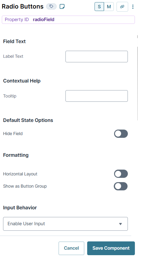
Field Text
Setting | Description |
|---|---|
Label Text | Label Text conveys what the input component is and what information it displays. Enter the purpose of the corresponding component or field. User-friendly labels make your module more accessible. Keep labels short and descriptive (a word or two) using title case. For longer entries, use sentence case. |
Contextual Help
Setting | Description |
|---|---|
Tooltip | A short hint that displays when an end-user positions their cursor over the |
Default State Options
Setting | Description |
|---|---|
Hide Field | Displays or hides the component from view. Setting Hide Field to By default, Hide Field is set to |
Formatting
Setting | Description |
|---|---|
Horizontal Layout | By default, the component's options display vertically, one below the other. When set to By default, Horizontal Layout is set to |
Show as Button Group | When set to By default, the Show as Button Group toggle is set to |
Input Behavior | Controls how end-users interact with the component. Choose from the following options:
|
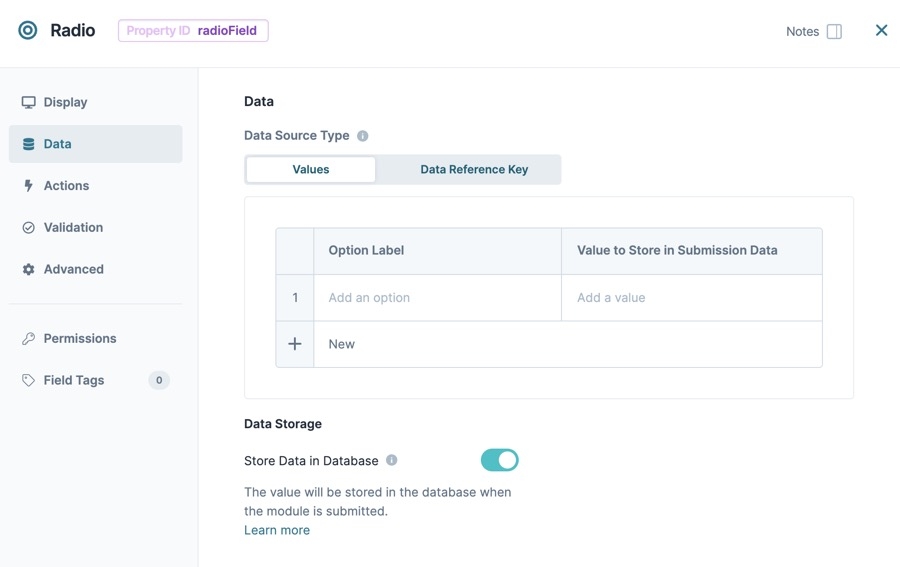
Data Panel
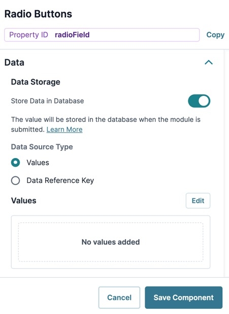
Data Storage
Setting | Description |
|---|---|
Store Data in Database | The Store Data in Database setting affects how data persists through your application. When set to
Set the toggle to
|
Data Source Type
There are two methods that you can use to populate a Radio Buttons component: Values or a Data Reference Key.
Values
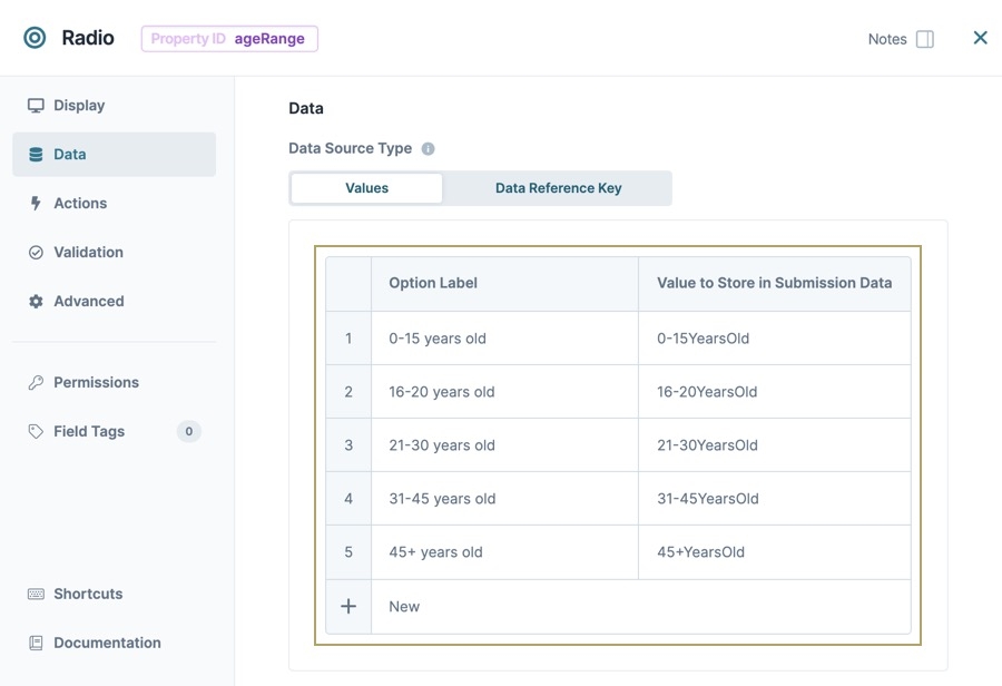
Values are the simplest way to populate a Radio Buttons component. Click the Edit button top open the Values table. In this table, enter each Radio Button option and its associated value.
Setting | Description |
|---|---|
Option Label | Each option needs an end-user-facing label describing the choice that it represents. Enter your Option Labels using this column. After you create an option, another row displays for you to create the next option. |
Value to Store in Submission Data | Each option needs an associated value to store in the submission data. Enter the values to store in submission data using this column. By default, the value is a camelCase version of the Option Label. |
Data Reference Key
With a Data Reference Key, you can use data from another component to populate your Radio Buttons component. You'll most often achieve this function with a Data Table component. Add your data to this component and then reference it in your Radio Buttons component's configuration menu.
Think of this as a hybrid of using Values and Data Collection to populate your Radio Buttons. You still use data stored in Unqork, but it's data from your module instead of a Data Collection.
Setting | Description |
|---|---|
Data Reference Key | Enter the Property ID of the component whose data you're referencing. |
Value Property | If a data set includes a column for values, enter the column's name here. If not specified, the application uses the data drawn using the Label Path setting below. |
Label Path | This field refers to the option labels to retrieve. If you're retrieving data from a Data Table component, enter the column header in this field. |
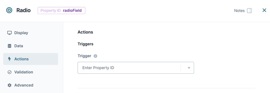
Actions Panel
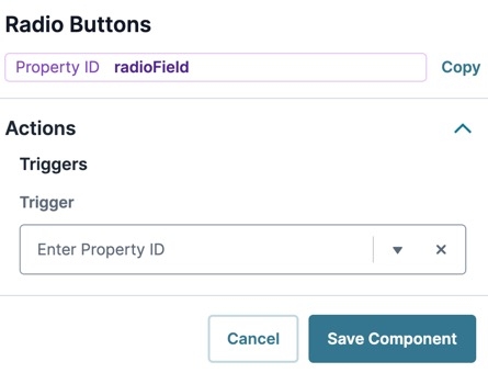
Triggers
Setting | Description |
|---|---|
Trigger | To set up a trigger, enter the Property ID of your chosen logic component into this field. When the end-user performs an action on the current component, the triggered component fires. |
Validation Panel
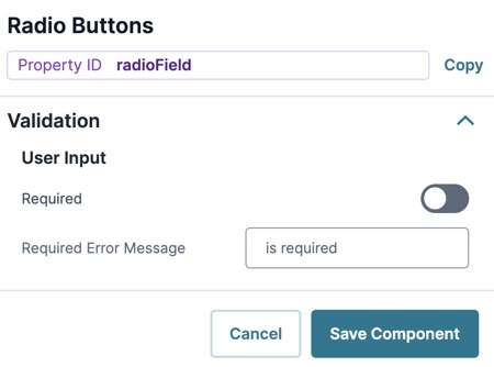
User Input
Setting | Description |
|---|---|
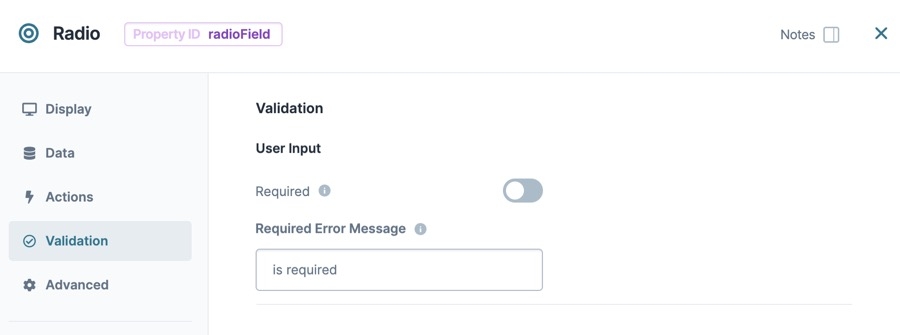
Required | When set to By default, Required is set to |
Required Error Message | A custom error message that displays below a required field. The error message displays when the end-user tries to save or submit the module without completing the required field. |
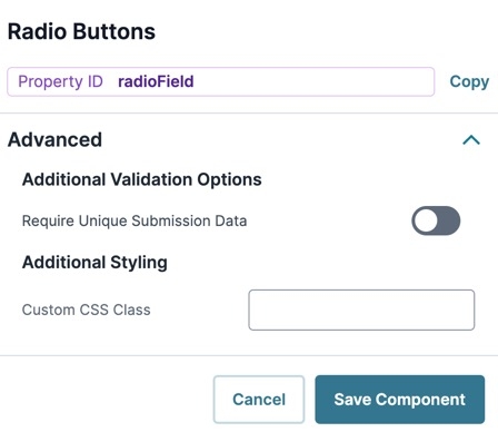
Advanced Panel
Additional Validation Options
Setting | Description |
|---|---|
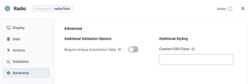
Require Unique Submission Data | When set to By default, the Require Unique Submission Data toggle is set to |
Additional Styling
Setting | Description |
|---|---|
Custom CSS Class | Enter a Custom CSS Class to apply to your component. Custom CSS lets you maintain a consistent look and feel when the field or element is part of a template or multiple modules. Updated CSS styling applies to all components that reference this custom class name. |
Adding a Radio Buttons Component
Add a Radio Buttons component to collect your end-user's age. You'll present five age ranges, allowing for a single selection by the end-user.
In the Module Builder, drag and drop a Radio Buttons component onto your canvas.
In the Property ID field, enter ageRange.
In the Label Text field, enter
How old are you?.Navigate to the component's Data settings.
Next to the Values table, click Edit. The Values panel displays.
Underneath the Values table, click New five times.
In the Option Label and Option Value fields, enter the following:
#
Option Label
Option Value
1
0-15 years old
0-15YearsOld
2
16-20 years old
16-20YearsOld
3
21-30 years old
21-30YearsOld
4
31-45 years old
31-45YearsOld
5
45+ years old
45+YearsOld
Click Save Component.
Save your module.
Once implemented, your Radio Buttons component looks like the following in Express View:
Structure of a Radio Buttons Component's Data
The Radio Buttons component's data stores in a key/value format. In the above example, the ageRange Radio Buttons component stores the 16-20YearsOld value.
Resources
The Radio Buttons component creates a list of mutually exclusive options for end-users. Use the Radio Buttons component when you have a list with five or fewer options, and the end-user can only select one of the options.
Here are some real-world examples of when to use a Radio Buttons component:
Ask a Yes or No question.
Select an age or salary range.
Create a multiple-choice quiz.
Choose from a product selection.
The Radio Buttons component is located in the Primary Fields group to the left of the Module Builder.
About the Configuration Window
To learn more about general component settings and those that display when a component is associated with Data Models, view our General Component Settings article.
Display Panel
Field Text
Setting | Description |
|---|---|
Label Text | Label Text conveys what the input component is and what information it displays. Enter the purpose of the corresponding component or field. User-friendly labels make your module more accessible. Keep labels short and descriptive (a word or two) using title case. For longer entries, use sentence case. |
Contextual Help
Setting | Description |
|---|---|
Tooltip | A short hint that displays when an end-user positions their cursor over the |
Default State Options
Setting | Description |
|---|---|
Read Only View | When set to By default, the Read Only View toggle is set to |
Disable User Input | When set to By default, Disable User Input is set to |
Hide Field | Displays or hides the component from view. Setting Hide Field to By default, Hide Field is set to |
Formatting
Setting | Description |
|---|---|
Horizontal Layout | By default, the component's options display vertically, one below the other. When set to By default, Horizontal Layout is set to |
Show as Button Group | When set to By default, the Show as Button Group toggle is set to |
Data Panel
Data Source Type
There are two methods that you can use to populate a Radio Buttons component: Values or a Data Reference Key.
Values
Values are the simplest way to populate a Radio Buttons component. In this table, enter each Radio Button option and its associated value.
Setting | Description |
|---|---|
Option Label | Each option needs an end-user-facing label describing the choice that it represents. Enter your Option Labels using this column. After you create an option, another row displays for you to create the next option. |
Value to Store in Submission Data | Each option needs an associated value to store in the submission data. Enter the values to store in submission data using this column. By default, the value is a camelCase version of the Option Label. |
Data Reference Key
With a Data Reference Key, you can use data from another component to populate your Radio Buttons component. You'll most often achieve this function with a Data Table component. Add your data to this component and then reference it in your Radio Buttons component's configuration menu.
Think of this as a hybrid of using Values and Data Collection to populate your Radio Buttons. You still use data stored in Unqork, but it's data from your module instead of a Data Collection.
Setting | Description |
|---|---|
Data Reference Key | Enter the Property ID of the component whose data you're referencing. |
Value Property | If a data set includes a column for values, enter the column's name here. If not specified, the application uses the data drawn using the Label Path setting below. |
Label Path | This field refers to the option labels to retrieve. If you're retrieving data from a Data Table component, enter the column header in this field. |
Data Storage
Setting | Description |
|---|---|
Store Data in Database | The Store Data in Database setting affects how data persists through your application. When set to
Set the toggle to
|
Actions Panel
Triggers
Setting | Description |
|---|---|
Trigger | To set up a trigger, enter the Property ID of your chosen logic component into this field. When the end-user performs an action on the current component, the triggered component fires. |
Validation Panel
User Input
Setting | Description |
|---|---|
Required | When set to By default, Required is set to |
Required Error Message | A custom error message that displays below a required field. The error message displays when the end-user tries to save or submit the module without completing the required field. |
Advanced Panel
Additional Validation Options
Setting | Description |
|---|---|
Require Unique Submission Data | When set to By default, the Require Unique Submission Data toggle is set to |
Additional Styling
Setting | Description |
|---|---|
Custom CSS Class | Enter a Custom CSS Class to apply to your component. Custom CSS lets you maintain a consistent look and feel when the field or element is part of a template or multiple modules. Updated CSS styling applies to all components that reference this custom class name. |
Adding a Radio Buttons Component
Add a Radio Buttons component to collect your end-user's age. You'll present five age ranges, allowing for a single selection by the end-user.
In the Module Builder, drag and drop a Radio Buttons component onto your canvas.
In the Property ID field, enter ageRange.
In the Label Text field, enter How old are you?.
In the component's configuration menu, select Data.
In the Option Label and Value to Store in Submission Data fields, enter the following:
Option Label
Value to Store in Submission Data
1
0-15 years old
0-15YearsOld
2
16-20 years old
16-20YearsOld
3
21-30 years old
21-30YearsOld
4
31-45 years old
31-45YearsOld
5
45+ years old
45+YearsOld
Click Save & Close.
Save your module.
Once implemented, your Radio Buttons component looks like the following in Express View:
Structure of a Radio Buttons Component's Data
The data structure of a Radio Button's selection is a key value pair. The key is the Property ID name of the component, and the value is stored as a string.
.jpg) (Tooltip) icon. Tooltips can display across more than one line.
(Tooltip) icon. Tooltips can display across more than one line.