Overview
The Timer component lets you add time-based rules and logic to your application. For example, a module could include a 10-minute timer for an end-user to confirm an order. If the end-user fails to confirm the order in 10 minutes, the order process resets. In this situation, the time limit might give the end-user a sense of urgency. Also, restarting an idle process could free up resources for other end-users.
Some other uses of the Timer component include:
Ensuring an end-user spends enough time on a page.
Limiting the amount of time an end-user can stay on a page.
Automatically reloading a page when the timer expires.
Detecting if an end-user becomes inactive.
Use the Timer component to trigger one or many components when it expires. For example, the Trigger setting fires a single component after the timer expires. You could also trigger other components using use a Decisions component with a Micro Decision of -0, which triggers when the timer reaches 0.
Timer components placed inside a Panel component that acts as a pop-up in Express View triggers the Timer component twice, once when the modal opens and once when it closes.
Server-side executed modules do not support the Timer component. For example, if you create a workflow with Task modules, any reference from one module to another in that workflow where a Timer component exists will result in an error.
You'll find the Timer component in the Data & Event Processing group to the left of the Module Builder.
Display Settings
Field Text
Setting | Description |
|---|---|
Label Text | Label Text conveys what the input component is and what information it displays. Enter the purpose of the corresponding component or field. User-friendly labels make your module more accessible. Keep labels short and descriptive (a word or two) using title case. For longer entries, use sentence case. |
Contextual Help
Setting | Description |
|---|---|
Tooltip | A short hint that displays when an end-user positions their cursor over the |
Helper Text | A quick tip describing the expected value of an input field. Unlike a Tooltip, Helper Text stays visible under the input field and displays on a single line. |
.jpg) (Tooltip) icon. Tooltips can display across more than one line.
(Tooltip) icon. Tooltips can display across more than one line.Default State Options
Setting | Description |
|---|---|
Set Timer Duration | Sets how long the timer runs in seconds. |
Timer Direction | Determines if the timer Counts Up to the Timer Duration or Counts Down from the Timer Duration. |
Set Timer Format | The Moment.js format for displaying the time remaining. To include words, surround them with square brackets. For example, [Time Remaining] mm:ss. |
Reset When User Activity is Detected | When set to When set to By default, setting is set to |
.png)
Formatting
Setting | Description |
|---|---|
Hide Label | Setting Hide Label to (ON) hides Label Text from displaying in Express View. Your Label Text still displays in the Module Builder. By default, this setting is set to |
Hide Timer | Shows or hides the component from view. Setting the Hide Timer toggle to By default, this setting is set to |

Data Settings
Data Storage
Setting | Description |
|---|---|
Store Data in Database | The Store Data in Database setting affects how data persists through your application. When set to
Set the toggle to
By default, this toggle is set to |

Actions Settings
Triggers
Setting | Description |
|---|---|
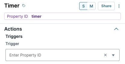
Trigger | To set up a trigger, enter the Property ID of your chosen logic component into this field. When the timer completes its duration, the specified component fires. |
 Advanced Settings

Additional Styling
Setting | Description |
|---|---|
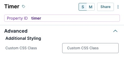
Custom CSS Class | Enter a Custom CSS Class to apply to your component. Custom CSS lets you maintain a consistent look and feel when the field or element is part of a template or multiple modules. Updated CSS styling applies to all components that reference this custom class name. |
 Adding a Timer Component

You can add a Timer component to any page in your Unqork application. For most Timer component configurations, you'll hide the component. Only keep the component visible if the end-user must see the timer.
For this example, the end-user must complete personal information and ensure they sufficient time to complete the Text Area component. The Timer component counts down from 60 seconds. After 60 seconds, a button displays letting your end-user submit their information.
Configure the Text Field Component
In the Module Builder, drag and drop a Text Field component onto your canvas.
In the Property ID field, enter name.
In the Label Text field, enter
Your Name.Click Save Component.
Configure the Text Area Component
Drag and drop a
.png) Text Area component onto your canvas, placing it below your name Text Field component.
Text Area component onto your canvas, placing it below your name Text Field component.In the Property ID field, enter experience.
In the Label Text field, enter
Your Experience.Click Save Component.
Configure the Timer Component
Drag and drop a
.png) Timer component onto your canvas, placing it below your experience Text Area component.
Timer component onto your canvas, placing it below your experience Text Area component.In the Property ID field, enter timerExperience.
In the Label Text field, enter
timerExperience.Set the Hide Label toggle to
 (ON).
(ON).In the Set Timer Duration field, enter
60.In the Set Timer Format field, enter
mm:ss.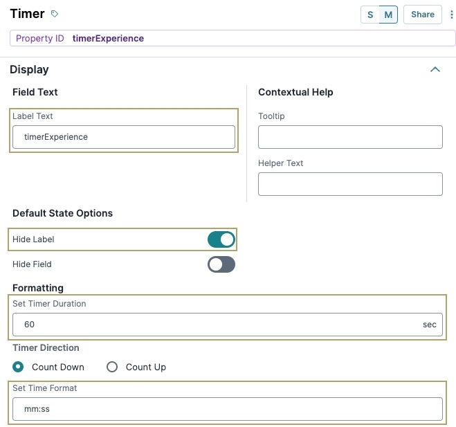
Click Save Component.

Configure the Button Component
This Button component displays after the Timer component expires.
Drag and drop a
.png) Button component onto your canvas, placing it below your timerExperience Timer component.
Button component onto your canvas, placing it below your timerExperience Timer component.In the Property ID field, enter btnSubmit.
Set the Hide Field toggle to
(ON).Click Save Component.
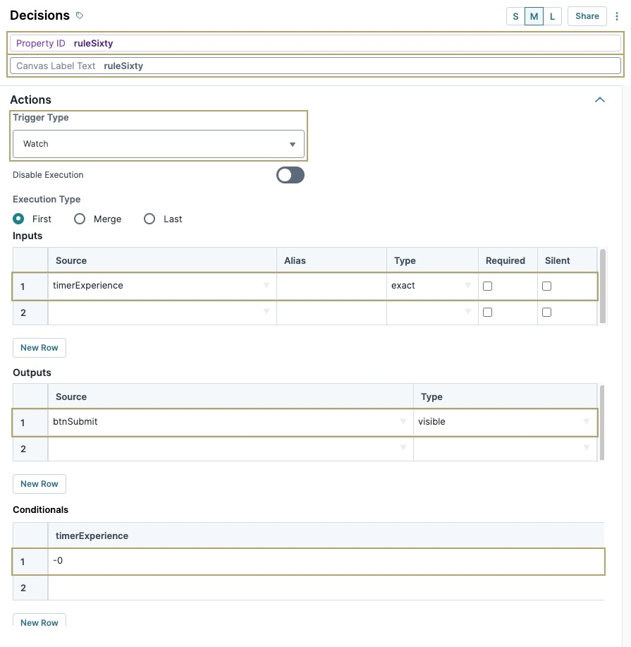
Configure the Decisions Component
This Decisions component is where you set the rule to only show the Submit button when the timer reaches zero.
Drag and drop a Decisions component onto your canvas, placing it between your timerExperience
Timer and btnSubmit Button components.In the Property ID and Canvas Label Text fields, enter
ruleSixty.Set Trigger Type to
Watch.Complete the Inputs table as follows:
Source
Alias
Type
1
timerExperience
exact
Complete the Outputs as follows:
Source
Type
1
btnSubmit
visible
Complete the Conditionals table as follows:
timerExperience
btnSubmit_visible
1
-0
yes
-0 is the Timer's value only after the time expires. So, this Decisions component only fires when the timer reaches zero.
Click Save Component.
Save your module.

Preview your module in Express View to see the button displaying after the Timer component expires:
Structure of a Timer Component's Data
Using the example above, execute the Vega Console command UNQENG.tools.getComponentState('timerExperience') in the DevTools Console to display the component's data structure:
.jpg?sv=2022-11-02&spr=https&st=2025-09-17T16%3A17%3A29Z&se=2025-09-17T16%3A32%3A29Z&sr=c&sp=r&sig=g0Cp3TBGvXmqYrsTk%2B8fq4csJIM0w9dHiUz991NIdpI%3D)
The Timer component stores as a key/value pair and displays the current time value in seconds (ss). When viewing a Timer component's value in the Devtools Console, the value displayed is the exact moment the Angular Command executes. For example, if a 60-second timer is set to countdown to 0, executing the Angular command at 30 seconds displays a value of 30 in the Console.
Overview
The Timer component lets you add time-based rules and logic to your application. Say you want to set a 10-minute timer for an end-user to confirm an order. If the end-user fails to confirm the order in the allotted 10 minutes, the order process resets. In this situation, the time limit might give the end-user a sense of urgency. Plus, restarting an idle process could free up resources for other end-users.
Some other uses of the Timer component include:
Ensuring an end-user spends enough time on a page.
Limiting the amount of time an end-user can stay on a page.
Automatically reloading a page when the timer expires.
Detecting if an end-user becomes inactive.
Use the Timer component to trigger one or many components when it expires. For example, the Trigger setting fires a single component after the timer expires. You could also use a Decisions component to trigger a number of actions after the timer expires. Once the timer expires, its value is -0. So, you can set up micro decisions to fire based on the timer's value of -0.
Timer components placed inside a Panel component that acts as a pop-up modal in Express View triggers the Timer component twice, once when the modal opens and once when it closes.
Server-side executed modules do not support the Timer component. For example, if you create a workflow with Task modules, any reference from one module to another in that workflow where a Timer component exists will result in an error.
You'll find the Timer component in the Data & Event Processing group to the left of the Module Builder.
Display Panel

Field Text
Setting | Description |
|---|---|
Label Text | Label Text conveys what the input component is and what information it displays. Enter the purpose of the corresponding component or field. User-friendly labels make your module more accessible. Keep labels short and descriptive (a word or two) using title case. For longer entries, use sentence case. |
Placeholder Text | A short prompt telling end-users the expected value of an input field. For example, |
Contextual Help
Setting | Description |
|---|---|
Tooltip | A short hint that displays when an end-user positions their cursor over the |
Helper Text | A quick tip describing the expected value of an input field. Unlike a Tooltip, Helper Text stays visible under the input field and displays on a single line. |
Default State Options
Setting | Description |
|---|---|
Set Timer Duration | Sets how long the timer runs in seconds. |
Timer Direction | Determines if the timer Counts Up to the Timer Duration or Counts Down from the Timer Duration. |
Set Timer Format | The Moment.js format for displaying the time remaining. To include words, surround them with square brackets. For example, [Time Remaining] mm:ss. |
Reset When User Activity is Detected | When set to When set to By default, setting is set to |
Formatting
Setting | Description |
|---|---|
Hide Label | Setting Hide Label to By default, this setting is set to |
Hide Timer | Shows or hides the component from view. Setting the Hide Timer toggle to By default, this setting is set to |
Data Panel

Data Storage
Setting | Description |
|---|---|
Store Data in Database | The Store Data in Database setting affects how data persists through your application. When set to
Set the toggle to
By default, this toggle is set to |
Actions Panel

Triggers
Setting | Description |
|---|---|
Trigger | To set up a trigger, enter the Property ID of your chosen logic component into this field. When the timer completes its duration, the specified component fires. |
Advanced Panel

Additional Styling
Setting | Description |
|---|---|
Custom CSS Class | Enter a Custom CSS Class to apply to your component. Custom CSS lets you maintain a consistent look and feel when the field or element is part of a template or multiple modules. Updated CSS styling applies to all components that reference this custom class name. |
Adding a Timer Component
You can add a Timer component to any page in your Unqork application. For most Timer component configurations, you'll hide the component. Only keep the component visible if the end-user must see the timer.
For this example, the end-user must complete personal information and ensure they sufficient time to complete the Text Area component. The Timer component counts down from 60 seconds. After 60 seconds, a button displays letting your end-user submit their information.
Configure the Text Field Component
In the Module Builder, drag and drop a Text Field component onto your canvas.
In the Property ID field, enter name.
In the Label Text field, enter
Your Name.Click Save & Close.
Configure the Text Area Component
Drag and drop a
Text Area component onto your canvas, placing it below your name Text Field component.In the Property ID field, enter experience.
In the Label Text field, enter
Your Experience.Click Save & Close.
Configure the Timer Component
Drag and drop a
Timer component onto your canvas, placing it below your experience Text Area component.In the Property ID field, enter timerExperience.
In the Label Text field, enter
timerExperience.In the Set Timer Duration field, enter
60.In the Set Timer Format field, enter
mm:ss.Set the Hide Label toggle to
(ON).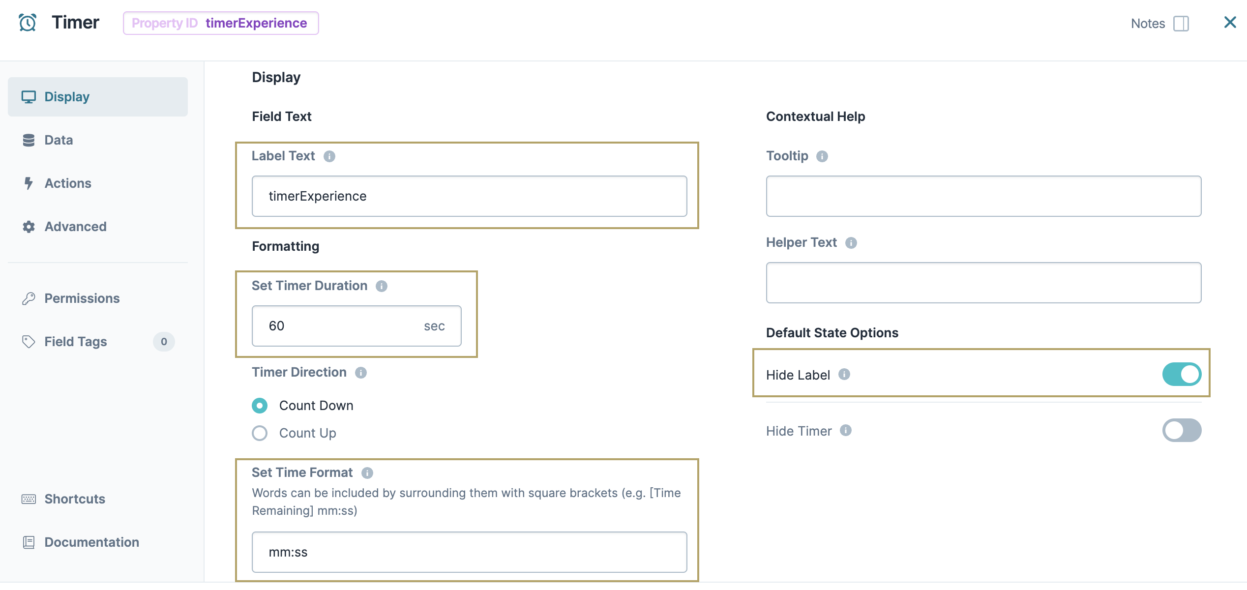
Click Save & Close.

Configure the Button Component
This Button component displays after the Timer component expires.
Drag and drop a
Button component onto your canvas, placing it below your timerExperience Timer component.In the Property ID field, enter btnSubmit.
In the Label Text field, enter
Submit.Set the Hide Field toggle to (ON).
Click Save & Close.
Configure the Decisions Component
This Decisions component is where you set the rule to only show the Submit button when the timer reaches zero.
In the Module Builder, drag and drop a Decisions component onto your canvas, placing it between your timerExperience
Timer and btnSubmit Button components.In the Property ID and Canvas Label Text fields, enter
ruleSixty.Click
.png) Actions.
Actions.Set Trigger Type to Watch.
Complete the Inputs table as follows:
Property ID
Alias
Type
1
timerExperience
exact
Complete the Outputs as follows:
Property ID
Type
1
btnSubmit
visible
Complete the Micro Decisions table as follows:
Input Values
Output Values
timerExperience
btnSubmit_visible
1
-0
yes
-0 is the Timer's value only after the time expires. So, this Decisions component only fires when the timer reaches zero.
Click Save & Close.
Save your module.

Preview your module in Express View to see the button displaying after the Timer component expires:
Structure of a Timer Component's Data
The Timer component stores as a key/value pair and displays the current time value in seconds (ss). When viewing a Timer component's value in the Devtools Console, the value displayed is the exact moment the executes. For example, if a 60-second timer is set to countdown to 0, executing the Angular command at 30 seconds displays a value of 30 in the Console.
