The Calculator component is a logic tool used with two or more components to carry out a calculation. A simple use of a Calculator is to add numbers from two different fields. But a Calculator component can do far more than simple addition. Here are some other examples of its uses:
Concatenating (or joining) two or more values.
Performing advanced calculations involving several components.
Calculating duration.
Pushing data from one component to another.
As you can see, the Calculator component is a versatile tool in your Unqork arsenal. To configure your Calculator component:
Enter your input components, and assign them simple aliases.
Create a formula using your defined aliases.
Set an output component to hold the result of your calculation.
You can find the Calculator component in the Data & Events Processing group to the left of the Module Builder.
What You'll Learn
After completing this article, you’ll know when to use a Calculator component, how to configure its settings, and how to use it in an Unqork application.
About the Configuration Window
To learn more about general component settings and those that display when a component is associated with Data Models, view our General Component Settings article.
Display Panel
Field Text
Setting | Description |
|---|---|
Canvas Label Text | A component’s Label Text indicates the purpose of the corresponding field or component. For non-input components, the Label Text isn't end-user facing, and only appears in the Module Builder. User-friendly labels make your module more accessible. Keep labels short and descriptive (a word or two) using title case. For longer entries, use sentence case.
|

Actions Panel
Triggers
Setting | Description |
|---|---|
Trigger Type | This setting provides the following options:
|
Inputs & Outputs | Displays the current Inputs and Outputs for this component. Click Edit to access the Inputs & Outputs tables. |
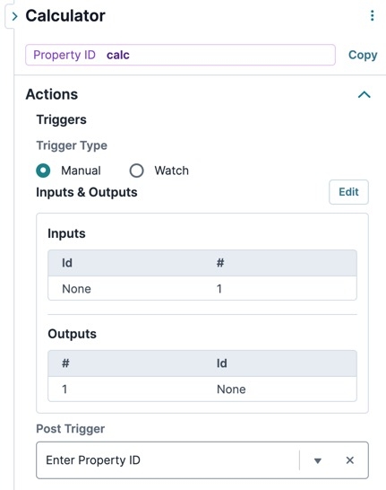
Post Trigger | The Property ID of the component that triggers after all the outputs are set. |
 Inputs


Setting | Description |
|---|---|
Property ID | The Source column is where you enter inputs for your logic component to reference. Examples of supported inputs include:
|
Alias | To simplify the configuration, give each component an alias. An easy approach is to assign each component a different letter of the alphabet. For example, A, B, C. |
Required | This setting sets the input as mandatory. That way, your calculation cannot take place without this input. |
Outputs

Setting | Description |
|---|---|
Property ID | For your logic component to recognize an output, you must enter the destination component's Property ID(s). The Property ID entered must match the Property ID of the component that acts as the output. Remember, use camel case without spaces or punctuation. This is most commonly a Text Field, Number, or Hidden component. |
Formula | Enter your calculation using an input component's alias instead of its Property ID. For example, summing two components with aliases A and B looks like the following: =(A+B). The Formula field works with most Excel formulas.
|
Advanced Panel
Setting | Description |
|---|---|
Set Execution | Select if and what is executed when this component triggers. |
Disable Execution | If Disable Execution is set to By default, this setting is set to |
Set Debounce | The number of milliseconds that pass before the form loads this component. For larger modules, increasing the debounce value prevents the Decisions component from triggering before all components load in. |
.png)

Adding a Calculator Component
For this example, let's look at an inventory count for a high-end outfitter. To create this application, you'll use four Number fields for inventory counts. Then, you'll add a Calculator to calculate the total.
In this configuration, you need the following components:
4 Number components
1 Calculator component
Configure the Number Components
Think of your Number components as buckets for the number of small, medium, and large clothing items you have in inventory. These components act as inputs for your Calculator component. Then you need a final Number component to hold the calculated total.
In the Module Builder, drag and drop four Number components onto your canvas.
In the Property ID and Label Text fields, enter the following:
Property ID
Label Text
small
Small
medium
Medium
large
Large
total
Total
Click Save Component for each component as you complete it.
Configure the Calculator Component
Now that you have a spot for each inventory count, use a Calculator component to add them together. Set each Number component as an input, then enter the logic behind your sum calculation.
Drag and drop a Calculator component onto your canvas, placing it below the four Number components.
In the Property ID field, enter calcTotal.
In the Canvas Label Text field, enter
calcTotal.Set the Trigger Type to Watch. Watch means that the Calculator continually looks for values entered in the input components.
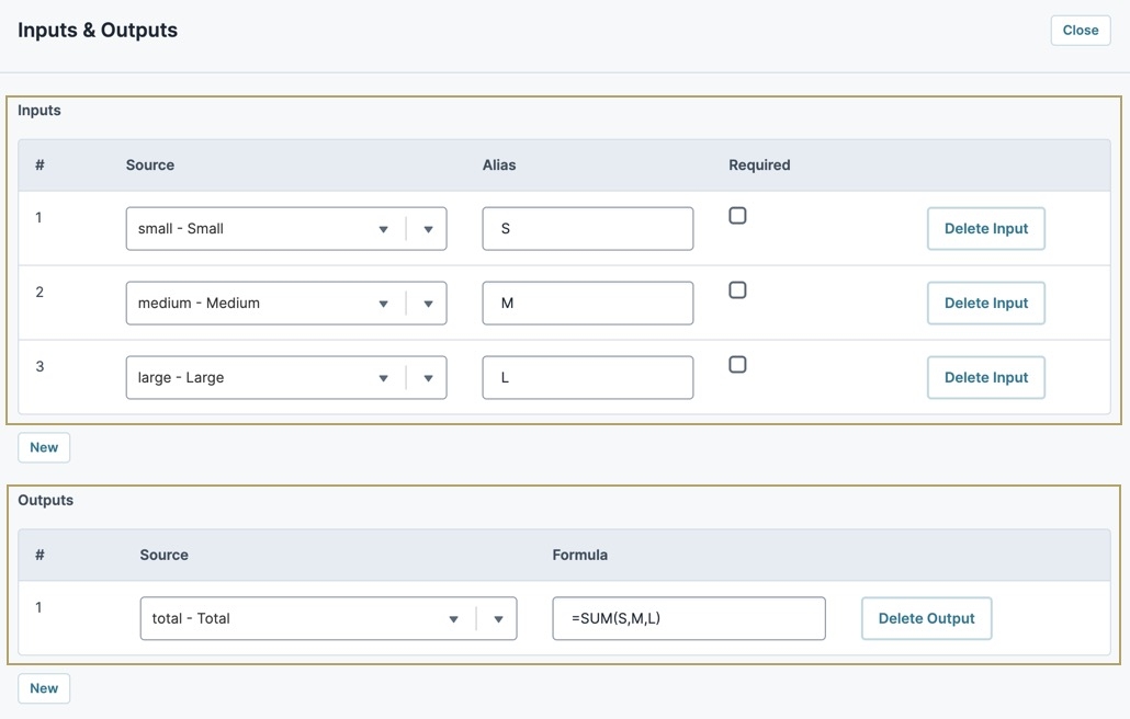
To the right of Inputs & Outputs, click Edit.
Complete the Inputs table as follows:
Source
Alias
Required
small
S
☐ (unchecked)
medium
M
☐ (unchecked)
large
L
☐ (unchecked)
In the Outputs table, enter the following:
Source
Formula
total
=SUM(S,M,L)
To discover more formulas, view our Supported Formulas page.
Click Save Component.
Save your module.

Preview your module in Express View, and test it out:
The Calculator component is a logic tool used with two or more components to carry out a calculation. A simple use of a Calculator is to add numbers from two different fields. But a Calculator component can do far more than simple addition. Here are some other examples of its uses:
Concatenating (or joining) two or more values.
Performing advanced calculations involving several components.
Calculating duration.
Pushing data from one component to another.
As you can see, the Calculator component is a versatile tool in your Unqork arsenal. To configure your Calculator component:
1.Enter your input components, and assign them simple aliases.
2.Create a formula using your defined aliases.
3.Set an output component to hold the result of your calculation.
You can find the Calculator component in the Data & Events Processing group to the left of the Module Builder.
What You'll Learn
After completing this article, you’ll know when to use a Calculator component, how to configure its settings, and how to use it in an Unqork application.
About the Configuration Window
To learn more about general component settings and those that display when a component is associated with Data Models, view our General Component Settings article.
Display Panel

Field Text
Setting | Description |
|---|---|
Canvas Label Text | A component’s Label Text indicates the purpose of the corresponding field or component. For non-input components, the Label Text isn't end-user facing, and only appears in the Module Builder. User-friendly labels make your module more accessible. Keep labels short and descriptive (a word or two) using title case. For longer entries, use sentence case.
|
Actions Panel

Triggers
Setting | Description |
|---|---|
Trigger Type | This setting provides the following options:
|
.png) Manual: The component fires when triggered by another component. For example, when using a
Manual: The component fires when triggered by another component. For example, when using a Inputs
Setting | Description |
|---|---|
Property ID | The Source column is where you enter inputs for your logic component to reference. Examples of supported inputs include:
|
Alias | To simplify the configuration, give each component an alias. An easy approach is to assign each component a different letter of the alphabet. For example, A, B, C. |
Required | This setting sets the input as mandatory. That way, your calculation cannot take place without this input. |
Outputs
Setting | Description |
|---|---|
Property ID | For your logic component to recognize an output, you must enter the destination component's Property ID(s). The Property ID entered must match the Property ID of the component that acts as the output. Remember, use camel case without spaces or punctuation. This is most commonly a Text Field, Number, or Hidden component. |
Formula | Enter your calculation using an input component's alias instead of its Property ID. For example, summing two components with aliases A and B looks like the following: =(A+B). The Formula field works with most Excel formulas.
|
Post Trigger | The Property ID of the component that triggers after all the outputs are set. |
Validation Panel

Unit Testing
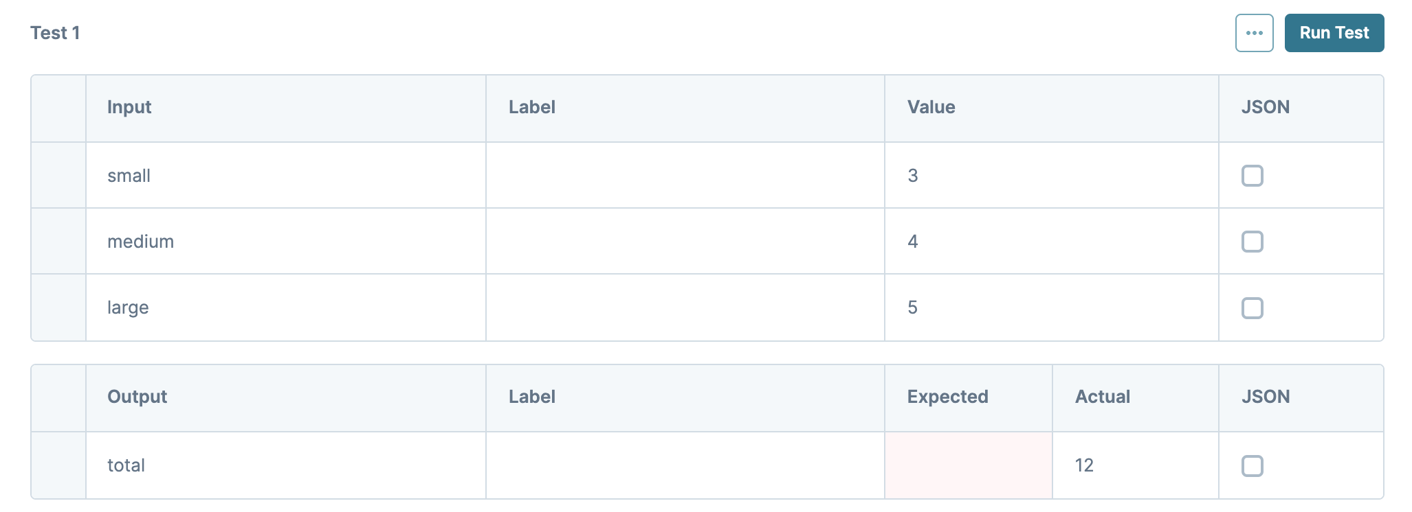
The Unit Testing tool lets you confirm your Calculator works as expected. Enter the data you want to test in the Input table, and the results of the test display in the Output table. This is a good way to catch logic errors early.
To get started, click Create Test to create a new test.

Setting | Description |
|---|---|
| Collapses or opens the Unit Testing panel. |
Refresh Fields | Updates all Input fields to reflect changes on the canvas. |
Run All Tests | Runs all added tests with the Input values entered. |
| Additional Unit Testing settings. |
| Makes a copy of an existing test. |
| Removes an existing test. |
Run Test | Runs the test with the Input values entered. |
Input Table | Use this table to enter the information you want to test. If you have multiple inputs and want to skip testing certain inputs, leave the Value column blank. |
Input | Automatically populates all components listed in the Calculator component’s Inputs table. |
Label | Automatically populates the label of the connected Input component. |
Value | Enter example data in this column that you want to test.
|
JSON | Select this checkbox when you enter a Value that's written in JSON. This can be an object, array, number, or Boolean (true/false) value. |
Output Table | This table displays the results of your test. |
Output | Automatically populates all components listed in the Calculator component's Outputs table. |
Label | Automatically populates with the label of your connected Output component. |
Expected | Enter the outcome you expect from the test you run. You can use this to compare the expected result with the actual result.
|
Actual | The result from the test you ran. |
JSON | Select this checkbox when your result must display in JSON. This can be an array, string, or object. |
.png)
.png)
.png)
.png) Duplicate
Duplicate.png) Delete Test
Delete TestAdvanced Panel

Setting | Description |
|---|---|
Set Execution | Select if and what is executed when this component triggers. |
Disable Execution | If Disable Execution is set to By default, this setting is set to |
Set Debounce | The number of milliseconds that pass before the form loads this component. For larger modules, increasing the debounce value prevents the Decisions component from triggering before all components load in. |
Adding a Calculator Component
For this example, let's look at an inventory count for a high-end outfitter. To create this application, you'll use four Number fields for inventory counts. Then, you'll add a Calculator to calculate the total.
In this configuration, you need the following components:
4 Number components
1 Calculator component
Configure the Number Components
Think of your Number components as buckets for the number of small, medium, and large clothing items you have in inventory. These components act as inputs for your Calculator component. Then you need a final Number component to hold the calculated total.
In the Module Builder, drag and drop four
.png) Number components onto your canvas.
Number components onto your canvas.In the Property ID and Label Text fields, enter the following:
Property ID
Label Text
small
Small
medium
Medium
large
Large
total
Total
Click Save & Close for each component as you add it.
Configure the Calculator Component
Now that you have a spot for each inventory count, use a Calculator component to add them together. Set each Number component as an input, then enter the logic behind your sum calculation.
Drag and drop a
.png) Calculator component onto your canvas, placing it below your Number components.
Calculator component onto your canvas, placing it below your Number components.In the Property ID and Canvas Label Text fields, enter calcTotal.
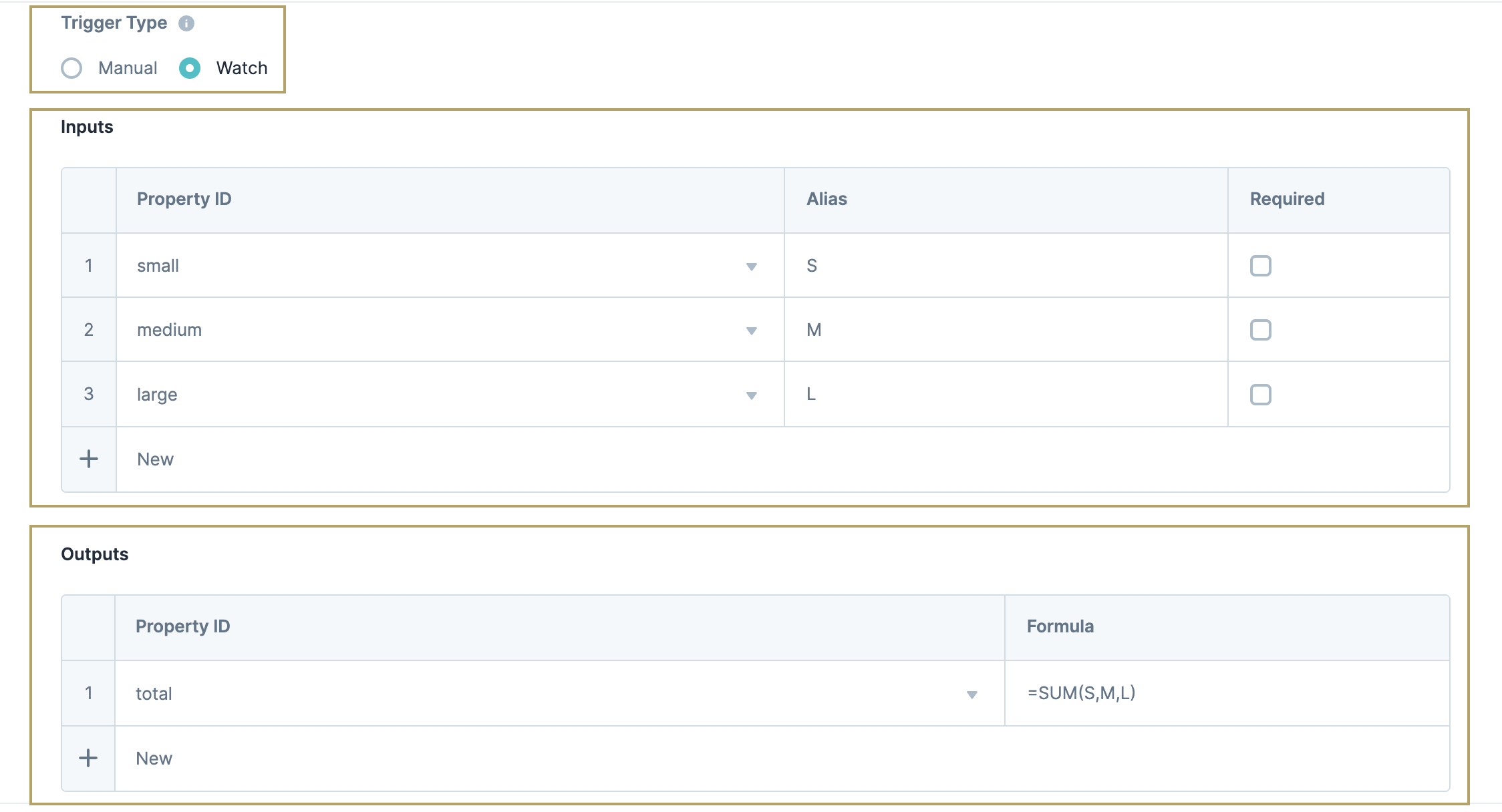
Set the Trigger Type to
 Watch. Watch means that the Calculator continually looks for values entered in the input components.
Complete the Inputs table as follows:
Property ID
Alias
Required
small
S
No (clear)
medium
M
No
large
L
No
In the Outputs table, enter the following:
Property ID
Formula
total
=SUM(S,M,L)

Your Calculator configuration is complete. Next, use the Unit Testing tool to ensure it works as expected.
Click Create Test.
In the Value column of the Inputs table, enter sample numeric values.
Click Run Test. The sum of your sample values shows in the Actual column of the Output Table.
Click Save & Close.
Save your module.

Preview your module in Express View, and test it out: