The Multi-Select Dropdown component is a compact way to show a long list of options to your end-user. The Multi-Select Dropdown component shares almost all functionality with the standard Dropdown component. But, the Multi-Select component lets your end-user make more than one selection.
Though the Checkboxes component offers similar functionality, some scenarios require a Multi-Select Dropdown component. For example, if you have more than six options or don't want your full list of options shown on the page at all times, you can use the Multi-Select Dropdown component.
Examples of when to use a Multi-Select Dropdown component are:
Which countries have you visited in the last five years? Select all that apply.
Which of these products are you interested in? Select all that apply.
This component also allows for custom styling. The standard Dropdown component relies on your end-user's operating system to determine the visual look and feel.
The amount of data in your Multi-Select Dropdown can vary, so you have a few internal and external options for how to populate it:
Internal: Enter the options directly in the configuration window or reference the options from a separate component.
External: Retrieve the options using an API call.
External data retrieved from an API must be a table array of JSON objects.
The Multi-Select Dropdown component is located in the Primary Fields group to the left of the Module Builder.
About the Configuration Window
To learn more about general component settings and those that display when a component is associated with Data Models, view our General Component Settings article.
Display Settings
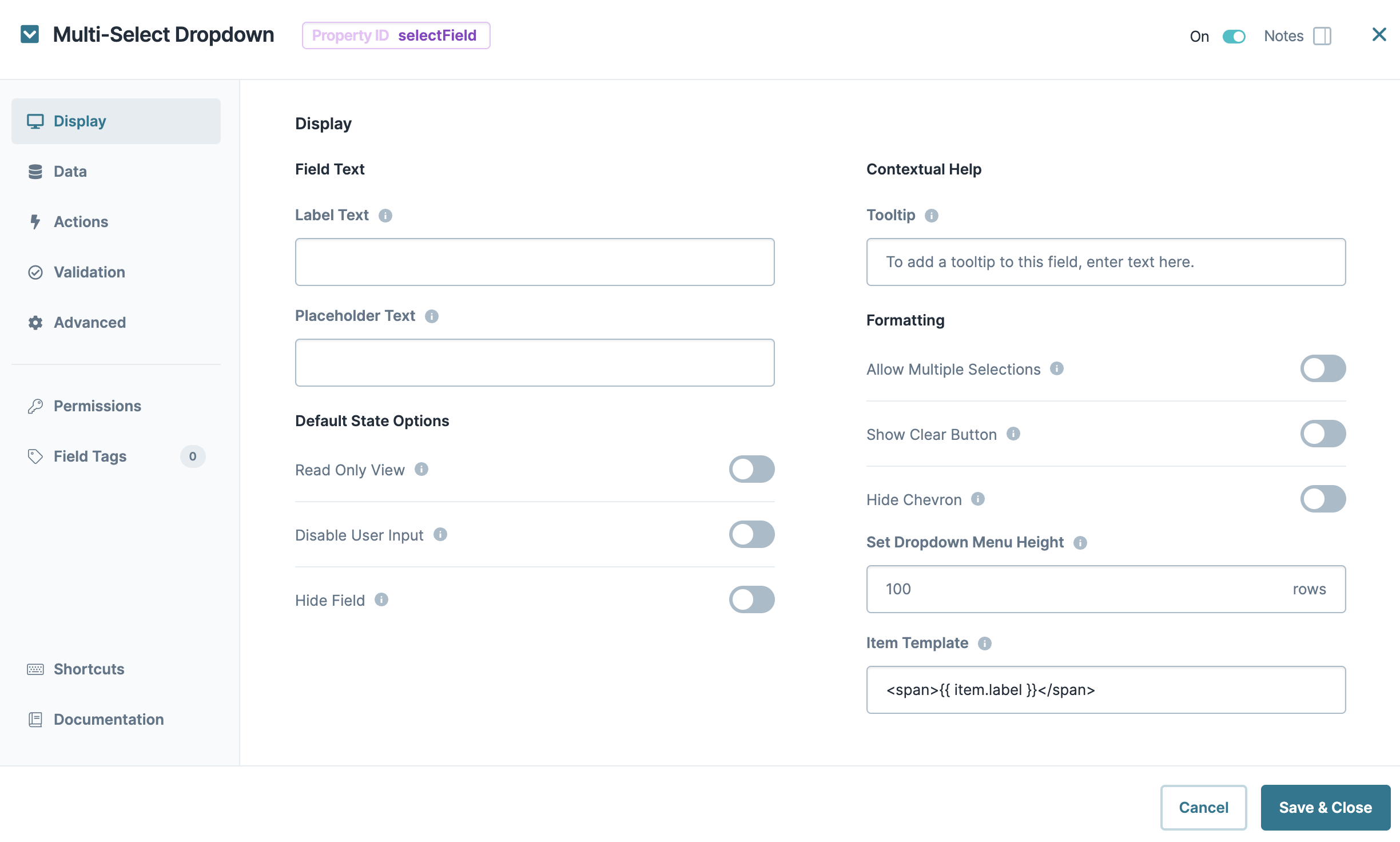
Field Text
Setting | Description |
|---|---|
Property ID | A Property ID is the unique field ID used by Unqork to track and link components in your module. The Property ID is how the software identifies your component. Using Property IDs lets you link components, creating logic-based configurations and API calls. Property IDs must use camel case (stylized as camelCase) without spaces or punctuation. |
Label Text | Label Text conveys what the input component is and what information it displays. Enter the purpose of the corresponding component or field. User-friendly labels make your module more accessible. Keep labels short and descriptive (a word or two) using title case. For longer entries, use sentence case. |
Placeholder Text | A short prompt telling end-users the expected value of an input field. For example, |
Contextual Help
Setting | Description |
|---|---|
Tooltip | A short hint that displays when an end-user positions their cursor over the |
Default State Options
Setting | Description |
|---|---|
Hide Field | Displays or hides the component from view. Setting Hide Field to By default, Hide Field is set to |
Formatting
Setting | Description |
|---|---|
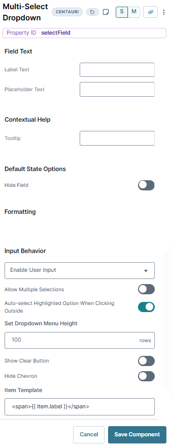
Input Behavior | Controls how end-users interact with the component. Choose from the following options:
|
Allow Multiple Selections | When set to By default, Allow Multiple Selections is set to |
Auto-Select Highlighted Option When Clicking Outside | When an end-user selects the drop-down, one of the options is automatically highlighted. When set to By default, this setting is set to |
Set Dropdown Menu Height | Sets the number of search result rows the component displays when filtered by an end-user. If there are more options than the number entered, your end-user can scroll to view them all. Or, they can enter a value to navigate to relevant results. |
Show Clear Button | When set to By default, the Show Clear Button toggle is set to |
Hide Chevron | When set to The chevron is only a visual aid and does not have functionality. Clicking into the drop-down menu (regardless of whether the chevron is visible) opens the drop-down to make a selection. Clicking or tabbing away from the drop-down menu closes it. By default, Hide Chevron is set to |
Item Template | Lets you choose which column of data you want to display as the label for the drop-down options. Replace the word label with your chosen attribute in the following string format: |
Data Settings
Data Storage
Setting | Description |
|---|---|
Store Data in Database | The Store Data in Database setting affects how data persists through your application. When set to
Set the toggle to
|
Data Source Types
There are three methods you can use to populate a Multi-Select Dropdown component: Values, URL, and Data Reference Key.
Values
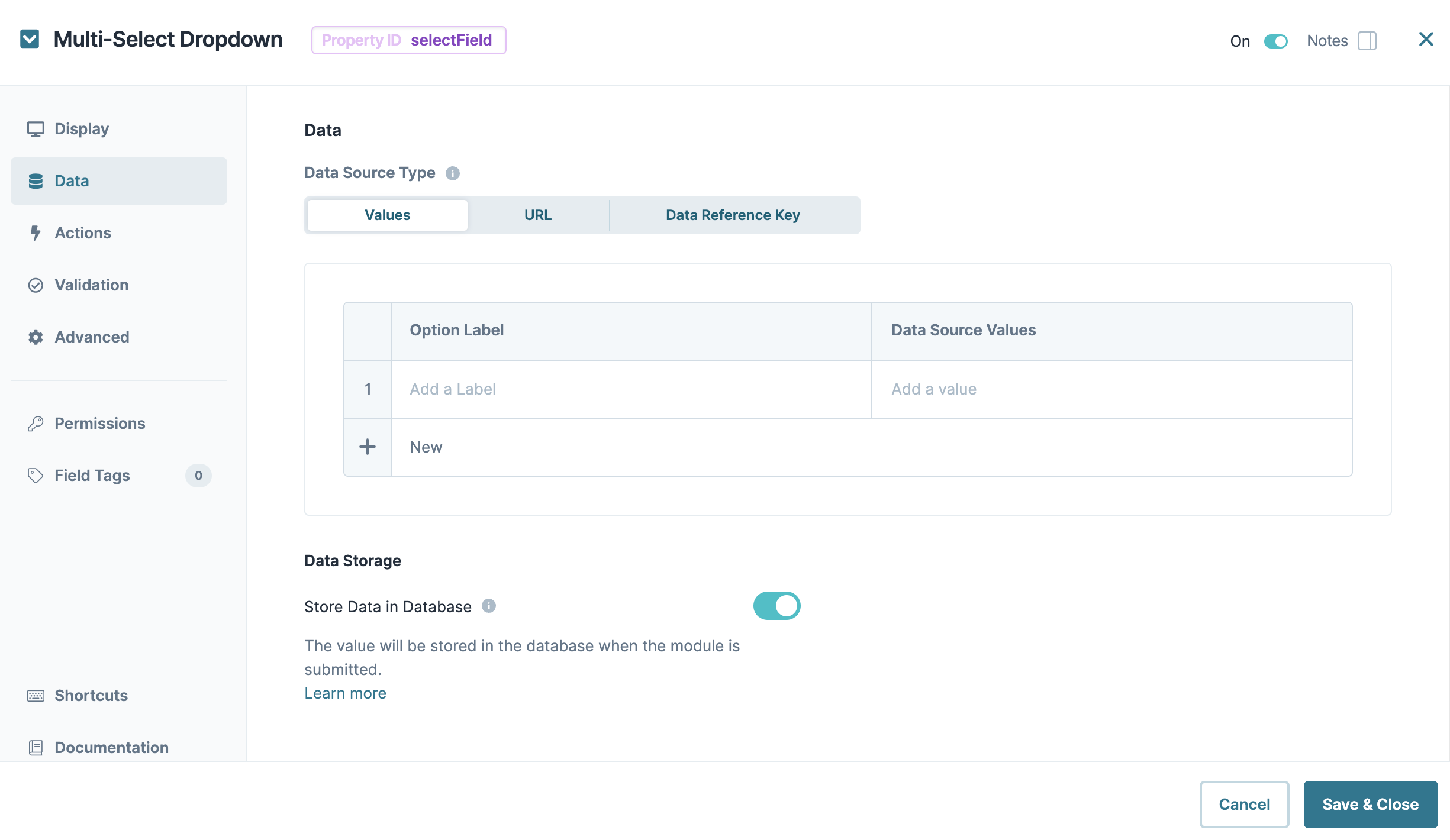
Selecting Values displays a table where you can enter each option and its value.
Setting | Description |
|---|---|
Option Label | Each option needs an end-user-facing label describing the choice that it represents. Enter your Option Labels using this column. After you create an option, another row displays for you to create the next option. |
Data Source Values | Each option needs an associated value to store in the submission data. Enter the values to store in the submission data using this column. By default, the value is a camelCase version of the Option Label. You can also assign a numeric value to each option for logic-based configurations. |
In Express View, the dropdown list searches and filters using the Option Label and Data Source values.
URL
To use data not stored in a specific component, select URL. Generally, this data lives in two places:
External to Unqork and pulled into the component using an external API call.
Internally and stored as a Data Collection.
To use an external API call, reference the provider's documentation. You'll find the API's URL address and the information you need to filter the data. To learn more, see our Using an External API in a Dropdown Component article.
To reference Data Collections in Unqork, use the Data Collections tab at the Application Level. Click Create Data Collection to create a new Data Collection. Or, explore the available Data Collections and use one of them.
To learn more about data collections, see our Data Collections article.
Setting | Description |
|---|---|
Request Header | Enter the information to display in the drop-down selections. These are your end-user's options. For external APIs, you'll find this information in the API documentation. To pull data from a Data Collection, enter the column header you want to use. |
Header Values | Each option needs an associated value to store in the submission data. Enter the values to store in the submission data using this column. If you want the value to be the same as the label, enter the same information you put in the Request Header. By default, the value is a camelCase version of the Request Header. You can also assign a numeric value to each option for logic-based configurations. |
Service | Select an external service configured through Unqork's Services Administration. This auto-populates the other required fields, including the Data Source URL. |
Data Source URL | For an API to retrieve data, you need the API's URL information. In this field, enter the API information as obtained from the API documentation. Add additional filters at the end of the URL if you want to drill down to a specific type of data. |
Value Property | If a data set includes a column for values, enter the column's name here. If not specified, the application uses the option label. |
Data Path | If using an API call to populate the component, enter a specific data property to reference here. This is useful if you want to show one piece of a larger data set in your Multi-Select Dropdown component. |
Label Path | This field refers to the option labels you want to pull. Enter the option label's column header in this field. |
Filter Query | Provide additional filtering using query parameters. Parameters append to the end of the Data Source URL. Query parameters can be static or dynamic. For example, |
Search Query Name | The name of the search query string parameter used when sending a request to filter results. The server at the specified URL must support this query parameter. |
Refresh On | This field displays a list of the other components in your module. You can select a component here to refresh your Multi-Select Dropdown. When your end-user interacts with the selected component, the Multi-Select Dropdown resets. You can also select Any Change. This refreshes the Multi-Select Dropdown if your end-user interacts with any of your components.
|
Refresh Delay | Works with the Refresh On setting to set the number of milliseconds that pass before refresh. Once typing has finished, the delay begins. The component has a minimum Refresh Delay of 250 ms, which is the default for this field. |
Limit Number of Items | Limits the number of matching responses when working with large data sets. For example, an API might return more responses than you want to display, even when your end-user starts typing. Here, you can set a limit on how many results display. |
Disable Limiting Response | When set to By default, this setting is |
Search Parameters are Required | When set to By default, this setting is |
Clear Value on Refresh | When set to By default, this setting is |
Authenticate | When set to By default, this setting is |
Disable Filter Application | When set to By default, this setting is |
Data Reference Key
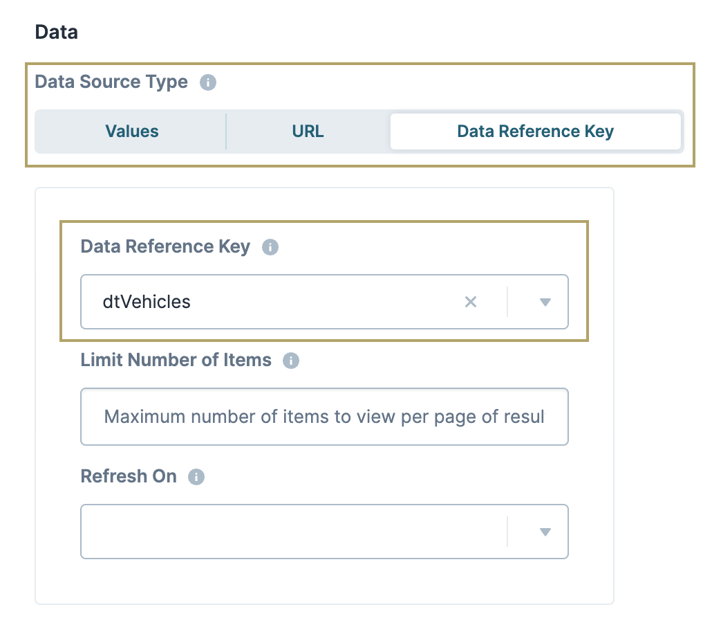
Using the Data Reference Key option, data from another component populates the Multi-Select Dropdown component. You'll most often do this with a Data Table component. Add your data to the Data Table component. Then, reference it in your Multi-Select Dropdown component's configuration menu.
Think of this as a hybrid option of Values and Data Collections to populate your Multi-Select Dropdown component. You still use data stored in Unqork, but it's data from your module instead of a Data Collection.
Setting | Description |
|---|---|
Data Reference Key | Enter the Property ID of the component whose data you're referencing. |
Limit Number of Items | Limits the number of matching responses when working with large data sets. For example, an API might return more responses than you want to show. Here, you can set a limit on how many results display. |
Refresh On | This field displays a list of the other components in your module. You can select a component here to cause your Dropdown to refresh. When your end-user interacts with the selected component, the Dropdown resets. Here, you can also select Any Change. This refreshes the Dropdown if your end-user interacts with any of your components.
|
Actions Settings
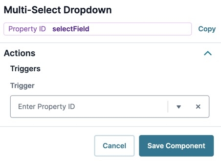
Triggers
Setting | Description |
|---|---|
Trigger | To set up a trigger, enter the Property ID of your chosen logic component into this field. When the end-user performs an action on the current component, the triggered component fires. |
Validation Settings
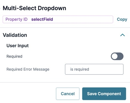
User Input
Setting | Description |
|---|---|
Required | When set to By default, Required is set to |
Required Error Message | A custom error message that displays below a required field. The error message displays when the end-user tries to save or submit the module without completing the required field. |
Advanced Settings
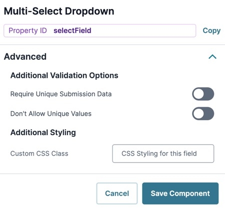
Additional Validation Options
Setting | Description |
|---|---|
Require Unique Submission Data | When set to By default, the Require Unique Submission Data toggle is set to |
Don't Allow Unique Values | When set to When set to |
Additional Styling
Setting | Description |
|---|---|
Custom CSS Class | Enter a Custom CSS Class to apply to your component. Custom CSS lets you maintain a consistent look and feel when the field or element is part of a template or multiple modules. Updated CSS styling applies to all components that reference this custom class name. |
Adding a Multi-Select Dropdown Component
Use a Multi-Select Dropdown to ask your end-user what vehicle types they own. Because the end-user could own multiple vehicle types, enable the Allow Multiple Selections setting. As the end-user selects vehicle types, they display above the drop-down as a button.
Configure the Multi-Select Dropdown Component
Configure a Multi-Select Dropdown to contain a list of vehicles the end-user can select from.
Drag and drop a Multi-Select Dropdown component onto your canvas.
In the Property ID field, enter vehicles.
In the Label Text field, enter
Vehicles.Under Formatting, set Allow Multiple Selections to
 (ON).
(ON).Navigate to the component's Data settings.
Next to the Values table, click Edit. The Values table panel displays.
Below the Values table, click the New button seven times.
In the Values table, enter the following:
#
Option Label
Option Value
1
Sedan
sedan
2
Coupe
coupe
3
SUV
suv
4
Truck
truck
5
Motorcycle
motorcycle
6
Tractor
tractor
7
Horse and Buggy
horseAndBuggy
As a best practice, enter column titles in lowercase, with no breaks or special characters.
Click Save Component.
Once implemented, here's how your Multi-Select Dropdown component displays in Express View:
The Multi-Select Dropdown component is a compact way to show a long list of options to your end-user. The Multi-Select Dropdown component shares almost all functionality with the standard Dropdown component. But, the Multi-Select component lets your end-user make more than one selection.
Though the Checkboxes component offers similar functionality, some scenarios require a Multi-Select Dropdown component. For example, if you have more than six options or don't want your full list of options shown on the page at all times, you can use the Multi-Select Dropdown component.
Examples of when to use a Multi-Select Dropdown component are:
Which countries have you visited in the last five years? Select all that apply.
Which of these products are you interested in? Select all that apply.
This component also allows for custom styling. The standard Dropdown component relies on your end-user's operating system to determine the visual look and feel.
The amount of data in your Multi-Select Dropdown can vary, so you have a few internal and external options for how to populate it:
Internal: Enter the options directly in the configuration window or reference the options from a separate component.
External: Retrieve the options using an API call.
External data retrieved from an API must be a table array of JSON objects.
The Multi-Select Dropdown component is located in the Primary Fields group to the left of the Module Builder.
About the Configuration Window
To learn more about general component settings and those that display when a component is associated with Data Models, view our General Component Settings article.
Display Panel
Field Text
Setting | Description |
|---|---|
Property ID | A Property ID is the unique field ID used by Unqork to track and link components in your module. The Property ID is how the software identifies your component. Using Property IDs lets you link components, creating logic-based configurations and API calls. Property IDs must use camel case (stylized as camelCase) without spaces or punctuation. |
Label Text | Label Text conveys what the input component is and what information it displays. Enter the purpose of the corresponding component or field. User-friendly labels make your module more accessible. Keep labels short and descriptive (a word or two) using title case. For longer entries, use sentence case. |
Placeholder Text | A short prompt telling end-users the expected value of an input field. For example, |
Default State Options
Setting | Description |
|---|---|
Read Only View | When set to By default, the Read Only View toggle is set to |
Disable User Input | When set to By default, Disable User Input is set to |
Hide Field | Displays or hides the component from view. Setting Hide Field to By default, Hide Field is set to |
Contextual Help
Setting | Description |
|---|---|
Tooltip | A short hint that displays when an end-user positions their cursor over the |
Formatting
Setting | Description |
|---|---|
Allow Multiple Selections | Setting the Use Input Mask toggle to By default, the Use Input Mask toggle is set to |
Auto-Select Highlighted Option When Clicking Outside | When an end-user selects the drop-down, one of the options is automatically highlighted. When set to By default, this setting is set to |
Show Clear Button | When set to By default, the Show Clear Button toggle is set to |
Hide Chevron | When set to The Chevron is only a visual aid and does not have functionality. Clicking into the drop-down menu (regardless of whether the chevron is visible) opens the drop-down to make a selection. Clicking or tabbing away from the drop-down menu closes it. By default, Hide Chevron is set to |
Set Dropdown Menu Height | Sets the number of search result rows the component displays when filtered by an end-user. If there are more options than the number entered, your end-user can scroll to view them all. Or, they can enter a value to navigate to relevant results. |
Item Template | Lets you choose which column of data you want to display as the label for the drop-down options. Replace the word label with your chosen attribute in the following string format: |
Data Panel
Data Source Types
There are three methods you can use to populate a Multi-Select Dropdown component: Values, URL, and Data Reference Key.
Values
Selecting Values displays a table where you can enter each option and its value.
Setting | Description |
|---|---|
Option Label | Each option needs an end-user-facing label describing the choice that it represents. Enter your Option Labels using this column. After you create an option, another row displays for you to create the next option. |
Data Source Values | Each option needs an associated value to store in the submission data. Enter the values to store in the submission data using this column. By default, the value is a camel case version of the Option Label. You can also assign a numeric value to each option for logic-based configurations. |
URL
To use data not stored in a specific component, select URL. Generally, this data lives in two places:
External to Unqork and pulled into the component using an external API call.
Internally and stored as a Data Collection.
To use an external API call, reference the provider's documentation. You'll find the API's URL address and the information you need to filter the data. To learn more, see our Using an External API in a Dropdown Component article.
To reference Data Collections in Unqork, use the Data Collections tab at the Application Level. Click Create Data Collection to create a new Data Collection. Or, explore the available Data Collections and use one of them.
To learn more about data collections, see our Data Collections article.
Setting | Description |
|---|---|
Request Header | Enter the information to display in the drop-down selections. These are your end-user's options. For external APIs, you'll find this information in the API documentation. To pull data from a Data Collection, enter the column header you want to use. |
Header Values | Each option needs an associated value to store in the submission data. Enter the values to store in the submission data using this column. If you want the value to be the same as the label, enter the same information you put in the Request Header. By default, the value is a camel case version of the Request Header. You can also assign a numeric value to each option for logic-based configurations. |
Service | Select an external service configured through Unqork's Services Administration. This auto-populates the other required fields, including the Data Source URL. |
Data Source URL | For an API to retrieve data, you need the API's URL information. In this field, enter the API information as obtained from the API documentation. Add additional filters at the end of the URL if you want to drill down to a specific type of data. |
Value Property | If a data set includes a column for values, enter the column's name here. If not specified, the application uses the option label. |
Data Path | If using an API call to populate the component, enter a specific data property to reference here. This is useful if you want to show one piece of a larger data set in your Multi-Select Dropdown component. |
Label Path | This field refers to the option labels you want to pull. Enter the option label's column header in this field. |
Filter Query | Provide additional filtering using query parameters. Parameters append to the end of the Data Source URL. Query parameters can be static or dynamic. For example, |
Search Query Name | The name of the search query string parameter used when sending a request to filter results. The server at the specified URL must support this query parameter. |
Refresh On | This field displays a list of the other components in your module. You can select a component here to refresh your Multi-Select Dropdown. When your end-user interacts with the selected component, the Multi-Select Dropdown resets. You can also select Any Change. This refreshes the Multi-Select Dropdown if your end-user interacts with any of your components.
|
Refresh Delay | Works with the Refresh On setting to set the number of milliseconds that pass before refresh. Once typing has finished, the delay begins. The component has a minimum Refresh Delay of 250 ms, which is the default for this field. |
Limit Number of Items | Limits the number of matching responses when working with large data sets. For example, an API might return more responses than you want to display, even when your end-user starts typing. Here, you can set a limit on how many results display. |
Disable Limiting Response | When set to By default, this setting is |
Search Parameters are Required | When set to By default, this setting is |
Clear Value on Refresh | When set to By default, this setting is |
Authenticate | When set to By default, this setting is |
Disable Filter Application | When set to By default, this setting is |
Data Reference Key
Using the Data Reference Key option, data from another component populates the Multi-Select Dropdown component. You'll most often do this with a Data Table component. Add your data to the Data Table component. Then, reference it in your Multi-Select Dropdown component's configuration menu.
Think of this as a hybrid option of Values and Data Collections to populate your Multi-Select Dropdown component. You still use data stored in Unqork, but it's data from your module instead of a Data Collection.
Setting | Description |
|---|---|
Data Reference Key | Enter the Property ID of the component whose data you're referencing. |
Limit Number of Items | Limits the number of matching responses when working with large data sets. For example, an API might return more responses than you want to show. Here, you can set a limit on how many results display. |
Refresh On | This field displays a list of the other components in your module. You can select a component here to cause your Dropdown to refresh. When your end-user interacts with the selected component, the Dropdown resets. Here, you can also select Any Change. This refreshes the Dropdown if your end-user interacts with any of your components.
|
Data Storage
Setting | Description |
|---|---|
Store Data in Database | The Store Data in Database setting affects how data persists through your application. When set to
Set the toggle to
|
Actions Panel
Triggers
Setting | Description |
|---|---|
Trigger | To set up a trigger, enter the Property ID of your chosen logic component into this field. When the end-user performs an action on the current component, the triggered component fires. |
Validation Panel
User Input
Setting | Description |
|---|---|
Required | When set to By default, Required is set to |
Required Error Message | A custom error message that displays below a required field. The error message displays when the end-user tries to save or submit the module without completing the required field. |
Advanced Panel
Additional Validation Options
Setting | Description |
|---|---|
Require Unique Submission Data | When set to By default, the Require Unique Submission Data toggle is set to |
Don't Allow Unique Values | When set to When set to |
Additional Styling
Setting | Description |
|---|---|
Custom CSS Class | Enter a Custom CSS Class to apply to your component. Custom CSS lets you maintain a consistent look and feel when the field or element is part of a template or multiple modules. Updated CSS styling applies to all components that reference this custom class name. |
Adding a Multi-Select Dropdown Component
Let's configure a Multi-Select Dropdown component referencing a Data Table component. Use the Multi-Select Dropdown to ask your end-user which vehicles they own.
Configure the Data Table Component
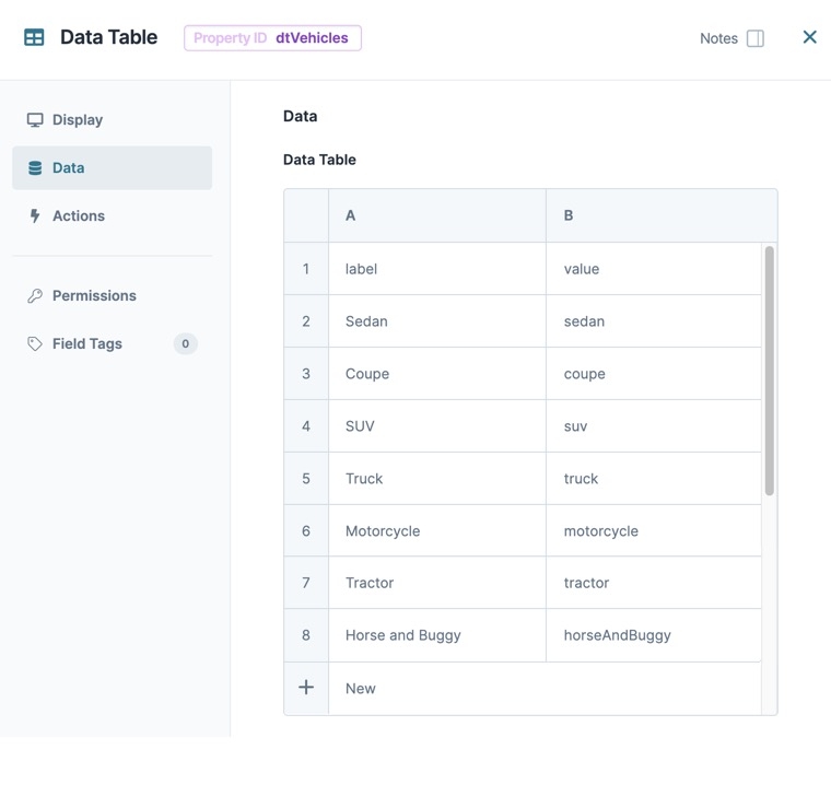
This Data Table component supplies the vehicle labels and values for your end-user to select from a drop-down menu in Express View.
These instructions assume that you have an open module saved with a title.
In the Module Builder, drag and drop a Data Table component onto your canvas.
In the Property ID and Canvas Label Text fields, enter
dtVehicles.In the data table, enter the following:
#
A
B
1
label
value
2
Sedan
sedan
3
Coupe
coupe
4
SUV
suv
5
Truck
truck
6
Motorcycle
motorcycle
7
Tractor
tractor
8
Horse and Buggy
horseAndBuggy
As a best practice, enter column titles in lowercase, with no breaks or special characters.
Click Save & Close.
Configure the Multi-Select Dropdown Component
Then, configure a Multi-Select Dropdown component to reference your Data Table component data so your end-user can select one or more options.
Drag and drop a Multi-Select Dropdown component onto your canvas, placing it below the
dtVehiclesData Table component.In the Property ID field, enter vehicles.
In the Label Text field, enter
Vehicles.From the Data Source Type options, select Data Reference Key.
In the Data Reference Key field, enter
dtVehicles. This refers to the Property ID of yourdtVehiclesData Table component.Click Save & Close.
Save your module.
Once implemented, here's how your Multi-Select Dropdown component displays in Express View:
Structure of a Multi-Select Dropdown Component's Data
Using the example above, in Express View, execute the AngularJS command in the DevTools Console. The vehicles .png) Multi-Select Dropdown component stores selected options in an array when viewed in the developer console. If no options have been checked, then the array is empty.
Multi-Select Dropdown component stores selected options in an array when viewed in the developer console. If no options have been checked, then the array is empty.
.jpg) (Tooltip) icon. Tooltips can display across more than one line.
(Tooltip) icon. Tooltips can display across more than one line.
