The Matrix (Centauri v1.0) component enables Creators to create a series of questions that have the same responses. For example, creating a survey where end-users answer several questions on a scale of 1 to 5.
The Matrix component displays data in one of two ways as shown below:
Table
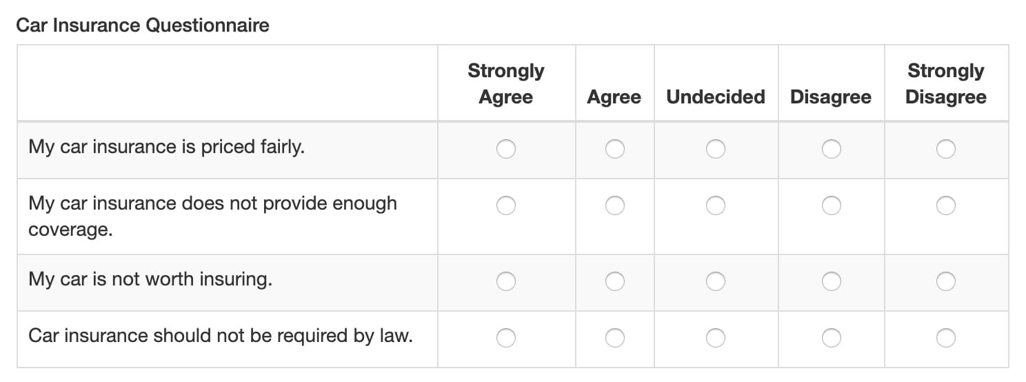
Displays data in a table of radio buttons. Here's how the table option for displaying the Matrix component looks in Express View:
Inline
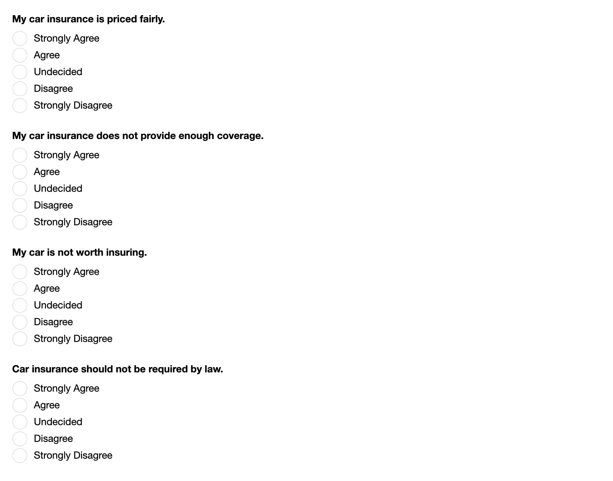
Displays data inline with the rest of your module. Here's how the inline option looks in Express View:
For logic-based configurations, you can also assign numeric values to your response options. For example, Strongly Agree = 5, Agree = 4, and so on.
You'll find the Matrix component in the Display & Layout group to the left of the Module Builder.
About the Configuration Window
To learn more about general component settings, view our General Component Settings article.
Display Settings
Default State Options
Setting | Description |
|---|---|
Hide Label | Setting Hide Label to By default, this setting is set to |
Hide Field | Displays or hides the component from view. Setting Hide Field to By default, Hide Field is set to |
Formatting
Setting | Description |
|---|---|
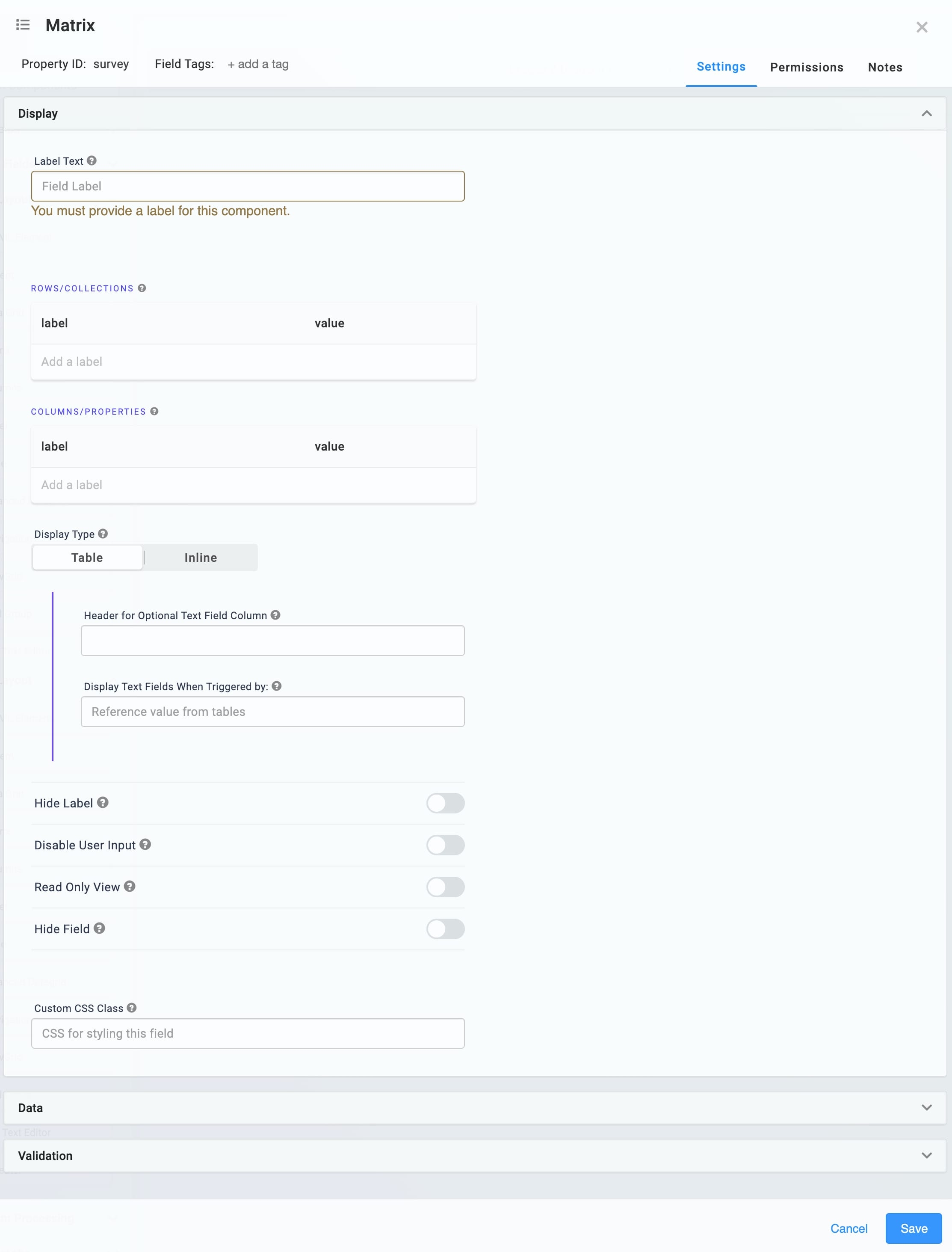
Display Type | You can choose to display the Matrix component either as a Table or Inline.
|
Table | When using Table display, you can add a text field column to your Matrix component. Doing so lets the end-user enter values, and the text field column triggers when the end-user selects the triggering value. For example, if an end-user selects an option called Selecting Table displays the following settings:
|
Inline | When you select Inline, the following setting displays: Tooltip: A short hint that displays when an end-user positions their cursor over the |
Input Behavior
Setting | Description |
|---|---|
Input Behavior | Controls how end-users interact with the component. Choose from the following options:
|
Data Settings
Data Storage
Setting | Description |
|---|---|
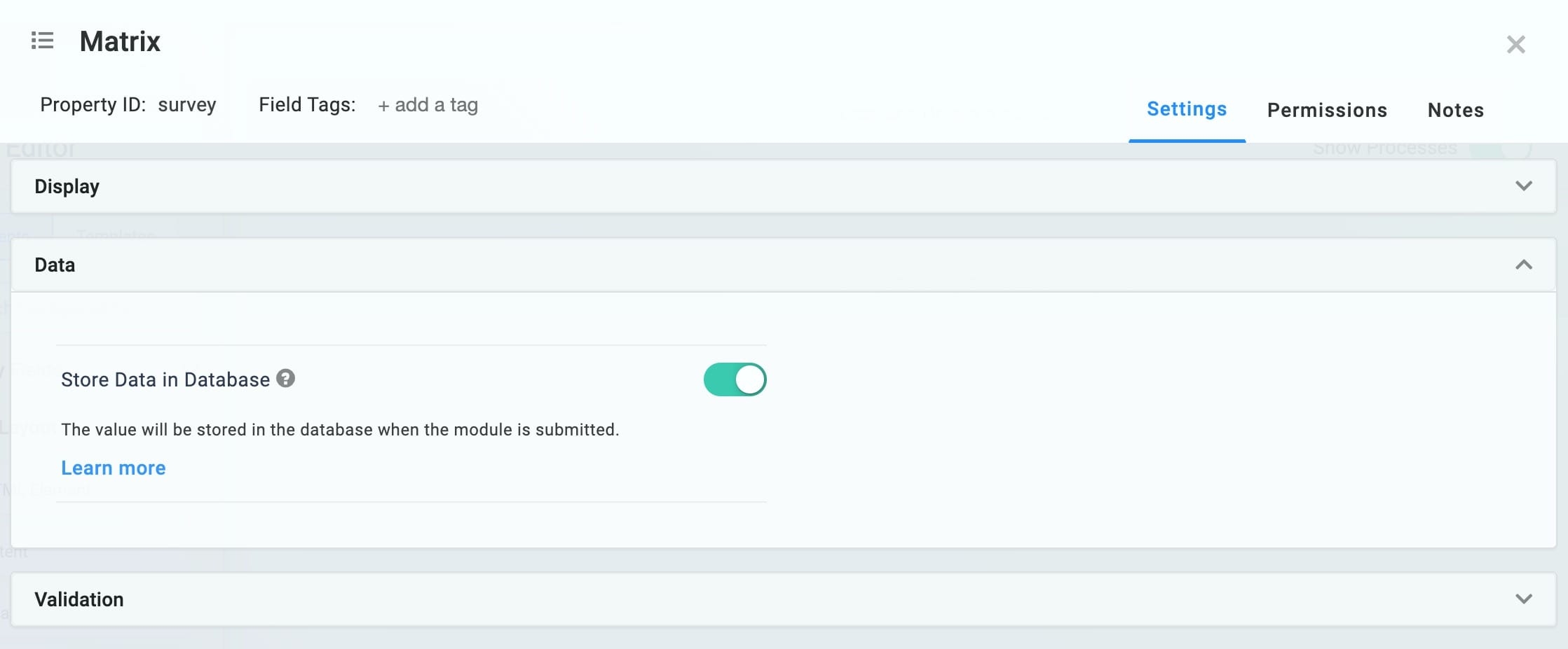
Store Data in Database | The Store Data in Database setting affects how data persists through your application. When set to
Set the toggle to
By default, the Store Data in Database toggle is set to ON. |
Validation Settings
User Input
Setting | Description |
|---|---|
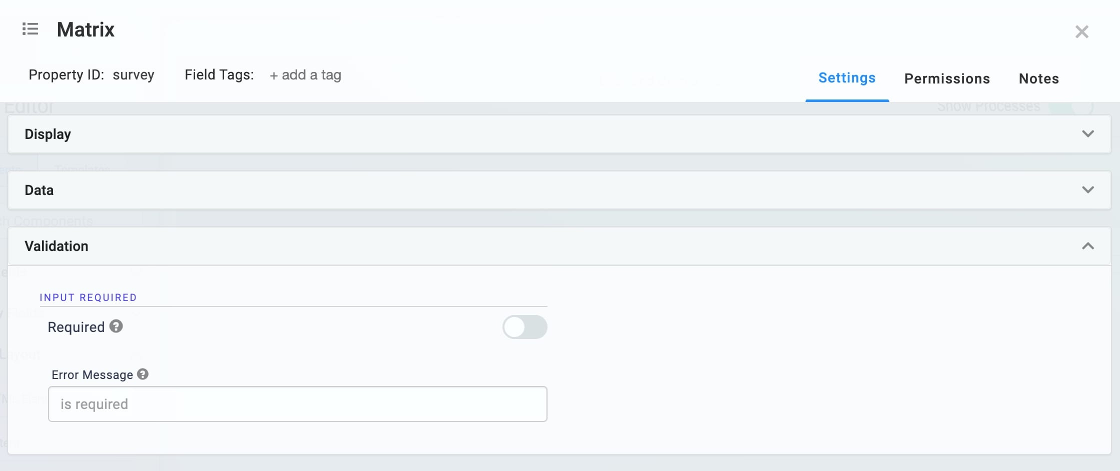
Required | When set to By default, Required is set to |
Error Message | A custom error message that displays below a required field. The error message displays when the end-user tries to save or submit the module without completing the required field. |
Advanced Settings
Additional Styling
Setting | Description |
|---|---|
Custom CSS Class | Enter a Custom CSS Class to apply to your component. Custom CSS lets you maintain a consistent look and feel when the field or element is part of a template or multiple modules. Updated CSS styling applies to all components that reference this custom class name. |
Adding a Matrix Component
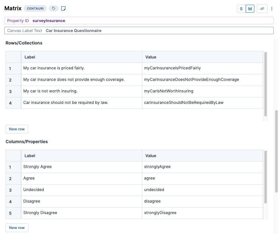
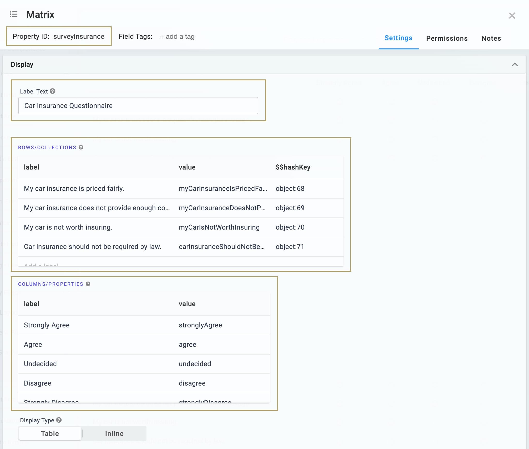
In this scenario, you'll create a car insurance questionnaire using the default Table display option. These instructions assume that you have an open module saved with a title.
In the Module Builder drag and drop a Matrix component onto your canvas.
In the Property ID field, enter
surveyInsurance.In the Canvas Label Text field, enter
Car Insurance Questionnaire.In the Rows/Collections table, enter the following:
Label
Value
1
My car insurance is priced fairly.
myCarInsuranceIsPricedFairly
2
My car insurance does not provide enough coverage.
myCarInsuranceDoesNotProvideEnoughCoverage
3
My car is not worth insuring.
myCarIsNotWorthInsuring
4
Car insurance should not be required by law.
carInsuranceShouldNotBeRequiredByLaw
The Label column sets the row labels for your table.
In the Columns/Properties table, enter the following:
Label
Value
1
Strongly Agree
stronglyAgree
2
Agree
agree
3
Undecided
undecided
4
Disagree
disagree
5
Strongly Disagree
stronglyDisagree
The Label column sets the column headers for your table.
Click Save Component.
Save your module.
Preview your module in Express View. Note how the data displays in the Matrix table:
The Matrix (Centauri v1.0) component enables Creators to create a series of questions that have the same responses. For example, creating a survey where end-users answer several questions on a scale of 1 to 5.
The Matrix component displays data in one of two ways as shown below:
Table: Displays data in a table of radio buttons. Here's how the table option for displaying the Matrix component looks in Express View:
Inline: Displays data inline with the rest of your module. Here's how the inline option looks in Express View:
For logic-based configurations, you can also assign numeric values to your response options. For example, Strongly Agree = 5, Agree = 4, and so on.
You'll find the Matrix component in the Display & Layout group to the left of the Module Builder.
About the Configuration Window
To learn more about general component settings, view our General Component Settings article.
Display Panel
Setting | Description |
|---|---|
Label Text | Label Text conveys what the input component is and what information it displays. Enter the purpose of the corresponding component or field. User-friendly labels make your module more accessible. Keep labels short and descriptive (a word or two) using title case. For longer entries, use sentence case. |
Rows/Collections | Use this table to set the row labels.
By default, the value is a camel case version of the label. You can also assign a numeric value to each option for use in logic-based configurations. |
Columns/Properties | Use this table to set the column headers.
By default, the value is a camel case version of the label. You can also assign a numeric value to each option for use in logic-based configurations. |
Display Type | You can choose to display the Matrix component either as a Table or Inline.
|
Table | When using Table display, you can add a text field column to your Matrix component. Doing so lets the end-user enter values, and the text field column triggers when the end-user selects the triggering value. For example, if an end-user selects an option called Other/Not, the selection triggers a text field where the end-user can enter a specific value. Selecting Table displays the following settings:
|
Inline | When you select Inline, the following setting displays: Tooltip: A short hint that displays when an end-user positions their cursor over the |
Hide Label | Setting Hide Label to By default, this setting is set to |
Disable User Input | When set to By default, Disable User Input is set to |
Read Only View | When set to By default, the Read Only View toggle is set to |
Hide Field | Displays or hides the component from view. Setting Hide Field to By default, Hide Field is set to |
Custom CSS Class | Enter a Custom CSS Class to apply to your component. Custom CSS lets you maintain a consistent look and feel when the field or element is part of a template or multiple modules. Updated CSS styling applies to all components that reference this custom class name. |
Data Panel
Setting | Description |
|---|---|
Store Data in Database | The Store Data in Database setting affects how data persists through your application. When set to
Set the toggle to
By default, the Store Data in Database toggle is set to ON. |
Validation Panel
Setting | Description |
|---|---|
Required | When set to By default, Required is set to |
Error Message | A custom error message that displays below a required field. The error message displays when the end-user tries to save or submit the module without completing the required field. |
Adding a Matrix Component
In this scenario, you'll create a car insurance questionnaire using the default Table display option. These instructions assume that you have an open module saved with a title.
In the Module Builder drag and drop a Matrix component onto your canvas.
In the Property ID field, enter
surveyInsurance.In the Label Text field, enter
Car Insurance Questionnaire.In the Rows/Collection table, enter the following:
Label
Value
My car insurance is priced fairly.
myCarInsuranceIsPricedFairly
My car insurance does not provide enough coverage.
myCarInsuranceDoesNotProvideEnoughCoverage
My car is not worth insuring.
myCarIsNotWorthInsuring
Car insurance should not be required by law.
carInsuranceShouldNotBeRequiredByLaw
The Label column sets the row labels for your table.
In the Columns/Properties table, enter the following:
Label
Value
Strongly Agree
stronglyAgree
Agree
agree
Undecided
undecided
Disagree
disagree
Strongly Disagree
stronglyDisagree
The Label column sets the column headers for your table.
Click Save.
Save your module.
Once complete, your module looks like the following in Express View:
.jpg) (Tooltip) icon. Tooltips can display across more than one line.
(Tooltip) icon. Tooltips can display across more than one line..jpg)
.jpg)
.jpg)
.jpg)
