Overview
The Simple Select component is a Vega (v2.0) Primary Fields component that lets end-users select one or more options from a drop-down list. The drop-down list uses a values table, or a data reference key, to display a list of options.
By default, the Simple Select component stays collapsed until the end-user opens it. After making a selection, the list closes again.
You'll find the Simple Select component in the Primary Fields group to the left of the Module Builder.
About the Configuration Window
To learn more about general component settings, view our General Component Settings article.
Display Settings
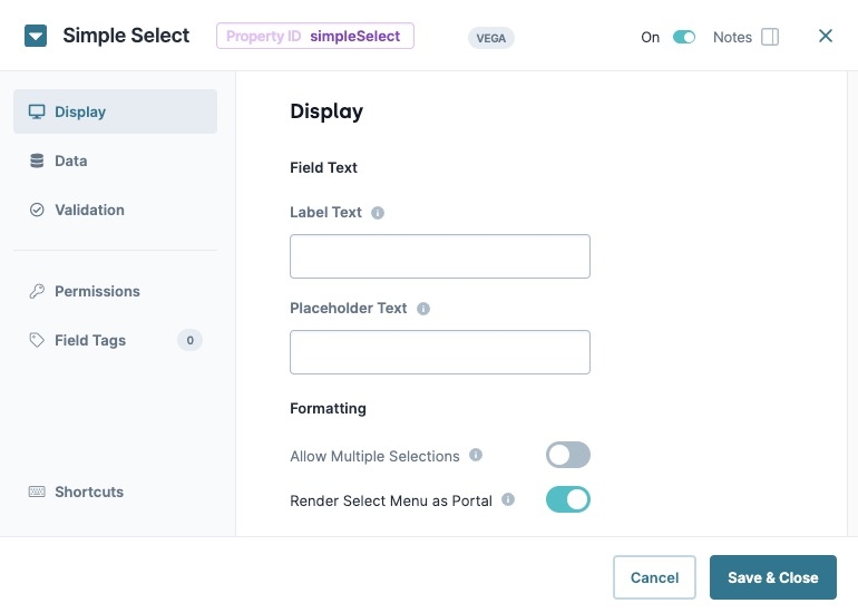
Field Text
Setting | Description |
|---|---|
Label Text | Label Text conveys what the input component is and what information it displays. Enter the purpose of the corresponding component or field. User-friendly labels make your module more accessible. Keep labels short and descriptive (a word or two) using title case. For longer entries, use sentence case. |
Placeholder Text | A short prompt telling end-users the expected value of an input field. For example, |
Formatting
Setting | Description |
|---|---|
Allow Multiple Selections | When set to |
Render Select Menu as Portal | When set to By default this setting is |
Data Settings
Data Source Type
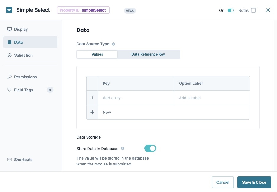
There are two methods that you can use to populate a Simple Select component: Values and Data Reference Key.
Values
Selecting Values displays a table where you can enter each option and its value.
Setting | Description |
|---|---|
Key | Create a key value for targeting the option. For example, if you have three options in your menu, you could assign the following keys: |
Option Label | Enter the text that displays to the end-user. When an end-user clicks the text, the Action setting fires. |
Data Reference Key
Using the Data Reference Key option, data from another component populates the Simple Select component. You'll most often use this option with a Data Table component. After adding you data to the Data Table component, reference the component in your Simple Select component's configuration window.
Think of this as a hybrid option of using Values and Data Collections to populate the Simple Select component. You still use data stored in Unqork, but it's data from your module instead of a Data Collection.
Setting | Description |
|---|---|
Data Reference Key | Enter the Property ID of the component whose data you're referencing. |
Key Property | Specify the property in the data source to use as the select value. If no value is specified, the item value is used. By default, this setting's value is empty. |
Label Property | This field refers to the option labels to retrieve. If you're retrieving data from a Data Table component, enter the column header in this field. |
Adornments Property | Specify the property that contains the adornments. This setting is optional. |
Actions Settings
Events & Operations
Setting | Description |
|---|---|
Edit | Opens the Operations Builder tool.
|
Validation Panel
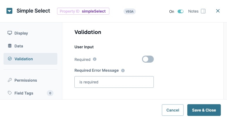
User Input
Setting | Description |
|---|---|
Required | When set to By default, Required is set to |
Required Error Message | A custom error message that displays below a required field. The error message displays when the end-user tries to save or submit the module without completing the required field. |
Adding a Simple Select Component
Configure a Simple Select component to collect an end-user's education history. You'll configure six options for end-users to select.
These instructions assume that you have an open module saved with a title.
In the Module Builder, drag and drop a Simple Select component onto the canvas.
In the Property ID field, enter educationHistory.
In the Label Text field, enter
What is the highest level of education you've completed?.Navigate to the Data settings.
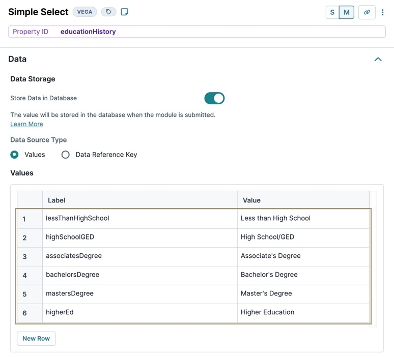
In the Values table, enter the following:
Label
Value
1
lessThanHighSchool
Less than High School
2
highSchoolGED
High School/GED
3
associatesDegree
Associate's Degree
4
bachelorsDegree
Bachelor's Degree
5
mastersDegree
Master's Degree
6
higherEd
Higher Education
Navigate to the Validation settings.
Set Required to
 (ON).
(ON).Click Save Component.
Save your module.
Preview your module in Express View:
Overview
The Simple Select component is a Vega (v2.0) Primary Fields component that lets end-users select one or more options from a drop-down list. The drop-down list uses a values table, or a data reference key, to display a list of options.
By default, the Simple Select component stays collapsed until the end-user opens it. After making a selection, the list closes again.
You'll find the Simple Select component in the Primary Fields group to the left of the Module Builder.
About the Configuration Window
To learn more about general component settings, view our General Component Settings article.
Display Panel
Field Text
Setting | Description |
|---|---|
Label Text | Label Text conveys what the input component is and what information it displays. Enter the purpose of the corresponding component or field. User-friendly labels make your module more accessible. Keep labels short and descriptive (a word or two) using title case. For longer entries, use sentence case. |
Placeholder Text | A short prompt telling end-users the expected value of an input field. For example, |
Formatting
Setting | Description |
|---|---|
Allow Multiple Selections | When set to |
Render Select Menu as Portal | When set to By default this setting is |
Data Panel
Data Source Type
There are two methods that you can use to populate a Simple Select component: Values and Data Reference Key.
Values
Selecting Values displays a table where you can enter each option and its value.
Setting | Description |
|---|---|
Key | Create a key value for targeting the option. For example, if you have three options in your menu, you could assign the following keys: |
Option Label | Enter the text that displays to the end-user. When an end-user clicks the text, the Action setting fires. |
Data Reference Key
Using the Data Reference Key option, data from another component populates the Simple Select component. You'll most often use this option with a Data Table component. After adding you data to the Data Table component, reference the component in your Simple Select component's configuration window.
Think of this as a hybrid option of using Values and Data Collections to populate the Simple Select component. You still use data stored in Unqork, but it's data from your module instead of a Data Collection.
Setting | Description |
|---|---|
Data Reference Key | Enter the Property ID of the component whose data you're referencing. |
Key Property | Specify the property in the data source to use as the select value. If no value is specified, the item value is used. By default, this setting's value is empty. |
Label Property | This field refers to the option labels to retrieve. If you're retrieving data from a Data Table component, enter the column header in this field. |
Adornments Property | Specify the property that contains the adornments. This setting is optional. |
Validation Panel
User Input
Setting | Description |
|---|---|
Required | When set to By default, Required is set to |
Required Error Message | A custom error message that displays below a required field. The error message displays when the end-user tries to save or submit the module without completing the required field. |
Adding a Simple Select Component
Configure a Simple Select component to collect an end-user's education history. You'll configure six options for end-users to select.
These instructions assume that you have an open module saved with a title.
In the Module Builder, drag and drop a Simple Select component onto the canvas.
In the Property ID field, enter educationHistory.
In the Label Text field, enter
What is the highest level of education you've completed?.Navigate to the Data settings.
In the Values table, enter the following:
Label
Value
1
lessThanHighSchool
Less than High School
2
highSchoolGED
High School/GED
3
associatesDegree
Associate's Degree
4
bachelorsDegree
Bachelor's Degree
5
mastersDegree
Master's Degree
6
higherEd
Higher Education
Navigate to the Validation settings.
Set Required to
 (ON).
(ON).Click Save Component.
Save your module.
Preview your module in Express View:
.jpg)
.jpg)
.jpg)
.jpg)


