The Advanced Datagrid component is a Centauri (v1.0) layout component that, like the Data Grid component, lets you organize other components. The difference is that the Advanced Datagrid component displays other components in a modal.
Examples of when to use an Advanced Datagrid include the following:
Display entries in a dashboard.
Collect detailed prescription medication information.
Collect beneficiary information, including percentage calculations.
Build lists or combine other grids or tables into a single grid.
Use reference keys to reference other tables or grids, combining multiple types of information and layouts.
You'll find the Advanced Datagrid in the Display & Layout group to the left of the Module Builder.
About the Configuration Window
To learn more about general component settings, view our General Component Settings article.
Display Settings
Field Text
Setting | Description |
|---|---|
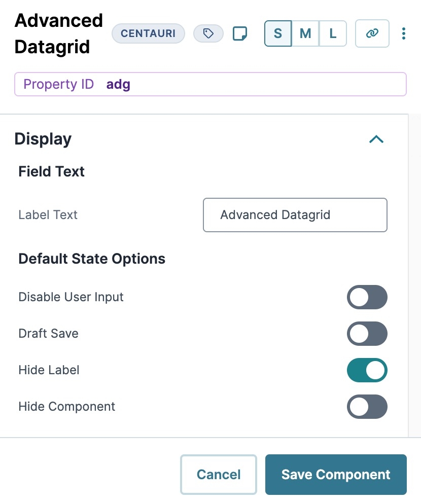
Label Text | Label Text conveys what the input component is and what information it displays. Enter the purpose of the corresponding component or field. User-friendly labels make your module more accessible. Keep labels short and descriptive (a word or two) using title case. For longer entries, use sentence case. |
Default State Options
Setting | Description |
|---|---|
Disable User Input | Prevents the end-user from entering a value in the field by displaying it as grayed-out and unclickable in Express View. By default, Disable User Input is set to |
Draft Save | Set to By default, this setting is set to off |
Hide Label | Displays or hides the Label field from view. Setting Hide Label to By default, Hide Label is set to |
Hide Component | Shows or hides the component. Set Hide Component to By default, this setting is set to |
Modal Formatting
Setting | Description |
|---|---|
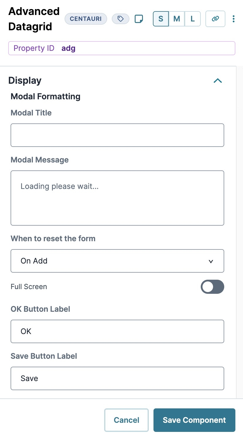
Modal Title | Enter a title for the pop-up modal. |
Modal Message | Lets configure a pop-up modal message that displays a submission's progress. By default, the message reads: |
When to reset the form | Choose when to restore the form to its default values:
|
Fullscreen | Expands your modal screen to the full width and height of the window. By default, this setting is set to off |
OK Button Label | A button displays at the bottom left of your modal in Express View. This field lets you choose the label text of the button. By default, this button label text displays as OK. |
Save Button Label | A button displays at the bottom left of your modal in Express View. This field lets you set the button label text of the button. By default, this button label text displays as Save. |
Grid Formatting
Setting | Description |
|---|---|
Delete Title | Enter title for the modal that displays when deleting an entry in Express View. By default, the modal displays the following: |
Delete Text | This modal displays if end-users select Confirm Deletion and try to delete an entry. By default, the message reads: |
Title for Save Confirmation Alert | When your end-user saves an invalid entry an error message displays. This field lets you set a title for that error message. |
Message for Save Confirmation Alert | When your end-user saves an invalid entry an error message displays. |
Save Event | Lets you create an event for your save confirmation modal. |
Message While Saving | Enter a message that displays when an entry saves. By default, the message reads: |
Cancel Button Label | Sets the button label text for the Cancel button. By default, this button label text displays as |
Action Label | Sets the button label text for the Action button. By default, this button label text displays as |
Add Button Label | Sets the button label text for the Add button. By default, this button label text displays as |
Edit Button Label | Sets the button label text for the Edit button. By default, the button label text displays as |
Delete Button Label | Sets the button label text for the Delete button. By default, the button label text displays as |
View Label | Sets the button label text for the View button. By default, the button label text displays as |
Additional Settings
Setting | Description |
|---|---|
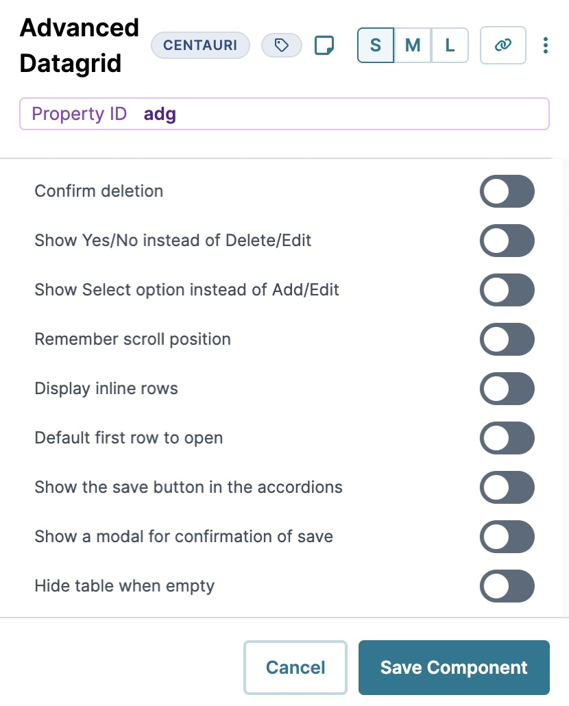
Confirm Deletion | When set to By default, this setting is set to |
Show Yes/No Instead of Delete/Edit | When set to By default, this setting is set to |
Show Select Option Instead of Add/Edit | When set to By default, this setting is set to |
Remember Scroll Position | Stores the page and vertical scroll position of the Advanced Datagrid component. When enabled, the component remembers the last place scrolled to on the grid. By default, this setting is set to |
Display Inline Rows | The Advanced Datagrid component defaults to a table style in the Express View. By default, this setting is set to |
Default First Row to Open | When set to By default, this setting is set to |
Show the Save Button in the Accordions | When set to By default, this setting is set to |
Show a Modal for Confirmation of Save | When set to By default, this setting is set to |
Hide Table When Empty | Hide the grid in Express View when there's no data in it. By default, this setting is set to |
Data Settings
Data Storage
Setting | Description |
|---|---|
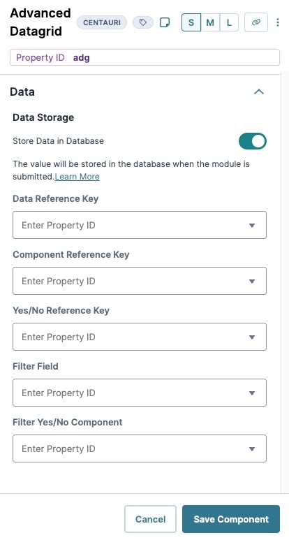
Store Data in Database | The Store Data in Database setting affects how data persists through your application. When set to
Set the toggle to
|
Data Reference Key | Enter the Property ID of the component whose data you're referencing. |
Component Reference Key | Enter the Property ID of the Data Table component where you're retrieving data. You'll notice this field duplicates the functionality of the Data Reference Key field. |
Yes/No Reference Key | This field is specific to components containing Yes/No lists. Enter the Property ID of the component where you're retrieving data. |
Filter Field | Enter the component containing a value that filters the list. |
Filter Yes/No Component | When the Yes/No Reference Key contains a component Property ID, you can use this field to filter the component’s Yes/No list. |
Display
Setting | Description |
|---|---|
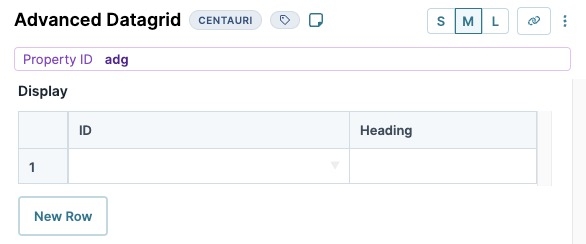
ID | This field lets you map a component in your Advanced Datagrid component. Enter the component's Property ID to display the component's data in your grid. |
Heading | For each Property ID you enter in the ID fields, you can display a header in Express View. |
New Row | Adds a new row to the table. |
Extra Fields to Include
Setting | Description |
|---|---|
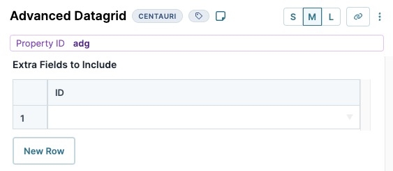
ID | This field lets you map a component in your Advanced Datagrid component. Enter the component's Property ID to display the component's data in your grid. |
New Row | Adds a new row to the table. |
Yes/No Question Listing
Setting | Description |
|---|---|
Code | Enter text to display for the Yes/No Question listing |
Text | Enter text to display for the Yes/No Question listing. |
Required | When By default, this checkbox is clear. |
Tooltip | A short hint that displays when an end-user positions their cursor over the |
Subheader | Enter a value to display under the header of the Yes/No Question listing. |
New Row | Adds a new row to the table. |
Actions
Triggers
Setting | Description |
|---|---|
New Row | Enter the Property ID of a component that, when triggered, creates a new row in Express View. |
Edit Row | Enter the Property ID of a component that, when triggered, edits a row in Express View. |
Validation
User Input
Setting | Description |
|---|---|
Required | When set to By default, Required is set to |
Required Error Message | A custom error message that displays below a required field. The error message displays when the end-user tries to save or submit the module without completing the required field. |
Advanced
Additional Validation Options
Setting | Description |
|---|---|
Error Title | Display as a header in a modal to the end-user if an error occurs. |
Error Message | Displays under the Error Title in a modal to the end-user if an error occurs. |
Min Length | Sets the minimum number of characters an end-user must enter for valid input. |
Max Length | Sets the maximum number of characters an end-user must enter for valid input. |
Additional Styling
Setting | Description |
|---|---|
Custom CSS Class | Enter a Custom CSS Class to apply to your component. Custom CSS lets you maintain a consistent look and feel when the field or element is part of a template or multiple modules. Updated CSS styling applies to all components that reference this custom class name. |
Add Button Icon Class | Enter a Custom CSS Class to apply to the Add button. |
Edit Button Icon Class | Enter a Custom CSS Class to apply to the Edit button. |
Adding an Advanced Datagrid Component
In this example, you'll set up an Advanced Datagrid component with a few components for data entry. In Express View, your end-user can add, edit, or delete data as needed. These instructions assume that you have an open module saved with a title.
Configure the Advanced Datagrid Component
Configure an Advanced Datagrid component to contain your information fields.
In the Module Builder, drag and drop an
 Advanced Datagrid component onto your canvas.
In the Property ID field, enter adgApplication .
In the Label Text field, enter
Application.Navigate to the Display setting's Grid Formatting section.
In the Add Button field, enter
Add Applicant.Navigate to the Data settings.
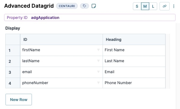
In the Display table, enter the following:
ID
Heading
1
firstName
First Name
2
lastName
Last Name
3
email
Email
4
phoneNumber
Phone Number
You'll configure the components that match these values in later steps.
Click Save Component.
Configure the Text Field Components
Configure two Text Field components for your first and last name fields.
Drag and drop two Text Field components inside of the adgApplication
 Advanced Datagrid, placing them one below the other.
For each component, enter the following Property ID and Label Text values:
Property ID
Label Text
firstName
First Name
lastName
Last Name
Click Save Component as you add each component.
Configure the Email Component
Configure an Email component to gather email addresses from your end-users.
Drag and drop an
.png) Email component into your adgApplication
Email component into your adgApplication  Advanced Datagrid, placing it below your firstName and lastName Text Field components.
In the Property ID field, enter email
In the Label Text field, enter
Email.Click Save Component.
Configure the Phone Number Component
Configure a Phone Number component to gather phone number data from your end-users.
Drag and drop a Phone Number component into your adgApplication
 Advanced Datagrid, placing it below your email
 .png) Email component
Email componentIn the Property ID field, enter phoneNumber.
In the Label Text field, enter
Phone Number.Click Save Component
Save your module.
Preview your module in Express View to see the following functionality:
The Advanced Datagrid component is a Centauri (v1.0) layout component that, like the Data Grid component, lets you organize other components. The difference is that the Advanced Datagrid component displays other components in a modal.
You can use an Advanced Datagrid to:
Display entries in a dashboard.
Collect detailed prescription medication information.
Collect beneficiary information, including percentage calculations.
When designing an Advanced Datagrid component, you'll create headings identify the information in the grid. In Express View, your end-users can add, edit, and delete data stored in the grid. All end-user edits take place in a modal.
Other advantages of the Advanced Datagrid component include the following:
Build lists or combine other grids or tables into a single Advanced Datagrid component.
Using reference keys to reference other tables or grids. Reference keys let you combine multiple types of information and layouts in your Advanced Datagrid component .
You'll find the Advanced Datagrid in the Display & Layout group to the left of the Module Builder.
About the Configuration Window
To learn more about general component settings, view our General Component Settings article.
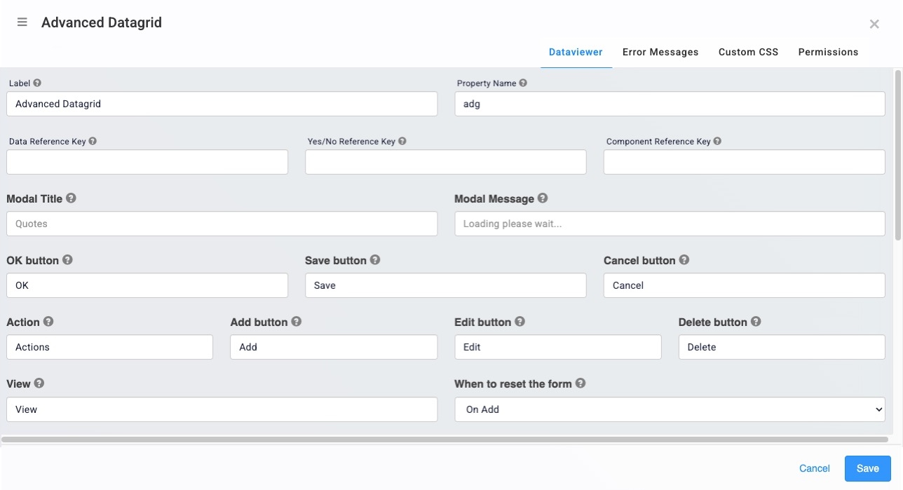
Dataviewer Panel
General and Button Settings
Setting | Description |
|---|---|
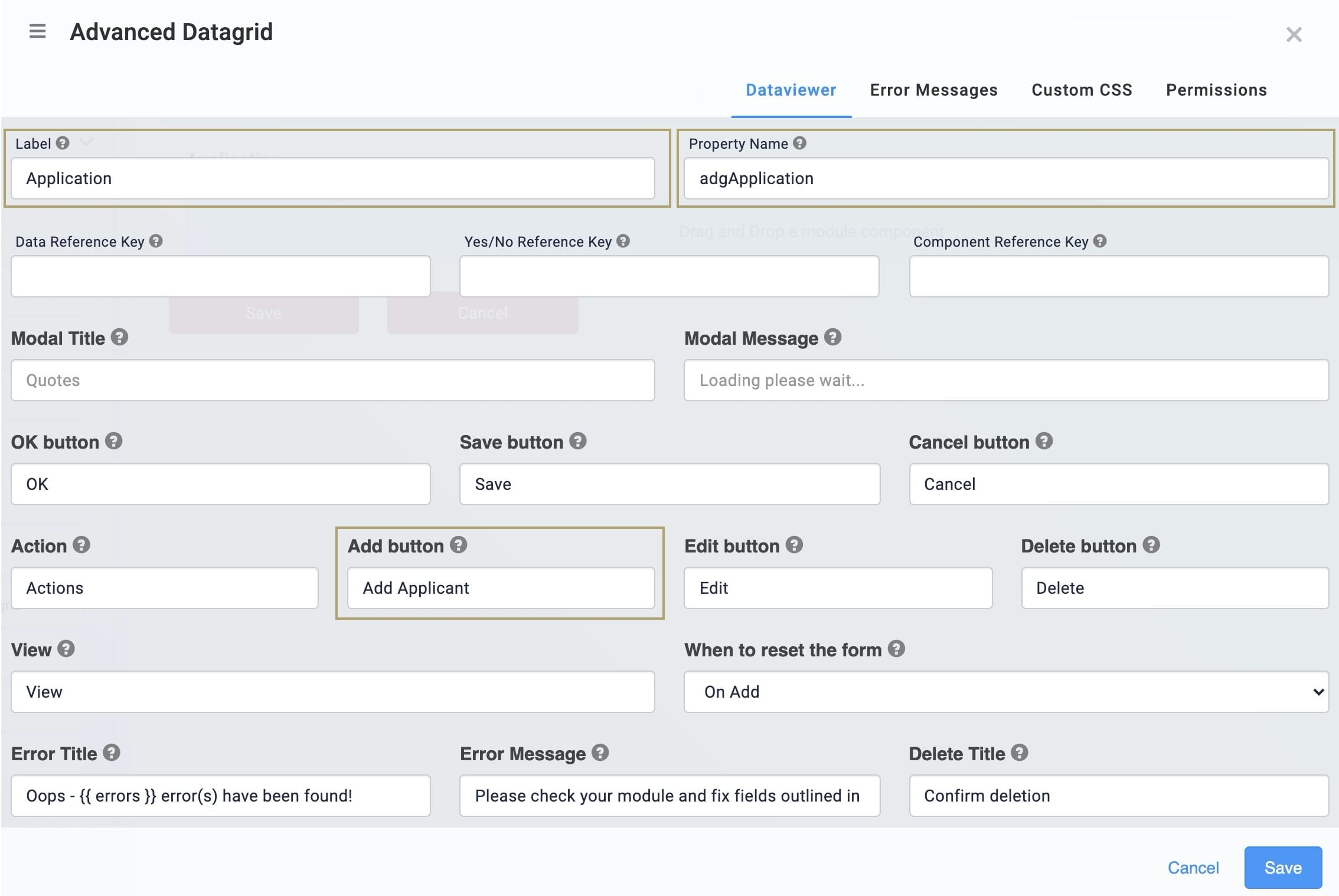
Label | Label Text conveys what the input component is and what information it displays. Enter the purpose of the corresponding component or field.User-friendly labels make your module more accessible. Keep labels short and descriptive (a word or two) using title case. For longer entries, use sentence case. |
Property Name | A Property Name (Property ID) is the unique field ID used by Unqork to track and link your module components. The Property Name is how the software identifies your component. Using Property Names lets you link components, creating logic-based configurations and API (application programming interface) calls. Property Names must use camel case (stylized as camelCase) without spaces or punctuation. |
Data Reference Key | Enter the Property ID of the component whose data you're referencing. |
Yes/No Reference Key | This field is specific to components containing Yes/No lists. Enter the Property ID of the component where you're referencing data. |
Component Reference Key | Enter the Property ID of the Data Table component where you're referencing data. You'll notice that this field duplicates the functionality of the Data Reference Key field. |
Modal Title | You can configure a pop-up that displays the loading progress of the Advanced Datagrid. This field lets you enter a title for the pop-up. |
Modal Message | You can configure a pop-up that displays a submission's progress. By default, the message reads: |
OK Button | This button displays at the bottom left of your modal in Express View. On button-press of the OK button, the pop-up closes. This field lets you choose the label text of the button. By default, this button label text shows as |
Save Button | This button displays at the bottom left of your modal in Express View. On button-press, your updates store, and you'll return to the grid. This field lets you set the button label text for the button. By default, this button label text shows as |
Cancel Button | This button displays at the bottom left of your modal in Express View. On button-press, your updates clear and you'll return to the grid. This field lets you set the button label text for the button. By default, this button label text shows as |
Action | By default, the Advanced Datagrid has an Actions column in Express View. You can perform Actions on entries added to the table. This field lets you set the label text of the column. By default, these actions are |
Add Button | The Add button lets you add entries to your grid in Express View. This field lets you set the button label text for the button. By default, this button label text shows as |
Edit Button | The Edit button displays at the right of your grid in Express View. On button-press, you can change or update your entries. This field lets you set the button label text for the button. By default, the button label text shows as |
Delete Button | This button displays at the right of your grid in Express View. On button-press, you'll remove the entry associated with the button. This field lets you set the button label text for the button. By default, the button label text shows as |
View | When disabling a component, the View button lets your end-user see the entry but not edit it. This field lets you set the button label text for the button. By default, the button label text shows as |
When to reset the form | Choose when to restore the form to default values:
This setting is optional. |
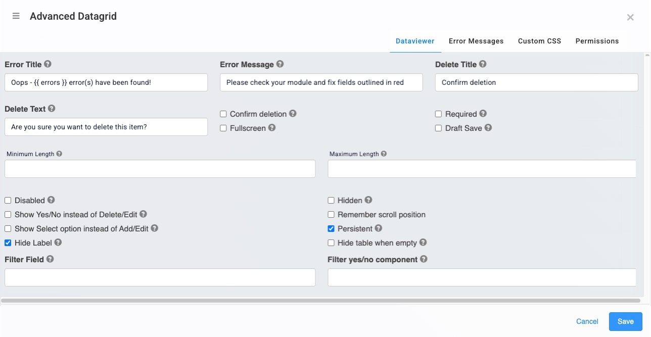
Error and Component Settings
Setting | Description |
|---|---|
Error Title | When your end-user saves an invalid entry an error message shows. This field lets you set a title for that error message. By default, the Error Title shows as: |
Error Message | When your end-user saves an invalid entry an error message shows. By default, the message reads: |
Delete Title | When deleting an entry in Express View, you can configure a pop-up to appear. This field lets you choose the title of the pop-up. By default, the pop-up asks: |
Delete Text | When deleting an entry in Express View, you can configure a pop-up to display. This pop-up displays if you select the Confirm Deletion checkbox and try to delete an entry. By default, the message reads: |
Confirm Deletion | When By default, this setting is ☐ (unchecked). |
Fullscreen | Sets your modal screen to expand to the entire width and height of the window. By default, this setting is ☐ (unchecked). |
Required | When By default, this setting is ☐ (unchecked). |
Draft Save | When By default, this setting is ☐ (unchecked). |
Minimum Length | Sets the minimum number of rows to display in the grid inExpress View. When you reach this lower limit, the button disappears. |
Maximum Length | Sets the maximum number of rows to display in the grid in Express View. When you reach this upper limit, the button disappears. |
Disabled | When By default, this setting is ☐ (unchecked). |
Hidden | When By default, this setting is ☐ (unchecked). |
Show Yes/No Instead of Delete/Edit | When By default, this setting is ☐ (unchecked). |
Remember Scroll Position | Stores the page and vertical scroll position of your Advanced Datagrid. When By default, this setting is ☐ (unchecked). |
Show Select Option Instead of Add/Edit | When By default, this setting is (checked). |
Persistent | When By default, this setting is |
Hide Label | When By default, this setting is ☐ (unchecked). |
Hide Table When Empty | When By default, this setting is ☐ (unchecked). |
Filter Field | Enter the component containing a value that filters the list. |
Filter Yes/No Component | When the Yes/No Reference Key contains a component Property ID, you can use this field to filter the component’s yes/no list. |
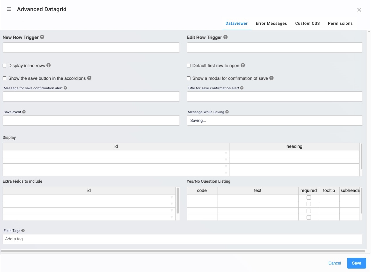
Triggers and Display Settings
Setting | Description |
|---|---|
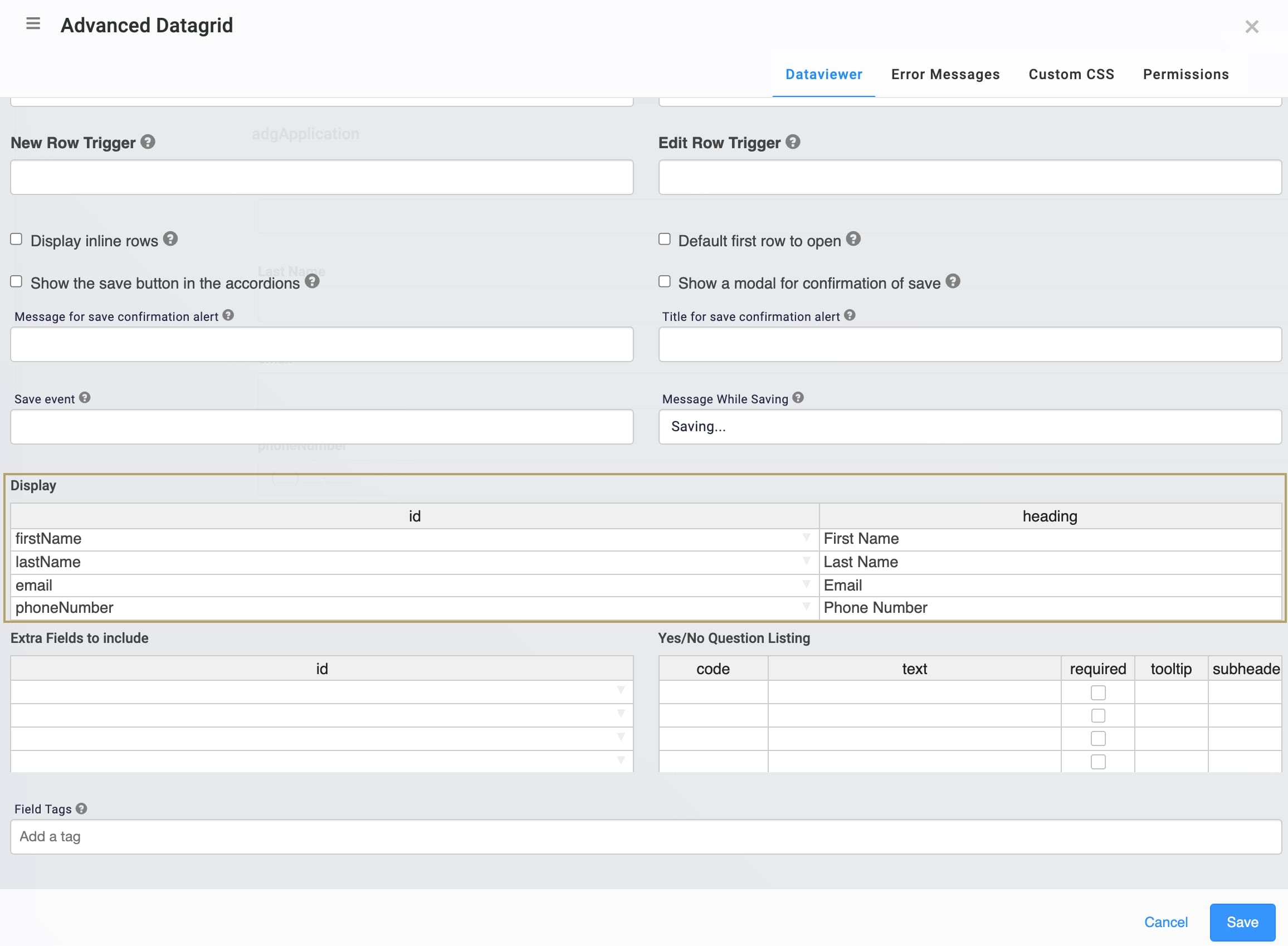
New Row Trigger | Enter the Property ID of a component that, when triggered, creates a new grid row in Express View. |
Edit Row Trigger | Enter the Property ID of a component that, when triggered, edits a grid row in Express View. |
Display Inline Rows | The Advanced Datagrid defaults to a table style in the Express View. To set up data in an accordion, set this to |
Default First Row to Open | Set to By default, this setting is ☐ (unchecked). |
Show the Save Button in the Accordions | When By default, this setting is ☐ (unchecked). |
Show a Modal for Confirmation of Save | When By default, this setting is ☐ (unchecked). |
Message for Save Confirmation Alert | When |
Title For Save Confirmation Alert | When |
Save Event | When |
Message While Saving | This field lets you enter a message that displays as an entry saves. By default, the message reads: |
Display
Setting | Description |
|---|---|
ID | This field lets you map a component in your Advanced Datagrid. Enter the component's Property ID to display the component's data in your grid. |
Heading | For each Property ID you enter in the ID fields, you can display a heading in Express View. |
Yes/No Question Listing
Setting | Description |
|---|---|
Code | Details coming soon! |
Text | Details coming soon! |
Required | When you select the Required checkbox, your end-user must enter a value into the field before they can save an entry. Clear the checkbox when an entry is optional. By default, this checkbox is clear. |
Tooltip | A short hint that displays when an end-user positions their cursor over the |
Subheader | Details coming soon! |
Field Tags | Assign components one-word labels to help organize, identify, and group the components in your application. Consider an example from the API Specification Snippet: Field Tags are applied to Hidden components in the panelRequest and panelResponse Panel components. The Field Tags identify the data type of parameters included in the API request and response. The API Docs Dashboard tool populates with information about each parameter’s data type, identified by the Field Tag. Field Tags act as a type of Property ID group and let you group components for configuration purposes. Field Tags let you target two or more components using a simple logic component. For example, add the Field Tag tagForDecision to multiple components in your module. Open the Inputs table of a Decisions component and reference the tagForDecision Field Tag as the input of the Decisions component. The output of the Decisions component then affects all components with the tagForDecision Field Tag. Save your Field Tags by pressing Enter (Return) or adding a comma after each entry. |
Adding an Advanced Datagrid Component
In this example, you'll set up an Advanced Datagrid component with a few components for data entry. In Express View, your end-user can add, edit, or delete data as needed. These instructions assume that you have an open module saved with a title.
Configure the Advanced Datagrid Component
Configure an Advanced Datagrid component to contain your information fields.
In the Module Builder, drag and drop an
 Advanced Datagrid component onto your canvas.
In the Label and Property Name fields, enter
adgApplication.In the Add Button field, enter
Add Applicant.In the Display table, enter the following:
ID
Heading
firstName
First Name
lastName
Last Name
email
Email
phoneNumber
Phone Number
You'll configure the components that match these values in later steps.
Click Save.
Configure the Text Field Components
Configure two Text Field components for your first and last name fields.
Drag and drop two Text Field components inside of the adgApplication
 Advanced Datagrid, placing them one below the other.
For each component, enter the following Property ID and Label Text values:
Property ID
Label Text
firstName
First Name
lastName
Last Name
Click Save & Close as you add each component.
Configure the Email Component
Configure an Email component to gather email addresses from your end-users.
Drag and drop an
.png) Email component into your adgApplication
Email component into your adgApplication  Advanced Datagrid, placing it below your firstName and lastName Text Field components.
In the Property ID and Label Text fields, enter
email.Click Save.
Configure the Phone Number Component
Configure a Phone Number component to gather phone number data from your end-users.
Drag and drop a Phone Number component onto your adgApplication
 Advanced Datagrid, placing it below your email
 .png) Email component
Email componentIn the Property ID and Label Text fields, enter
phoneNumber.Click Save
Save your module.
Preview your module in Express View to see the following functionality:


.png)
.jpg) (Tooltip) icon. Tooltips can display across more than one line.
(Tooltip) icon. Tooltips can display across more than one line..jpg)
.jpg)
.jpg)
