Vega Table Component
Overview
The Vega Table component is a powerful tool that lets you gather, organize, and display data in your application. Using the Vega Table component, you can retrieve data and customize how it displays. You can also use Vega Table operations that give end-users End-users, also known as Express Users, are the individuals accessing an application through Express View. In most cases, end-users are the customers using the product. the ability to dynamically modify the way they see your data.
To use the Vega Table component, enable the Vega runtime The Vega (v 2.0.0) runtime is the next-generation engine of the UDesigner platform. Vega uses cutting-edge technologies to improve the Creator and end-user experience. in your module. To learn more about enabling Vega, see the Adding a Vega Table Component section of this article.
Like the Panel or Field Group components, the Vega Table component acts as a grouping or storage component for fields (other components) configured inside it. Instead of creating self-contained pages or sections, the Vega Table uses the component fields to create table headers.
You can add the following supported components to the Vega Table component:
Common ways you can use the Vega Table component include:
-
Collecting, editing, and displaying data from different sources on a single screen, such as a dashboard.
-
Displaying dynamic data that end-users can manipulate using Vega Table Operations.
-
Applying logic (rules, calculations, procedural operations, and so on) to multiple data records simultaneously.
To learn more about Vega Table operations, view our Vega Table Operations reference guide.
You can find the Vega Table component under the Display & Layout group to the left of the Module Builder.
About the Configuration Window
To learn more about general component settings and those that display when a component is associated with Data Models, view our General Component Settings article.
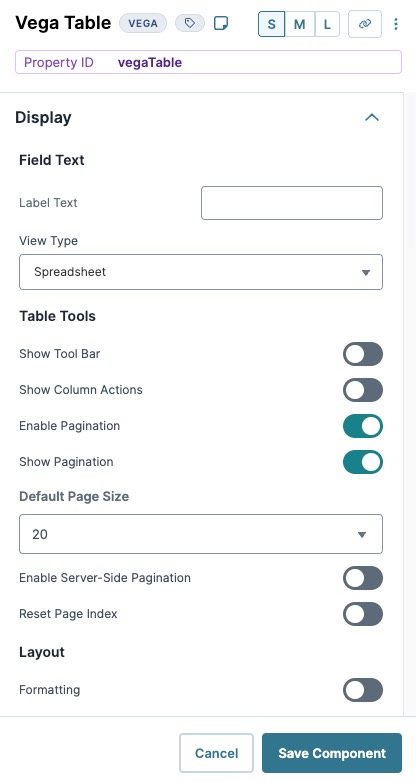
Display Panel
Field Text
|
Setting |
Description |
|---|---|
|
Label Text |
Label Text conveys what the input component is and what information it displays. Enter the purpose of the corresponding component or field. User-friendly labels make your module more accessible. Keep labels short and descriptive (a word or two) using title case. For longer entries, use sentence case. |
|
View Type |
Displays Grid as a Spreadsheet or Form. The View Type affects how component fields and their settings display in your table. The Spreadsheet view is recommended because its functionality is more robust. The Form view is scheduled for sunsetting and will not be supported. |
Table Tools
|
Setting |
Description |
|---|---|
|
Set to (ON) to display table options to end-users, including:
By default, this setting is Off in Express View.
In Express View, full-screen tables might be partially hidden by the Preview Bar. Remove or hide the preview bar to see the top portion of the table. By default, this setting is (OFF) in Express View. |
|
|
Show Column Actions |
Set to (ON) to display column actions. Settings include: In the list below, headerValue is replaced by column's header name.
By default, this setting is (OFF) |
|
Enable Pagination |
Controls the pagination Pagination is the process of separating content into individual pages. of data provided to the component. When set to (ON), the Vega Table component’s data paginates, creating one or more pages of table data. When set to (OFF), all data displays in the Vega Table on a single page. |
|
Show Pagination |
When set to (ON), displays the page sequence numbers at the bottom of the table. By default, paginated tables display 20 rows. End-users can change the amount displayed to 5, 10, 15, 20, or 30 rows. By default, this setting is (ON). |
|
Default Page Size |
Specify how many rows of data display per paginated page. By default, this setting is set to 20 items per page. |
|
Enable Server-Side Pagination |
When set to (ON), this setting enables server side pagination on the Vega Table component. Server-Side Pagination works with large data sets by retrieving a single page or subset of data at a time. This setting improves the end-user's performance and reduces memory usage when using large data sets with the Vega Table component. |
|
Reset Page Index |
When set to (ON), the Vega Table component resets to the first page when a filter or sort operation is applied, or the page size changes. Additionally, when the Show Tool Bar setting is set to (ON), The Reset Page Index setting applies to the Tool Bar in Express View. |
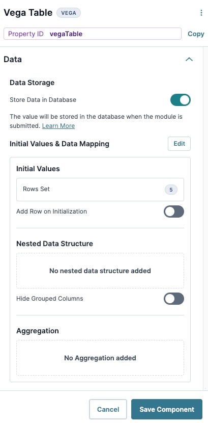
Data Panel
Data Storage
|
Setting |
Description |
|---|---|
|
Store Data in Database |
The Store Data in Database setting affects how data persists through your application. When set to (ON), Unqork stores values entered into the field to the database (server-side submission). This occurs in three scenarios:
By default, workflows persist data from all fields in the client-side submission when navigating between screens. However, only values from fields with Store Data in Database enabled store in the server-side submission. Set the toggle to (OFF) when you don’t want to store the values from this field in the database. When using a Plug-In to remote execute a module, ensure data moving between modules is persistent. You can optionally enable Store Data in Database for components in the source module. But any components in the API module whose values are included in an API response must have Store Data in Database enabled. When a component’s data is not persistent, the data isn't included in an API call's response. So, Plug-Ins or external services requesting data from the API module can't receive non-persistent data in the response. Store Data in Database also affects what data is tracked using Unqork’s built-in tracker. When the Enable Tracker and Track Value toggles are set to (ON) in Module Settings, only values from fields with Store Data in Database enabled are tracked. |
Initial Values & Data Mapping
Initial Values
|
Setting |
Description |
|---|---|
|
Initial Values Table |
After adding components to the Vega Table component, the Initial Values table displays the fields as column headers. You can then enter and/or edit table values in each cell. You can also output values from other components, like a Plug-In component, to existing Vega Table fields. |
|
New Row |
Add a new row to all Table column fields. Rows that contain no data in any column field do not display in Express View. |
|
Add Row on Initialization |
Adds one blank row if the Table contains no data entries on initialization. If the Table contains data entries, the row won't be added. |
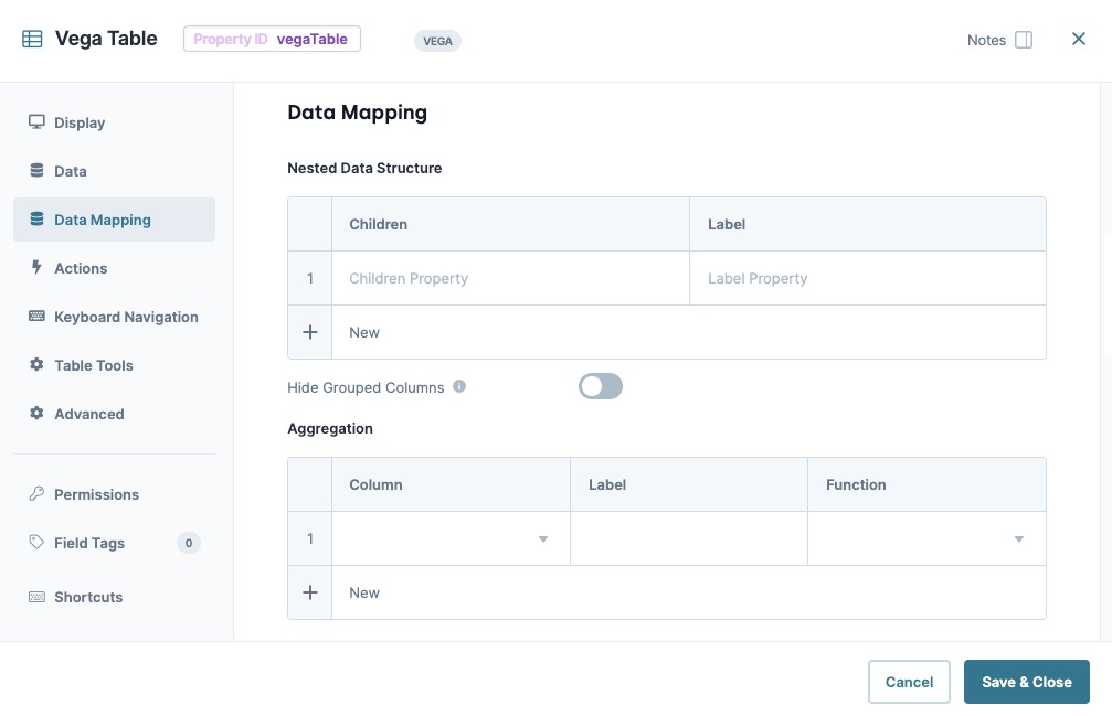
Nested Data Structure
|
Setting |
Description |
|---|---|
|
Nested Data Structure Table |
This setting is still in development, but will allow you to easily create nested data in your table. Stay tuned for new developments and enhancements for this feature. |
|
New Row |
Add a new row to all Table column fields. Rows that contain no data in any column field do not display in Express View. |
|
Add Row on Initialization |
Adds one blank row if the Table contains no data entries on initialization. If the Table contains data entries, the row won't be added. |
Aggregation
|
Setting |
Description |
|---|---|
|
Aggregation Table |
This setting is still in development, but will allow you to easily create nested data in your table. Stay tuned for new developments and enhancements for this feature. |
|
New Row |
Add a new row to all Table column fields. Rows that contain no data in any column field do not display in Express View. |
Actions Panel
Events and Operations
| Setting | Description |
|---|---|
|
Edit |
Opens the Operations Builder tool. Discover how to use events and operations in our Operations Builder article. |
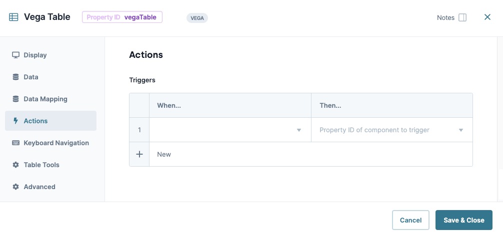
Triggers
| Setting | Description |
|---|---|
|
Edit |
Opens the Triggers Table. |
|
Triggers Table |
The Triggers table contains a list of When events, and the component property ID the When event triggers. |
|
When... |
Select an action that, when it takes place, triggers another component selected using the Then... setting. Actions include:
|
|
Then... |
When the action selected in the When... setting occurs, the component entered in this field triggers. |
|
New Row |
Add a new row to the table. |
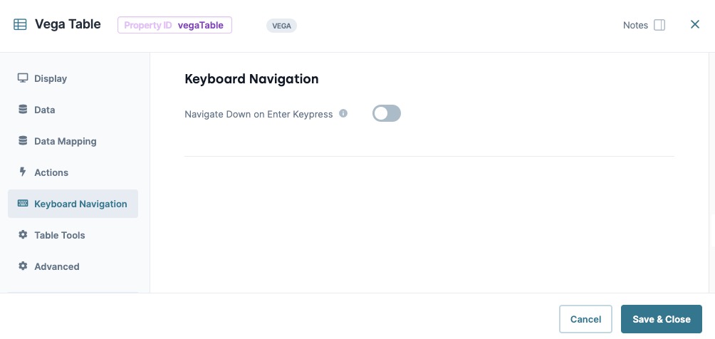
Keyboard Navigation
| Setting | Description |
|---|---|
|
Navigate Down on Enter Keypress |
When set to (ON), focus moves to the next row in the column after pressing Enter. Provides similar functionality to a spreadsheet tool. When (OFF), the focus remains on the same cell when pressing Enter. By default, this setting is (OFF). |
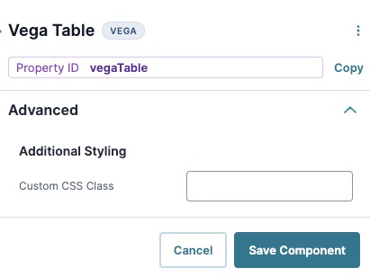
Advanced Panel
Additional Styling
|
Setting |
Description |
|---|---|
|
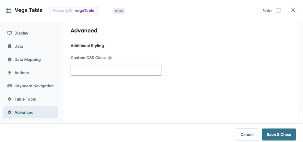
Custom CSS Class |
Enter a Custom CSS Cascading Style Sheets (CSS) is a style sheet language used for presenting how a HTML or XML document looks to end-users. Class to apply to your component. Custom CSS lets you maintain a consistent look and feel when the field or element is part of a template or multiple modules. Updated CSS styling applies to all components that reference this custom class name. |
Adding a Vega Table Component
In this example, use the Vega Table component to display a Market Summary spreadsheet for vehicle insurance. The Vega Table will include the insurance carrier, type, premium amount in USD, and the market status. Then add sorting and filter Vega Table operations that allow end-users End-users, also known as Express Users, are the individuals accessing an application through Express View. In most cases, end-users are the customers using the product. to modify the grid view.
What You Need
Before starting this configuration, you'll need the following:
-
A Workspace.
-
An Unqork application.
-
A module with a title.
Configure the Text Field Components
Begin by adding the fields you want in the Vega Table component. For this example, add Text Field components to act as the Vega Table component's fields.
| 1. | Drag and drop four Text Field components onto your canvas. |
|
Property ID |
Label Text |
|---|---|
|
carrier |
Carrier |
|
type |
Type |
|
premium |
Premium |
|
status |
Status |
| 3. | Click Save Component for each component as you add it. |
Configure the Vega Table Component
Next, add your Vega Table component to use your Text Field components as table columns.
| 1. | Drag and drop a Vega Table component onto your canvas, placing it above your Text Field components. |
| 2. | In the Property ID A Property ID is the unique field ID used by Unqork to track and link components in your module. field, enter tableInsurance. |
| 3. | In the Label Text Label Text conveys what the input component is and what information it displays. Enter the purpose of the corresponding component or field. field, enter Market Summary. |
| 4. | Click Save Component. |
| 5. | Drag and drop the carrier, type, premium, and status Text Field components inside the tableInsurance Vega Table component. |
| 6. | Hover over the tableInsuranceVega Table component and click the (Settings) button from the component toolbar. |
| 7. | Navigate to the Data settings, next to Intial Values & Data Mapping, click Edit. |
| 8. | In the Initial Values table, enter the following values: |
|
|
Carrier (carrier) |
Type (type) |
Premium (premium) |
Status (status) |
|---|---|---|---|---|
|
1 |
Unqork Auto |
Motorcycle |
$10,000 |
Not Taken Up |
|
2 |
State Farm |
Auto |
$20,000 |
Submitted |
|
3 |
Nationwide |
RV |
$50,000 |
Not Taken Up |
|
4 |
American Family |
Boat |
$25,000 |
Indication |
|
5 |
Geico |
Auto |
$25,000 |
Submitted |
|
6 |
Unqork Auto |
Auto |
$30,000 |
Submitted |
|
7 |
Nationwide |
RV |
$60,000 |
Indication |
|
8 |
Geico |
Auto |
$12,000 |
Not Taken Up |
|
9 |
State Farm |
Motorcycle |
$5,000 |
Not Taken Up |
|
10 |
American Family |
Boat |
$30,000 |
Submitted |
| 9. | Click Save Component. |
Configure the colFilter Columns Component
Add a Columns component to organize the Vega Table operations that filter specific columns and cells in your table.
| 1. | Drag and drop a  Columns component onto your canvas, placing it above your tableInsurance Vega Table component. Columns component onto your canvas, placing it above your tableInsurance Vega Table component. |
| 2. | In the Property ID A Property ID is the unique field ID used by Unqork to track and link components in your module. field, enter colFilter. |
| 3. | Under Formatting, click  (three columns). (three columns). |
| 4. | Click Save Component. |
Configure the btnFilterGlobal Button Component
Add a button that uses the Operations Builder to filter the table by the Unqork Auto insurance carrier.
| 1. | Drag and drop a  Button component onto your canvas, placing it in the far-left column of the colFilter Columns component. Button component onto your canvas, placing it in the far-left column of the colFilter Columns component. |
| 2. | In the Property ID A Property ID is the unique field ID used by Unqork to track and link components in your module. field, enter btnFilterGlobal. |
| 3. | In the Label Text Label Text conveys what the input component is and what information it displays. Enter the purpose of the corresponding component or field. field, enter Global Filter By Unqork Auto. |
| 4. | Navigate to the Actions settings. |
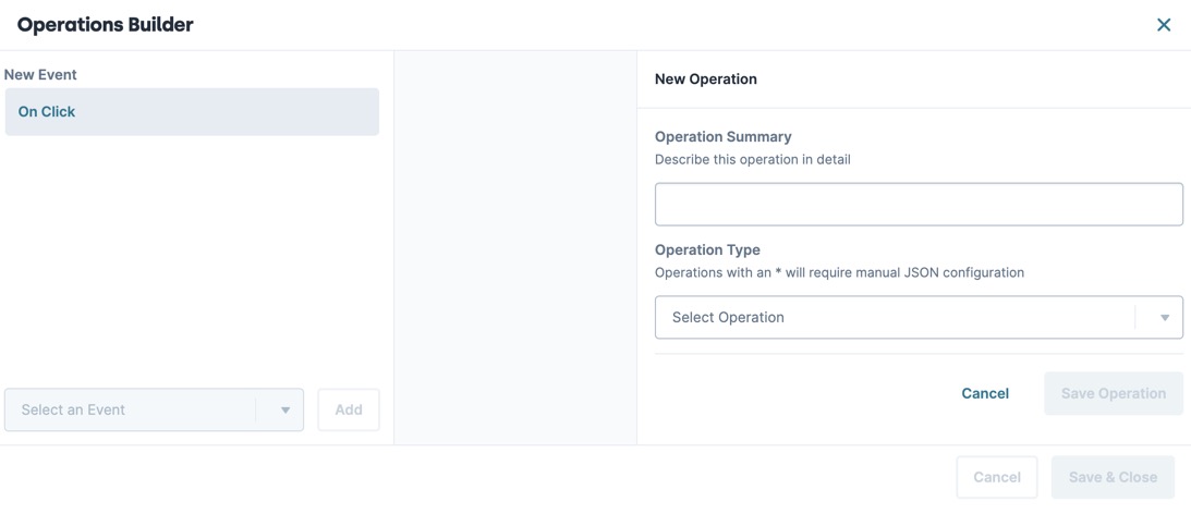
| 5. | To the right of Events & Operations, click Edit. |
The Events & Operations menu displays.
| 6. | From the Add Event drop-down, enter or select On Click. |
| 7. | Click Add. |
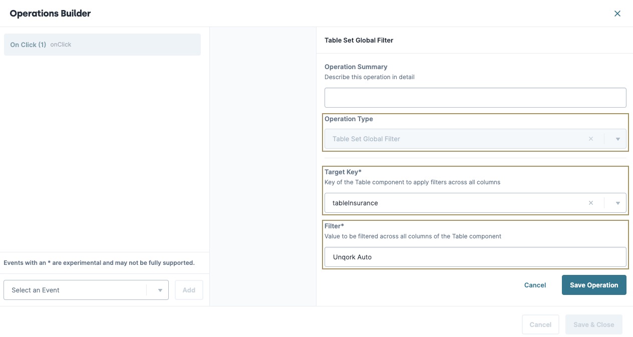
| 8. | From the Operation Type* drop-down, enter or select TABLE_SET_GLOBAL_FILTER. |
| 9. | Click + Add Operation. |
| 10. | In the Target Key field, enter tableInsurance. |
| 11. | In the Filter* field, enter Unqork Auto. |
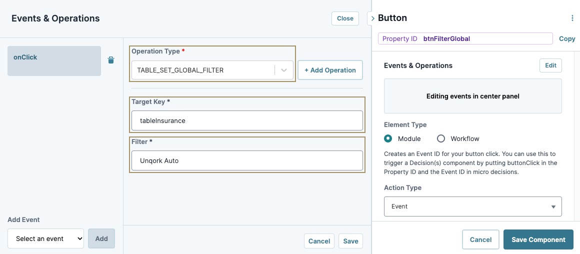
| 12. | Click Save. |
The operation displays in the Events & Operation list.
| 13. | In the component's configuration menu, set the Action Type The action performed by the button when selected. drop-down to Event. |
| 14. | Click Save Component. |
Configure the btnFilterSubmitted Button Component
Add another button that uses the Operations Builder to filter the table by the Status column. Clicking the button filters the table to only display statuses containing the value Submitted.
| 1. | Drag and drop a Button component onto your canvas, placing it in the far-right column of the colFilter Columns component. |
| 2. | In the Property ID A Property ID is the unique field ID used by Unqork to track and link components in your module. field, enter btnFilterSubmitted. |
| 3. | In the Label Text Label Text conveys what the input component is and what information it displays. Enter the purpose of the corresponding component or field. field, enter Filter By Submitted. |
| 4. | Navigate to the Actions settings. |
| 5. | To the right of Events & Operations, click Edit. |
The Events & Operations menu displays.
| 6. | From the Add Event drop-down, enter or select On Click. |
| 7. | Click Add. |
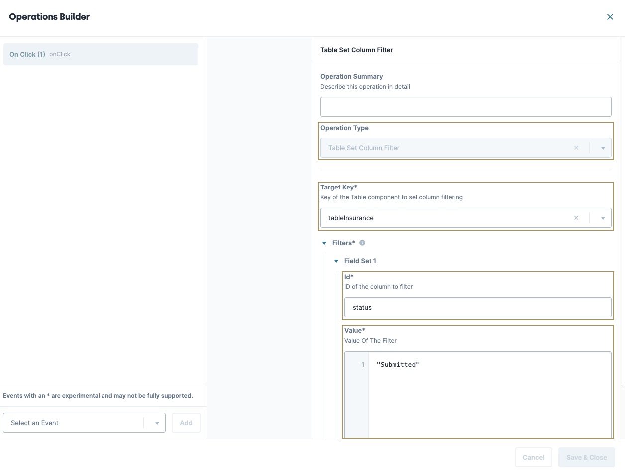
| 8. | From the Operation Type* drop-down, enter or select TABLE_SET_COLUMN_FILTER. |
| 9. | Click + Add Operation. |
| 10. | In the Target Key field, enter tableInsurance. |
| 11. | Under Filters, click Add. |
| 12. | In the Id field, enter status. |
| 13. | In the Value field, enter Submitted. |
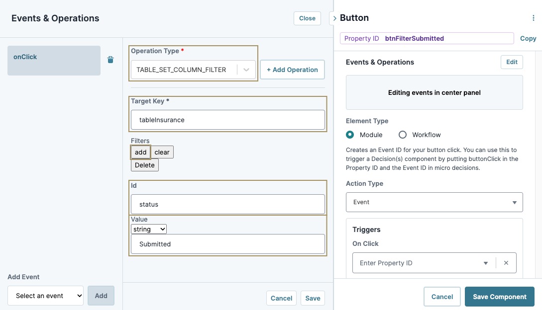
| 14. | Click Save. |
The operation displays in the Events & Operation list.
| 15. | In the component's configuration menu, set the Action Type The action performed by the button when selected. drop-down to Event. |
| 16. | Click Save Component. |
Configure the colAddRow Columns Component
Let's add one more Columns component to organize the Vega Table operation that lets you add a new row to the bottom of the table.
| 1. | Drag and drop a Columns component onto your canvas, placing it below your tableInsurance Vega Table component. |
| 2. | In the Property ID A Property ID is the unique field ID used by Unqork to track and link components in your module. field, enter colAddRow. |
| 3. | Click Save Component. |
Configure the btnAddRow Button Component
Lastly, you'll add a Button component that uses the Operations Builder to add a new row to the bottom of the table. Allowing end-users to add additional entries to the table.
| 1. | Drag and drop a Button component onto your canvas, placing it in the left column of the colAddRow Columns component and above your initAddRow Initializer component. |
| 2. | In the Property ID A Property ID is the unique field ID used by Unqork to track and link components in your module. field, enter btnAddRow. |
| 3. | In the Label Text Label Text conveys what the input component is and what information it displays. Enter the purpose of the corresponding component or field. field, enter Add Row. |
| 4. | Navigate to the Actions settings. |
| 5. | To the right of Events & Operations, click Edit. |
The Events & Operations menu displays.
| 6. | From the Add Event drop-down, enter or select On Click. |
| 7. | Click Add. |
| 8. | From the Operation Type* drop-down, enter or select ADD ROW. |
| 9. | Click + Add Operation. |
| 10. | In the Target Key field, enter tableInsurance. |
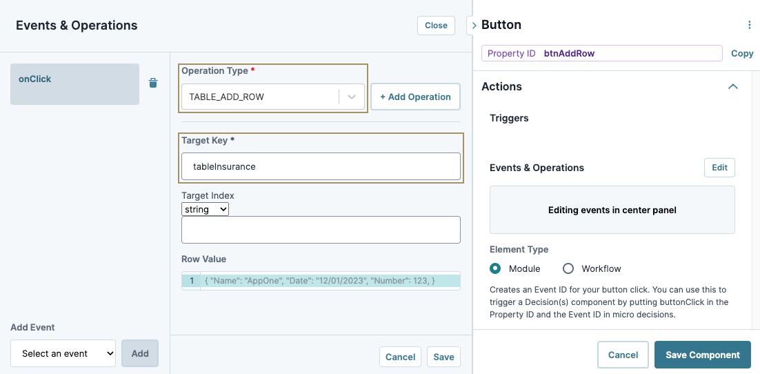
| 11. | Click Save. |
The operation displays in the Events & Operation list.
| 12. | In the component's configuration menu, set the Action Type The action performed by the button when selected. drop-down to Event. |
| 13. | Click Save Component. |
| 14. | Save your module. |
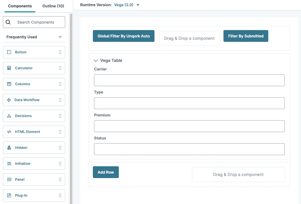
Here's how the completed module looks in the Module Builder:
Preview your module in Express View Express View is how your end-user views your application. Express View also lets you preview your applications to test your configuration and view the styling. This is also the view your end-users will see when interacting with your application. After configuring a module, click Preview in the Module Builder to interact with the module in Express View. to test out your Vega Table operations.
Overview
The Vega Table component is a powerful tool that lets you gather, organize, and display data in your application. Using the Vega Table component, you can retrieve data and customize how it displays. You can also use Vega Table operations that give end-users End-users, also known as Express Users, are the individuals accessing an application through Express View. In most cases, end-users are the customers using the product. the ability to dynamically modify the way they see your data.
To use the Vega Table component, you must enable Vega in your module. To learn more about enabling Vega, see the Adding a Vega Table Component section of this article.
Like the Panel or Field Group components, the Vega Table component acts as a grouping or storage component for fields (other components) configured inside it. Instead of creating self-contained pages or sections, the Vega Table uses the component fields to create table headers. You can add any Unqork component to your Vega Table, but each component behaves differently depending on the view settings of your Vega Table component.
Common ways you can use the Vega Table component include:
-
Collecting, editing, and displaying data from different sources on a single screen, such as a dashboard.
-
Displaying dynamic data that end-users can manipulate using Vega Table Operations.
-
Applying logic (rules, calculations, procedural operations, and so on) to multiple data records simultaneously.
To learn more about Vega Table operations, view our Vega Table Operations reference guide.
You can find the Vega Table component under the Display & Layout group to the left of the Module Builder.
What You'll Learn
After completing this
About the Configuration Window
To learn more about general component settings and those that display when a component is associated with Data Models, view our General Component Settings article.
Display Panel
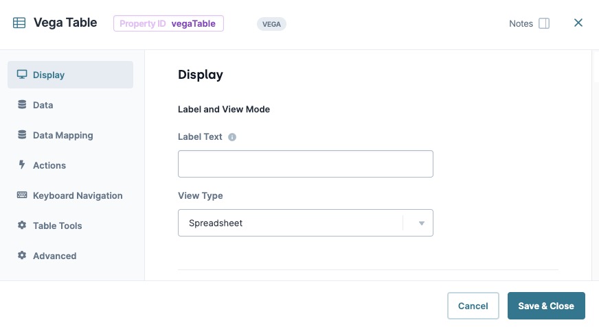
Label and View Mode
|
Setting |
Description |
|---|---|
|
Label Text |
Label Text conveys what the input component is and what information it displays. Enter the purpose of the corresponding component or field. User-friendly labels make your module more accessible. Keep labels short and descriptive (a word or two) using title case. For longer entries, use sentence case. |
|
View Type |
Displays Grid as a Spreadsheet or Form. The View Type affects how component fields and their settings display in your table. |
Data Panel
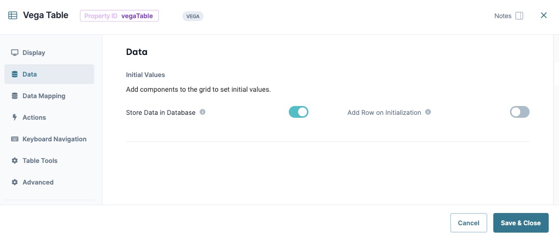
Initial Values
After adding components to the Vega Table component, the Initial Values table displays the fields as column headers. You can then enter and/or edit table values in each cell. You can also output values from other components, like a Plug-In component, to existing Vega Table fields. To customize the table columns or rows, use the Table Column and Table Row Settings.
The Initial Values table does not display unless components have been added to the table in Designer View.
|
Setting |
Description |
||
|---|---|---|---|
|
Table Column Settings |
|
||
|
Table Row Settings |
|
||
|
|
Add a new row to all Table column fields. Rows that contain no data in any column field do not display in Express View. |
||
|
Store Data in Database |
The Store Data in Database setting affects how data persists through your application. When set to (ON), Unqork stores values entered into the field to the database (server-side submission). This occurs in three scenarios:
By default, workflows persist data from all fields in the client-side submission when navigating between screens. However, only values from fields with Store Data in Database enabled store in the server-side submission. Set the toggle to (OFF) when you don’t want to store the values from this field in the database. When using a Plug-In to remote execute a module, ensure data moving between modules is persistent. You can optionally enable Store Data in Database for components in the source module. But any components in the API module whose values are included in an API response must have Store Data in Database enabled. When a component’s data is not persistent, the data isn't included in an API call's response. So, Plug-Ins or external services requesting data from the API module can't receive non-persistent data in the response. Store Data in Database also affects what data is tracked using Unqork’s built-in tracker. When the Enable Tracker and Track Value toggles are set to (ON) in Module Settings, only values from fields with Store Data in Database enabled are tracked. |
||
|
Add Row on Initialization |
Adds one blank row if the Table contains no data entries on initialization. If the Table contains data entries, the row won't be added. By default, this setting is (OFF). |
 (
(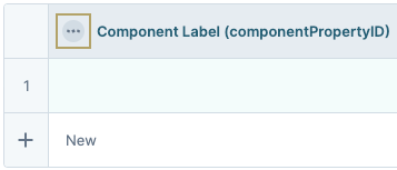
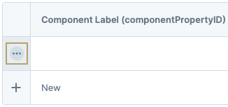
 (Add New Row)
Data Mapping Panel
Nested Data Structure
|
Setting |
Description |
|---|---|
|
Nested Data Structure Table |
This setting is still in development, but will allow you to easily create nested data in your table. Stay tuned for new developments and enhancements for this feature. |
|
New Row |
Add a new row to all Table column fields. Rows that contain no data in any column field do not display in Express View. |
|
Hide Grouped Columns |
In Express View, hides columns that have been grouped. By default, this setting is (OFF). |
Aggregation
|
Setting |
Description |
|---|---|
|
Aggregation Table |
This setting is still in development, but will allow you to easily create nested data in your table. Stay tuned for new developments and enhancements for this feature. |
|
New Row |
Add a new row to all Table column fields. Rows that contain no data in any column field do not display in Express View. |
Actions Panel
Triggers
| Setting | Description |
|---|---|
|
When... |
Select an action that, when it takes place, triggers another component selected using the Then... setting. Actions include:
|
|
Then... |
When the action selected in the When... setting occurs, the component entered in this field triggers. |
Keyboard Navigation
Keyboard Navigation
| Setting | Description |
|---|---|
|
Navigate Down on Enter Keypress |
When set to (ON), focus moves to the next row in the column after pressing Enter. Provides similar functionality to a spreadsheet tool. When (OFF), the focus remains on the same cell when pressing Enter. By default, this setting is (OFF). |
Table Tools
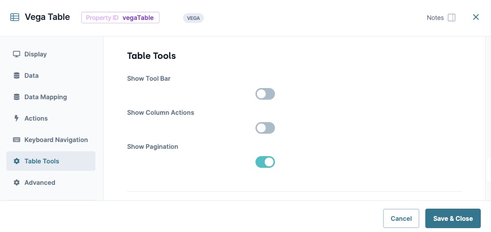
Table Tools
|
Setting |
Description |
|---|---|
|
Set to (ON) to display table options to end-users, including:
By default, this setting is Off in Express View.
In Express View, full-screen tables might be partially hidden by the Preview Bar. Remove or hide the preview bar to see the top portion of the table. By default, this setting is (OFF) in Express View. |
|
|
Show Column Actions |
Set to (ON) to display column actions. Settings include: In the list below, headerValue is replaced by column's header name.
By default, this setting is (OFF) |
|
Enable Pagination |
Controls the pagination Pagination is the process of separating content into individual pages. of data provided to the component. When set to (ON), the Vega Table component’s data paginates, creating one or more pages of table data. When set to (OFF), all data displays in the Vega Table on a single page. |
|
Show Pagination |
When set to (ON), displays the page sequence numbers at the bottom of the table. By default, paginated tables display 20 rows. End-users can change the amount displayed to 5, 10, 15, 20, or 30 rows. By default, this setting is (ON). |
|
Default Page Size |
Specify how many rows of data display per paginated page. By default, this setting is set to 20 items per page. |
|
Enable Server-Side Pagination |
When set to (ON), this setting enables server side pagination on the Vega Table component. Server-Side Pagination works with large data sets by retrieving a single page or subset of data at a time. This setting improves the end-user's performance and reduces memory usage when using large data sets with the Vega Table component. |
|
Reset Page Index |
When set to (ON), the Vega Table component resets to the first page when a filter or sort operation is applied, or the page size changes. Additionally, when the Show Tool Bar setting is set to (ON), The Reset Page Index setting applies to the Tool Bar in Express View. |
Advanced Panel
Additional Styling
|
Setting |
Description |
|---|---|
|
Custom CSS Class |
Enter a Custom CSS Cascading Style Sheets (CSS) is a style sheet language used for presenting how a HTML or XML document looks to end-users. Class to apply to your component. Custom CSS lets you maintain a consistent look and feel when the field or element is part of a template or multiple modules. Updated CSS styling applies to all components that reference this custom class name. |
Adding a Vega Table Component
In this example, use the Vega Table component to display a Market Summary spreadsheet for vehicle insurance. The Vega Table will include the insurance carrier, type, premium amount in USD, and the market status. Then add sorting and filter Vega Table operations that allow end-users End-users, also known as Express Users, are the individuals accessing an application through Express View. In most cases, end-users are the customers using the product. to modify the grid view.
What You Need
Before starting this configuration, you'll need the following:
-
A Workspace.
-
An Unqork application.
-
A module with a title.
Accessing Vega
Currently, the Vega Table component is only available in the Vega runtime engine. To use the Vega runtime in your module:
| 1. | Open your workspace. |
| 2. | Select your application. |
| 3. | Open your application module. |
| 4. | At the top of the Module Builder, select the version drop-down. By default, it's set to Runtime v1.0.0  . . |
| 5. | From the version drop-down, select Runtime v2.0.0 . |
Configure the Text Field Components
Begin by adding the fields you want in the Vega Table component. For this example, add Text Field components to act as the Vega Table component's fields.
| 1. | Drag and drop four Text Field components onto your canvas. |
|
Property ID |
Label Text |
|---|---|
|
carrier |
Carrier |
|
type |
Type |
|
premium |
Premium |
|
status |
Status |
| 3. | Click Save & Close for each component as you add it. |
Configure the Vega Table Component
Next, add your Vega Table component to use your Text Field components as table columns.
| 1. | Drag and drop a Vega Table component onto your canvas, placing it above your Text Field components. |
| 2. | In the Property ID A Property ID is the unique field ID used by Unqork to track and link components in your module. field, enter tableInsurance. |
| 3. | In the Label Text Label Text conveys what the input component is and what information it displays. Enter the purpose of the corresponding component or field. field, enter Market Summary. |
| 4. | Click Save & Close. |
| 5. | Drag and drop the carrier, type, premium, and status Text Field components inside the tableInsurance Vega Table component. |
| 6. | Hover over the tableInsurance Vega Table component and click the (Settings) button from the component toolbar. |
| 7. | Navigate to the Data settings, next to Intial Values & Data Mapping, click Edit. |
| 8. | In the Initial Values table, enter the following values: |
|
|
Carrier (carrier) |
Type (type) |
Premium (premium) |
Status (status) |
|---|---|---|---|---|
|
1 |
Unqork Auto |
Motorcycle |
$10,000 |
Not Taken Up |
|
2 |
State Farm |
Auto |
$20,000 |
Submitted |
|
3 |
Nationwide |
RV |
$50,000 |
Not Taken Up |
|
4 |
American Family |
Boat |
$25,000 |
Indication |
|
5 |
Geico |
Auto |
$25,000 |
Submitted |
|
6 |
Unqork Auto |
Auto |
$30,000 |
Submitted |
|
7 |
Nationwide |
RV |
$60,000 |
Indication |
|
8 |
Geico |
Auto |
$12,000 |
Not Taken Up |
|
9 |
State Farm |
Motorcycle |
$5,000 |
Not Taken Up |
|
10 |
American Family |
Boat |
$30,000 |
Submitted |
| 9. | Click Save & Close. |
Configure the colFilter Columns Component
Add a Columns component to organize the Vega Table operations that filter specific columns and cells in your table.
| 1. | Drag and drop a Columns component onto your canvas, placing it above your tableInsurance Vega Table component. |
| 2. | In the Property ID A Property ID is the unique field ID used by Unqork to track and link components in your module. field, enter colFilter. |
| 3. | Under Formatting, click (three columns). |
| 4. | Click Save & Close. |
Configure the btnFilterGlobal Button Component
Add a button that uses the Operations Builder to filter the table by the Unqork Auto insurance carrier.
| 1. | Drag and drop a Button component onto your canvas, placing it in the far-left column of the colFilter Columns component. |
| 2. | In the Property ID A Property ID is the unique field ID used by Unqork to track and link components in your module. field, enter btnFilterGlobal. |
| 3. | In the Label Text Label Text conveys what the input component is and what information it displays. Enter the purpose of the corresponding component or field. field, enter Global Filter By Unqork Auto. |
| 4. | In the component's configuration menu, select  Actions. Actions. |
| 5. | Set the Action Type The action performed by the button when selected. drop-down to Event. |
| 6. | Click Save & Close. |
| 7. | Hover over the Button component. |
A 6-button toolbar displays above the component on hover-over.
| 8. | Click the (Operations Builder) button. The Operations Buildermodal A modal is a window that appears on top of the content you are currently viewing. displays. |
| 9. | In the Select an Event | ▾ field, enter or select the On Click event. |
| 10. | Click Add. The New Operation configuration menu displays. |
| 11. | From the Operation Type* drop-down, enter or select TABLE_SET_GLOBAL_FILTER. |
| 12. | Click + Add Operation. |
| 13. | In the Target Key field, enter tableInsurance. |
| 14. | In the Filter* field, enter Unqork Auto. |
| 15. | Click Save Operation. |
The operation displays in the Events & Operation list.
| 16. | Click Save & Close. |
Configure the btnFilterSubmitted Button Component
Add another button that uses the Operations Builder to filter the table by the Status column. Clicking the button filters the table to only display statuses containing the value Submitted.
| 1. | Drag and drop a Button component onto your canvas, placing it in the far-right column of the colFilter Columns component. |
| 2. | In the Property ID A Property ID is the unique field ID used by Unqork to track and link components in your module. field, enter btnFilterSubmitted. |
| 3. | In the Label Text Label Text conveys what the input component is and what information it displays. Enter the purpose of the corresponding component or field. field, enter Filter By Submitted. |
| 4. | In the component's configuration menu, select Actions. |
| 5. | Set the Action Type The action performed by the button when selected. drop-down to Event. |
| 6. | Click Save & Close. |
| 7. | Hover over the Button component. |
A 6-button toolbar displays above the component on hover-over.
| 8. | Click the (Operations Builder) button. The Operations Buildermodal A modal is a window that appears on top of the content you are currently viewing. displays. |
| 9. | In the Select an Event | ▾ field, enter or select the On Click event. |
| 10. | Click Add. The New Operation configuration menu displays. |
| 11. | From the Operation Type* drop-down, enter or select TABLE_SET_COLUMN_FILTER. |
| 12. | Click + Add Operation. |
| 13. | In the Target Key field, enter tableInsurance. |
| 14. | Under Filters*, in the Id field, enter status. |
| 15. | In the Value field, enter "Submitted". |
| 16. | Click Save Operation. |
The operation displays in the Events & Operation list.
| 17. | Click Save & Close. |
Configure the colAddRow Columns Component
Let's add one more Columns component to organize the Vega Table operation that lets you add a new row to the bottom of the table.
| 1. | Drag and drop a Columns component onto your canvas, placing it below your tableInsurance Vega Table component. |
| 2. | In the Property ID A Property ID is the unique field ID used by Unqork to track and link components in your module. field, enter colAddRow. |
| 3. | Click Save & Close. |
Configure the btnAddRow Button Component
Lastly, you'll add a Button component to trigger the initAddRow Initializer component.
| 1. | Drag and drop a Button component onto your canvas, placing it in the left column of the colAddRow Columns component and above your initAddRow Initializer component. |
| 2. | In the Property ID A Property ID is the unique field ID used by Unqork to track and link components in your module. field, enter btnAddRow. |
| 3. | In the Label Text Label Text conveys what the input component is and what information it displays. Enter the purpose of the corresponding component or field. field, enter Add Row. |
| 4. | In the component's configuration menu, select Actions. |
| 5. | Set the Action Type The action performed by the button when selected. drop-down to Event. |
| 6. | Click Save & Close. |
| 7. | Hover over the Button component. |
A 6-button toolbar displays above the component on hover-over.
| 8. | Click the (Operations Builder) button. The Operations Buildermodal A modal is a window that appears on top of the content you are currently viewing. displays. |
| 9. | In the Select an Event | ▾ field, enter or select the On Click event. |
| 10. | Click Add. The New Operation configuration menu displays. |
| 11. | From the Operation Type* drop-down, enter or select ADD ROW. |
| 12. | Click + Add Operation. |
| 13. | In the Target Key field, enter tableInsurance. |
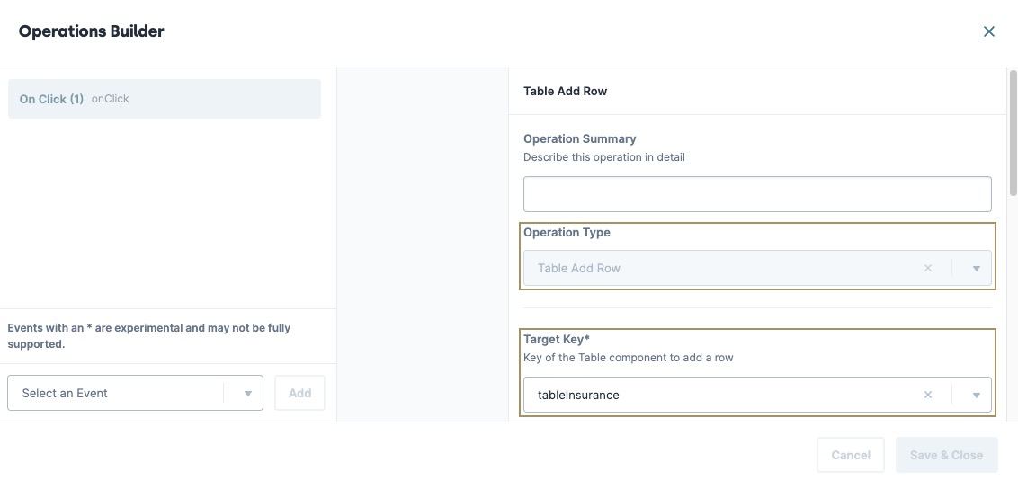
| 14. | Click Save Operation. |
The operation displays in the Events & Operation list.
| 15. | Click Save & Close. |
| 16. | Save your module. |
Here's how the completed module looks in the Module Builder:
Preview your module in Express View Express View is how your end-user views your application. Express View also lets you preview your applications to test your configuration and view the styling. This is also the view your end-users will see when interacting with your application. After configuring a module, click Preview in the Module Builder to interact with the module in Express View. to test out your Vega Table operations.
