The Protected Field is a Centauri (v1.0) component that masks data entered in Express View. Masking is useful when your end-user needs to enter PII they do not want the information to be seen, like a Social Security or account number.
Consider using a Protected Field component when:
Preventing the field from being viewed in real-time by anyone other than your end-user. Using a Protected Field component helps prevent "shoulder surfing", which is when someone physically views the end-user's screen to collect information.
You do not need to store sensitive data in the database. The Protected Field component does not include the Store Data in Database setting.
A Protected Field component works like a Text Field or Number component, but values entered in a Protected Field component do not display in the field. Instead, the field displays a substitute character, like asterisks or dots.
The Protected Field component does not support built-in encryption or other security features. It only masks the end-user's input in Express View. Therefore, the Protected Field component is not a good option for storing passwords.
You'll find the Protected Field component under the Secondary Fields group to the left of the Module Builder.
About the Configuration Window
To learn more about general component settings, view our General Component Settings article.
Display Settings
Field Text
Setting | Description |
|---|---|
Label Text | Label Text conveys what the input component is and what information it displays. Enter the purpose of the corresponding component or field. User-friendly labels make your module more accessible. Keep labels short and descriptive (a word or two) using title case. For longer entries, use sentence case. |
Placeholder Text | A short prompt telling end-users the expected value of an input field. For example, |
Prefix | Alphanumeric characters append to the start of the value entered in the field. If called by another component, the prefix stores with the value. |
Suffix | Alphanumeric characters that append to the end of the value entered in the field. If called by another component, the suffix stores with the value. |
Contextual Help
Setting | Description |
|---|---|
Tooltip | A quick tip describing the expected value of an input field. Unlike a Tooltip, Helper Text stays visible under the input field and displays on a single line. |
Default State Options
Setting | Description |
|---|---|
Hide Field | Displays or hides the component from view. Setting Hide Field to By default, Hide Field is set to |
Input Behavior
Setting | Description |
|---|---|
Input Behavior | Controls how end-users interact with the component. Choose from the following options:
|
Validation Settings
Input Required
Setting | Description |
|---|---|
Required | When set to By default, Required is set to |
Required Error Message | A custom error message that displays below a required field. The error message displays when the end-user tries to save or submit the module without completing the required field. |
Advanced Settings
Additional Validation Options
Setting | Description |
|---|---|
Min Length | Sets the minimum number of characters that an end-user must enter for valid input. |
Min Length Error Message | A custom error message that displays below the input field. The error message displays when the entry does not meet the minimum character length rule. |
Max Length | Sets the maximum number of characters that an end-user must enter for valid input. |
Max Length Error Message | A custom error message that displays below the input field. The error message displays when the entry does not meet the maximum character length rule. |
Additional Styling
Setting | Description |
|---|---|
Custom CSS Class | Enter a Custom CSS Class to apply to your component. Custom CSS lets you maintain a consistent look and feel when the field or element is part of a template or multiple modules. Updated CSS styling applies to all components that reference this custom class name. |
Adding a Protected Field Component
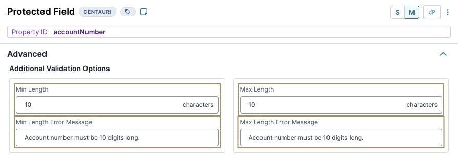
Configure a Protected Field component to collect an account number. You'll use validation settings to ensure the account number is exactly 10 characters in length. These instructions assume that you have an open module saved with a title.
In the Module Builder, drag and drop a Protected Field component onto your canvas.
In the Property ID field, enter accountNumber.
In the Label Text field, enter
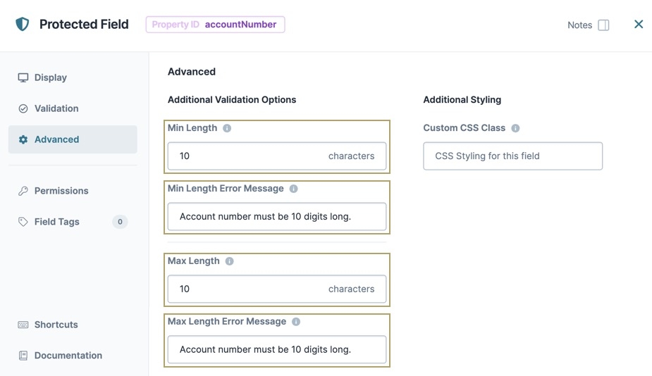
Enter Account Number.In the Min Length and Max Length fields, enter
10.Navigate to the component's Advanced settings.
In the Min Length Error Message and Max Length Error Message fields, enter
Account number must be 10 digits long..Click Save Component.
Save your module.
Preview your module in Express View to see the following functionality:
The Protected Field component masks data entered in Express View. Masking is useful when your end-user needs to enter sensitive information like a Social Security or account number, and they don't want the information to be visibly seen.
Consider using a Protected Field component when:
Preventing the field from being viewed in real-time by anyone other than your end-user. Using a Protected Field component helps prevent "shoulder surfing", which is when someone physically views the end-user's screen to collect information.
You do not need to store sensitive data in the database. The Protected Field component does not include the Store Data in Database setting.
A Protected Field component works like a Text Field or Number component, but values entered in a Protected Field component do not display in the field. Instead, the field displays a substitute character, like asterisks or dots.
The Protected Field component does not support built-in encryption or other security features. It only masks the end-user's input in Express View. Therefore, the Protected Field component is not a good option for storing passwords.
You'll find the component under the Secondary Fields group to the left of the Module Builder.
About the Configuration Window
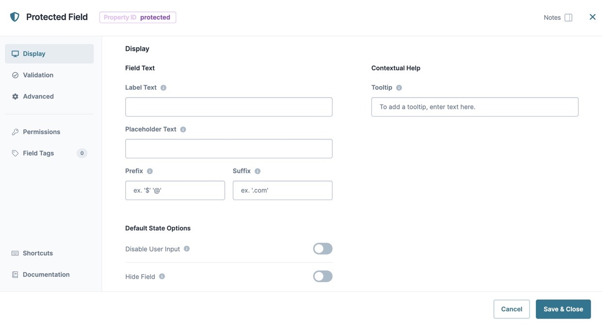
Display Panel
Field Text
Setting | Description |
|---|---|
Label Text | Label Text conveys what the input component is and what information it displays. Enter the purpose of the corresponding component or field. User-friendly labels make your module more accessible. Keep labels short and descriptive (a word or two) using title case. For longer entries, use sentence case. |
Placeholder Text | A short prompt telling end-users the expected value of an input field. For example, |
Prefix | Alphanumeric characters append to the start of the value entered in the field. If called by another component, the prefix stores with the value. |
Suffix | Alphanumeric characters that append to the end of the value entered in the field. If called by another component, the suffix stores with the value. |
Contextual Help
Setting | Description |
|---|---|
Tooltip | A quick tip describing the expected value of an input field. Unlike a Tooltip, Helper Text stays visible under the input field and displays on a single line. |
Default State Options
Setting | Description |
|---|---|
Disable User Input | When set to By default, Disable User Input is set to |
Hide Field | Displays or hides the component from view. Setting Hide Field to (ON) hides the component in Express View. Setting it to By default, Hide Field is set to |
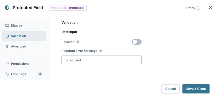
Validation Panel
Input Required
Setting | Description |
|---|---|
Required | When set to By default, Required is set to |
Error Message | A custom error message that displays below a required field. The error message displays when the end-user tries to save or submit the module without completing the required field. |
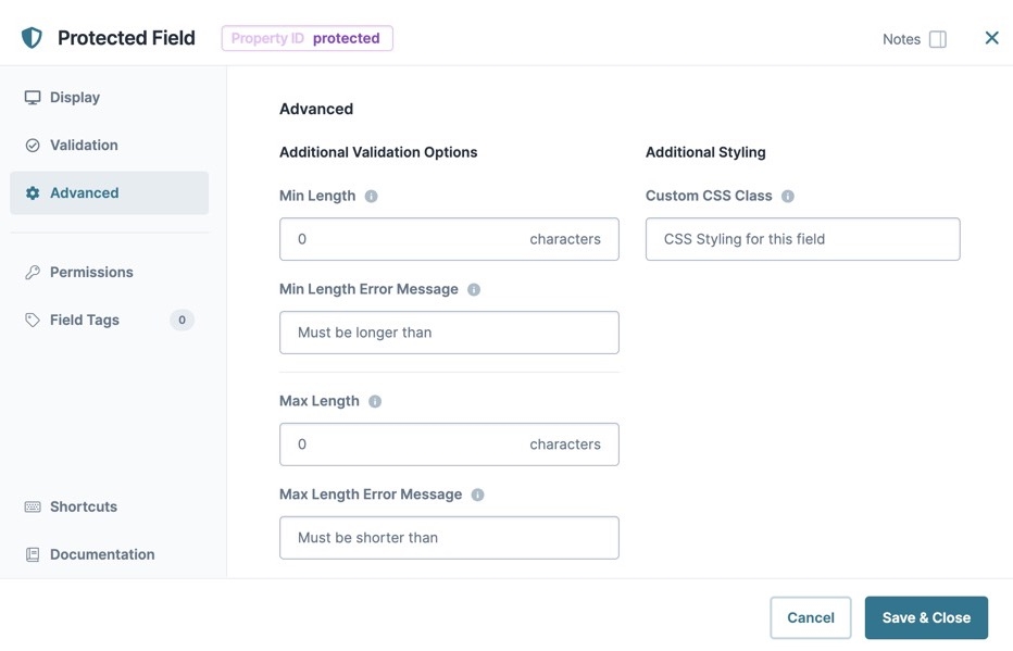
Advanced Panel
Additional Validation Options
Setting | Description |
|---|---|
Min Length | Sets the minimum number of characters that an end-user must enter for valid input. |
Min Length Error Message | A custom error message that displays below the input field. The error message displays when the entry does not meet the minimum character length rule. |
Max Length | Sets the maximum number of characters that an end-user must enter for valid input. |
Max Length Error Message | A custom error message that displays below the input field. The error message displays when the entry does not meet the maximum character length rule. |
Additional Styling
Setting | Description |
|---|---|
Custom CSS Class | Enter a Custom CSS Class to apply to your component. Custom CSS lets you maintain a consistent look and feel when the field or element is part of a template or multiple modules. Updated CSS styling applies to all components that reference this custom class name. |
Adding a Protected Field Component
Configure a Protected Field component to collect an account number. You'll use validation settings to ensure the account number is exactly 10 characters in length. These instructions assume that you have an open module saved with a title.
In the Module Builder, drag and drop a Protected Field component onto your canvas.
In the Property ID field, enter accountNumber.
In the Label Text field, enter
Enter Account Number.In the Min Length and Max Length fields, enter
10.From the component's configuration window, click the
 Advanced tab.
In the Min Length Error Message and Max Length Error Message fields, enter
Account number must be 10 digits long..Click Save & Close.
Save your module.
Preview your module in Express View to see the following functionality:
Structure of a Protected Field Component's Data
A Protected Field component stores its data as key/value pair. The value is stored as a string data type.
.jpg)
.jpg)
.jpg)
