Overview
The Vega Image component lets you display images in your Front-End modules. With this component, you can specify image dimensions, alternate text, or apply a custom CSS class. Use this component by specifying the URL of external image files, or image files stored in Managed Assets.
You can find the Vega Image component under the Display & Layout group to the left of the Module Builder.
About the Configuration Window
To learn more about general component settings, view our General Component Settings article.
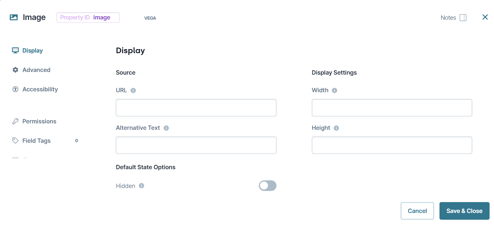
Display Panel
Source
Setting | Description |
|---|---|
URL | Enter the URL address of the image. For images stored in Managed Assets, enter the following: Supported image formats include:
|
Alternative Text | Provide a simple description of the image. Screen readers produce an audio description of the alternate text when they reach the image. |
Default State Options
Setting | Description |
|---|---|
Hide Field | Shows or hides the component from view in Express View. Setting Hide Field to By default, Hide Field is set to |
Disable User Input | Used to disable end-user inputs in Express View. By default, Disable User Input is set to |
Display Settings
Setting | Description |
|---|---|
Width | The width of the image in pixels. Leave this field blank to use the image's original width. |
Height | The height of the image in pixels. Leave this field blank to use the image's original height. |
Advanced Panel
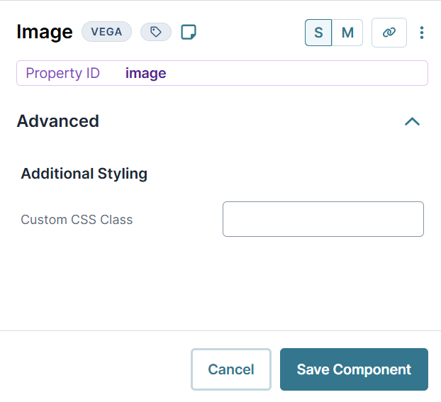
Additional Styling
Setting | Description |
|---|---|
Custom CSS Class | Enter a Custom CSS Class to apply to your component. Custom CSS lets you maintain a consistent look and feel when the field or element is part of a template or multiple modules. Updated CSS styling applies to all components that reference this custom class name. |
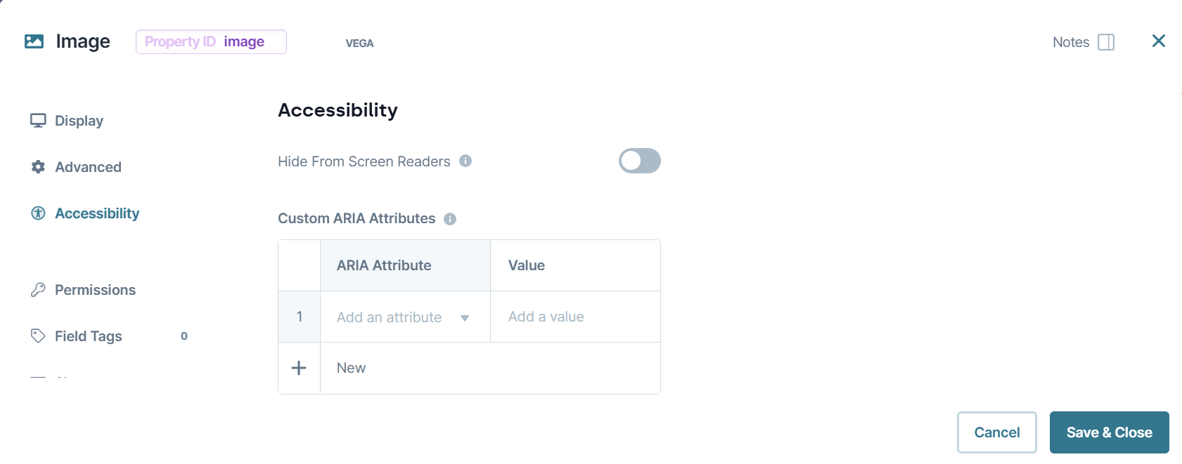
Accessibility Panel
Accessibility
Setting | Description |
|---|---|
Hide From Screen Readers | This setting is used to prevent from being announced by screen readers. It is mostly used for decorative or non-essential content. |
Custom ARIA Attributes | This is a long example of text in a description. This setting is used to enhance accessibility beyond the built-in settings. You can add ARIA attributes and their values to define how assistive technologies interpret your component. |
Adding an Image Component
To use an Image component, you must have a URL address for an image. For this example, use the following image URL: https://docs.unqork.io/Content/Resources/Images/exampleLogo.jpg.
Configure the Image Component
In the Module Builder, drag and drop an Image component onto the canvas.
In the Property ID field, enter imageLogo.
In the URL field, enter
https://docs.unqork.io/Content/Resources/Images/exampleLogo.jpg.In the Alternative Text field, enter
A static image displaying the company logo..Click Save & Close.
Save your module.
Preview your module in Express View. The image displays at its original size.
Inspect the image using your browser's DevTools to display the Alternate Text value in the alt attribute.
Overview
The Vega Image component lets you display images in your Front-End modules. With this component, you can specify image dimensions, alternate text, or apply a custom CSS class. Use this component by specifying the URL of external image files, or image files stored in Managed Assets.
You can find the Vega Image component under the Display & Layout group to the left of the Module Builder.
About the Configuration Window
To learn more about general component settings, view our General Component Settings article.
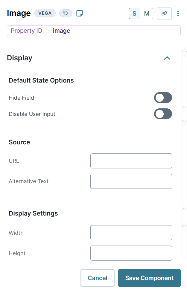
Display Settings
Default State Options
Setting | Description |
|---|---|
Hide Field | Shows or hides the component from view in Express View. Setting Hide Field to By default, Hide Field is set to |
Disable User Input | Used to disable end-user inputs in Express View. By default, Disable User Input is set to |
Source
Setting | Description |
|---|---|
URL | Enter the URL address of the image. For images stored in Managed Assets, enter the following: Supported image formats include:
|
Alternative Text | Provide a simple description of the image. Screen readers produce an audio description of the alternate text when they reach the image. |
Display Settings
Setting | Description |
|---|---|
Width | The width of the image in pixels. Leave this field blank to use the image's original width. |
Height | The height of the image in pixels. Leave this field blank to use the image's original height. |
Advanced Settings
Additional Styling
Setting | Description |
|---|---|
Custom CSS Class | Enter a Custom CSS Class to apply to your component. Custom CSS lets you maintain a consistent look and feel when the field or element is part of a template or multiple modules. Updated CSS styling applies to all components that reference this custom class name. |
Adding an Image Component
To use an Image component, you must have a URL address for an image. For this example, use the following image URL: https://docs.unqork.io/Content/Resources/Images/exampleLogo.jpg.
Configure the Image Component
In the Module Builder, drag and drop an Image component onto the canvas.
In the Property ID field, enter imageLogo.
In the URL field, enter
https://docs.unqork.io/Content/Resources/Images/exampleLogo.jpg.In the Alternative Text field, enter
A static image displaying the company logo..Click Save Component.
Save your module.
Preview your module in Express View. The image displays at its original size.
Inspect the image using your browser's DevTools to display the Alternate Text value in the alt attribute.
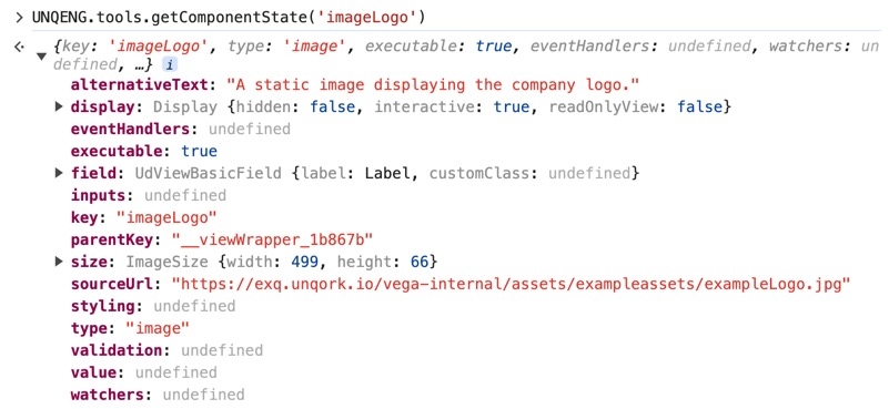
Structure of an Image Component's Data
Using the example above, execute the Vega Console command UNQENG.tools.getComponentState('imageLogo') in the DevTools Console to display the component's data structure:
