Vega Table Operations JSON Reference List

Vega Table Operations JSON Reference List

Overview

Vega Table operations are the actions the Vega Table component performs. These actions include filtering, adding rows, removing rows, navigating to different table pages, and so on. But, instead of running operations in the Table component, you'll use logic components to control and trigger them.

Using the Operations Builder tool? View table operation descriptions in our Vega Table Operations article.

Each Vega Table operation holds key/value pairs called options. For each Vega Table option, enter the relevant option value to customize how your Vega Table operation performs. For example, the TABLE_SET_COLUMN_FILTER operation filters columns in the Vega Table component. The TABLE_SET_COLUMN_FILTER operation uses the ColumnFilter option key/value pair to determine the column you want to filter by.

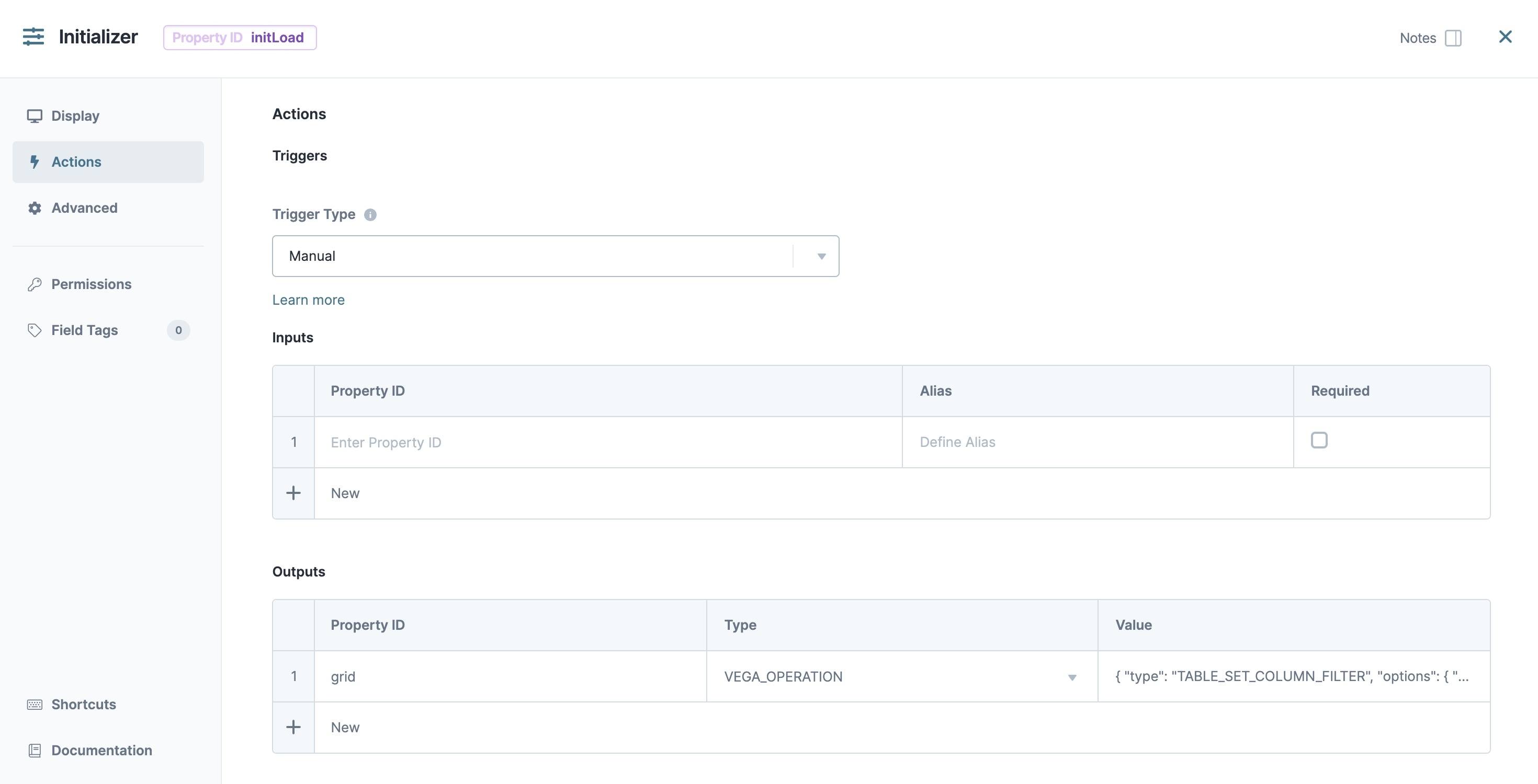
To control and trigger Vega Table operations in logic components, use a new Outputs Enter outputs components and actions you want the component to perform.  Type called VEGA_OPERATION. For the logic component's Outputs Value, enter the operation and options you want your Vega Table to perform.

A static image displaying the table set column filter Table operation configured in an Initializer component's Outputs table.

Here is the basic template for performing an operation:

Copy
{
   "type": "OPERATION_TYPE",
   "options": {
      // Options go here.
   }
}

Vega Table Operations

Below is a list of all supported Vega Table operations you can use to control your Vega Table component.

This banner denotes that the operation requires you to enable a feature flag to use it. To learn more, view the Enabling Feature Flags section of this article.

Operation Type

Description

Option

Example JSON

TABLE_ADD_COLUMN

Adds a column to the table.

  • targetKey: string

  • definitions: object[]

You can add additional definitions, like label. If you do not provide label, it defaults to the label associated with the type of component.

Copy
{
  "type": "TABLE_ADD_COLUMN",
  "options": {
    "targetKey": "grid",
    "definitions": [
      {
        "key": "ColumnAdded",
        "type": "button"
      }
    ]
  }
}

TABLE_ADD_ROW

Adds an empty row to the table at a specified index.

  • targetKey: string

  • targetIndex: number

  • rowValue: object

If no index is specified, a row adds to the bottom of the table.

Copy
{
  "type": "TABLE_ADD_ROW",
  "options": {
    "targetKey": "table",
    "targetIndex": 1,
    "rowValue": {
      "Name": "AppOne",
      "Date": "12/01/2023",
      "Number": 123
    }
  }
}

TABLE_CLEAR

Removes all columns and rows from the table.

  • targetKey: string

Copy
{
  "type": "TABLE_CLEAR",
  "options": {
    "targetKey": "grid"
  }
}

TABLE_GO_TO_FIRST_PAGE

Navigates to the first page of the table.

  • targetKey: string

Use enablePagination: true to allow pagination.

Copy
{
  "type": "TABLE_GO_TO_FIRST_PAGE",
  "options": {
    "targetKey": "grid"
  }
}

TABLE_GO_TO_LAST_PAGE

Navigates to the last page of the table.

  • targetKey: string

Use enablePagination: true to allow pagination.

Copy
{
  "type": "TABLE_GO_TO_LAST_PAGE",
  "options": {
    "targetKey": "grid"
  }
}

TABLE_GO_TO_NEXT_PAGE

Navigates to the next page of the table.

  • targetKey: string

Use enablePagination: true to allow pagination.

Copy
{
  "type": "TABLE_GO_TO_NEXT_PAGE",
  "options": {
    "targetKey": "grid"
  }
}

TABLE_GO_TO_PAGE

Navigates to a specific page of the table.

  • targetKey: string

  • pageNumber: number or string

The first page has an index of 0.

Use enablePagination: true to allow pagination.

Copy
{
  "type": "TABLE_GO_TO_PAGE",
  "options": {
    "targetKey": "grid",
    "pageNumber": "{{textField.value}}"
  }
}


Copy
{
  "type": "TABLE_GO_TO_PAGE",
  "options": {
    "targetKey": "grid",
    "pageNumber": 5
  }
}

TABLE_GO_TO_PREVIOUS_PAGE

Navigates to the previous page of the table.

  • targetKey: string

Use enablePagination: true to allow pagination.

Copy
{
  "type": "TABLE_GO_TO_PREVIOUS_PAGE",
  "options": {
    "targetKey": "grid"
  }
}

TABLE_SET_PAGE_SIZE

Sets the number of rows displayed on each page.

  • targetKey: string

  • pageSize: number or string

Use enablePagination: true to allow pagination.

Copy
{
  "type": "TABLE_SET_PAGE_SIZE",
  "options": {
    "targetKey": "grid",
    "pageSize": 3
  }
}


Copy
{
  "type": "TABLE_SET_PAGE_SIZE",
  "options": {
    "targetKey": "grid",
    "pageSize": "{{pageSizeText.value}}"
  }
}

TABLE_REMOVE_COLUMN

Removes a column from the table.

  • targetKey: string

  • keysToRemove: string or string[]

Copy
{
  "type": "TABLE_REMOVE_COLUMN",
  "options": {
    "targetKey": "grid",
    "keysToRemove": [
      "firstName",
      "lastName"
    ]
  }
}

TABLE_REMOVE_ROWS

Removes a specified row(s) from the table.

  • targetKey: string

  • targetRowKeys: string[]

The target key of the row(s) to be removed.

  • targetIndexes: number[]

The index for the row(s) to be removed.

Copy
{
   "type": "TABLE_REMOVE_ROWS",
   "options": {
      "targetKey": "grid",
      "targetIndex": [0]
   }
}

TABLE_SET_ACTION_TOOLBAR_VISIBILITY

Displays or hides the action toolbar.

  • targetKey: string

  • enableTopToolbar: Boolean or string

  • enableBottomToolbar: Boolean or string

Copy
{
   "type": "TABLE_SET_ACTION_TOOLBAR_VISIBILITY",
   "options": {
      "targetKey": "grid",
      "enableTopToolbar": true,
      "enableBottomToolbar": false
   }
}

TABLE_SET_COLUMN_FILTERS_VISIBILITY

Displays or hides the column filter toolbar.

  • targetKey: string

  • enableColumnFilters: Boolean or string

Copy
{
   "type": "TABLE_SET_COLUMN_FILTERS_VISIBILITY",
   "options": {
      "targetKey": "grid",
      "enableColumnFilters": true
   }
}

TABLE_SET_COLUMN_FILTER

Filters one or more columns.

  • targetKey: string

  • filters: ColumnFilter[]

ColumnFilter =

{

id: string

value: unknown

}

Copy
{
  "type": "TABLE_SET_COLUMN_FILTER",
  "options": {
    "targetKey": "grid",
    "filters": [
      {
        "id": "title",
        "value": "CEO"
      }
    ]
  }
}

TABLE_SET_GLOBAL_FILTER_VISIBILITY

Displays or hides the global filter toolbar.

  • targetKey: string

  • enableGlobalFilter: Boolean or string

Copy
{
   "type": "TABLE_SET_GLOBAL_FILTER_VISIBILITY",
   "options": {
      "targetKey": "grid",
      "enableGlobalFilter": true
   }
}

TABLE_SET_GLOBAL_FILTER

Filters all columns simultaneously.

  • targetKey: string

  • filters: ColumnFilter[]

Copy
{
  "type": "TABLE_SET_GLOBAL_FILTER",
  "options": {
    "targetKey": "grid",
    "filter": "CEO"
  }
}

TABLE_SET_COLUMN_PINNING

Pins a column of the table.

  • targetKey: string

  • columnPinningState: ColumnPinningState

ColumnPinningState =

{

left: string[]

right: string[]

}

Copy
{
  "type": "TABLE_SET_COLUMN_PINNING",
  "options": {
    "targetKey": "grid",
    "columnPinningState": {
      "left": [
        "name"
      ],
      "right": [
        "title"
      ]
    }
  }
}

TABLE_SET_COLUMN_VISIBILITY

Displays or hides a column of the table.

  • targetKey: string

  • column: string or string[]

  • visibility: string

    visibility =

  • HIDDEN: Hides the column(s)

  • VISIBLE: Displays the column(s)

  • TOGGLE: Switches the current visibility

  • If any of the provided columns are invalid or do not exist, the operation stops.

  • If no columns are provided, an error displays.

  • targetKey, column, and visibility support interpolation syntax.

Copy
{
   "type": "TABLE_SET_COLUMN_VISIBILITY",
   "options": {
      "targetKey": "grid",
      "column": [
          "firstName",
          "age"
        ],
      "visibility": "TOGGLE"
   }
}

TABLE_SET_FILTER_TYPES

Offers additional control over filtering columns by data type.

  • targetKey: string

  • filters: string

Filters string values include:

  • text: Text filter where the end user types in the value to search.

  • select: A dropdown for the end user to select a value.

  • multi-select: A dropdown for the end user to select one or multiple value(s).

  • checkbox: A checkbox to filter boolean values.

  • range: A number range where the end user types in the number values.

  • range-slider: A range slider for a number value that the end user can interact with. If no min and max values selected, the min and max will be auto populated with the lowest and highest numbers in the data respectively.

  • date-range: A date range to filter.

Learn more about each filters type in the Filters Types and Options section.

Copy
{
  "options": {
    "shouldExecute": true,
    "targetKey": "vegaTable",
    "filters": [
      {}
    ]
  },
  "type": "TABLE_SET_FILTER_TYPES",
  "creatorSummary": "Initialize filter types"
}

TABLE_SET_GROUPING_CRITERIA

Sets row grouping in the table.

  • targetKey: string

  • groupBy: string or string[]

Use enableGrouping: true to allow row grouping.

Copy
{
  "type": "TABLE_SET_GROUPING_CRITERIA",
  "options": {
    "targetKey": "grid",
    "groupBy": "lastName"
  }
}

TABLE_SET_ROW_PINNING

Pins a row of the table.

  • targetKey: string

  • rowPinningState: RowPinningState

RowPinningState =

{

top: string[]

bottom: string[]

}

Use enableRowPinning: true to allow row pinning.

Copy
{
  "type": "TABLE_SET_ROW_PINNING",
  "options": {
    "targetKey": "grid",
    "rowPinningState": {
      "top": [
        "0",
        "1"
      ],
      "bottom": [
        "4"
      ]
    }
  }
}

TABLE_SET_SELECTED_ROW

Highlights the selected row of the table.

  • targetKey: string

  • selectedRows: RowSelection

RowSelection = {[rowIndex: string]: boolean}

Use enableRowSelection: true to allow row selection.

Copy
{
  "type": "TABLE_SET_SELECTED_ROW",
  "options": {
    "targetKey": "grid",
    "selectedRows": {
      "0": true
    }
  }
}

TABLE_TOGGLE_GROUPING

Enables or disables grouping.

  • targetKey: string

Copy
{
  "type": "TABLE_TOGGLE_GROUPING",
  "options": {
    "targetKey": "grid"
  }
}

Filters Types and Options

The TABLE_SET_FILTER_TYPES operation enables granular control over a Vega Table's column filtering feature. Creators can specify the type of filter to use for each column, and control its specific effects. For example, you could limit the filter options for a column containing a drop-down list, or limit the the minimum and maximum range values of a column displaying the number data type.

Filter Types

The list below includes a description and available option for each filter type available to the TABLE_SET_FILTER_TYPES filter:

Filter Option Description Option Values Example

checkbox

Filters column by Boolean values.

Useful for filtering data from a Single Checkbox component.

  • useFacetedOptions: Boolean

  • includeBlanksInFilter: Boolean

  • allowFilterBlank: Boolean

Copy
{
    "id": "approved",
    "type": "checkbox",
    "useFacetedOptions": true,
    "includeBlanksInFilter": false,
    "allowFilterBlank": false
}

date-range

Filters column by date value and allows Creators to specify the date format that displays in the Vega Table's filter tool bar.

Useful for filtering data from a Date Input component.

  • dateFormat: iso format
    Example iso formats:

    • MM/DD/YYYY

    • YYY-DD-MM

    • YYYY-MM-DDTHH:mm:ss.SSSZ

  • useFacetedOptions: Boolean

  • allowFilterBlank: Boolean

  • includeBlanksInFilter: Boolean

Copy
{
    "id": "policyStartDate",
    "type": "date-range",
    "dateFormat": "MM/DD/YYYY",
    "useFacetedOptions": true,
    "includeBlanksInFilter": false,
    "allowFilterBlank": false
}

multi-select

Filters column by drop-down values that allow end-users to select multiple values.

Useful for filtering data fields from a Checkboxes, Simple Select, or Search Select component containing multiple values.

  • allowFilterBlank: Boolean

  • useFacetedOptions: Boolean

  • includeBlanksInFilter: Boolean

Copy
{
    "id": "tags",
    "type": "multi-select",
    "allowFilterBlank": true,
    "useFacetedOptions": true,
    "includeBlanksInFilter": false
}

range

Filters column by number values and presents as a Min and Max field to the end-user.

Useful for filtering data from the Number component.

  • useFacetedOptions: Boolean

  • includeBlanksInFilter: Boolean

  • allowFilterBlank: Boolean

Copy
{
    "id": "quoteAmount",
    "type": "range",
    "useFacetedOptions": true,
    "includeBlanksInFilter": false,
    "allowFilterBlank": false
}

range-slider

Filters column by number values and presents as a slider to the end-user. Creators can set the minimum and maximum values end-users can filter by.

Useful for filtering data from the Number component.

  • useFacetedOptions: Boolean

  • includeBlanksInFilter: Boolean

  • allowFilterBlank: Boolean

  • min: number (optional)

  • max: number (optional)

  • step: number (optional)

Copy
{
    "id": "totalValue",
    "type": "range-slider",
    "useFacetedOptions": true,
    "includeBlanksInFilter": false,
    "allowFilterBlank": false,
    "min": 0,
    "max": 100000,
    "step": 1000
}

select

Filters column by drop-down values where the end-user can select a single value.

Useful for filtering data values from a Dropdown, Simple Select, or or Search Select component.

  • useFacetedOptions: Boolean

  • filterOptions: array

    • label: string

    • value: string

  • allowFilterBlank: Boolean

  • includeBlanksInFilter: Boolean

Copy
{
    "id": "team",
    "type": "select",
    "useFacetedOptions": false,
    "filterOptions": [
        { "label": "Sales", 
        "value": "Sales" },
        { "label": "HR", 
        "value": "HR" },
        { "label": "Product", 
        "value": "Product" },
        { "label": "Engineering", 
        "value": "Engineering" }
        ],
    "allowFilterBlank": true,
    "includeBlanksInFilter": false
}

Filter Type Options

Creators us Filter type options to customize each filter type in a Vega table. The options listed below are available for some, or all filter types.

Setting Supported Filters Description

Use Faceted Values

select

multi-select

When Checked Box Icon (checked), the Vega Table generates filter options for end-users using the unique values contained in the data.

When, ☐ (unchecked), Creators manually enter a label and value for each option in the Filter Options list.

Allow Filter Blanks

text

select

multi-select

Set toChecked Box Icon (checked) display an option to end-users that lets them filter for black values.

Include Blanks in Filter

All Filters

Set to Checked Box Icon (checked) to include blank data values

Enabling Feature Flags

Many of the Vega Table operations require you to enable them in your Initializer component. The table below provides you with the necessary syntax to enable pagination, row selection, grouping, and pinning.

Operation Type

Description

Option Example JSON

SET_PROPERTY

Enables those operations behind a feature flag.

  • targetKey: string
  • property: string

  • value: Boolean

Copy
{
"type": "SET_PROPERTY", "options": {
"targetKey": "grid",
"property": "enableRowSelection",
"value": true
    }
}

It's important to note that you can enable feature flags and perform Vega Table operations in the same Initializer component.

A static image displaying an Intializer component's Outputs table, configured to enable a feature flag and perform a Table operation.

Resources