Overview
The Menu component is a Primary Fields component that attaches a drop-down list of customizable options to an element. For example, if your page has a Button component labeled Settings, and you want to display options when an end-user clicks it, use the Menu component to create the drop-down effect.
The Menu component is a Vega (2.0) runtime component and is not supported in the Centauri (1.0) runtime.
About the Configuration Window
To learn more about general component settings, view our General Component Settings article.
Display Panel
Field Text
Setting | Description |
|---|---|
Label Text | Label Text conveys what the input component is and what information it displays. Enter the purpose of the corresponding component or field. User-friendly labels make your module more accessible. Keep labels short and descriptive (a word or two) using title case. For longer entries, use sentence case. |
Default State Options
Setting | Description |
|---|---|
Hide Field | Displays or hides the component from view. Setting Hide Field to By default, Hide Field is set to |
Anchor Location
Setting | Description |
|---|---|
propertyID | To attach the Menu component to another component, enter the component's Property ID. For example, enter a Button component's Property ID in this field to attach the Menu component to the button. In Express View, when an end-user clicks the button, the menu displays below it. |
Data Panel
Values
Setting | Description |
|---|---|
Data Source Type | Use the Values table to create individual options in the menu. End-Users open the menu to see each of the options in a list, the option's adornments, and click on the option to trigger its action. |
Label | Enter the text that displays to the end-user. When an end-user clicks the text, the Action setting fires. |
Value | Create a key value for targeting the option. For example, if you have three options in your menu, you could assign the following keys: |
Action | The action triggered when an end-user clicks the Option Label text. Enter a Vega Operation to perform or a Property ID to trigger. |
Adding a Menu Component
In this example, configure a Button component to trigger a Menu component.
These instructions assume that you have an open module saved with a title.
Configure the Button Component
This Button component acts as the visual anchor for the Menu component. Your end-user clicks the button to display the menu beneath it.
In the Module Builder, drag and drop a
.png) Button component onto the canvas.
Button component onto the canvas.In the Property ID field, enter btnMenu.
In the Label Text field, enter
Navigate.Navigate to the Actions settings.
Under Action Type, click Event.
You'll configure the btnMenu
.png) Button component's Operations Builder settings after configuring the Menu component.
Button component's Operations Builder settings after configuring the Menu component.Click Save Component.
Configure the Menu Component
Configure a Menu component to anchor to the Button component. You can also configure options based on your needs.
Drag and drop a Menu component onto the canvas, placing it below the btnMenu
.png) Button component.
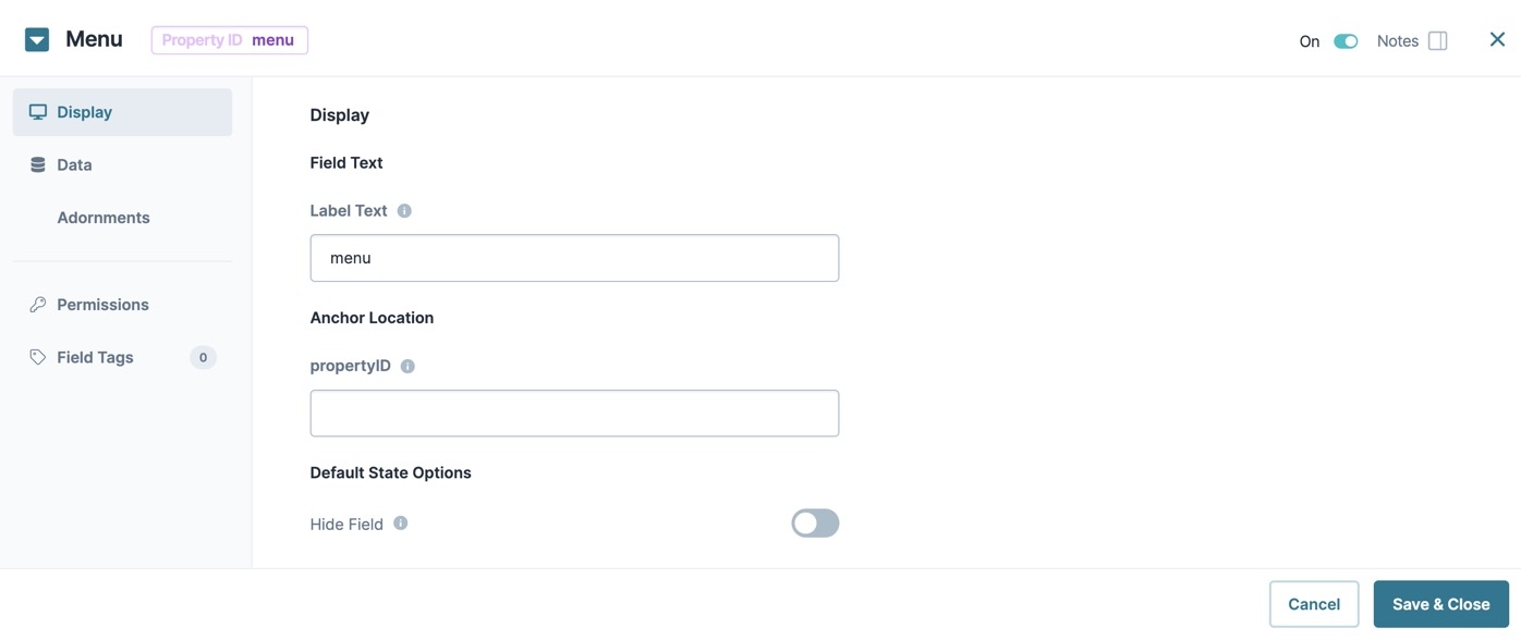
Button component.In the Property ID field, enter menuNav.
In the Label Text field, enter
menuNav.Under Anchor Location, in the propertyID field, enter btnMenu. This attaches the menu to the Button component in Express View.
Navigate to the Data settings.
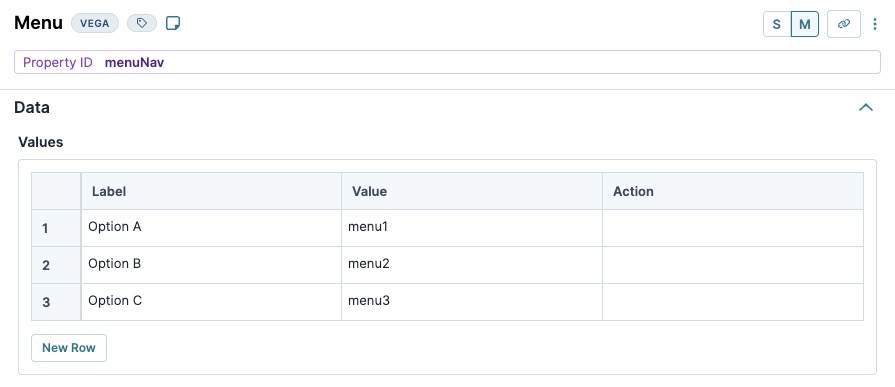
In the Values table, enter the following:
Label
Value
Action
1
Option A
menu1
2
Option B
menu2
3
Option C
menu3
You can configure options to perform specific functions using the Action setting. For example, each option could direct the end-user to another module, display Hidden components, trigger a workflow, and so on.
Click Save Component.
Configure the Button Component's Operations Builder
Open the
.png) Button component's configuration drawer.
Button component's configuration drawer.Navigate to the Actions settings.
Next to Events & Operations, click Edit.
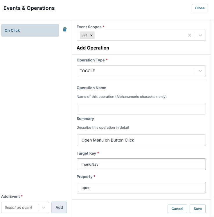
From the Add Event* drop-down, enter or select the
On Clickevent.Click + Add Operation.
In the Operation Type* field, enter or select
TOGGLE.In the Summary field, enter
Open Menu on Button Click.In the Target Key* field, enter or select
menuNav.In the Property* field, enter
open.Click Save to close the Add Operation window. The operation displays in the Operations Builder configuration window as a new row. The Operation Type and Operation Summary values display inside the row.
Click Close to close the Operations Builder modal.
Click Save Component .
Save your module.
Preview your module in Express View. Click the Navigate button to display the menu:
Overview
The Menu component is a Primary Fields component that attaches a drop-down list of customizable options to an element. For example, if your page has a Button component labeled Settings, and you want to display options when an end-user clicks it, use the Menu component to create the drop-down effect.
About the Configuration Window
To learn more about general component settings, view our General Component Settings article.
Display Panel
Field Text
Setting | Description |
|---|---|
Label Text | Label Text conveys what the input component is and what information it displays. Enter the purpose of the corresponding component or field. User-friendly labels make your module more accessible. Keep labels short and descriptive (a word or two) using title case. For longer entries, use sentence case. |
Anchor Location
Setting | Description |
|---|---|
propertyID | To attach the Menu component to another component, enter the component's Property ID. For example, enter a Button component's Property ID in this field to attach the Menu component to the button. In Express View, when an end-user clicks the button, the menu displays below it. |
Default State Options
Setting | Description |
|---|---|
Hide Field | Displays or hides the component from view. Setting Hide Field to By default, Hide Field is set to |
Data Panel
Data
Setting | Description |
|---|---|
Data Source Type | Use the Values table to create individual options in the menu. End-Users open the menu to see each of the options in a list, the option's adornments, and click on the option to trigger its action. |
Key | Create a key value for targeting the option. For example, if you have three options in your menu, you could assign the following keys: |
Option Label | Enter the text that displays to the end-user. When an end-user clicks the text, the Action setting fires. |
Action | The action triggered when an end-user clicks the Option Label text. Enter a Vega Operation to perform or a Property ID to trigger. |
Adding a Menu Component
In this example, configure a Button component to trigger a Menu component.
These instructions assume that you have an open module saved with a title.
Configure the Button Component
This Button component acts as the visual anchor for the menu. Your end-users click the button to display the menu underneath.
In the Module Builder, drag and drop a
.png) Button component onto the canvas.
Button component onto the canvas.In the Property ID field, enter btnMenu.
In the Label Text field, enter
Navigate.In the component's configuration menu, click
.png) Actions.
Actions.Under Action Type, click Event.
You'll configure the btnMenu
.png) Button component's Operations Builder settings after configuring the Menu component.
Button component's Operations Builder settings after configuring the Menu component.Click Save & Close.
Configure the Menu Component
Configure a Menu component to anchor to the Button component. You can also configure options based on your needs.
Drag and drop a Menu component onto the canvas, placing it below the btnMenu
.png) Button component.
Button component.In the Property ID field, enter menuNav.
In the Label Text field, enter
menuNav.Under Anchor Location, in the propertyID field, enter btnMenu. This attaches the menu to the Button component in Express View.
In the component's configuration menu, click select Data.
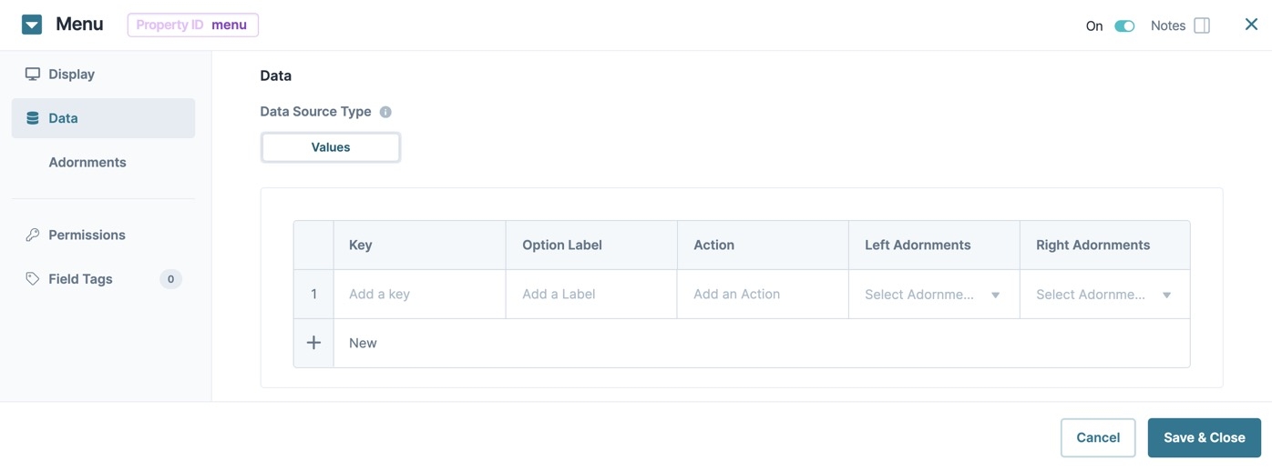
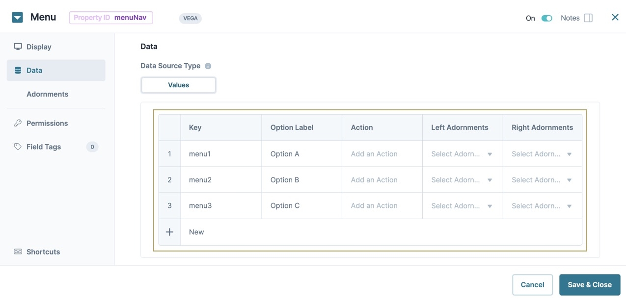
In the Values table, enter the following:
Key
Optional Label
Action
Left Adornments
Right Adornments
1
menu1
Option A
2
menu2
Option B
3
menu3
Option C
You can configure options to perform a certain function using the Action setting. For example, each option could direct the end-user to another module, display Hidden components, trigger a workflow, and so on.
Click Save & Close.
Configure the Button Component's Operations Builder
Hover over the
.png) Button component.
Button component.A 6-button toolbar displays above the component on hover-over.
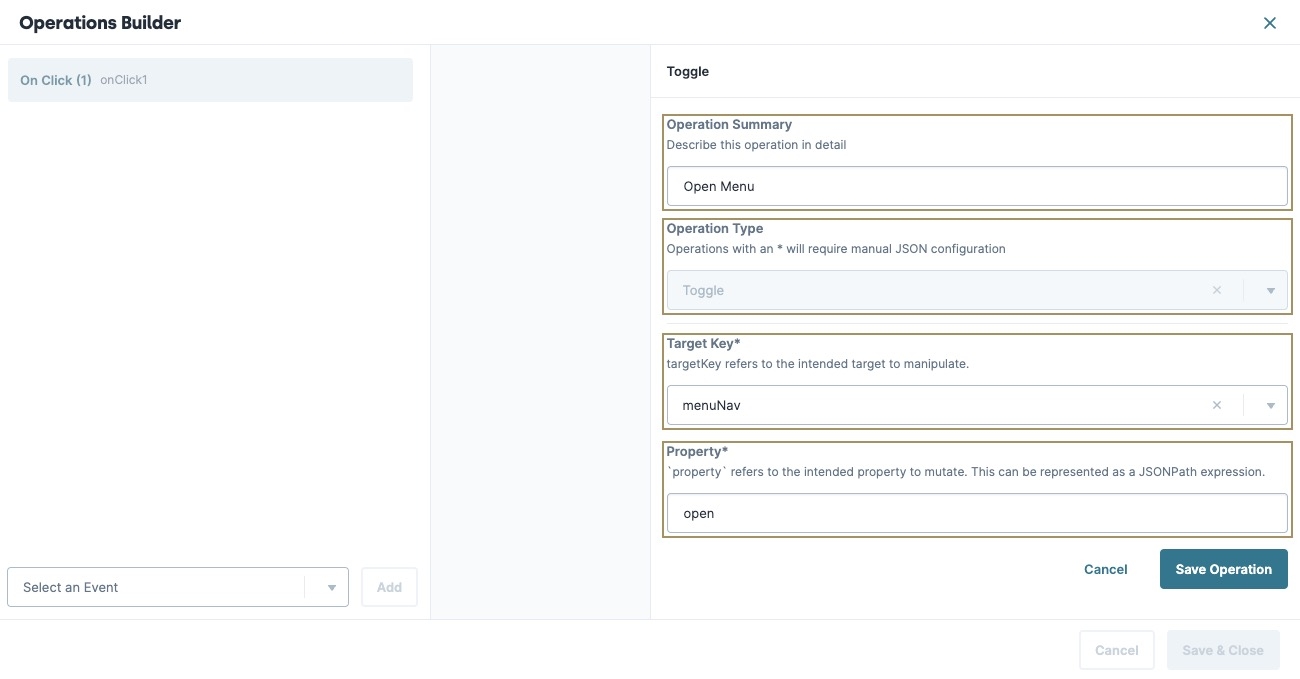
Click the (Operations Builder) button. The Operations Builder modal displays.
In the Select an Event | ▾ field, enter or select the On Click event.
Click Add. The New Operation configuration menu displays.
In the Operation Summary field, enter
Open Menu.In the Operation Type field, enter or select
Toggle.In the Target Key field, enter or select
menuNav.In the Property* field, enter
open.Click Save Operation to close the New Operation window. The operation displays in the Operations Builder configuration window as a new row. The Operation Type and Operation Summary values display inside the row.
Click Save & Close to close the Operations Builder modal.
Save your module.
Preview your module in Express View. Click the Navigate button to display the menu:
Structure of a Menu Component's Data
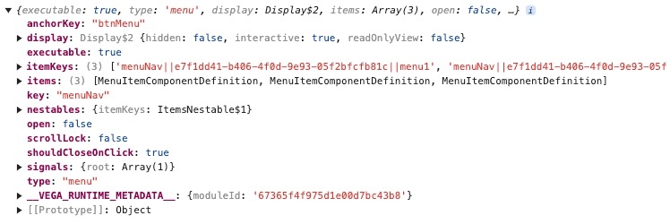
Using the example above, execute the Vega Console command UNQENG.tools.getComponentState('menuNav') in the DevTools Console to display the component's data structure:
.jpg)
.jpg)
