ViewGrid Component
Overview
Unqork applications often use dashboards, and configuring a ViewGrid component is the simplest way to create and customize a basic dashboard display. ViewGrid components let you view and manage submission data, work queues, and large data sets. Tailor your Viewgrid component to include any number of columns, buttons, and filters as needed. These features let end-users End-users, also known as Express Users, are the individuals accessing an application through Express View. In most cases, end-users are the customers using the product. easily navigate and manage the data in the dashboard.
You can find the ViewGrid component under the Display & Layout group to the left of the Module Builder.
About the Configuration Window
To learn more about general component settings and those that display when a component is associated with Data Models, view our General Component Settings article.
Display Panel
Field Text
| Setting | Description |
|---|---|
|
Canvas Label Text |
Label Text conveys what the input component is and what information it displays. Enter the purpose of the corresponding component or field. User-friendly labels make your module more accessible. Keep labels short and descriptive (a word or two) using title case. For longer entries, use sentence case. |
Default State Options
| Setting | Description |
|---|---|
|
Hide Field |
Displays or hides the component from view. Setting Hide Field to (ON) hides the component in Express View. Setting it to (OFF) displays the component. The component is always visible in the Module Builder. By default, Hide Field is set to (OFF). |
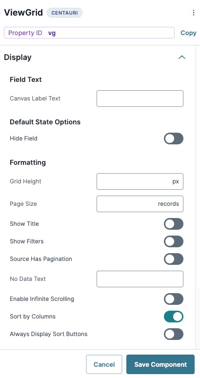
Formatting
| Setting | Description |
|---|---|
|
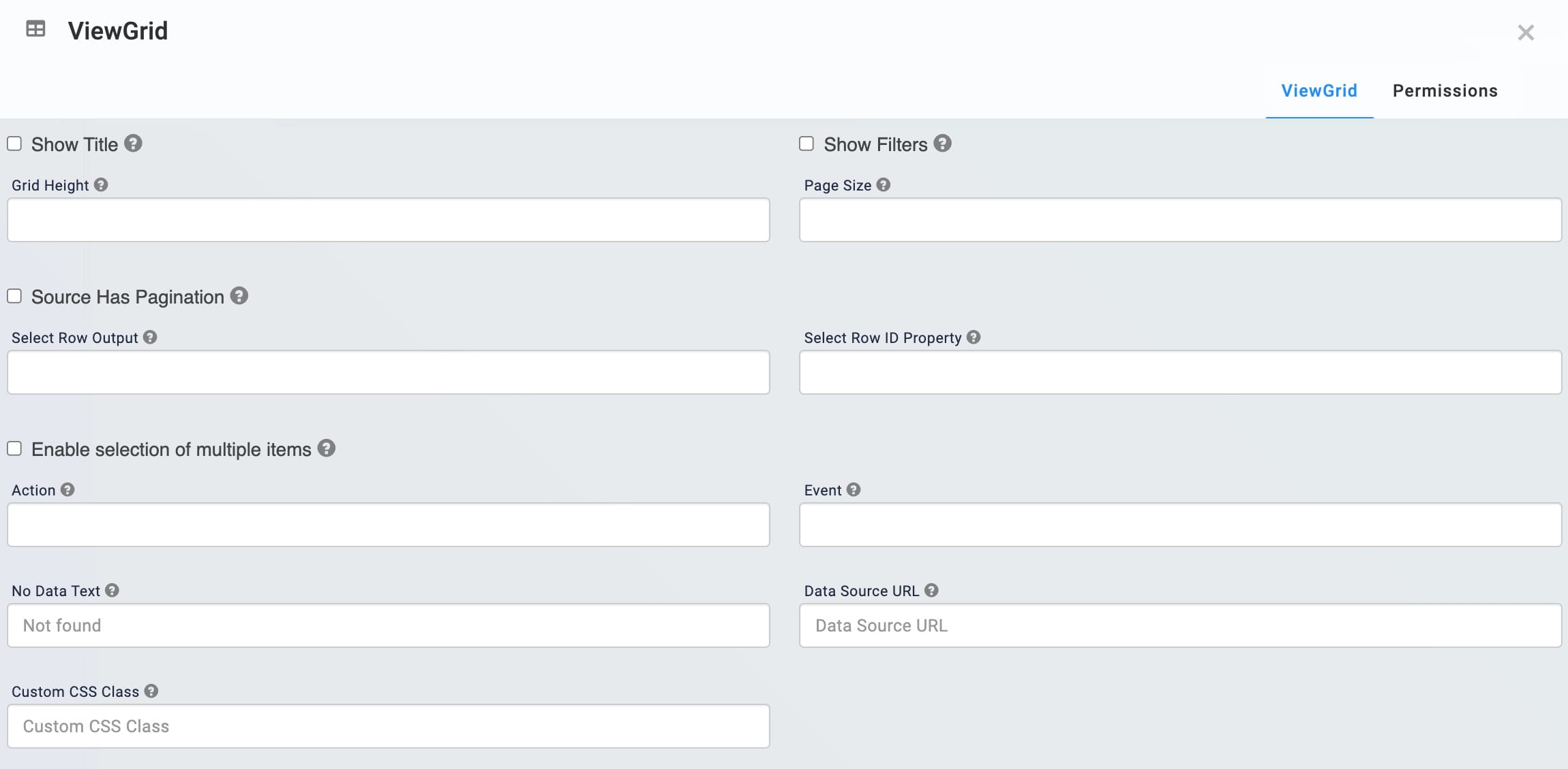
Grid Height |
Enter the grid height in pixels. Grid height must be between 250 and 426 pixels. By default, the grid height is set to 426 pixels. Leave this field blank to keep the default setting. |
|
Page Size |
Enter the number of records to display on each page. By default, the ViewGrid component displays 10 records. Leave this field blank to keep the default setting. |
|
Show Title |
Display the Canvas Label Text field's value above the dashboard. By default, this setting is (OFF). |
|
Show Filters |
Display a search box below each column header. End-users use this search box to type a few letters or an entire word to narrow down the results in the dashboard. The ViewGrid component does not support filtering numeric columns. By default, this setting is (OFF). |
|
Source Has Pagination |
Format the pagination in your ViewGrid component. Select this checkbox if pagination is enabled in the original data source component. By default, this setting is (OFF). |
|
No Data Text |
Enter a message that displays when there's no data to display.By default, this field is empty. |
|
Enable Infinite Scrolling |
Allow end-users to scroll through the ViewGrid table without pagination. By default, this setting is (OFF). |
|
Sort by Columns |
Allow end-users to sort the columns of your ViewGrid component. Click the column header once to sort in ascending order (A to Z). Click the column again to sort in descending order (Z to A). By default, this setting is (ON). |
|
Always Display Sort Buttons |
Add an arrow icon next to the column name. The arrow icon points up (ascending order, A to Z) or down (descending order, Z to A) depending on your sort order. A column displays in ascending order by default when it's clicked. This feature is only for visual purposes. As long as you select Sort Columns, your end-users can sort columns by clicking on the header. By default, this setting is (OFF). |
Data Panel
Data
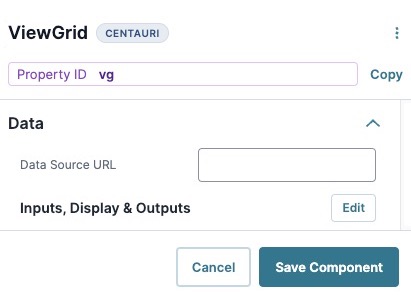
| Setting | Description |
|---|---|
|
Data Source URL |
For an API to retrieve data, you need the API's URL information. In this field, enter the API information as obtained from the API documentation. Add additional filters at the end of the URL if you want to drill down to a specific type of data. |
Inputs, Display, and Outputs
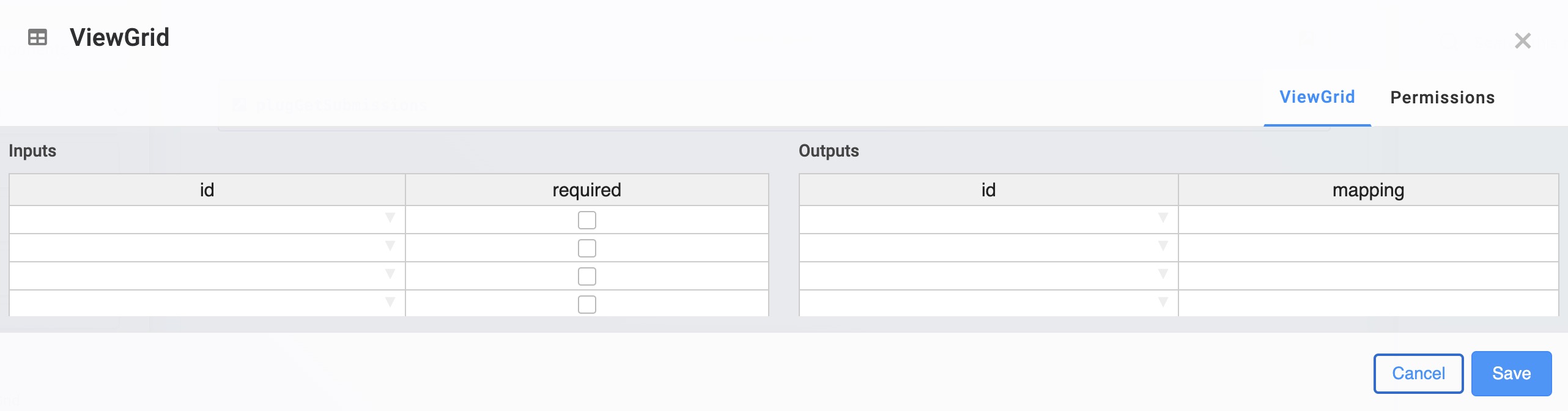
Inputs
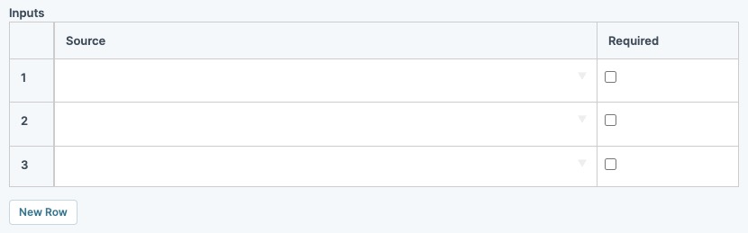
|
Setting |
Description |
|---|---|
|
Source |
Provide your component with an input reference. For example, the Property ID A Property ID is the unique field ID used by Unqork to track and link components in your module. of another component in the module. |
|
Required |
When set to (checked), the end-user must enter a value in the field of this input component before the component displays. |
|
New Row |
Click to add a new row to the Inputs table. |
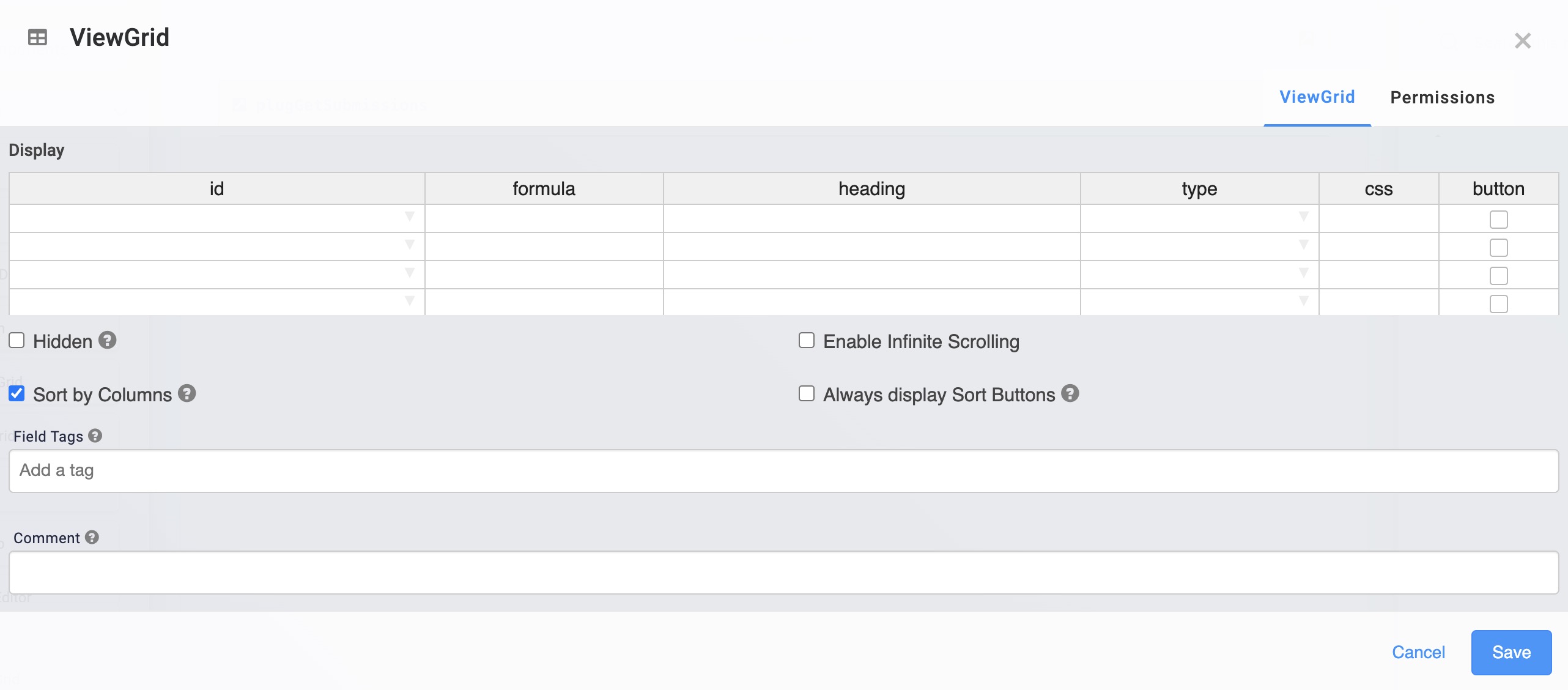
Display
|
Setting |
Description |
|---|---|
|
ID |
Enter the field ID of an element that exists in your input to display in the grid. |
|
Formula |
Adjust the data in the row. For example, use MomentJS A JavaScript date library that lets you parse, validate, manipulate, and reformat dates. to reformat a stored Date Input value from mm/dd/yyyy to dd-mm-yy. Do not use this setting to perform calculations or manipulate data. |
|
Heading |
Display a heading in Express View Express View is how your end-user views your application. Express View also lets you preview your applications to test your configuration and view the styling. This is also the view your end-users will see when interacting with your application. After configuring a module, click Preview in the Module Builder to interact with the module in Express View. for each Property ID A Property ID is the unique field ID used by Unqork to track and link components in your module. entered in the ID fields. |
|
Type |
Determine the format in which your data displays in your ViewGrid component. Select string, number, or date using the drop-down menu. |
|
CSS |
Apply an optional custom style sheet. |
|
Button |
Set to (checked) to turn the ID name from the Display table into a button. This button applies to each row in your ViewGrid component under the selected column. Use a use a Decisions component to trigger the button. |
|
New Row |
Click to add a new row to the Display table. |
Outputs
|
Setting |
Description |
|---|---|
|
Source |
The component where the ViewGrid component sends the data. Enter the Property ID A Property ID is the unique field ID used by Unqork to track and link components in your module.(s) of the destination component(s). The Property ID A Property ID is the unique field ID used by Unqork to track and link components in your module. entered must match the Property ID A Property ID is the unique field ID used by Unqork to track and link components in your module. used in the output component. |
|
Mapping |
Specifies the field ID from the input that the output component is set to. |
|
New Row |
Click to add a new row to the Inputs table. |
Actions Panel
Actions
| Setting | Description |
|---|---|
|
Action |
Create a buttonClick event for each row of your ViewGrid component. Enter a name to display in all rows. The Action label is Submit by default. You can also connect your ViewGrid component to a Decisions component to trigger the action. Enter null to remove the action button completely. By default, this field is empty. |
|
Event |
Enter a value to output in the console data when the Action button is clicked. By default, this field is empty. |
Advanced Panel
Row Selection Options
| Setting | Description |
|---|---|
|
Select Row Output |
Use the Property ID A Property ID is the unique field ID used by Unqork to track and link components in your module. of a component to store the unique identifier of select rows. Create this value in the Select Row ID Property field. By default, this field is empty. |
|
Select Row ID Property |
Use a key from your data source as a unique identifier for the selected row in the ViewGrid table. By default, this field is empty. |
|
Enable Selection of Multiple Items |
Allow end-users to select more than one row at a time. By default, this setting is (OFF). |
Additional Styling
| Setting | Description |
|---|---|
|
Custom CSS Class |
Enter a Custom CSS Cascading Style Sheets (CSS) is a style sheet language used for presenting how a HTML or XML document looks to end-users. Class to apply to your component. Custom CSS lets you maintain a consistent look and feel when the field or element is part of a template or multiple modules. Updated CSS styling applies to all components that reference this custom class name. |
Adding a ViewGrid Component
Create a dashboard that displays some basic submission data from a module. This dashboard does not require action buttons and the data in this configuration is dynamic. So, it updates as end-users submit or edit submissions.
To simplify this configuration, use the following source module: https://training.unqork.io/#/form/648c6514991ac5b474b73b2f/edit.
This is a front-end module where end-users End-users, also known as Express Users, are the individuals accessing an application through Express View. In most cases, end-users are the customers using the product. can submit basic information, like name, date of birth, and email address. Set up a Plug-In component to retrieve this information to display on a dashboard.
These instructions assume that you have an open module saved with a title.
Configure the Hidden Component
First, configure a Hidden component to store the module ID of the source module. You'll need to copy the module ID of the source module's as follows: https://training.unqork.io/#/form/648c6514991ac5b474b73b2f/edit.
| 1. | In the Module Builder, drag and drop a Hidden component onto your canvas. |
| 3. | In the Default Value field, enter 648c6514991ac5b474b73b2f. This is the source module's module ID. |
| 4. | Click Save Component. |
Configure the Plug-In Component
Configure a Plug-In component to retrieve the submission data from the source module to display in your dashboard.
| 1. | Drag and drop a Plug-In component onto your canvas, placing it below your Hidden component. |
| 3. | Navigate to the component's Data settings. |
| 4. | From the Internal Services drop-down, select List Submissions for Dashboard. The /fbu/uapi/system/GetSubmissions URL automatically displays in the Data Source URL field. |
| 5. | Next to Inputs, Display, & Outputs table, click Edit. |
| 6. | In the Inputs table Enter inputs components and actions you want the component to perform., enter the following: |
|
|
Property ID |
Mapping |
|---|---|---|
|
1 |
moduleId |
moduleId |
|
2 |
'firstName,middleName,lastName,email,dateOfBirth' |
fields |
The first row references the module ID stored in the moduleIdHidden component. The second row identifies which source module fields to retrieve and display in the dashboard. The values entered in the Mapping column (moduleId and fields) are native values in Unqork.
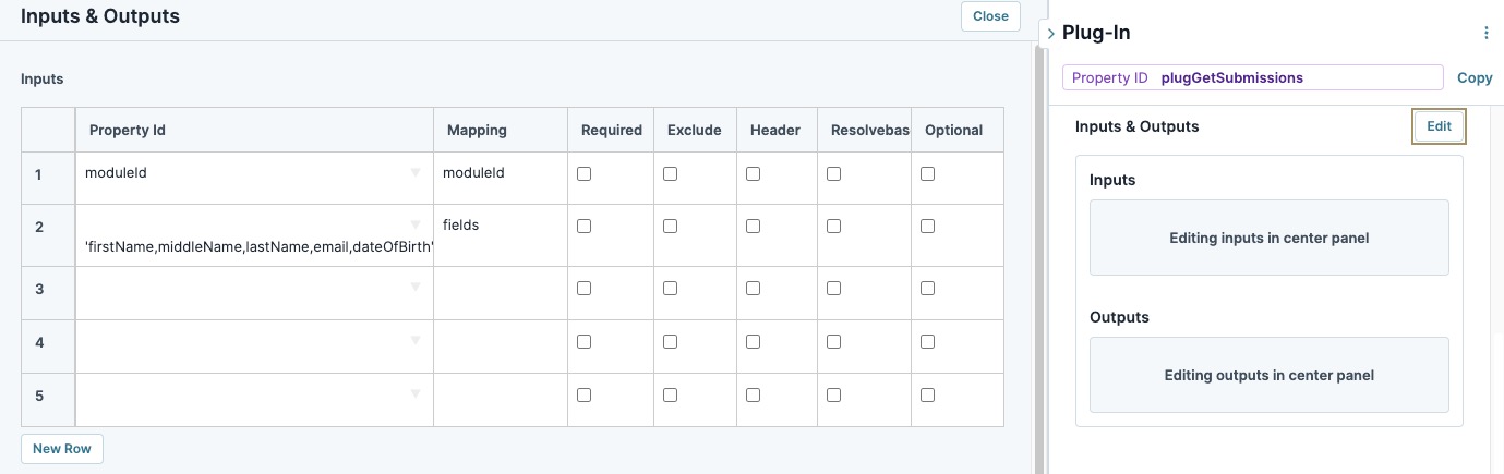
| 7. | Click Save Component. |
Configure the ViewGrid Component
Next, configure a ViewGrid component to display the submission data on a dashboard.
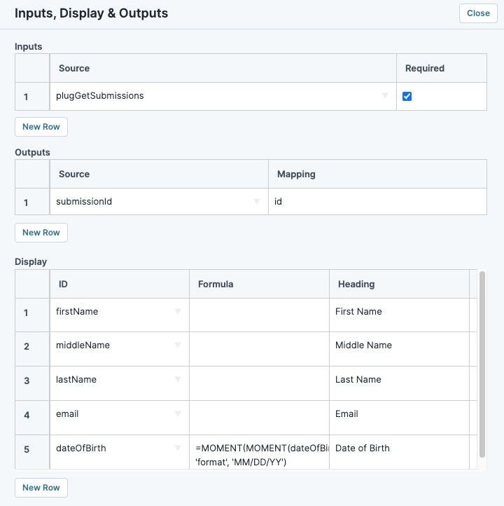
| 1. | Drag and drop a  ViewGrid component onto the canvas, placing it below your Plug-In component. ViewGrid component onto the canvas, placing it below your Plug-In component. |
| 2. | In the Property ID A Property ID is the unique field ID used by Unqork to track and link components in your module. field, enter gridView. |
| 4. | In the Inputs table Enter inputs components and actions you want the component to perform., enter the following: |
|
# |
Source |
Required |
|---|---|---|
|
1 |
plugGetSubmissions |
(checked) |
The field IDs are those that exist in the source module. The MomentJS A JavaScript date library that lets you parse, validate, manipulate, and reformat dates. in the Formula column formats the dateOfBirth values as MM/DD/YY.
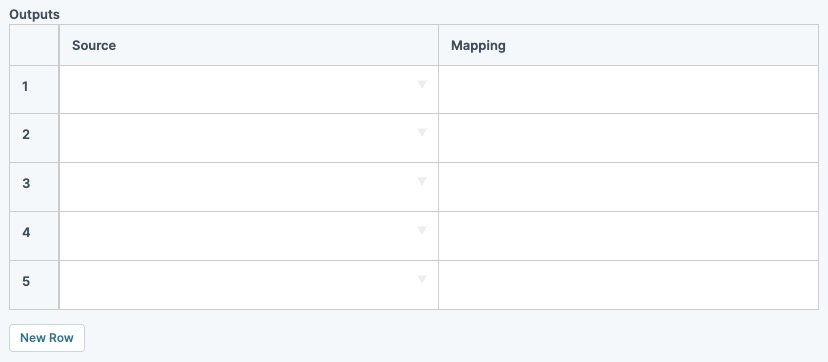
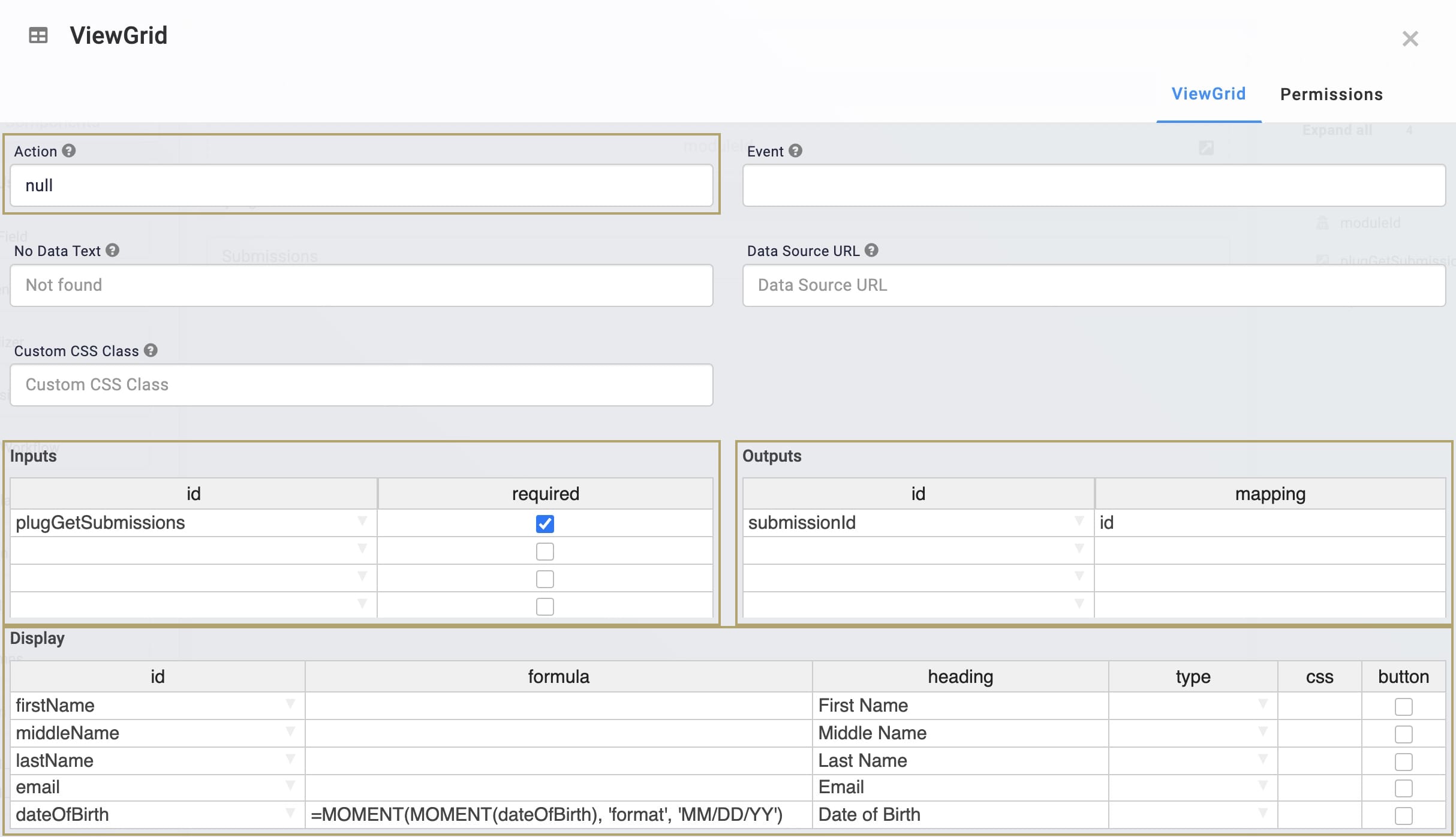
| 5. | In the Outputs table Enter outputs components and actions you want the component to perform., enter the following: |
|
# |
Source |
Mapping |
|---|---|---|
|
1 |
submissionId |
id |
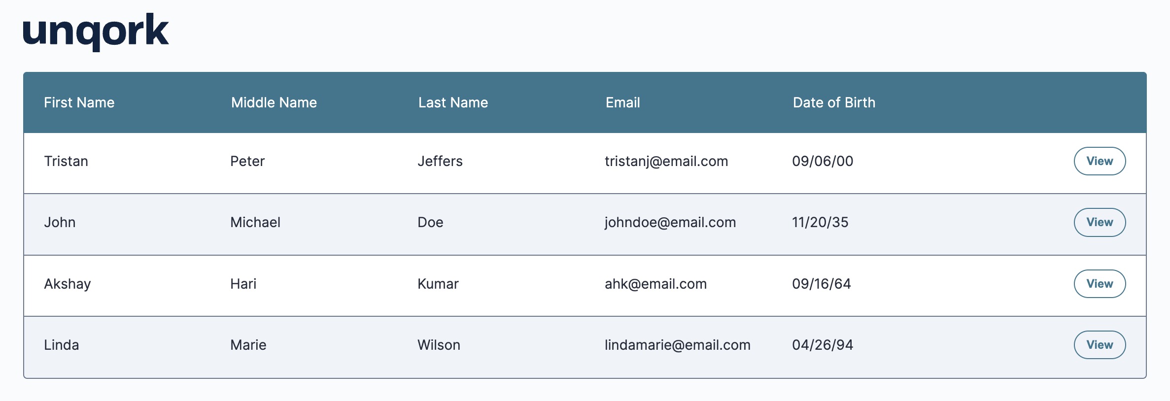
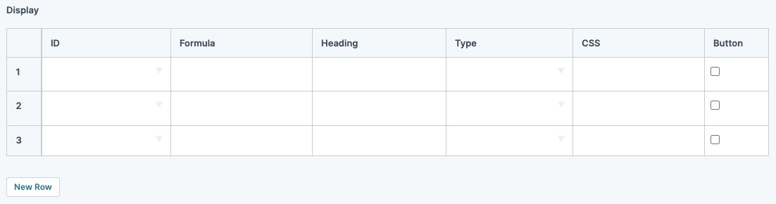
| 6. | In the Display table, enter the following: |
|
# |
ID |
Formula |
Heading | CSS | Button |
|---|---|---|---|---|---|
|
1 |
firstName |
|
First Name |
|
☐ (unchecked) |
|
2 |
middleName |
|
Middle Name |
|
☐ (unchecked) |
|
3 |
lastName |
|
Last Name |
|
☐ (unchecked) |
|
4 |
|
|
|
|
☐ (unchecked) |
|
5 |
dateOfBirth |
=MOMENT(MOMENT(dateOfBirth), 'format', 'MM/DD/YY') |
Date of Birth |
|
☐ (unchecked) |
|
|
|
|
|
|
|
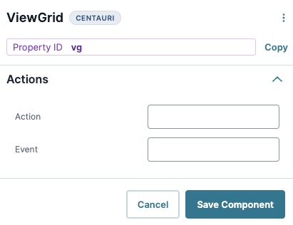
| 7. | Navigate to the component's Actions settings. |
| 8. | In the Action field, enter null. |
| 9. | Click Save Component. |
Configure the Initializer Component
Lastly, configure an Initializer component to trigger the Plug-In component.
| 1. | Drag and drop an Initializer component onto your canvas, placing it above your Hidden component. |
| 3. | Navigate to the component's Actions settings. |
| 4. | From the Trigger Type drop-down, enter or select New Submission. |
| 5. | Next to Inputs & Outputs, click Edit. |
| 6. | In the Outputs table Enter outputs components and actions you want the component to perform., enter the following: |
|
# |
Source |
Type |
Value |
|---|---|---|---|
|
1 |
plugGetSubmissions |
trigger |
GO |
| 7. | Click Save Component. |
| 8. | Save your module. |
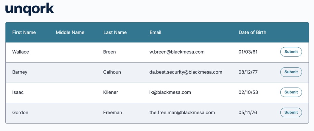
Preview your module in Express View Express View is how your end-user views your application. Express View also lets you preview your applications to test your configuration and view the styling. This is also the view your end-users will see when interacting with your application. After configuring a module, click Preview in the Module Builder to interact with the module in Express View. to see the result. You can also Preview the source module in Express View Express View is how your end-user views your application. Express View also lets you preview your applications to test your configuration and view the styling. This is also the view your end-users will see when interacting with your application. After configuring a module, click Preview in the Module Builder to interact with the module in Express View. to add your own values to populate the dashboard. You can find the source module here: https://trainingx.unqork.io/#/display/648c6514991ac5b474b73b2f.
Resources

Overview
Unqork applications often use dashboards, and configuring a ViewGrid component is the simplest way to create and customize a basic dashboard display. ViewGrid components let you view and manage submission data, work queues, and large data sets. Tailor your Viewgrid component to include any number of columns, buttons, and filters as needed. These features let end-users End-users, also known as Express Users, are the individuals accessing an application through Express View. In most cases, end-users are the customers using the product. easily navigate and manage the data in the dashboard.
You can find the ViewGrid component under the Display & Layout group to the left of the Module Builder.
About the Configuration Window
To learn more about general component settings and those that display when a component is associated with Data Models, view our General Component Settings article.
General Settings
| Setting | Description |
|---|---|
|
Label |
A Label indicates the purpose of the corresponding field or component. For input components, the Label tells the end-user how to interact with the field. For non-input components, the Label is not end-user facing, and only appears in the Module Builder. User-friendly Labels make your module more accessible. Keep Labels short and descriptive (a word or two) using title case. For longer entries, use sentence case. |
|
Property Name |
A Property Name is the unique field ID used by Unqork to track and link components in your module. The Property Name is how the software identifies your component. Using Property Names lets you link components, creating logic-based configurations and API APIs (application programming interfaces) are a set of protocols and definitions developers use to build and integrate application software. APIs act as the connective tissue between products and services. (application programming interface) calls. Property Names must use camel case (stylized as camelCase) without spaces or punctuation. Property IDs must use camel case (stylized as camelCase) without spaces or punctuation. |
|
ViewGrid Tab |
Select this tab to see the configuration settings of the ViewGrid component. |
|
Permissions Tab |
Select this tab to see the RBAC RBAC (Role-Based Access Control) is a method to control system access for authorized users. The role in RBAC refers to the levels of access employees have to a network. settings of the component. |
|
Cancel |
Click this button to undo any unsaved configuration changes and return to the Module Builder canvas. |
|
Save |
Click this button to save all setting configuration changes and return to the Module Builder canvas. |
Customization Settings
|
Setting |
Description |
|---|---|
|
Show Title |
Display the Canvas Label Text field's value above the dashboard. By default, this setting is (OFF). |
|
Show Filters |
Display a search box below each column header. End-users use this search box to type a few letters or an entire word to narrow down the results in the dashboard. The ViewGrid component does not support filtering numeric columns. By default, this setting is (OFF). |
|
Grid Height |
Enter the grid height in pixels. Grid height must be between 250 and 426 pixels. By default, the grid height is set to 426 pixels. Leave this field blank to keep the default setting. |
|
Page Size |
Enter the number of records to display on each page. By default, the ViewGrid component displays 10 records. Leave this field blank to keep the default setting. |
|
Source Has Pagination |
Format the pagination in your ViewGrid component. Select this checkbox if pagination is enabled in the original data source component. By default, this setting is (OFF). |
|
Paginator Source |
Use the Property ID A Property ID is the unique field ID used by Unqork to track and link components in your module. of a Plug-in component as the original data source. |
|
Select Row Output |
Use the Property ID A Property ID is the unique field ID used by Unqork to track and link components in your module. of a component to store the unique identifier of select rows. Create this value in the Select Row ID Property field. By default, this field is empty. |
|
Select Row ID Property |
Use a key from your data source as a unique identifier for the selected row in the ViewGrid table. By default, this field is empty. |
|
Enable Selection of Multiple Items |
Allow end-users to select more than one row at a time. |
|
Show Row Selection |
Create a checkbox for each row of your ViewGrid component. The row highlights blue when your end-users select a box. |
|
Restrict Multiple Selection With Cmd/Ctrl |
Pressing and holding the Shift key allows end-users to select rows. Pressing and holding Ctrl (Windows/Linux) or Cmd (Mac OS) allows end-users to select any rows on the page. |
|
Action |
Create a buttonClick event for each row of your ViewGrid component. Enter a name to display in all rows. The Action label is Submit by default. You can also connect your ViewGrid component to a Decisions component to trigger the action. Enter null to remove the action button completely. By default, this field is empty. |
|
Event |
Enter a value to output in the console data when the Action button is clicked. By default, this field is empty. |
|
No Data Text |
Enter a message that displays when there's no data to display.By default, this field is empty. |
|
Data Source URL |
For an API to retrieve data, you need the API's URL information. In this field, enter the API information as obtained from the API documentation. Add additional filters at the end of the URL if you want to drill down to a specific type of data. |
|
Custom CSS Class |
Enter a Custom CSS Cascading Style Sheets (CSS) is a style sheet language used for presenting how a HTML or XML document looks to end-users. Class to apply to your component. Custom CSS lets you maintain a consistent look and feel when the field or element is part of a template or multiple modules. Updated CSS styling applies to all components that reference this custom class name. |
Data Table
Input Table
|
Setting |
Description |
|---|---|
|
ID |
Provide your component with an input reference. For example, the Property ID A Property ID is the unique field ID used by Unqork to track and link components in your module. of another component in the module. |
|
Required |
End-user must enter a value in the field of this input component before the component displays. |
Outputs Table
|
Setting |
Description |
|---|---|
|
ID |
The component where the ViewGrid component sends sends the data. Enter the Property ID A Property ID is the unique field ID used by Unqork to track and link components in your module.(s) of the destination component(s). The Property ID A Property ID is the unique field ID used by Unqork to track and link components in your module. entered must match the Property ID A Property ID is the unique field ID used by Unqork to track and link components in your module. used in the output component. |
|
Mapping |
Specifies the field ID from the input that the output component is set to. |
Display Settings
Display Table
|
Setting |
Description |
|---|---|
|
ID |
The field ID of an element that exists in your input to display in the grid. |
|
Formula |
Adjust the data in the row. For example, use MomentJS A JavaScript date library that lets you parse, validate, manipulate, and reformat dates. to reformat a stored Date Input value from mm/dd/yyyy to dd-mm-yy. Do not use this setting to perform calculations or manipulate data. |
|
Heading |
Display a heading in Express View Express View is how your end-user views your application. Express View also lets you preview your applications to test your configuration and view the styling. This is also the view your end-users will see when interacting with your application. After configuring a module, click Preview in the Module Builder to interact with the module in Express View. for each Property ID A Property ID is the unique field ID used by Unqork to track and link components in your module. entered in the ID fields. |
|
Type |
Determine the format in which your data displays in your ViewGrid component. Select string, number, or date using the drop-down menu. |
|
CSS |
Apply an optional custom style sheet. |
|
Button |
Turn the ID name from the Display table into a button. This button applies to each row in your ViewGrid component under the selected column. Use a You can also use a Decisions component to trigger the button. |
Additional Display Settings
|
Setting |
Description |
|---|---|
|
Hidden |
Hide the ViewGrid component in Express View. Your ViewGrid component still shows in the Module Builder. |
|
Enable Infinite Scrolling |
Allow end-users to scroll through the ViewGrid table without pagination. By default, this setting is (OFF). |
|
Sort by Columns |
Allow end-users to sort the columns of your ViewGrid component. Click the column header once to sort in ascending order (A to Z). Click the column again to sort in descending order (Z to A). By default, this setting is (ON). |
|
Always Display Sort Buttons |
Add an arrow icon next to the column name. The arrow icon points up (ascending order, A to Z) or down (descending order, Z to A) depending on your sort order. A column displays in ascending order by default when it's clicked. This feature is only for visual purposes. As long as you select Sort Columns, your end-users can sort columns by clicking on the header. By default, this setting is (OFF). |
|
Field Tags |
Assign components one-word labels to help organize, identify, and group the components in your application. Consider an example from the API Specification Snippet: Field Tags are applied to Hidden components in the panelRequest and panelResponse Panel components. The Field Tags identify the data type of parameters included in the API APIs (application programming interfaces) are a set of protocols and definitions developers use to build and integrate application software. APIs act as the connective tissue between products and services. request and response. The API Docs Dashboard tool populates with information about each parameter’s data type, identified by the Field Tag. Field Tags act as a type of Property ID A Property ID is the unique field ID used by Unqork to track and link components in your module. group and let you group components for configuration purposes. Field Tags let you target two or more components using a simple logic component. For example, add the Field Tag tagForDecision to multiple components in your module. Open the Inputs table of a Decisions component and reference the tagForDecision Field Tag as the input of the Decisions component. The output of the Decisions component then affects all components with the tagForDecision Field Tag. Save your Field Tags by pressing Enter (Return) or adding a comma after each entry. |
|
Comment |
Enter comments about your component and its configuration. Use this setting to keep your teammates in the loop. |
Adding a ViewGrid Component
Create a dashboard that displays some basic submission data from a module. This dashboard does not require action buttons and the data in this configuration is dynamic. So, it updates as end-users submit or edit submissions.
To simplify this configuration, use the following source module: https://training.unqork.io/#/form/648c6514991ac5b474b73b2f/edit.
This is a front-end module where end-users End-users, also known as Express Users, are the individuals accessing an application through Express View. In most cases, end-users are the customers using the product. can submit basic information, like name, date of birth, and email address. Set up a Plug-In component to retrieve this information to display on a dashboard.
These instructions assume that you have an open module saved with a title.
Configure the Hidden Component
First, configure a Hidden component to store the module ID of the source module. You'll need to copy the module ID of the source module's as follows: https://training.unqork.io/#/form/648c6514991ac5b474b73b2f/edit.
| 1. | In the Module Builder, drag and drop a Hidden component onto your canvas. |
| 3. | In the Default Value field, enter 648c6514991ac5b474b73b2f. This is the source module's module ID. |
| 4. | Click Save & Close. |
Configure the Plug-In Component
Now, add Plug-In component to retrieve the submission data from the source module to display in your dashboard.
| 1. | Drag and drop a Plug-In component onto your canvas, placing it below your Hidden component. |
| 3. | From the Internal Services drop-down, select List Submissions for Dashboard. The /fbu/uapi/system/GetSubmissions URL automatically displays in the Data Source URL field. |
| 4. | In the INPUTS table enter the following: |
|
Property ID |
Mapping |
|---|---|
|
moduleId |
moduleId |
|
'firstName,middleName,lastName,email,dateOfBirth' |
fields |
The first row references the module ID stored in the moduleIdHidden component. The second row identifies which source module fields to retrieve and display in the dashboard. The values entered in the Mapping column (moduleId and fields) are native values in Unqork.
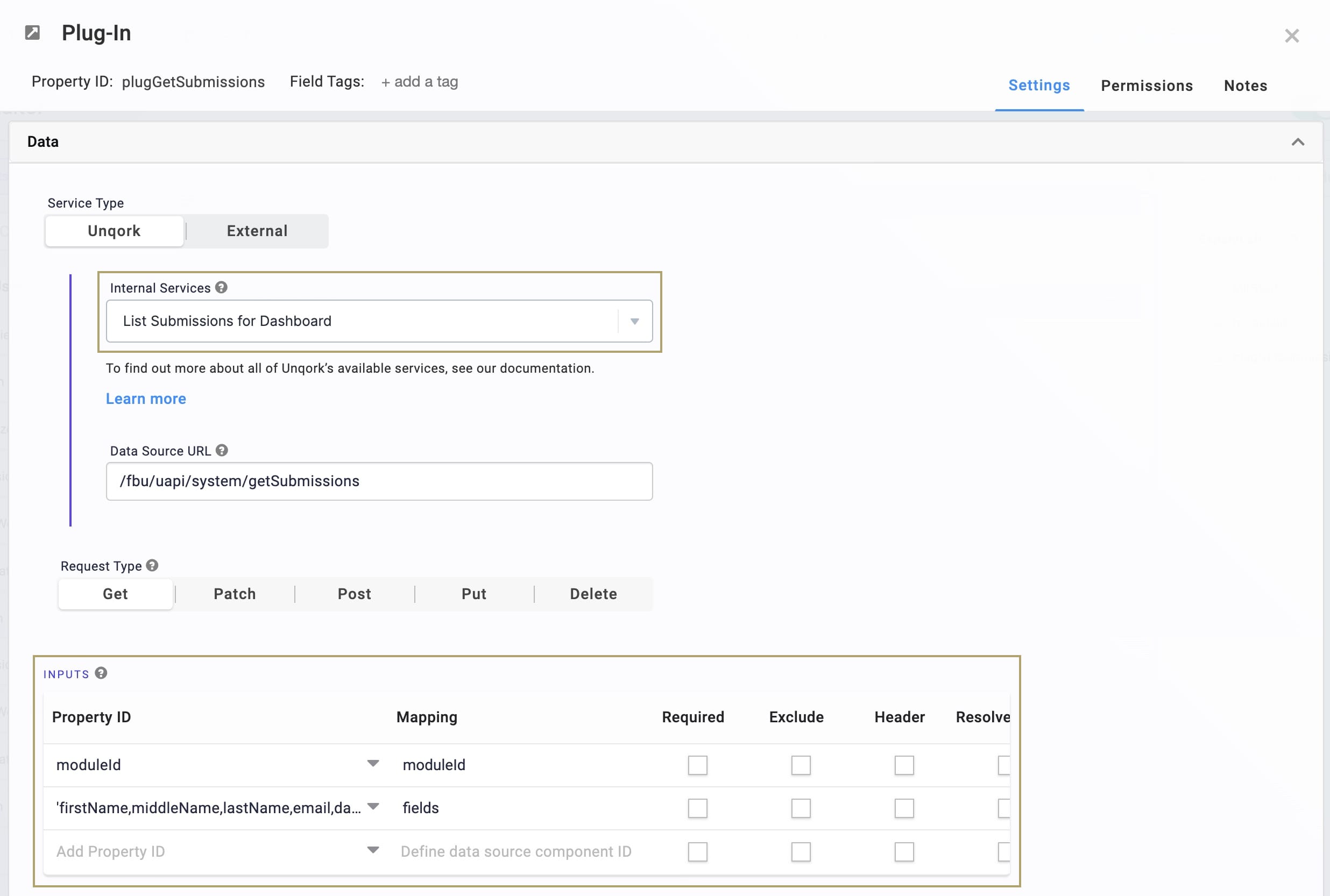
| 5. | Click Save. |
Configure the ViewGrid Component
Next, add a ViewGrid component to display the submission data on a dashboard.
| 1. | Drag and drop a ViewGrid component onto the canvas, placing it below your Plug-In component. |
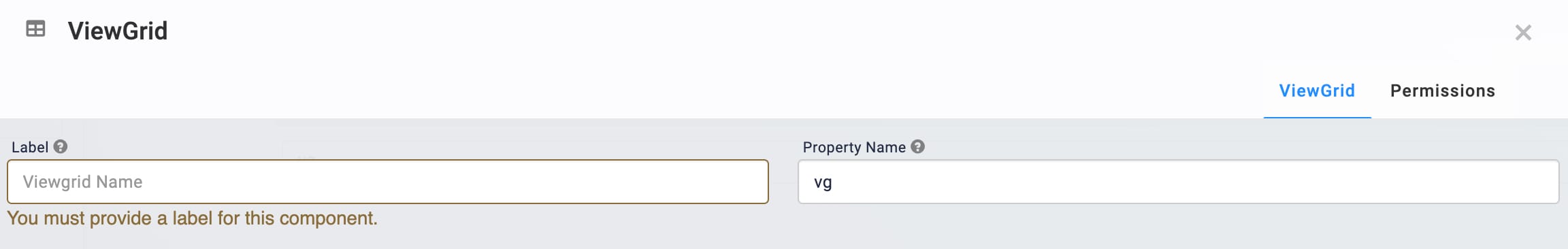
| 2. | In the Label Label Text conveys what the input component is and what information it displays. Enter the purpose of the corresponding component or field. field, enter View Grid. |
| 3. | In the Property Name A Property ID is the unique field ID used by Unqork to track and link components in your module. field, enter gridView. |
| 4. | In the Action field, enter null. |
| 5. | In the Inputs table, enter the following: |
|
Setting |
Value |
|---|---|
|
ID |
plugGetSubmissions |
|
Required |
|
 (checked)
| 6. | In the Outputs table, enter the following: |
|
Setting |
Value |
|---|---|
|
ID |
submissionId |
|
Mapping |
id |
| 7. | In the Display table, enter the following: |
|
ID |
Formula |
Heading |
|---|---|---|
|
firstName |
|
First Name |
|
middleName |
|
Middle Name |
|
lastName |
|
Last Name |
|
|
|
|
|
dateOfBirth |
=MOMENT(MOMENT(dateOfBirth), 'format', 'MM/DD/YY') |
Date of Birth |
The field IDs are those that exist in the source module. The MomentJS A JavaScript date library that lets you parse, validate, manipulate, and reformat dates. in the Formula column formats the dateOfBirth values as MM/DD/YY.
| 8. | Click Save. |
Configure the Initializer Component
Lastly, configure an Initializer component to trigger the Plug-In component.
| 1. | Drag and drop an Initializer component onto your canvas, placing it above your Hidden component. |
| 3. | In the component's configuration window, click  Actions. Actions. |
| 4. | From the Trigger Type drop-down, select New Submission. |
| 5. | In the Outputs table, enter the following: |
| Property ID | Type | Value |
|---|---|---|
|
plugGetSubmissions |
trigger |
GO |
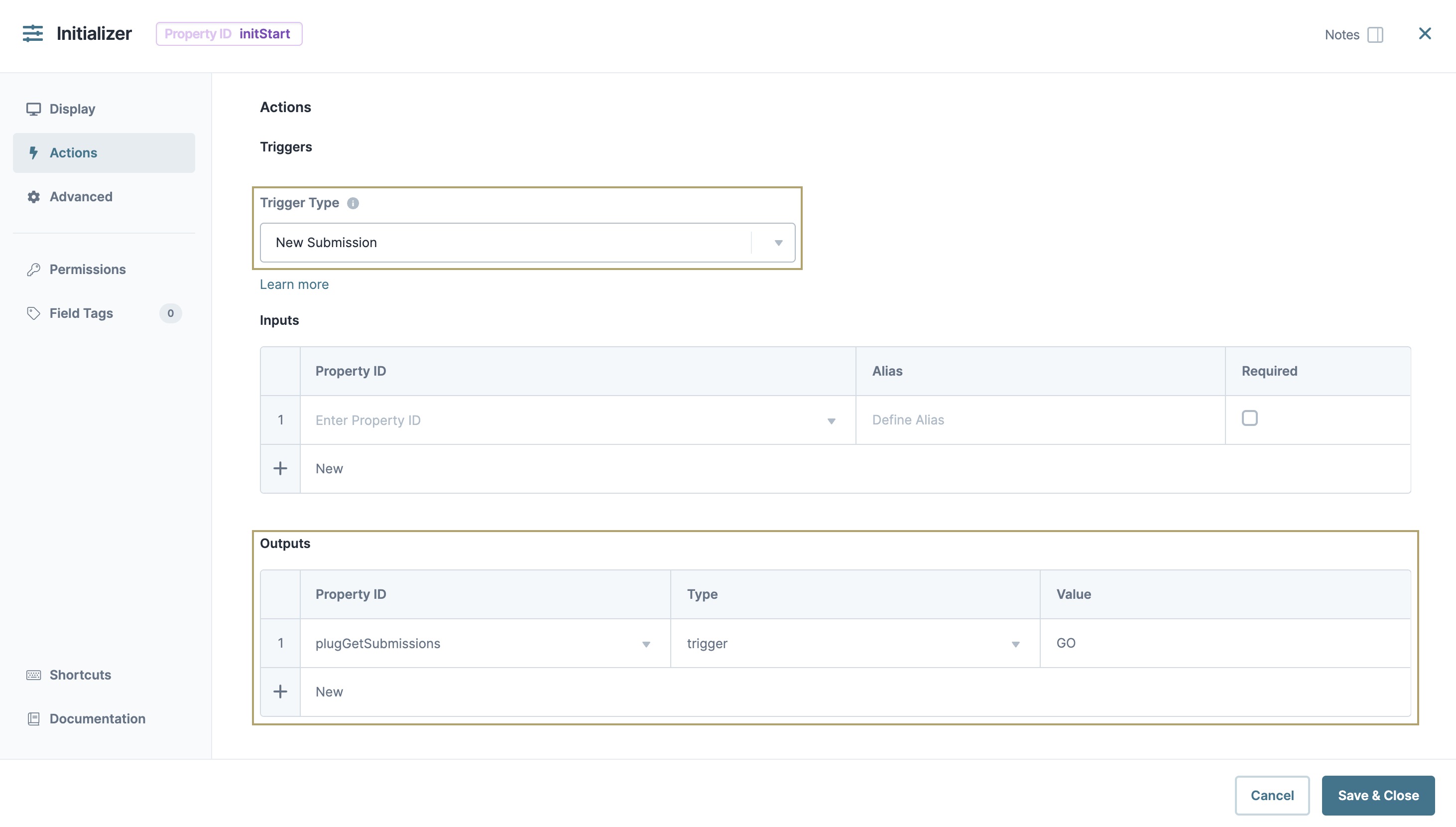
| 6. | Click Save & Close. |
| 7. | Save your module. |
Preview your module in Express View Express View is how your end-user views your application. Express View also lets you preview your applications to test your configuration and view the styling. This is also the view your end-users will see when interacting with your application. After configuring a module, click Preview in the Module Builder to interact with the module in Express View. to see the result. You can also Preview the source module in Express View Express View is how your end-user views your application. Express View also lets you preview your applications to test your configuration and view the styling. This is also the view your end-users will see when interacting with your application. After configuring a module, click Preview in the Module Builder to interact with the module in Express View. to add your own values to populate the dashboard. You can find the source module here: https://trainingx.unqork.io/#/display/648c6514991ac5b474b73b2f.