The Repeater component lets you interface with table-based data by adding multiple components inside it to display repeating rows of data.
The Repeater component offers a simplified method to display and review table-based data. Displaying data with a Repeater component involves three essential parts:
A table-based data source, like a Data Table component.
Fields placed inside the Repeater component display values from each row of the data source. The fields' Property IDs must match the data source's column headers, or keys.
A Data Workflow component that links the data source to the Repeater component.
You'll find the Repeater component in the Display & Layout group to the left of the Module Builder.
About the Configuration Window
To learn more about general component settings, view our General Component Settings article.
Display Settings
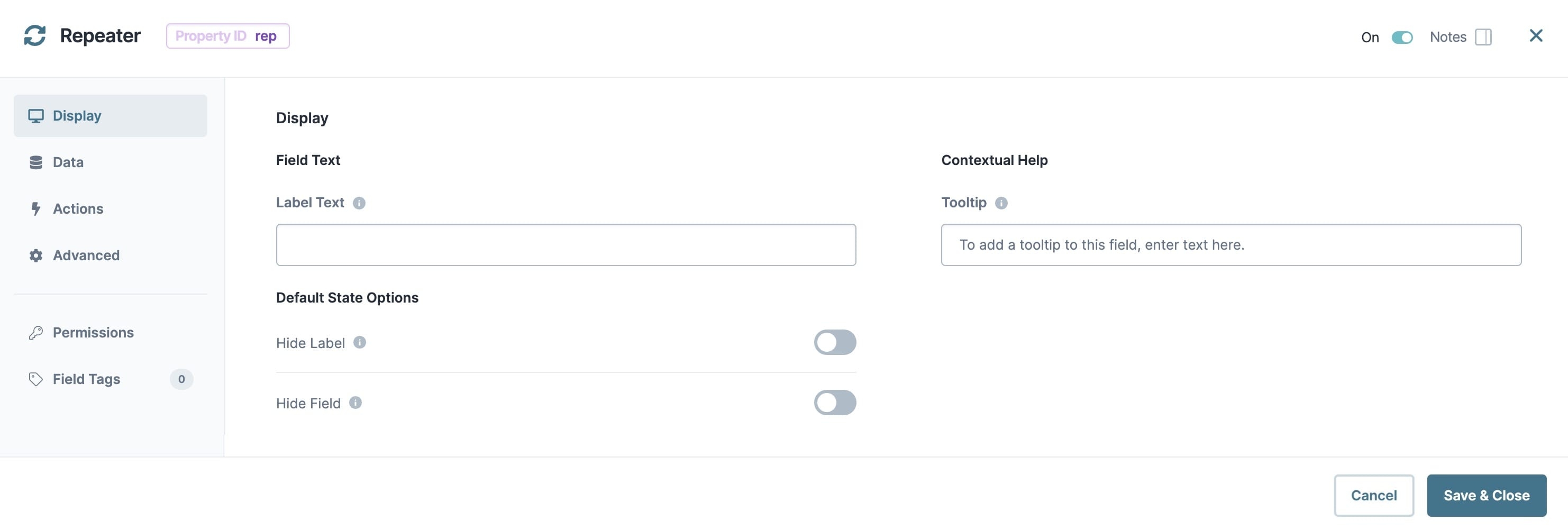
Field Text
Setting | Description |
|---|---|
Label Text | Label Text conveys what the input component is and what information it displays. Enter the purpose of the corresponding component or field. User-friendly labels make your module more accessible. Keep labels short and descriptive (a word or two) using title case. For longer entries, use sentence case. |
Contextual Help
Setting | Description |
|---|---|
Tooltip | A short hint that displays when an end-user positions their cursor over the |
Default State Options
Setting | Description |
|---|---|
Hide Label | Setting Hide Label to By default, Hide Label is set to |
Hide Field | Displays or hides the component from view. Setting Hide Field to By default, Hide Field is set to |
Data Settings
Data Storage
Setting | Description |
|---|---|
Store Data in Database | The Store Data in Database setting affects how data persists through your application. When set to
Set the toggle to
By default, this toggle is set to |
Actions Settings
Triggers
Setting | Description |
|---|---|
Edit Row | Enter the Property ID of the component to trigger after editing a field displayed in a Repeater component row. |
Row Generation | Enter the Property ID of the component to trigger after refreshing the Repeater component's data source. |
Advanced Settings
Additional Styling
Setting | Description |
|---|---|
Custom CSS Class | Enter a Custom CSS Class to apply to your component. Custom CSS lets you maintain a consistent look and feel when the field or element is part of a template or multiple modules. Updated CSS styling applies to all components that reference this custom class name. |
Adding a Repeater Component
In this example, you'll configure a page where your end-users can review the data they submitted. On this page, end-users can edit fields and save any changes to their submission data. A Data Table component acts as the data source, and you'll configure a Text Field, Radio Buttons, and Number component inside the Repeater component. That way, the Repeater component can display the Data Table component's values. Lastly, you'll connect the Data Table and Repeater components with a Data Workflow component.
These instructions assume that you have an open module saved with a title.
Configure the Data Table Component
First, set up your data source using a Data Table component.
In the Module Builder, drag and drop a Data Table component onto your canvas.
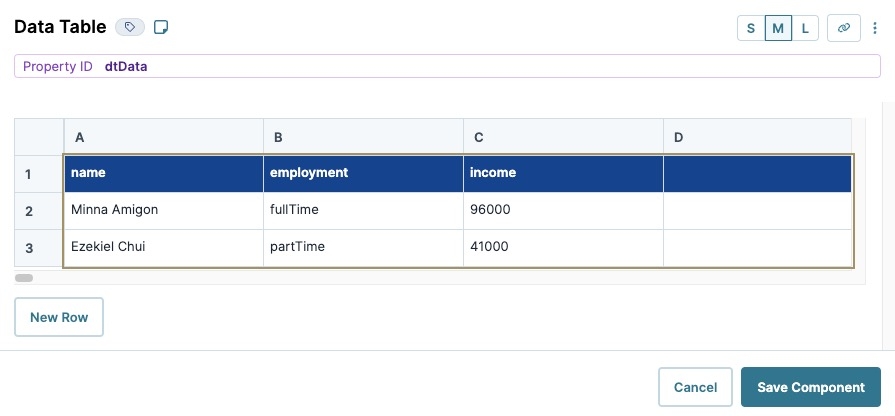
In the Property ID field, enter dtData.
In the data table, enter the following:
A
B
C
1
name
employment
income
2
Minna Amigon
fullTime
96000
3
Ezekiel Chui
partTime
41000
Navigate to the Display settings.
In the Label Text field, enter
dtData.Click Save Component.
Configure the Repeater Component
Next, configure a Repeater component to act as a container for the Text Field, Radio Buttons, and Number components.
Drag and drop a Repeater component onto your canvas, placing it below the dtData Data Table component.
In the Property ID and Label Text fields, enter
repeater.Click Save Component.
Configure the Columns Component
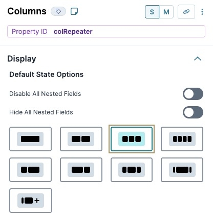
Your Data Table component has three columns of data. So, use a Columns component to add three display columns inside the Repeater component. That way, the Name, Employment, and Income fields display side-by-side.
Drag and drop a
.png) Columns component onto your canvas, placing it inside the repeater Repeater component.
Columns component onto your canvas, placing it inside the repeater Repeater component.In the Property ID field, enter colRepeater.
Under Formatting, click
.png) (Three Columns).
(Three Columns).Click Save Component.
Configure the Text Field Component
This Text Field component displays the values from the name column of the Data Table component. It's important that the Property ID matches the column header in the Data Table component.
Drag and drop a Text Field component onto your canvas, placing it in column1 of the colRepeater
.png) Columns component.
Columns component.In the Property ID field, enter name.
In the Label Text field, enter
Name.Click Save Component.
Configure the Radio Buttons Component
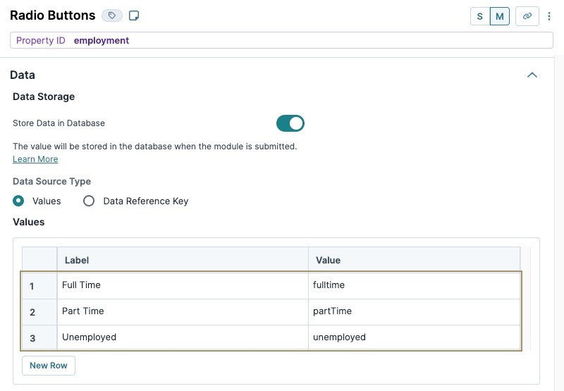
This Radio Buttons component displays the values from the employment column of your Data Table component. Match the values in the component's Value to Store in Submission Data column to those in the Data Table component. Doing so lets the Repeater component preselect the values in Express View based on the value in your Data Table component.
Drag and drop a Radio Buttons component onto your canvas, placing it in column2 of the colRepeater
.png) Columns component.
Columns component.In the Property ID field, enter employment.
In the Label Text field, enter
Employment.Navigate to the Data settings.
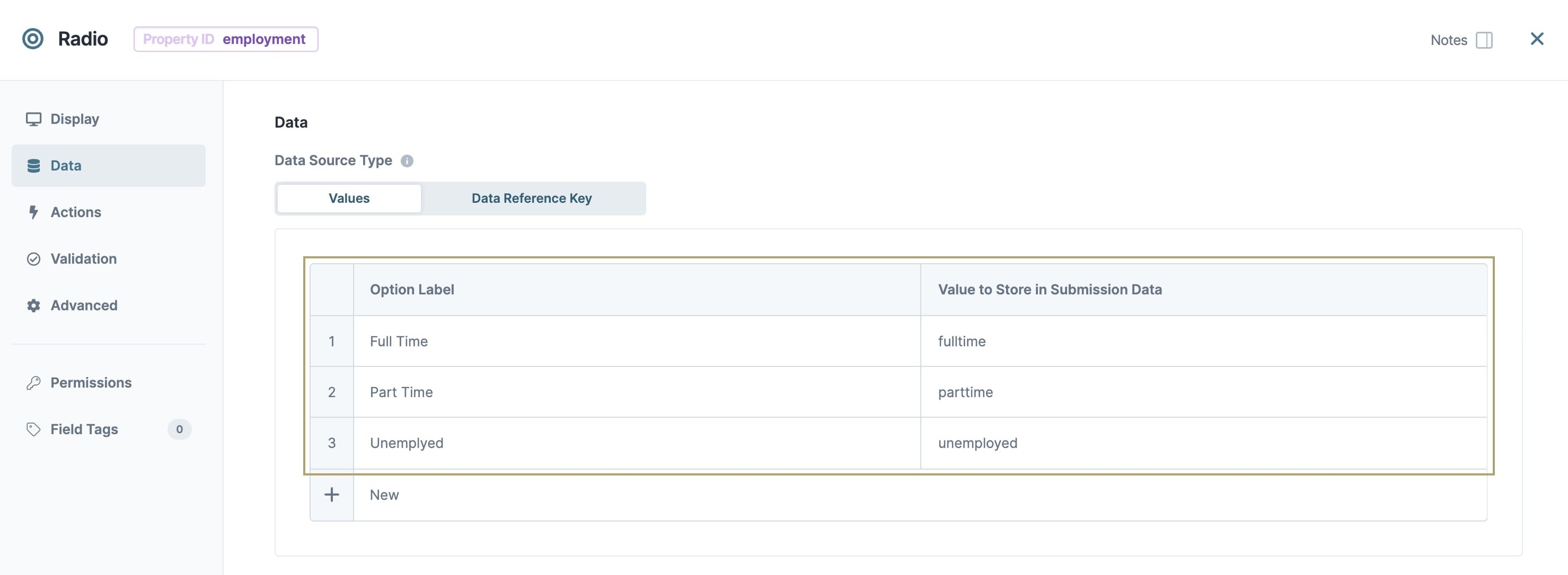
In the Values table, enter the following:
Label
Value
1
Full Time
fullTime
2
Part Time
partTime
3
Unemployed
unemployed
Values entered in the Value to Store in Submission Data column must match the values entered in the Data Table component.
Click Save Component.
Configure the Number Component
This Number component will display the values from the income column of your Data Table component. Again, the Property ID must match the column header from your Data Table component.
Drag and drop a Number component onto your canvas, placing it in column3 of the colRepeater
.png) Columns component.
Columns component.In the Property ID field, enter income.
In the Label Text field, enter
Annual Pre-Tax Income.Click Save Component.
Configure the Data Workflow Component
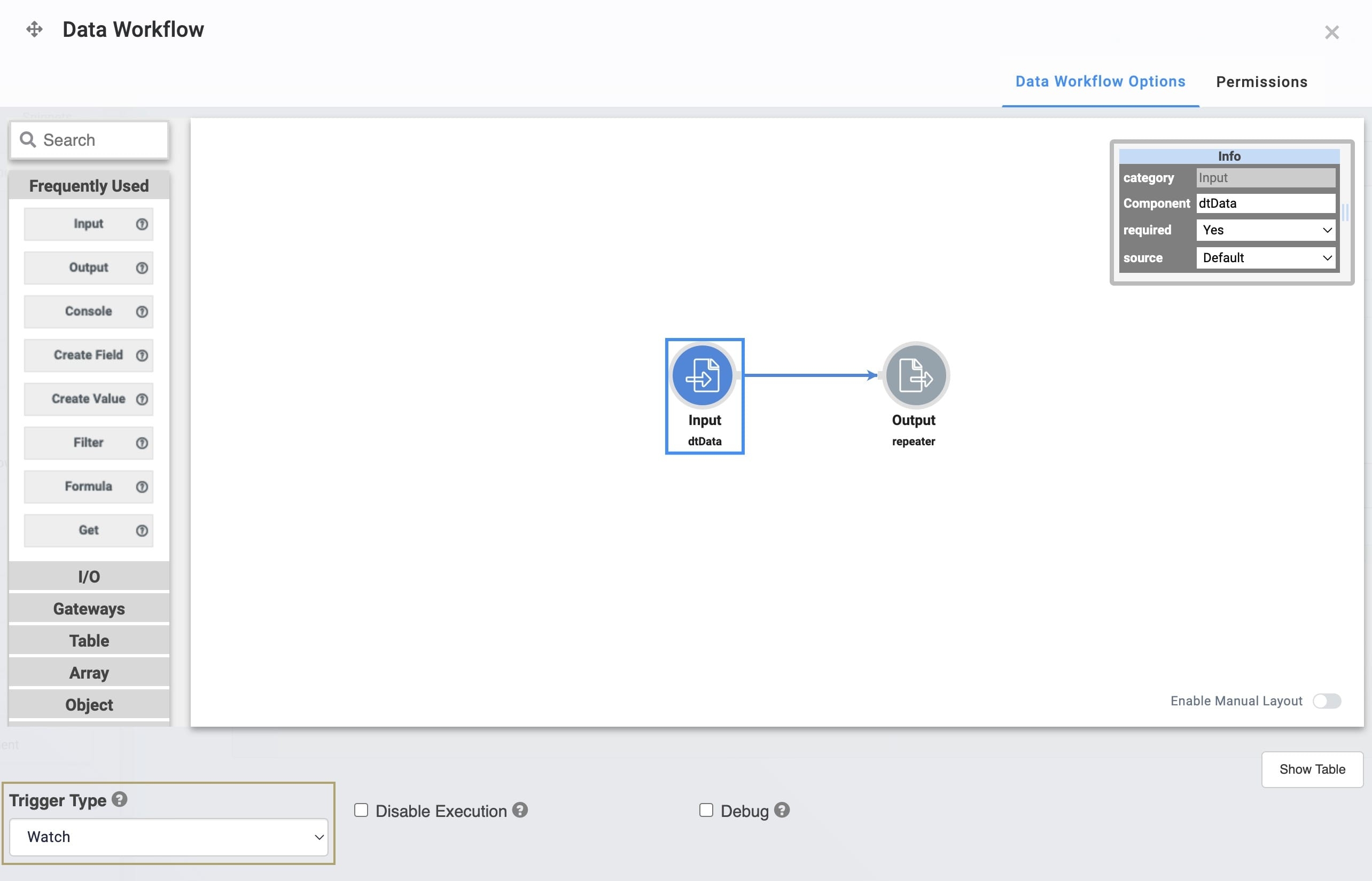
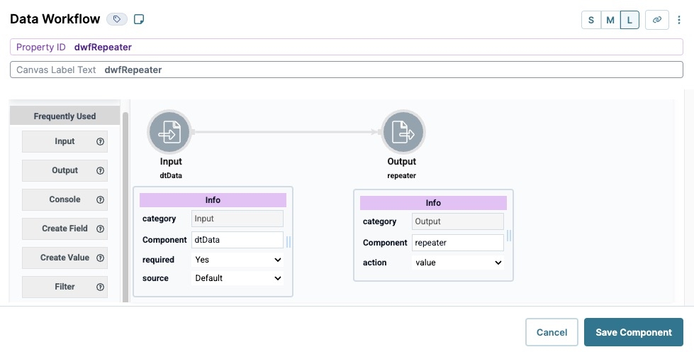
This Data Workflow component connects your Data Table component to the Repeater component.
Drag and drop a Data Workflow component onto your canvas, placing it below the repeater Repeater component.
In the Property ID and Canvas Label Text fields, enter
dwfRepeater.
Configure the Input Operator
Drag and drop an Input operator onto your Data Workflow canvas.
Configure the operator's Info window as follows:
Info
category
Input
Component
dtData
required
Yes
source
Default
Configure the Output Operator
Drag and drop an Output operator onto your Data Workflow canvas.
Configure the operator's Info window as follows:
Info
category
Output
Component
repeater
action
value
Connect the output port (right) of the dtData Input operator to the input port (left) of the repeater Output operator.
Navigate to the Data Workflow component's Actions settings.
Set the Trigger Type to
.png) Watch.
Watch.Click Save Component.
Save your module.
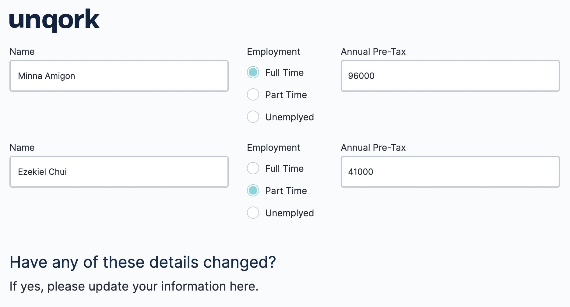
Preview your module in Express View. Notice how each of the fields auto-populate, including the preselected Radio Buttons.
The Repeater component lets you interface with table-based data by adding multiple components inside it to display repeating rows of data.
The Repeater component offers a simplified method to display and review table-based data. Displaying data with a Repeater component involves three essential parts:
A table-based data source, like a Data Table component.
Fields placed inside the Repeater component display values from each row of the data source. The fields' Property IDs must match the data source's column headers, or keys.
A Data Workflow component that links the data source to the Repeater component.
You'll find the Repeater component in the Display & Layout group to the left of the Module Builder.
About the Configuration Window
To learn more about general component settings, view our General Component Settings article.
Display Panel
Field Text
Setting | Description |
|---|---|
Label Text | Label Text conveys what the input component is and what information it displays. Enter the purpose of the corresponding component or field. User-friendly labels make your module more accessible. Keep labels short and descriptive (a word or two) using title case. For longer entries, use sentence case. |
Contextual Help
Setting | Description |
|---|---|
Tooltip | A short hint that displays when an end-user positions their cursor over the |
Default State Options
Setting | Description |
|---|---|
Hide Label | Setting Hide Label to By default, the Hide Label toggle is set to |
Hide Field | Displays or hides the component from view. Setting Hide Field to By default, Hide Field is set to |
Data Panel
Data Storage
Setting | Description |
|---|---|
Store Data in Database | The Store Data in Database setting affects how data persists through your application. When set to
Set the toggle to
By default, this toggle is set to |
Actions Panel
Triggers
Setting | Description |
|---|---|
Edit Row | Enter the Property ID of the component to trigger after editing a field displayed in a Repeater component row. |
Setting | Description |
|---|---|
Row Generation | Enter the Property ID of the component to trigger after refreshing the Repeater component's data source. |
Advanced Panel
Additional Styling
Setting | Description |
|---|---|
Custom CSS Class | Enter a Custom CSS Class to apply to your component. Custom CSS lets you maintain a consistent look and feel when the field or element is part of a template or multiple modules. Updated CSS styling applies to all components that reference this custom class name. |
Adding a Repeater Component
In this example, you'll configure a page where your end-users can review the data they submitted. On this page, end-users can edit fields and save any changes to their submission data. A Data Table component acts as the data source, and you'll configure a Text Field, Radio Buttons, and Number component inside the Repeater component. That way, the Repeater component can display the Data Table component's values. Lastly, you'll connect the Data Table and Repeater components with a Data Workflow component.
These instructions assume that you have an open module saved with a title.
Configure the Data Table Component
First, set up your data source using a Data Table component.
In the Module Builder, drag and drop a Data Table component onto your canvas.
In the Label and Property Name fields, enter
dtData.In the data table, enter the following:
A
B
C
1
name
employment
income
2
Minna Amigon
fulltime
96000
3
Ezekiel Chui
parttime
41000
Click Save.
Configure the Repeater Component
Next, configure a Repeater component to act as a container for the Text Field, Radio Buttons, and Number components.
Drag and drop a Repeater component onto your canvas, placing it below the dtData Data Table.
In the Property ID and Label Text field, enter repeater.
Click Save & Close.
Configure the Columns Component
Your Data Table component has three columns of data. So, use a Columns component to add three display columns inside the Repeater component. That way, the Name, Employment, and Income fields display side-by-side.
Drag and drop a
.png) Columns component onto your canvas, placing it inside the repeater Repeater component.
Columns component onto your canvas, placing it inside the repeater Repeater component.In the Property ID field, enter colRepeater.
Under Formatting, click
.png) (Three Columns).
(Three Columns).Click Save & Close.
Configure the Text Field Component
This Text Field component displays the values from the name column of the Data Table component. It's important that the Property ID matches the column header in the Data Table component.
Drag and drop a Text Field component onto your canvas, placing it in column1 of the colRepeater
.png) Columns component.
Columns component.In the Property ID field, enter firstName.
In the Label Text field, enter
First Name.Click Save & Close.
Configure the Radio Buttons Component
This Radio Buttons component displays the values from the employment column of your Data Table component. Match the values in the component's Value to Store in Submission Data column to those in the Data Table component. Doing so lets the Repeater component preselect the values in Express View based on the value in your Data Table component.
Drag and drop a Radio Buttons component onto your canvas, placing it in column2 of the colRepeater
.png) Columns component.
Columns component.In the Property ID field, enter employment.
In the Label Text field, enter
Employment.In the component's configuration window, click the
.png) Data tab.
Data tab.Set your Option Label and Value to Store in Submission Data as shown below:
Option Label
Value to Store in Submission Data
1
Full Time
fulltime
2
Part Time
partime
3
Unemployed
unemployed
Values entered in the Value to Store in Submission Data column must match the values entered in the Data Table component.
Click Save & Close.
Configure the Number Component
This Number component will display the values from the income column of your Data Table component. Again, the Property ID must match the column header from your Data Table component.
Drag and drop a Number component onto your canvas.
In the Property ID field, enter income.
In the Label Text field, enter
Annual Pre-Tax Income.Click Save & Close.
Configure the Data Workflow Component
This Data Workflow component connects your Data Table component to the Repeater component.
Drag and drop a Data Workflow component onto your canvas, placing it below the repeater Repeater component.
In the Label and Property Name fields, enter dwfRepeater.
Set the Trigger Type to Watch.
Configure the Input Operator
Drag and drop an Input operator onto your Data Workflow canvas.
Configure the operator's Info window as follows:
Setting
Value
Category
Input
Component
dtData
Required
Yes
Source
Default
Configure the Output Operator
Drag and drop an Output operator onto your Data Workflow canvas.
Configure the operator's Info window as follows:
Setting
Value
Category
Output
Component
repeater
Connect the output port (right) of the Input operator to the input port (left) of the Output operator.
Click Save.
Configure the HTML Element Component
Lastly, let's configure an HTML Element component to display some instructions so your end-user knows what to do.
Drag and drop a HTML Element component onto your canvas, placing it below the dwfRepeater Data Workflow component.
In the Property ID and Canvas Label Text fields, enter
html.In the Content field, enter the following:
<h3>Have any of these details changed?</h3>
<h4>If yes, please update your information here.</h4><br>
Click Save & Close.
Save your module.
Preview your module in Express View. Notice how each of the fields auto-populate, including the preselected Radio Buttons.
.jpg) (Tooltip) icon. Tooltips can display across more than one line.
(Tooltip) icon. Tooltips can display across more than one line..jpg)
.jpg)
.jpg)
.jpg)

.jpg)
