The Data Grid component is a Centauri Runtime (v1.0) display and layout tool designed to organize components into columns and rows. Adding a component to a Data Grid component uses the added component's Label Text to create a new column in Express View. Then, it displays the component's field in a row matching that column. Creators can also configure the Data Grid component so end-users can add additional rows containing these components.
The Data Grid component is useful for configurations where end-users need to enter multiple datasets in an organized format. For example, let's say you're a financial planner. You need to collect your end-user's account name, type, and balance. Use a Data Grid component to display one or more fields so you can capture these values.
You'll find the Data Grid component in the Display & Layout group to the left of the Module Builder.
About the Configuration Window
To learn more about general component settings, view our General Component Settings article.
Display Settings
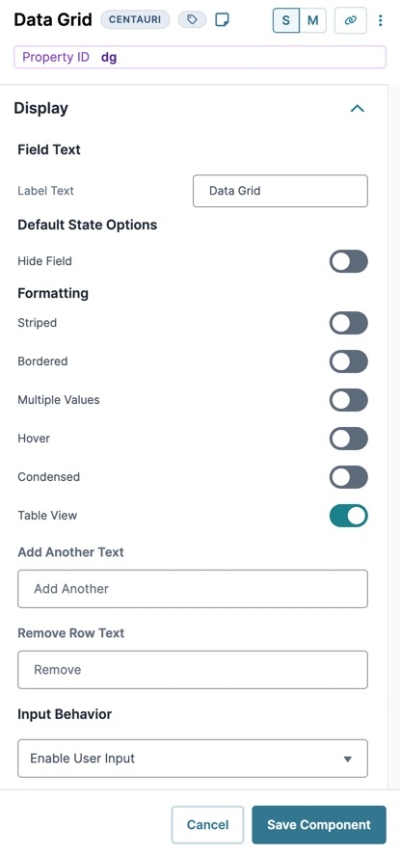
Field Text
Setting | Description |
|---|---|
Label Text | Label Text conveys what the input component is and what information it displays. Enter the purpose of the corresponding component or field. User-friendly labels make your module more accessible. Keep labels short and descriptive (a word or two) using title case. For longer entries, use sentence case. |
Default State Options
Setting | Description |
|---|---|
Hide Field | Displays or hides the field from view. Setting Hide Field toggle By default, Hide Field is set to |
Formatting
Setting | Description |
|---|---|
Striped | Set to By default, this setting is set to |
Bordered | Set to By default, this setting is set to |
Multiple Values | Set to By default, this setting is set to |
Hover | Set to By default, this setting is set to |
Condensed | Set to By default, this setting is set to |
Table View | Set to By default, this setting is set to |
Add Another Text | Set the label value for the Add New Row button. |
Remove Row Text | Set the label value for the Remove Row button. |
Input Behavior
Setting | Description |
|---|---|
Input Behavior | Controls how end-users interact with the component. Choose from the following options:
|
Data Settings
Data Storage
Setting | Description |
|---|---|
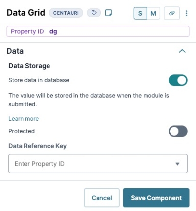
Store Data in Database | The Store Data in Database setting affects how data persists through your application. When set to
Set the toggle to
|
Protected | When checked, the API call won't returns this field as part of the API call. Set to unchecked when you want the field returned as part of the call. By default, this checkbox is unchecked. |
Data Reference Key
With a Data Reference Key, you can use data from another component to populate your Data Grid component. You'll most often achieve this function using a Data Table component. Add your data to this component and then reference it in your Data Grid component's Settings drawer.
Think of this as a hybrid of using Values and Data Collections to populate a Radio Buttons component. You still use data stored in Unqork, but it's data from your module instead of a Data Collection.
Setting | Description |
|---|---|
Data Reference Key | Enter the Property ID of the component whose data you're referencing. |
Validation Settings
User Input
Setting | Description |
|---|---|
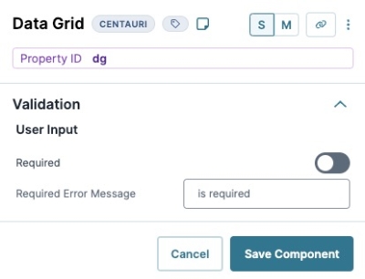
Required | When set to By default, Required is set to |
Required Error Message | A custom error message that displays below a required field. The error message displays when the end-user tries to save or submit the module without completing the required field. |
Advanced Settings
Error Messages
Setting | Description |
|---|---|
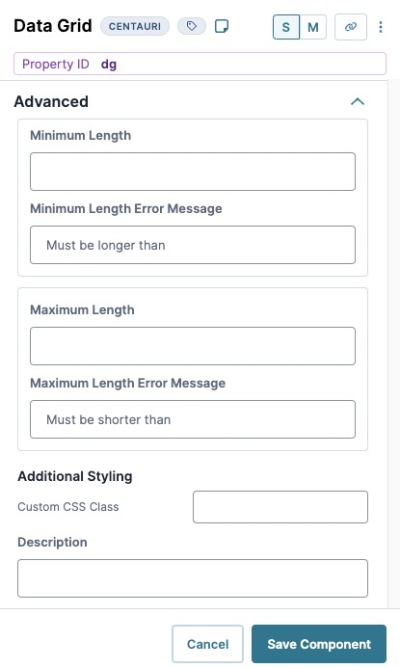
Min/Max Length | Sets the minimum or the maximum number of characters an end-user must enter for valid input. |
Min/Max Length Error Message | A custom error message that displays below the input field. The error message displays when the entry doesn't meet the minimum or maximum character length rule. |
Additional Styling
Setting | Description |
|---|---|
Custom CSS Class | Enter a Custom CSS Class to apply to your component. Custom CSS lets you maintain a consistent look and feel when the field or element is part of a template or multiple modules. Updated CSS styling applies to all components that reference this custom class name. |
Description | Quick tip describing the expected value of an input field. Unlike a Tooltip, Helper Text stays visible under the input field and displays on a single line. |
Adding a Data Grid Component
In this example, configure a Data Grid component to ask your end-user to input personal information about their account assets.
Configure the Data Grid Component
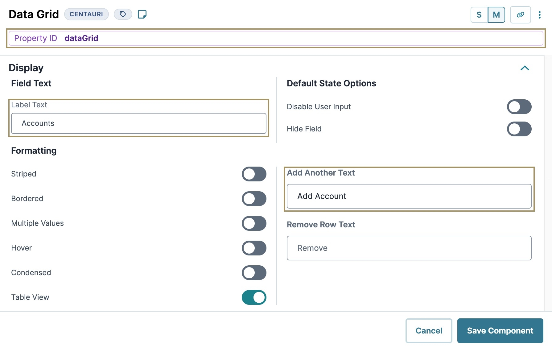
This Data Grid component is used to organize three Text Field components so end-users can create multiple rows of fields based on their needs.
In the Module Builder, drag and drop a Data Grid component onto your canvas.
In the Property ID field, enter
dataGrid.In the Label Text field, enter
Accounts.In the Add Another Text field, enter
Add Account.Click Save Component.
Configure the Text Field components
Configure three Text Field components for your end-user to enter their account name, type, and balance. Apart from their Property IDs, all other settings are the same.
Drag and drop three Text Field components onto your canvas, placing them next to one another inside the datagrid Data Grid component.
In the Property ID and Label Text fields, enter the following:
Property ID
Label Text
1
accountName
Account Name
2
accountType
Account Type
3
accountBalance
Account Balance
Click Save Component for each Text Field component as you complete it.
Save your module.
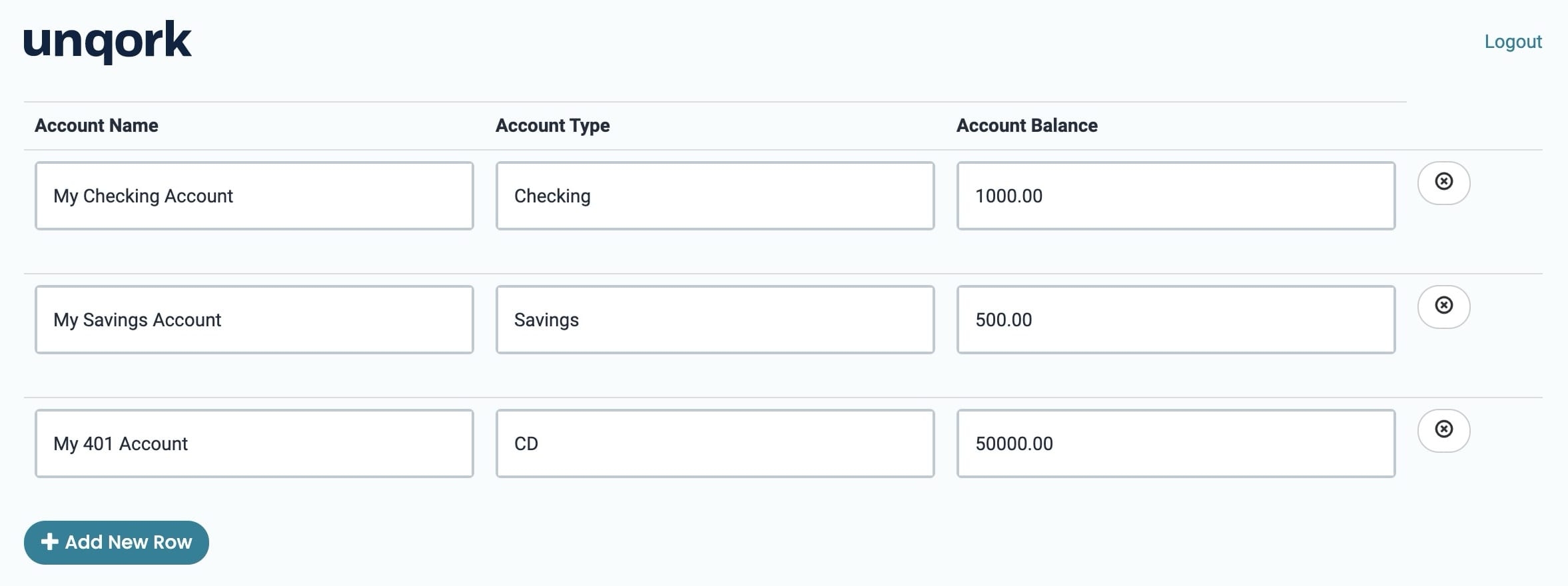
Preview your module in Express View. to see the following functionality:
The Data Grid component is a Centauri Runtime (v1.0) display and layout tool designed to organize components into columns and rows. Adding a component to a Data Grid component uses the added component's Label Text to create a new column in Express View. Then, it displays the component's field in a row matching that column. Creators can also configure the Data Grid component so end-users can add additional rows containing these components.
The Data Grid component is useful for configurations where end-users need to enter multiple datasets in an organized format. For example, let's say you're a financial planner. You need to collect your end-user's account name, type, and balance. Use a Data Grid component to display one or more fields so you can capture these values.
You'll find the Data Grid component in the Display & Layout group to the left of the Module Builder.
About the Configuration Window
To learn more about general component settings, view our General Component Settings article.
Display Settings
Setting | Description |
|---|---|
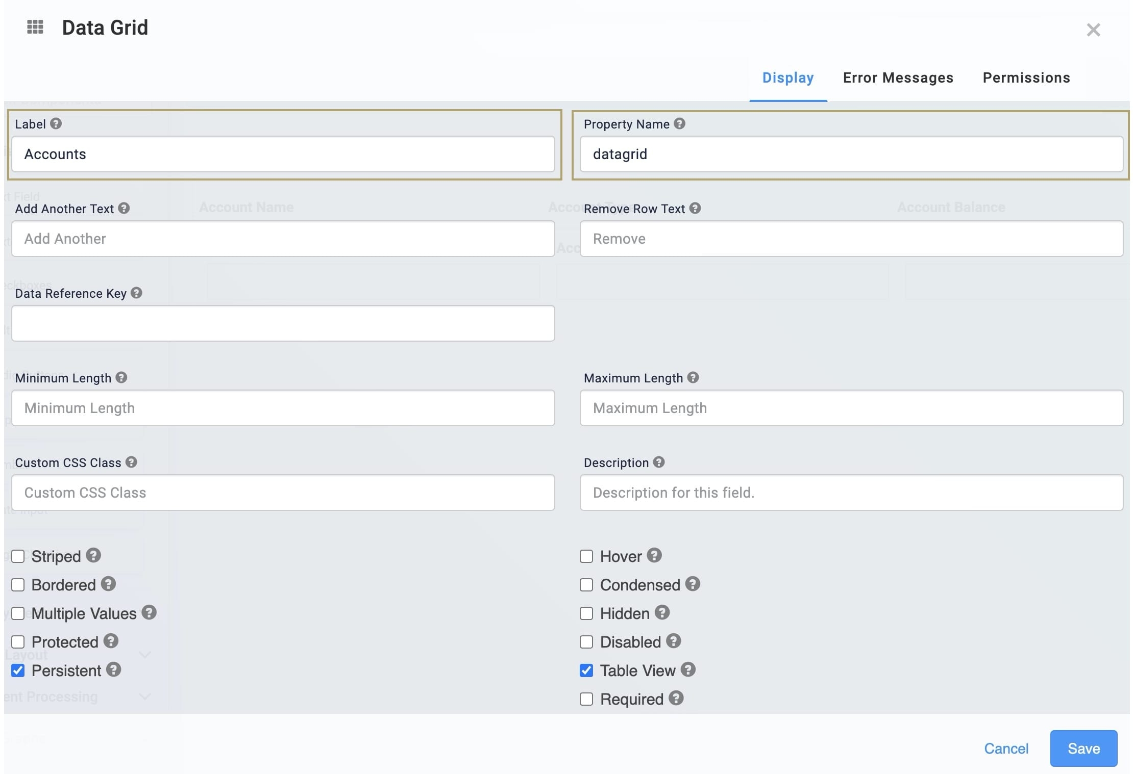
Label | A Label indicates the purpose of the corresponding field or component. For input components, the Label tells the end-user how to interact with the field. For non-input components, the Label is not end-user facing, and only appears in the Module Builder. User-friendly Labels make your module more accessible. Keep Labels short and descriptive (a word or two) using title case. For longer entries, use sentence case. |
Property Name (Property ID) | A Property ID is the unique field ID used by Unqork to track and link components in your module. The Property ID is how the software identifies your component. Using Property IDs lets you link components, creating logic-based configurations and API calls. Property IDs must use camel case (stylized as camelCase) without spaces or punctuation. |
Add Another Text | Enter text here to set the label for the Add New Row button. |
Remove Row Text | Enter text here to set the label for the Remove Row button. |
Data Reference Key | Enter the Property ID of the component whose data you're referencing. |
Minimum Length | Sets the lowest number of rows displayed in your Data Grid component. Notice that the Add row button hides when your end-user reaches this lowest limit. |
Maximum Length | Sets the highest number of rows displayed in your Data Grid component. Notice that the Add row button hides when your end-user reaches this highest limit. |
Custom CSS Class | Enter a Custom CSS Class to apply to your component. Custom CSS lets you maintain a consistent look and feel when the field or element is part of a template or multiple modules. Updated CSS styling applies to all components that reference this custom class name. |
Description | Quick tip describing the expected value of an input field. Unlike a Tooltip, Helper Text stays visible under the input field and displays on a single line. |
Striped | Set to By default, this checkbox is ☐ (unchecked). |
Hover | Set to By default, this checkbox is ☐ (unchecked). |
Bordered | Sets to By default, this checkbox is ☐ (unchecked). |
Condensed | Set to By default, this checkbox is ☐ (unchecked). |
Multiple Values | Set to By default, this checkbox is ☐ (unchecked). |
Hidden | Shows or hides the component from view. Checking the Hidden checkbox hides the component in Express View. Clearing the checkbox displays the component. The component will always remain visible in the Module Builder. By default, this checkbox is ☐ (unchecked). |
Disabled | Checking the Disabled checkbox, prevents end-users from interacting with the element in Express View. When your end-user hovers over the field, their cursor changes to alert them to the status change. By default, this checkbox is ☐ (unchecked). |
Protected | When By default, this checkbox is ☐ (unchecked). |
Table View | Set to By default, this checkbox is (checked). |
Persistent | When By default, this checkbox is (checked).
|
Required | When set to By default, Required is set to ☐ (unchecked). |
Adding a Data Grid Component
In this example, configure a Data Grid component to ask your end-user to input personal information about their account assets.
Configure the Data Grid Component
This Data Grid component is used to organize three Text Field components so end-users can create multiple rows of fields based on their needs.
In the Module Builder, drag and drop a Data Grid component onto your canvas.
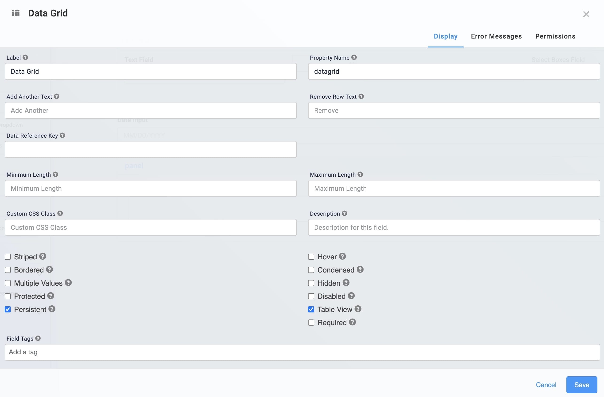
In the Label field, enter
Accounts.In the Property Name, enter
datagrid.Click Save.
Configure the Text Field components
Configure three Text Field components for your end-user to enter their account name, type, and balance. Apart from their Property ID, all other settings are the same.
Drag and drop three Text Field components onto your canvas, placing them next to one another in the datagrid Data Grid.
In the Property ID and Label Text fields, enter the following :
Property ID
Label Text
accountname
Account Name
accounttype
Account Type
accountbalance
Account Balance
Click Save & Close for each Text Field component as you complete it.
Save your module.
Preview your module in Express View. to see the following functionality:

.png)
