The Table component is a Centauri (1.0) component that organizes components into rows and columns for efficient readability. The Table component is similar to the Columns component. But, the Columns component can only organize components in vertical groups. The Table component aligns components both vertically and horizontally.
You can use the Table component in the following ways:
Organize components into columns and rows.
Display components in a grid-like format.
You can find the Table component in the Display & Layout group to the left of the Module Builder.
About the Configuration Window
To learn more about general component settings and those that display when a component is associated with Data Models, view our General Component Settings article.
Display Settings
Setting | Description |
|---|---|
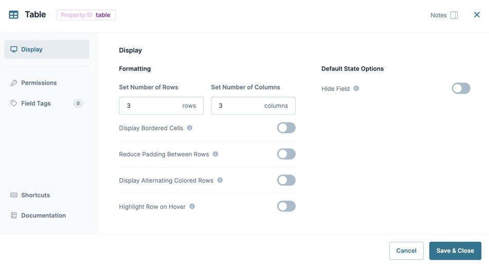
Set Number of Rows | Sets the number of rows in the table. By default, the Table component has three rows. |
Set Number of Columns | Sets the number of columns in the table. By default, the Table component has three columns. |
Display Bordered Cells | When set to By default, this setting is |
Reduce Padding Between Rows | Padding sets the amount of space between the border of a table cell and its contents. When set to By default, this setting is |
Display Alternating Colored Rows | When set to By default, this setting is |
Highlight Row on Hover | When set to By default, this setting is |
Hide Field | When set to By default, this setting is |
Adding a Table Component
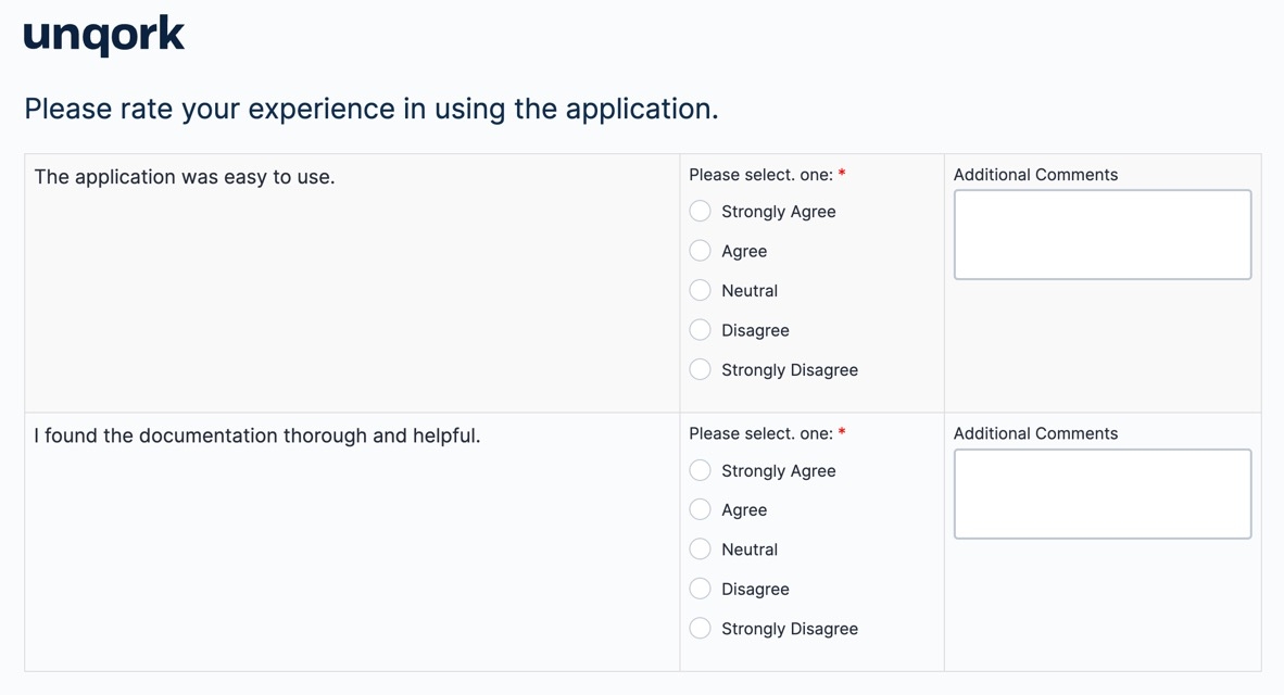
In this example, you'll configure a Table component in a module and display a short survey about an end-user's experience with an application.
These instructions assume that you have an open module saved with a title.
Configure the Table Component
This component organizes the other components into columns and rows. That way, your survey displays in a grid-like format.
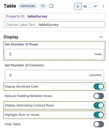
In the Module Builder, drag and drop a Table component onto your canvas.
In the Property ID field and Canvas Label Text fields, enter
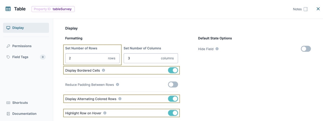
tableSurvey.In the Set Number of Rows field, enter
2.Set Display Bordered Cells to
 (ON).
(ON).Set Display Alternating Colored Rows to
 (ON).
(ON).Set Highlight Row on Hover to
 (ON).
(ON).Click Save Component.
Configure the HTML Element Components
Place the first HTML Element component above the tableSurveyTable component to provide the end-user with instructions about the survey. Then, configure two more HTML Element component inside the Table component to display text the end-user can either agree or disagree with.
Configure the First HTML Element Component
Drag and drop an HTML Element component onto your canvas, placing it above the tableSurvey Table component.
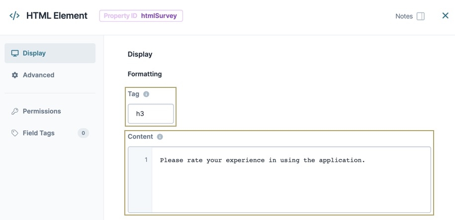
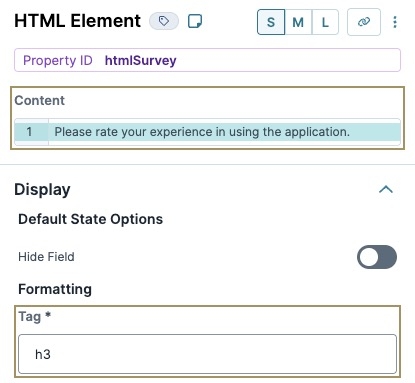
In the Property ID field, enter htmlSurvey.
In the Content component field, enter
Please rate your experience in using the application.In the Tag field, enter
h3.Click Save Componente.
Configure the Second HTML Element Component
Drag and drop an HTML Element component onto your canvas, placing it in the top-left cell of the tableSurvey Table component.
In the Property ID field, enter htmlEasy.
In the Content field, enter
The application was easy to use.Click Save Component.
Configure the Third HTML Element Component
Drag and drop an HTML Element component onto your canvas, placing it in the bottom-left cell of the tableSurvey Table component.
In the Property ID field, enter htmlHelpful.
In the Content field, enter
I found the documentation thorough and helpful.Click Save Component.
After adding the Table and HTML Element components, your canvas looks like the following in the Module Builder:
Configure the Radio Buttons Components
Configure two Radio Buttons components for the end-user to rate their experience. Apart from their Property IDs, all other settings are the same.
Drag and drop two Radio Buttons components onto your canvas, placing them in the top and bottom rows of the tableSurvey Table component's middle column.
Complete the Property ID and Label Text fields as follows:
Property ID
Label Text
radioEasy
Please select one:
radioHelpful
Please select one:
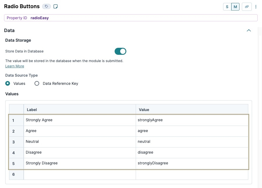
Navigate to each component's Data settings.
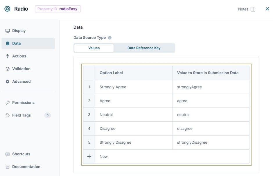
In the Values table of each component, enter the following:
Label
Value
1
Strongly Agree
stronglyAgree
2
Agree
agree
3
Neutral
neutral
4
Disagree
disagree
5
Strongly Disagree
stronglyDisagree
Navigate to each component's Validation settings.
Set Required to
 (ON).
(ON).Click Save Component for each component as you complete it.
Configure the Text Area Components
Lastly, configure two Text Area components to each cell in the far right column for the end-user to add comments. Apart from their Property IDs, all other settings are the same.
Drag and drop two
.png) Text Area components onto your canvas, placing them in separate cells of the right-most tableSurvey Table component column.
Text Area components onto your canvas, placing them in separate cells of the right-most tableSurvey Table component column.Complete the Property ID and Label Text fields as follows:
Property ID
Label Text
commentEasy
Additional Comments
commentHelpful
Additional Comments
Click Save Component for each component as you add it.
Save your module
Preview your module in Express View. Here's how your module displays:
The Table component is a Centauri (1.0) component that organizes components into rows and columns for efficient readability. The Table component is similar to the Columns component. But, the Columns component can only organize components in vertical groups. The Table component aligns components both vertically and horizontally.
You can use the Table component in the following ways:
Organize components into columns and rows.
Display components in a grid-like format.
You can find the Table component in the Display & Layout group to the left of the Module Builder.
About the Configuration Window
To learn more about general component settings and those that display when a component is associated with Data Models, view our General Component Settings article.
Display Panel
Setting | Description |
|---|---|
Set Number of Rows | Sets the number of rows in the table. By default, the Table component has three rows. |
Set Number of Columns | Sets the number of columns in the table. By default, the Table component has three columns. |
Display Bordered Cells | When set to By default, this setting is |
Reduce Padding Between Rows | Padding sets the amount of space between the border of a table cell and its contents. When set to By default, this setting is |
Display Alternating Colored Rows | When set to By default, this setting is |
Highlight Row on Hover | When set to By default, this setting is |
Hide Field | When set to By default, this setting is |
Adding a Table Component
In this example, you'll configure a Table component in a module and display a short survey about an end-user's experience with an application.
These instructions assume that you have an open module saved with a title.
Configure the Table Component
This component organizes the other components into columns and rows. That way, your survey displays in a grid-like format.
In the Module Builder, drag and drop a Table component onto your canvas.
In the Property ID field, enter tableSurvey.
In the Set Number of Rows field, enter
2.Set Display Bordered Cells to
 (ON).
(ON).Set Display Alternating Colored Rows to
 (ON).
(ON).Set Highlight Row on Hover to
 (ON).
(ON).Click Save & Close.
Configure the HTML Element Components
Place the first HTML Element component above the tableSurveyTable component to provide the end-user with instructions about the survey. Then, configure two more HTML Element component inside the Table component to display text the end-user can either agree or disagree with.
Configure the First HTML Element Component
Drag and drop an HTML Element component onto your canvas, placing it above the tableSurvey Table component.
In the Property ID and Label Text fields, enter htmlSurvey.
In the Tag field, enter
h3.In the Content component field, enter
Please rate your experience in using the application.Click Save & Close.
Configure the Second HTML Element Component
Drag and drop an HTML Element component onto your canvas, placing it in the top-left cell of the tableSurvey Table component.
In the Property ID and Label Text fields, enter htmlEasy.
In the Content field, enter
The application was easy to use.Click Save & Close.
Configure the Third HTML Element Component
Drag and drop an HTML Element component onto your canvas, placing it in the bottom-left cell of the tableSurvey Table component.
In the Property ID and Label Text fields, enter htmlHelpful.
In the Content field, enter
I found the documentation thorough and helpful.Click Save & Close.
After adding the Table and three HTML Element components, your canvas looks like the following in Express View:
Configure the Radio Buttons Components
Configure two Radio Buttons components for the end-user to rate their experience. Apart from their Property IDs, all other settings are the same.
Drag and drop two Radio Buttons components onto your canvas. Place these Radio components in the top and bottom rows of the tableSurvey Table component's middle column.
Complete the Property ID and Label Text fields as follows:
Property ID
Label Text
radioEasy
Please select one:
radioHelpful
Please select one:
From the component's configuration window, select Data.
In the Values table of each component, enter the following:
Option Label
Value to Store in Submission Data
1
Strongly Agree
stronglyAgree
2
Agree
agree
3
Neutral
neutral
4
Disagree
disagree
5
Strongly Disagree
stronglyDisagree
From the component's configuration window, select
.png) Validation.
Validation.Set Required to
 (ON).
(ON).Save & Close each component as you complete it.
Configure the Text Area Components
Lastly, configure two Text Area components to each cell in the far right column for the end-user to add comments. Apart from their Property IDs, all other settings are the same.
Drag and drop two
.png) Text Area components onto your canvas. Place the Text Area components in separate cells of the rightmost tableSurvey Table component column.
Text Area components onto your canvas. Place the Text Area components in separate cells of the rightmost tableSurvey Table component column.Complete the Property ID and Label Text fields as follows:
Property ID
Label Text
commentEasy
Additional Comments
commentHelpful
Additional Comments
Save & Close each component as you add it.
Save your module
Preview your module in Express View. Here's how your module displays:
.jpg)

.jpg)
