In the application development process, end-user data validation is essential. It ensures that the data entered into your system is accurate and reliable. End-users might enter incorrect information because of keyboard errors or general misunderstanding. If your application accepts any input in any field without validation, it can result in unusable data.
The key to effective data validation is performing it at the time of entry to reduce errors. When an error occurs, you can offer guidance to your end-users using error messages, so they know how to correct the errors. Validating data ensures it's consistent with your expectations, which enhances data integrity. In this article, you'll learn about the different ways to validate data in your Unqork applications.
Data Type Validation
The first part of your validation journey begins with the component you add to the Module Builder canvas. It's important to use a component that best matches the data you're gathering. For example, the Number, Date Input, and Email components confirm that end-users input the correct data type. When you select a component that specifies a data type, you do not have to build separate validation.
When gathering email addresses, you'll use an Email component. This component verifies whether an end-user has entered all four parts of a valid email address. The parts include the username, @ symbol, domain name, and top-level domain name (.com, .org). A message below the field lets your end-user know that the email address is incomplete or incorrect. While the component verifies the format is correct, it cannot verify that the email address is active or real.
Component Validation Panel
Data validation is not the only validation option. Input components also include input-related validation settings. For example, requiring input or setting a minimum or maximum input length. Let’s explore the settings available in a component's Validation panel.
Required
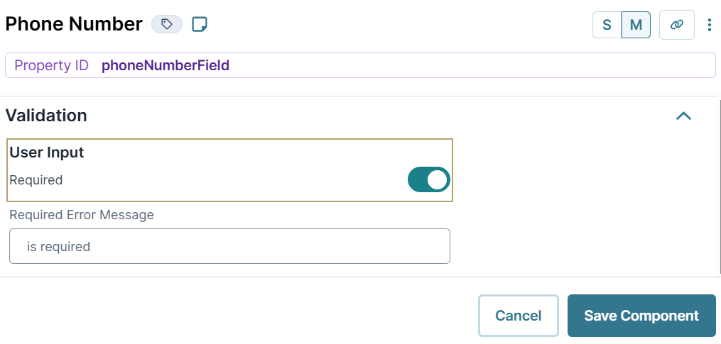
Setting a component to Required is the simplest form of validation. When set to ![]() (ON), the end-user must enter an input before they can navigate to another page or save their submission. Use this validation type on fields that must contain an input from the end-user. Setting a field to Required also ensures your end-user completes all important fields. Set Required to
(ON), the end-user must enter an input before they can navigate to another page or save their submission. Use this validation type on fields that must contain an input from the end-user. Setting a field to Required also ensures your end-user completes all important fields. Set Required to ![]() (OFF) when data entry is optional.
(OFF) when data entry is optional.
Minimum Length and Maximum Length
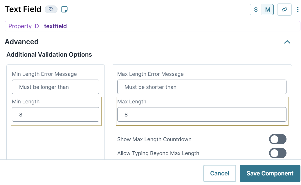
Using length validation ensures the character string entered by the end-user is not too short or too long. For example, consider a driver’s license that requires eight characters. Using Minimum Length and Maximum length validation ensures your end-user enters exactly eight characters.
The Text Area and Text Field components have two more Maximum Length settings. Show Maximum Length Countdown lets your end-user view the number of characters remaining. And Allow Typing Beyond Maximum Length displays a message when the text reaches the maximum limit. End-users can continue to enter text beyond this point, despite the notification.
Error Messages
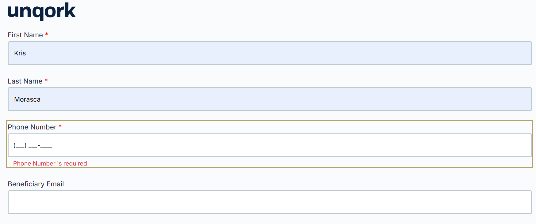
When end-users enter invalid information, you want to ensure they understand. Error messages communicate to your end-user about how their input should look. An error message should provide details about the issue and offer a solution. Each error message has default text that you can change. If you do adjust your error message, ensure it's clear and concise.
Different components have different error messages available:
Error Message | Description |
|---|---|
Required Error Message | This message lets your end-user know they must make an entry in the field before continuing. |
Minimum Length Error | This message lets your end-user know they have not entered the correct number of characters in the field. |
Maximum Length Error | This message lets end-users know they have entered too many characters in the field. |
Custom Error Message | Only available for the Checkboxes component, and lets you set specific parameters for a field. For example, you might restrict your end-user to only selecting two items from the list. If they select a third option, this custom error message displays. |
Email Error Message | This message lets your end-user know they've entered an invalid email address. |
File Size Error Message | This message lets end-users know their uploaded file exceeds the maximum size. |
Require Unique Submission Data
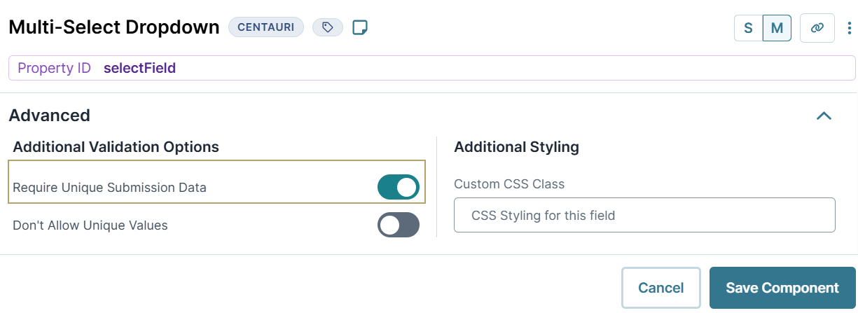
There might be times when you want to ensure that an answer is only entered once. You can achieve this validation using the Require Unique Submission Data setting. When set to ![]() (ON), the end-user cannot select an option that already exists in the submission.
(ON), the end-user cannot select an option that already exists in the submission.
This setting is available in the following components:
Don't Allow Unique Values
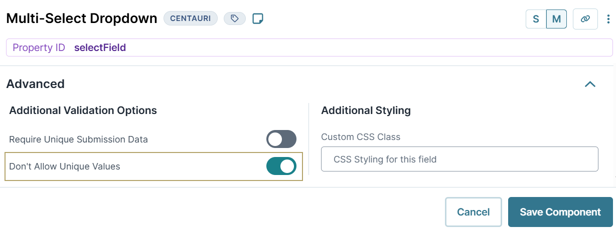
The Multi-Select Dropdown component lets your end-user select an item from a list or enter text. To prevent your end-user from adding text, you'll set the Don't Allow Unique Values setting to ![]() (ON).
(ON).
When set to ![]() (OFF), your end-user can enter a value into the drop-down menu. The field accepts the input even if it does not match any of the existing values in the drop-down. When set to
(OFF), your end-user can enter a value into the drop-down menu. The field accepts the input even if it does not match any of the existing values in the drop-down. When set to ![]() (ON), your end-user can only select an existing value from the drop-down.
(ON), your end-user can only select an existing value from the drop-down.
Valid Number
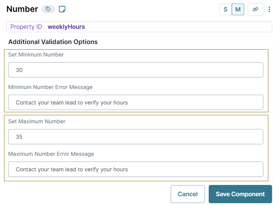
The Number component includes the Minimum Number and Maximum Number settings. You'll use these settings when you want to set a range of acceptable values.
Let's say you have an application that acts as a portal where contractors track the hours they worked during the week. Each of your contractors has an approved number of weekly hours of 30 to 35. You can set a Minimum Number of 30 and a Maximum Number of 35. You could even set up Minimum or Maximum Number Error Messages. If your end-user enters 29 or 36, an error message displays telling your end-user to contact their team lead.
Date Restrictions
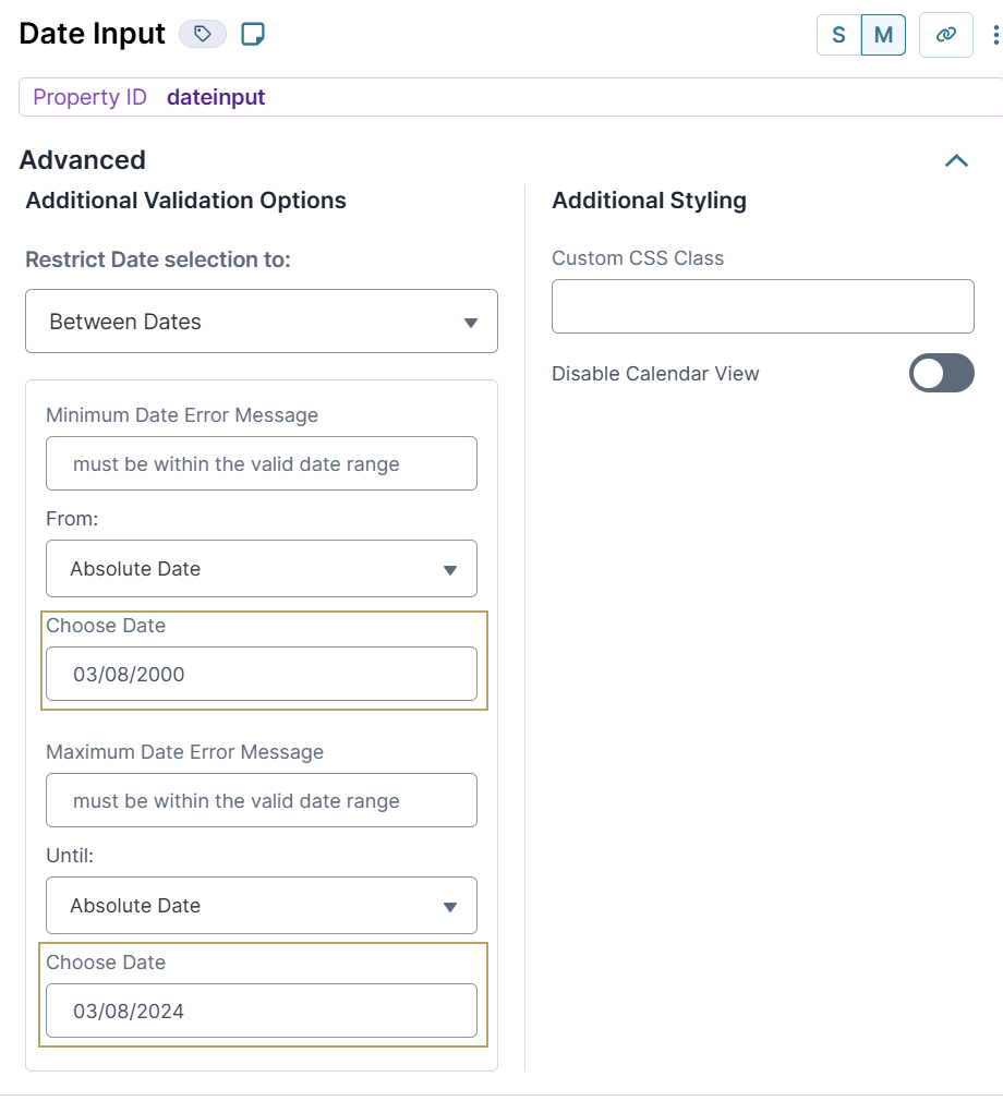
The Date Input component can limit the range of dates that end-users enter. For example, when capturing a birth date, you want to avoid a 1-year-old or a 251-year-old entry. So, use the Restrict Date Selection setting to select the appropriate age range. For example, no younger than 18 and no older than 120 years old.
The following validation settings are available for the Date Input component:
Setting | Description |
|---|---|
Restrict Date Selection To | Limits the field based on the date restriction selected. Available date restrictions include:
|
From | Specifies the from date. Use the drop-down menu to apply more restrictions to the beginning of your date range:
|
Until | This field displays the selection of the Between Dates setting. Use the drop-down menu to apply more restrictions to the beginning of your date range:
|
File Upload Validation
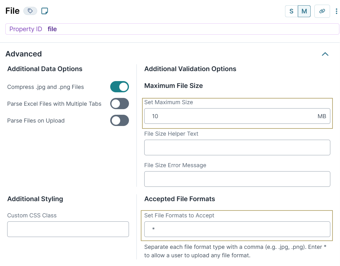
The File component lets your end-user upload files to your application, like images or PDF file. The File component lets you create validation rules, like the maximum file size and the file types available for upload. Let's say, your current systems only support Word documents. You can use the component's validation settings to limit uploads only to Word documents.
The following validation settings are available for the File component:
Setting | Description |
|---|---|
Set Maximum Size | Validation that limits the size of each file that an end-user can upload. It might take longer to upload larger files depending on the browser and network connection.
|
Set File Formats to Accept | Sets the file types accepted by this component. To allow the upload of any file type, simply set the field value to |
Input Mask
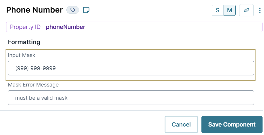
Using an Input Mask ensures your end-user’s input follows a specific format. For example, only using numbers when entering a social security number. You can also use input masks to set alphanumeric patterns. For example, the input mask for a Canadian postal code would be X9X 9X9. When setting an input mask, X represents any letter, and 9 represents any number.
The following components include the Use Input Mask setting in their Display panel:
Phone Number component: The Input Mask defaults to
(999) 999-9999.
By default, the Text Field and Text Area components have Use Input Mask set to
(OFF). To use an input mask, set this setting to
(ON).
Decisions Component Validation
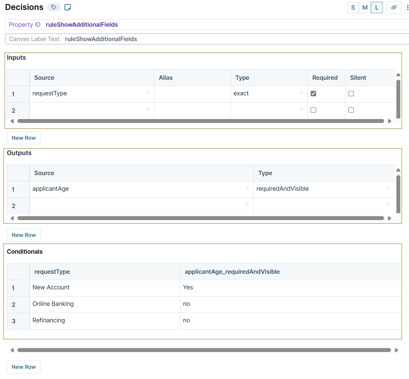
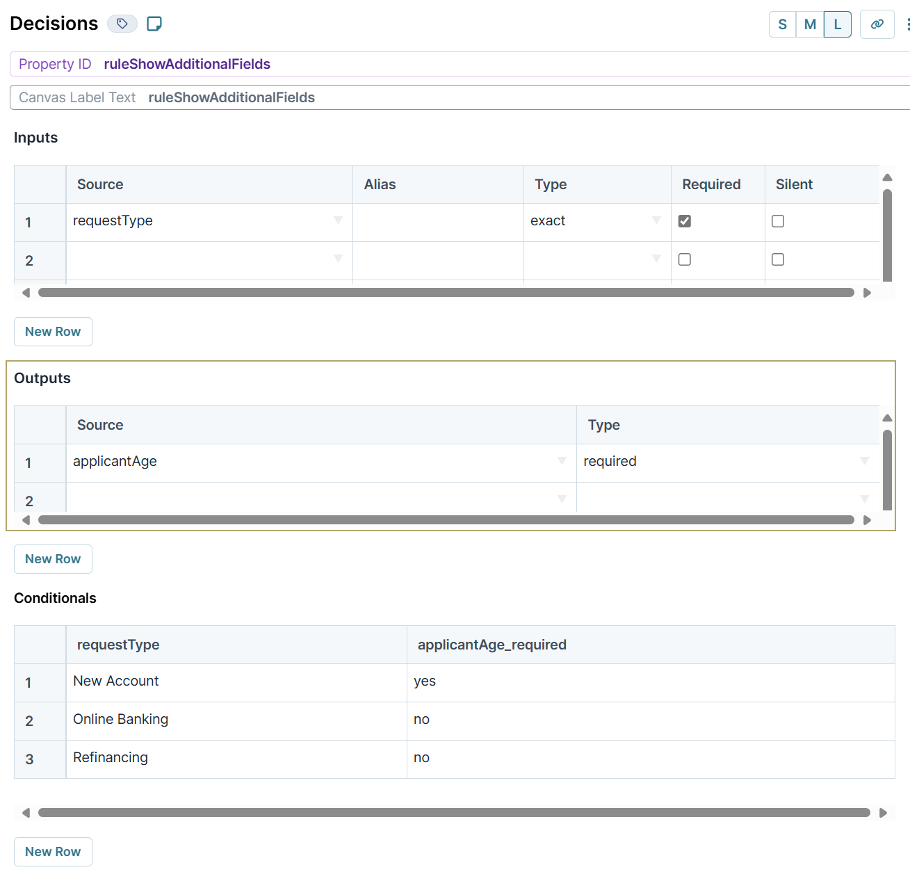
The Decisions component is a logic component used in if/then scenarios. The Decisions component has many output types, including Required and Required and Visible. These two output types let you build conditional validation rules in your application. For example, setting one field to Required based on what your end-user enters in another field.
Let's say you're building an application where end-users can apply for various financial services. Only one of these services, opening a new account, has an age requirement. So, if an end-user applies for a new account, you could set a Decision component to only display for an end-user to answer the following question: Are you over 18?.
Another option is to always display the question. Instead of conditionally displaying the question, you can conditionally require it. That way, you only need to use the Required output type. Your end-user only needs to enter their age when they apply for a new account.

