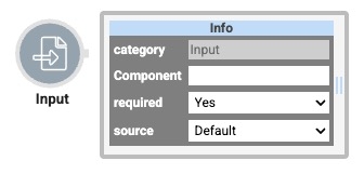
The Input operator serves as the beginning of your Data Workflow, with a single output port. The Input operator lets you retrieve data from a component and bring it into your Data Workflow.
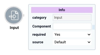
You can use an Input operator to:
Bring in end-user data from another component in your module.
Set dynamic variables in a Data Table component by using the Binded Table setting.
You can use an Input operator to easily reference an end-user's name in a Text Field component. Or, retrieve an email address from an Email component. Then, use other Data Workflow operators to process those pieces of data.
You'll find the Input operator under the I/O group to the left of the Data Workflow canvas.
About the Info Window
And here's a breakdown of each setting in the Info window:
Setting | Description |
|---|---|
Category | Grayed out and non-adjustable setting indicating the operation type. |
Component | A component storing the data you'll bring into your Data Workflow. Here, you'll see a drop-down containing every component's Property ID in your module. Select the component you want to reference from the drop-down list. After selecting a Property ID, the Component field remains editable. You can type in the Component field to define a property path or target fields nested under the selected Property ID. Your selection displays as the operator's label.
|
Required | When set to Yes, your Data Workflow does not begin until a value is present in the chosen component. So, if you selected a Text Field component, the Data Workflow does not run if the Text Field component is empty. When set to No, the Data Workflow runs with or without a value in the chosen component. By default, the Required drop-down is set to Yes. |
Source | Sets the type of data the source component contains. To draw the exact value of the component selected earlier, you'll choose Default. If you work with dynamic values, you'll choose Binded Table. Doing so is useful when using dynamic values in a Data Table component. If you have dynamic values in a Data Table component, select the Data Table component under the Component setting. Then, select Binded Table as your Source. To see an example of configuring a Binded Table, read our Binded Table Use Case article. By default, the Source drop-down is set to Default. |
Manually-Defined Inputs
In some cases, you might want to reference an input that does not display in the Info window's Component drop-down. For example, the Property ID of components in imported modules.
To reference an input that does not display in the Component drop-down:
Select your Input operator.
In the operator's Info window, select any Property ID from the component drop-down. The Property ID displays below the Input operator as a label.
On the Data Workflow canvas, double-click the Input operator's label. The field becomes editable.
Enter the Property ID to use as an input.
Click outside the field to save your manually-defined input.
Reopening the Data Workflow component might not display your manually-defined input on the canvas, though the connection still exists. Consider using the Data Workflow component's Comment field to note the input.
Adding an Input Operator
To demonstrate an Input operator, you'll use it to retrieve data from a Data Table component.
These instructions assume you have a new module open, saved, and with a title.
Configure the Data Table Component
First, configure a Data Table component to store some sample data.
In the Module Builder, drag and drop a Data Table component onto your canvas.
In the Property ID and Label Text fields, enter
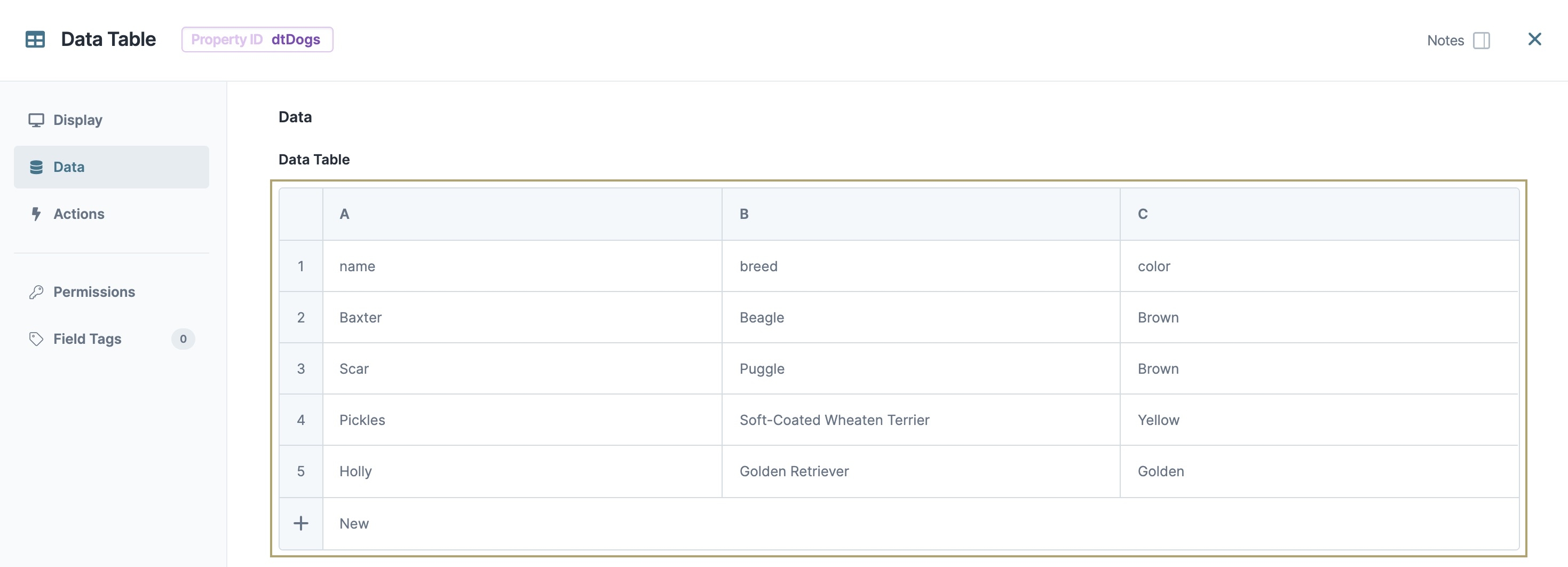
dtDogs.In the data table, enter the following:
#
A
B
C
1
name
breed
color
2
Baxter
Beagle
Brown
3
Scar
Puggle
Brown
4
Pickles
Soft-Coated Wheaten Terrier
Yellow
5
Holly
Golden Retriever
Golden
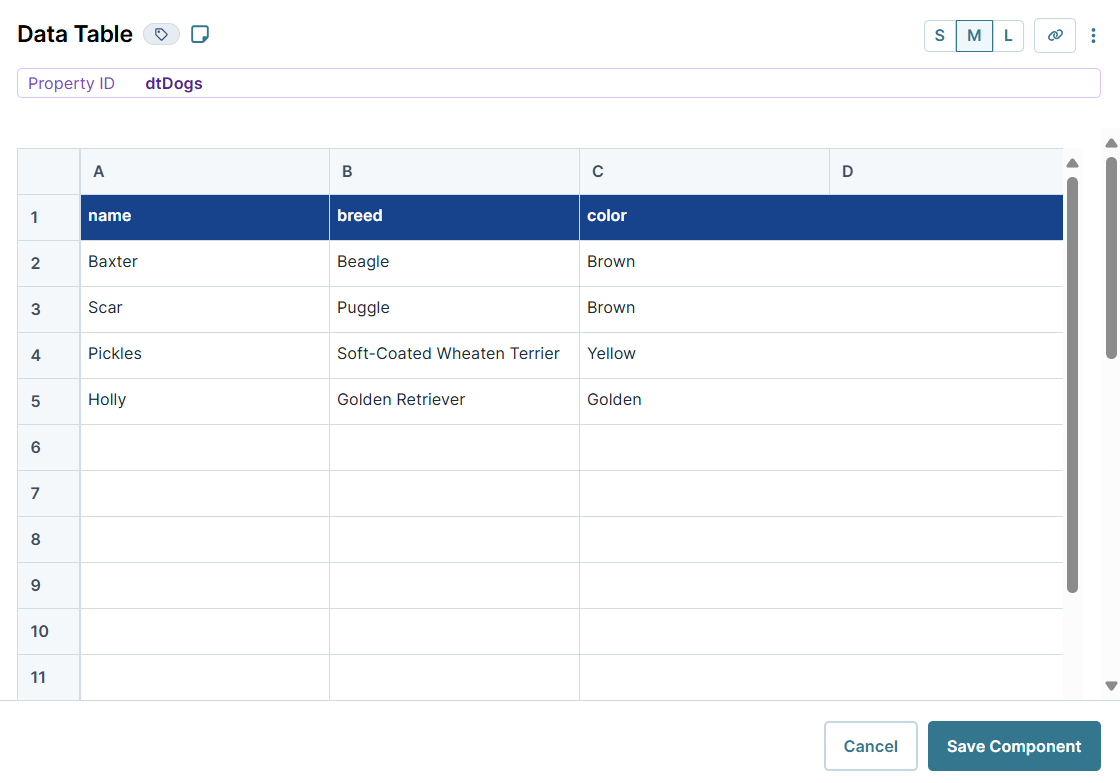
Click Save Component.
Configure the Hidden Component
Next, configure a Hidden component to store the Data Workflow's output data.
Drag and drop a Hidden component onto your canvas, placing it below your dtDogs Data Table component.
In the Property ID and Label Text fields, enter
dwfOutput.Click Save Component.
Configure the Data Workflow Component
Now, add a Data Workflow component to process the data.
Drag and drop a Data Workflow component onto your canvas, placing it between your dtDogs Data Table and dwfOutput Hidden components.
In the Property ID and Canvas Label Text fields, enter
dwfDogs.
Configure the Input Operator
Drag and drop an Input operator onto your Data Workflow canvas.
Configure the operator's Info window as follows:
Info
Category
Input
Component
dtDogs
Required
Yes
Source
Default
Configure the Output Operator
Drag and drop an Output operator onto your Data Workflow canvas.
Configure the operator's Info window as follows:
Info
Category
Output
Component
dwfOutput
Action
Value
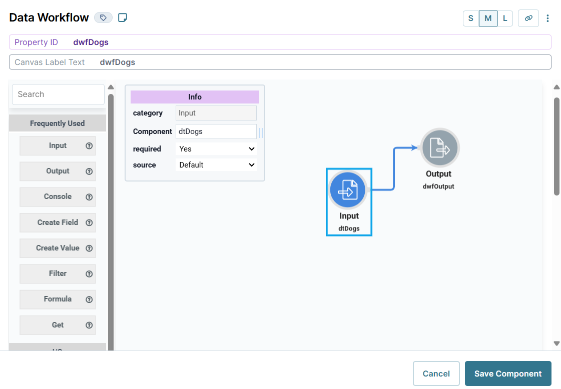
Connect the output port (right) of the Input operator to the input port (left) of the Output operator.
Click Save Component.
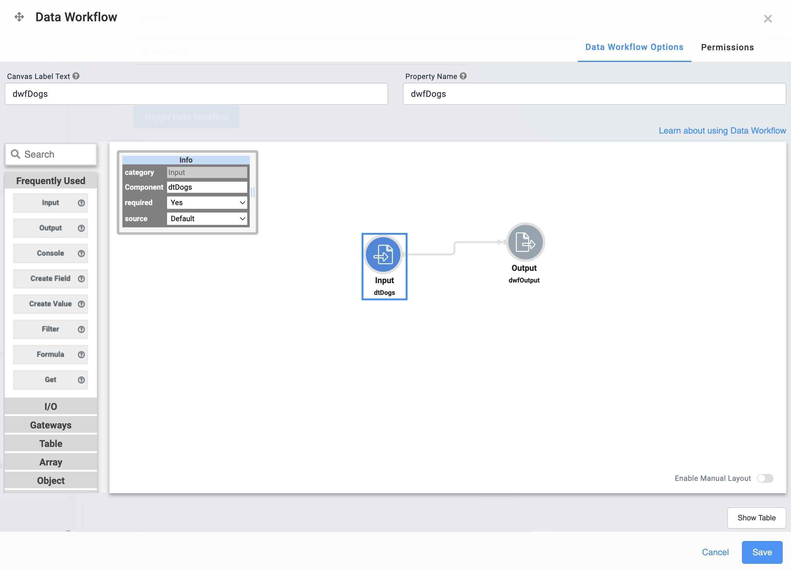
Here's how the completed Data Workflow looks:
Configure the Button Component
Lastly, add a Button component to trigger the Data Workflow.
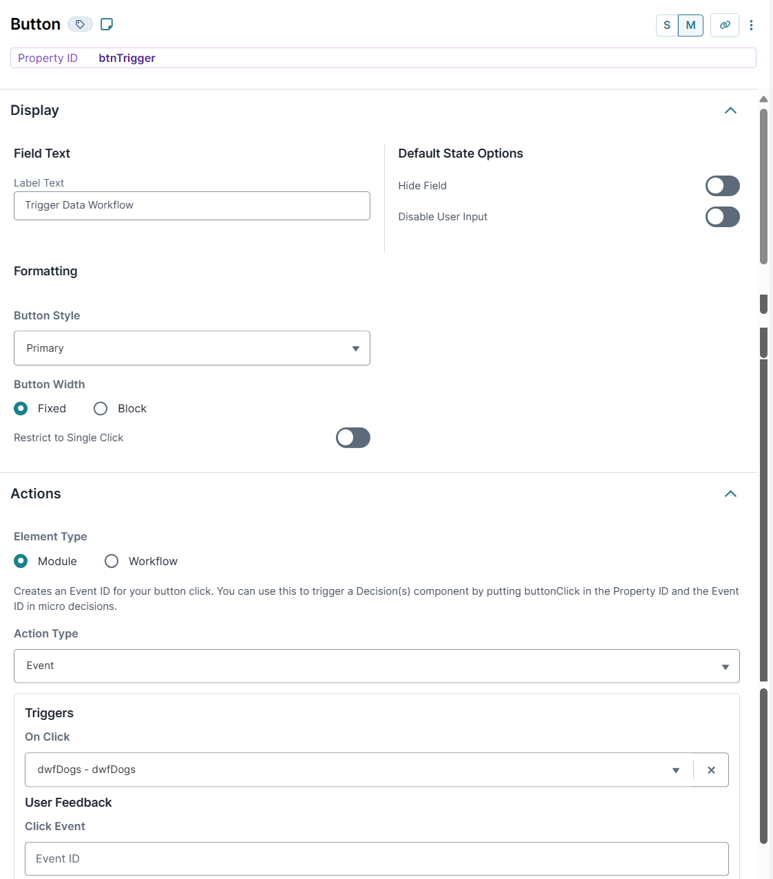
Drag and drop a Button component onto your canvas, placing it below your dwfDogsData Workflow component.
In the Property ID field, enter
btnTrigger.In the Label Text field, enter
Trigger Data Workflow.From the Action Type drop-down, select Event.
From the On Click drop-down, select dwfDogs.
Click Save Component.
Save your module.
Your completed module looks like the following:

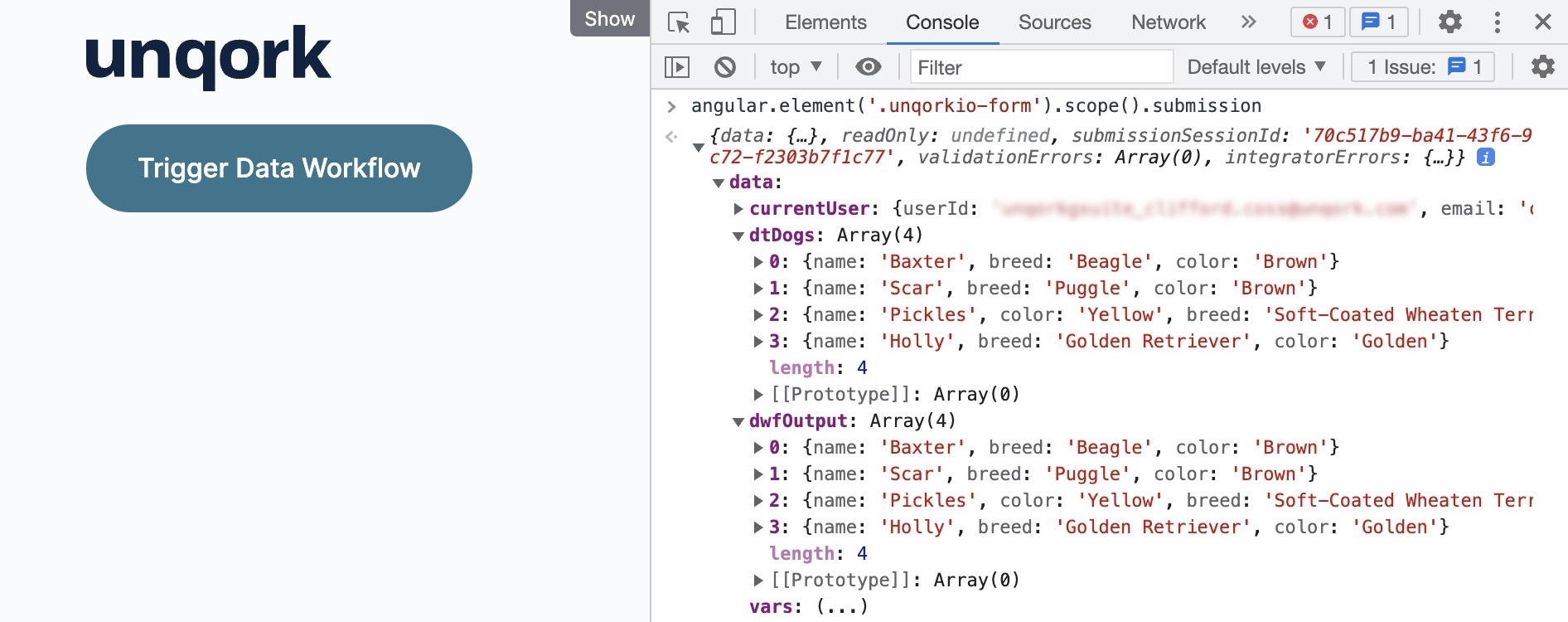
Preview your module in Express View. Open the DevTools Console and click Trigger Data Workflow. Run the Angular command and expand the data: tab. You can see the dog data in both the dtDogs (your Data Workflow input) array and the dwfOutput (your Data Workflow output) array.
The Input operator serves as the beginning of your Data Workflow, with a single output port. The Input operator lets you retrieve data from a component and bring it into your Data Workflow.
You can use an Input operator to:
Bring in end-user data from another component in your module.
Set dynamic variables in a Data Table component by using the Binded Table setting.
You can use an Input operator to easily reference an end-user's name in a Text Field component. Or, retrieve an email address from an Email component. Then, use other Data Workflow operators to process those pieces of data.
You'll find the Input operator under the I/O group to the left of the Data Workflow canvas.
About the Info Window
And here's a breakdown of each setting in the Info window:
Setting | Description |
|---|---|
Category | Grayed out and non-adjustable setting indicating the operation type. |
Component | A component storing the data you'll bring into your Data Workflow. Here, you'll see a drop-down containing every component's Property ID in your module. Select the component you want to reference from the drop-down list. After selecting a Property ID, the Component field remains editable. You can type in the Component field to define a property path or target fields nested under the selected Property ID. Your selection displays as the operator's label.
|
Required | When set to Yes, your Data Workflow does not begin until a value is present in the chosen component. So, if you selected a Text Field component, the Data Workflow does not run if the Text Field component is empty. When set to No, the Data Workflow runs with or without a value in the chosen component. By default, the Required drop-down is set to Yes. |
Source | Sets the type of data the source component contains. To draw the exact value of the component selected earlier, you'll choose Default. If you work with dynamic values, you'll choose Binded Table. Doing so is useful when using dynamic values in a Data Table component. If you have dynamic values in a Data Table component, select the Data Table component under the Component setting. Then, select Binded Table as your Source. To see an example of configuring a Binded Table, read our Binded Table Use Case article. By default, the Source drop-down is set to Default. |
Manually-Defined Inputs
In some cases, you might want to reference an input that does not display in the Info window's Component drop-down. For example, the Property ID of components in imported modules.
To reference an input that does not display in the Component drop-down:
Select your Input operator.
In the operator's Info window, select any Property ID from the Component drop-down. The Property ID displays below the Input operator as a label.
On the Data Workflow canvas, double-click the Input operator's label. The field becomes editable.
Enter the Property ID to use as an input.
Click outside the field to save your manually-defined input.
Reopening the Data Workflow component might not display your manually-defined input on the canvas, though the connection still exists. Consider using the Data Workflow component's Comment field to note the input.
Adding an Input Operator
To demonstrate an Input operator, you'll use it to retrieve data from a Data Table component.
These instructions assume you have a new module open, saved, and with a title.
Configure the Data Table Component
First, configure a Data Table component to store some sample data.
In the Module Builder, drag and drop a Data Table component onto your canvas.
In the Property ID and Canvas Label Text fields, enter
dtDogs.To the left of the component's configuration window, click Data.
In the data table, enter the following:
#
A
B
C
1
name
breed
color
2
Baxter
Beagle
Brown
3
Scar
Puggle
Brown
4
Pickles
Soft-Coated Wheaten Terrier
Yellow
5
Holly
Golden Retriever
Golden
Click Save & Close.
Configure the Hidden Component
Next, configure a Hidden component to store the Data Workflow's output data.
Drag and drop a Hidden component onto your canvas, placing it below your dtDogs Data Table component.
In the Property ID and Canvas Label Text fields, enter
dwfOutput.Click Save & Close.
Configure the Data Workflow Component
Now, add a Data Workflow component to process the data.
Drag and drop a Data Workflow component onto your canvas, placing it between your dtDogs Data Table and dwfOutput Hidden components.
In the Canvas Label Text and Property Name fields, enter
dwfDogs.
Configure the Input Operator
Drag and drop an Input operator onto your Data Workflow canvas.
Configure the operator's Info window as follows:
Setting
Value
Category
Input
Component
dtDogs
Required
Yes
Source
Default
Configure the Output Operator
Drag and drop an Output operator onto your Data Workflow canvas.
Configure the operator's Info window as follows:
Setting
Value
Category
Output
Component
dwfOutput
Action
value
Connect the output port (right) of the Input operator to the input port (left) of the Output operator.
Click Save.
Here's how the completed Data Workflow looks:
Configure the Button Component
Lastly, add a Button component to trigger the Data Workflow.
Drag and drop a Button component onto your canvas, placing it below your dwfDogs Data Workflow component.
In the Property ID field, enter
btnTrigger.In the Label Text field, enter
Trigger Data Workflow.To the left of the component's configuration window, click Actions.
Set the Action Type as Event.
From the On Click drop-down, select dwfDogs.
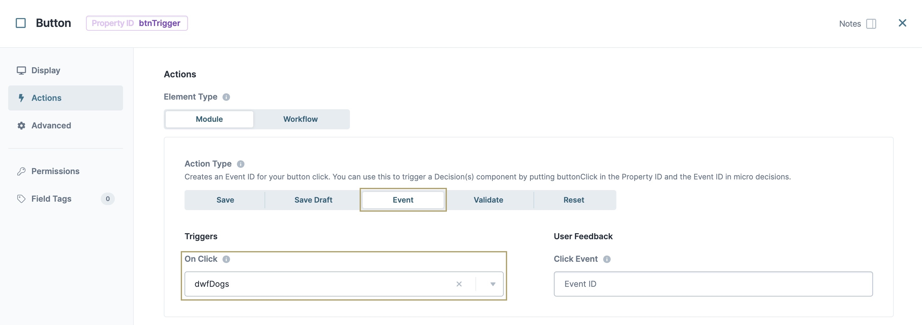
Click Save & Close.
Save your module.
Your completed module looks like the following:
.jpg)
Preview your module in Express View. Open the DevTools Console and click Trigger Data Workflow. Run the Angular command and expand the data: tab. You can see the dog data in both the dtDogs (your Data Workflow input) array and the dwfOutput (your Data Workflow output) array.
.jpg)