The Uniform Grid component is a highly customizable grid component that you can use to fine-tune the data entry, viewing, and editing experience for end-users. At its foundation, the Uniform Grid component acts as a container for nesting other Unqork components. In Express View, those nested components render in self-contained rows. The Uniform Grid component not only supports nesting simple input fields but also creates row-level logic based on end-user’s inputs. For example, displaying or hiding fields in the row based on input to another component in that row.
With its traditional table-based layout, the Uniform Grid component is well-suited for inline editing with data in full view. It has flexible styling options and customizable interactions. For example, customizing how end-users can invoke the edit state of the grid or a selected row. The Uniform Grid component works well when end-users need a rich data entry experience, without a set number of rows. For example, listing guests for a booking or adding beneficiaries to an insurance policy.
The Uniform Grid component supports nesting in most Primary Fields, Secondary Fields, and the following Data & Event Processing components used for logic:
Calculator, Decisions, Initializer, Plug-In, and Data Workflow components.
Nesting other components like the Dropdown and Multi-Select Dropdown components can result in unexpected behavior.
While you can easily customize your Uniform Grid component’s appearance, the Uniform Grid component is best for simple table layout is appropriate. For more advanced layout options, try the Freeform Grid component.
.gif)
You'll find the Uniform Grid component under the Display & Layout group to the left of the Module Builder.
About the Configuration Window
Learn more about the Uniform Grid component’s settings by clicking on the tabs below:
General
Setting | Description |
|---|---|
Property ID | A Property ID is the unique field ID used by Unqork to track and link components in your module. The Property ID is how the software identifies your component. Using Property IDs lets you link components, creating logic-based configurations and API calls. Property IDs must use camel case (stylized as camelCase) without spaces or punctuation. It's best practice for Uniform Grid components to have uniformGrid as a prefix in the Property ID. |
Display Panel
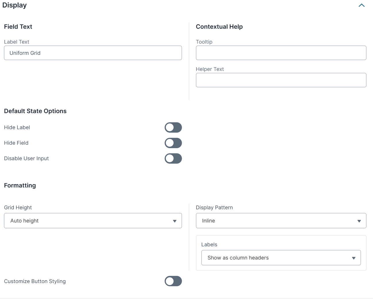
Setting | Description |
|---|---|
Label Text | The heading of the grid. The end-user sees this title at the top of the grid in Express View. To hide the label in Express View, set Hide Label to |
Tooltip | A short hint that displays when an end-user positions their cursor over the The tooltip displays next to the title. |
Helper Text | A quick tip describing the expected inputs or how to use the grid. The Helper Text displays below the Uniform Grid component's Title in Express View. |
Hide Label | Setting Hide Label to By default, Hide Label is set to |
Hide Field | Displays or hides the component from view. Setting Hide Field to By default, Hide Field is set to |
Disable User Input | Disables the end-user from editing the field. |
Grid Height | Select how to set the maximum height of the grid. The options include:
|
Display Pattern | Defines the display pattern for components nested in the Uniform Grid component. The two supported options are Inline and Simple Loop. By default, Display Pattern is set to Inline. |
Labels | When the Display Pattern is selected as Inline, the Labels field is visible. Select where nested components' labels display in the Uniform Grid component.
|
Customize Button Styling | When set to
To customize each button, edit the fields displayed below the corresponding button's header. |
Button Label Text | When the Customize Button Styling field is set to Each button has the following default Label Text:
|
Button Style | Sets the visual appearance of the button. Options include Primary, Secondary, Success, Danger, Warning, Info, Light, Dark, and Link. The Button Style only affects the Button component's appearance and does not affect its function. |
Custom CSS Class | Enter a Custom CSS Class to apply to the button. When you update the CSS styling, it applies to all elements that reference this custom class name. |
Left/Right Icon | Use these fields to add icons (glyphs) to the left or right of your button's Label Text. For example, entering glyphicon glyphicon-pencil adds an icon of a pencil to your button.
|
Actions Panel
Triggers Group
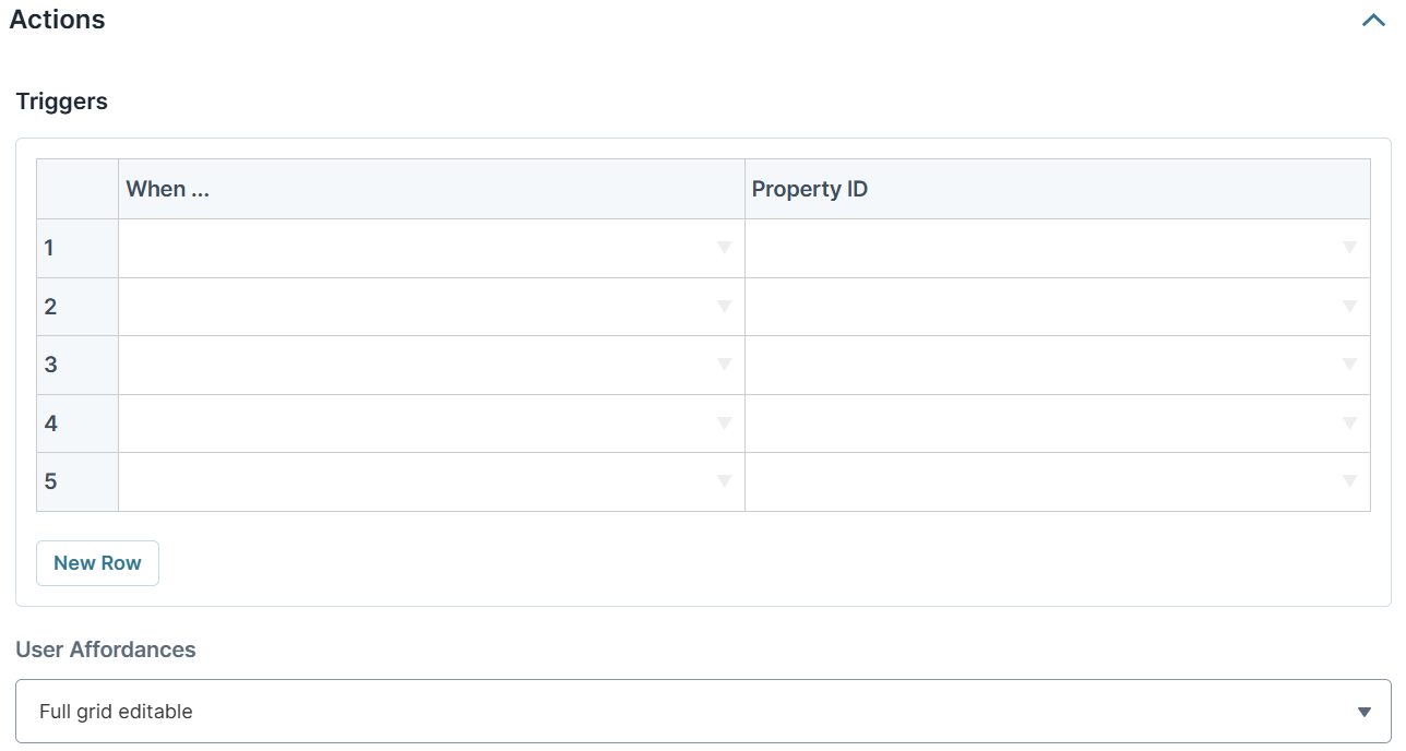
The Uniform Grid component supports creating multiple triggers directly in the component's configuration window. You can choose from four possible triggering events for each trigger.
You can also create several triggers that have the same triggering event.
Setting | Description |
|---|---|
When... | Select an action to watch for to fire the trigger. The drop-down's options are:
|
Property ID | Enter the Property ID of the component to trigger when the specified When... action occurs. |
User Affordances Group
These settings determine how your end-user can interact with the grid and its rows. Select how and where the end-user invokes edit state for a row. From the edit state, end-users can edit and delete rows.
There are four options:
Full Grid Editable: All rows of the grid retain the edit state at all times.
Full Grid Editable via Global Edit Button: End-users control the edit state for all rows in the grid using a component-level Edit button. Clicking Edit makes all rows editable. Clicking Done makes all rows view-only.
Selected Entry Editable: End-users control the edit state at the individual row level by selecting the row. Selecting a row makes the selected row editable. Clicking Done makes the selected row view-only.
Entry Editable via Edit Button: End-users control the edit state at the individual row level, using a row-level Edit button. Clicking Edit makes the selected row editable. Clicking Done makes the selected row view-only.
Validation Panel

Set Number of Allowed Rows Group
Setting | Description |
|---|---|
Invalid Error | An error message that displays when the grid has any validation errors. |
Minimum Number of Allowed Rows | Sets the minimum number of allowed rows in the grid. |
Min Length Error Message | An error message displays when the grid does not meet the minimum number of rows set. |
Maximum Number of Allowed Rows | Sets the maximum number of allowed rows in the grid.
|
Max Length Error Message | An error message displays when the grid exceeds the maximum number of rows set. |
Adding a Uniform Grid Component
In this configuration, you'll use a Uniform Grid component to let end-users list guests attending an event. The Uniform Grid component is useful for simple data entry scenarios like this example, especially when you don't know how many rows your end-user needs. Nesting input fields in the Uniform Grid component makes it easy to collect information. To see how you can use logic components inside the Uniform Grid component, the configuration includes a Decisions component that displays hidden fields based on the end-user's input.
This simple configuration focuses on how to use the Uniform Grid component for basic information collection. You can add additional components and leverage features like validation and triggers for more complex functionality.
Configure the Uniform Grid Component
For this configuration, the Uniform Grid component uses the default settings.
In the Module Builder, drag and drop a Uniform Grid component onto the canvas.
In the Property ID field, enter
uniformGridRsvp.In the Label Text field, enter
Guest RSVP.In the Helper Text field, enter
Please list all guests who will attend the event.From the Labels drop-down, select Show Inline.
Set Customize Button Styling to
.png) (ON).
(ON).Under Add Row Button, in the Button Label Text field, enter
Add Guest.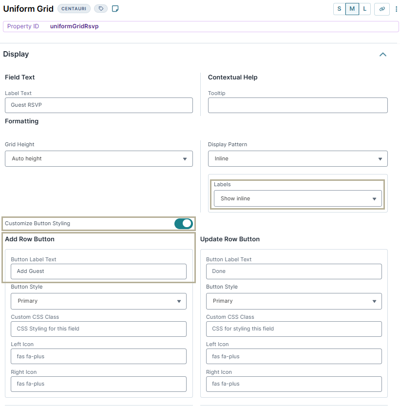
Click Save Component.
Configure the Text Field Components
Next, configure Text Field components to collect basic information about each guest.
Drag and drop two Text Field components inside the
uniformGridRsvpUniform Grid component.In the Property ID and Label Text fields, enter the following for each component:
#
Property ID
Label Text
1
firstName
First Name
2
lastName
Last Name
Click Save Component for each component as you add it.
Configure the Number Component
Drag and drop a Number component inside the
uniformGridRsvpUniform Grid component, below thelastNameText Field component.In the Property ID field, enter
age.In the Label Text field, enter
Age.Click Save Component.
Configure the Text Field Component
The third Text Field component is a read-only field, used to display a message. You'll use a Decisions component to set when this Text Field displays.
Drag and drop a Text Field component inside the
uniformGridRsvpUniform Grid component, below theageNumber component.In the Property ID field, enter
ageNotice.In the Label Text field, enter
Notice.Set Display as Text to
.png) (ON).
(ON).Set Hide Field to (ON).
Click Save & Close.
Configure the Single Checkbox Component
Drag and drop a Single Checkbox component inside the
uniformGridRsvpUniform Grid component, below theageNoticeText Field component.In the Property ID field, enter
minorGuest.In the Label Text field, enter
I understand that minors must be accompanied by an adult at all times.Set Hide Field to
.png) (ON).
(ON).Click Save Component.
Configure the Decisions Component
The Decisions component displays the ageNotice Text Field and the minorGuest Single Checkbox component when certain criteria are met. In this case, when the end-user lists a guest who is under the age of 18, the ageNotice Text Field displays a message noting the name of the underage guest. Then, the end-user must confirm that they understand that an adult must accompany all minors during the event.
Drag and drop a Decisions component inside the
uniformGridRsvpUniform Grid component, below theminorGuestSingle Checkbox component.In the Property ID and Canvas Label Text fields, enter
ruleAdultCheck.From the Trigger Type drop-down, select Watch.
Set the Execution Type to Merge. Because the same Property ID appears twice in the Outputs table, a Merge execution is necessary to apply both associated outputs.
In the Inputs table, enter the following:
#
Property ID
Alias
Type
Required
1
age
A
range
Yes
2
firstName
B
exact
Yes
3
lastName
C
exact
Yes
In the Outputs table, enter the following:
#
Property ID
Type
1
ageNotice
visible
2
minorGuest
requiredAndVisible
3
ageNotice
value
In the Conditionals table, enter the following:
#
age_min
age_max
firstName
lastName
ageNotice_visible
minorGuest_requiredAndVisible
ageNotice_value
1
0
17
yes
yes
=CONCATENATE(B, " ", C, " is a minor. Please answer the following question.")
2
18
no
no
By using a concatenation formula that references the
firstNameandlastNameProperty IDs, theageNoticemessage can include the guest's name.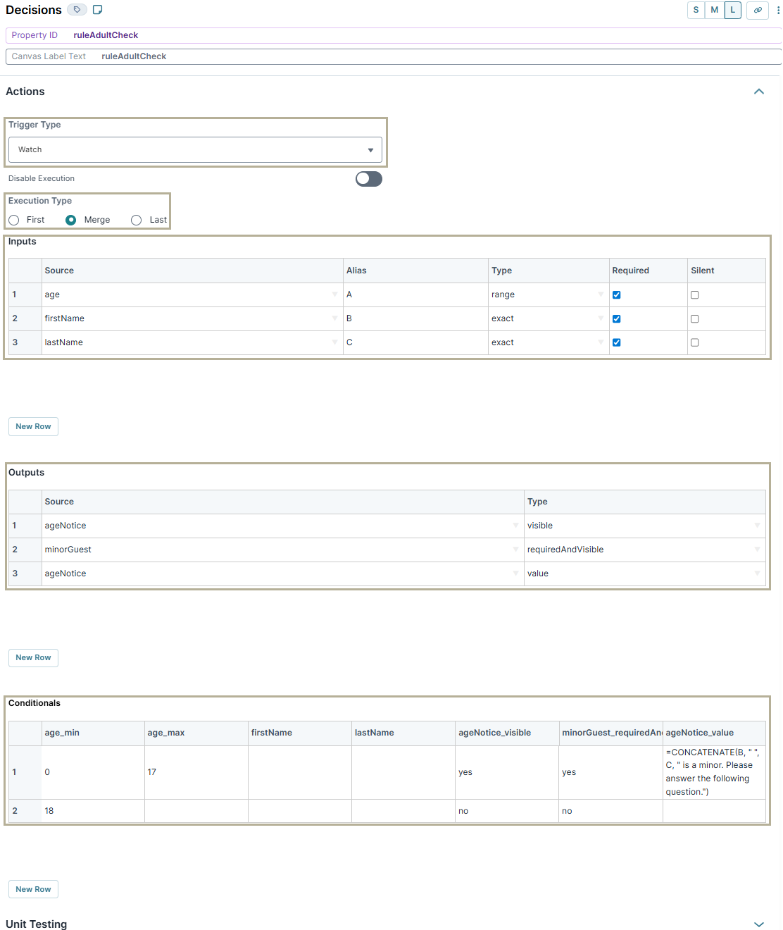
Click Save Component.
Save your module.
Here's how the completed configuration looks in the Module Builder:
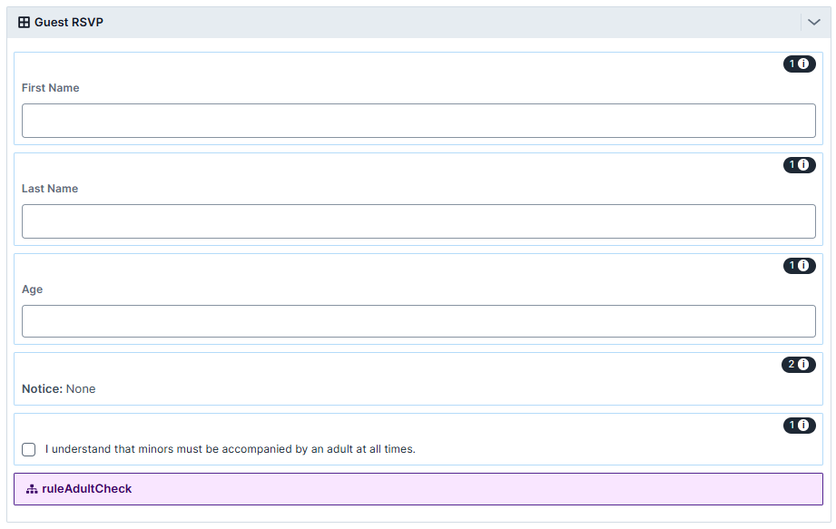
Preview your module in Express View. The completed configuration works like the following:
The following image shows an example of how two rows of data entered in a Uniform Grid component look in the DevTools Console:
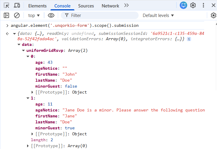
Structure of a Uniform Grid Component's Data
Data entered in the Uniform Grid component is stored as an array of objects under a single key. The top-level key is the Uniform Grid component's Property ID. Each row added to the Uniform Grid component becomes a new object in the array of row objects. In each row object, row-specific values are stored as explicit key/value pairs, where the keys are the Property IDs of the components nested in the Uniform Grid component. The values are those entered by the end-user in that row. Depending on the component type, values are stored as different data types and data structures.
General

Setting | Description |
|---|---|
Property ID | A Property ID is the unique field ID used by Unqork to track and link components in your module. The Property ID is how the software identifies your component. Using Property IDs lets you link components, creating logic-based configurations and API calls. Property IDs must use camel case (stylized as camelCase) without spaces or punctuation. It's best practice for Uniform Grid components to have uniformGrid as a prefix in the Property ID. |
Field Tags | Assign one-word labels to help organize, identify, and group the components in your application. Consider an example from the API Specification Snippet: Field Tags are applied to Hidden components in the Field Tags act as a type of Property ID group and let you group components for configuration purposes. Field Tags let you target two or more components using a simple logic component. For example, add the Field Tag Save your Field Tags by pressing Enter (Return) or adding a comma after each entry. |
Settings Tab | Select this tab to display the component's Display, Data, Actions, and Validation settings panels, as applicable. |
Permissions Tab | Select this tab to see the RBAC settings of the component. |
Notes Tab | Select this tab to display the component's Notes area. You can use notes to keep your teammates informed. The Notes editor offers a semi-WYSIWYG (What You See is What You Get) content editor. Built to look like a word processor, this editor lets you create, edit, and format your notes. Notes save when saving the component. |
Cancel | Click this button to undo any unsaved configuration changes and return to the Module Builder canvas. |
Save | Click this button to save all setting configuration changes and return to the Module Builder canvas. |
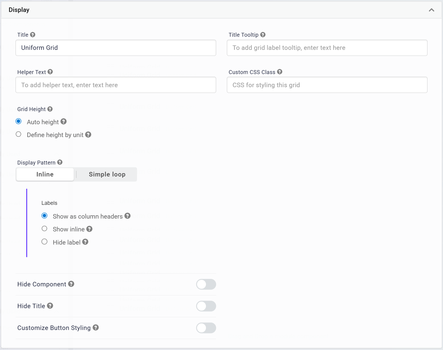
Display Panel
Setting | Description |
|---|---|
Title | The heading of the grid. The end-user sees this title at the top of the grid in Express View. It’s best practice to always include a title. To hide the title in Express View, set the Hide Title toggle to |
Title Tooltip | A short hint that displays when an end-user positions their cursor over the The tooltip displays next to the title. |
Helper Text | A quick tip describing the expected inputs or how to use the grid. The Helper Text displays below the Uniform Grid component's Title in Express View. |
Custom CSS Class | Enter a Custom CSS Class to apply to your component. Custom CSS lets you maintain a consistent look and feel when the field or element is part of a template or multiple modules. Updated CSS styling applies to all components that reference this custom class name. |
Grid Height | Select how to set the maximum height of the grid. The options are:
|
Display Pattern | Defines the display pattern for components nested in the Uniform Grid component. It supports two options, Inline and Simple Loop. By default, Display Pattern is set to Inline. |
Labels | When the Display Pattern is selected as Inline, the Labels field is visible. Select where nested components' labels display in the Uniform Grid.
|
Hide Component | Displays or hides the component from view. Setting Hide Field to By default, Hide Field is set to |
Hide Title | Setting the Hide Title toggle to By default, Hide Title is set to |
Customize Button Styling | When set to
To customize each button, edit the fields displayed below the corresponding button's header. |
Button Label Text | When the Customize Button Styling field is set to Each button has the following default Label Text:
|
Button Style | Sets the visual appearance of the button. Options include: Primary, Secondary, Success, Danger, Warning, Info, Light, Dark, and Link. The Button Style only affects the Button component's appearance and does not affect its function. |
Custom CSS Class | Enter a Custom CSS Class to apply to the button. When you update the CSS styling, it applies to all elements that reference this custom class name. |
Left/Right Icon | Use these fields to add icons (glyphs) to the left or right of your button's Label Text. For example, entering glyphicon glyphicon-pencil adds an icon of a pencil to your button.
|
Actions Panel
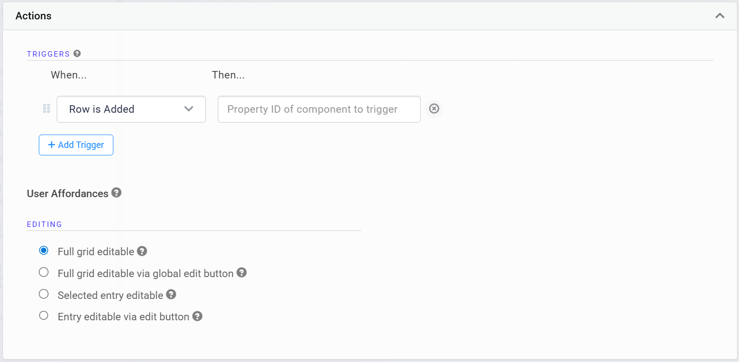
Triggers Group
The Uniform Grid component supports creating multiple triggers directly in the component's configuration window. You can choose from four possible triggering events for each trigger. You can also create several triggers that have the same triggering event.
Setting | Description |
|---|---|
+ Add Trigger | Click + Add Trigger to create a new trigger. Triggers let you create if/then condition rules to trigger components when a specified action occurs. |
When... | Select an action to watch for to fire the trigger. The drop-down's options are:
|
Then... | Enter the Property ID of the component to trigger when the specified When... action occurs. |
User Affordances Group
These settings determine how your end-user can interact with the grid and its rows. Select how and where the end-user invokes edit state for a row. From the edit state, end-users can edit and delete rows. There are four options:
Full Grid Editable: All rows of the grid retain the edit state at all times.
Full Grid Editable via Global Edit Button: End-users control the edit state for all rows in the grid using a component-level Edit button. Clicking Edit makes all rows editable. Clicking Done makes all rows view-only.
Selected Entry Editable: End-users control the edit state at the individual row level by selecting the row. Selecting a row makes the selected row editable. Clicking Done makes the selected row view-only.
Entry Editable via Edit Button: End-users control the edit state at the individual row level, using a row-level Edit button. Clicking Edit makes the selected row editable. Clicking Done makes the selected row view-only.
Validation Panel
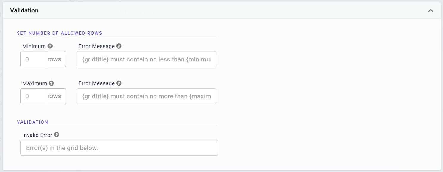
Set Number of Allowed Rows Group
Setting | Description |
|---|---|
Minimum | Sets the minimum number of allowed rows in the grid. |
Minimum Error Message | An error message displays when the grid does not meet the minimum number of rows set. |
Maximum | Sets the maximum number of allowed rows in the grid.
|
Maximum Error Message | An error message displays when the grid exceeds the maximum number of rows set. |
Validation
Setting | Description |
|---|---|
Invalid Error | An error message that displays when the grid has any validation errors. |
Adding a Uniform Grid Component
In this configuration, you'll use a Uniform Grid component to let end-users list guests attending an event. The Uniform Grid component is useful for simple data entry scenarios like this example, especially when you don't know how many rows your end-user needs. Nesting input fields in the Uniform Grid component makes it easy to collect information. To see how you can use logic components inside the Uniform Grid component, the configuration includes a Decisions component that displays hidden fields based on the end-user's input.
This simple configuration focuses on how to use the Uniform Grid component for basic information collection. You can add additional components and leverage features like validation and triggers for more complex functionality.
Configure the Uniform Grid Component
For this configuration, the Uniform Grid component uses the default settings.
In the Module Builder, drag and drop a Uniform Grid component onto the canvas.
In the Property ID field, enter
uniformGridRsvp.In the Title field, enter
Guest RSVP.In the Helper Text field, enter
Please list all guests who will attend the event.Under Labels, select the Show inline radio button.
Set Customize Button Styling to
 (ON).
(ON).Under 'Add Row' Button, in the Button Label Text field, enter
Add Guest.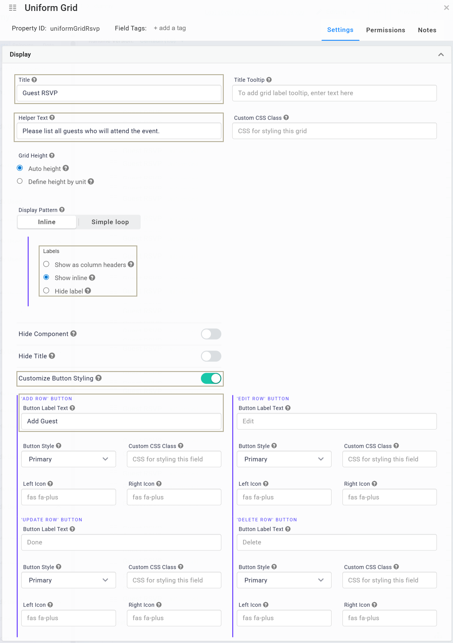
Click Save.
Configure the Text Field Components
Next, configure two Text Field components to collect basic information about each guest.
Drag and drop two Text Field components inside the
uniformGridRsvpUniform Grid component.In the Property ID and Label Text fields, enter the following for each component:
#
Property ID
Label Text
1
firstName
First Name
2
lastName
Last Name
Click Save & Close for each component as you add it.
Configure the Number Component
Drag and drop a Number component inside the
uniformGridRsvpUniform Grid component, below thelastNameText Field component.In the Property ID field, enter
age.In the Label Text field, enter
Age.Click Save & Close.
Configure the Text Field Component
The third Text Field component is a read-only field, used to display a message. You'll use a Decisions component to set when this Text Field displays.
Drag and drop a Text Field component inside the
uniformGridRsvpUniform Grid component, below theageNumber component.In the Property ID field, enter
ageNotice.In the Label Text field, enter
Notice.Set Display as Text to
 (ON).
(ON).Set Hide Field to
 (ON).
(ON).Click Save & Close.
Configure the Single Checkbox Component
Drag and drop a Single Checkbox component inside the
uniformGridRsvpUniform Grid component, below theageNoticeText Field component.In the Property ID field, enter
minorGuest.In the Label Text field, enter
I understand that minors must be accompanied by an adult at all times.Set Hide Field to
 (ON).
(ON).Click Save & Close.
Configure the Decisions Component
The Decisions component displays the ageNotice Text Field and the minorGuest Single Checkbox component when certain criteria are met. In this case, when the end-user lists a guest who is under the age of 18, the ageNotice Text Field displays a message noting the name of the underage guest. Then, the end-user must confirm that they understand that an adult must accompany all minors during the event.
Drag and drop a Decisions component inside the
uniformGridRsvpUniform Grid component, below theminorGuestSingle Checkbox component.In the Property ID and Canvas Label Text fields, enter
ruleAdultCheck.Set the Trigger Type to Watch.
Set the Execution Type to Merge. Because the same Property ID appears twice in the Outputs table, a Merge execution is necessary to apply both associated outputs.
In the Inputs table, enter the following:
Property ID
Alias
Type
Required
age
A
range
Yes
firstName
B
exact
Yes
lastName
C
exact
Yes
In the Outputs table, enter the following:
Property ID
Type
ageNotice
visible
minorGuest
requiredAndVisible
ageNotice
value
In the Micro Decisions table, enter the following:
age_min
age_max
firstName
lastName
ageNotice_visible
minorGuest_requiredAndVisible
ageNotice_value
0
17
yes
yes
=CONCATENATE(B, " ", C, " is a minor. Please answer the following question.")
18
no
no
By using a concatenation formula that references the
firstNameandlastNameProperty IDs, theageNoticemessage can include the guest's name.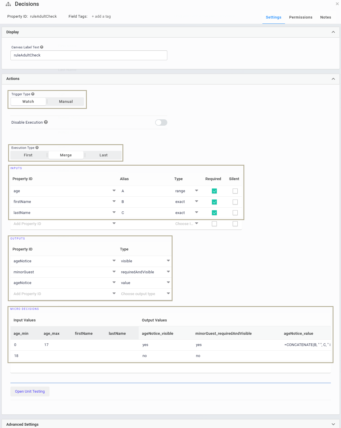
Click Save.
Save your module.
Here's how the completed configuration looks in the Module Builder:
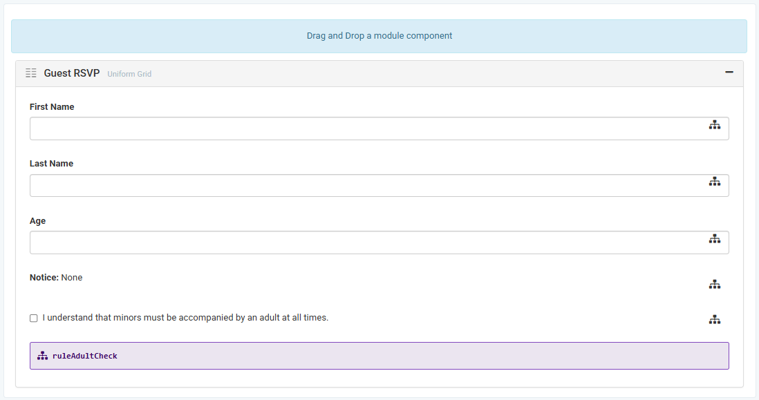
Preview your module in Express View. The completed configuration works like the following:
The following image shows an example of how two rows of data entered in a Uniform Grid component look in the DevTools Console:

Structure of a Uniform Grid Component's Data
Data entered in the Uniform Grid component is stored as an array of objects under a single key. The top-level key is the Uniform Grid component's Property ID. Each row added to the Uniform Grid component becomes a new object in the array of row objects. In each row object, row-specific values are stored as explicit key/value pairs, where the keys are the Property IDs of the components nested in the Uniform Grid component. The values are those entered by the end-user in that row. Depending on the component type, values are stored as different data types and data structures.

