At its foundation, the Freeform Grid component acts as a container for nesting other Unqork components. In Express View, those nested components render in self-contained rows of the grid, making it a flexible and customizable grid component for creating complex data and displaying interactions.
In addition to nesting simple input fields, you can also use the Freeform Grid component to nest logic components inside the grid, creating row-level logic regardless whether your end-users inputs data inside or outside the grid. It also lets you nest components in other nested components, like displaying a fully-configured Uniform Grid component in each row of the Freeform Grid component.
The Freeform Grid component also provides flexible layout and styling options. These layout options let you create a custom viewing and editing experience that's ideal for complex data display.
The Freeform Grid component also uses a summary-detail view to display data in Express View, letting you easily convey your information hierarchy.
The summary view is an at-a-glance layout that includes the following options:
Stacked rows
Table
The detail view displays when selecting a row from the summary view. From the detail view, you can explore details and perform actions, like adding, editing, or deleting data.
The detail view includes the following options:
Accordion view
Modal view
Sidebar view
You can mix-and-match most summary and detail views, giving you the flexibility to create custom layouts and complex display logic. For example, your end-user can review information at-a-glance by scrolling through stacked rows. Then, they can select a row to display a modal with more details.
The following video shows three different summary/detail view combinations, applied to the same Freeform Grid component and its data. The only configuration change between each view is the detail view selected. In order: Rows and Sidebar, Rows and Accordion, and Rows and modal.
You can find the component under the Display & Layout group to the left of the Module Builder.
About the Configuration Window
To learn more about general component settings and those that display when a component is associated with Data Models, view our General Component Settings article.
Display Panel
Field Text
Setting | Description |
|---|---|
Label Text | The heading of the grid that displays to the end-user in Express View. To hide the title in Express View, set Hide Label to |
Contextual Help
Setting | Description |
|---|---|
Tooltip | A short hint that displays when an end-user positions their cursor over the |
Helper Text | A quick tip describing the expected value of an input field. Unlike a Tooltip, Helper Text stays visible under the input field and displays on a single line. |
Default State Options
Setting | Description |
|---|---|
Hide Label | Setting Hide Label to By default, this setting is set to |
Hide Field | Displays or hides the component from view. Setting Hide Field to By default, Hide Field is set to |
Formatting
Setting | Description |
|---|---|
Customize Button Styling | When set to
To customize each button, edit the fields displayed below the corresponding button's header. |
Button Label Text | The Button Label Text identifies the purpose of the button before your end-user clicks it. Each button has the following default Label Text:
|
Button Style | Sets the visual appearance of the button. Options include: Primary, Secondary, Success, Danger, Warning, Info, Light, Dark, and Link. The Button Style only affects the Button component's appearance and does not effect its function. |
Custom CSS Class | Enter a Custom CSS Class to apply to the button. When you update the CSS styling, it applies to all elements that reference this custom class name. |
Left/Right Icon | Use these fields to add icons (glyphs) to the left or right of your Button's Label Text. For example, entering glyphicon glyphicon-pencil adds an icon of a pencil to your Button.
|
Summary View
The Summary View table is where you set up the information you want displayed in the grid's summary view. You'll define the grid headings and the values to display under that heading. Click New Row to add a new heading.
The top-to-bottom order of rows in your Summary View table creates the left-to-right order of headings in Express View.
Setting | Description |
|---|---|
Heading | Enter a heading to display in the summary view. |
Property ID | Define the value to display under the heading. You can reference a Property ID in the grid or use a formula that references multiple Property IDs. For example:
|
Customize Summary and Detail View Group
The following settings let you configure the component's summary and detail view options:
Setting | Description |
|---|---|
Choose Summary View | Select which summary view your Freeform Grid component uses:
|
Customize Detail View | Select which detail view your Freeform Grid component uses:
|
Modal Title | Displays when Customize Detail View is set to Enter a title for the detail view modal. |
Sidebar Title | Displays when Customize Detail View is set to Enter a title for the detail view sidebar. |
Actions Panel
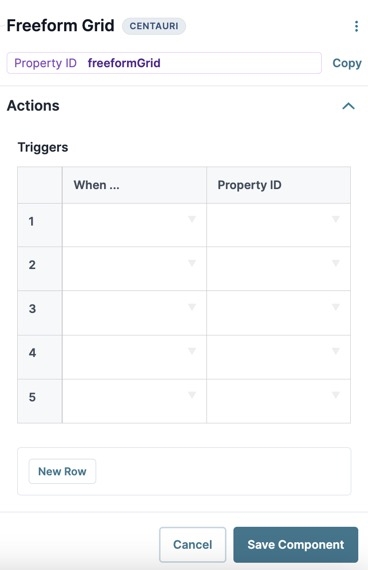
Triggers Group
The Freeform Grid component supports creating multiple triggers directly in the component's configuration window. You can choose from various possible triggering events for each trigger. You can also create several triggers that have the same triggering event.
Setting | Description |
|---|---|
New Row | Click New Row to create a new trigger. Triggers let you create if/then rules to trigger components when a specified action occurs. |
When... | Select an action that, when it occurs, executes the trigger. Actions include the following:
|
Property ID | Enter the Property ID of the component to trigger when the specified When... action occurs. |
Validation Panel
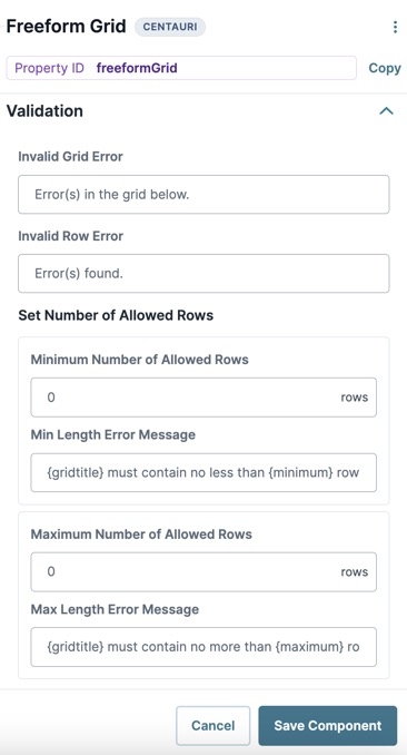
Validation
Setting | Description |
|---|---|
Invalid Grid Error | An error message that displays when the grid has validation errors. |
Invalid Row Error | An error message that displays when a specific row of the grid has validation errors. |
Set Number of Allowed Rows
Setting | Description |
|---|---|
Minimum Number of Allowed Rows | Sets the minimum number of allowed rows in the grid. |
Minimum Length Error Message | An error message that displays when the grid does not meet the minimum number of rows set. |
Maximum Number of Allowed Rows | Sets the maximum number of allowed rows in the grid.When the maximum number of rows is met, the Freeform Grid component's Create New button is disabled and end-users cannot add any new rows.
|
Maximum Length Error Message | An error message that displays when the grid exceeds the maximum number of rows set. |
Advanced Panel
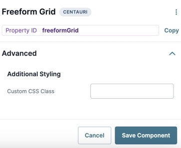
Additional Styling
Setting | Description |
|---|---|
Custom CSS Class | Enter a Custom CSS Class to apply to your component. Custom CSS lets you maintain a consistent look and feel when the field or element is part of a template or multiple modules. Updated CSS styling applies to all components that reference this custom class name. |
Adding a Freeform Grid Component
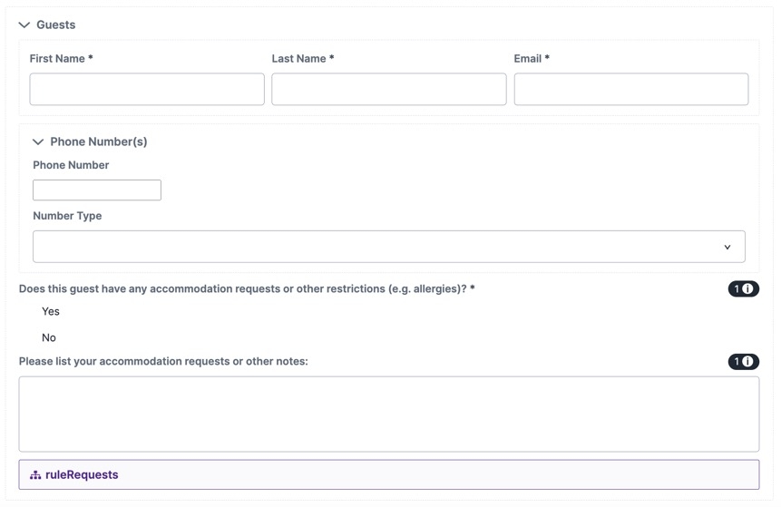
In this configuration, you'll use a Freeform Grid component to let end-users create a list of guests that are joining a reservation. This simple usage of the Freeform Grid component highlights its support for nesting components, including nesting components in other nested components.
This configuration focuses on how to use the Freeform Grid component for basic information collection. To learn about more complex configuration scenarios, including notes on using logic components with the Freeform Grid, visit the Uniform Grid and Freeform Grid: Logic and Referencing Syntax article.
Configure the Freeform Grid Component
For this configuration, the Freeform Grid uses the Rows summary view with a modal detail view. The modal is where the end-user fills out all the fields nested in the Freeform Grid. The summary view then displays the values from some of the nested components, as defined in the Summary View table.
Drag and drop a
.png) Freeform Grid component onto the canvas.
Freeform Grid component onto the canvas.In the Property ID field, enter freeformGridGuests.
In the Label Text field, enter
Guests.In the Helper Text field, enter
Please list all guests who will be on this reservation.Set the Customize Button Styling toggle to
 (ON).
(ON).Complete the Summary View table as follows:
Heading
Property ID
Guest Requests
requests
Email
email
Full Name
=CONCATENATE(firstName, " ", lastName)
By using a concatenation formula that references the firstName and lastName Property IDs, the summary view can include the guest's full name while the submission data stores individual values.
Under Choose Summary View, select
.png) Rows.
Rows.Under Customize Detail View, select
.png) Modal.
Modal.Under 'Add Row' Button, in the Button Label Text field, enter
Add Guest.Click Save Component.
Configure the Columns Component
A Columns component helps structure and organize the module.
Drag and drop a
.png) Columns component onto your canvas, placing it inside the Freeform Grid component.
Columns component onto your canvas, placing it inside the Freeform Grid component.In the Property ID field, enter col1.
Under Formatting, select
 (3 columns).
Click Save Component.
Configure the Text Field Components
The following two Text Field components to collect some basic information about the guest.
Drag and drop two Text Field components onto the canvas, placing one in column 1 and the other in column 2 of the col1
.png) Columns component.
Columns component.Complete the Property ID and Label Text as follows:
Property ID
Label Text
firstName
First Name
lastName
Last Name
Set the Required toggle to
 (ON) for both fields.
Click Save Component for each component as you add it.
Configure the Email Component
Next, you'll use an Email component to collect the guest's email address.
Drag and drop an
.png) Email component onto the canvas, placing it in column 3 of the col1
Email component onto the canvas, placing it in column 3 of the col1 .png) Columns component.
Columns component.In the Property ID field, enter email.
In the Label Text field, enter
Email.Set the Required toggle to
 (ON).
(ON).Click Save Component.
Configure the Uniform Grid Component
This Uniform Grid component collects phone numbers using a nested Phone Number component and Dropdown component. Using a Uniform Grid makes it easy for the end-user to add multiple phone numbers, if needed.
Drag and drop a
.png) Uniform Grid component onto the canvas, placing it below the col1
Uniform Grid component onto the canvas, placing it below the col1 .png) Columns component inside the freeformGridGuests
Columns component inside the freeformGridGuests .png) Freeform Grid component.
Freeform Grid component.In the Property ID field, enter uniformGridPhoneNumber.
In the Label Text field, enter
Phone Number(s).In the Helper Text field, enter
Enter your phone number(s) below:.Set the Customize Button Styling toggle to
 (ON).
(ON).Under 'Add Row' Button, in the Button Label Text field, enter
Add Number.Navigate to the
.png) Uniform Grid component's Validation settings.
Uniform Grid component's Validation settings.In the Invalid Error field, enter
Please add at least one phone number.In the Minimum Number of Allowed Rows field, enter
1.Click Save Component.
Configure the Phone Number Component
Configure a Phone Number component inside the Uniform Grid component to collect guest phone numbers.
Drag and drop a Phone Number component onto the canvas, placing it inside the uniformGridPhoneNumber
.png) Uniform Grid component.
Uniform Grid component.In the Property ID field, enter phoneNumber.
In the Label Text field, enter
Phone Number.Click Save Component.
Configure the Dropdown Component
Configure a Dropdown component inside the Uniform Grid component to let guests identify if the phone number they entered is a home, mobile, or work phone number.
Drag and drop a
.png) Dropdown component onto the canvas, placing it inside the uniformGridPhoneNumber
Dropdown component onto the canvas, placing it inside the uniformGridPhoneNumber .png) Uniform Grid component.
Uniform Grid component.In the Property ID field, enter numberType.
In the Label Text field, enter
Number Type.Complete the Values table as follows:
Label
Value
1
Mobile
mobile
2
Home
home
3
Work
work
Click Save Component.
Configure the Radio Buttons Component
The next three components, the Radio Buttons, Text Area, and Decisions components, work together to form a specific functionality. Based on the answer to the Radio Buttons component, the Decisions component either makes the hidden Text Area component visible or it remains hidden.
Drag and drop a Radio Buttons component onto the canvas, placing it inside the freeformGridGuests
.png) Freeform Grid component and below the uniformGridPhoneNumber
Freeform Grid component and below the uniformGridPhoneNumber .png) Uniform Grid component.
Uniform Grid component.In the Property ID field, enter requests.
In the Label Text field, enter
Does this guest have any accommodation requests or other restrictions (e.g. allergies)?.Complete the Values table as follows:
Label
Value
1
Yes
Yes
2
No
No
Set the Required toggle to
 (ON).
(ON).Click Save Component.
Configure the Text Area Component
Based on the radio-button choice the guest makes, this Text Area component becomes visible to add further information.
Drag and drop a
.png) Text Area component onto the canvas, placing it below the requests Radio Buttons component.
Text Area component onto the canvas, placing it below the requests Radio Buttons component.In the Property ID field, enter guestNotes.
In the Label Text field, enter
Please list your accommodation requests or other notes:.Set the Hide Field toggle to
 (ON).
(ON).Click Save Component.
Configure the Decisions Component
Lastly, you'll configure a Decisions component with the following if/then logic:
If the end-user selects Yes from the requests Radio Buttons component, then make the guestNotes
.png) Text Area component visible.
Text Area component visible.If the end-user selects No, then keep the guestNotes
.png) Text Area component hidden.
Text Area component hidden.
Drag and drop a Decisions component onto the canvas, placing it below the guestNotes
.png) Text Area component.
Text Area component.In the Property ID and Canvas Label Text fields, enter
ruleRequests.Set the Trigger Type to Watch.
Complete the Inputs table as follows:
Source
Alias
Type
Required
1
requests
exact
(checked)
Complete the Outputs table as follows:
Source
Type
1
guestNotes
visible
Complete the Conditionals table table as follows:
requests
guestNotes_visible
1
Yes
yes
2
No
no
Click Save Component.
Save your module.
Preview Your Configuration
If you need to troubleshoot your work, here's how the completed configuration looks in the Module Builder:
You're now ready to test out your configuration. Click Preview to open your module in Express View.
At its foundation, the Freeform Grid component acts as a container for nesting other Unqork components. In Express View, those nested components render in self-contained rows of the grid, making it a flexible and customizable grid component for creating complex data and displaying interactions.
In addition to nesting simple input fields, you can also use the Freeform Grid component to nest logic components inside the grid, creating row-level logic regardless whether your end-user inputs data inside or outside the grid. It also lets you nest components in other nested components, like displaying a fully-configured Uniform Grid component in each row of the Freeform Grid component.
The Freeform Grid component also provides flexible layout and styling options. These layout options let you create a custom viewing and editing experience that's ideal for complex data display.
The Freeform Grid component also uses a summary-detail view to display data in Express View, letting you easily convey your information hierarchy.
The summary view is an at-a-glance layout that includes the following options:
Stacked rows
Table
The detail view displays when selecting a row from the summary view. From the detail view, you can explore details and perform actions, like adding, editing, or deleting data.
The detail view includes the following options:
Accordion view
Modal view
Sidebar view
You can mix-and-match most summary and detail views, giving you the flexibility to create custom layouts and complex display logic. For example, your end-user can review information at-a-glance by scrolling through stacked rows. Then, they can select a row to display a modal with more details.
The following video shows three different summary/detail view combinations, applied to the same Freeform Grid component and its data. The only configuration change between each view is the detail view selected. In order: Rows and Sidebar, Rows and Accordion, and Rows and Modal.
You can find the component under the Display & Layout group to the left of the Module Builder.
Creating a dashboard to review customer information, with high-level information available in the summary view and full customer details available in detail view.
Displaying a list of available doctors in the area, where end-users can select a doctor's name to reveal their contact information, without leaving the page.
Adding or reviewing beneficiaries for an insurance policy.
About the Configuration Window
To learn more about general component settings and those that display when a component is associated with Data Models, view our General Component Settings article.
Display Panel
Setting | Description |
|---|---|
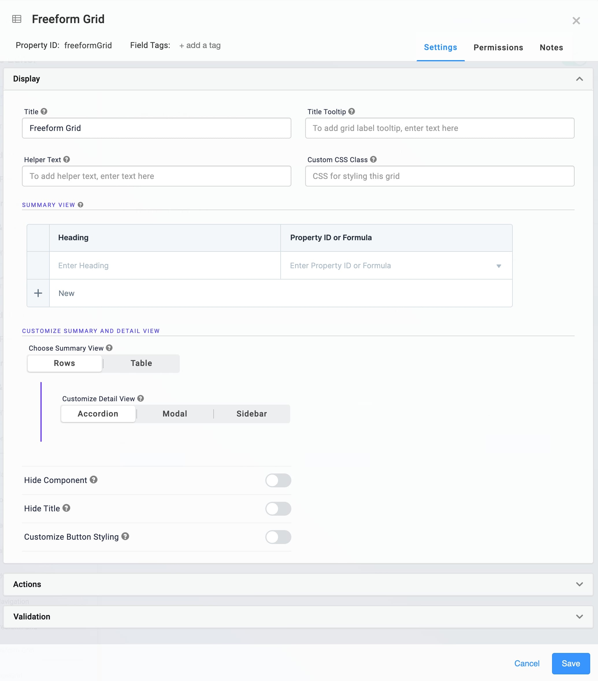
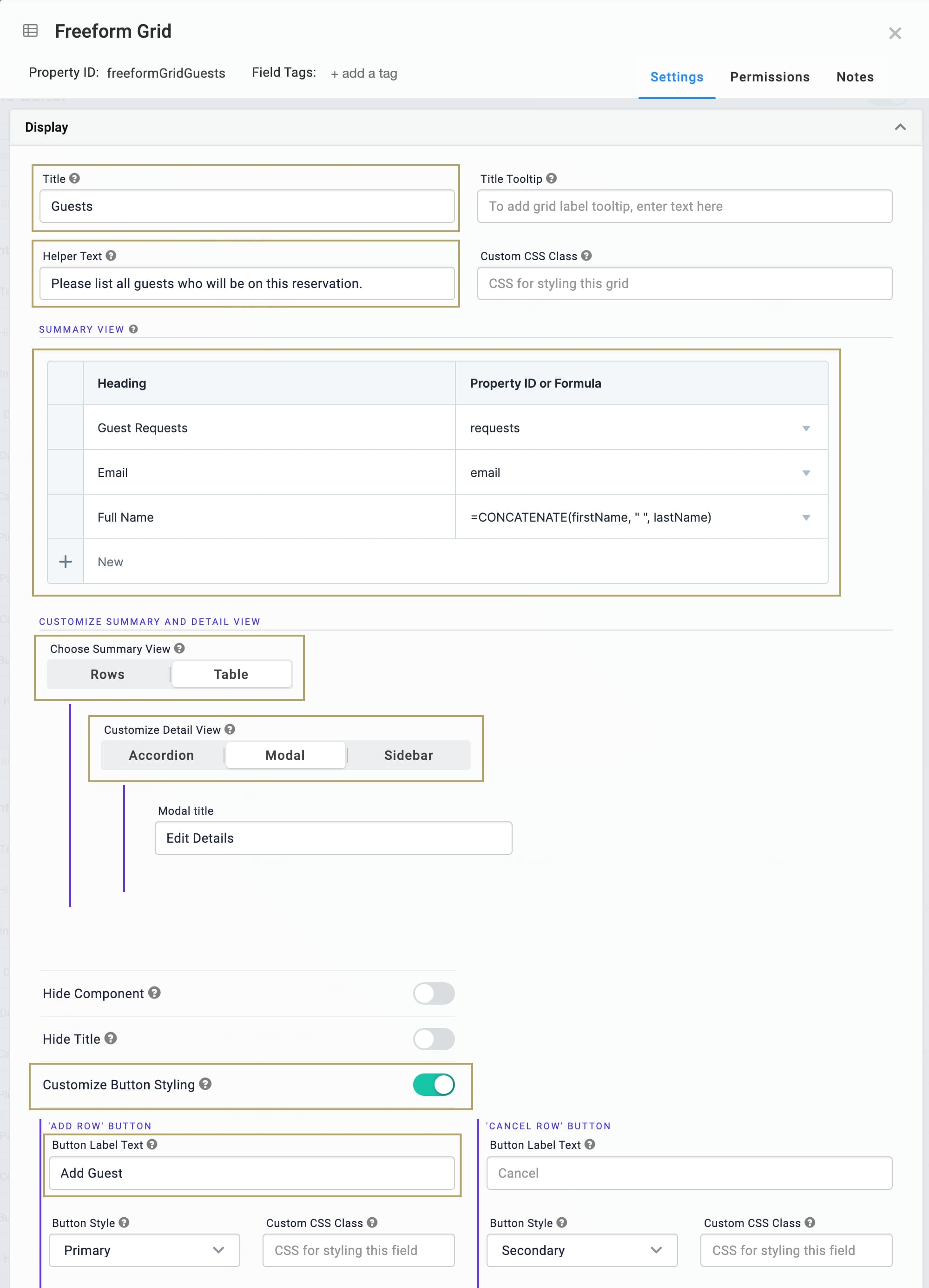
Title | The heading of the grid. The end-user sees this title at the top of the grid in Express View.
|
Title Tooltip | A short hint that displays when an end-user positions their cursor over the (Tooltip) icon. Tooltips can display across more than one line. The tooltip displays next to the title. |
Helper Text | A quick tip describing the expected value of an input field. Unlike a Tooltip, Helper Text stays visible under the input field and displays on a single line. |
Custom CSS Class | Enter a Custom CSS Class to apply to your component. Custom CSS lets you maintain a consistent look and feel when the field or element is part of a template or multiple modules. Updated CSS styling applies to all components that reference this custom class name. |
Summary View Table
The Summary View table is where you set the information that displays in your grid's summary view. Define headings as well as what values to show under that heading.
Click + New to add a new heading.
The top-to-bottom order of rows in your Summary View table creates the left-to-right order of headings in Express View.
Setting | Description |
|---|---|
Heading | Enter a heading to display in the summary view. |
Property ID or Formula | Define the value to display under the heading. You can reference a Property ID in the grid or use a formula that references multiple Property IDs. For example:
|
Customize Summary and Detail View Group
The following settings set the summary and detail view options for your Freeform Grid.
Setting | Description |
|---|---|
Choose Summary View | Select which summary view your Freeform Grid uses:
|
Customize Detail View | Select which detail view your Freeform Grid uses:
|
Modal Title | Displays when Customize Detail View is set to Modal. Enter a title for the detail view modal. |
Sidebar Title | Displays when Customize Detail View is set to Sidebar. Enter a title for the detail view sidebar. |
Additional Display Settings
Setting | Description |
|---|---|
Hide Component | Displays or hides the component from view. Setting Hide Field to By default, Hide Field is set to |
Hide Title | Setting the Hide Title toggle to By default, Hide Title is set to |
Customize Button Styling | When set to
To customize each button, edit the fields displayed below the corresponding button's header. |
Button Label Text | The Button Label Text identifies the purpose of the button before your end-user clicks it. Each button has the following default Label Text:
|
Button Style | Sets the visual appearance of the button. Options include: |
Custom CSS Class | Enter a Custom CSS Class to apply to the button. When you update the CSS styling, it applies to all elements that reference this custom class name. |
Left/Right Icon | Use these fields to add icons (glyphs) to the left or right of your Button's Label Text. For example, entering glyphicon glyphicon-pencil adds an icon of a pencil to your Button.
|
Actions Panel
Triggers Group
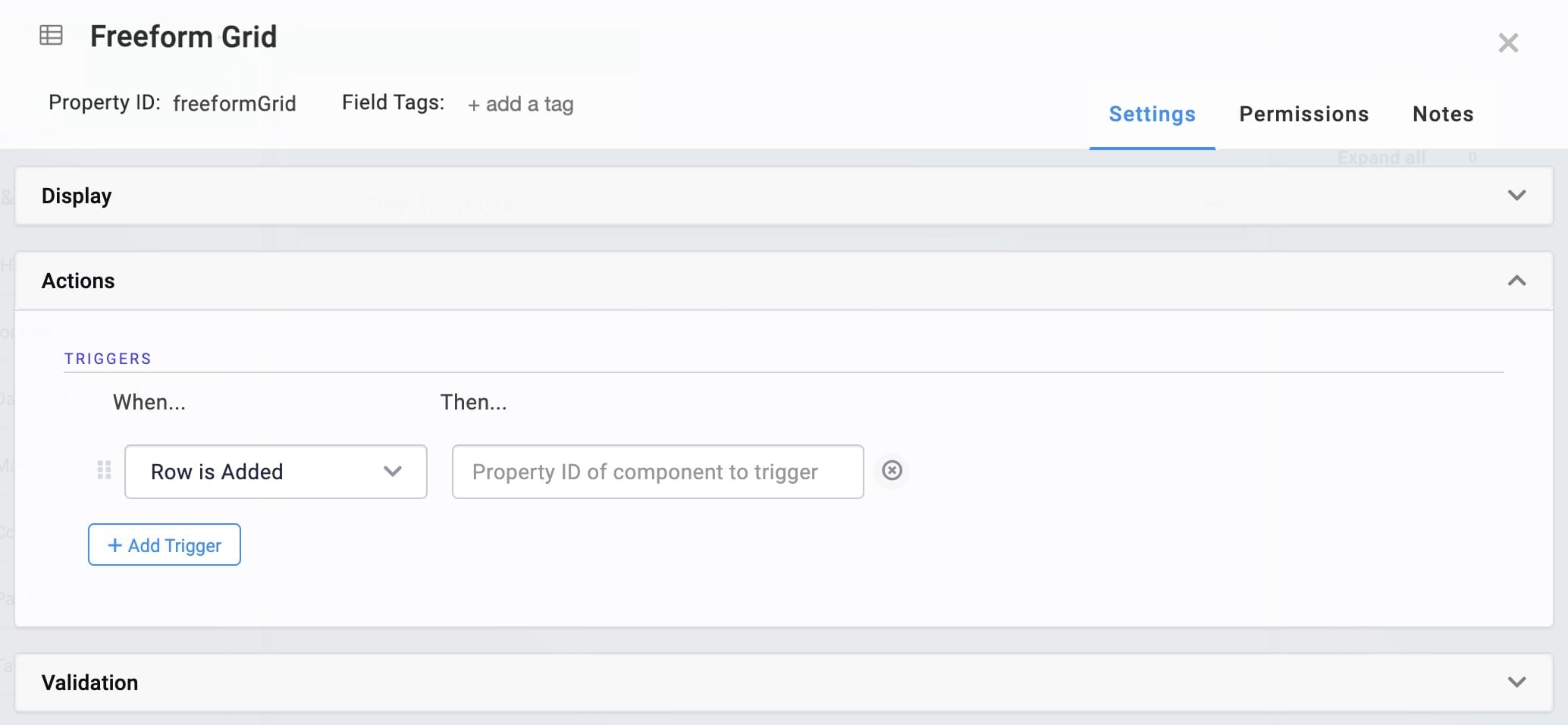
The Freeform Grid component supports creating multiple triggers directly in the component's configuration window. You can choose from three possible triggering events for each trigger. You can also create several triggers that have the same triggering event.
Setting | Description |
|---|---|
+ Add Trigger | Click + Add Trigger to create a new trigger. Triggers let you create if/then rules to trigger components when a specified action occurs. |
When... | Select an action that, when it occurs, executes the trigger. Actions include the following:
|
Then... | Enter the Property ID of the component to trigger when the specified When... action occurs. |
Validation Panel
Set Number of Allowed Rows Group
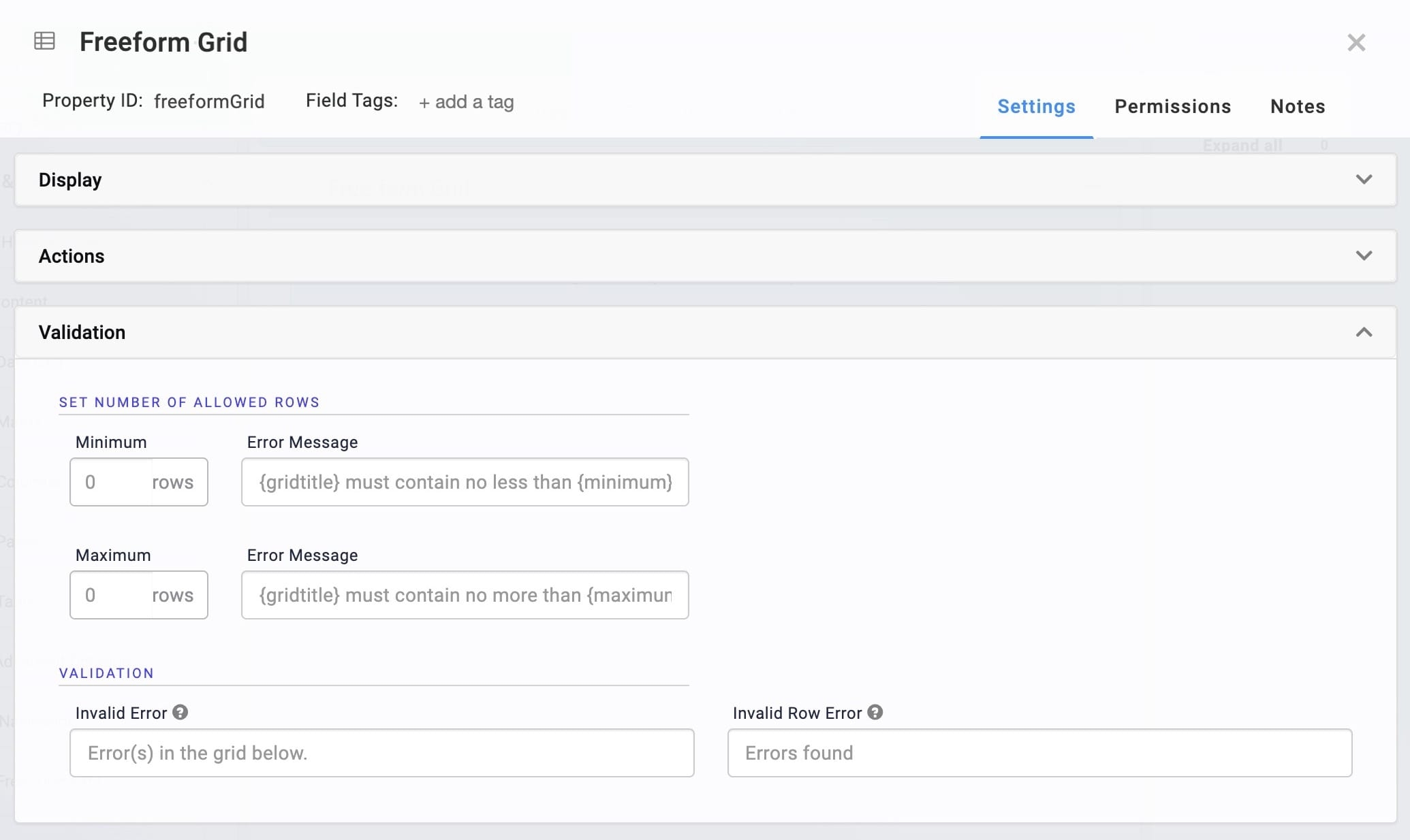
Setting | Description |
|---|---|
Minimum | Sets the minimum number of allowed rows in the grid. |
Minimum Error Message | An error message that displays when the grid does not meet the minimum number of rows set. |
Maximum | Sets the maximum number of allowed rows in the grid.When the maximum number of rows is met, the Freeform Grid component's Create New button is disabled and end-users cannot add any new rows. |
Maximum Error Message | An error message that displays when the grid exceeds the maximum number of rows set. |
Validation
Setting | Description |
|---|---|
Invalid Error | An error message that displays when the grid has validation errors. |
Invalid Row Error | An error message that displays when a specific row of the grid has validation errors. |
Adding a Freeform Grid Component
In this configuration, you'll use a Freeform Grid to let end-users list guests joining a reservation. This simple usage of the Freeform Grid component highlights its support for nesting components, including nesting components within already-nested components.
This configuration focuses on how to use the Freeform Grid component for basic information collection. To learn about more complex configuration scenarios, including notes on using logic components with the Freeform Grid, visit the Uniform Grid and Freeform Grid: Logic and Referencing Syntax article.
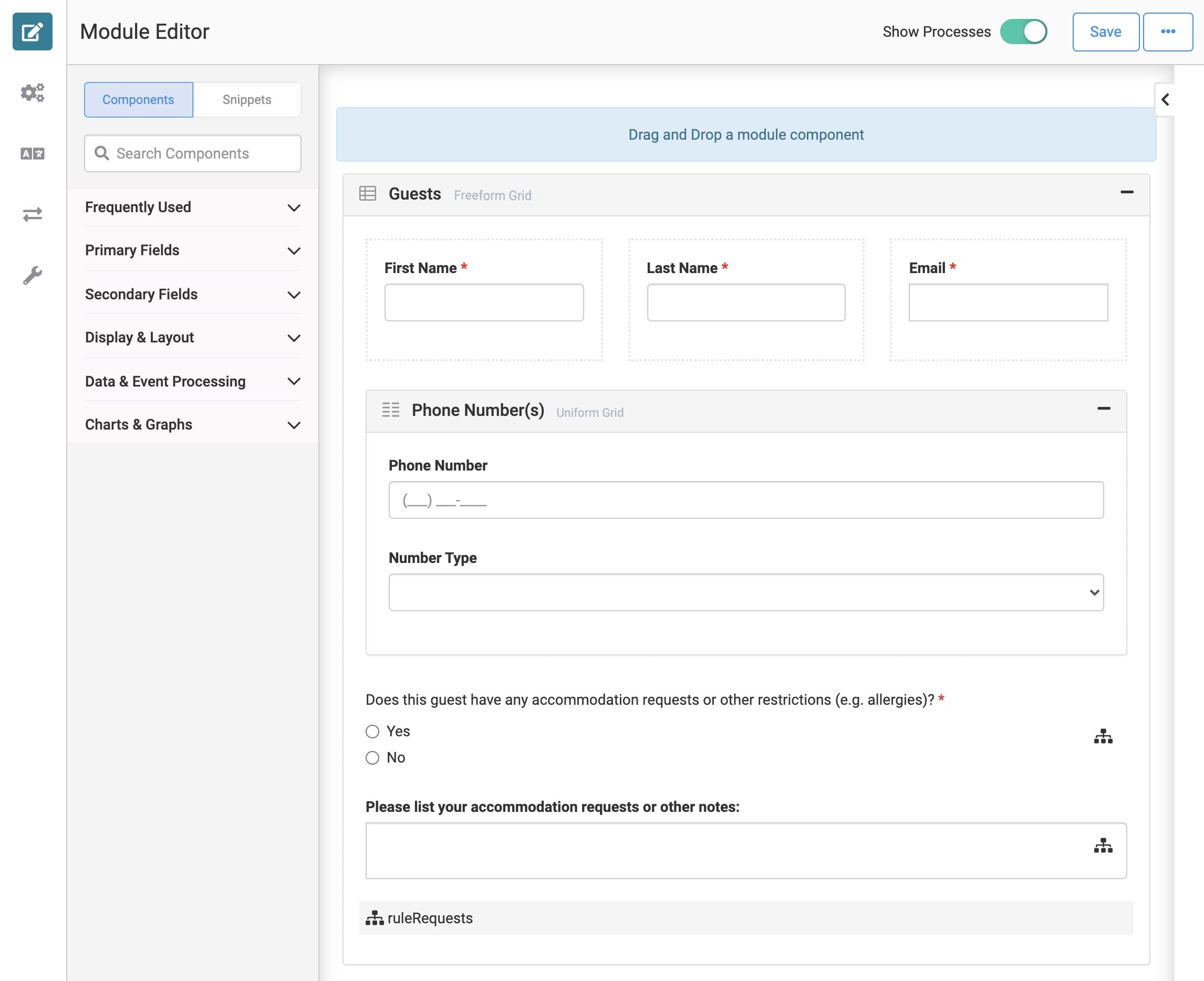
Here's how the completed configuration looks in the Module Builder:
Configure the Freeform Grid Component
For this configuration, the Freeform Grid uses the Rows summary view with a Modal detail view. The modal is where the end-user fills out all the fields nested in the Freeform Grid. The summary view then displays the values from some of the nested components, as defined in the Summary View table.
Drag and drop a
.png) Freeform Grid component onto the canvas.
Freeform Grid component onto the canvas.In the Property ID field, enter freeformGridGuests.
In the Title field, enter
Guests.In the Helper Text field, enter
Please list all guests who will be on this reservation.Complete the Summary View table as follows:
Heading
Property ID or Formula
Guest Requests
requests
Email
email
Full Name
=CONCATENATE(firstName, " ", lastName)
By using a concatenation formula that references the firstName and lastName Property IDs, the summary view can include the guest's full name while the submission data stores individual values.×
Under Choose Summary View, select Rows.
Under Customize Detail View, select Modal.
Set the Customize Button Styling toggle to
 (ON).
(ON).Under Triggers, select + Add Trigger.
Under 'Add Row' Button, in the Button Label Text field, enter
Add Guest.Click Save.
Configure the Columns Component
A Columns component helps structure and organize the modal.
Drag and drop a
.png) Columns component onto your canvas, placing it inside the Freeform Grid component.
Columns component onto your canvas, placing it inside the Freeform Grid component.In the Property ID field, enter col1.
Under Column Layout, select
.png) (3 columns).
(3 columns).Click Save & Close.
Configure the Text Field Components
The following two Text Field components and the Email component collect some basic information about the guest.
Drag and drop two Text Field components onto the canvas, placing one in column 1 of the Columns component, and the other in column 2 of the Columns component.
Complete the Property ID and Label Text as follows:
Property ID
Label Text
firstName
First Name
lastName
Last Name
Set the Required toggle to
 (ON) for both fields.
Save & Close each component as you add it.
Configure the Email Component
Drag and drop an
.png) Email component onto the canvas, placing it in column 3 of the col1
Email component onto the canvas, placing it in column 3 of the col1 .png) Columns component.
Columns component.In the Property ID field, enter email.
In the Label Text field, enter
Email.Set the Required toggle to
 (ON).
(ON).Click Save & Close.
Configure the Uniform Grid Component
This Uniform Grid collects phone numbers, with the help of a nested Phone Number component and Dropdown component. Using a Uniform Grid makes it easy for the end-user to add multiple phone numbers, if needed.
Drag and drop a
.png) Uniform Grid component onto the canvas, placing it below the col1
Uniform Grid component onto the canvas, placing it below the col1 .png) Columns component inside the freeformGridGuests
Columns component inside the freeformGridGuests .png) Freeform Grid.
Freeform Grid.In the Property ID field, enter uniformGridPhoneNumber.
In the Title field, enter
Phone Number(s).In the Helper Text field, enter
Enter your phone number(s) below:.Set the Customize Button Styling toggle to
 (ON).
(ON).Under 'Add Row' Button, in the Button Label Text field, enter
Add Number.Under Set Number of Allowed Rows, in the Minimum field, enter
1.Under Validation, in the Invalid Error field, enter
Please add at least one phone number.Click Save.
Configure the Phone Number Component
Drag and drop a Phone Number component onto the canvas, placing it inside the uniformGridPhoneNumber
.png) Uniform Grid component.
Uniform Grid component.In the Property ID field, enter phoneNumber.
In the Label Text field, enter
Phone Number.Click Save & Close.
Configure the Dropdown Component
Drag and drop a
.png) Dropdown component onto the canvas, placing it inside the uniformGridPhoneNumber
Dropdown component onto the canvas, placing it inside the uniformGridPhoneNumber .png) Uniform Grid component.
Uniform Grid component.In the Property ID field, enter numberType.
In the Label Text field, enter
Number Type.Complete the Values table as follows:
Option Label
Data Source Values
1
Mobile
mobile
2
Home
home
3
Work
work
Click Save & Close.
Configure the Radio Buttons Component
The next three components, the Radio Buttons, Text Area, and Decisions components, work together. Based on the answer to the Radio Buttons, the Decisions component will either make the hidden Text Area component visible or keep it hidden.
Drag and drop a Radio Buttons component onto the canvas, placing it inside the Freeform Grid, below the Uniform Grid component.
In the Property ID field, enter requests.
In the Label Text field, enter
Does this guest have any accommodation requests or other restrictions (e.g. allergies)?.Complete the Values table as follows:
Option Label
Value to Store in Submission Data
1
Yes
Yes
2
No
No
Set the Required toggle to
 (ON).
(ON).Click Save & Close.
Configure the Text Area Component
Drag and drop a
.png) Text Area component onto the canvas, placing it below the requests Radio Buttons component.
Text Area component onto the canvas, placing it below the requests Radio Buttons component.In the Property ID field, enter guestNotes.
In the Label Text field, enter
Please list your accommodation requests or other notes:.Set the Hide Field toggle to
 (ON).
(ON).Click Save & Close.
Configure the Decisions Component
The if/then logic for this Decisions component is:
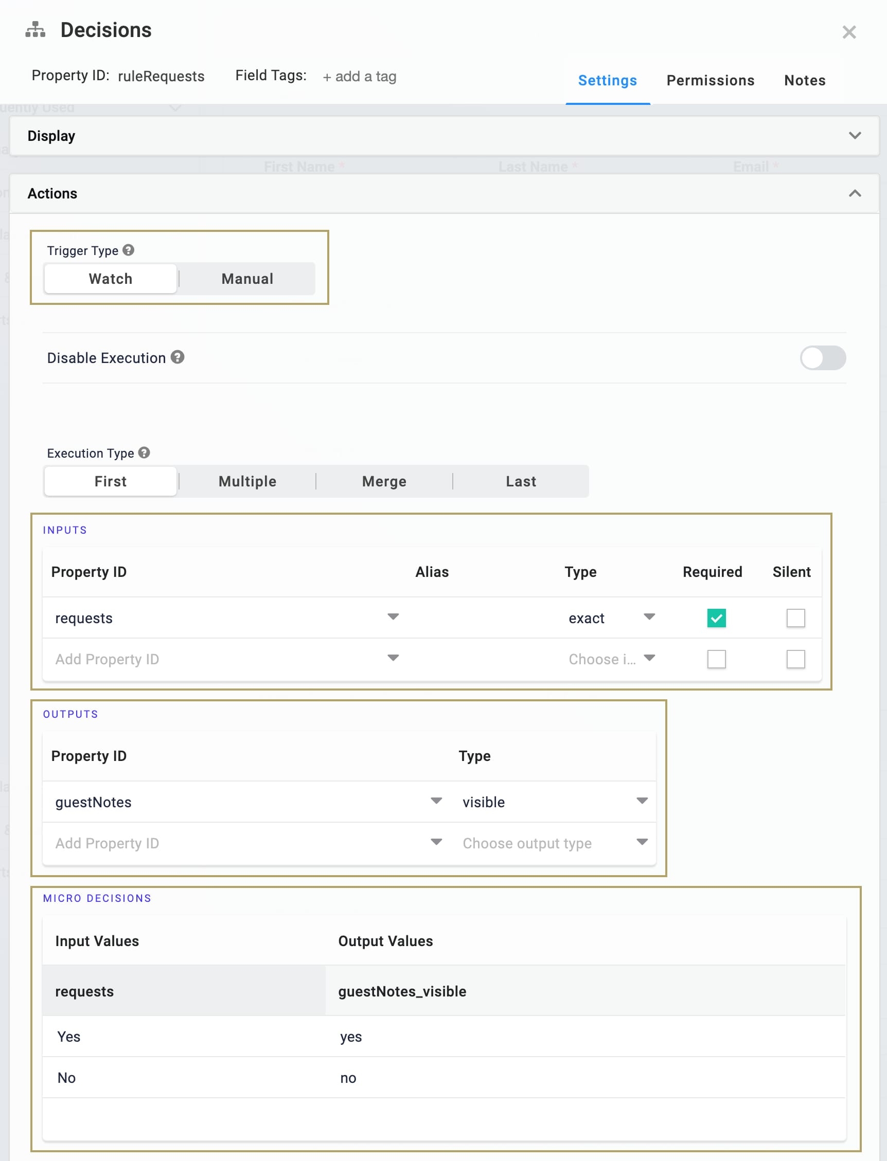
If the end-user selects Yes in the requests Radio Buttons component, then make the guestNotes
.png) Text Area visible.
Text Area visible.If the end-user selects No, then keep the guestNotes
.png) Text Area hidden.
Text Area hidden.
Drag and drop a Decisions component onto the canvas, placing it below the guestNotes
.png) Text Area component.
Text Area component.In the Property ID and Canvas Label Text fields, enter
ruleRequests.Set the Trigger Type to Watch.
Complete the Inputs table as follows:
Property ID
Alias
Type
Required
1
requests
exact
.png) (Checked)
(Checked)Complete the Outputs table as follows:
Property ID
Type
1
guestNotes
visible
Complete the Micro Decisions table as follows:
Input Values
Output Values
requests
guestNotes_visible
1
Yes
yes
2
No
no
Click Save & Close.
Save your module.
Preview Your Configuration
You're now ready to test out your configuration. Click Preview to open your module in Express View.
Structure of a Freeform Grid Component's Data
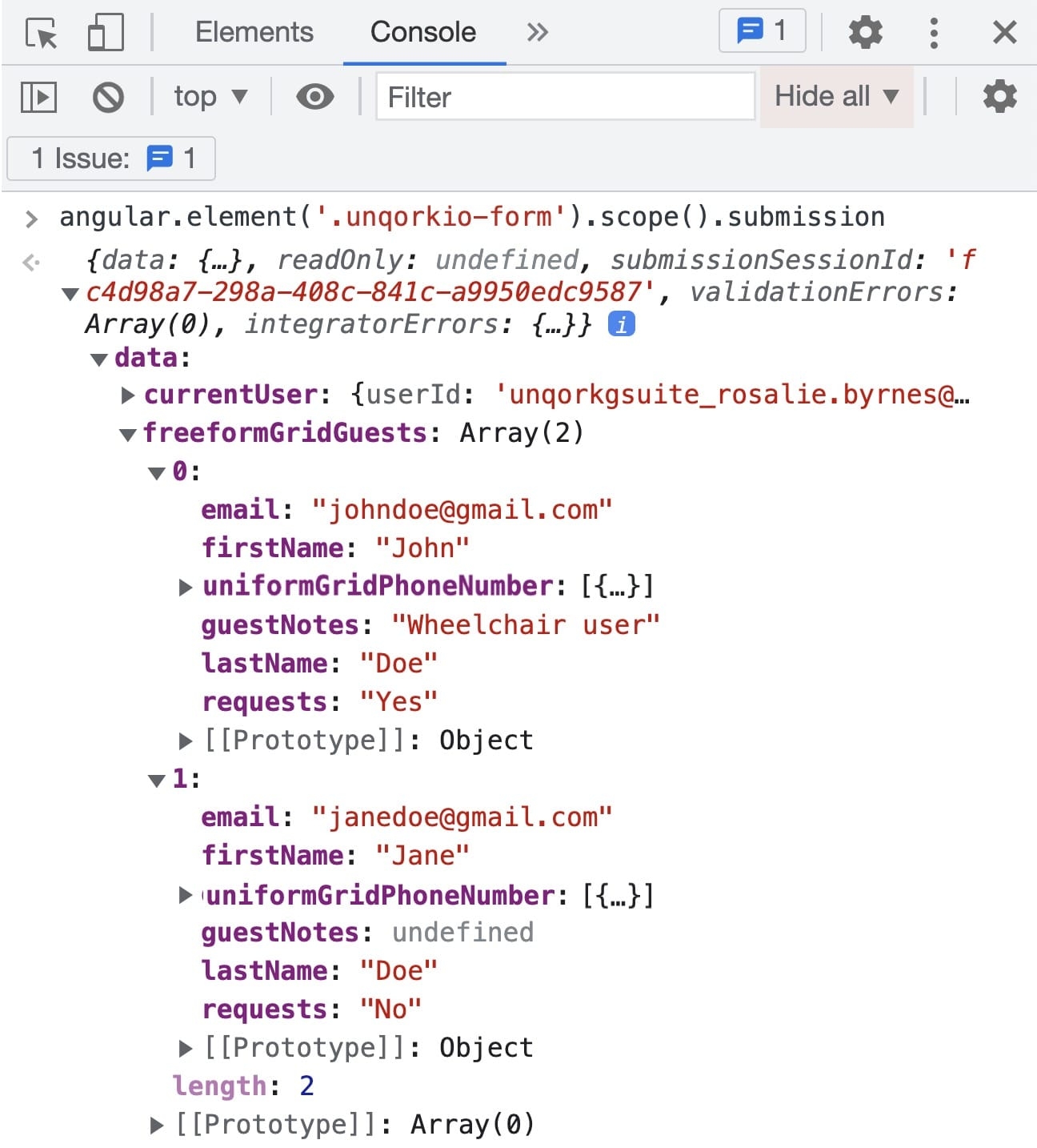
Data entered in the Freeform Grid component stores as an array of objects under a single key. The top-level key is the Freeform Grid component's Property ID, and each row added to the Freeform Grid component in Express View becomes a new object in the array of row objects. In each row object, row-specific values store as explicit key/value pairs, where the keys are the Property IDs of the components nested in the Freeform Grid component. The values are those entered by the end-user in that row
Depending on the component type, values store as different data types and data structures. The following image shows an example of how two rows of data entered in a Freeform Grid component display in the DevTools Console:
Freeform Grid Data Storage: Grid Cache and Submission Data Object
There are a couple of locations where data can be read or written to the Freeform Grid component:
Grid cache: Any data entered in the Freeform Grid component is written to the cache. Cached data is temporarily saved in the browser, but the data only writes to the submission data object after a grid Save event occurs.
Submission data object (
submission.data): The submission data object stores data for all components in the module. The Freeform Grid component's data is accessible from thesubmission.data.[gridPropertyId]path. Data from the Freeform Grid component writes to the submission data object after a grid Save event.
To get a snapshot of data in the grid cache, you can use the following Angular command in the DevTools Console:
angular.element('.unqorkio-form').injector().get('CacheService').cache. To get a snapshot of data in the submission data object, use the following Angular command:angular.element('.unqorkio-form').scope().submission.
The following diagram shows a simplified flow of data in a module containing a Freeform Grid component, after both a grid and moduleSave event.
In the image below, assume myGrid is the Property ID of the Freeform Grid component. Then, submission.data.{gridPropertyID} is the data access path for the Freeform Grid component's array of row objects.
 The data from the input component outside of the Freeform Grid component automatically syncs to the submission data object. The data from the input components inside the Freeform Grid component only syncs to the grid cache. A grid Save event is required for the grid cache to sync to the submission data object. That said, none of these changes can save as a submission in the database until a moduleSave event occurs.
The grid cache impacts how logic components nested inside a Freeform Grid component behave. To learn about using logic components with the Freeform Grid component, including how to use grid referencing syntax, visit the Uniform Grid and Freeform Grid: Logic and Referencing Syntax article.
Due to limitations of the grid cache, nesting an Advanced Datagrid component(s) is not supported in a Freeform Grid component.
Resource
Modify the Uniform Grid component using the toolbar settings.
Uniform Grid and Freeform Grid: Logic and Referencing Syntax

