The Group Input operator lets you combine data from multiple sources into a single object in your Data Workflow.
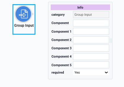
For example, let's say you need to collect the name, phone number, and email address data points from your end-user. You'll gather each in separate components and use a Group Input operator to combine all three. One Group Input operator can reference up to six components. It always serves as an input to your Data Workflow and therefore only has an output port.
You’ll find the Group Input operator under the I/O group to the left of the Data Workflow canvas.
About the Info Window
And here's a breakdown of each setting in the Info window:
Setting | Description |
|---|---|
Category | Grayed out and non-adjustable setting indicating the operation type. |
Component | A component storing the data you'll bring into your Data Workflow. Here, you'll see a drop-down containing every component's Property ID in your module. Select the component you want to reference from the drop-down list. After selecting a Property ID, the Component field remains editable. You can type in the Component field to define a property path or target fields nested under the selected Property ID. Your selection displays as the operator's label.
|
Component 1-5 | Add the additional components you want to include with your selection above. Remember, the Group Input operator can have multiple inputs. Each extra field lets you choose a component to reference in your Data Workflow. You'll select a unique Property ID from each drop-down. If you're referencing fewer than five extra components, you'll leave the rest empty. |
Required | When set to Yes, your Data Workflow does not begin until a value is present in each of your chosen components. So, if you select a Text Field and Email component, your Data Workflow does not run if either field is empty. When set to No, the Data Workflow runs with or without a value in your chosen components. The result is an empty string for each blank value. By default, the Required drop-down is set to Yes. |
Manually-Defined Inputs
In some cases, you might want to reference an input that does not display in the Info window's Component drop-down. For example, Property IDs of components in imported modules.
To reference an input that doesn't display in the Component drop-down:
Select your Group Input operator.
In the operator's Info window, select any Property ID from the Component drop-down. The Property ID displays below the Group Input operator as a label.
On the Data Workflow canvas, double-click the Group Input operator's label. The field becomes editable.
Enter the Property ID to use as an input.
Click outside the field to save your manually-defined input.
Reopening the Data Workflow component might not display your manually-defined input on the canvas, though the connection still exists. Consider using the Data Workflow component's Comment field to note the input.
Adding a Group Input Operator
To demonstrate a Group Input operator, you'll take values from three Text Field components and combine them into a single object.
Configure the Text Field Components
You'll use these fields to enter information related to dogs, including name, breed, and color.
In the Module Builder, drag and drop three Text Field components onto your canvas.
In each component's Property ID and Label Text field, enter the following:
#
Property ID
Label Text
1
name
Name
2
breed
Breed
3
color
Color
Click Save Component for each component as you add it.
Configure the Hidden Component
Next, configure a Hidden component to store the Data Workflow's output data.
Drag and drop a Hidden component onto your canvas, placing it below your color Text Field component.
In the Property ID and Label Text fields, enter
dwfGroupInputOutput.Click Save Component.
Configure the Data Workflow Component
Now, add a Data Workflow component to process the data.
Drag and drop a Data Workflow component, placing it between your color Text Field and dwfGroupInputOutput Hidden components.
In the Property ID and Canvas Label Text fields, enter
dwfDogs.
Configure the Group Input Operator
Drag and drop a Group Input operator onto your Data Workflow canvas.
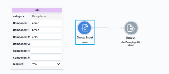
Configure the operator's Info window as follows:
Info
Category
Group Input
Component
name
Component 1
breed
Component 2
color
Component 3
Component 4
Component 5
Required
Yes
Configure the Output Data Operator
Drag and drop an Output operator onto your Data Workflow canvas.
Configure the operator's Info window as follows:
Info
Category
Output
Component
dwfGroupInputOutput
Action
Value
Connect the output port (right) of the Group Input operator to the input port (left) of the Output operator.
Click Save Component.
Here's how the completed Data Workflow looks:
Configure the Button Component
Lastly, add a Button component to trigger the Data Workflow.
Drag and drop a Button component onto your canvas, placing it below your dwfDogs Data Workflow component.
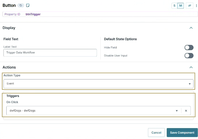
In the Property ID field, enter
btnTrigger.In the Label Text field, enter
Trigger Data Workflow.From the Action Type drop-down, select Event.
From the On Click drop-down, select dwfDogs.
Click Save Component.
Save your module.
Here's how the completed example looks in the Module Builder:
.png)
Here's how the completed example works in Express View, including a look at the DevTools Console:
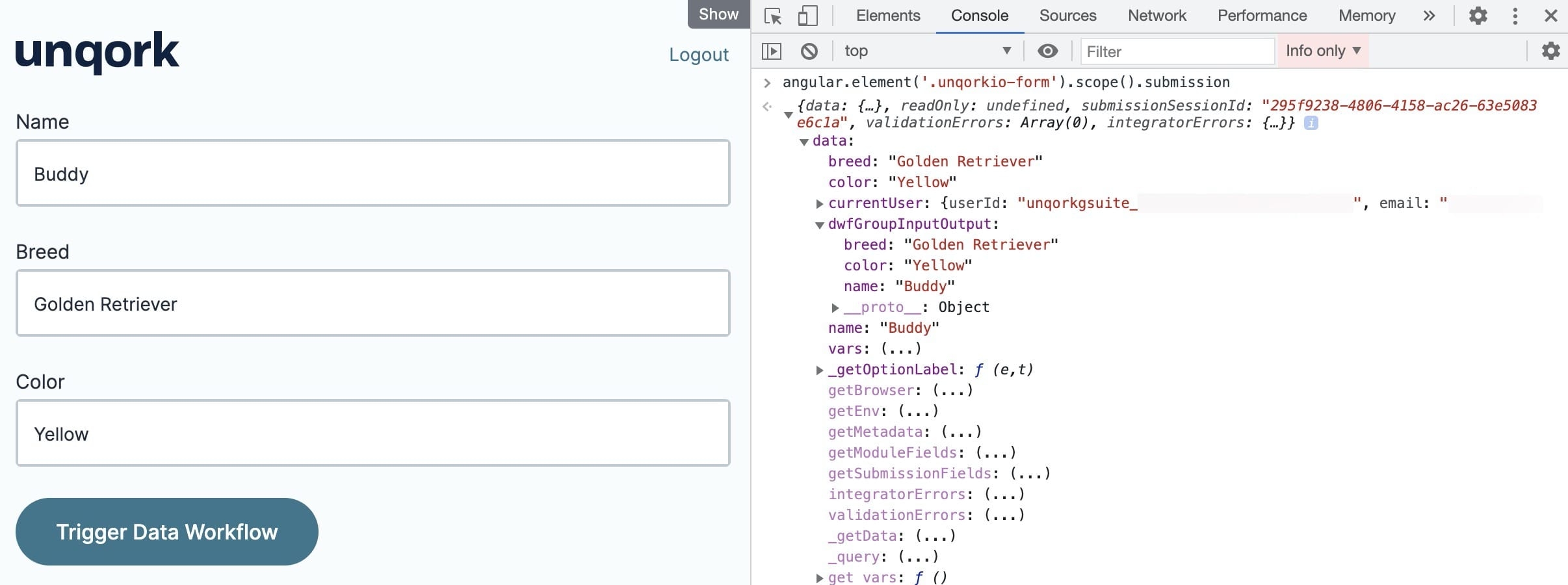
Preview your module in Express View and complete your end-user input fields. With your DevTools Console open, click Trigger Data Workflow. The Data Workflow combines the values from each of your Text Field components and puts the resulting value in your Hidden component.
The Group Input operator lets you combine data from multiple sources into a single object in your Data Workflow.
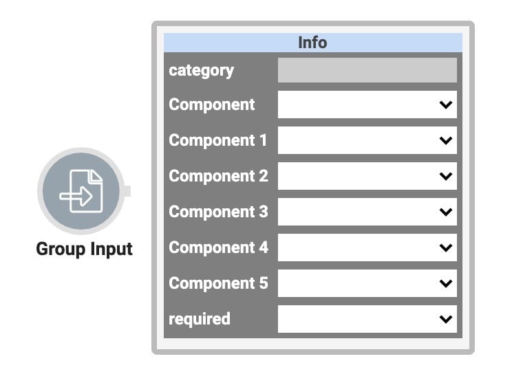
For example, let's say you need to collect the name, phone number, and email address data points from your end-user. You'll gather each in separate components and use a Group Input operator to combine all three. One Group Input operator can reference up to six components. It always serves as an input to your Data Workflow and therefore only has an output port.
You’ll find the Group Input operator under the I/O group to the left of the Data Workflow canvas.
About the Info Window
And here's a breakdown of each setting in the Info window:
Setting | Description |
|---|---|
Category | Grayed out and non-adjustable setting indicating the operation type. |
Component | A component storing the data you'll bring into your Data Workflow. Here, you'll see a drop-down containing every component's Property ID in your module. Select the component you want to reference from the drop-down list. After selecting a Property ID, the Component field remains editable. You can type in the Component field to define a property path or target fields nested under the selected Property ID. Your selection displays as the operator's label.
|
Component 1-5 | Add the additional components you want to include with your selection above. Remember, the Group Input operator can have multiple inputs. Each extra field lets you choose a component to reference in your Data Workflow. You'll select a unique Property ID from each drop-down. If you're referencing fewer than five extra components, you'll leave the rest empty. |
Required | When set to Yes, your Data Workflow does not begin until a value is present in each of your chosen components. So, if you select a Text Field and Email component, your Data Workflow does not run if either field is empty. When set to No, the Data Workflow runs with or without a value in your chosen components. The result is an empty string for each blank value. By default, the Required drop-down is set to Yes. |
Manually-Defined Inputs
In some cases, you might want to reference an input that doesn't display in the Info window's Component drop-down. For example, Property IDs of components in imported modules.
To reference an input that doesn't display in the Component drop-down:
Select your Group Input operator.
In the operator's Info window, select any Property ID from the Component drop-down. The Property ID displays below the Group Input operator as a label.
On the Data Workflow canvas, double-click the Group Input operator's label. The field becomes editable.
Enter the Property ID to use as an input.
Click outside the field to save your manually-defined input.
Reopening the Data Workflow component might not display your manually-defined input on the canvas, though the connection still exists. Consider using the Data Workflow component's Comment field to note the input.
Adding a Group Input Operator
To demonstrate a Group Input operator, you'll take values from three Text Field components and combine them into a single object.
Configure the Text Field Components
You'll use these fields to enter information related to dogs, including name, breed, and color.
In the Module Builder, drag and drop three Text Field components onto your canvas.
In each component's Property ID and Label Text field, enter the following:
Property ID
Label Text
name
Name
breed
Breed
color
Color
Save & Close each component as you add it.
Configure the Hidden Component
Next, configure a Hidden component to store the Data Workflow's output data
Drag and drop a Hidden component onto your canvas, placing it below your color Text Field component.
In the Property ID and Label Text fields, enter
dwfGroupInputOutput.Click Save & Close.
Configure the Data Workflow Component
Now, add a Data Workflow component to process the data.
Drag and drop a Data Workflow component onto your canvas, placing it between your color Text Field and dwfGroupInputOutput Hidden components.
In the Canvas Label Text and Property Name fields, enter
dwfDogs.
Configure the Group Input Operator
Drag and drop a Group Input operator onto your Data Workflow canvas.
Configure the operator's Info window as follows:
Setting
Value
Category
Group Input
Component
name
Component 1
breed
Component 2
color
Component 3
Component 4
Component 5
Required
Yes
Configure the Output Data Operator
Drag and drop an Output operator onto your Data Workflow canvas.
Configure the operator's Info window as follows:
Setting
Value
Category
Output
Component
dwfGroupInputOutput
Action
Value
Connect the output port (right) of the Group Input operator to the input port (left) of the Output operator.
Click Save.
Here's how the completed Data Workflow looks:
.png)
Configure the Button Component
Lastly, add a Button component to trigger the Data Workflow.
Drag and drop a Button component onto your canvas, placing it below your dwfDogs Data Workflow component.
In the Property ID field, enter
btnTrigger.In the Label Text field, enter
Trigger Data Workflow.Set the Action Type as Event.
From the On Click drop-down, select dwfDogs.
.png)
Click Save & Close.
Save your module.
Here's how the completed example looks in the Module Builder:
.png)
Here's how the completed example works in Express View, including a look at the DevTools Console:
.jpg)
Preview your module in Express View and complete your end-user input fields. With your DevTools Console open, click Trigger Data Workflow. The Data Workflow combines the values from each of your Text Field components and puts the resulting value in your Hidden component.