The Browser Storage component lets you add, edit, delete, and retrieve data in an end-user's browser. The component stores data using the IndexedDB API. IndexedDB is a large storage service for encrypting and storing data in a browser. This API lets you store large amounts of structured, indexed information locally, letting you filter and search this information.
Data stored in a browser expires after 30 days. The expiration time resets when the end-user accesses the data.
Only end-users can access the encrypted data stored on their browser.
You'll find the Browser Storage component in the Data & Event Processing group to the left of the Module Builder.
About the Configuration Window
To learn more about general component settings, view our General Component Settings article.
Data Settings
Setting | Description |
|---|---|
Interaction Type | The Browser Storage component has the following options:
|
Namespace | A Namespace is required. This is a unique label applied to the information you store in the IndexedDB object. The Read, Write, and Delete interactions happen only to the data entered in the Namespace.
|
Data - Filters Table
Setting | Description |
|---|---|
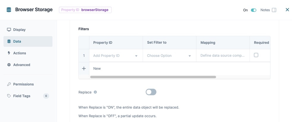
Filters | The Browser Storage component's Filters table helps you find information stored in the browser's IndexedDB object store. |
Property ID | This is the Property ID of the stored information. Mapping to this Property ID performs the Write, Read, and Delete operations to that data.
|
Set Filter To | This drop-down lets you select how you want to compare the Filter’s Property ID to its Mapping. Your options are: =, <, or >. |
Mapping | Mapping describes where in the stored data you're filtering. This mapping information tells the component what data send or call when triggered. |
Required | If By default, this setting is ☐ (unchecked). |
Exclude | If By default, this setting is ☐ (unchecked). |
Optional | If By default, this setting is ☐ (unchecked). |
Replace | This setting is only available when the Interaction Type is set to Write. If this setting is By default, this setting is |
Data - Inputs Table
Input settings are only available for the Write operation.
Setting | Description |
|---|---|
Property ID | This Property ID refers to your triggering component. Use this field to enter values that you send to the browser’s IndexedDB object store. |
Mapping | API documentation includes mapping information. This mapping information tells the Browser Storage component which information to send or call from the browser's IndexedDB object store.
|
Required | If By default, this setting is ☐ (unchecked). |
Exclude | If By default, this setting is ☐ (unchecked). |
Optional | If By default, this setting is ☐ (unchecked). |
Data - Outputs Table
Setting | Description |
|---|---|
Property ID | This Property ID is where you want the component to send the data retrieved from your browser. For your logic component to recognize an output, you must enter the destination component's Property IDs.
|
Mapping | Map Property IDs according to API specifications. Mapping tells your component what to retrieve from the browser. For example, enter 0.data.storedExample to retrieve the first stored submission. The [0] represents your first saved record, [1] is the second, and so on. |
Actions Settings
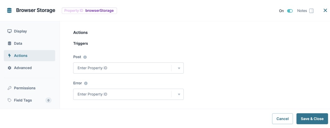
Triggers
Setting | Description |
|---|---|
Post | Enter the Property ID of the component that you want to trigger after the Browser Storage component completes the API call. For example, triggering a component to display the data received from the Browser Storage component's API call. |
Error | Enter the Property ID of a component that you want to trigger on the failure of the API call. |
.jpg) Advanced Settings
Advanced Settings
Setting | Description |
|---|---|
Disable Execution | If Disable Execution is set to By default, this setting is set to |
Set Debounce | The number of milliseconds that pass before the module loads this component. This is useful if you have a large module and you load several components at the same time.
|
Adding a Browser Storage Component
First, you'll configure a survey application for use offline. This survey has fields for a surveyor's name, the date surveyed, and other various criteria. This front-end module lets you input values that a Browser Storage component writes to the browser cache.
For a completed example of the survey application, view the training environment module here: https://training.unqork.io/#/form/5ffddf6ae336b802494437c8/edit.
This example assumes you have a module saved and with a title.
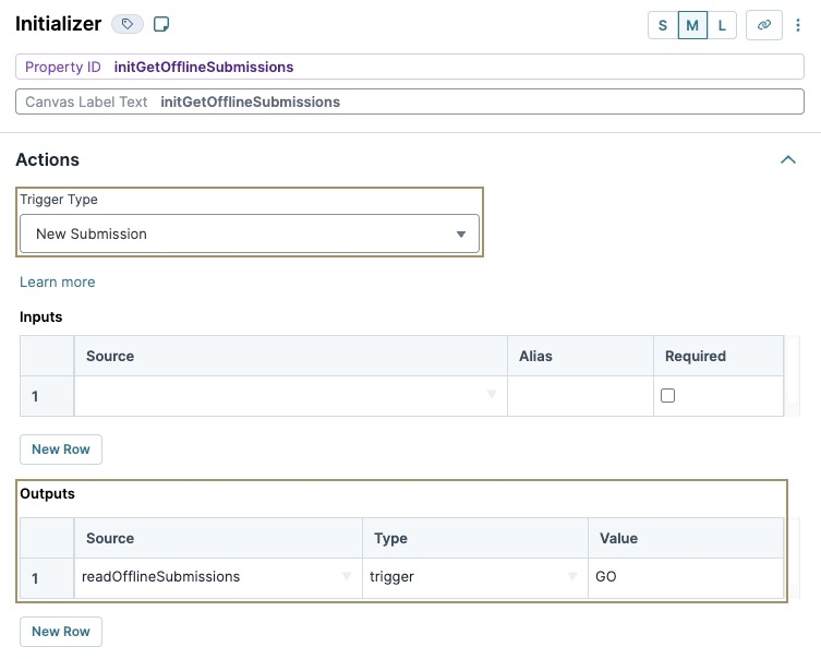
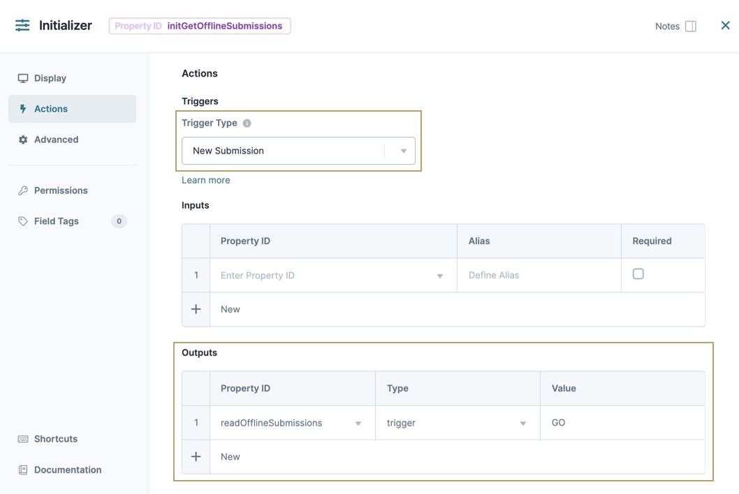
Configure the Initializer Component
This Initializer component triggers the Browser Storage component to retrieve submission data from the browser.
In the Module Builder, drag and drop an Initializer component onto the canvas.
In the Property ID field, enter initGetOfflineSubmissions.
In the Canvas Label Text field, enter initGetOfflineSubmissions.
From the Trigger Type drop-down, select New Submission.
In the Outputs table, enter the following:
Property ID
Type
Value
1
readOfflineSubmissions
trigger
GO
This Property ID matches the Browser Storage component you'll set up next.
Click Save Component.
Configure the Browser Storage Component
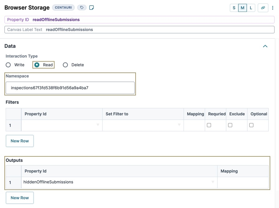
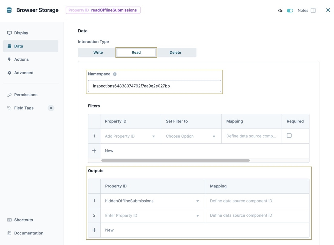
Next, you'll configure a Browser Storage component to retrieve the data from your browser’s storage, using the Read interaction to view offline submissions.
Drag and drop a Browser Storage component onto your canvas, placing it below your initGetOfflineSubmissions Initializer component.
In the Property ID field, enter readOfflineSubmissions.
In the Canvas Label Text field, enter readOfflineSubmissions.
Set the Interaction Type to
.png) Read.
Read.In the Namespace field, enter inspectionsModuleId. Where ModuleId is the ID value of your module. For example inspections5ffddf6ae336b802494437c8.
For this example, the Namespace refers to the Browser Storage data created in the following training module: https://training.unqork.io/#/form/5ffddf6ae336b802494437c8/edit.
In the Outputs table, enter the following:
Property ID
Mapping
1
hiddenOfflineSubmissions
This Property ID matches the Hidden component you'll set up next.
Click Save Component.
Configure the Hidden Component
Add a Hidden component to store offline submissions made by the end-user.
Drag and drop a Hidden component onto the canvas, placing it below the readOfflineSubmissions Browser Storage component.
2.In the Property ID and Label Text fields, enter
hiddenOfflineSubmissions.3.Click Save Component.
Save your module.
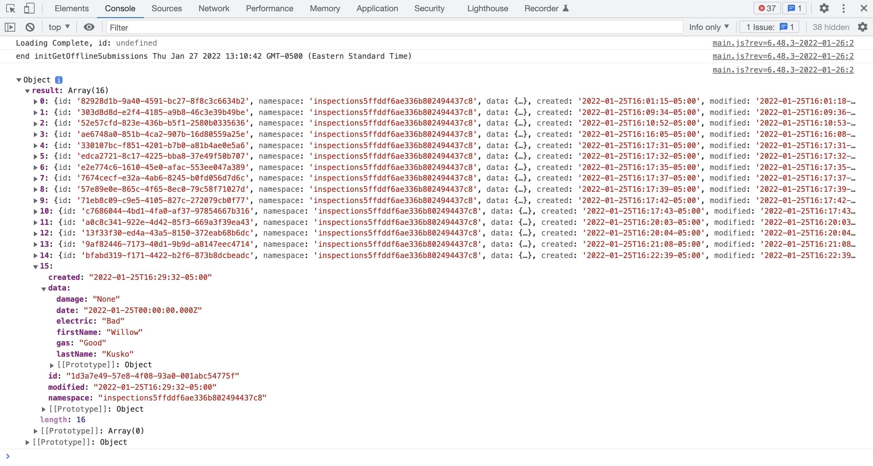
Preview your module in Express View, and open the DevTools Console. Open the object to see the submission data created from the front-end source module.
Structure of a Browser Storage Component's Data
The IndexedDB stores data in an array of objects. Each object contains the submission data collected in the front-end module.
The Browser Storage component lets you add, edit, delete, and retrieve data in an end-user's browser. The component stores data using the IndexedDB API. IndexedDB is a large storage service for encrypting and storing data in a browser. This API lets you store large amounts of structured, indexed information locally, letting you filter and search this information.
Data stored in a browser expires after 30 days. The expiration time resets when the end-user accesses the data.
Only end-users can access the encrypted data stored on their browser.
You'll find the Browser Storage component in the Data & Event Processing group to the left of the Module Builder.
About the Configuration Window
To learn more about general component settings, view our General Component Settings article.
Display Panel
Setting | Description |
|---|---|
Canvas Label Text | Label Text conveys what the input component is and what information it displays. Enter the purpose of the corresponding component or field. User-friendly labels make your module more accessible. Keep labels short and descriptive (a word or two) using title case. For longer entries, use sentence case. |
Data Panel
Setting | Description |
|---|---|
Interaction Type | The Browser Storage component has the following options:
|
Namespace | A Namespace is required. This is a unique label applied to the information you store in the IndexedDB object. The Read, Write, and Delete interactions happen only to the data entered in the Namespace.
|
Data - Filters Table
Setting | Description |
|---|---|
Filters | The Browser Storage component's Filters table helps you find information stored in the browser's IndexedDB object store. |
Property ID | This is the Property ID of the stored information. Mapping to this Property ID performs the Write, Read, and Delete operations to that data.
|
Set Filter To | This drop-down lets you select how you want to compare the Filter’s Property ID to its Mapping. Your options are: =, <, or >. |
Mapping | Mapping describes where in the stored data you're filtering. This mapping information tells the component what data send or call when triggered. |
Required | If By default, this setting is ☐ (unchecked). |
Exclude | If By default, this setting is ☐ (unchecked). |
Optional | If By default, this setting is ☐ (unchecked). |
Replace | This setting is only available when the Interaction Type is set to Write. If this setting is By default, this setting is |
Data - Inputs Table
Input settings are only available for the Write operation.
Setting | Description |
|---|---|
Property ID | This Property ID refers to your triggering component. Use this field to enter values that you send to the browser’s IndexedDB object store. |
Mapping | API documentation includes mapping information. This mapping information tells the Browser Storage component which information to send or call from the browser's IndexedDB object store.
|
Required | If By default, this setting is ☐ (unchecked). |
Exclude | If By default, this setting is ☐ (unchecked). |
Optional | If By default, this setting is ☐ (unchecked). |
Data - Outputs Table
Setting | Description |
|---|---|
Property ID | This Property ID is where you want the component to send the data retrieved from your browser. For your logic component to recognize an output, you must enter the destination component's Property IDs.
|
Mapping | Map Property IDs according to API specifications. Mapping tells your component what to retrieve from the browser. For example, enter 0.data.storedExample to retrieve the first stored submission. The [0] represents your first saved record, [1] is the second, and so on. |
Actions Panel
Triggers
Setting | Description |
|---|---|
Post | Enter the Property ID of the component that you want to trigger after the Browser Storage component completes the API call. For example, triggering a component to display the data received from the Browser Storage component's API call. |
Error | Enter the Property ID of a component that you want to trigger on the failure of the API call. |
Advanced Panel
Setting | Description |
|---|---|
Disable Execution | If Disable Execution is set to By default, this setting is set to |
Set Debounce | The number of milliseconds that pass before the module loads this component. This is useful if you have a large module and you load several components at the same time.
|
Adding a Browser Storage Component
First, you'll configure a survey application for use offline. This survey has fields for a surveyor's name, the date surveyed, and other various criteria. This front-end module lets you input values that a Browser Storage component writes to the browser cache.
For a completed example, view the training environment module here: https://training.unqork.io/#/form/5ffddf6ae336b802494437c8/edit.
This example assumes you have a module saved and with a title.
Configure the Initializer Component
This Initializer component triggers the Browser Storage component to retrieve submission data from the browser.
In the Module Builder, drag and drop an Initializer component onto your canvas.
In the Property ID and Canvas Label Text fields, enter initGetOfflineSubmissions.
From the component's configuration window, select
.png) Actions.
Actions.From the Trigger Type drop-down, select New Submission.
In the Outputs table, enter the following:
Property ID
Type
Value
1
readOfflineSubmissions
trigger
GO
This Property ID matches the Browser Storage component you'll set up next.
Click Save & Close.
Configure the Browser Storage Component
Next, you'll configure a Browser Storage component to retrieve the data from your browser’s storage, using the Read interaction to view offline submissions.
Drag and drop a Browser Storage component onto your canvas, placing it below your initGetOfflineSubmissions Initializer component.
In the Property ID and Canvas Label Text fields, enter readOfflineSubmissions.
From the component's configuration window, select Data.
Set the Interaction Type to Read.
In the Namespace field, enter
inspections64838074792f7aa9e2e027bb.In the Outputs table, enter the following:
Property ID
Mapping
1
hiddenOfflineSubmissions
This Property ID matches the Hidden component you'll set up next.
Click Save & Close.
Configure the Hidden Component
Add a Hidden component to store offline submissions made by the end-user.
Drag and drop a Hidden component onto the canvas, placing it below the readOfflineSubmissions Browser Storage component.
In the Property ID and Canvas Label Text fields, enter hiddenOfflineSubmissions.
Click Save & Close.
Save your module.
Preview your module in Express View, and open the DevTools Console. Open the object to see the submission data created from the front-end source module.
Structure of a Browser Storage Component's Data
The IndexedDB stores data in an array of objects. Each object contains the submission data collected in the front-end module.
Resources
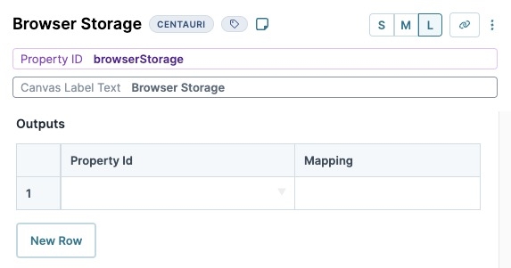
Modify the Browser Storage component using the toolbar settings.
Discover more about the Browser Storage component on the Community Hub.
.jpg)

.png)

.jpg)
