File Storage component is a Centauri (1.0) component that handles file transfers in a module. Use this component to send and retrieve files from outside of Unqork. These files can be private customer data or confidential employee records that you need to keep somewhere other than on your company network. The File Storage component uses an SFTP and FTP service to send and receive these files.
Learn how to setup and use a File Storage component in our Best Practices: Secure File Transfer Protocol (SFTP) Integration article.
Common uses for the File Storage component include:
Retrieving a file from a remote file service and returning an object with file contents.
Uploading data to a remote server.
You can find the File Storage component in the Data & Event Processing group to the left of the Module Builder.
About the Configuration Window
To learn more about general component settings, view our General Component Settings article.
Data Settings
Setting | Description |
|---|---|
File Storage Type | The File Storage component is compatible with the following file types:
The default setting is SFTP. |
Method | You can select the following methods:
The default setting is GET. |
Service | This drop-down displays all services configured in Services Administration. You must set up your service in Services Administration before you can configure the File Storage component. |
Path | The directory path or property ID to place or access the file. |
Property ID | Enter the Property ID for the request type. |
Watch | Selecting this checkbox fires the component on each new entry made or action taken on the component. |
File Object (PUT Method Only) | When the Method is set to PUT, you must specify the property ID or file location to update. |
Property ID | Enter the Property ID for the request type. |
Watch | Selecting this checkbox fires the component on each new entry made or action taken on the component. |
.jpg) Advanced Settings
Advanced Settings
Setting | Description |
|---|---|
Disable Execution | Once activated, the logic tied to this component doesn't execute. Use this if you want to keep the component's settings, but want to disable the operations it performs. By default, the Disabled is |
Learn how to setup and use a File Storage component in our Best Practices: Secure File Transfer Protocol (SFTP) Integration article.
File Storage component is a Centauri (1.0) component that handles file transfers in a module. Use this component to send and retrieve files from outside of Unqork. These files can be private customer data or confidential employee records that you need to keep somewhere other than on your company network. The File Storage component uses an SFTP and FTP service to send and receive these files.
Learn how to setup and use a File Storage component in our Best Practices: Secure File Transfer Protocol (SFTP) Integration article.
Common uses for the File Storage component include:
Retrieving a file from a remote file service and returning an object with file contents.
Uploading data to a remote server.
You can find the File Storage component in the Data & Event Processing group to the left of the Module Builder.
About the Configuration Window
To learn more about general component settings, view our General Component Settings article.
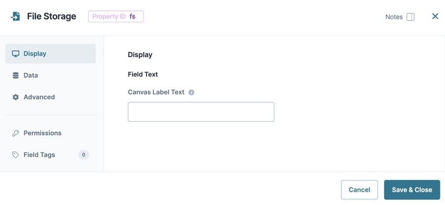
Display Panel
Field Text
Setting | Description |
|---|---|
Canvas Label Text | Label Text conveys what the input component is and what information it displays. Enter the purpose of the corresponding component or field. User-friendly labels make your module more accessible. Keep labels short and descriptive (a word or two) using title case. For longer entries, use sentence case. |
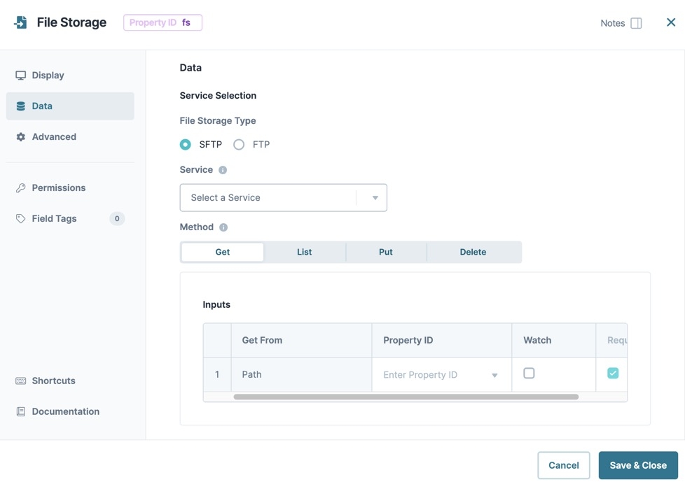
Data Panel
Service Selection
Setting | Description |
|---|---|
File Storage Type | The File Storage component is compatible with the following file types:
The default setting is SFTP. |
Service | This drop-down displays all services configured in Services Administration. You must set up your service in Services Administration before you can configure the File Storage component. |
Method | You can select the following methods:
The default setting is GET. |
Inputs | Whether your API (application programming interface) call is an Inbound or Outbound call depends on your Method selection. The following settings let you input the file path, file object, and request type. You can also select if you want the component to watch for an action or make it required. For Outbound FTP requests, both the Path and File Object are required. The first row of your Inputs table displays the file name to pull from the server. The second row tells the File Storage component how to pass the data from the source. When the file returns, it's received by the File Storage component and stored for later use. |
Get From | This field populates with Path and/or Object depending on your Method selection. This is the path or object of your inbound or outbound request. You cannot adjust this setting. |
Property ID | Enter the Property ID for the request type. |
Watch | Selecting this checkbox fires the component on each new entry made or action taken on the component. |
Required | Selecting this checkbox requires entering input data before the logic component fires. |
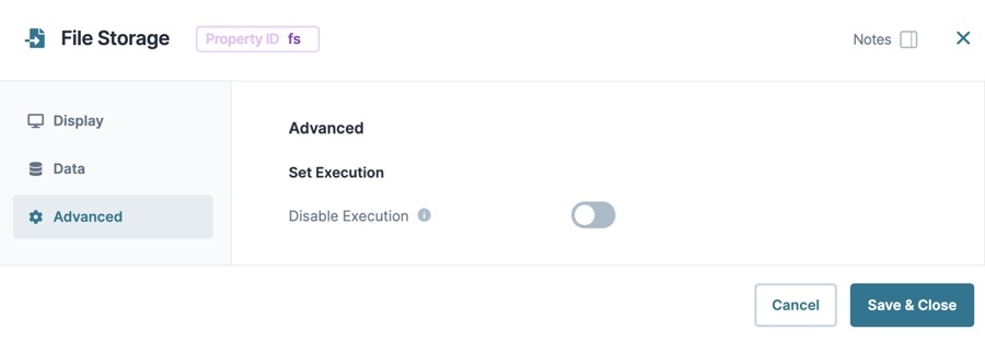
Advanced Panel
Setting | Description |
|---|---|
Disable Execution | Once activated, the logic tied to this component doesn't execute. Use this if you want to keep the component's settings, but want to disable the operations it performs. By default, the Disabled is |
Learn how to setup and use a File Storage component in our Best Practices: Secure File Transfer Protocol (SFTP) Integration article.
Resources
Modify the File Storage component using the toolbar settings
Best Practices: Secure File Transfer Protocol (SFTP) Integration
.jpg)


