The Data Mapper component is a Centauri (v1.0) component that manipulates submission data captured from other components using Excel formulas and Lodash functions.
Data Mapper component configurations commonly use if statements. IF statements let you make logical decisions based on an input value using the following format: =IF(condition, valueIfTrue, valueIfFalse).
A few scenarios lend themselves particularly for using the Data Mapper component:
Organizing top-level fields into a key/value pair array and manipulating that data.
Iterating an existing array as defined in the Watch Field setting. For example, the output of an Advanced DataGrid component.
You can find the Data Mapper component in the Data & Event Processing group to the left of the Module Builder.
About the Configuration Window
To learn more about general component settings, view our General Component Settings article.
Data Settings
Data Storage
Setting | Description |
|---|---|
Store Data in Database | The Store Data in Database setting affects how data persists through your application. When set to
Set the toggle to
|
Restrict Search to Array | When set to By default, this setting is set to |
Include All Fields | When set to When set to By default, this is setting is set to |
Wrap in Table | When set to By default, this setting is set to |
Traverse Array Bottom to Top | When set to By default, this setting is set to |
.jpg) Data Mapper
Data Mapper
Setting | Description |
|---|---|
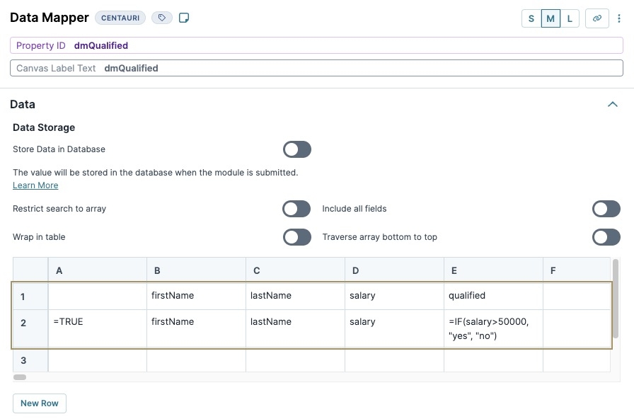
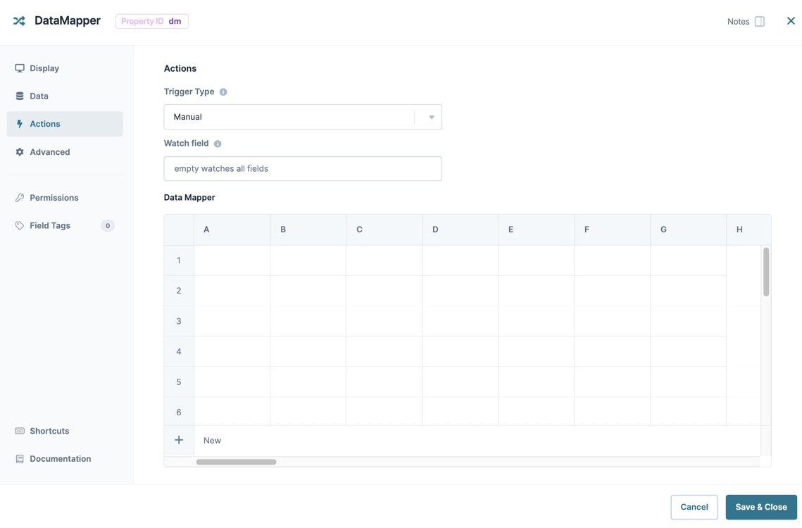
Data Mapper Table | The Data Mapper table is where you'll enter the logic for the Data Mapper component. The first column (skipping cell A1) is where you add your inclusion logic for the row. As long as the logic equals TRUE, the row attaches. For example, The first row (skipping cell A1) is where you define your keys. Treat this row like column headers in an Excel spreadsheet. |
Actions Settings
Actions
Setting | Description |
|---|---|
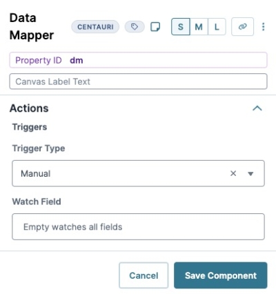
Trigger Type | This setting provides the following options:
|
Watch Field | Enter the Property ID of the component you want the Data Mapper component to watch. The Data Mapper component refreshes on each new entry in the Watch Field. By default, the Data Mapper component watches all fields. Leave this field blank to continue with default settings. |
Advanced Settings
Setting | Description |
|---|---|
Disable Execution | If Disable Execution is set to By default, this setting is set to |
Prevent Execution While Loading Data | When set to By default, this setting is set to |
Adding a Data Mapper Component
In this example, configure a Data Mapper component to create an array with a single row of data based on an end-user's name and salary. In the DevTools Console, you'll see an extra data point stored in the array. That data point, based on the salary input, determines if the end-user qualifies for a program.
Configure the First Text Field Component
Configure a Text Field component so your end-user can enter their first name.
In the Module Builder, drag and drop a Text Field component onto your canvas.
2.In the Property ID field, enter firstName.
In the Label Text field, enter
First Name.Navigate to the Validation settings.
Set Required to
 (ON).
(ON).Click Save Component.
Configure the Second Text Field Component
Configure a second Text Field component so your end-user can enter their last name.
Drag and drop a second Text Field component onto your canvas, placing it below the firstName Text Field component.
2.In the Property ID field, enter lastName.
In the Label Text field, enter
Last Name.Navigate to the Validation settings.
Set Required to
 (ON).
(ON).Click Save Component.
Configure the Number Component
The Number component is where your end-user enters their salary. Depending on the end-user's input, the system records them as qualified or not.
Drag and drop a Number component onto the canvas, placing it below the lastName Text Field component.
2.In the Property ID field, enter salary.
In the Label Text field, enter
Your Salary.In the Prefix field, enter
$.Navigate to the Validation settings.
Set Required to
 (ON).
(ON).Click Save Component.
Configure the Data Mapper Component
Lastly, configure the Data Mapper component to create the logic that maps data to the database.
Drag and drop a Data Mapper component onto the canvas, placing it below the salary Number component.
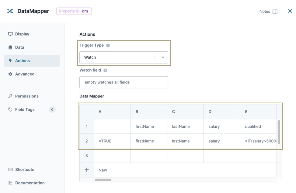
In the Property ID and Canvas Label Text fields, enter
dmQualified.In the Data Mapper configuration table, enter the following:
A
B
C
D
E
1
firstName
lastName
salary
qualified
2
=TRUE
firstName
lastName
salary
=IF(salary>50000, "yes", "no")
the salary value is over $50,000, the system records "qualified":"yes". If the salary value is less than $50,000, the system records "qualified":"no".
Navigate to the Actions settings.
From the Trigger Type drop-down, select Watch.
Click Save Component.
Save your module.
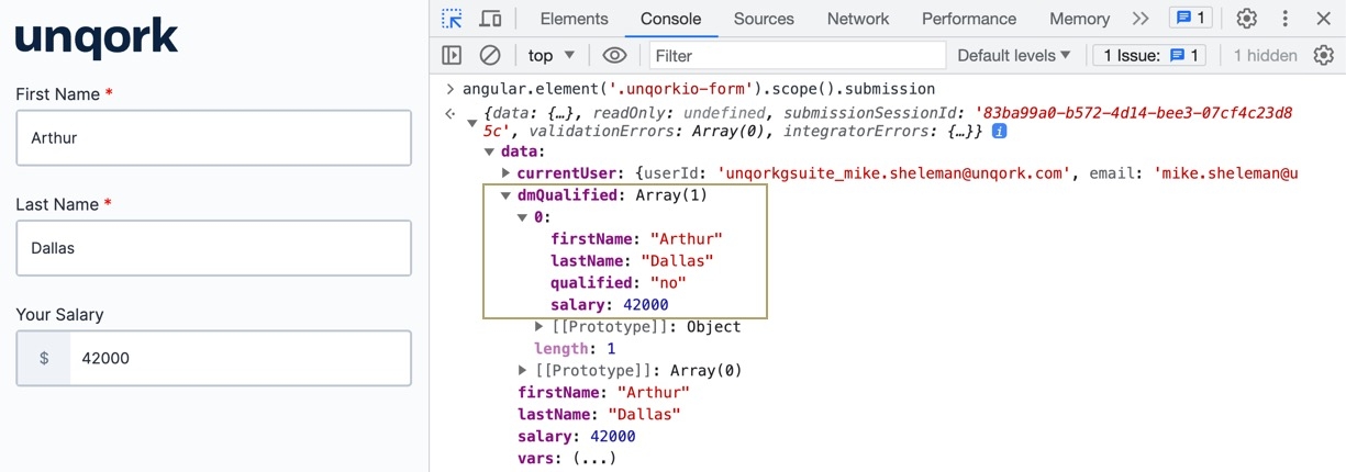
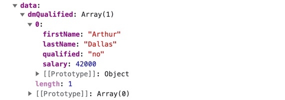
Preview your module in Express View and enter values in the fields. Open the DevTools Console and use the Angular command to view the submission data. Expand the dmQualified key to view your Data Mapper array. In the image below, the salary is less than $50,000. So, the Data Mapper component records "qualified":"no".
The Data Mapper component is a Centauri (v1.0) component that manipulates submission data captured from other components using Excel formulas and Lodash functions.
Data Mapper component configurations commonly use if statements. IF statements let you make logical decisions based on an input value using the following format: =IF(condition, valueIfTrue, valueIfFalse).
A few scenarios lend themselves particularly for using the Data Mapper component:
Organizing top-level fields into a key/value pair array and manipulating that data.
Iterating an existing array as defined in the Watch Field setting. For example, the output of an Advanced DataGrid component.
You can find the Data Mapper component in the Data & Event Processing group to the left of the Module Builder.
About the Configuration Window
To learn more about general component settings, view our General Component Settings article.
Display Panel
Setting | Description |
|---|---|
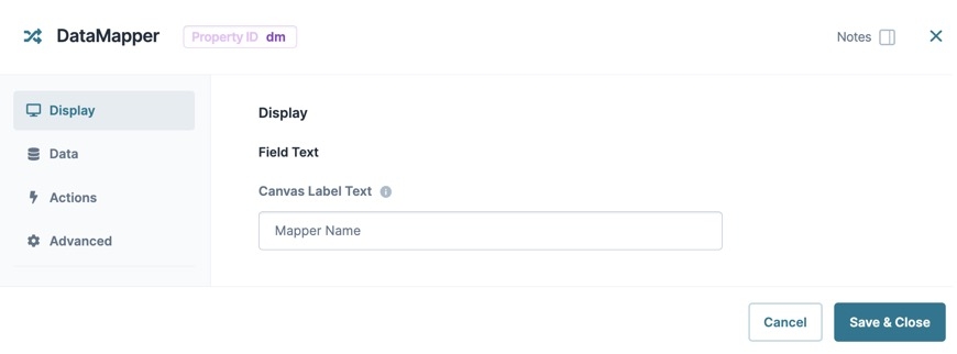
Canvas Label Text | Label Text conveys what the input component is and what information it displays. Enter the purpose of the corresponding component or field. User-friendly labels make your module more accessible. Keep labels short and descriptive (a word or two) using title case. For longer entries, use sentence case. |
Data Panel
Data Storage
Setting | Description |
|---|---|
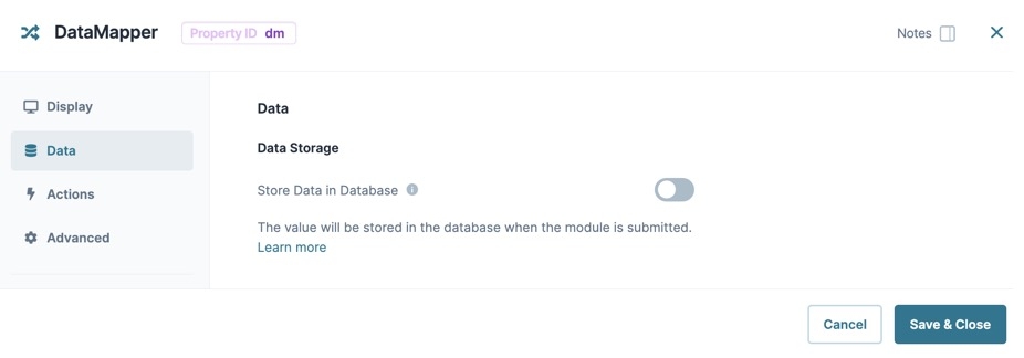
Store Data in Database | The Store Data in Database setting affects how data persists through your application. When set to
Set the toggle to
|
Actions Panel
Actions
Setting | Description |
|---|---|
Trigger Type | This setting provides the following options:
|
Watch Field | Enter the Property ID of the component you want the Data Mapper component to watch. The Data Mapper component refreshes on each new entry in the Watch Field. By default, the Data Mapper component watches all fields. Leave this field blank to continue with default settings. |
Data Mapper
Setting | Description |
|---|---|
Data Mapper Table | The Data Mapper table is where you'll enter the logic for the Data Mapper component. The first column (skipping cell A1) is where you add your inclusion logic for the row. As long as the logic equals TRUE, the row attaches. For example, The first row (skipping cell A1) is where you define your keys. Treat this row like column headers in an Excel spreadsheet. |
Advanced Panel
Set Execution
Setting | Description |
|---|---|
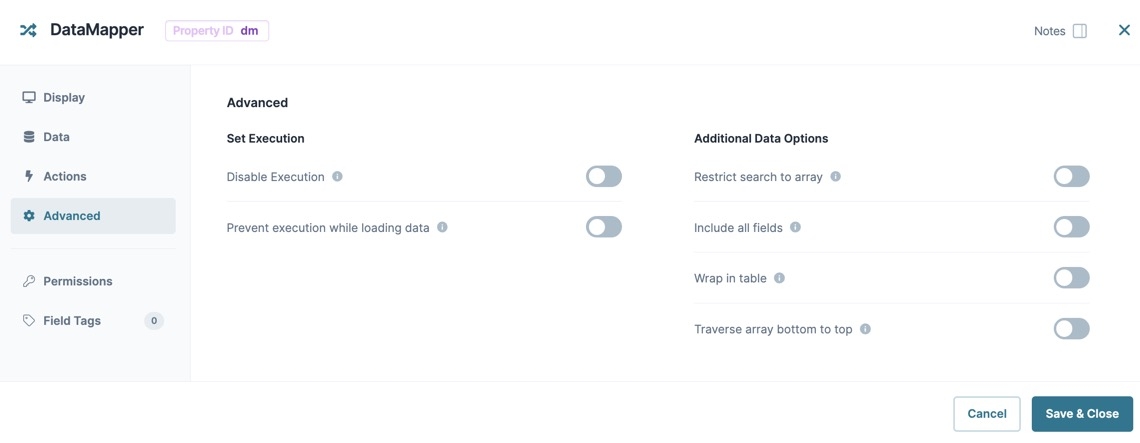
Disable Execution | If Disable Execution is set to By default, this setting is set to |
Prevent Execution While Loading Data | When set to By default, this setting is set to |
Additional Data Options
Setting | Description |
|---|---|
Restrict Search to Array | When set to By default, this setting is set to |
Include All Fields | When set to When set to By default, this is setting is set to |
Wrap in Table | When set to By default, this setting is set to |
Traverse Array Bottom to Top | When set to By default, this setting is set to |
Adding a Data Mapper Component
In this example, configure a Data Mapper component to create an array with a single row of data based on an end-user's name and salary. In the DevTools Console, you'll see an extra data point stored in the array. That data point, based on the salary input, determines if the end-user qualifies for a program.
Configure the First Text Field Component
Configure a Text Field component so your end-user can enter their first name.
In the Module Builder, drag and drop a Text Field component onto your canvas.
In the Property ID field, enter firstName.
In the Label Text field, enter
First Name.To the left of the component's configuration window, click Validation.
Set Required to
 (ON).
(ON).Click Save & Close.
Configure the Second Text Field Component
Configure a second Text Field component so your end-user can enter their last name.
Drag and drop a second Text Field component onto your canvas, placing it below the firstName Text Field component.
In the Property ID field, enter lastName.
In the Label Text field, enter
Last Name.To the left of the component's configuration window, click Validation.
Set Required to
 (ON).
(ON).Click Save & Close.
Configure the Number Component
The Number component is where your end-user enters their salary. Depending on the end-user's input, the system records them as qualified or not.
1.Drag and drop a Number component onto the canvas, placing it below the lastName Text Field component.
In the Property ID field, enter salary.
In the Label Text field, enter
Your Salary.In the Prefix field, enter
$.To the left of the component's configuration window, click Validation.
Set Required to
 (ON).
(ON).Click Save & Close.
Configure the Data Mapper Component
Lastly, configure the Data Mapper component to create the logic that maps data to the database.
Drag and drop a Data Mapper component onto the canvas, placing it below the salary Number component.
In the Property ID and Canvas Label Text fields, enter dmQualified.
To the left of the component's configuration window, click Actions.
From the Trigger Type drop-down, select
Watch.In the Data Mapper table, enter the following:
A
B
C
D
E
1
firstName
lastName
salary
qualified
2
=TRUE
firstName
lastName
salary
=IF(salary>50000, "yes", "no")
the salary value is over $50,000, the system records "qualified":"yes". If the salary value is less than $50,000, the system records "qualified":"no".
Click Save & Close.
Save your module.
Preview your module in Express View and enter values in the fields. Open the DevTools Console and use the Angular command to view the submission data. Expand the dmQualified key to view your Data Mapper array. In the image below, the salary is less than $50,000. So, the Data Mapper component records "qualified":"no".
Data Structure of a Data Mapper Component
The Data Mapper component's data stores in an array. In the above example, the dmQualified Data Mapper component stores the firstName Text Field, lastName Text Field, and salary Number components in the first row (0) of the array. The Data Mapper component's logic creates the qualified key/value pair that validates if the end-user makes more than $50,000 based on the value in the salary Number component.
Resources
Modify the Data Mapper component using the toolbar settings.
Discover more about the Data Mapper component in the Community Hub.
View the latest enhancements and bug fixes for the Data Mapper component.
.jpg)
