Navigation Component
Overview
The Navigation component creates a multi-page navigation experience in a single module. The Navigation component uses Panel components to represent different pages for end-users End-users, also known as Express Users, are the individuals accessing an application through Express View. In most cases, end-users are the customers using the product. to navigate through an application.
By default, the Navigation component has a variety of navigation and event buttons. These include:
-
Previous and Next buttons.
-
A Save Draft and Exit button.
-
A Submit button.
You can also add custom navigation buttons. To learn more, see our Custom Navigation Buttons article.
The default navigation style is navigation bubbles at the top of the page. You can also use tabs or a table of contents-style navigation.
You'll find the Navigation component in the Display & Layout group to the left of the Module Builder.
Click on the tabs below to learn more about the Navigation component:
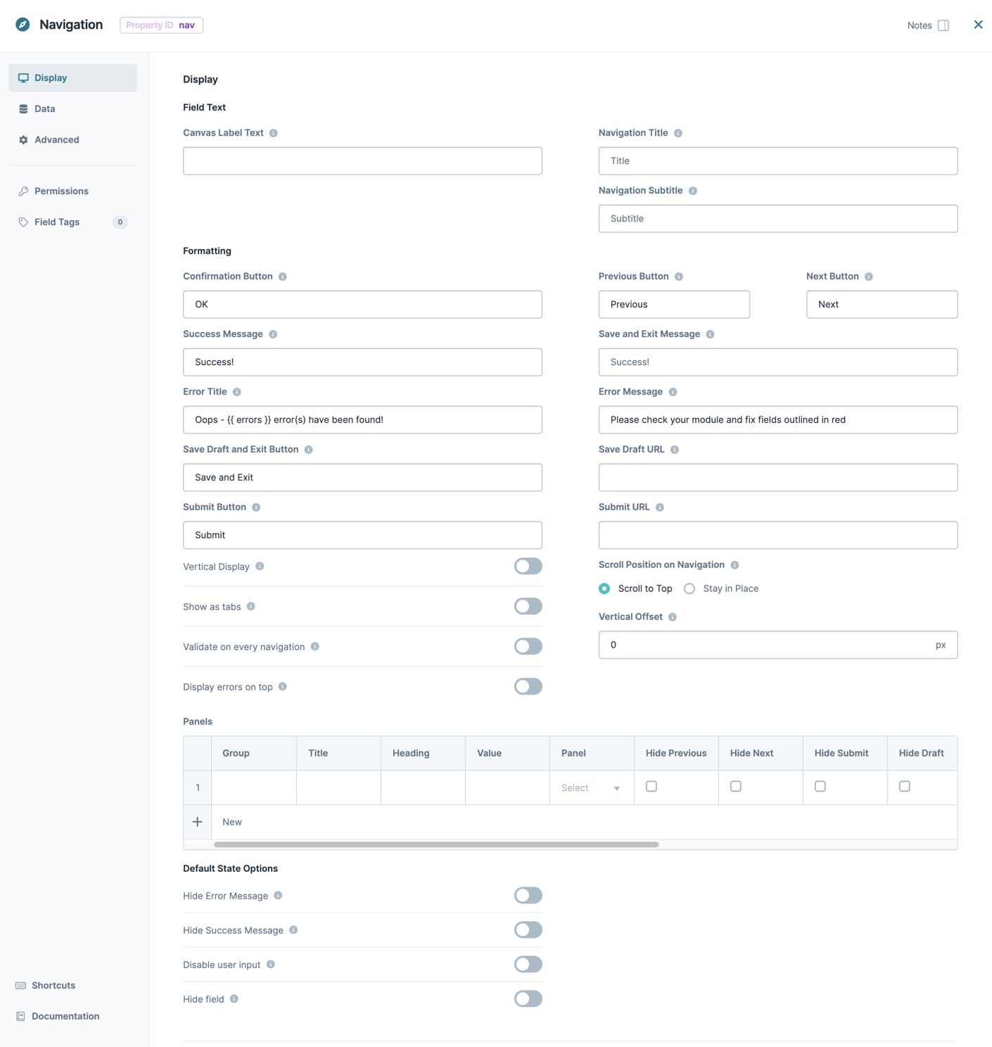
Display Settings
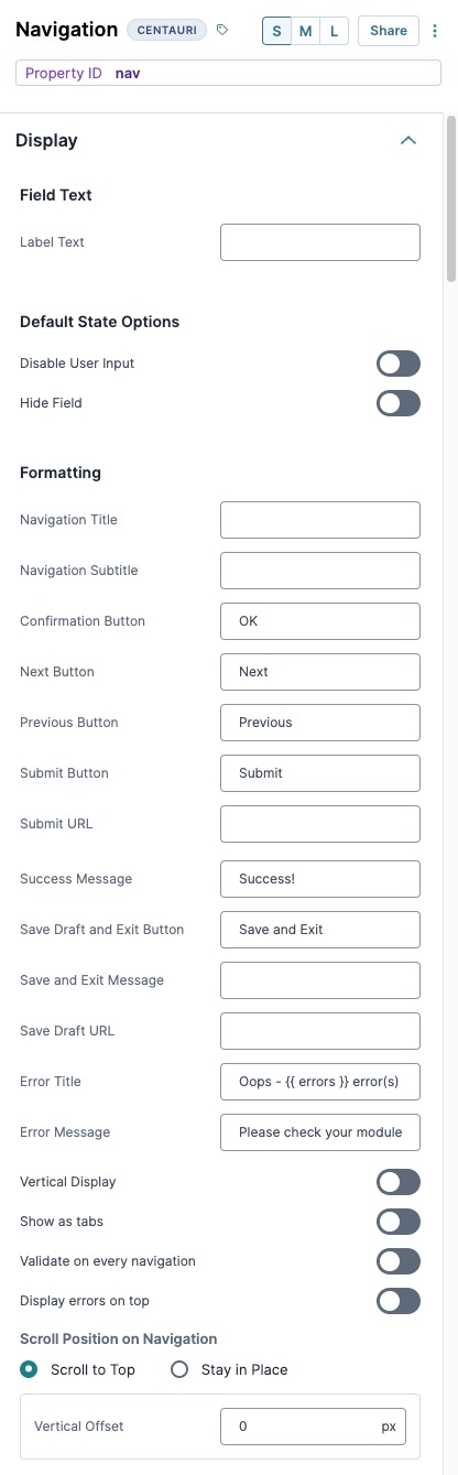
Field Text
| Settings | Description |
|---|---|
|
Canvas Label Text |
The Label Text field conveys what the input component is and what information it displays. Enter the purpose of the corresponding component or field. Use user-friendly labels to make your module accessible. It's best practice to use brief and descriptive labels (one or two words). Use title case for short entries and sentence case for long entries. |
Default State Options
| Settings | Description |
|---|---|
|
Hide Field |
Set to (checked) to hide the Navigation component and all nested components in Express View. The components are always visible in the Module Builder. |
Input Behavior
| Setting | Description |
|---|---|
|
Input Behavior |
Controls how end-users End-users, also known as Express Users, are the individuals accessing an application through Express View. In most cases, end-users are the customers using the product. interact with the component. Choose from the following options:
|
Formatting
| Settings | Description |
|---|---|
|
Navigation Title |
Enter a title to display on every page. |
|
Navigation Subtitle |
Enter a subtitle to display on every page. |
|
Confirmation Button |
The text that displays in the Success and Error message modals A modal is a window that appears on top of the content you are currently viewing.. The default value is OK. |
|
Next Button |
The text that displays on the Next navigation button. The default text is Next. |
|
Previous Button |
The text that displays on the Previous navigation button. The default label is Previous. |
|
Submit Button |
The text for the Submit button. The default value is Submit. |
|
Submit URL |
The URL to redirect your end-user to after they click Submit. |
|
Success Message |
The message that displays on successfully saving the submission. The default value is Success! |
|
Save Draft and Exit Button |
The text that displays on the Save Draft and Exit button. The default value is Save Draft and Exit. After clicking Save Draft and Exit, your end-user sees a confirmation modal. |
|
Save and Exit Message |
The text that displays in the Save and Exit modal. The modal displays when clicking the Save Draft and Exit button. |
|
Save Draft URL |
The URL to redirect your end-user to after they click Save Draft and Exit. |
|
Error Title |
The message that displays in a modal A modal is a window that appears on top of the content you are currently viewing. when validation errors are present. |
|
Error Message |
The text that displays in the error message modal when validation errors are present. |
|
Vertical Display |
Set to (ON) to display the navigation in vertical order. This navigation style looks like a table of contents at the left side of the page, with expandable groups of pages. Use the Group column in the Panels table to create and add top-level titles to the page groups. The default navigation style is navigation bubbles displayed in horizontal order. The default setting is (OFF). |
|
Show as Tabs |
Set to (ON) to use tabs-style navigation. The default navigation style is navigation bubbles. The default setting is (OFF). |
|
Validate on Every Navigation |
Set to (ON) to validate the module when the end-user clicks the Previous or Next buttons. You must also select either the Validate on User Navigation or Validate All Module Fields setting. For the Vertical Display to work, there must be a Group value in the Panels table. The default setting is (OFF). |
|
Display Errors on Top |
Set to (ON) to display validation error messages at the top of the page instead of the bottom. The default setting is (OFF). |
Scroll Position on Navigation
| Settings | Description |
|---|---|
|
Scroll Position on Navigation |
This setting controls the end-user's scroll position when navigating between pages. Options include:
The default setting is Scroll to Top. |
|
Vertical Offset |
The number of pixels to move the Navigation component down by. Use this in applications with fixed headers to prevent the Navigation component from overlapping with the header. The Vertical Offset value is in pixels. |
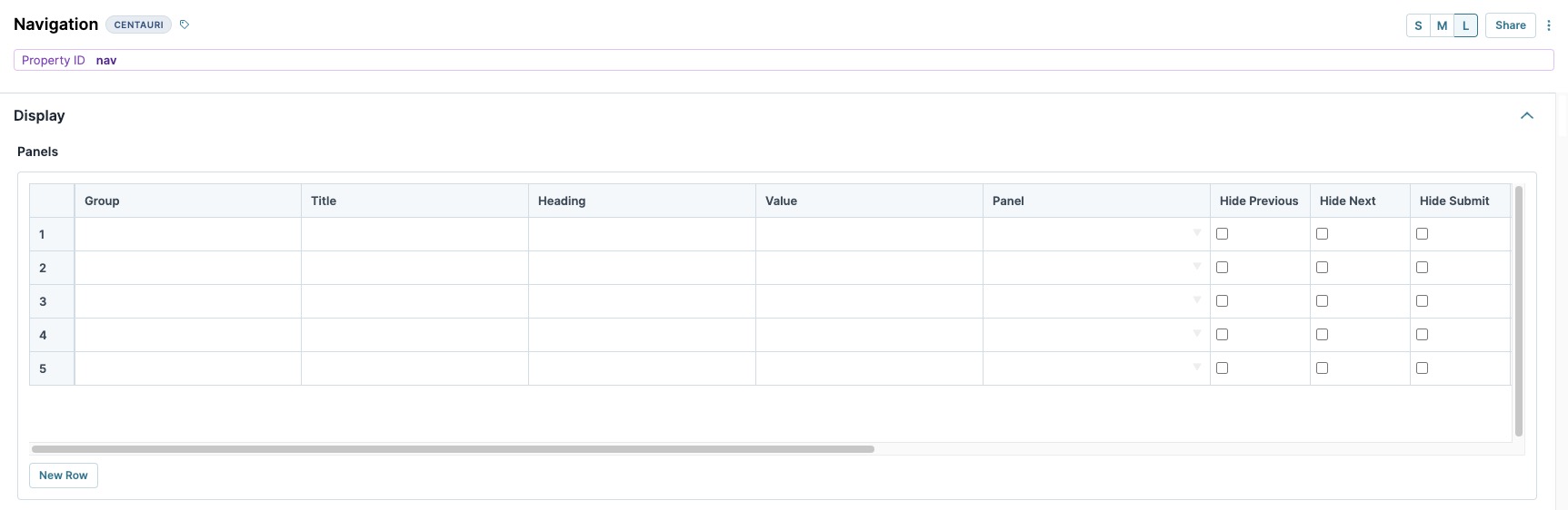
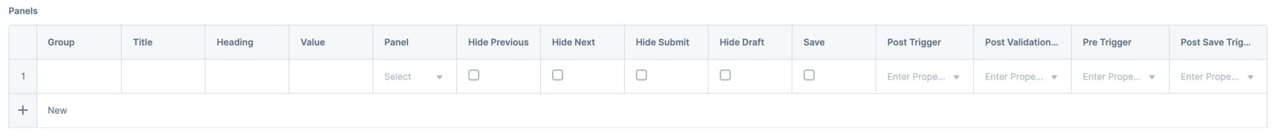
Panels
The Panels table defines each page in the Navigation component. The Panel referenced in the first row of the table becomes the first page. The Panel referenced in the second row of the table becomes the second page, and so on. To improve end-user experience, use the smallest amount of pages possible.
The Panels referenced in this table must nest inside the Navigation component.
| Setting | Description |
|---|---|
|
Group |
Enter a title for a group of Panels. This title displays when the Vertical Display setting is enabled. The Vertical Display navigation style looks like a Table of Contents, with expandable groups of pages. Set the top-level title for each group in this column. Using the same title in multiple rows will add that Panel to the page group. There must be a Group value for the Vertical Display to work. |
|
Title |
Enter a title to display below each navigation bubble. With Show as Tabs set to (ON), the value in this column displays as the tab's title. With Vertical Display set to (ON), the value in this column displays as the second-level title. |
|
Heading |
Enter a heading to display on this Panel's page. |
|
Value |
Enter the Property ID A Property ID is the unique field ID used by Unqork to track and link components in your module. of a Panel component to act as a page. |
|
Panel |
Enter the Property ID A Property ID is the unique field ID used by Unqork to track and link components in your module. of a Panel component to act as a page. |
|
Hide Previous |
Set to (checked) to hide the Previous navigation button on this Panel's page. By default, the Previous button does not display on the first page. |
|
Hide Next |
Set to (checked) to hide the Next navigation button on this Panel's page. By default, the Next button does not display on the final page. |
|
Hide Submit |
Set to (checked) to hide the Submit button on this Panel's page. By default, the Submit button displays only on the final page. |
|
Hide Draft |
Set to (checked) to hide the Save Draft and Exit button on this Panel's page. By default, the Save Draft and Exit button displays on every page. |
|
Save |
Set to (checked) to create a new submission or save to an existing submission after the end-user navigates away from this Panel's page. |
|
Post Trigger |
Enter the Property ID of the component to trigger when navigating away from this Panel's page. |
|
Post Validation Trigger |
Enter the Property ID of the component to trigger on validation of the module. Use in combination with either of the following settings:
|
|
Pre Trigger |
Enter the Property ID of the component to trigger when navigating to this Panel's page. Post Trigger triggers on the preceding page fire first. |
|
Post Save Trigger |
Enter the Property ID of the component to trigger on saving the submission. Use in combination with either of the following settings:
Save events created by clicking either the Submit button or the Save and Exit button won't trigger components entered in the Post Save Trigger field. |
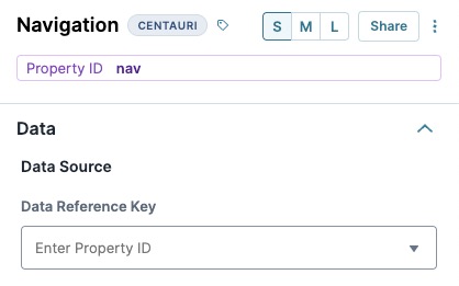
Data Settings
| Settings | Description |
|---|---|
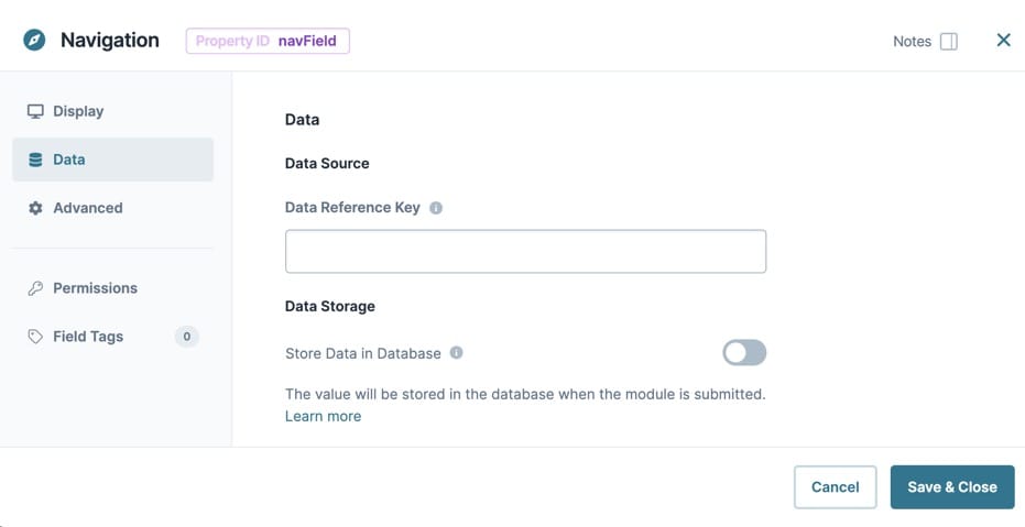
|
Data Reference Key |
Enter a Property ID that contains a JSON JSON (JavaScript Object Notation) is an open standard file and data interchange format. Unqork uses JSON for submission (record) data. array to use as the Data Source. |
Advanced Settings
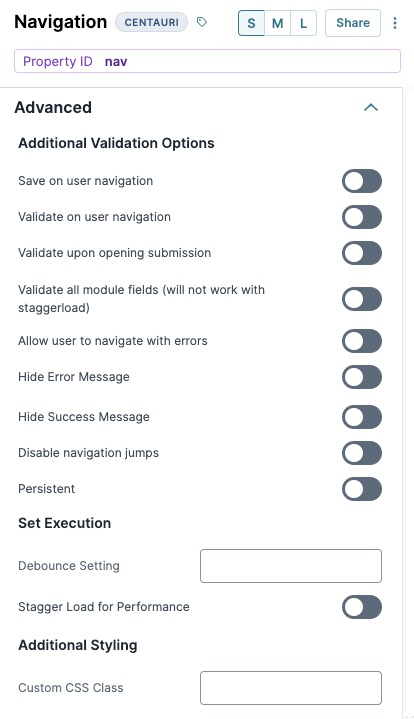
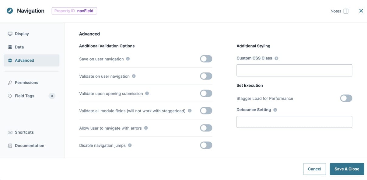
Additional Validation Settings
| Settings | Description |
|---|---|
|
Save on User Navigation |
Set to (checked) to create a submission when your end-user navigates between the first and second pages. The submission then updates and saves any changes on every subsequent navigation. By default, only clicking the Submit or Save Draft and Exit buttons create a submission. |
|
Validate on User Navigation |
Set to (checked) to validate the module whenever your end-user clicks the Next or Submit buttons. When validation errors are present, your end-user cannot navigate away. |
|
Validate Upon Opening Submission |
Set to (checked) to validate the module when your end-user opens a new submission. |
|
Validate All Module Fields |
Set to (checked) to validate all fields in the module, not just the fields visible on the current page. All validation errors display on the final page when your end-user clicks Submit. This setting is not supported when the Stagger Load for Performance setting is set to (checked). |
|
Allow User to Navigate with Errors |
Set to (checked) to let your end-user navigate between pages despite validation errors. Your end-user can't submit their information when validation errors are present. |
|
Hide Error Message |
Set to (checked) to prevent the end-user from seeing the error message. |
|
Hide Success Message |
Set to (checked) to prevent the end-user from seeing the success message. |
|
Disable Navigation Jumps |
Set to (checked) to prevent end-users from navigating between pages in non-sequential order. For example, by clicking the navigation bubbles. |
|
Persistent |
This setting is not required for the Navigation component |
Set Execution
| Settings | Description |
|---|---|
|
Stagger Load for Performance |
Set to (checked) to prevent the Navigation component's Panel components from being loaded into the module until the end-user End-users, also known as Express Users, are the individuals accessing an application through Express View. In most cases, end-users are the customers using the product. makes them visible by navigating to that Panel component step. Doing so improves loading and navigation performance in larger Navigation components with many Panel components or components in the Panel components. When set to (checked), components remain hidden and do not trigger until displayed. These components include those with Hide Field set to (ON) or when a logic component controls another component with a hidden Output Type. By default, the Stagger Load for Performance setting is set to ☐ (unchecked). |
|
Debounce Setting |
The number of milliseconds that pass before the module loads this component. This is useful if you have a large module and you load several components at the same time. 1,000 milliseconds = 1 second. |
Additional Styling
| Settings | Description |
|---|---|
|
Custom CSS Class |
Enter a Custom CSS Cascading Style Sheets (CSS) is a style sheet language used for presenting how a HTML or XML document looks to end-users. Class to apply to your component. Custom CSS lets you maintain a consistent look and feel when the field or element is part of a template or multiple modules. Updated CSS styling applies to all components that reference this custom class name. |
Adding a Navigation Component
Let's say you want to collect information about a claim your end-user submitted. Configure a Navigation component with a two-page navigation experience. Use Panel components for each page of your module. On one page, end-users enter some basic information. On the next page, end-users enter some claim details before submitting the form.
-
1 Navigation component
-
2 Panel components
-
2 Text Field components
-
1 Date Input component
-
1 Number component
Configure the Navigation Component
First, add and configure the Navigation component. This component holds two Panel components that act as pages of the application.
| 1. | In the Module Builder, drag and drop a  Navigation component onto your canvas. Navigation component onto your canvas. |
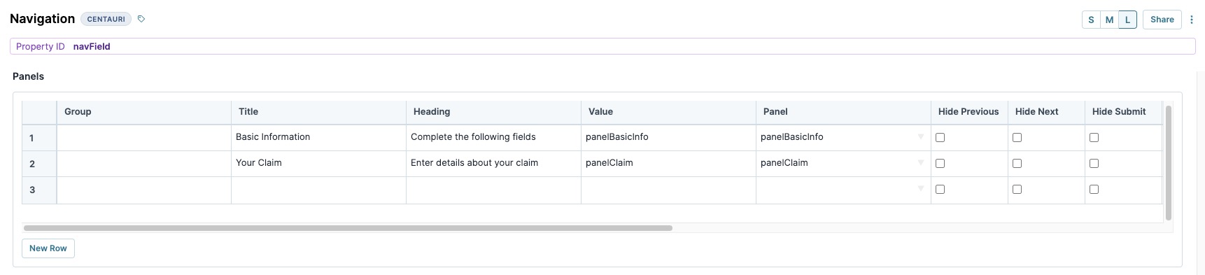
| 2. | In the Property ID A Property ID is the unique field ID used by Unqork to track and link components in your module. field, enter navField. |
| 3. | In the Canvas Label Text field, enter navField. |
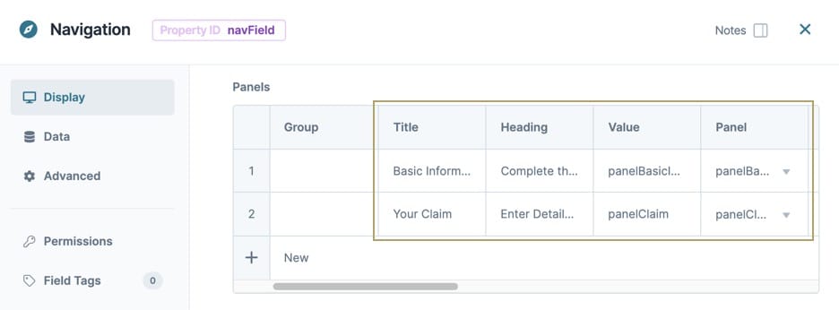
| 4. | In the Panels table, enter the following: |
| Group | Title | Heading | Value | Panel |
|---|---|---|---|---|
|
|
Basic Information |
Complete the following fields |
panelBasicInfo |
panelBasicInfo |
|
|
Your Claim |
Enter details about your claim |
panelClaim |
panelClaim |
You'll set up the panelBasicInfo and panelClaim Panel components next.
| 5. | Navigate to the Advanced settings. |
| 6. | Set Validate on User Navigation to (ON). |
| 7. | Click Save Component. |
Configure the Panel Components
Add two Panel components inside the Navigation component. Each of these Panels becomes a page in your module.
| 1. | Drag and drop a Panel component onto your canvas, placing it inside the navfield Navigation component. |
| 2. | In the Property ID A Property ID is the unique field ID used by Unqork to track and link components in your module. field, enter panelBasicInfo. |
| 3. | Set Hide Panel to (ON). |
| 4. | Click Save Component. |
| 5. | Drag and drop a second Panel component onto your canvas, placing it inside the navfield Navigation component and below the panelBasicInfo Panel component. |
| 6. | In the Property ID A Property ID is the unique field ID used by Unqork to track and link components in your module. field, enter panelClaim. |
| 7. | Set Hide Panel to (ON). |
| 8. | Click Save Component. |
Configure the Text Field Components
Next, add some Text Fields into the panelBasicInfo Panel component.
| 1. | Drag and drop a Text Field component onto your canvas, placing it inside the panelBasicInfo Panel component. |
| 2. | In the Property ID A Property ID is the unique field ID used by Unqork to track and link components in your module. field, enter firstName. |
| 3. | In the Label Text field, enter First Name. |
| 4. | Navigate to the Validation settings. |
| 5. | Set the Required toggle to (ON). |
| 6. | Click Save Component. |
| 7. | Drag and drop a Text Field component onto your canvas, placing it under the firstName Text Field component. |
| 8. | In the Property ID A Property ID is the unique field ID used by Unqork to track and link components in your module. field, enter lastName. |
| 9. | In the Label Text field, enter Last Name. |
| 10. | Navigate to the Validation settings. |
| 11. | Set the Required toggle to (ON). |
| 12. | Click Save Component. |
Configure the Date Input Component
Add a Date Input component so your end-user can enter the date of their claim.
| 1. | Drag and drop a  Date Input component onto your canvas, placing it inside the panelClaim Panel component. Date Input component onto your canvas, placing it inside the panelClaim Panel component. |
| 2. | In the Property ID A Property ID is the unique field ID used by Unqork to track and link components in your module. field, enter dateClaim. |
| 3. | In the Label Text field, enter Date of Claim. |
| 4. | Navigate to the Validation settings. |
| 5. | Set the Required toggle to (ON). |
| 6. | Click Save Component. |
Configure the Number Component
Lastly, add a Number component for your end-user to add their claim's reference number.
| 1. | Drag and drop a Number component onto your canvas, placing it under the dateClaim Date Input component. |
| 2. | In the Property ID A Property ID is the unique field ID used by Unqork to track and link components in your module. field, enter claimNumber. |
| 3. | In the Label Text field, enter Claim Reference Number. |
| 4. | Navigate to the Validation settings. |
| 5. | Set the Required toggle to (ON). |
| 6. | Click Save Component. |
Preview your module in Express View Express View is how your end-user views your application. Express View also lets you preview your applications to test your configuration and view the styling. This is also the view your end-users will see when interacting with your application. After configuring a module, click Preview in the Module Builder to interact with the module in Express View.. You'll see the following functionality:
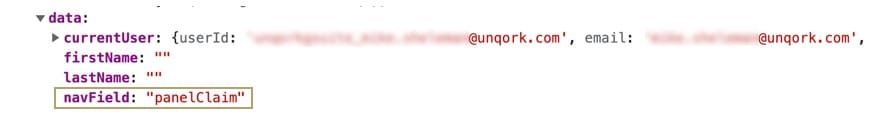
Structure of a Navigation Component's Data
The Navigation component presents as a key/value pair, where the key is the Property ID of the Navigation component, and the value is the Property ID of the Panel component displaying to the end-user. In the above example, the navfield Navigation component is the key, and the panelClaim Panel component is the value.

Overview
The Navigation component creates a multi-page navigation experience in a single module. The Navigation component uses Panel components to represent different pages for end-users End-users, also known as Express Users, are the individuals accessing an application through Express View. In most cases, end-users are the customers using the product. to navigate through an application.
By default, the Navigation component has a variety of navigation and event buttons. These include:
-
Previous and Next buttons.
-
A Save Draft and Exit button.
-
A Submit button.
You can also add custom navigation buttons. To learn more, see our Custom Navigation Buttons article.
The default navigation style is navigation bubbles at the top of the page. You can also use tabs or a table of contents-style navigation.
You'll find the Panel component in the Display & Layout group to the left of the Module Builder.
Click on the tabs below to learn more about the Navigation component:
Display Panel
Field Text
| Settings | Description |
|---|---|
|
Canvas Label Text |
The Label Text field conveys what the input component is and what information it displays. Enter the purpose of the corresponding component or field. Use user-friendly labels to make your module accessible. It's best practice to use brief and descriptive labels (one or two words). Use title case for short entries and sentence case for long entries. |
| Settings | Description |
|---|---|
|
Navigation Title |
Enter a title to display on every page. |
|
Navigation Subtitle |
Enter a subtitle to display on every page. |
Formatting
| Settings | Description |
|---|---|
|
Confirmation Button |
The text that displays in the Success and Error message modals A modal is a window that appears on top of the content you are currently viewing.. The default value is OK. |
|
Success Message |
The message that displays on successfully saving the submission. The default value is Success! |
|
Error Title |
The message that displays in a modal A modal is a window that appears on top of the content you are currently viewing. when validation errors are present. |
|
Save Draft and Exit Button |
The text that displays on the Save Draft and Exit button. The default value is Save Draft and Exit. After clicking Save Draft and Exit, your end-user sees a confirmation modal. |
|
Submit Button |
The text for the Submit button. The default value is Submit. |
|
Vertical Display |
Set to (ON) to display the navigation in vertical order. This navigation style looks like a table of contents at the left side of the page, with expandable groups of pages. Use the Group column in the Panels table to create and add top-level titles to the page groups. The default navigation style is navigation bubbles displayed in horizontal order. The default setting is (OFF). |
|
Show as Tabs |
Set to (ON) to use tabs-style navigation. The default navigation style is navigation bubbles. The default setting is (OFF). |
|
Validate on Every Navigation |
Set to (ON) to validate the module when the end-user clicks the Previous or Next buttons. You must also select either the Validate on User Navigation or Validate All Module Fields setting. For the Vertical Display to work, there must be a Group value in the Panels table. The default setting is (OFF). |
|
Display Errors on Top |
Set to (ON) to display validation error messages at the top of the page instead of the bottom. The default setting is (OFF). |
| Settings | Description |
|---|---|
|
Previous Button |
The text that displays on the Previous navigation button. The default label is Previous. |
|
Next Button |
The text that displays on the Next navigation button. The default text is Next. |
|
Save and Exit Message |
The text that displays in the Save and Exit modal. The modal displays when clicking the Save Draft and Exit button. |
|
Error Message |
The text that displays in the error message modal when validation errors are present. |
|
Save Draft URL |
The URL to redirect your end-user to after they click Save Draft and Exit. |
|
Submit URL |
The URL to redirect your end-user to after they click Submit. |
|
Scroll Position on Navigation |
This setting controls the end-user's scroll position when navigating between pages. Options include:
The default setting is Scroll to Top. |
|
Vertical Offset |
The number of pixels to move the Navigation component down by. Use this in applications with fixed headers to prevent the Navigation component from overlapping with the header. The Vertical Offset value is in pixels. |
Panels Table
The Panels table defines each page in the Navigation component. The Panel component referenced in the first row of the table becomes the first page. The Panel component referenced in the second row of the table becomes the second page, and so on. To improve user experience, use the smallest amount of pages possible.
The Panel components referenced in this table must nest inside the Navigation component.
| Setting | Description |
|---|---|
|
Group |
Enter a title for a group of Panels. This title displays when the Vertical Display setting is enabled. The Vertical Display navigation style looks like a Table of Contents, with expandable groups of pages. Set the top-level title for each group in this column. Using the same title in multiple rows will add that Panel to the page group. There must be a Group value for the Vertical Display to work. |
|
Title |
Enter a title to display below each navigation bubble. With Show as Tabs set to (ON), the value in this column displays as the tab's title. With Vertical Display set to (ON), the value in this column displays as the second-level title. |
|
Heading |
Enter a heading to display on this Panel's page. |
|
Value |
Enter the Property ID A Property ID is the unique field ID used by Unqork to track and link components in your module. of a Panel component that will act as a page. |
|
Panel |
Enter the Property ID A Property ID is the unique field ID used by Unqork to track and link components in your module. of a Panel component that will act as a page. |
|
Hide Previous |
Set to (checked) to hide the Previous navigation button on this Panel's page. By default, the Previous button doesn't display on the first page. |
|
Hide Next |
Set to (checked) to hide the Next navigation button on this Panel's page. By default, the Next button doesn't display on the final page. |
|
Hide Submit |
Set to (checked) to hide the Submit button on this Panel's page. By default, the Submit button displays only on the final page. |
|
Hide Draft |
Set to (checked) to hide the Save Draft and Exit button on this Panel's page. By default, the Save Draft and Exit button displays on every page. |
|
Save |
Set to (checked) to create a new submission or save to an existing submission after the end-user navigates away from this Panel's page. |
|
Post Trigger |
Enter the Property ID of the component to trigger when navigating away from this Panel's page. |
|
Post Validation Trigger |
Enter the Property ID of the component to trigger on validation of the module. Use in combination with either of the following settings:
|
|
Pre Trigger |
Enter the Property ID of the component to trigger when navigating to this Panel's page. Post Trigger triggers on the preceding page fire first. |
|
Post Save Trigger |
Enter the Property ID of the component to trigger on saving the submission. Use in combination with either of the following settings:
Save events created by clicking either the Submit button or the Save and Exit button won't trigger components entered in the Post Save Trigger field. |
Default State Options
| Settings | Description |
|---|---|
|
Hide Error Message |
Set to (checked) to prevent the end-user from seeing the error message. |
|
Hide Success Message |
Set to (checked) to prevent the end-user from seeing the success message. |
|
Disable User Input |
Set to (checked) to disable input for all nested components in Express View. Navigation between pages continues to work. |
|
Hide Field |
Set to (checked) to hide the Navigation component and all nested components in Express View. The components are always visible in the Module Builder. |
Data Panel
| Settings | Description |
|---|---|
|
Data Reference Key |
Enter a Property ID that contains a JSON JSON (JavaScript Object Notation) is an open standard file and data interchange format. Unqork uses JSON for submission (record) data. array to use as the Data Source. |
|
Store Data in Database |
The Store Data in Database setting affects how data persists through your application. When set to (ON), Unqork stores values entered into the field to the database (server-side submission). This occurs in three scenarios:
By default, workflows persist data from all fields in the client-side submission when navigating between screens. However, only values from fields with Store Data in Database enabled store in the server-side submission. Set the toggle to (OFF) when you don’t want to store the values from this field in the database. When using a Plug-In to remote execute a module, ensure data moving between modules is persistent. You can optionally enable Store Data in Database for components in the source module. But any components in the API module whose values are included in an API response must have Store Data in Database enabled. When a component’s data is not persistent, the data isn't included in an API call's response. So, Plug-Ins or external services requesting data from the API module can't receive non-persistent data in the response. Store Data in Database also affects what data is tracked using Unqork’s built-in tracker. When the Enable Tracker and Track Value toggles are set to (ON) in Module Settings, only values from fields with Store Data in Database enabled are tracked. |
Advanced Panel
Additional Validation Settings
|
Additional Styling
Set Execution
|
 (unchecked).
Adding a Navigation Component
Let's say you want to collect information about a claim your end-user submitted. Configure a Navigation component with a two-page navigation experience. Use Panel components for each page of your module. On one page, end-users enter some basic information. On the next page, end-users enter some claim details before submitting the form.
Configure the Navigation Component
First, add and configure the Navigation component. This component holds two Panel components that act as pages of the application.
| 1. | In the Module Builder, drag and drop a Navigation component onto your canvas. |
| 2. | In the Property ID A Property ID is the unique field ID used by Unqork to track and link components in your module. field, enter navField. |
| 3. | In the Canvas Label Text field, enter navField. |
| 4. | In the Panels table, enter the following: |
| Group | Title | Heading | Value | Panel |
|---|---|---|---|---|
|
|
Basic Information |
Complete the following fields |
panelBasicInfo |
panelBasicInfo |
|
|
Your Claim |
Enter details about your claim |
panelClaim |
panelClaim |
You'll set up the panelBasicInfo and panelClaim Panel components next.
| 5. | From the component's configuration menu, select  Advanced. Advanced. |
| 6. | Set Validate on User Navigation to (ON). |
| 7. | Click Save & Close. |
Configure the Panel Components
Add two Panel components inside the Navigation component. Each of these Panels becomes a page in your module.
| 1. | Drag and drop a Panel component onto your canvas, placing it inside the navfield Navigation component. |
| 2. | In the Property ID A Property ID is the unique field ID used by Unqork to track and link components in your module. field, enter panelBasicInfo. |
| 3. | Set Hide Panel to (ON). |
| 4. | Click Save & Close. |
| 5. | Drag and drop a second Panel component onto your canvas, placing it inside the navfield Navigation component and below the panelBasicInfo Panel component. |
| 6. | In the Property ID A Property ID is the unique field ID used by Unqork to track and link components in your module. field, enter panelClaim. |
| 7. | Set Hide Panel to (ON). |
| 8. | Click Save & Close. |
Configure the Text Field Components
Next, add some Text Fields into the panelBasicInfo Panel component.
| 1. | Drag and drop a Text Field component onto your canvas, placing it inside the panelBasicInfo Panel component. |
| 2. | In the Property ID A Property ID is the unique field ID used by Unqork to track and link components in your module. field, enter firstName. |
| 3. | In the Label Text field, enter First Name. |
| 4. | From the component's configuration menu, select  Validation. Validation. |
| 5. | Set the Required toggle to (ON). |
| 6. | Click Save & Close. |
| 7. | Drag and drop a Text Field component onto your canvas, placing it under the firstName Text Field component. |
| 8. | In the Property ID A Property ID is the unique field ID used by Unqork to track and link components in your module. field, enter lastName. |
| 9. | In the Label Text field, enter Last Name. |
| 10. | From the component's configuration menu, select Validation. |
| 11. | Set the Required toggle to (ON). |
| 12. | Click Save & Close. |
Configure the Date Input Component
Add a Date Input component so your end-user can enter the date of their claim.
| 1. | Drag and drop a Date Input component onto your canvas, placing it inside the panelClaim Panel component. |
| 2. | In the Property ID A Property ID is the unique field ID used by Unqork to track and link components in your module. field, enter dateClaim. |
| 3. | In the Label Text field, enter Date of Claim. |
| 4. | From the component's configuration menu, select Validation. |
| 5. | Set the Required toggle to (ON). |
| 6. | Click Save & Close. |
Configure the Number Component
Lastly, add a Number component for your end-user to add their claim's reference number.
| 1. | Drag and drop a Number component onto your canvas, placing it under the dateClaim Date Input component. |
| 2. | In the Property ID A Property ID is the unique field ID used by Unqork to track and link components in your module. field, enter claimNumber. |
| 3. | In the Label Text field, enter Claim Reference Number. |
| 4. | From the component's configuration menu, select Validation. |
| 5. | Set the Required toggle to (ON). |
| 6. | Click Save & Close. |
Preview your module in Express View Express View is how your end-user views your application. Express View also lets you preview your applications to test your configuration and view the styling. This is also the view your end-users will see when interacting with your application. After configuring a module, click Preview in the Module Builder to interact with the module in Express View.. You'll see the following functionality:
Structure of a Navigation Component's Data
The Navigation component presents as a key/value pair, where the key is the Property ID of the Navigation component, and the value is the Property ID of the Panel component displaying to the end-user. In the above example, the navfield Navigation component is the key, and the panelClaim Panel component is the value.
Resources
