The Navigation component is ideal for adding navigation buttons to your module, ensuring consistent placement throughout. But sometimes you need a button in a different location. Alternatively, you may only need a single button to perform an action. Because the Navigation component buttons cannot be customized, you’ll explore ways to meet your needs using a Button component.
Adding Custom Navigation Buttons
In this how-to guide, you'll configure a Navigation component but hide the navigation buttons that you don't want to use. You'll replace those buttons with custom Button components. Then, you'll initiate the process using Initializer components.
Select the tab that corresponds to your Unqork Designer experience:
Preconfiguration
First, you'll configure a Navigation component to manage your two Panel components, which will collect customer information. Then, you'll set up navigation with custom Next and Previous buttons.
Configure the Navigation Component
Configure a Navigation component to manage which Panel component becomes active. You'll notice in this configuration that the default Next and Previous buttons are hidden. You’ll add your own buttons in a later step.
In the Module Builder, drag and drop a Navigation component onto your canvas.
In the Property ID and Label Text field, enter
navPanels.In the Panels table, enter the following:
Group
Title
Heading
Value
Panel
Hide Previous
Hide Next
Personal Information
panelPersonalInfo
panelPersonalInfo
.png) (checked)
(checked)Contact Information
panelContactInfo
panelContactInfo
(checked).png)
When you first open the configuration window, you may need to resize the columns in your Panels table.
Click Save Component.
Configure the Panel Components
These components separate your input fields based on the information you're collecting. You'll have a Panel component for personal information and one for contact information.
Drag and drop two Panel components into your Navigation component.
In the Property ID and Canvas Label Text field, enter the following for each component:
#
Property ID
Canvas Label Text
1
panelPersonalInfo
panelPersonalInfo
2
panelContactInfo
panelContactInfo
Click Save Component after adding each component.
Configure the Text Field Component
Now, let's add your first input field. You'll use a Text Field component to collect your end-user's full name, placing it inside your panelPersonalInfo Panel component.
Drag and drop a Text Field component onto your canvas, placing it inside your
panelPersonalInfoPanel component.In the Property ID field, enter
name.In the Label Text field, enter
Full Name.Click Save Component.
Configure the Date Input Component
Next, let's add the second end-user input field in this configuration. You'll use this Date Input component to collect your end-user's date of birth, placing it inside your panelPersonalInfo Panel component.
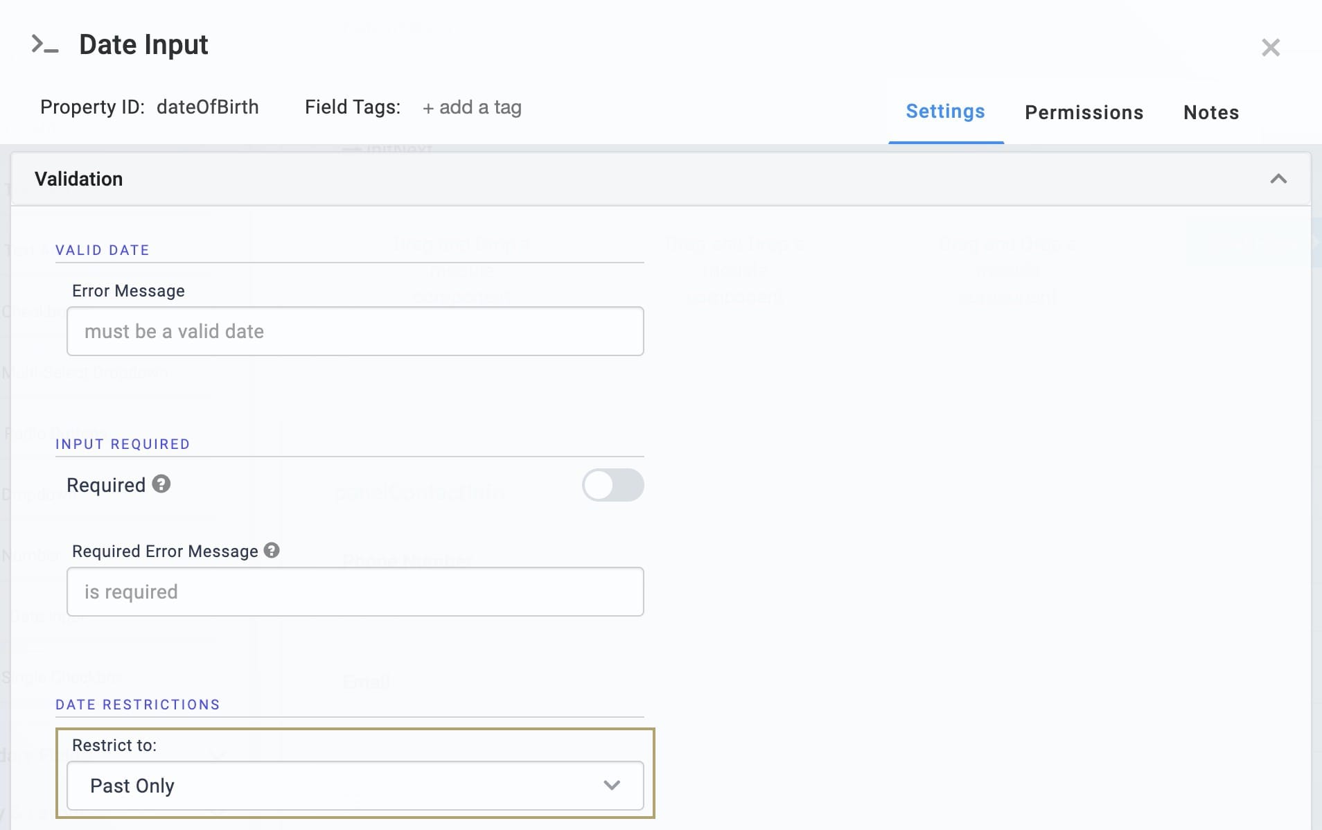
Drag and drop a Date Input component inside your
panelPersonalInfoPanel component, below yournameText Field component.In the Property ID field, enter
dateOfBirth.In the Label Text field, enter
Date of Birth.From the Restrict Date Selection to drop-down, select Past Only.
.png)
Click Save Component.
Configure the Phone Number Component
The third end-user input field in this configuration is a Phone Number component that you’ll place in your panelContactInfo Panel component.
Drag and drop a Phone Number component inside your
panelContactInfoPanel component, below yourdateOfBirthDate Input component.In the Property ID field, enter
phoneNumber.In the Label Text field, enter
Phone Number.Click Save Component.
Configure the Email Component
The last end-user input field in this configuration is an Email component that you’ll place in your panelContactInfo Panel component.
Drag and drop an Email component inside your
panelContactInfoPanel component, below thephoneNumberPhone Number component.In the Property ID field, enter
email.In the Label Text field, enter
Email.Click Save Component.
Configuration
Configure the colNext Columns Component
Next, you'll set up a series of Columns components to organize your buttons. You'll leave each column empty except the far-right column. There, you'll place your customized Next button.
Drag and drop a Columns component inside your
panelPersonalInfoPanel component, below yourdateOfBirthDate Input component.In the Property ID field, enter
colNext.Select the Column Layout that shows four evenly spaced columns.
.png)
Click Save Component.
Configure the btnNext Button Component
Next, let's add the first Button component to create a custom button to replace the one you set as hidden in the Navigation component.
Drag and drop a Button component inside the far-right column of your
colNextColumns component.In the Property ID field, enter
btnNext.In the Label Text field, enter
Next Page.From the Action Type drop-down, select Event.
In the On Click field, enter
initNext.This configuration connects your Button component to an Initializer component you’ll add next.
.png)
In the Right Icon field, enter
glyphicon glyphicon-chevron-right.This configuration is a standard GLYPHICONS® glyph code supported by the Button component. For a full list of other glyph codes, visit https://getbootstrap.com/docs/3.3/components/.
Click Save Component.
Configure the initNext Initializer Component
Now, you'll add an Initializer component that gets triggered when you click your Next button. Then, the Initializer component sends a Next value back to the Navigation component.
Drag and drop an Initializer component inside your
panelPersonalInfoPanel component, below yourdateOfBirthDate Input component.In the Property ID and Canvas Label Text field, enter
initNext.From the Trigger Type drop-down, select Manual.
In the Outputs table, enter the following:
Property ID
Type
Value
navPanels
navigation
next
.png)
Click Save Component.
Configure the colPrevious Columns Component
This Columns component serves the same purpose as the first set of columns that you added. The only difference is that this set will hold your custom Previous button. You'll leave each column empty except the far-right column. There, you'll place your Previous button.
Drag and drop a second Columns component inside your
panelContactInfoPanel component, below youremailEmail component.In the Property ID field, enter
colPrevious.Select the Column Layout that shows four evenly spaced columns.
.png)
Click Save Component.
Configure the btnPrevious Button Component
Next, let’s add another Button component that represents your Previous button.
Drag and drop a second Button component in the far-right column of your
colPreviousColumns component.In the Property ID field, enter
btnPrevious.In the Label Text field, enter
Previous Page.In the Left Icon field, enter
glyphicon glyphicon-chevron-left.This is a standard GLYPHICONS® glyph code supported by the Button component. For a full list of other glyph codes you can use, visit https://getbootstrap.com/docs/3.3/components/.
From the Action Type drop-down, select Event.
In the On Click field, enter
initPrevious..png)
Click Save Component.
Configure the initPrevious Initializer Component
Next, you'll add an Initializer component that is triggered when you click your Previous button. Then, the Initializer component sends a previous value back to your Navigation component.
Drag and drop a second Initializer component inside your
panelContactInfoPanel component, below youremailEmail component.In the Property ID and Canvas Label Text field, enter
initPrevious.From the Trigger Type drop-down, select Manual.
In the Outputs table, enter the following:
Property ID
Type
Value
navPanels
navigation
previous
.png)
Click Save Component.
Save your module.
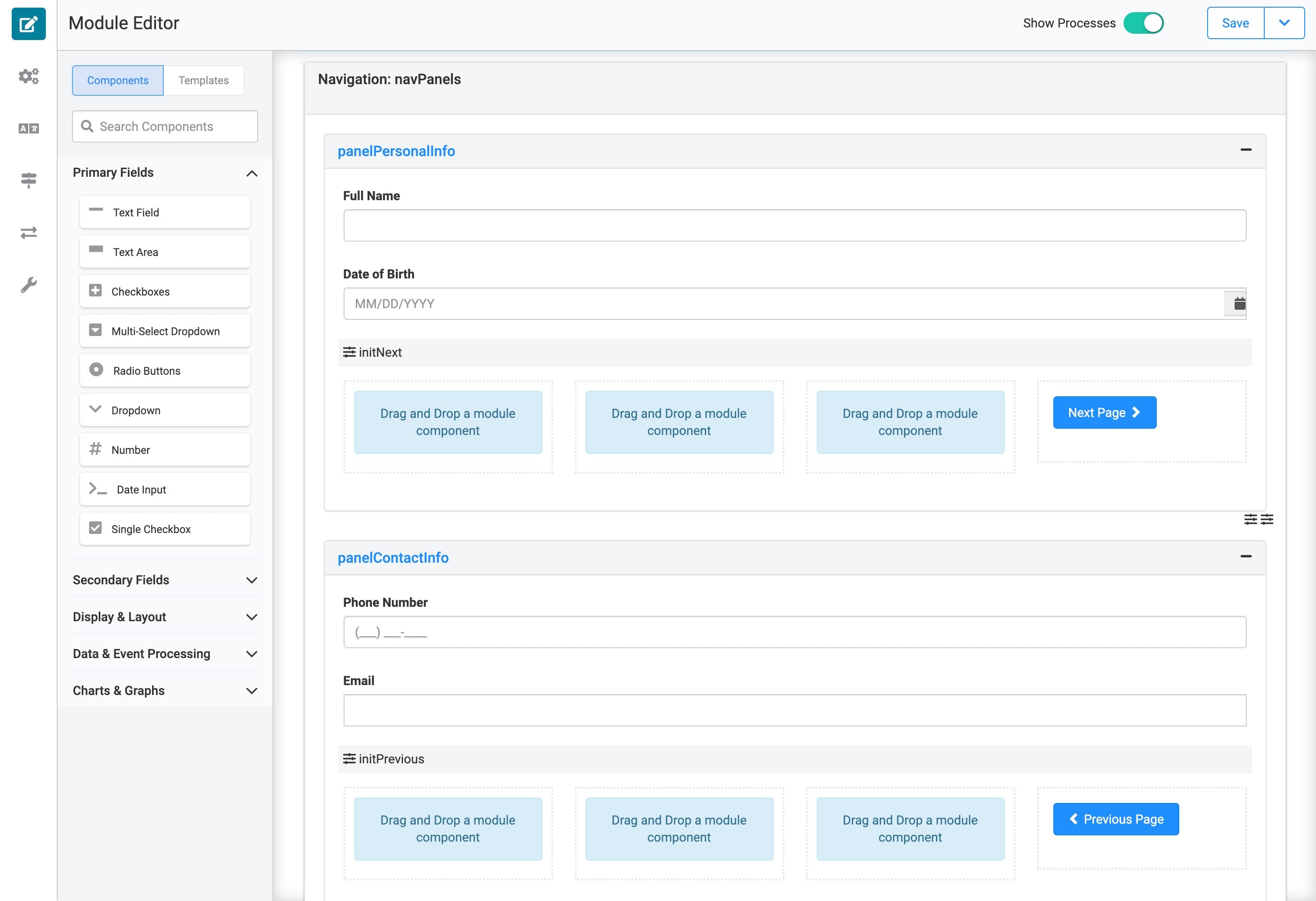
Here's how your configured module looks in the Module Builder:
.png)
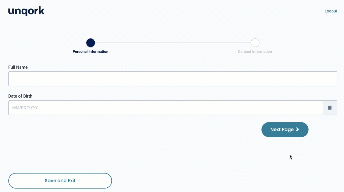
Preview your module in Express View. You'll see your Personal Information panel along with your custom Next button. If you click Next, you navigate to the Contact Information page. Clicking Previous navigates you back a page. This is the same functionality as a Navigation component, but you can control the placement and functionality of your navigation buttons.
Preconfiguration
First, you'll configure a Navigation component to manage your two Panel components, which will collect customer information. Then, you'll set up navigation with custom Next and Previous buttons.
Configure the Navigation Component
Configure a Navigation component to manage which Panel component becomes active. You'll notice in this configuration that the default Next and Previous buttons are hidden. You’ll add your own buttons in a later step.
In the Module Builder, drag and drop a Navigation component onto your canvas.
In the Label and Property Name field, enter
navPanels.In the Panels table, enter the following:
Group
Title
Heading
Value
Panel
Hide Previous
Hide Next
Personal Information
panelPersonalInfo
panelPersonalInfo
.png) (checked)
(checked)Contact Information
panelContactInfo
panelContactInfo
(checked)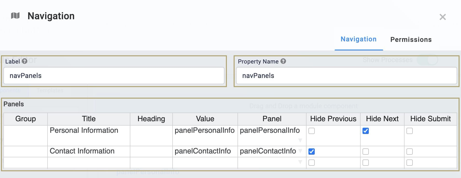
When you first open the configuration window, you may need to resize the columns in your Panels table.
Click Save.
Configure the Panel Components
These components separate your input fields based on the information you're collecting. You'll have a Panel component for personal information and one for contact information.
Drag and drop two Panel components onto your canvas.
In the Property ID and Label Text field, enter the following for each component:
#
Property ID
Label Text
1
panelPersonalInfo
panelPersonalInfo
2
panelContactInfo
panelContactInfo
Save & Close each component as you add it.
Configure the Text Field Component
Now, let's add your first input field. You'll use a Text Field component to collect your end-user's full name, placing it inside your panelPersonalInfo Panel component.
Drag and drop a Text Field component inside your
panelPersonalInfoPanel component.In the Property ID field, enter
name.In the Label Text field, enter
Full Name.Click Save & Close.
Configure the Date Input Component
Next, let's add the second end-user input field in this configuration. You'll use this Date Input component to collect your end-user's date of birth, placing it inside your panelPersonalInfo Panel component.
Drag and drop a Date Input component inside your
panelPersonalInfoPanel component, below yournameText Field component.In the Property ID field, enter
dateOfBirth.In the Label Text field, enter
Date of Birth.From the Restrict to drop-down, select Past Only.
Click Save & Close.
Configure the Phone Number Component
The third end-user input field in this configuration is a Phone Number component that you’ll place in your panelContactInfo Panel component.
Drag and drop a Phone Number component inside your
panelContactInfoPanel component, below yourdateOfBirthDate Input component.In the Property ID field, enter
phoneNumber.In the Label Text field, enter
Phone Number.Click Save.
Configure the Email Component
The last end-user input field in this configuration is an Email component that you’ll place in your panelContactInfo Panel component.
Drag and drop an Email component inside your
panelContactInfoPanel component, below thephoneNumberPhone Number component.In the Property ID field, enter
email.In the Label Text field, enter
Email.Click Save.
Configuration
Configure the colNext Columns Component
Next, you'll set up a series of Columns components to organize your buttons. You'll leave each column empty except the far-right column. There, you'll place your customized Next button.
Drag and drop a Columns component inside your
panelPersonalInfoPanel component, below yourdateOfBirthDate Input component.In the Property ID field, enter
colNext.Select the Column Layout that shows four evenly spaced columns.
Click Save & Close.
Configure the btnNext Button Component
Next, let's add the first Button component to create a custom button to replace the one you set as hidden in the Navigation component.
Drag and drop a Button component in the far-right column of your
colNextColumns component.In the Property ID field, enter
btnNext.In the Label Text field, enter
Next Page.In the Right Icon field, enter
glyphicon glyphicon-chevron-right.This configuration is a standard GLYPHICONS® glyph code supported by the Button component. For a full list of other glyph codes, visit https://getbootstrap.com/docs/3.3/components/.
From the Button Action Type drop-down, select Event.
In the Trigger on Click field, enter
initNext.This configuration connects your Button component to an Initializer component you’ll add next.
.png)
Click Save & Close.
Configure the initNext Initializer Component
Now, you'll add an Initializer component that gets triggered when you click your Next button. Then, the Initializer component sends a Next value back to the Navigation component.
Drag and drop an Initializer component inside your
panelPersonalInfoPanel component, below yourdateOfBirthDate Input component.In the Property ID and Canvas Label Text field, enter
initNext.Set the Trigger Type as Manual.
In the Outputs table, enter the following:
Property ID
Type
Value
navPanels
navigation
next
.png)
Click Save & Close.
Configure the colPrevious Columns Component
This Columns component serves the same purpose as the first set of columns that you added. The only difference is that this set will hold your custom Previous button. You'll leave each column empty except the far-right column. There, you'll place your Previous button.
Drag and drop a second Columns component inside your
panelContactInfoPanel component, below youremailEmail component.In the Property ID field, enter
colPrevious.Select the Column Layout that shows four evenly spaced columns.
Click Save.
Configure the btnPrevious Button Component
Next, let’s add another Button component that represents your Previous button.
Drag and drop a second Button component in the far-right column of your
colPreviousColumns component.In the Property ID field, enter
btnPrevious.In the Label Text field, enter
Previous Page.In the Left Icon field, enter
glyphicon glyphicon-chevron-left.This is a standard GLYPHICONS® glyph code supported by the Button component. For a full list of other glyph codes you can use, visit https://getbootstrap.com/docs/3.3/components/.
Set the Button Action Type as Event
In the Trigger on Click field, enter
initPrevious..png)
Click Save.
Configure the initPrevious Initializer Component
Next, you'll add an Initializer component that is triggered when you click your Previous button. Then, the Initializer component sends a previous value back to your Navigation component.
Drag and drop a second Initializer component inside your
panelContactInfoPanel component, below youremailEmail component.In the Property ID and Label Text field, enter
initPrevious.Set the Trigger Type as Manual.
In the Outputs table, enter the following:
Property ID
Type
Value
navPanels
navigation
previous
.png)
Click Save.
Save your module.
Here's how your completed module looks in the Module Builder:
Preview your module in Express View. You'll see your Personal Information panel along with your custom Next button. If you click Next, you navigate to the Contact Information page. Clicking Previous navigates you back a page. This is the same functionality as a Navigation component, but you can control the placement and functionality of your navigation buttons.