By default, the Dropdown component stays collapsed until the end-user clicks to open it. After making a selection, the Dropdown list closes again. Your end-user has the option to type the first few letters of their response to quickly find that option in the list.
Label Text conveys what the input component is and what information it displays. Enter the purpose of the corresponding component or field.
User-friendly labels make your module more accessible. Keep labels short and descriptive (a word or two) using title case. For longer entries, use sentence case.
Placeholder Text
A short prompt telling end-users the expected value of an input field. For example, Enter your Social Security Number. Placeholder Text displays inside the input field until the end-user begins an entry.
Contextual Help
Setting
Description
Tooltip
A short hint that displays when an end-user positions their cursor over the (Tooltip) icon. Tooltips can display across more than one line.
Displays or hides the component from view. Setting Hide Field to (ON) hides the component in Express View. Setting it to (OFF) displays the component. The component is always visible in the Module Builder.
Enable User Input: Allow end-users to view and enter data in this field.
Disable User Input: Prevents end-users from entering data in the field, but lets them view it. In the Module Builder, the field’s background displays as gray. In Express View, when end-users hover over the field, their cursor displays with a prohibited symbol.
Read Only - Legacy: Prevents end-users from entering data and replaces the field with the component’s data value. If no value is provided, the component displays None.
Data Panel
Data Storage
Setting
Description
Store Data in Database
The Store Data in Database setting affects how data persists through your application. When set to (ON), Unqork stores values entered into the field to the database (server-side submission). This occurs in three scenarios:
Navigating between Panels in a Navigation component. On navigation between pages (Panels), the component’s value saves to the database.
Triggering a module save event using a Button component with an Action Type of Save.
Navigating between screens of a workflow. On navigation between screens, the component’s value saves to the database.
By default, workflows persist data from all fields in the client-side submission when navigating between screens. However, only values from fields with Store Data in Database enabled store in the server-side submission.×
Set the toggle to (OFF) when you don’t want to store the values from this field in the database.
When using a Plug-In to remote execute a module, ensure data moving between modules is persistent. You can optionally enable Store Data in Database for components in the source module. But any components in the API module whose values are included in an API response must have Store Data in Database enabled. When a component’s data is not persistent, the data isn't included in an API call's response. So, Plug-Ins or external services requesting data from the API module can't receive non-persistent data in the response.×
Store Data in Database also affects what data is tracked using Unqork’s built-in tracker. When the Enable Tracker and Track Value toggles are set to (ON) in Module Settings, only values from fields with Store Data in Database enabled are tracked.×
Data Source Type
There are three methods that you can use to populate a Dropdown component: Values, URL, and Data Reference Key.
Values
Selecting Values displays a table where you can enter each option and its value.
Setting
Description
Option Label
Each option needs an end-user-facing label describing the choice that it represents. Enter your Option Labels using this column.
After you create an option, another row displays for you to create the next option.
In Express View, the dropdown list searches and filters using the Option Label and Data Source values.×
URL
To use data that are not stored in a specific component, select URL. Generally, this data lives in two places:
External to Unqork and pulled into the component using an external API call.
Internally and stored as a data collection.
To use an external API call, reference the provider's documentation. There, you'll find the API's URL address and the information you need to filter the data. To learn more, see our Using an External API in a Dropdown Component article.×
To reference data collections in Unqork, use the Data Collections tab at the Application Level. Click Create Data Collection to create a new data collection. Or, look through the available data collections and use one of those.
Enter the information to display in the drop-down selections. These are your end-user's options. For external APIs, you'll find this information in the API documentation. To pull data from a Data Collection, enter the column header you want to use.
For an API to retrieve data, you need the API's URL information. In this field, enter the API information as obtained from the API documentation. Add additional filters at the end of the URL if you want to drill down to a specific type of data.
Data Path
If using an API call to populate the component, enter a specific data property to reference here. This is useful if you want to show one piece of a larger data set in your Dropdown component.
Filter Query
Provide additional filtering using query parameters. Parameters append to the end of the Data Source URL. Query parameters can be static or dynamic. For example, name={{data.groupName}}.
Value Property
If a data set includes a column for values, enter the column's name here.
If not specified, the application uses the option label itself.
Label Path
This field refers to the option labels you want to pull. Enter the option label's column header in this field.
Refresh On
This field displays a list of the other components in your module. You can select a component here to refresh your Dropdown. When your end-user interacts with the selected component, the Dropdown resets.
You can also select Any Change. This refreshes the Dropdown if your end-user interacts with any of your components.
This setting watches other components in your module. The more components the component watches, the more performance issues can occur. It’s also important to note that processes large amounts of data on the client side will also impact performance.×
Require Search Parameters
When set to (ON), search parameters must be present to execute the search.
By default, this setting is (OFF).
Clear Value on Refresh
When set to (ON), the selected value is cleared after the Refresh On setting triggers.
By default, this setting is (OFF).
Authenticate
When set to (ON), authentication headers from the application are sent to the Data Source URL destination.
By default, this setting is (OFF).
Data Reference Key
Using the Data Reference Key option, data from another component populates the Dropdown component. You'll most often do this with a Data Table component. Add your data to the Data Table. Then, reference the Data Table in your Dropdown's configuration window.
Think of this as a hybrid option of using Values and Data Collections to populate your Dropdown. You still use data stored in Unqork, but it's data from your module instead of a Data Collection.
If a data set includes a column for values, enter the column's name here.
If not specified, the application uses the data drawn using the Label Path setting below.
Label Path
This field refers to the option labels to retrieve. If you're retrieving data from a Data Table component, enter the column header in this field.
Refresh On
This field displays a list of the other components in your module. You can select a component here to cause your Dropdown to refresh. When your end-user interacts with the selected component, the Dropdown resets.
Here, you can also select Any Change. This refreshes the Dropdown if your end-user interacts with any of your components.
This setting watches other components in your module. The more components the component watches, the more performance issues can occur. It’s also important to note that processes large amounts of data on the client side will also impact performance.×
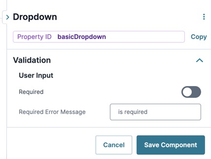
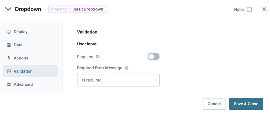
When set to (ON), the end-user must enter a value in the component's visible fields. When set to (OFF), the input is optional.
By default, Required is set to (OFF).
Required Error Message
A custom error message that displays below a required field. The error message displays when the end-user tries to save or submit the module without completing the required field.
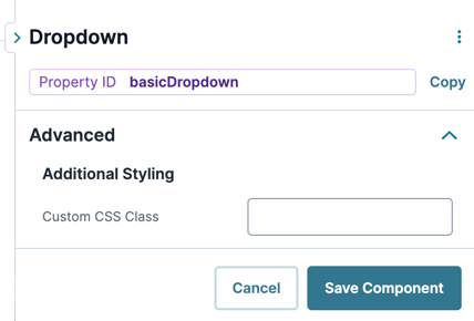
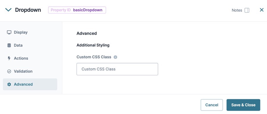
Updated CSS styling applies to all components that reference this custom class name.
Adding a Dropdown Component
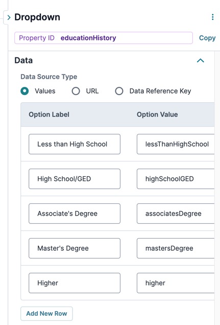
Now, configure a Dropdown component asking about an end-user's education history. The Dropdown includes six options for selection. These instructions assume that you have an open module saved with a title.
1.
Drag and drop a Dropdown component onto the canvas.
The data structure of a Dropdown's selection is a key value pair. The key is the Property ID name of the component, and the value is stored as a string.
By default, the Dropdown component stays collapsed until the end-user clicks to open it. After making a selection, the Dropdown list closes again. Your end-user has the option to type the first few letters of their response to quickly find that option in the list.
In this article, you'll learn about the Dropdown component, how to configure its settings, and how to use it in an application.
About the Configuration Window
To learn more about general component settings and those that display when a component is associated with Data Models, view our General Component Settings article.×
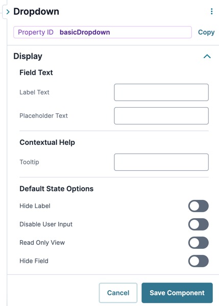
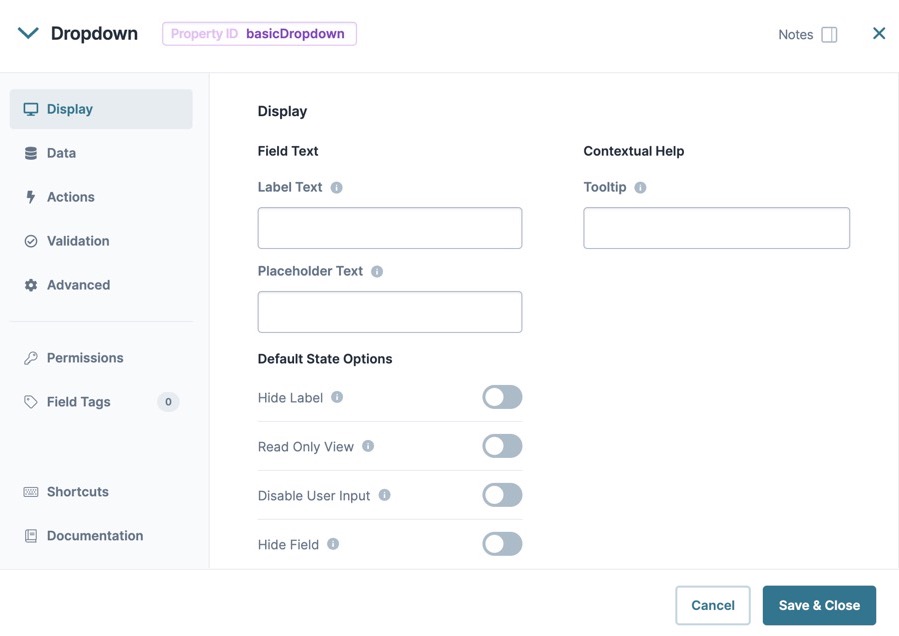
Display Panel
Setting
Description
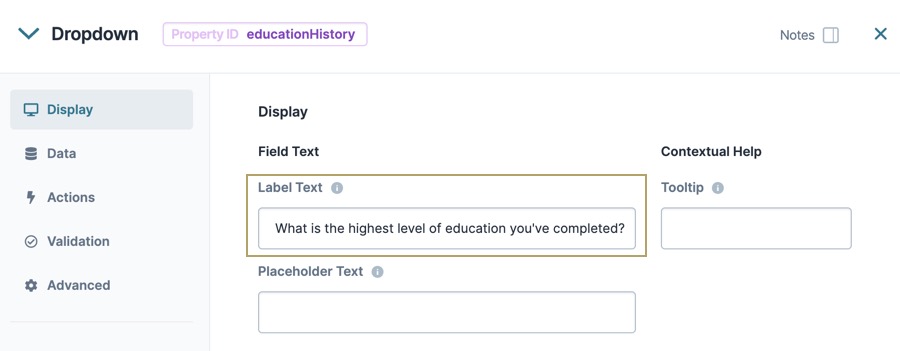
Label Text
Label Text conveys what the input component is and what information it displays. Enter the purpose of the corresponding component or field.
User-friendly labels make your module more accessible. Keep labels short and descriptive (a word or two) using title case. For longer entries, use sentence case.
Tooltip
A short hint that displays when an end-user positions their cursor over the (Tooltip) icon. Tooltips can display across more than one line.
Placeholder Text
A short prompt telling end-users the expected value of an input field. For example, Enter your Social Security Number. Placeholder Text displays inside the input field until the end-user begins an entry.
When set to (ON), the component is display-only. If another component sends content to the field, the end-user can view that content. Otherwise, end-users see the word None.
By default, the Read Only View toggle is set to (OFF).
Disable User Input
When set to (ON), end-users cannot interact with or edit the Express View's input field or element. When end-users hover over the field, their cursor changes to alert them to the status change.
By default, Disable User Input is set to (OFF).
Hide Field
Displays or hides the component from view. Setting Hide Field to (ON) hides the component in Express View. Setting it to (OFF) displays the component. The component is always visible in the Module Builder.
By default, Hide Field is set to (OFF).
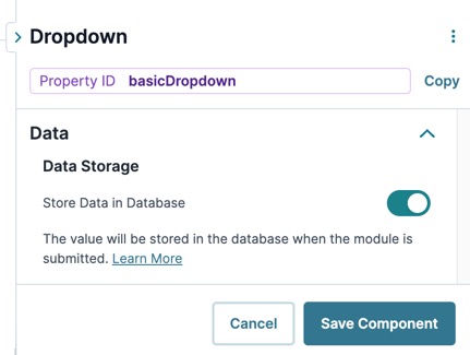
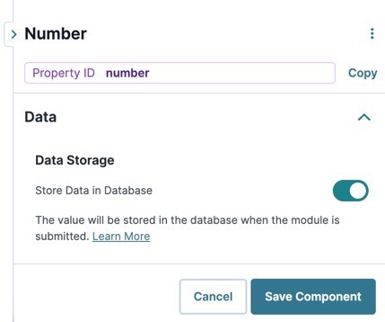
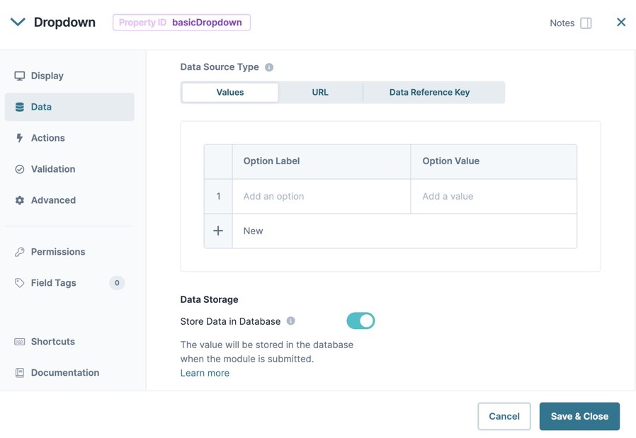
Data Panel
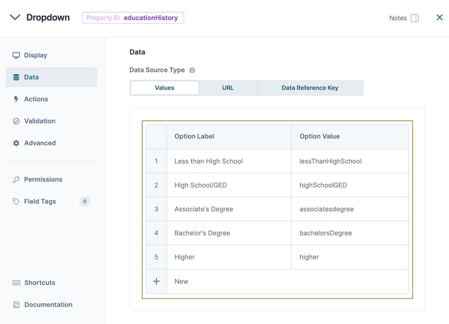
Data Source Type
There are three methods that you can use to populate a Dropdown component: Values, URL, and Data Reference Key.
Values
Selecting Values displays a table where you can enter each option and its value.
Setting
Description
Option Label
Each option needs an end-user-facing label describing the choice that it represents. Enter your Option Labels using this column.
After you create an option, another row displays for you to create the next option.
To use data that are not stored in a specific component, select URL. Generally, this data lives in two places:
External to Unqork and stored in the component using an external API call.
Internally and stored as a data collection.
To use an external API call, reference the provider's documentation. There, you'll find the API's URL address and the information you need to filter the data. To learn more, see our Using an External API in a Dropdown Component article.×
To reference data collections in Unqork, use the Data Collections tab at the Application Level. Click Create Data Collection to create a new data collection. Or, look through the available data collections and use one of those.
Enter the information to display in the drop-down selections. These are your end-user's options. For external APIs, you'll find this information in the API documentation. To pull data from a Data Collection, enter the column header you want to use.
For an API to retrieve data, you need the API's URL information. In this field, enter the API information as obtained from the API documentation. Add additional filters at the end of the URL if you want to drill down to a specific type of data.
Value Property
If a data set includes a column for values, enter the column's name here.
If not specified, the application uses the option label itself.
Data Path
If using an API call to populate the component, enter a specific data property to reference here. This is useful if you want to show one piece of a larger data set in your Dropdown component.
Label Path
This field refers to the option labels you want to pull. Enter the option label's column header in this field.
Filter Query
Provide additional filtering using query parameters. Parameters append to the end of the Data Source URL. Query parameters can be static or dynamic. For example, name={{data.groupName}}.
Refresh On
This field displays a list of the other components in your module. You can select a component here to refresh your Dropdown. When your end-user interacts with the selected component, the Dropdown resets.
You can also select Any Change. This refreshes the Dropdown if your end-user interacts with any of your components.
This setting watches other components in your module. The more components the component watches, the more performance issues can occur. It’s also important to note that processes large amounts of data on the client side will also impact performance.×
Require Search Parameters
When set to (ON), search parameters must be present to execute the search.
By default, this setting is (OFF).
Clear Value on Refresh
When set to (ON), the selected value is cleared after the Refresh On setting triggers.
By default, this setting is (OFF).
Authenticate
When set to (ON), authentication headers from the application are sent to the Data Source URL destination.
By default, this setting is (OFF).
Data Reference Key
Using the Data Reference Key option, data from another component populates the Dropdown component. You'll most often do this with a Data Table component. Add your data to the Data Table. Then, reference the Data Table in your Dropdown's configuration window.
Think of this as a hybrid option of using Values and Data Collections to populate your Dropdown. You still use data stored in Unqork, but it's data from your module instead of a Data Collection.
If a data set includes a column for values, enter the column's name here.
If not specified, the application uses the data drawn using the Label Path setting below.
Label Path
This field refers to the option labels to retrieve. If you're retrieving data from a Data Table component, enter the column header in this field.
Refresh On
This field displays a list of the other components in your module. You can select a component here to cause your Dropdown to refresh. When your end-user interacts with the selected component, the Dropdown resets.
Here, you can also select Any Change. This refreshes the Dropdown if your end-user interacts with any of your components.
This setting watches other components in your module. The more components the component watches, the more performance issues can occur. It’s also important to note that processes large amounts of data on the client side will also impact performance.×
Data Storage
Setting
Description
Store Data in Database
The Store Data in Database setting affects how data persists through your application. When set to (ON), Unqork stores values entered into the field to the database (server-side submission). This occurs in three scenarios:
Navigating between Panels in a Navigation component. On navigation between pages (Panels), the component’s value saves to the database.
Triggering a module save event using a Button component with an Action Type of Save.
Navigating between screens of a workflow. On navigation between screens, the component’s value saves to the database.
By default, workflows persist data from all fields in the client-side submission when navigating between screens. However, only values from fields with Store Data in Database enabled store in the server-side submission.×
Set the toggle to (OFF) when you don’t want to store the values from this field in the database.
When using a Plug-In to remote execute a module, ensure data moving between modules is persistent. You can optionally enable Store Data in Database for components in the source module. But any components in the API module whose values are included in an API response must have Store Data in Database enabled. When a component’s data is not persistent, the data isn't included in an API call's response. So, Plug-Ins or external services requesting data from the API module can't receive non-persistent data in the response.×
Store Data in Database also affects what data is tracked using Unqork’s built-in tracker. When the Enable Tracker and Track Value toggles are set to (ON) in Module Settings, only values from fields with Store Data in Database enabled are tracked.×
When set to (ON), the end-user must enter a value in the component's visible fields. When set to (OFF), the input is optional.
By default, Required is set to (OFF).
Required Error Message
A custom error message that displays below a required field. The error message displays when the end-user tries to save or submit the module without completing the required field.
Updated CSS styling applies to all components that reference this custom class name.
Adding a Dropdown Component
Now, configure a Dropdown component asking about an end-user's education history. The Dropdown includes six options for selection. These instructions assume that you have an open module saved with a title.
1.
Drag and drop a Dropdown component onto the canvas.
The data structure of a Dropdown's selection is a key value pair. The key is the Property ID name of the component, and the value is stored as a string.
 (
(
 Data Collections
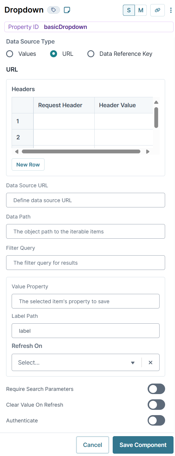
 (ON), search parameters must be present to execute the search.
 (OFF).
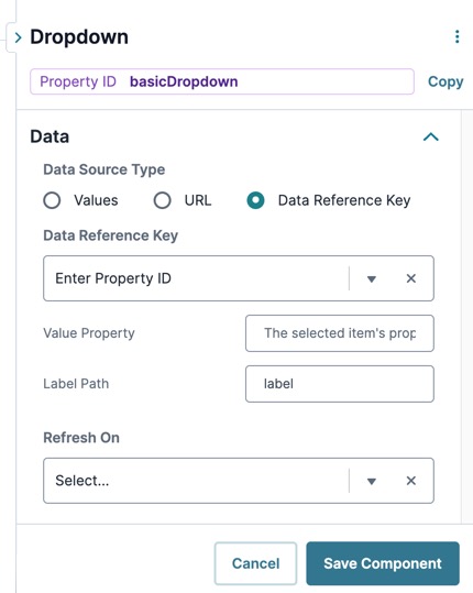
 Dropdown component onto the canvas.
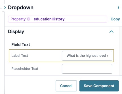


 Validation