In this how-to guide, you'll learn how to use a Plug-In component to make an internal API call to Unqork's Data Collection and reference select data using a Dropdown component.
By making this API call, you’ll populate a drop-down menu without manually adding values. If you change your Data Collection, those changes populate in your menu dynamically. In this how-to guide, you'll use a pre-existing Data Collection to reference.
You'll see the terms "reference data" and "data collections". Both terms refer to an Unqork Data Collections.
For this how-to guide, use an Initializer component with a New Submission Trigger Type. The Initializer component triggers a Plug-In component that requests data from an existing Data Collection. A Dropdown component references the Data Collection and populates a list in a drop-down menu. That way, end-users can select an option.
To better understand how this works, consider the following example. Let’s say you create an application for the Motor Vehicle Division. Your customers need to complete an application for a new driver’s license. Part of the application asks the applicant to include their height. To make it easier for the applicant, they can select a height from a drop-down list. You can also provide measurements in inches and centimeters.
Click on the tab that matches your Unqork designer platform:
Preconfiguration
Typically, you need to create a Data Collection whose data you want to retrieve. For this how-to guide, you'll call a pre-existing Data Collection called Human Height. You do not need to configure a Data Collection as long as you know its file name.
Configuration
Now that you know which Data Collection to reference, open your module to finish the configuration.
Configure the Plug-In Component
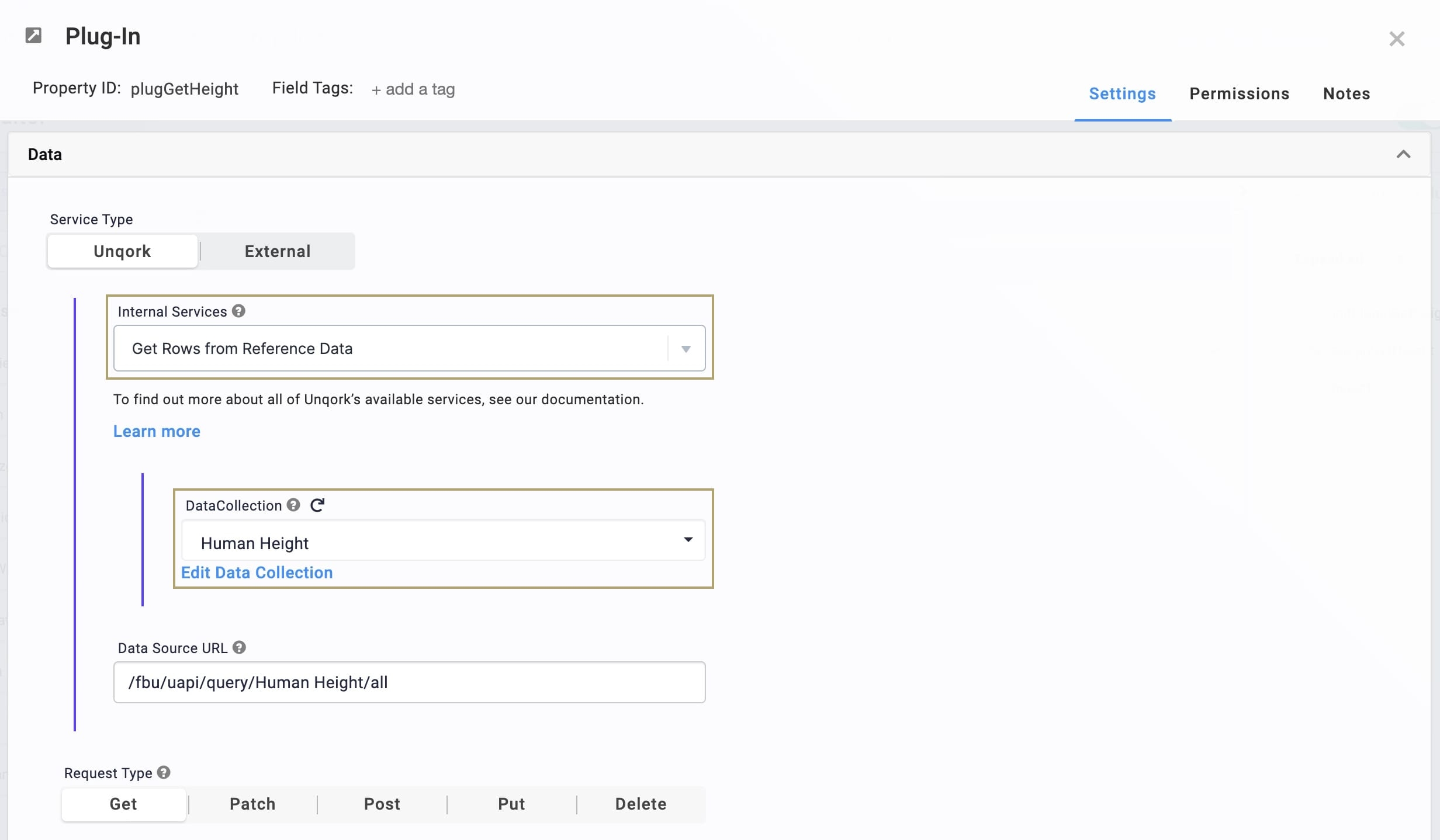
Use a Plug-In component to retrieve submission data from the Human Height Data Collection using an internal API call.
In the Module Builder, drag and drop a Plug-In component onto your canvas.
In the Property ID and Canvas Label Text fields, enter
plugGetHeight.From the Internal Services drop-down, select Get Rows from Reference Data.
From the Data Collection drop-down, enter or select
HumanHeight.The Data Source URL automatically populates as /fbu/uapi/query/Human Height/all.
.png)
Click Save Component.
Configure the Dropdown Component
Next, configure a Dropdown component to reference height data from your Plug-In component.
Drag and drop a Dropdown component onto your canvas, placing it below the Plug-In component.
In the Property ID field, enter
height.In the Label Text field, enter
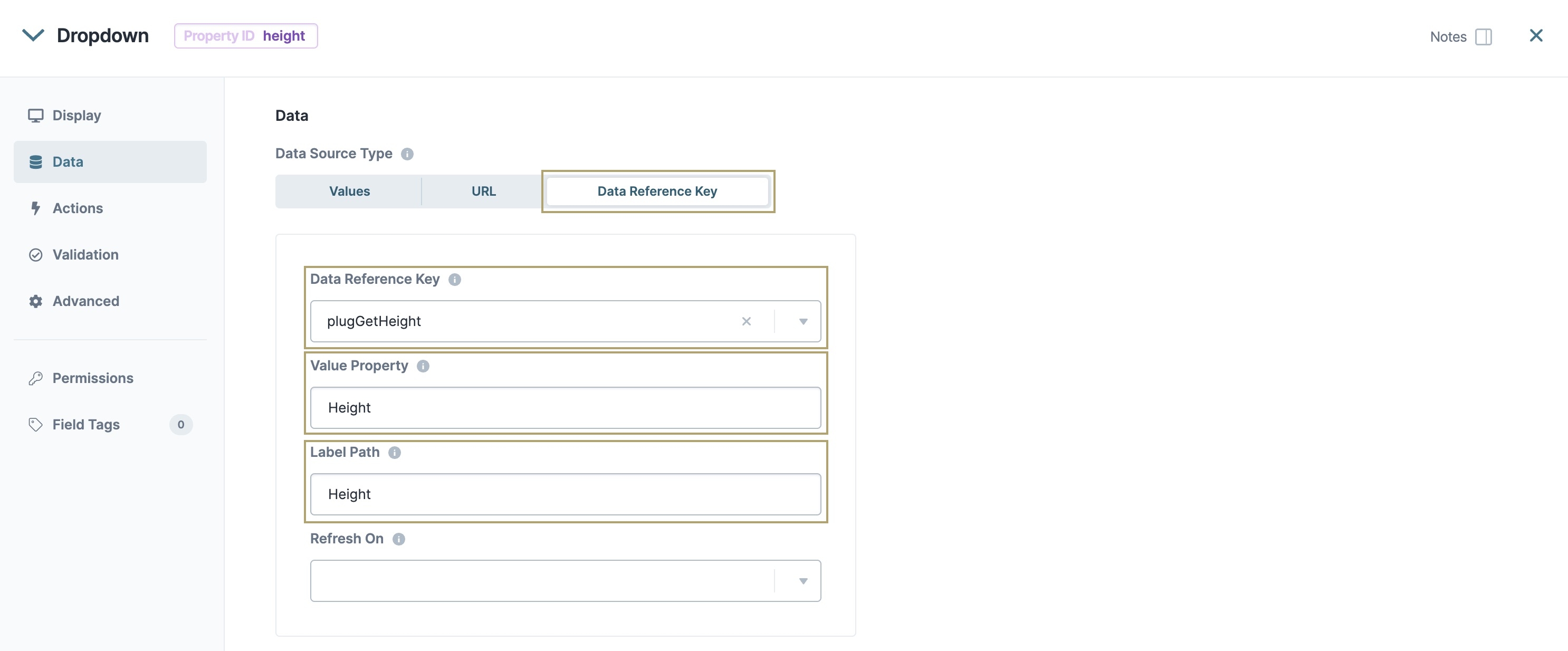
Height.Set the Data Source Type as Data Reference Key.
In the Data Reference Key field, enter or select
plugGetHeight.In the Value Property field, enter
Height.In the Label Path field, enter
Height..png)
Click Save Component.
Configure the Initializer Component
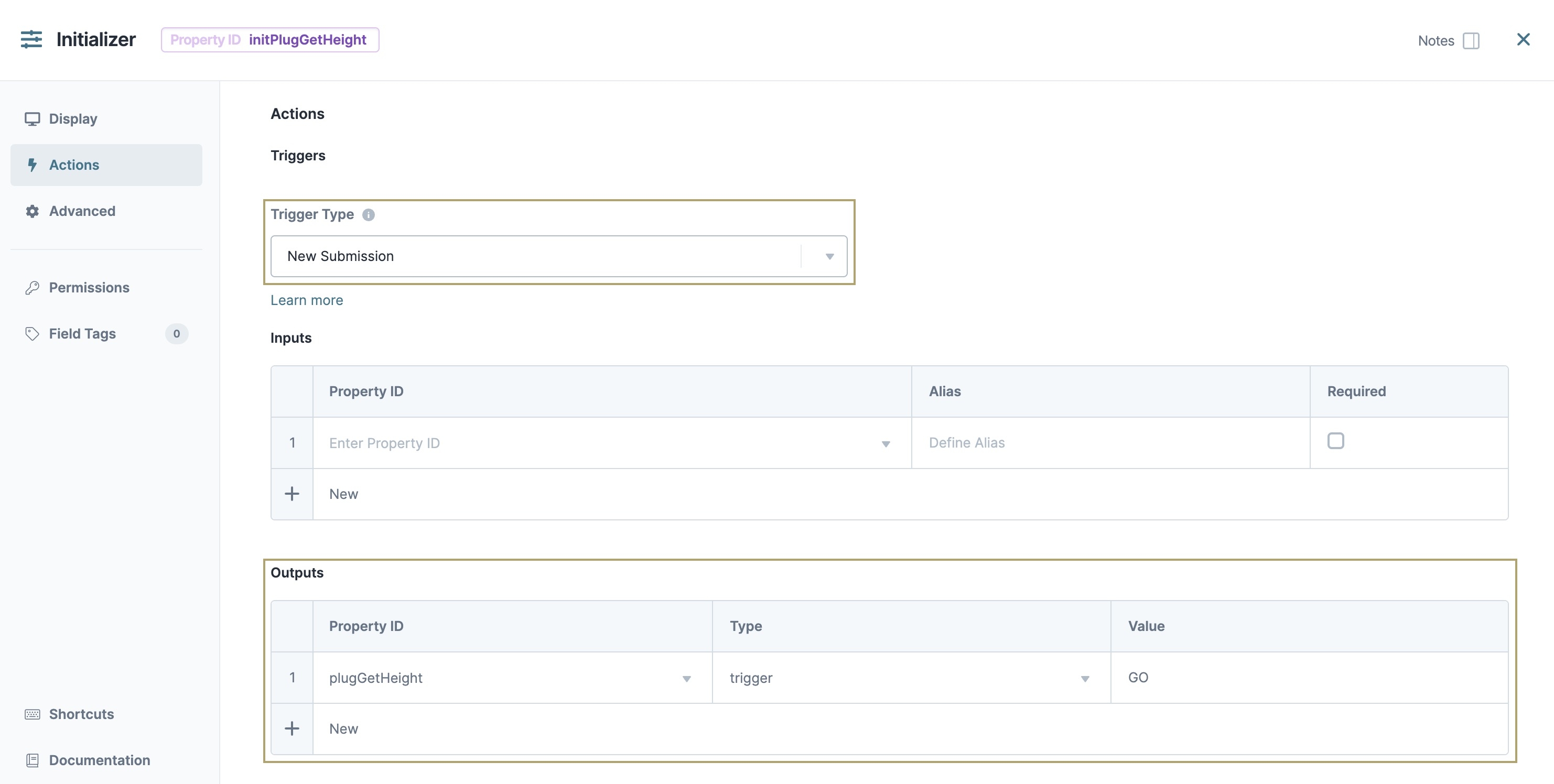
Now, set up your Initializer component with a New Submission Trigger Type. This Trigger Type executes the Initializer component with each new module submission.
Drag and drop an Initializer component onto your canvas, placing it above your Plug-In component.
In the Property ID and Label Text fields, enter
initPlugGetHeight.From the Trigger Type drop-down, select New Submission.
In the Outputs table, enter the following:
Property ID
Type
Value
plugGetHeight
trigger
GO
.png)
Click Save Component.
Save your module.
Your completed module configuration looks like the following in the Module Builder:
.png)
Preview your module to test your configuration in Express View. From the Height drop-down, select a height in feet and inches, or centimeters.
Preconfiguration
Typically, you need to create a Data Collection whose data you want to retrieve. For this how-to guide, you'll call a pre-existing Data Collection called Human Height. You do not need to configure a Data Collection as long as you know its file name.
Configuration
Now that you know which Data Collection to reference, open your module to finish the configuration.
Configure the Plug-In Component
Use a Plug-In component to retrieve submission data from the Human Height Data Collection using an internal API call.
In the Module Builder, drag and drop a Plug-In component onto your canvas.
In the Property ID and Canvas Label Text fields, enter
plugGetHeight.From the Internal Services drop-down, select Get Rows from Reference Data.
From the DataCollection drop-down, enter or select
Human Height.The Data Source URL automatically populates as /fbu/uapi/query/Human Height/all.
Click Save.
Configure the Dropdown Component
Next, configure a Dropdown component to reference height data from your Plug-In component.
Drag and drop a Dropdown component onto your canvas, placing it below the Plug-In component.
In the Property ID field, enter
height.In the Label Text field, enter
Height.To the left of the component's configuration window, click Data.
Set the Data Source Type as Data Reference Key.
In the Data Reference Key field, enter or select
plugGetHeight.In the Value Property field, enter
Height.In the Label Path field, enter
Height.Click Save & Close.
Configure the Initializer Component
Now, set up your Initializer component with a New Submission Trigger Type. This Trigger Type executes the Initializer component with each new module submission.
Drag and drop an Initializer component onto your canvas, placing it above your Plug-In component.
In the Property ID and Canvas Label Text fields, enter
initPlugGetHeight.To the left of the component's configuration window, click Actions.
From the Trigger Type drop-down, select New Submission.
In the Outputs table, enter the following:
Property ID
Type
Value
plugGetHeight
trigger
GO
Click Save & Close.
Save your module.
Your completed module configuration looks like the following in the Module Builder:
Preview your module to test your configuration in Express View. From the Height drop-down, select a height in feet and inches, or centimeters.


