Overview
In the Module Builder, you can configure Dropdown and Multi-Select Dropdown components to reference Data Collection values using an internal API (application programming interface) call. In Express View, the Dropdown components display the Data Collection values to the end-user in a list.
Here's how the completed how-to guide looks in Express View:
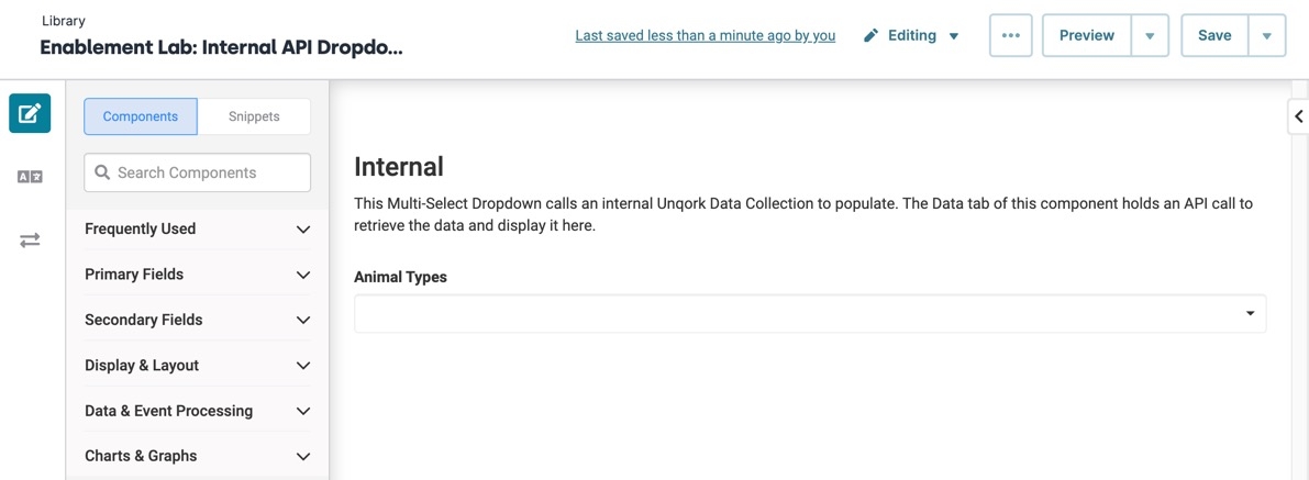
Here's how the completed how-to guide looks in the Module Builder:
What You'll Learn
In this article, you’ll learn how to make an internal API call using a Multi-Select Dropdown component.
What You’ll Need
To set up this use case, you need:
Pre-Configuration
Configure the Data Collection
First, create a Data Collection of animal types. Then, configure a Multi-Select Dropdown component to call an API to reference the Data Collection. Since the Data Collection is in Unqork, it's an internal API call.
From the Workspace page:
Click
.jpg) Data Collections.
Data Collections.Click + Create New.
In the Enter a Collection Name field, enter Animal Types.
Each Data Collection name is unique. If you are practicing in the Training environment, you need a unique name for your Data Collection to save it.
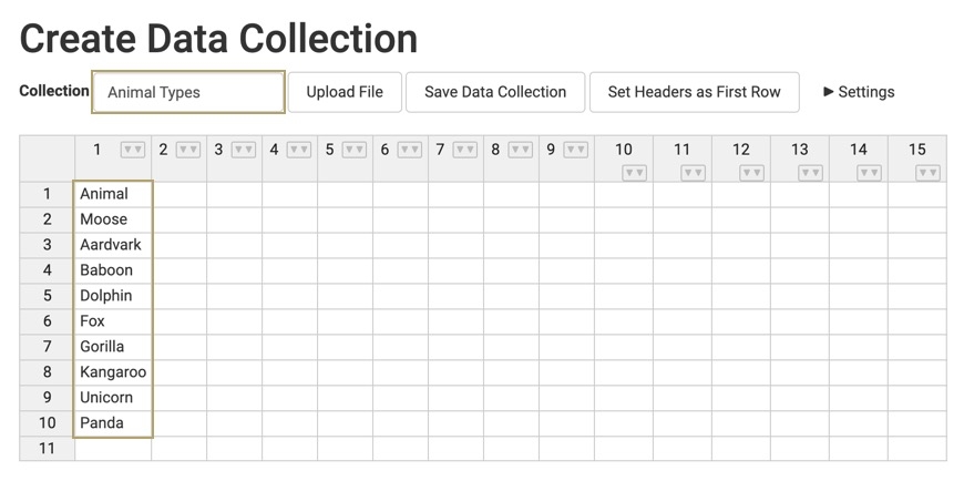
In the first column, enter the following: Animal, Moose, Aardvark, Baboon, Dolphin, Fox, Gorilla, Kangaroo, Unicorn, Panda.
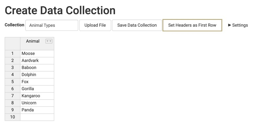
Click Set Headers as First Row. This sets your Animal Data Collection entry (column 1, row 1) as the header for the first column. Later, you'll reference this header when configuring your Multi-Select Dropdown component.
Click Save Data Collection.
Configure the Multi-Select Dropdown Component
Next, add a Multi-Select Dropdown component to list the options for the end-user. Then, populate the Multi-Select Dropdown using the Animal Types data using an internal API call to pull it. These instructions assume that you have an open module saved with a title.
In the Module Builder, drag and drop a
.png) Multi-Select Dropdown component onto your canvas.
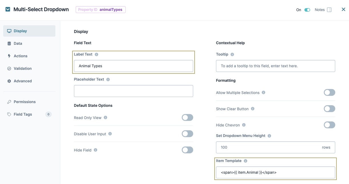
Multi-Select Dropdown component onto your canvas.In the Property ID field, enter animalTypes.
In the Label Text field, enter Animal Types.
In the Item Template field, Enter <span>{{ item.Animal }}</span>. This sets the HTML display for each item in the Multi-Select Dropdown.
From the
.png) Multi-Select Dropdown navigation menu, select
Multi-Select Dropdown navigation menu, select .png) Data.
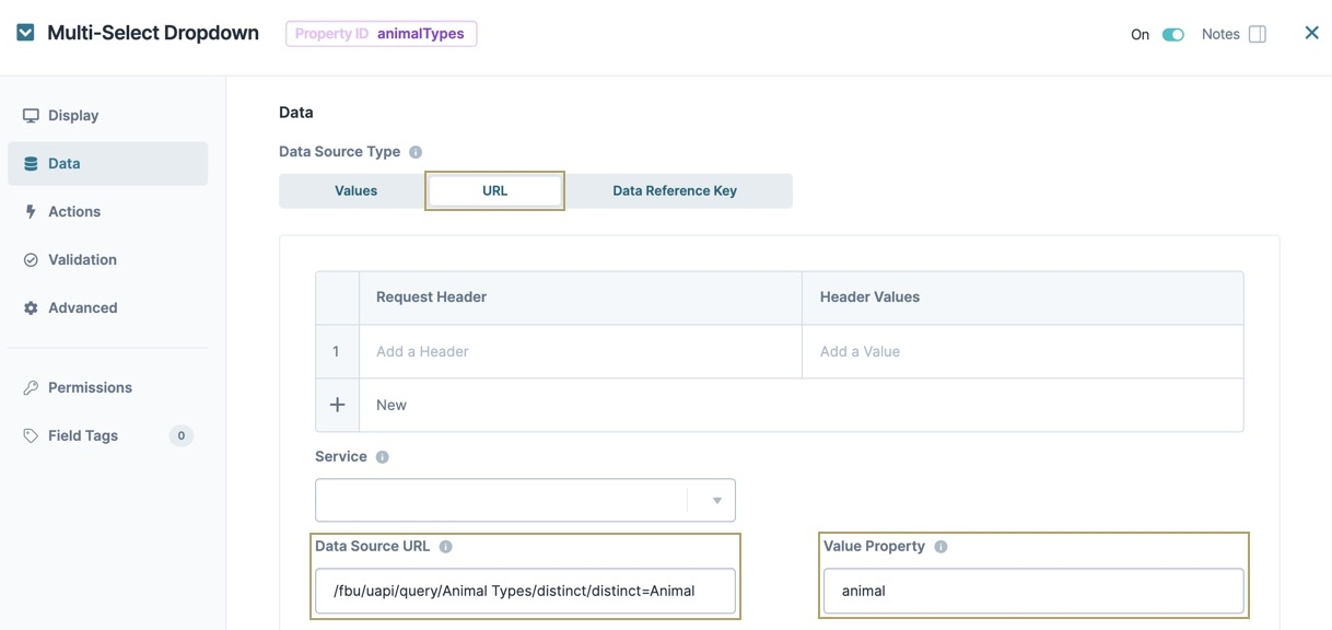
Data.From the Data Source Type, select URL.
In the Data Source URL, enter /fbu/uapi/query/Animal Types/distinct/distinct=Animal.
This URL directs the Multi-Select Dropdown to the Animal Types Data Collection. From there, the URL instructs the component to separate out the column labeled Animal. Only values from that column display in your Multi-Select Dropdown component.
In the Value Property, enter animal.
Click Save & Close.
Save your module.