Overview
The Metrics Dashboard tool shows your application and environment performance metrics. You can look at everything from CPU usage to completed operations.
The dashboard also includes filters to help you see metrics over a date and time range. Or, you can use the filters to look at a specific date and time. After you set your filters, performance metrics appear in 9 user-friendly charts. Hover over each to see precise measurements at that date and time. Or, export and print any of the charts to share with your team.
Filtering the Metrics Dashboard
Let's start by filtering for date and time. After you've made your selections, they'll populate the Charts section of the dashboard. When you open the tool, the date and time range sets automatically. The charts will show you performance metrics for the last 4 hours. You can use these defaults or change them as needed.
You can use the following filters:
Filter | Description |
|---|---|
Client | Your Unqork client credentials. These automatically populate when you open the tool. |
Environment | Your current Unqork environment. This field automatically populates when you open the tool. |
Start Date | The start date you want to filter application and database metrics. This field automatically populates with your current date. |
Start Time | The start time you want to filter application and database metrics. This field automatically populates with the time 4 hours before you opened the tool. The tool uses your current timezone. |
End Date | The end date you want to filter application and database metrics. This field automatically populates with your current date. |
Start Time | The end time you want to filter application and database metrics. This field automatically populates with the exact time you opened the tool. The tool uses your current timezone. |
Here's an example of how the Filters section looks on the Metrics Dashboard:
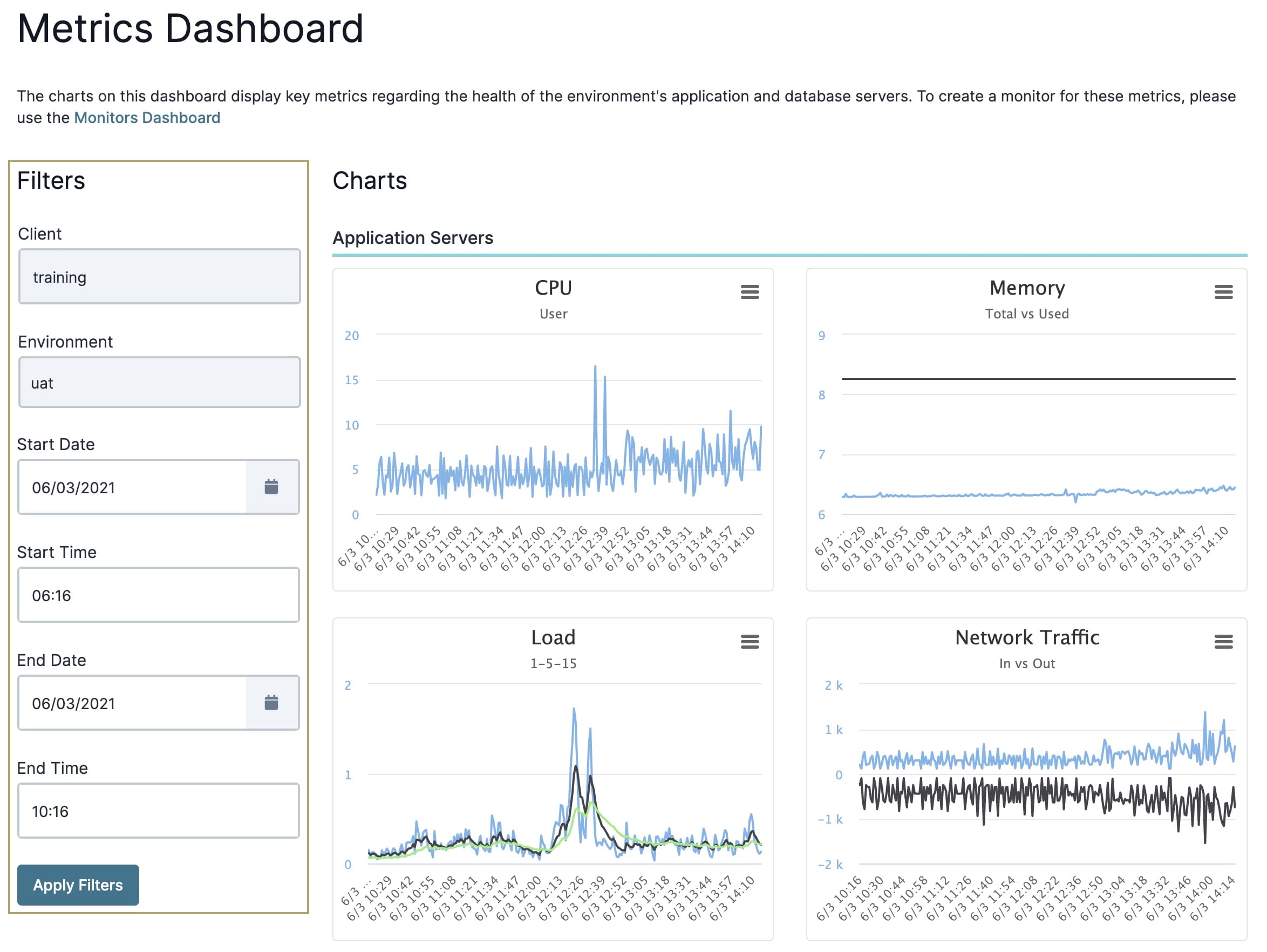
The only fields you can't change are the Client and Environment fields. Use any of the other filters to modify your search.
To change the date and time range:
Set the Start Date using the date picker.
Enter a time in the Start Time field. Enter a time based on the 24-hour clock.
Set the End Date using the date picker.
Enter a time in the End Time field. Enter a time based on the 24-hour clock.
Click Apply Filters.
Navigating the Charts
The Metrics Dashboard consists of 2 sets of charts:
Application Server charts
Database Server charts
These charts populate based on the date and time you choose in the dashboard's filters. Your date and time selections appear as the horizontal axis of the charts. The vertical axis depends on the chart.
Let's take a look at each chart.
Application Server Charts
The Application Servers section of the dashboard consists of 4 charts. These charts are:
Chart | Description |
|---|---|
CPU | The percentage of time the CPU spent running your environment's applications. |
Memory | The amount of physical RAM used versus the total amount of RAM available. |
Load | The average system load over a specific time period. You'll see the average load in the last:
|
Network Traffic | The amount of network throughput coming and going from your applications. This chart is measured in kb/s (kilobytes per second). |
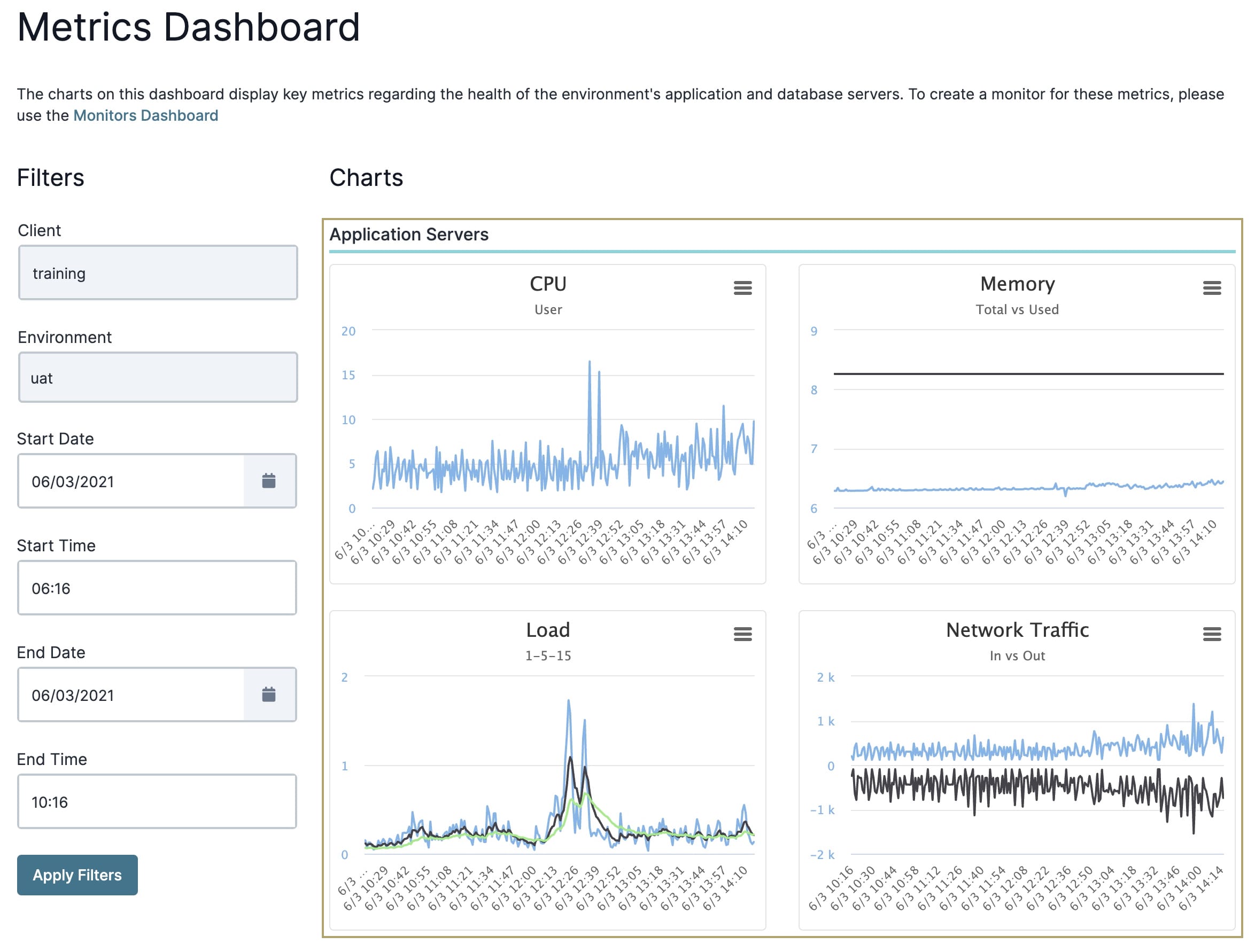
Here's an example of how the Application Servers charts will look:
Database Server Charts
The Database Servers section of the dashboard consists of 5 charts. These charts show you database metrics for UAT and production environments. You won't see metrics for staging environments. The charts include:
Chart | Description |
|---|---|
CPU | The percent of time the CPU spent running in your environment. |
Memory | The amount of RAM in use. |
Disk Space | The percentage of disk space used. |
Connections | The total number of queries executed by Unqork's database. |
Operations | The total number of operations performed. The types of operations you'll see in this chart are:
|
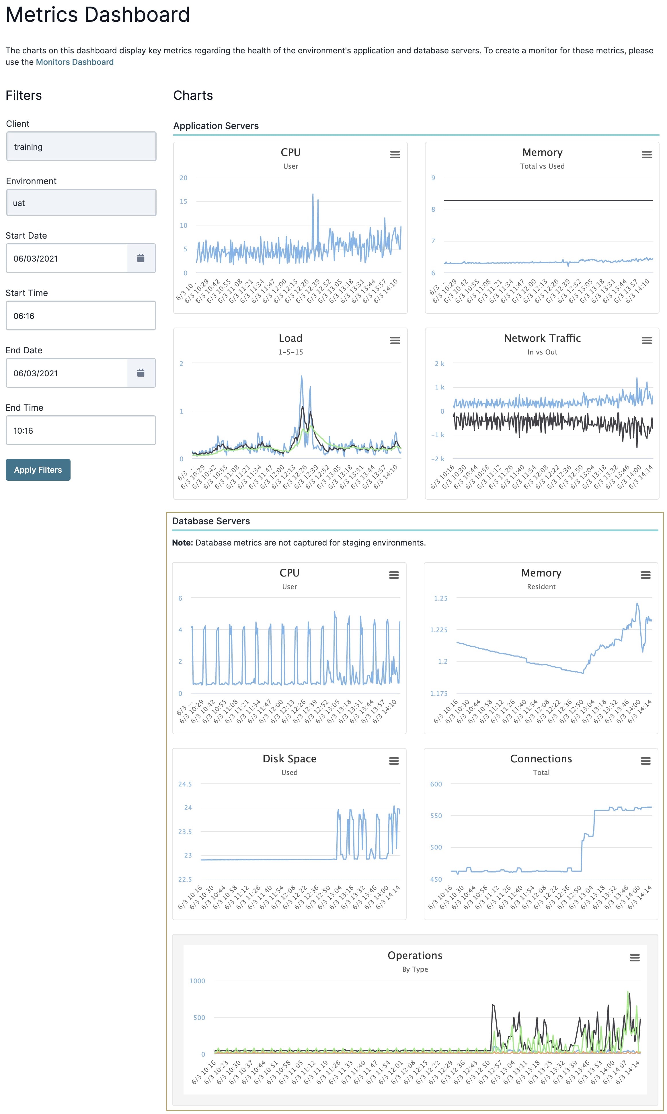
Here's an example of how the Database Servers charts will look:
Exporting and Sharing Chart Data
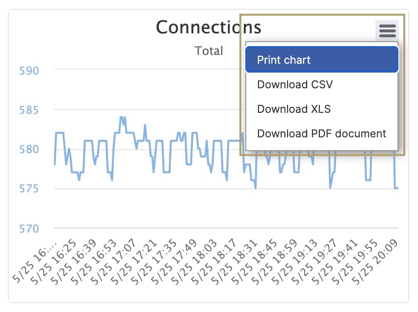
You’ll notice a hamburger button (.jpg) ) at the top right of each chart widget. When you click on this button, you get the following options:
) at the top right of each chart widget. When you click on this button, you get the following options:
Print chart
Download CSV
Download XLS
Download PDF document
Let's look at each of these in more detail.
Print Chart
The Print Chart option lets you print data from each chart.
To print a chart:
Click the
(Hamburger) button at the right of the chart.Select Print Chart.
At the print dialog, set your Destination:
Save as PDF.
A connected printer device.
Set the Layout as Portrait or Landscape.
Under More Settings, set the Scale as either Default or Custom. The Custom option lets you adjust the chart size to fit the full page.
Click Save/Print. The button updates based on your Destination selected earlier.
Download CSV
A CSV (comma-separated values) file is a plain text file that contains a list of data.
To download your chart as a CSV file:
Click the
(Hamburger) button at the right of the chart.Select Download CSV.
Check your Downloads folder for the .csv file. Your file name is similar to that of the chart name. For example, the Connections chart downloads as connections.csv.
Download XLS
XLS is a file extension created by Microsoft for use with Microsoft Excel.
To download your chart as an XLS file:
Click the
(Hamburger) button at the right of the chart.Select Download XLS.
Check your Downloads folder for the .xls file. Your file name is similar to that of the chart name. For example, the Connections chart downloads as connections.xls.
Download PDF Document
PDF stands for Portable Document Format. Using this format prevents modification of your chart file while still allowing sharing and printing.
To download your chart as a PDF file:
Click the
(Hamburger) button at the right of the chart.Select Download PDF Document.
Check your Downloads folder for the .pdf file. Your file name is similar to that of the chart name. For example, the Connections chart downloads as connections.pdf.