Overview
The Charts & Graphs group of components display aggregated statistics of data. These data visualization tools help end-users to gather insights from a data set retrieved by a Plug-In component.
In Express View, these components display as widgets. Widgets can display data as numeric metrics, tables, or charts, so your end-users can interact with it.
You'll find the Charts & Graphs components in the Charts & Graphs group to the left of the Module Builder.
What Are the Charts & Graphs Components?
Click on the list below to learn more about each chart and graph component:
Chart Component
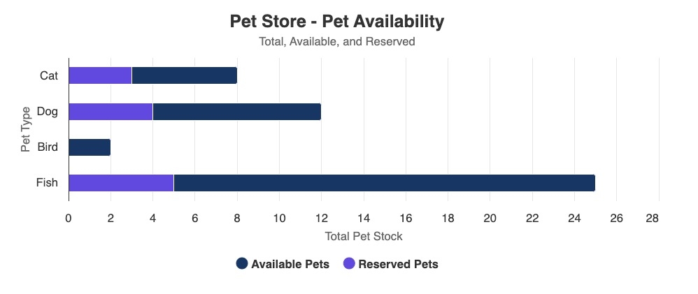
The Chart component makes it easy to add different types of charts to your module. This component loops through every index of a data structure, then displays numerical values in the chart.
With the Chart component, you can choose from the following chart types:
Bar | Funnel | Pie |
Bubble | Heatmap | Scatter |
Column | Line | Spline |
Here's an Express View example of a bar and column chart in action:
KPI (Key Performance Indicator) Component
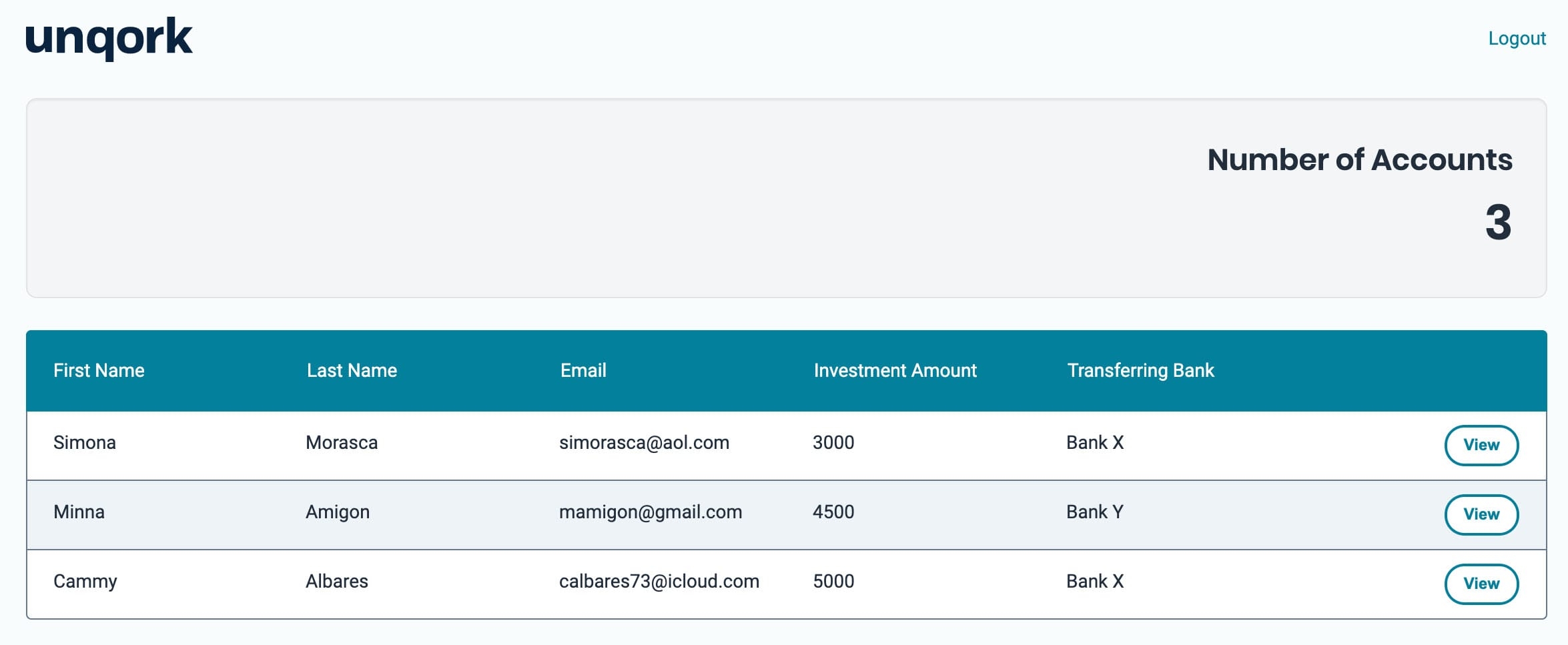
Sometimes you want to measure the performance of a particular activity. For example, you might want to see the number of submissions in your dashboard. You can achieve this example by adding a KPI component to your dashboard. KPIs are a great way to measure and view a key metric.
Here's a KPI widget in Express View, displaying the total number of accounts (submissions) in a dashboard:
Map Component
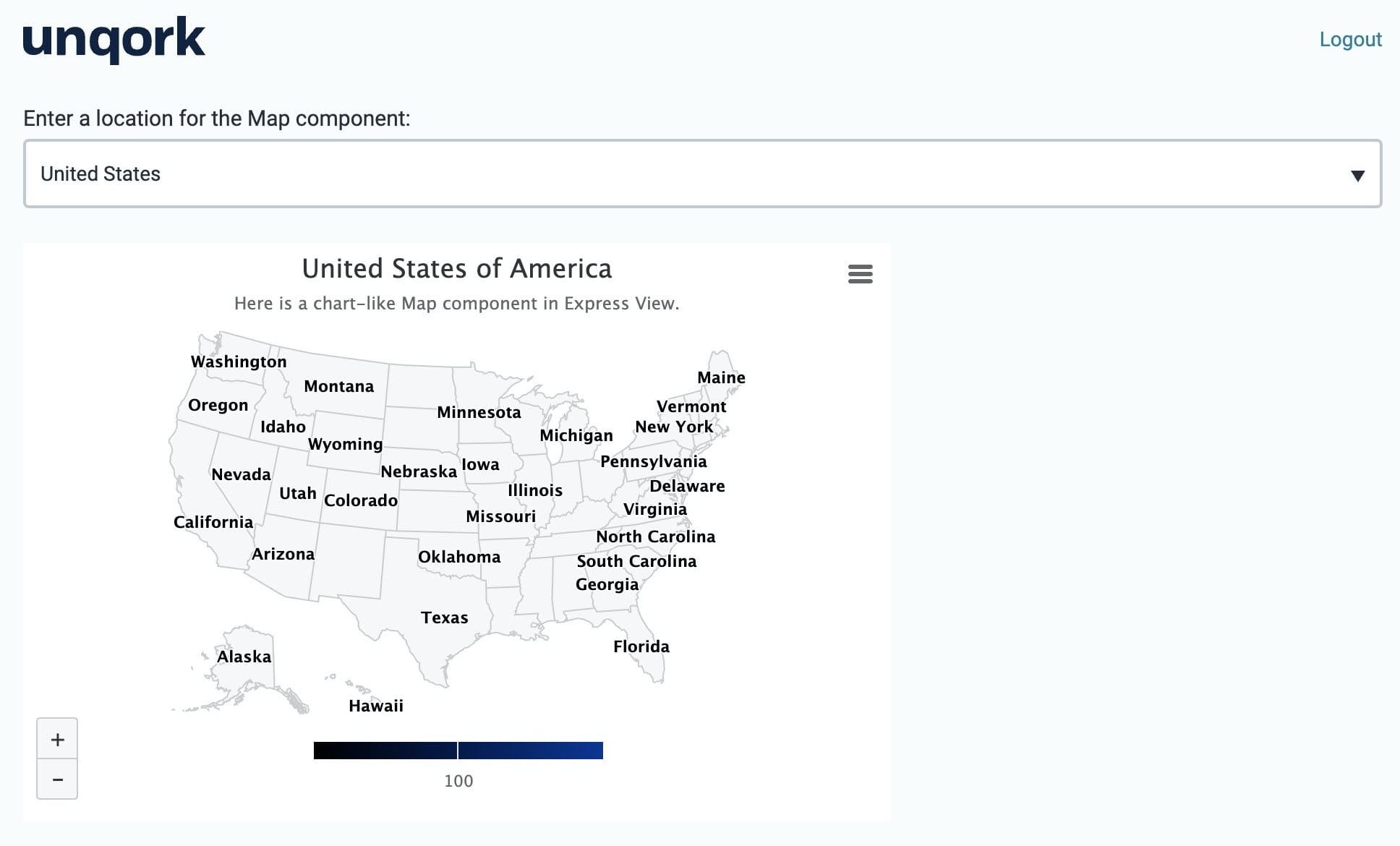
You'll notice a Map and a Map v2 component. The Map component is a basic chart-like component that displays a map chart. The Map v2 component uses Google Maps to display an interactive Google Maps view.
Here's an example of how a Map widget looks in Express View:
Map v2 Component
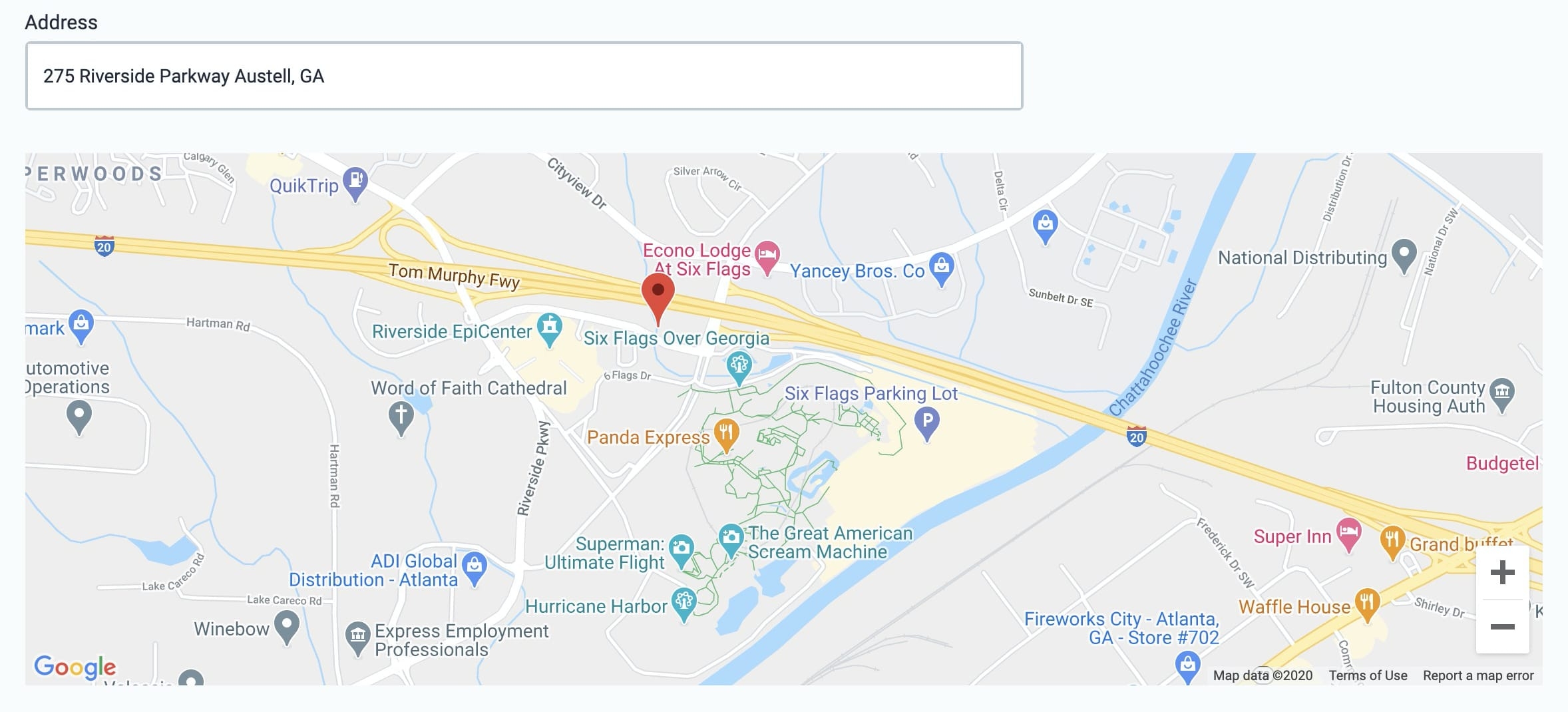
The Map v2 component uses Google Maps to display an interactive Google Maps view for your end-user. The simplest way to use the Map v2 component is to use it with an Address Search component. Once configured, your end-user can enter their address in Express View and the component pinpoints their location on the map.
Here's an example of the Map v2 widget in Express View:
Vega Chart Component
The Vega Chart component creates a graphical display of data sets in an application. In the Module Builder, Creators configure the Vega Chart component using one or more chart types and data sets. In Express View, the Vega Chart lets end-users visualize the data sets in a meaningful and intuitive way.
The Vega Chart component is a Vega (2.0) runtime component and is not supported in the Centauri (1.0) runtime.
Below are some common examples of when to use the Vega Chart component:
To display a scatter plot to track the number of sales for each sales agent in your department.
To display a pie chart to show the percentages of end-user submissions.
To display a bar graph that shows product consumption by demographic.
Here's an example of the Vega Chart component in Express View:


